4. Project [vuejs-02]: Using the Bootstrap CSS framework
The [vuejs-02] project demonstrates the use of Bootstrap in a [Vue.js] project. This is the CSS framework that will be used in all our projects. We will use a variation of Bootstrap called [BootstrapVue] [https://bootstrap-vue.js.org/].
The project directory structure will be as follows:
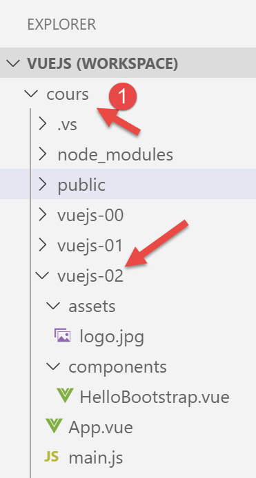
Note: In the document below, the [vuejs] folder has been renamed [cours] [1].
4.1. Installing the [BootstrapVue] framework
[BootstrapVue] is a framework that we add to the project using the [npm] tool:
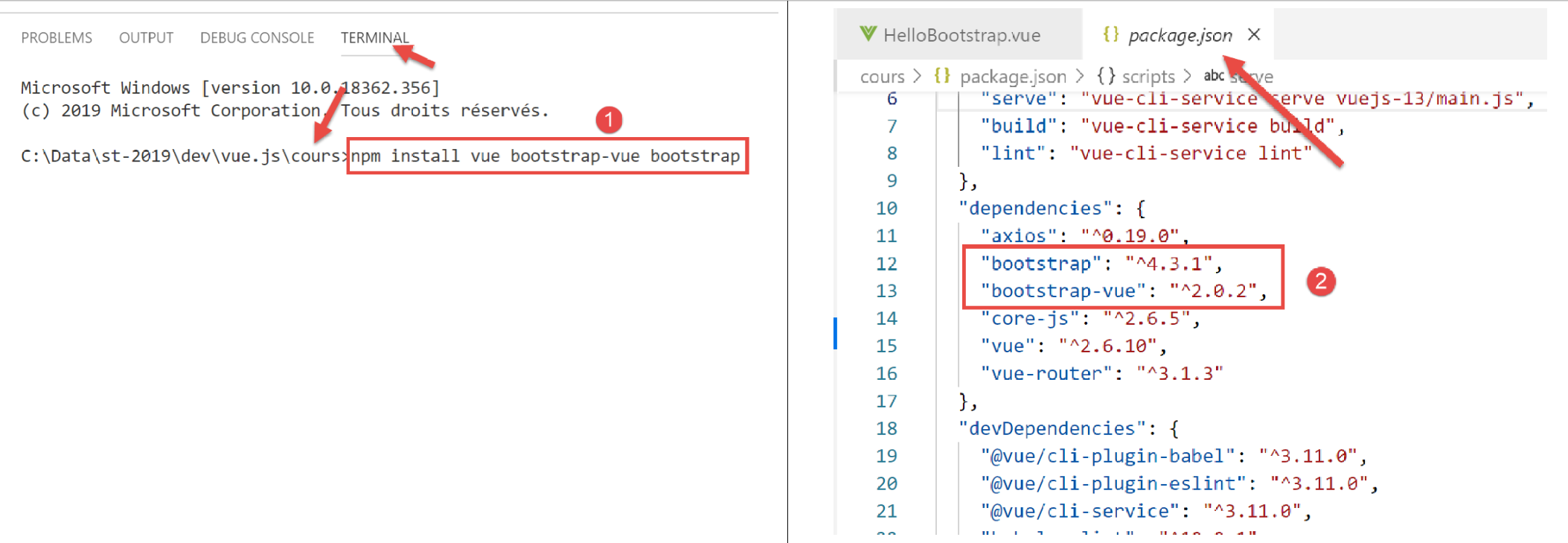
- In [1], we are therefore installing two frameworks: [Bootstrap] and its variant [BootstrapVue];
- in [2], both dependencies appear in the [package.json] file;
4.2. The [main.js] script
The main script [main.js] is as follows:
// imports
import Vue from 'vue'
import App from './App.vue'

// plugins
import BootstrapVue from 'bootstrap-vue'
Vue.use(BootstrapVue);

// bootstrap
import 'bootstrap/dist/css/bootstrap.css'
import 'bootstrap-vue/dist/bootstrap-vue.css'

// configuration
Vue.config.productionTip = false

// instanciation projet [App]
new Vue({
  render: h => h(App),
}).$mount('#app')
- line 2: import the [Vue] framework;
- line 3: import the main view;
- line 6: import the [BootstrapVue] framework;
- line 7: this framework is designed as a plugin for the [Vue] framework. Line 7 includes this plugin in the [Vue] framework;
- lines 10–11: import the CSS files from the [Bootstrap] and [BootstrapVue] frameworks;
- Lines 5–11 are therefore entirely dedicated to using [BootstrapVue]. The rest of the code is identical to what we saw in the previous paragraph;
4.3. The [App.vue] component
<template>
  <b-container>
    <b-card>
      <!-- Bootstrap Jumbotron -->
      <b-jumbotron>
        <!-- ligne -->
        <b-row>
          <!-- colonne de largeur 4 -->
          <b-col cols="4">
            <img src="./assets/logo.jpg" alt="Cerisier en fleurs" />
          </b-col>
          <!-- colonne de largeur 8 -->
          <b-col cols="8">
            <h1>Calculez votre impôt</h1>
          </b-col>
        </b-row>
      </b-jumbotron>
      <HelloBootstrap msg="Hello Bootstrap !" />
    </b-card>
  </b-container>
</template>


<script>
  import HelloBootstrap from "./components/HelloBootstrap.vue";

  export default {
    name: "app",
    components: {
      HelloBootstrap
    }
  };
</script>
Comments
- lines 1–21: all <b-xx> tags are tags from the [BootstrapVue] framework;
- lines 2, 20: the <b-container> tag defines a Bootstrap container. Inside this container, we can define rows using the <b-row> tag and columns using the <b-col> tag;
- lines 3, 19: the <b-card> tag defines a Bootstrap “card.” Visually, this appears as a rectangle with a border;
- lines 5, 17: the <b-jumbotron> tag allows you to highlight a section of the page, in this case an image and some text. We will use it in our various projects as a visual identifier for the project;
- line 7: the <b-row> tag defines a row;
- lines 9–11: the <b-col> tag defines a column in the previous row. Bootstrap assigns 12 columns to each row. The [cols=’4’] attribute indicates that the <b-col> column will occupy 4 of these 12 columns;
- Line 10: an image
- lines 13–15: a column that will occupy 8 of the 12 columns in the row. We place some text there;
- line 18: use of a component called [HelloBootstrap] with a property named [msg];
- lines 24–33: the <script> part of the component;
- lines 29–31: the [HelloBootstrap] component used in line 18 is exported. To be recognized, it must be imported in line 25;
The result is as follows:
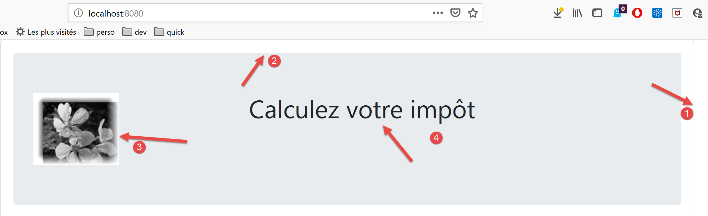
- in [1], the <b-card> tag;
- in [2], the <jumbotron> tag;
- in [3], the 4-column image;
- in [4], the 8-column text;
4.4. The [HelloBootstrap]
[HelloBootstrap] is the following component:
<template>
  <div>
    <!-- message on green background -->
    <b-col cols="12">
      <b-alert show variant="success" align="center">
        <h4>[vuejs-02] : bootstrap</h4>
      </b-alert>
    </b-col>
    <!-- message on yellow background -->
    <b-col cols="12">
      <b-alert show variant="warning" align="center">
        <h4>{{msg}}</h4>
      </b-alert>
    </b-col>
  </div>
</template>

<script>
  export default {
    name: "HelloBootstrap",
    props: {
      msg: String
    }
  };
</script>
Comments
- line 3: the <b-alert show> tag displays a colored rectangle that typically contains text (line 6). The [variant] attribute allows you to select an alert type. Each alert type has a different background color. The color for the [success] variant is green. The [align] attribute allows you to align the alert text (left, right, or centered). Note that the [show] attribute is required to display the alert. Without this attribute, the alert is not visible;
- Possible values for [variant]:
- [primary]: blue;
- [secondary]: gray;
- [success]: green;
- [danger]: light red;
- [warning]: yellow;
- [info]: turquoise;
- [light]: no background color;
- [dark]: gray slightly darker than [secondary];
- line 12: [msg] is a parameter of the [HelloBootstrap] component (lines 21–23);
The visual output is as follows:
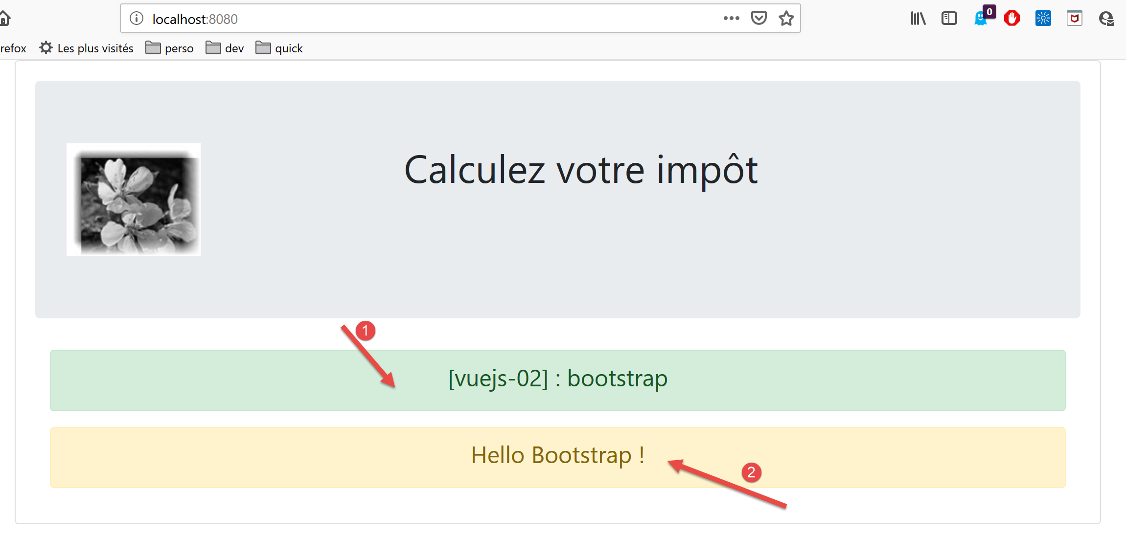
- [1]: <b-alert show variant='success'> tag;
- [2]: <b-alert show variant='warning'> tag;
4.5. Running the project
To run the project, first modify the [package.json] file:
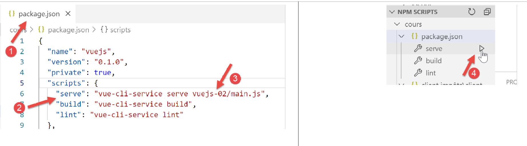
- in [3], modify the script executed by the [serve] command [2] in the package.json file [1];
- in [4], run the project;
Note: In the following, we will use BootstrapVue framework tags, which are in the form <b-something>. This is not mandatory. You can use the original Bootstrap framework tags. They work in [Vue.js] templates. Therefore, developers accustomed to Bootstrap tags can continue to use them.