7. Graphical Interfaces with C# and VS.NET
7.1. The basics of graphical user interfaces
7.1.1. A First Project
Let’s build a first “Windows Application” project:
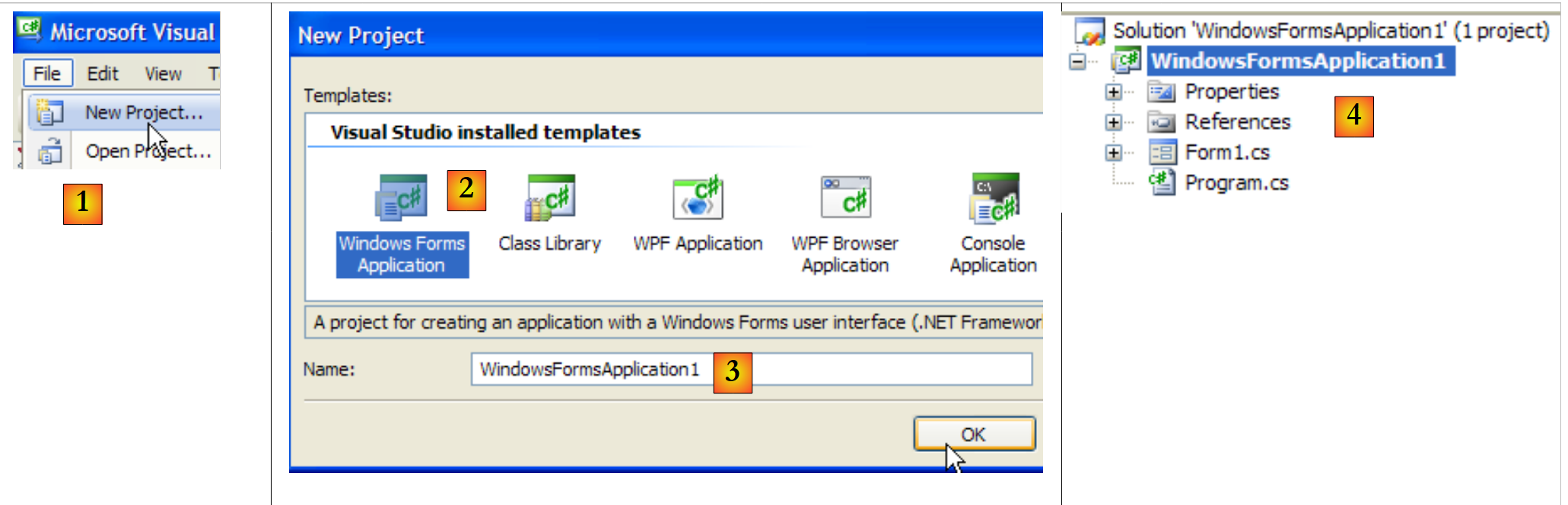 |
- [1]: Create a New Project
- [2]: Windows Application type
- [3]: the project name doesn’t matter for now
- [4]: the project has been created
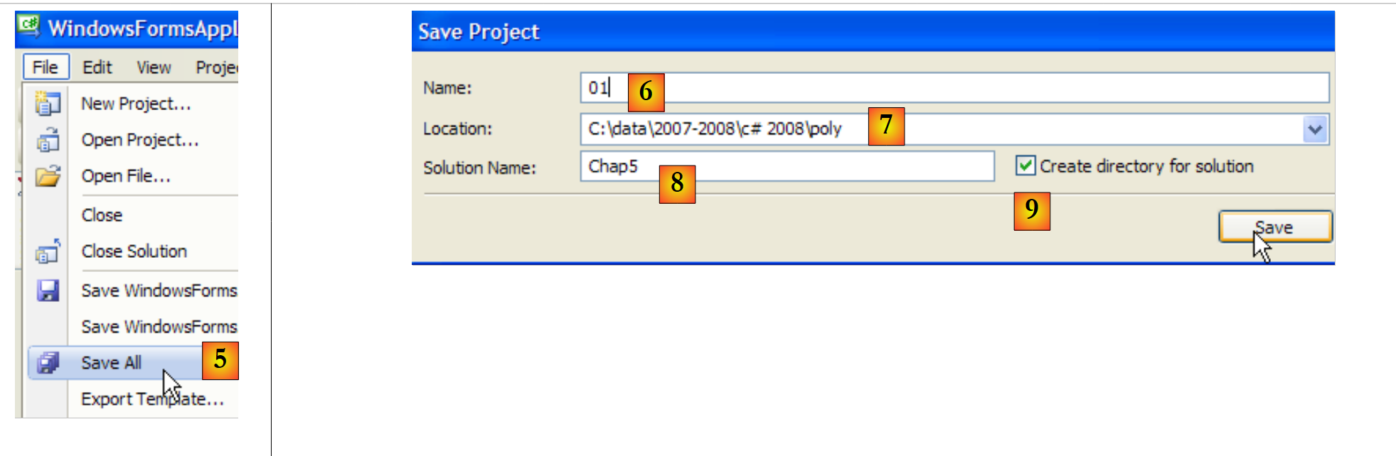 |
- [5]: Save the current solution
- [6]: project name
- [7]: Solution folder
- [8]: solution name
- [9]: A folder will be created for the [Chap5] solution. Its projects will be in subfolders.
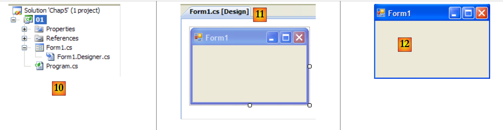 |
- [10]: the [01] project in the [Chap5] solution:
- [Program.cs] is the main class of the project
- [Form1.cs] is the source file that will manage the behavior of the window [11]
- [Form1.Designer.cs] is the source file that will encapsulate information about the components of the [11] window
- [11]: the [Form1.cs] file in "design" mode
- [12]: The generated application can be run by pressing (Ctrl-F5). The [Form1] window appears. It can be moved, resized, and closed. We thus have the basic elements of a graphical window.
The main class [Program.cs] is as follows:
using System;
using System.Windows.Forms;

namespace Chap5 {
    static class Program {
        /// <summary>
        /// The main entry point for the application.
        /// </summary>
        [STAThread]
        static void Main() {
            Application.EnableVisualStyles();
            Application.SetCompatibleTextRenderingDefault(false);
            Application.Run(new Form1());
        }
    }
}
- Line 2: Applications with forms use the System.Windows.Forms namespace.
- Line 4: The initial namespace has been renamed to Chap5.
- Line 10: When the project is run (Ctrl-F5), the [Main] method is executed.
- Lines 11–13: The Application class belongs to the System.Windows.Forms namespace. It contains static methods to start and stop Windows GUI applications.
- Line 11: optional—allows you to apply different visual styles to controls placed on a form
- line 12: optional - sets the text rendering engine for controls: GDI+ (true), GDI (false)
- line 13: the only essential line in the [Main] method: instantiates the [Form1] class, which is the form class, and instructs it to run.
The source file [Form1.cs] is as follows:
using System;
using System.Windows.Forms;

namespace Chap5 {
    public partial class Form1 : Form {
        public Form1() {
            InitializeComponent();
        }
    }
}
- line 5: the Form1 class derives from the [System.Windows.Forms.Form] class, which is the base class for all windows. The partial keyword indicates that the class is partial and can be extended by other source files. This is the case here, where the Form1 class is split across two files:
- [Form1.cs]: which contains the form’s behavior, including its event handlers
- [Form1.Designer.cs]: which contains the form components and their properties. This file is regenerated every time the user modifies the window in [conception] mode.
- Lines 6–8: the constructor for the Form1 class
- line 7: calls the InitializeComponent method. We can see that this method is not present in [Form1.cs]. It is found in [Form1.Designer.cs].
The source file [Form1.Designer.cs] is as follows:
namespace Chap5 {
    partial class Form1 {
        /// <summary>
        /// Required designer variable.
        /// </summary>
        private System.ComponentModel.IContainer components = null;

        /// <summary>
        /// Clean up any resources being used.
        /// </summary>
        /// <param name="disposing">true if managed resources should be disposed; otherwise, false.</param>
        protected override void Dispose(bool disposing) {
            if (disposing && (components != null)) {
                components.Dispose();
            }
            base.Dispose(disposing);
        }

        #region Windows Form Designer generated code

        /// <summary>
        /// Required method for Designer support - do not modify
        /// the contents of this method with the code editor.
        /// </summary>
        private void InitializeComponent() {
            this.SuspendLayout();
            //
            // Form1
            //
            this.AutoScaleDimensions = new System.Drawing.SizeF(6F, 13F);
            this.AutoScaleMode = System.Windows.Forms.AutoScaleMode.Font;
            this.ClientSize = new System.Drawing.Size(196, 98);
            this.Name = "Form1";
            this.Text = "Form1";
            this.ResumeLayout(false);

        }

        #endregion

    }
}
- line 2: this is still the Form1 class. Note that it is no longer necessary to specify that it derives from the Form class.
- lines 25–37: the InitializeComponent method called by the constructor of the [Form1] class. This method will create and initialize all the form components. It is regenerated every time the form is modified in [conception] mode. A section, called a region, is created to delimit it (lines 19–39). The developer must not add code to this region: it will be overwritten during the next regeneration.
It is simpler at first not to concern yourself with the code in [Form1.Designer.cs]. It is generated automatically and is the C# translation of the choices the developer makes in [conception] mode. Let’s look at a first example:
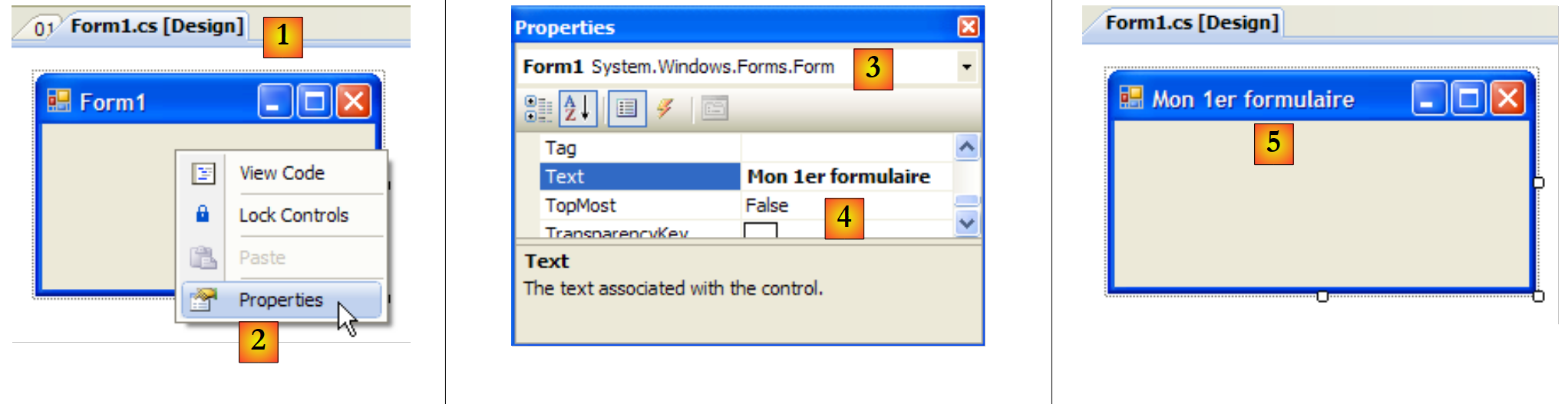 |
- [1]: select [conception] mode by double-clicking the [Form1.cs] file
- [2]: right-click on the form and select [Properties]
- [3]: the properties window for [Form1]
- [4]: The property [Text] represents the window title
- [5]: Changes to the [Text] property are reflected in [conception] mode as well as in the source code [Form1.Designer.cs]:
        private void InitializeComponent() {
            this.SuspendLayout();
...
            this.Text = "Mon 1er formulaire";
...
}
7.1.2. A second project
7.1.2.1. The form
We are starting a new project called 02. To do this, we follow the procedure described earlier to create a project. The window to be created is as follows:
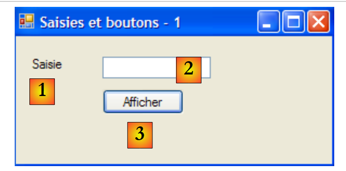 |
The form components are as follows:
No. | name | Type | role |
1 | labelSaisie | Label | a label |
2 | textBoxSaisie | TextBox | an input field |
3 | buttonAfficher | Button | to display the contents of the input field in a dialog box textBoxSaisie |
You can proceed as follows to build this window:
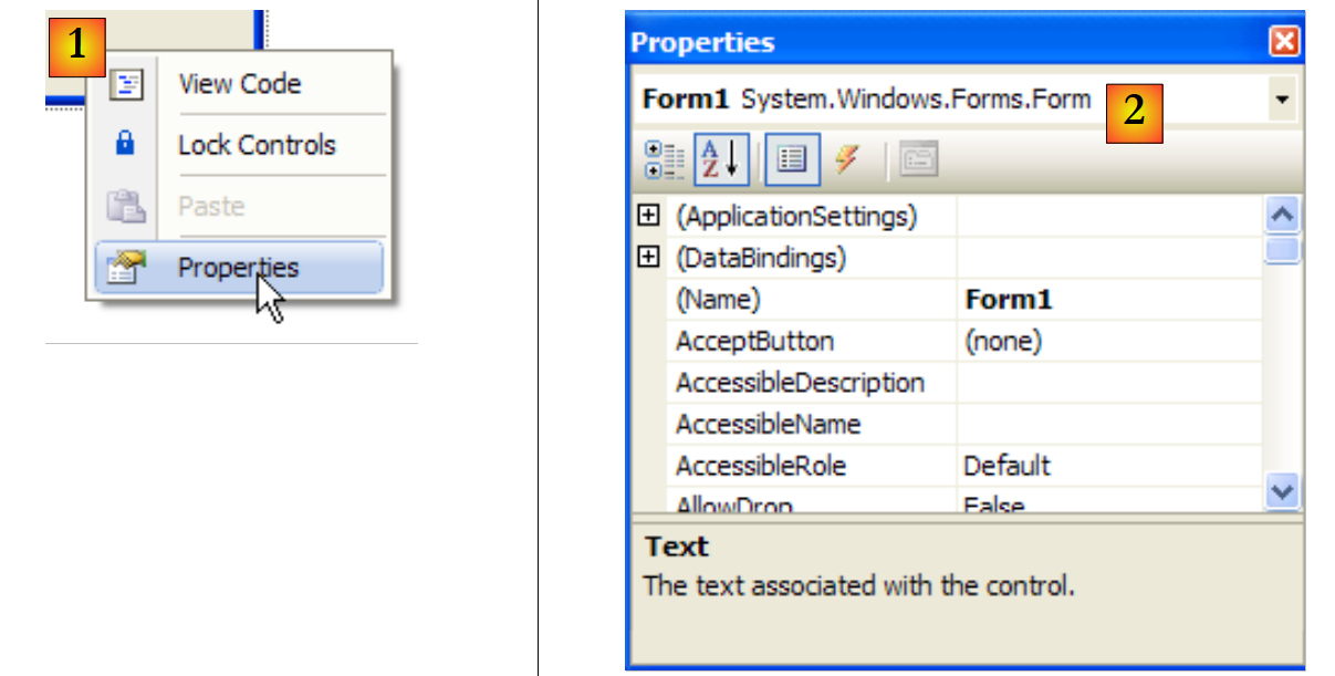 |
- [1]: Right-click on the form outside of any component and select option [Properties]
- [2]: The window’s properties sheet appears in the lower-right corner of Visual Studio
Notable form properties include:
to set the window's background color | |
to set the color of drawings or text on the window | |
to associate a menu with the window | |
to give the window a title | |
to set the window type | |
to set the font for text in the window | |
to set the window name |
Here, we set the Text and Name properties:
Inputs and buttons - 1 | |
frmSaisiesBoutons |
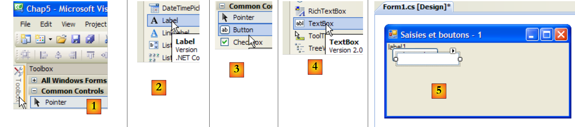 |
- [1]: Select the [Common Controls] toolkit from the toolkits offered by Visual Studio
- [2, 3, 4]: Double-click successively on the components [Label], [Button], and [TextBox]
- [5]: the three components are on the form
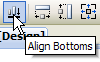
To align and resize the components correctly, you can use the toolbar elements:
 |
 |  |  |  |  |  |  |  | ||
 |  |  |  |  | |||||
The formatting process works as follows:
- select the various components to be formatted together (hold down the Ctrl key while clicking to select the components)
- select the desired formatting type:
- (continued)
- The Align options allow you to align components at the top, bottom, left, right, or center
- The Make Same Size options allow components to have the same height or width
- The option Horizontal Spacing option allows you to align components horizontally with equal spacing between them. The same applies to the option Vertical Spacing option for vertical alignment.
- The option Center allows you to center a component horizontally or vertically within the window
Once the components are placed, we set their properties. To do this, right-click on the component and select option Properties:
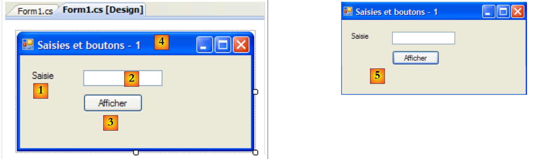 |
- [1]: Select the component to open its Properties window. In this window, modify the following properties: name: labelSaisie, text: Enter
- [2]: do the same: name: textBoxSaisie, text: leave blank
- [3]: name: buttonAfficher, text: Display
- [4]: the window itself: name: frmSaisiesBoutons, text: Inputs and buttons - 1
- [5]: Run (Ctrl-F5) the project to get a first preview of the window in action.
What was done in [conception] mode has been translated into the code for [Form1.Designer.cs]:
namespace Chap5 {
    partial class frmSaisiesBoutons {
...
        private System.ComponentModel.IContainer components = null;
...
        private void InitializeComponent() {
            this.labelSaisie = new System.Windows.Forms.Label();
            this.buttonAfficher = new System.Windows.Forms.Button();
            this.textBoxSaisie = new System.Windows.Forms.TextBox();
            this.SuspendLayout();
            //
            // labelSaisie
            //
            this.labelSaisie.AutoSize = true;
            this.labelSaisie.Location = new System.Drawing.Point(12, 19);
            this.labelSaisie.Name = "labelSaisie";
            this.labelSaisie.Size = new System.Drawing.Size(35, 13);
            this.labelSaisie.TabIndex = 0;
            this.labelSaisie.Text = "Saisie";
            //
            // buttonAfficher
            //
            this.buttonAfficher.Location = new System.Drawing.Point(80, 49);
            this.buttonAfficher.Name = "buttonAfficher";
            this.buttonAfficher.Size = new System.Drawing.Size(75, 23);
            this.buttonAfficher.TabIndex = 1;
            this.buttonAfficher.Text = "Afficher";
            this.buttonAfficher.UseVisualStyleBackColor = true;
            this.buttonAfficher.Click += new System.EventHandler(this.buttonAfficher_Click);
            //
            // textBoxSaisie
            //
            this.textBoxSaisie.Location = new System.Drawing.Point(80, 19);
            this.textBoxSaisie.Name = "textBoxSaisie";
            this.textBoxSaisie.Size = new System.Drawing.Size(100, 20);
            this.textBoxSaisie.TabIndex = 2;
            //
            // frmSaisiesBoutons
            //
            this.AutoScaleDimensions = new System.Drawing.SizeF(6F, 13F);
            this.AutoScaleMode = System.Windows.Forms.AutoScaleMode.Font;
            this.ClientSize = new System.Drawing.Size(292, 118);
            this.Controls.Add(this.textBoxSaisie);
            this.Controls.Add(this.buttonAfficher);
            this.Controls.Add(this.labelSaisie);
            this.Name = "frmSaisiesBoutons";
            this.Text = "Saisies et boutons - 1";
            this.ResumeLayout(false);
            this.PerformLayout();

        }

        private System.Windows.Forms.Label labelSaisie;
        private System.Windows.Forms.Button buttonAfficher;
        private System.Windows.Forms.TextBox textBoxSaisie;

    }
}
- lines 53–55: The three components have given rise to three private fields in the [Form1] class. Note that the names of these fields are the names given to the components in [conception] mode. This is also the case for the form on line 2, which is the class itself.
- lines 7-9: the three objects of type [Label], [TextBox], and [Button] are created. It is through these that the visual components are managed.
- Lines 14–19: Configuration of the label labelSaisie
- lines 23–29: configuration of the buttonAfficher button
- lines 33-36: configuration of the input field textBoxSaisie
- lines 40–47: configuration of the frmSaisiesBoutons form. Note, in lines 43–45, how components are added to the form.
This code is straightforward. It allows you to build forms using code without using the [conception] mode. Numerous examples of this are provided in the Visual Studio MSDN documentation. Mastering this code allows you to create forms at runtime: for example, creating a form on the fly to update a database table, where the structure of that table is only discovered at runtime.
We still need to write the procedure to handle a click on the Display button. Select the button to access its Properties window. This window has several tabs:
 |
- [1]: list of properties in alphabetical order
- [2]: events related to the control
A control’s properties and events can be accessed by category or in alphabetical order:
- [3]: Properties or events by category
- [4]: Properties or events in alphabetical order
The Events tab in Categories mode for the buttonAfficher button is as follows:
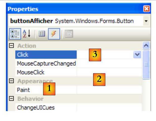 |
- [1]: The left column of the window lists the possible events for the button. Clicking a button corresponds to the Click event.
- [2]: The right-hand column contains the name of the procedure called when the corresponding event occurs.
- [3]: If you double-click the Click event cell, you are automatically taken to the code window to write the Click event handler for the button buttonAfficher:
using System;
using System.Windows.Forms;

namespace Chap5 {
    public partial class frmSaisiesBoutons : Form {
        public frmSaisiesBoutons() {
            InitializeComponent();
        }

        private void buttonAfficher_Click(object sender, EventArgs e) {

        }
    }
}
- Lines 10–12: the skeleton of the Click event handler for the button named buttonAfficher. Note the following points:
- The method is named according to the pattern nomDuComposant_NomEvénement
- the method is private. It takes two parameters:
- sender: is the object that triggered the event. If the procedure is executed following a click on the buttonAfficher button, sender will be equal to buttonAfficher. It is conceivable that the procedure buttonAfficher_Click is executed from within another procedure. That procedure would then be free to set the first parameter to the sender object of its choice.
- EventArgs: an object containing information about the event. For a Click event, it contains nothing. For an event related to mouse movements, it contains the mouse coordinates (X,Y).
- We will not use any of these parameters here.
Writing an event handler involves completing the code skeleton above. Here, we want to display a dialog box containing the contents of the textBoxSaisie field if it is not empty ([1]), or an error message otherwise ([2]):
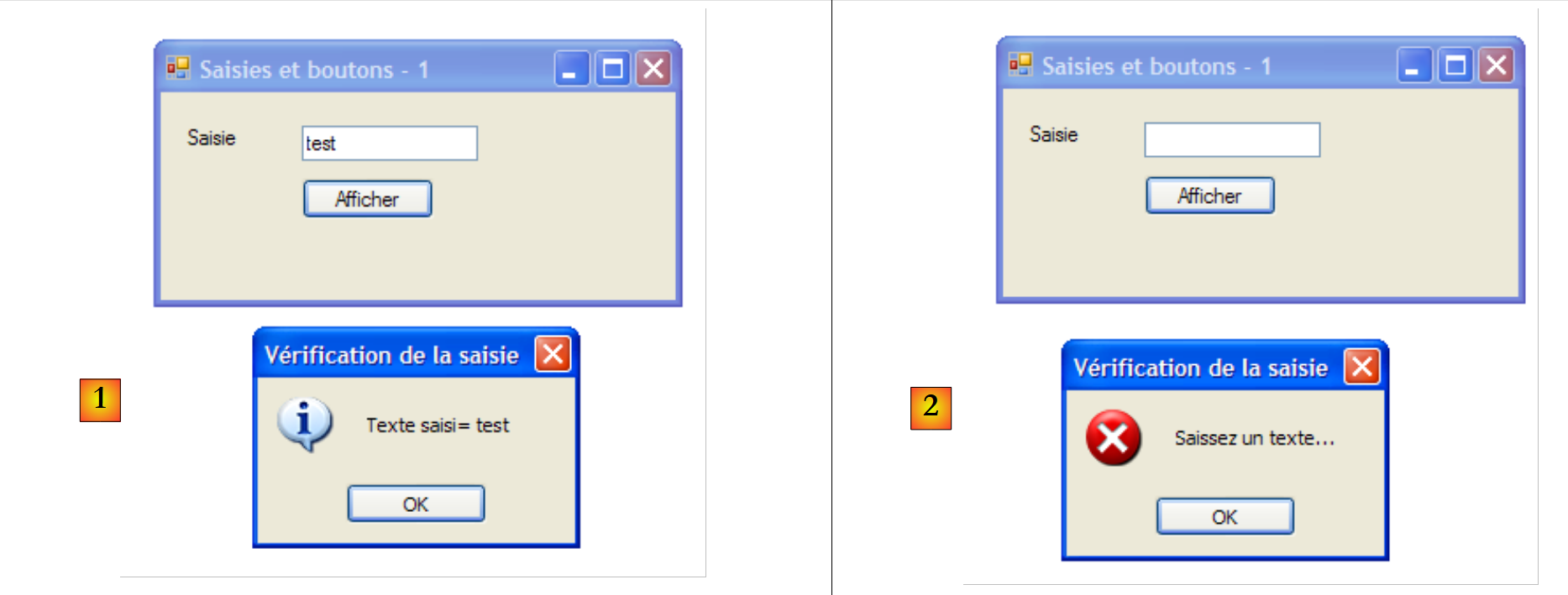 |
The code to achieve this could be as follows:
        private void buttonAfficher_Click(object sender, EventArgs e) {
            // displays the text entered in the TextBox textboxSaisie
            string texte = textBoxSaisie.Text.Trim();
            if (texte.Length != 0) {
                MessageBox.Show("Texte saisi= " + texte, "Vérification de la saisie", MessageBoxButtons.OK, MessageBoxIcon.Information);
            } else {
                MessageBox.Show("Saissez un texte...", "Vérification de la saisie", MessageBoxButtons.OK, MessageBoxIcon.Error);
}
The MessageBox class is used to display messages in a window. Here, we used the following Show method:
public static DialogResult Show(string text, string caption, MessageBoxButtons buttons, MessageBoxIcon icon);
with
the message to display | |
the window title | |
the buttons in the window | |
the icon in the window |
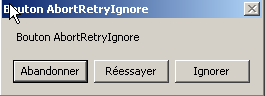
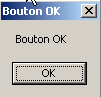
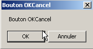
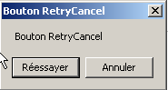
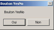
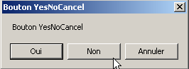
The buttons parameter can take values from the following constants (prefixed with MessageBoxButtons as shown in line 7) above:
buttons | |
 | |
 | |
 | |
 | |
 | |
 |
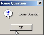
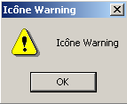
The icon parameter can take values from the following constants (prefixed with MessageBoxIcon as shown in line 10) above:
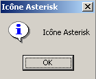 | same as above Stop | ||
idem Warning | 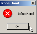 | ||
same as Asterisk | 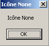 | ||
 | Same as Hand | ||
 |
The Show method is a static method that returns a result of type [System.Windows.Forms.DialogResult], which is an enumeration:
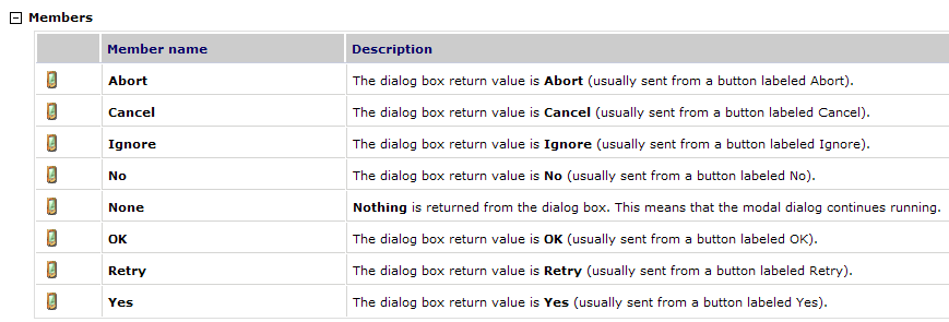
To determine which button the user clicked to close the window of type MessageBox, we write:
7.1.2.2. The code related to event handling
In addition to the buttonAfficher_Click function we wrote, Visual Studio generated the following line in the InitializeComponents method of [Form1.Designer.cs], which creates and initializes the form components:
this.buttonAfficher.Click += new System.EventHandler(this.buttonAfficher_Click);
Click is an event of the Button class [1, 2, 3]:
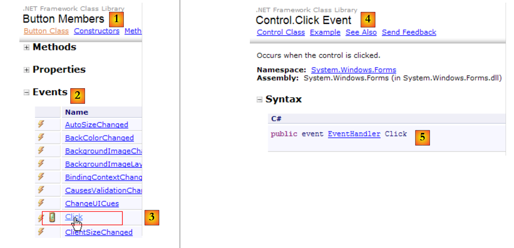 |
- [5]: the declaration of the [Control.Click] [4] event. Thus, we see that the Click event is not specific to the [Button] class. It belongs to the [Control] class, the parent class of the [Button] class.
- EventHandler is a method prototype (a template) called a delegate. We’ll come back to this later.
- `event` is a keyword that restricts the functionality of the delegate `EventHandler`: a delegate object has richer functionality than an event object.
The delegate EventHandler is defined as follows:
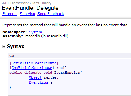 |
The delegate EventHandler refers to a method template:
- with a first parameter of type Object
- with a type EventArgs as its second parameter
- returning no result
This is the case for the button click handler method buttonAfficher generated by Visual Studio:
private void buttonAfficher_Click(object sender, EventArgs e);
Thus, the method buttonAfficher_Click corresponds to the prototype defined by the type EventHandler. To create an object of type EventHandler, proceed as follows:
EventHandler evtHandler=new EventHandler(méthode correspondant au prototype défini par le type EventHandler);
Since the method buttonAfficher_Click corresponds to the prototype defined by the type EventHandler, we can write:
A variable of type delegate is actually a list of references to methods of the delegate’s type. To add a new method M to the variable evtHandler above, we use the following syntax:
The += notation can be used even if evtHandler is an empty list.
Let’s return to the line of [InitializeComponent] that adds an event handler to the Click event of the buttonAfficher object:
this.buttonAfficher.Click += new System.EventHandler(this.buttonAfficher_Click);
This statement adds a method of type EventHandler to the list of methods for the buttonAfficher.Click field. These methods will be called whenever the Click event on the buttonAfficher component is detected. There is often only one. It is called the "event handler".
Let's take a closer look at the signature of EventHandler:
private delegate void EventHandler(object sender, EventArgs e);
The second parameter of the delegate is an object of type EventArgs or a derived class. The EventArgs type is very general and does not actually provide any information about the event that occurred. For a button click, this is sufficient. For a mouse movement on a form, we would have a MouseMove event of the [Form] class defined by:
The delegate MouseEventHandler is defined as:
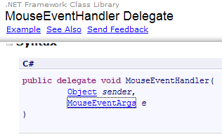 |
It is a delegate function with the signature void f (object, MouseEventArgs). The class MouseEventArgs is defined by:
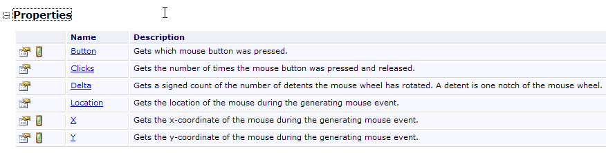 |
The MouseEventArgs class is more feature-rich than the EventArgs class. For example, you can obtain the mouse’s X and Y coordinates at the time the event occurs.
7.1.2.3. Conclusion
From the two projects studied, we can conclude that once the graphical user interface is built with Visual Studio, the developer’s work consists mainly of writing the event handlers for the events they want to manage for that interface. Code is automatically generated by Visual Studio. This code, which can be complex, can be ignored initially. Later, studying it can lead to a better understanding of form creation and management.
7.2. Basic Components
We will now present various applications that utilize the most common components to explore their main methods and properties. For each application, we will present the graphical user interface and the relevant code, primarily that of the event handlers.
7.2.1. Form
We begin by introducing the essential component: the form onto which components are placed. We have already covered some of its basic properties. Here, we focus on a few important events of a form.
The form is loading | |
The form is closing | |
The form is closed |
The Load event occurs even before the form is displayed. The Closing event occurs when the form is being closed. This closing can still be stopped programmatically.
We are building a form named Form1 without any components:
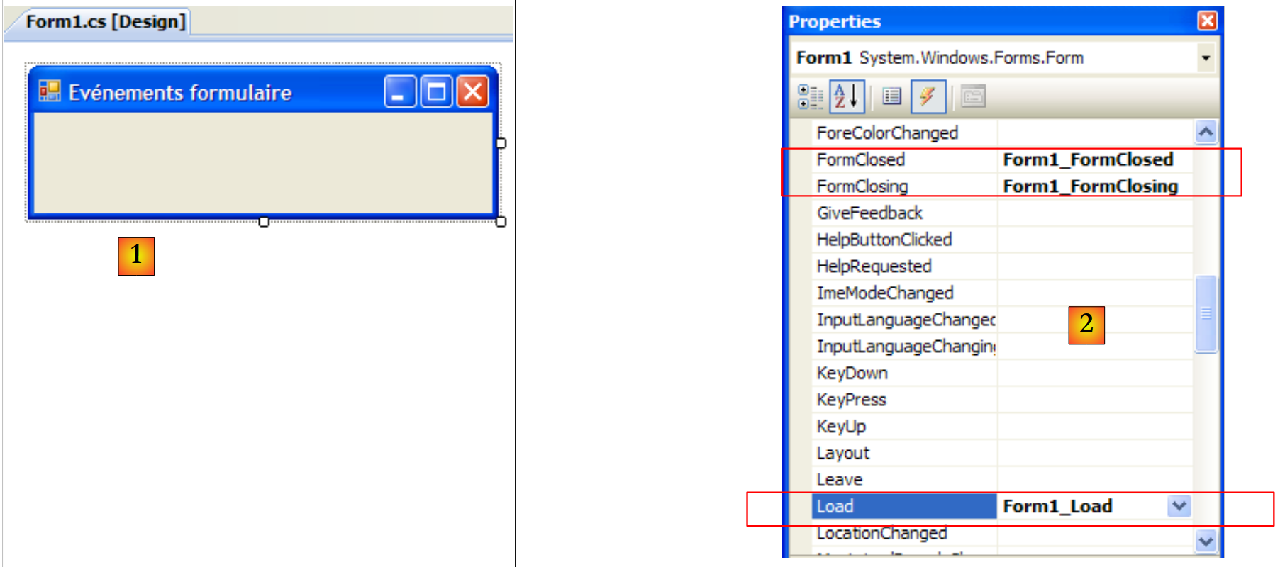 |
- [1]: the form
- [2]: the three events handled
The code for [Form1.cs] is as follows:
using System;
using System.Windows.Forms;

namespace Chap5 {
    public partial class Form1 : Form {
        public Form1() {
            InitializeComponent();
        }

        private void Form1_Load(object sender, EventArgs e) {
            // initial form loading
            MessageBox.Show("Evt Load", "Load");
        }

        private void Form1_FormClosing(object sender, FormClosingEventArgs e) {
            // the form is closing
            MessageBox.Show("Evt FormClosing", "FormClosing");
            // confirmation requested
            DialogResult réponse = MessageBox.Show("Voulez-vous vraiment quitter l'application", "Closing", MessageBoxButtons.YesNo, MessageBoxIcon.Question);
            if (réponse == DialogResult.No)
                e.Cancel = true;
        }

        private void Form1_FormClosed(object sender, FormClosedEventArgs e) {
            // the form will be closed
            MessageBox.Show("Evt FormClosed", "FormClosed");
        }
    }
}
We use the MessageBox function to be notified of various events.
Line 10: The Load event will occur when the application, even before the form is displayed: | 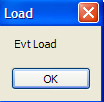 |
line 15: The FormClosing event will occur when the user closes the window. | 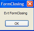 |
Line 19: We then ask the user if they really want to exit the application: | 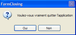 |
line 20: If they answer No, we set the Cancel property of the CancelEventArgs event that the method received as a parameter. If we set this property to False, closing of the window is canceled; otherwise, it proceeds. The event FormClosed will then occur: | 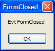 |
7.2.2. Labels and input boxes TextBox
We have already encountered these two components. Label is a text component, and TextBox is an input field component. Their main property is Text, which refers to either the content of the input field or the label text. This property is read/write.
The event typically used for TextBox is TextChanged, which signals that the user has modified the input field. Here is an example that uses the TextChanged event to track changes in an input field:
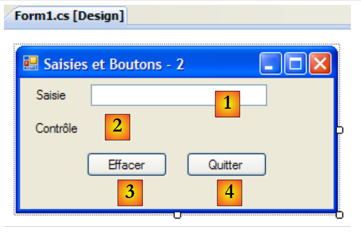 |
No. | type | name | role |
1 | TextBox | textBoxSaisie | input field |
2 | Label | labelControle | displays the text from 1 in real time AutoSize=False, Text=(none) |
3 | Button | buttonEffacer | to clear fields 1 and 2 |
4 | Button | buttonQuitter | to exit the application |
The code for this application is as follows:
using System.Windows.Forms;

namespace Chap5 {
    public partial class Form1 : Form {
        public Form1() {
            InitializeComponent();
        }

        private void textBoxSaisie_TextChanged(object sender, System.EventArgs e) {
            // the content of TextBox has changed - copy it to Label labelControle
            labelControle.Text = textBoxSaisie.Text;
        }

        private void buttonEffacer_Click(object sender, System.EventArgs e) {
            // delete the contents of the input box
            textBoxSaisie.Text = "";
        }

        private void buttonQuitter_Click(object sender, System.EventArgs e) {
            // click on the Quit button - exit the application
            Application.Exit();
        }

        private void Form1_Shown(object sender, System.EventArgs e) {
            // focus on the input field
            textBoxSaisie.Focus();
        }
    }
}
- line 24: the [Form].Shown event occurs when the form is displayed
- line 26: the focus is then set (for input) on the textBoxSaisie component.
- line 9: the event [TextBox].TextChanged occurs every time the content of a TextBox component changes
- Line 11: The content of the [TextBox] component is copied to the [Label] component
- Line 14: Handles the click on the [Effacer] button
- line 16: sets the empty string in the [TextBox] component
- line 19: handles the click on the [Quitter] button
- line 21: to stop the currently running application. Recall that the Application object is used to launch the application in the [Main] method of [Form1.cs]:
        static void Main() {
            Application.EnableVisualStyles();
            Application.SetCompatibleTextRenderingDefault(false);
            Application.Run(new Form1());
}
The following example uses a multi-line TextBox:
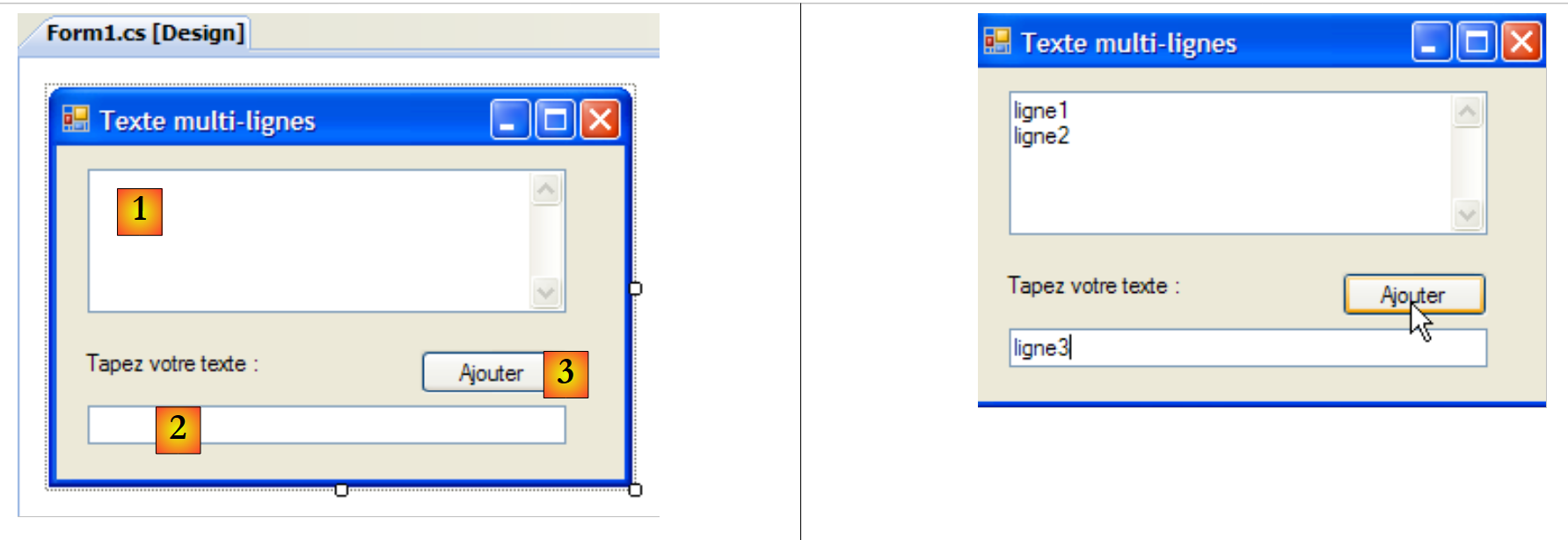 |
The list of controls is as follows:
No. | Type | name | role |
1 | TextBox | textBoxLignes | multiline input field Multiline=true, ScrollBars=Both, AcceptReturn=True, AcceptTab=True |
2 | TextBox | textBoxLigne | single-line input field |
3 | Button | buttonAjouter | Adds the content from 2 to 1 |
To make a TextBox multi-line, set the following control properties:
to allow multiple lines of text | |
to specify whether the control should have scroll bars (Horizontal, Vertical, Both) or not (None) | |
if set to true, the Enter key will move to the next line | |
if set to true, the Tab key will insert a tab in the text |
The application allows you to type lines directly into [1] or add them via [2] and [3].
The application code is as follows:
using System.Windows.Forms;
using System;

namespace Chap5 {
    public partial class Form1 : Form {
        public Form1() {
            InitializeComponent();
        }

        private void buttonAjouter_Click(object sender, System.EventArgs e) {
            // add the content of textBoxLigne to that of textBoxLignes
            textBoxLignes.Text += textBoxLigne.Text+Environment.NewLine;
            textBoxLigne.Text = "";
        }

        private void Form1_Shown(object sender, EventArgs e) {
            // focus on the input field
            textBoxLigne.Focus();
        }
    }
}
- line 18: when the form is displayed (possibly Shown), set focus on the input field textBoxLigne
- line 10: handles the click on the [Ajouter] button
- line 12: the text in the textBoxLigne input field is appended to the text in the textBoxLignes input field, followed by a line break.
- line 13: the textBoxLigne input field is cleared
7.2.3. Drop-down lists ComboBox
We create the following form:
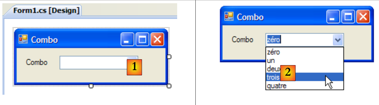 |
No. | Type | Name | role |
1 | ComboBox | comboNombres | contains strings DropDownStyle=DropDownList |
A ComboBox component is a drop-down list combined with an input field: the user can either select an item from (2) or type text into (1). There are three types of ComboBox determined by the DropDownStyle property:
non-dropdown list with an edit field | |
drop-down list with edit box | |
drop-down list without edit field |
By default, the type of a ComboBox is DropDown.
The ComboBox class has a single constructor:
creates an empty combo box |
The items of the ComboBox are available in the Items property:
This is an indexed property, where *Items[i]* refers to the i-th item in the Combo. It is read-only.
Let C be a combo box and C.Items its list of items. We have the following properties:
number of items in the combo | |
element i of the combo | |
adds object o as the last item in the combo box | |
adds an array of objects to the end of the combo | |
adds the object o at position i in the combo box | |
removes element i from the combo box | |
removes object o from the combo box | |
clears all items from the combo box | |
returns the position i of object o in the combo box | |
index of the selected item | |
selected item | |
displayed text of the selected item | |
displayed text of the selected item |
It may seem surprising that a combo box can contain objects when visually it displays strings. If a ComboBox contains an object obj, it displays the string obj.ToString(). Recall that every object has a method ToString inherited from the object class, which returns a character string that "represents" the object.
The Item selected in combo box C is C.SelectedItem or C.Items[C.SelectedIndex], where C.SelectedIndex is the number of the selected item, with this number starting at zero for the first item. The selected text can be obtained in various ways: C.SelectedItem.Text, C.Text
When an item is selected from the drop-down list, the SelectedIndexChanged event occurs, which can then be used to be notified of the selection change in the combo box. In the following application, we use this event to display the item that was selected from the list.
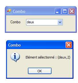 |
The application code is as follows:
using System.Windows.Forms;

namespace Chap5 {
    public partial class Form1 : Form {
        private int previousSelectedIndex=0;

        public Form1() {
            InitializeComponent();
            // combo filling
            comboBoxNombres.Items.AddRange(new string[] { "zéro", "un", "deux", "trois", "quatre" });
            // select item no. 0
            comboBoxNombres.SelectedIndex = 0;
        }

        private void comboBoxNombres_SelectedIndexChanged(object sender, System.EventArgs e) {
            int newSelectedIndex = comboBoxNombres.SelectedIndex;
            if (newSelectedIndex != previousSelectedIndex) {
                // the selected item has changed - it is displayed
                MessageBox.Show(string.Format("Elément sélectionné : ({0},{1})", comboBoxNombres.Text, newSelectedIndex), "Combo", MessageBoxButtons.OK, MessageBoxIcon.Information);
                // note the new index
                previousSelectedIndex = newSelectedIndex;
            }
        }
    }
}
- line 5: previousSelectedIndex stores the last selected index in the combo box
- line 10: populates the combo box with an array of strings
- line 12: the first item is selected
- line 15: the method executed every time the user selects an item from the combo box. Contrary to what the event name might suggest, this occurs even if the selected item is the same as the previous one.
- line 16: the index of the selected item is noted
- line 17: if it is different from the previous one
- line 19: display the number and text of the selected item
- line 21: the new index is noted
7.2.4. Component ListBox
We propose to build the following interface:
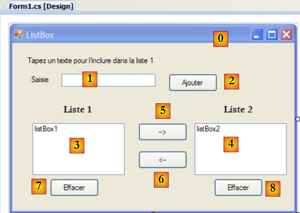 |
The components of this window are as follows:
No. | Type | Name | role/properties |
0 | Form | Form1 | form FormBorderStyle=FixedSingle (non-resizable border) |
1 | TextBox | textBoxSaisie | input field |
2 | Button | buttonAjouter | Button to add the contents of the input field [1] to the list [3] |
3 | ListBox | listBox1 | List 1 SelectionMode=MultiExtended: |
4 | ListBox | listBox2 | List 2 SelectionMode=MultiSimple: |
5 | Button | button1to2 | transfers the selected items from list 1 to list 2 |
6 | Button | button2to1 | does the opposite |
7 | Button | buttonEffacer1 | clear list 1 |
8 | Button | buttonEffacer2 | clear list 2 |
The ListBox components have an element selection mode defined by their SelectionMode property:
only one element can be selected | |
multi-selection possible: holding down the SHIFT key and clicking on an element extends the selection from the previously selected element to the current element. | |
multi-selection possible: an item is selected/deselected by a mouse click or by pressing the spacebar. |
- The user types text into field 1. They add it to list 1 using the Add button (2). The input field (1) is then cleared, and the user can add a new item.
- They can transfer items from one list to another by selecting the item to be transferred in one of the lists and choosing the appropriate transfer button 5 or 6. The transferred item is added to the end of the destination list and removed from the source list.
- They can double-click on an item in List 1. This item is then transferred to the input box for editing and removed from List 1.
The buttons are enabled or disabled according to the following rules:
- the Add button is lit only if there is non-empty text in the input field
- the [5] button for transferring from List 1 to List 2 is enabled only if an item is selected in List 1
- The [6] button for transferring from List 2 to List 1 is enabled only if an item is selected in List 2
- The [7] and [8] buttons for clearing Lists 1 and 2 are enabled only if the list to be cleared contains items.
Under the above conditions, all buttons must be disabled when the application starts. To achieve this, set the Enabled property of the buttons to false. This can be done during design time, which will generate the corresponding code in the InitializeComponent method, or done manually in the constructor as shown below:
        public Form1() {
            InitializeComponent();
            // --- additional initializations ---
            // a number of buttons are disabled
            buttonAjouter.Enabled = false;
            button1vers2.Enabled = false;
            button2vers1.Enabled = false;
            buttonEffacer1.Enabled = false;
            buttonEffacer2.Enabled = false;
}
The state of the Add button is controlled by the content of the text box. The TextChanged event allows us to track changes to this content:
        private void textBoxSaisie_TextChanged(object sender, System.EventArgs e) {
            // the content of textBoxSaisie has changed
            // the Add button is only lit if the entry is non-empty
            buttonAjouter.Enabled = textBoxSaisie.Text.Trim() != "";
        }
The state of the transfer buttons depends on whether or not an item has been selected in the list they control:
        private void listBox1_SelectedIndexChanged(object sender, System.EventArgs e) {
            // an item has been selected
            // switch on the 1 to 2 transfer button
            button1vers2.Enabled = true;
        }

        private void listBox2_SelectedIndexChanged(object sender, System.EventArgs e) {
            // an item has been selected
            // switch on the 2 to 1 transfer button
            button2vers1.Enabled = true;
}
The code associated with the Add button click is as follows:
        private void buttonAjouter_Click(object sender, System.EventArgs e) {
            // add a new element to list 1
            listBox1.Items.Add(textBoxSaisie.Text.Trim());
            // raz de la saisie
            textBoxSaisie.Text = "";
            // List 1 is not empty
            buttonEffacer1.Enabled = true;
            // return focus to input box
            textBoxSaisie.Focus();
}
Note the Focus method, which allows you to set the "focus" on a form control. The code associated with clicking the Clear buttons:
        private void buttonEffacer1_Click(object sender, System.EventArgs e) {
            // delete list 1
            listBox1.Items.Clear();
            // delete button
            buttonEffacer1.Enabled = false;
        }

        private void buttonEffacer2_Click(object sender, System.EventArgs e) {
            // delete list 2
            listBox2.Items.Clear();
            // delete button
            buttonEffacer2.Enabled = false;
}
The code to transfer selected items from one list to another:
        private void button1vers2_Click(object sender, System.EventArgs e) {
            // transfer the item selected in List 1 to List 2
            transfert(listBox1, button1vers2, buttonEffacer1, listBox2, button2vers1, buttonEffacer2);
        }

        private void button2vers1_Click(object sender, System.EventArgs e) {
            // transfer the item selected in List 2 to List 1
            transfert(listBox2, button2vers1, buttonEffacer2, listBox1, button1vers2, buttonEffacer1);
        }
The two methods above delegate the transfer of selected items from one list to another to a single private method called transfer:
        // transfer
        private void transfert(ListBox l1, Button button1vers2, Button buttonEffacer1, ListBox l2, Button button2vers1, Button buttonEffacer2) {
            // transfer selected items from list l1 to list l2
            for (int i = l1.SelectedIndices.Count - 1; i >= 0; i--) {
                // index of selected item
                int index = l1.SelectedIndices[i];
                // addition to l2
                l2.Items.Add(l1.Items[index]);
                // deletion in l1
                l1.Items.RemoveAt(index);
            }
            // delete buttons
            buttonEffacer2.Enabled = l2.Items.Count != 0;
            buttonEffacer1.Enabled = l1.Items.Count != 0;
            // transfer buttons
            button1vers2.Enabled = false;
}
- line b: the transfer method takes six parameters:
- a reference to the list containing the selected items, referred to here as l1. When the application runs, l1 is either listBox1 or listBox2. Examples of calls can be seen in lines 3 and 8 of the transfer procedures buttonXversY_Click.
- a reference to the transfer button linked to list l1. For example, if l1 is listBox2, it will be button2vers1 (see call on line 8)
- a reference to the button for clearing list l1. For example, if l1 is listBox1, it will be buttonEffacer1 (see call on line 3)
- The other three references are similar but refer to list l2.
- line d: the collection [ListBox].SelectedIndices represents the indices of the elements selected in the component [ListBox]. It is a collection:
- [ListBox].SelectedIndices.Count is the number of elements in this collection
- [ListBox].SelectedIndices[i] is element number i in this collection
We traverse the collection in reverse order: we start at the end of the collection and finish at the beginning. We will explain why.
- line f: index of a selected element from list l1
- line h: this element is added to list l2
- line j: and removed from list l1. Because it is removed, it is no longer selected. The collection l1.SelectedIndices from line d will be recalculated. It will lose the element that has just been removed. All elements following it will have their indices change from n to n-1.
- If the loop in line (d) is ascending and has just processed element #0, it will next process element #1. However, the element that had the number 1 before the deletion of element #0 will now have the number 0. It will then be skipped by the loop.
- If the loop in line (d) is descending and has just processed element n, it will next process element n-1. After element n is removed, element n-1 does not change its number. It is therefore processed in the next loop iteration.
- Lines m-n: The state of the [Effacer] buttons depends on whether or not there are elements in the associated lists
- line p: list l2 no longer has any selected items: its transfer button is turned off.
7.2.5. Checkboxes CheckBox, radio buttons ButtonRadio
We propose to write the following application:
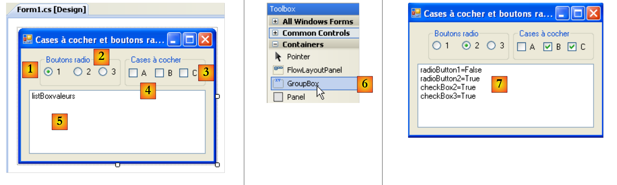 |
The window components are as follows:
No. | type | name | role |
1 | GroupBox see [6] | groupBox1 | a component container. Other components can be placed inside it. Text=Radio buttons |
2 | RadioButton | radioButton1 radioButton2 radioButton3 | 3 radio buttons - radioButton1 has the property Checked=True and the property Text=1 - radioButton2 has the property Text=2 - radioButton3 has the property Text=3 Radio buttons within the same container, in this case GroupBox, are mutually exclusive: only one of them can be selected. |
3 | GroupBox | groupBox2 | |
4 | CheckBox | checkBox1 checkBox2 checkBox3 | 3 checkboxes. chechBox1 has the property Checked=True and the property Text=A - chechBox2 has the property Text=B - chechBox3 has the property Text=C |
5 | ListBox | listBoxValeurs | a list that displays the values of the radio buttons and checkboxes as soon as a change occurs. |
6 | shows where to find the container GroupBox |
The event of interest for these six controls is the CheckChanged event, which indicates that the state of the checkbox or radio button has changed. This state is represented in both cases by the Boolean property Checked; when true, it means the control is checked. Here, we will use only one method to handle the six CheckChanged events: the display method. To ensure that the six CheckChanged events are handled by the same display method, we can proceed as follows:
Select the radioButton1 component and right-click on it to access its properties:
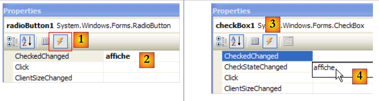 |
In the [1] events tab, associate the display method [2] with the event CheckChanged. This means that we want a click on the option A1 control to be handled by a method called Display. Visual Studio automatically generates the Display method in the code window:
private void affiche(object sender, EventArgs e) {
        }
The affiche method is a method of type EventHandler.
For the other five components, we proceed in the same way. Let’s select, for example, the option CheckBox1 and its [3] events. Next to the Click event, there is a drop-down list ([4]) containing the existing methods that can handle this event. Here, only the "display" method is available. Select it. Repeat this process for all other components.
Code was generated in the InitializeComponent method. The affiche method was declared as the handler for the six CheckedChanged events as follows:
this.radioButton1.CheckedChanged += new System.EventHandler(this.affiche);
this.radioButton2.CheckedChanged += new System.EventHandler(this.affiche);
this.radioButton3.CheckedChanged += new System.EventHandler(this.affiche);
this.checkBox1.CheckedChanged += new System.EventHandler(this.affiche);
this.checkBox2.CheckedChanged += new System.EventHandler(this.affiche);
this.checkBox3.CheckedChanged += new System.EventHandler(this.affiche);
The affiche method is completed as follows:
        private void affiche(object sender, System.EventArgs e) {
            // displays radio button or checkbox status
            // is it a checkbox?
            if (sender is CheckBox) {
                CheckBox chk = (CheckBox)sender;
                listBoxvaleurs.Items.Add(chk.Name + "=" + chk.Checked);
            }
            // is it a radiobutton?
            if (sender is RadioButton) {
                RadioButton rdb = (RadioButton)sender;
                listBoxvaleurs.Items.Add(rdb.Name + "=" + rdb.Checked);
            }
}
The syntax
if (sender is CheckBox) {
checks whether the sender object is of type CheckBox. This then allows us to cast it to the exact type of sender. The method displays the name of the component that triggered the event and the value of its Checked property in the listBoxValeurs list. Upon execution of [7], we see that clicking a radio button triggers two events: one on the old checked button, which changes to "unchecked," and the other on the new button, which changes to "checked."
7.2.6. ScrollBar Sliders
There are several types of sliders: the horizontal slider (HscrollBar), the vertical slider (VscrollBar), the incrementer (NumericUpDown). |    |
Let’s implement the following application:
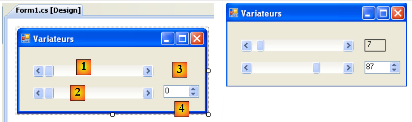 |
No. | Type | name | role |
1 | hScrollBar | hScrollBar1 | a horizontal variator |
2 | hScrollBar | hScrollBar2 | a horizontal variator that follows the variations of variator 1 |
3 | Label | labelValeurHS1 | displays the value of the horizontal drive |
4 | NumericUpDown | numericUpDown2 | allows the user to set the value of slider 2 |
A ScrollBar slider allows the user to select a value from a range of integer values represented by the slider's "track" along which a cursor moves. The slider's value is available in its Value property.
- For a horizontal slider, the left end represents the minimum value of the range, the right end the maximum value, and the cursor the currently selected value. For a vertical slider, the minimum is represented by the top end, and the maximum by the bottom end. These values are represented by the Minimum and Maximum properties and default to 0 and 100.
- Clicking on the ends of the slider changes the value by one increment (positive or negative) depending on the end clicked, referred to as SmallChange, which defaults to 1.
- Clicking on either side of the slider changes the value by one increment (positive or negative) depending on the end clicked, referred to as LargeChange, which defaults to 10.
- When you click on the top end of a vertical slider, its value decreases. This may surprise the average user, who normally expects to see the value "increase." This issue is resolved by setting the properties SmallChange and LargeChange to negative values
- These five properties (Value, Minimum, Maximum, SmallChange, LargeChange) are accessible for both reading and writing.
- The drive’s main event is the one that signals a value change: the Scroll event.
A NumericUpDown component is similar to the slider: it also has the Minimum, Maximum, and Value properties, with default values of 0, 100, and 0. However, here the Value property is displayed in an input box that is an integral part of the control. The user can modify this value themselves unless the control’s ReadOnly property has been set to true. The increment value is set by the Increment property, with a default value of 1. The main event of the NumericUpDown component is the one that signals a value change: the ValueChanged event
The application code is as follows:
using System.Windows.Forms;

namespace Chap5 {
    public partial class Form1 : Form {
        public Form1() {
            InitializeComponent();
            // set the characteristics of drive 1
            hScrollBar1.Value = 7;
            hScrollBar1.Minimum = 1;
            hScrollBar1.Maximum = 130;
            hScrollBar1.LargeChange = 11;
            hScrollBar1.SmallChange = 1;
            // drive 2 is given the same characteristics as drive 1
            hScrollBar2.Value = hScrollBar1.Value;
            hScrollBar2.Minimum = hScrollBar1.Minimum;
            hScrollBar2.Maximum = hScrollBar1.Maximum;
            hScrollBar2.LargeChange = hScrollBar1.LargeChange;
            hScrollBar2.SmallChange = hScrollBar1.SmallChange;
            // ditto for the incrementer
            numericUpDown2.Value = hScrollBar1.Value;
            numericUpDown2.Minimum = hScrollBar1.Minimum;
            numericUpDown2.Maximum = hScrollBar1.Maximum;
            numericUpDown2.Increment = hScrollBar1.SmallChange;

            // the Label is given the value of drive 1
            labelValeurHS1.Text = hScrollBar1.Value.ToString();
        }

        private void hScrollBar1_Scroll(object sender, ScrollEventArgs e) {
            // value change on drive 1
            // its value is passed on to drive 2 and to the label
            hScrollBar2.Value = hScrollBar1.Value;
            labelValeurHS1.Text = hScrollBar1.Value.ToString();
        }

        private void numericUpDown2_ValueChanged(object sender, System.EventArgs e) {
            // incrementer has changed value
            // set the value of controller 2
            hScrollBar2.Value = (int)numericUpDown2.Value;
        }
    }
}
7.3. Mouse Events
When drawing in a container, it is important to know the mouse position so that, for example, a point can be displayed when the mouse is clicked. Mouse movements trigger events in the container within which the mouse is moving.
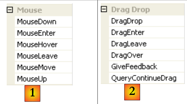 |
- [1]: events that occur when the mouse moves over the form or a control
- [2]: events that occur during a drag-and-drop (Drag'nDrop)
The mouse has just entered the control's area | |
the mouse has just left the control's area | |
the mouse is moving within the control's area | |
Left mouse button pressed | |
Left mouse button released | |
The user drops an object onto the control | |
The user enters the control's area by dragging an object | |
The user exits the control's area while dragging an object | |
The user hovers over the control's area while dragging an object |
Here is an application that helps you better understand when the various mouse events occur:
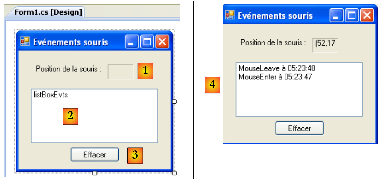 |
No. | type | name | role |
1 | Label | lblPositionSouris | to display the mouse position in form 1, list 2, or button 3 |
2 | ListBox | listBoxEvts | to display mouse events other than MouseMove |
3 | Button | buttonEffacer | to clear the contents of 2 |
To track mouse movements across the three controls, we write a single handler, the display handler:
 |
The code for the display procedure is as follows:
        private void affiche(object sender, MouseEventArgs e) {
            // mvt mouse - displays its (X,Y) coordinates
            labelPositionSouris.Text = "(" + e.X + "," + e.Y + ")";
}
Every time the mouse enters a control’s area, its coordinate system changes. Its origin (0,0) is the top-left corner of the control it is on. Thus, during execution, when moving the mouse from the form to the button, the change in coordinates is clearly visible. To better see these changes in the mouse’s domain, you can use the Cursor property of the controls:
 |
This property allows you to set the shape of the mouse cursor when it enters the control’s area. Thus, in our example, we have set the cursor to Default for the form itself ([2]), Hand for List 2 ([3]), and Cross for Button 3 ([4]).
Furthermore, to detect when the mouse enters and exits List 2, we handle events MouseEnter and MouseLeave for that same list:
        private void listBoxEvts_MouseEnter(object sender, System.EventArgs e) {
            // the event
            listBoxEvts.Items.Insert(0, string.Format("MouseEnter à {0:hh:mm:ss}",DateTime.Now));
        }

        private void listBoxEvts_MouseLeave(object sender, EventArgs e) {
            // the event
            listBoxEvts.Items.Insert(0, string.Format("MouseLeave à {0:hh:mm:ss}", DateTime.Now));
}
To handle clicks on the form, we handle the MouseDown and MouseUp events:
        private void listBoxEvts_MouseDown(object sender, MouseEventArgs e) {
            // the event
            listBoxEvts.Items.Insert(0, string.Format("MouseDown à {0:hh:mm:ss}", DateTime.Now));
        }

        private void listBoxEvts_MouseUp(object sender, MouseEventArgs e) {
            // the event
            listBoxEvts.Items.Insert(0, string.Format("MouseUp à {0:hh:mm:ss}", DateTime.Now));
}
- Lines 3 and 8: The messages are placed in the first position in ListBox so that the most recent events appear first in the list.
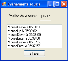 |
Finally, the code for the Clear button click handler:
        private void buttonEffacer_Click(object sender, EventArgs e) {
            listBoxEvts.Items.Clear();
}
7.4. Creating a window with a menu
Now let’s see how to create a window with a menu. We’re going to create the following window:
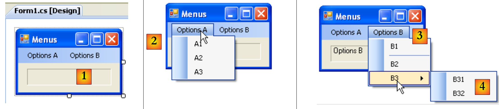 |
To create a menu, select the "MenuStrip" component from the "Menus & Toolbars" bar:
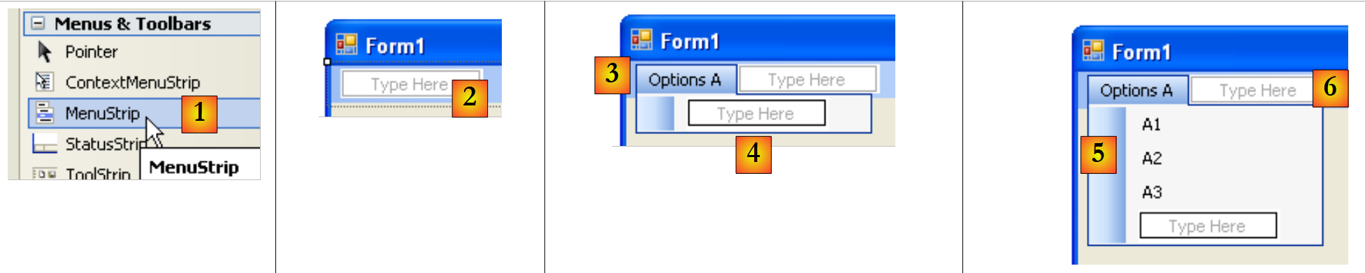 |
- [1]: Select the [MenuStrip] component
- [2]: You now have a menu that appears on the form with empty fields labeled "Type Here." Simply enter the various menu options there.
- [3]: the label "Options A" has been entered. Move on to the label [4].
- [5]: The labels for the A options have been entered. We move on to the label [6]
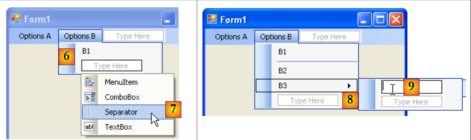 |
- [6]: The first B options
- [7]: Under B1, insert a separator. This is available in a dropdown menu labeled "Type Here"
- [8]: To create a submenu, use the arrow [8] and type the submenu in [9]
You still need to name the various form components:
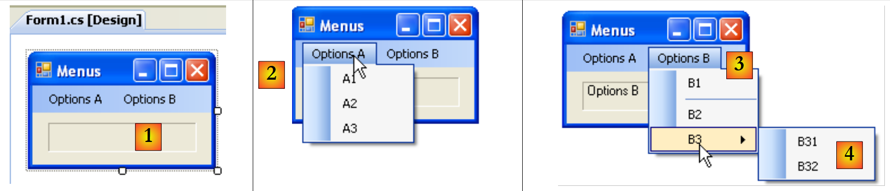 |
No. | type | name(s) | role |
1 | Label | labelStatut | to display the text of the clicked menu item |
2 | toolStripMenuItem | toolStripMenuItemOptionsA toolStripMenuItemA1 toolStripMenuItemA2 toolStripMenuItemA3 | menu options under the main "Options A" menu |
3 | toolStripMenuItem | toolStripMenuItemOptionsB toolStripMenuItemB1 toolStripMenuItemB2 toolStripMenuItemB3 | menu options under the main "Options B" menu |
4 | toolStripMenuItem | toolStripMenuItemB31 toolStripMenuItemB32 | Menu options under the main "B3" menu |
Menu options are controls like other visual components and have properties and events. For example, the properties of menu option A1 are as follows:
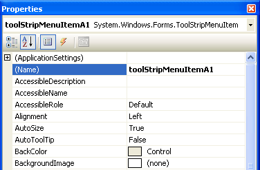 |
Two properties are used in our example:
the name of the menu control | |
the label of the menu control |
In the menu structure, select the A1 control and right-click to access its properties:
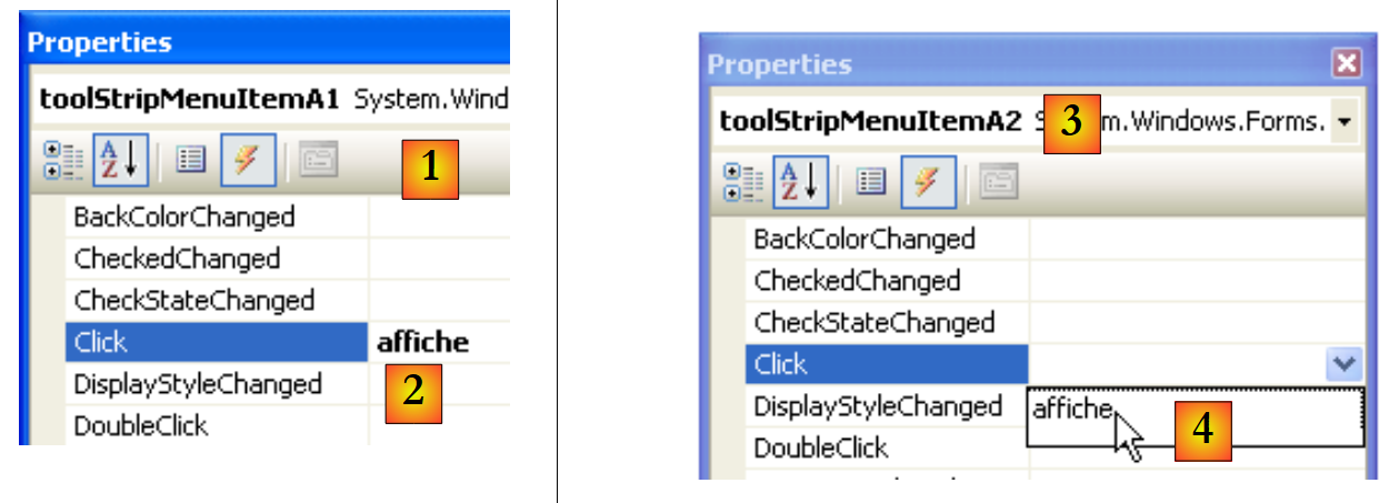 |
In the Events tab, we associate the Display method with the Click event. This means that we want a click on A1 to be handled by a method called Display. Visual Studio automatically generates the *display* method in the code window:
private void affiche(object sender, EventArgs e) {
        }
In this method, we will simply display the Text property of the menu item that was clicked in the labelStatut label:
private void affiche(object sender, EventArgs e) {
            // displays the name of the selected submenu in the TextBox
            labelStatut.Text = ((ToolStripMenuItem)sender).Text;
}
The source of the "sender" event is of type "object". The menu options are of type "ToolStripMenuItem", so we must cast the "object" type to "ToolStripMenuItem".
For all menu options, we set the click handler to the display method [3,4].
Let’s run the application and select a menu item:
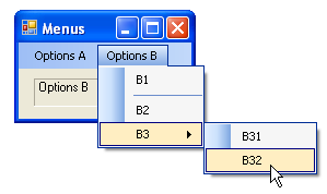 | 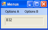 |
7.5. Non-visual components
We will now look at a number of non-visual components: these are used during design but are not visible during runtime.
7.5.1. , OpenFileDialog, and SaveFileDialog dialog boxes
We will build the following application:
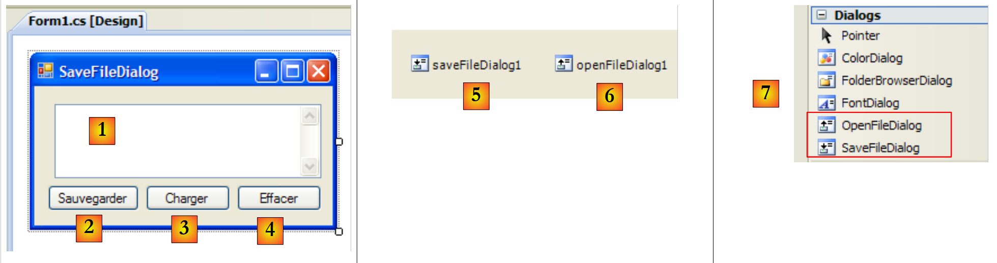 |
The controls are as follows:
No. | Type | Name | role |
1 | TextBox | TextBoxLignes | text entered by the user or loaded from a file MultiLine=True, ScrollBars=Both, AccepReturn=True, AcceptTab=True |
2 | Button | buttonSauvegarder | allows you to save the text from [1] to a text file |
3 | Button | buttonCharger | allows you to load the contents of a text file into [1] |
4 | Button | buttonEffacer | clears the contents of [1] |
5 | SaveFileDialog | saveFileDialog1 | component that allows you to choose the name and location of the backup file for [1]. This component is dragged from the [7] toolbar and simply dropped onto the form. It is then saved but does not take up any space on the form. It is a non-visual component. |
6 | OpenFileDialog | openFileDialog1 | Component for selecting the file to load into [1]. |
The code associated with the Clear button is simple:
        private void buttonEffacer_Click(object sender, EventArgs e) {
            // we put the empty string in the TexBox
            textBoxLignes.Text = "";
}
We will use the following properties and methods of the SaveFileDialog class:
Field | Type | Role |
Property | the file types offered in the file type drop-down list of the | |
Property | The index of the file type displayed by default in the list above. Starts at 0. | |
Property | The directory initially displayed for saving the file | |
Property | The name of the backup file specified by the user | |
Method | A method that displays the save dialog box. Returns a result of type DialogResult. |
The method ShowDialog displays a dialog box similar to the following:
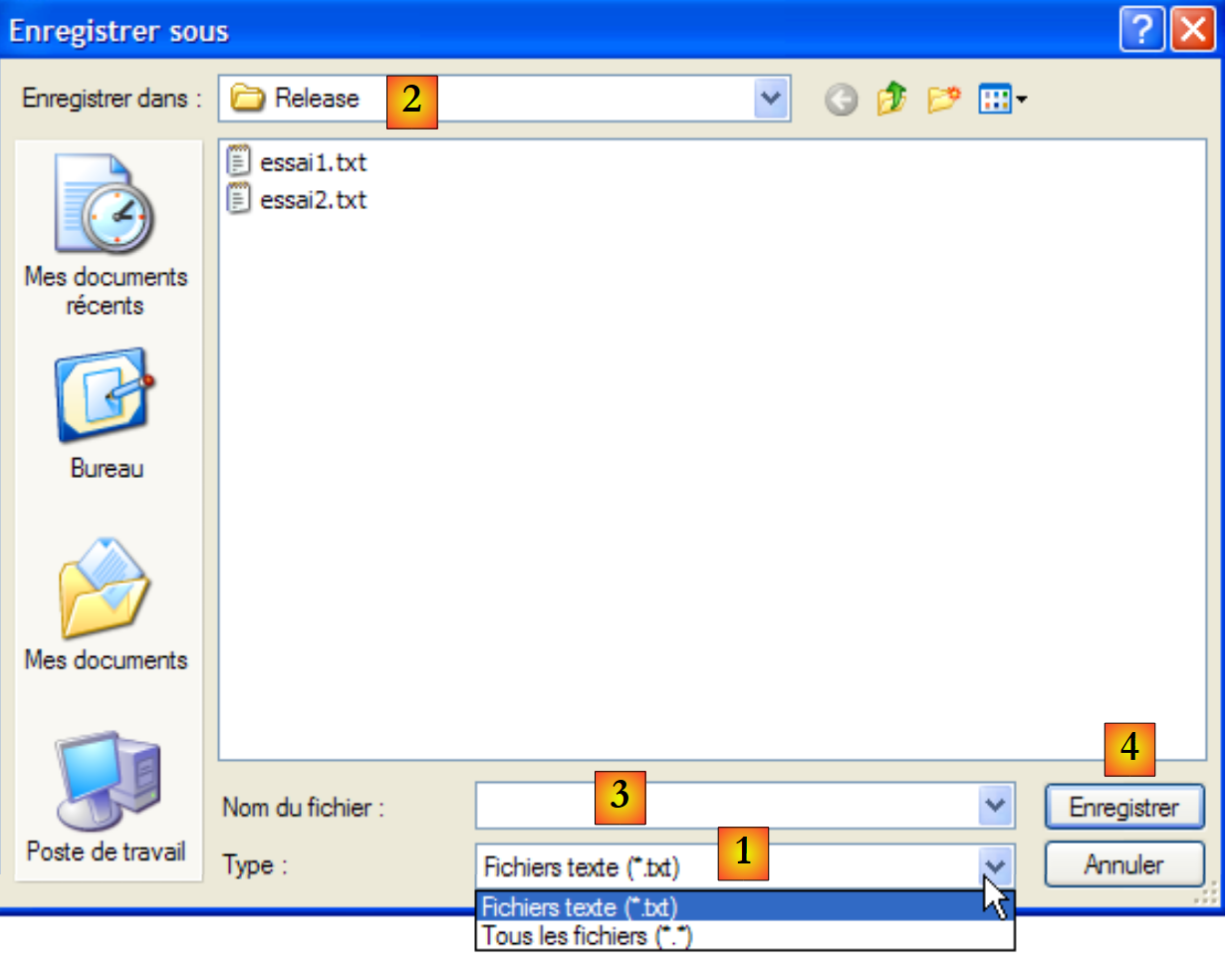 |
drop-down list based on the Filter property. The default file type is set by FilterIndex | |
current folder, set by InitialDirectory if this property has been specified | |
File name selected or typed directly by the user. Will be available in the FileName property | |
Save/Cancel buttons. If the Save button is used, the ShowDialog function returns the result DialogResult.OK |
The save procedure can be written as follows:
private void buttonSauvegarder_Click(object sender, System.EventArgs e) {
            // save the input box in a text file
            // set the savefileDialog1 dialog box
            saveFileDialog1.InitialDirectory = Application.ExecutablePath;
            saveFileDialog1.Filter = "Fichiers texte (*.txt)|*.txt|Tous les fichiers (*.*)|*.*";
            saveFileDialog1.FilterIndex = 0;
            // display the dialog box and retrieve the result
            if (saveFileDialog1.ShowDialog() == DialogResult.OK) {
                // retrieve the file name
                string nomFichier = saveFileDialog1.FileName;
                StreamWriter fichier = null;
                try {
                    // open the file for writing
                    fichier = new StreamWriter(nomFichier);
                    // we write the text inside
                    fichier.Write(textBoxLignes.Text);
                } catch (Exception ex) {
                    // problem
                    MessageBox.Show("Problème à l'écriture du fichier (" +
                    ex.Message + ")", "Erreur", MessageBoxButtons.OK, MessageBoxIcon.Error);
                    return;
                } finally {
                    // close the file
                    if (fichier != null) {
                        fichier.Dispose();
                    }
                }
            }
        }
- Line 4: Set the initial directory (InitialDirectory) to the directory (Application.ExecutablePath) containing the application executable.
- line 5: we specify the file types to display. Note the filter syntax: filter1|filter2|..|filteren where filteri = Text|file pattern. Here, the user will have the choice between *.txt files and *.* files.
- Line 6: We specify the file type to be presented first to the user. Here, index 0 refers to *.txt files.
- Line 8: The dialog box is displayed, and its result is retrieved. While the dialog box is displayed, the user no longer has access to the main form (a so-called modal dialog box). The user specifies the name of the file to save and exits the dialog box either by clicking the Save button, the Cancel button, or by closing the dialog box. The result of the ShowDialog method is DialogResult.OK only if the user used the Save button to exit the dialog box.
- Once this is done, the name of the file to be created is now in the FileName property of the saveFileDialog1 object. We then return to the standard process of creating a text file. We write the contents of TextBox: textBoxLignes.Text to it while handling any exceptions that may occur.
The OpenFileDialog class is very similar to the SaveFileDialog class. We will use the same methods and properties as before. The ShowDialog method displays a dialog box similar to the following:
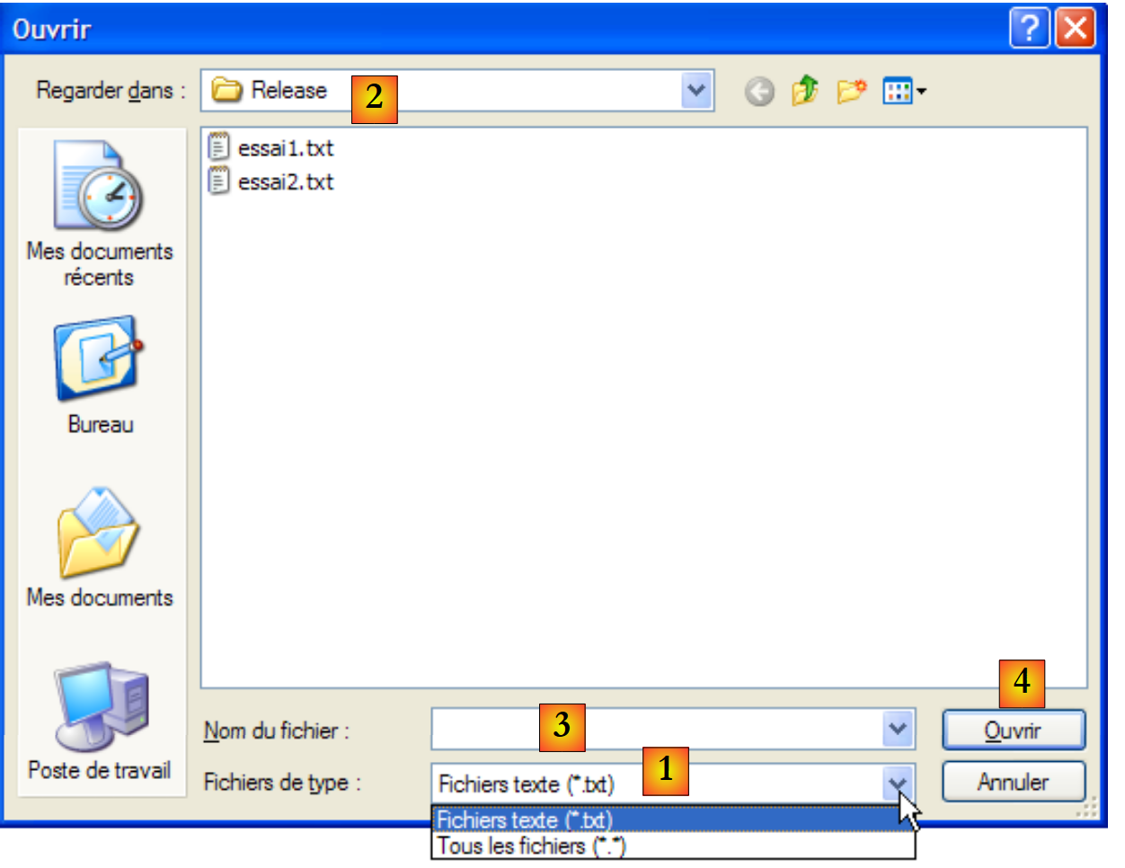 |
drop-down list built from the Filter property. The default file type is set by FilterIndex | |
current folder, set by InitialDirectory if this property has been specified | |
File name selected or entered directly by the user. Will be available in the FileName property | |
Open/Cancel buttons. If the Open button is used, the ShowDialog function returns the result DialogResult.OK |
The procedure for loading the text file can be written as follows:
private void buttonCharger_Click(object sender, EventArgs e) {
            // load a text file into the input box
            // set the openfileDialog1 dialog box
            openFileDialog1.InitialDirectory = Application.ExecutablePath;
            openFileDialog1.Filter = "Fichiers texte (*.txt)|*.txt|Tous les fichiers (*.*)|*.*";
            openFileDialog1.FilterIndex = 0;
            // display the dialog box and retrieve the result
            if (openFileDialog1.ShowDialog() == DialogResult.OK) {
                // retrieve the file name
                string nomFichier = openFileDialog1.FileName;
                StreamReader fichier = null;
                try {
                    // open the file in read mode
                    fichier = new StreamReader(nomFichier);
                    // read the entire file and put it in the TextBox
                    textBoxLignes.Text = fichier.ReadToEnd();
                } catch (Exception ex) {
                    // problem
                    MessageBox.Show("Problème à la lecture du fichier (" +
                    ex.Message + ")", "Erreur", MessageBoxButtons.OK, MessageBoxIcon.Error);
                    return;
                } finally {
                    // close the file
                    if (fichier != null) {
                        fichier.Dispose();
                    }
                }//finally
            }//if
        }
- Line 4: Set the initial directory (InitialDirectory) to the directory (Application.ExecutablePath) containing the application executable.
- line 5: we specify the file types to display. Note the filter syntax: filter1|filter2|..|filteren where filteri = Text|file pattern. Here, the user will have the choice between *.txt and *.* files.
- Line 6: We specify the file type to be presented first to the user. Here, index 0 refers to *.txt files.
- Line 8: The dialog box is displayed, and its result is retrieved. While the dialog box is displayed, the user no longer has access to the main form (a so-called modal dialog box). The user specifies the name of the file to save and exits the dialog box either by clicking the Open button, the Cancel button, or by closing the dialog box. The result of the ShowDialog method is DialogResult.OK only if the user used the Save button to exit the dialog box.
- Once this is done, the name of the file to be created is now in the FileName property of the openFileDialog1 object. We then return to the standard reading of a text file. Note, on line 16, the method that allows the entire file to be read.
7.5.2. Dialog boxes FontColor and ColorDialog
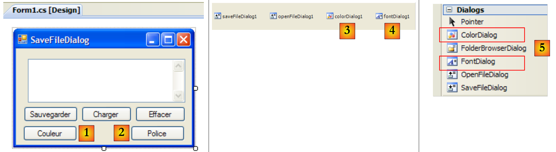
We continue the previous example by adding two new buttons and two new non-visual controls:
 |
67
No. | type | name | role |
1 | Button | buttonCouleur | to set the font color of TextBox |
2 | Button | buttonPolice | to set the font of the TextBox |
3 | ColorDialog | colorDialog1 | the component that allows color selection - taken from the [5] toolbox. |
4 | FontDialog | colorDialog1 | The component that allows font selection - taken from the [5] toolkit. |
The classes FontDialog and ColorDialog have a method ShowDialog that is analogous to the method ShowDialog of the classes OpenFileDialog and SaveFileDialog.
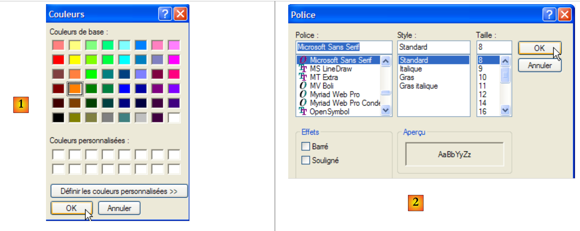 |
The ShowDialog method of the ColorDialog class allows you to select a color [1]. The method in the FontDialog class allows you to choose a font [2]:
- [1]: if the user exits the dialog box using the OK button, the result of the ShowDialog method is DialogResult.OK and the selected color is in the Color property of the ColorDialog object used.
- [2]: If the user exits the dialog box using the OK button, the result of the ShowDialog method is DialogResult.OK and the selected font is in the Font property of the FontDialog object used.
We now have the elements to handle clicks on the Color and Font buttons:
        private void buttonCouleur_Click(object sender, EventArgs e) {// choice of text color
            if (colorDialog1.ShowDialog() == DialogResult.OK) {
                // change the Forecolor property of TextBox
                textBoxLignes.ForeColor = colorDialog1.Color;
            }//if
        }

        private void buttonPolice_Click(object sender, EventArgs e) {
            // font selection
            if (fontDialog1.ShowDialog() == DialogResult.OK) {
                // change the Font property of TextBox
                textBoxLignes.Font = fontDialog1.Font;
}
- line [4]: the [ForeColor] property of a TextBox component specifies the [Color] color of the characters in the TextBox. Here, this color is the one selected by the user in the [ColorDialog] dialog box.
- line [12]: The [Font] property of a TextBox component specifies the font of type [Font] for the characters in TextBox. Here, this font is the one selected by the user in the [FontDialog] dialog box.
7.5.3. Timer
Here, we will write the following application:
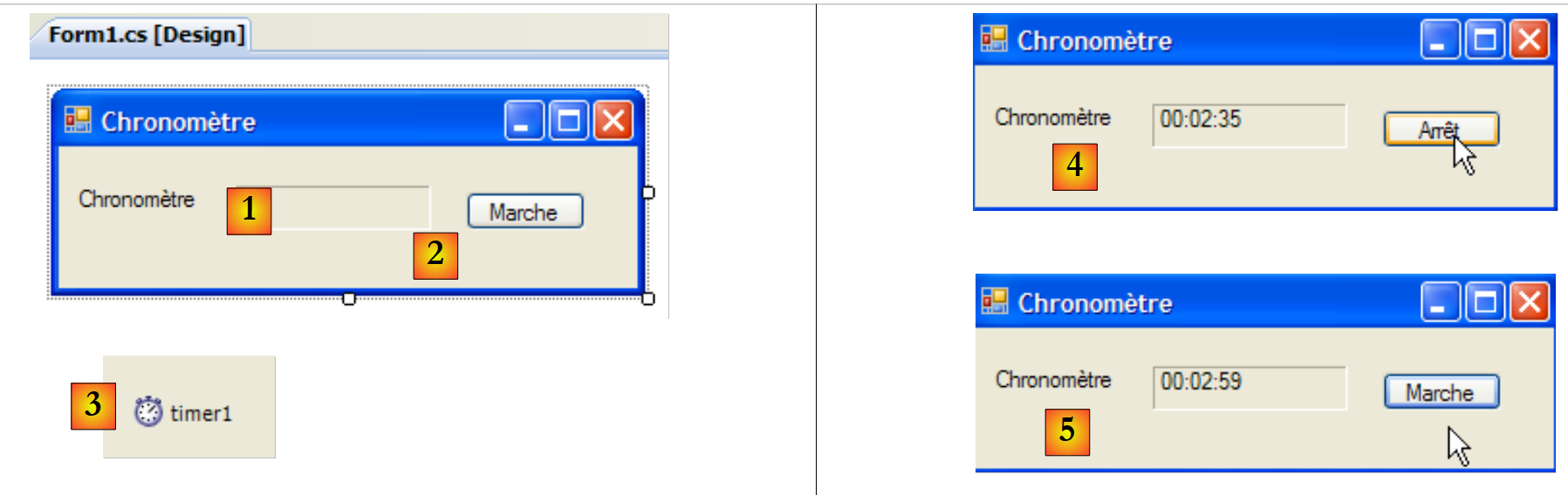 |
No. | Type | Name | Role |
1 | Label | labelChrono | displays a timer |
2 | Button | buttonArretMarche | Stop/Start button for the timer |
3 | Timer | timer1 | component emitting an event every second |
In [4], we see the timer running; in [5], the timer is stopped.
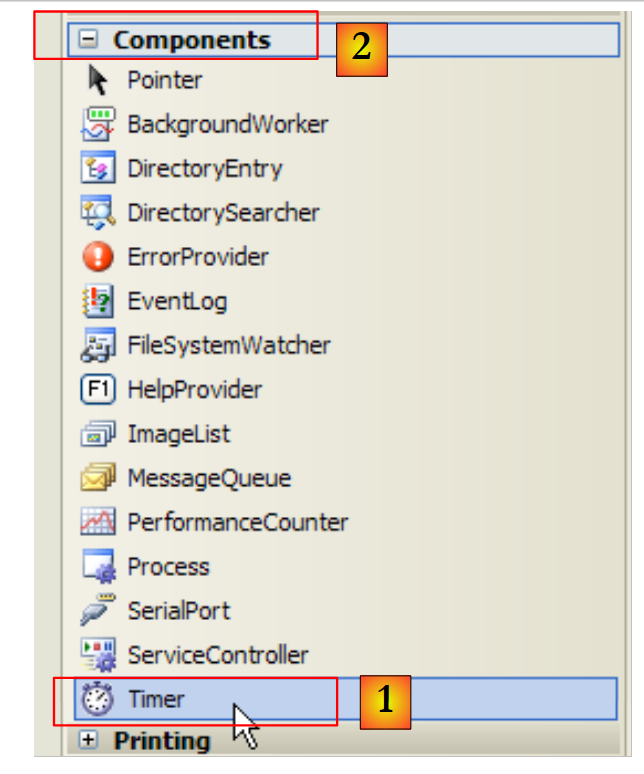
To update the content of the Label LabelChrono every second, we need a component that generates an event every second, an event that we can intercept to update the stopwatch display. This component is the Timer [1] available in the Components toolbox [2]:
 |
The properties of the Timer component used here will be as follows:
number of milliseconds after which a Tick event is triggered. | |
The event triggered at the end of the Interval in milliseconds | |
sets the timer to active (true) or inactive (false) |
In our example, the timer is named timer1 and timer1.Interval is set to 1000 ms (1s). The Tick event will therefore occur every second. Clicking the Stop/Start button is handled by the following buttonArretMarche_Click procedure:
using System;
using System.Windows.Forms;

namespace Chap5 {
    public partial class Form1 : Form {
        public Form1() {
            InitializeComponent();
        }

        // instance variable
        private DateTime début = DateTime.Now;
...
        private void buttonArretMarche_Click(object sender, EventArgs e) {
            // off or on?
            if (buttonArretMarche.Text == "Marche") {
                // we note the start time
                début = DateTime.Now;
                // we display it
                labelChrono.Text = "00:00:00";
                // start timer
                timer1.Enabled = true;
                // change the button label
                buttonArretMarche.Text = "Arrêt";
                // end
                return;
            }//
            if (buttonArretMarche.Text == "Arrêt") {
                // timer off
                timer1.Enabled = false;
                // change the button label
                buttonArretMarche.Text = "Marche";
                // end
                return;
            }
        }

    }
}
- line 13: the procedure that handles the click on the On/Off button.
- line 15: the label of the Start/Stop button is either "Stop" or "Start". We therefore have to check this label to determine what action to take.
- line 17: if the label is "Start", we store the start time in a variable named `start`, which is a global variable (line 11) of the form object
- Line 19: Initializes the content of the LabelChrono label
- line 21: the timer is started (Enabled=true)
- Line 23: The button label changes to "Stop".
- line 27: in the case of "Stop"
- line 29: the timer is stopped (Enabled=false)
- line 31: the button label changes to "Start".
We still need to handle the Tick event on the timer1 object, which occurs every second:
private void timer1_Tick(object sender, EventArgs e) {
            // a second has passed
            DateTime maintenant = DateTime.Now;
            TimeSpan durée = maintenant - début;
            // update the stopwatch
            labelChrono.Text = durée.Hours.ToString("d2") + ":" + durée.Minutes.ToString("d2") + ":" + durée.Seconds.ToString("d2");
        }
- Line 3: Record the current time
- line 4: calculate the elapsed time since the stopwatch was started. This returns an object of type TimeSpan, which represents a duration in time.
- line 6: this must be displayed in the timer in the format hh:mm:ss. To do this, we use the Hours, Minutes, and Seconds properties of the TimeSPan object, which represent the hours, minutes, and seconds of the duration, respectively. We display this in the format ToString("d2") to show two digits.
7.6. Example Application - version 6
We return to the example application IMPOTS. The previous version was discussed in Section 6.4. It was the following three-layer application:
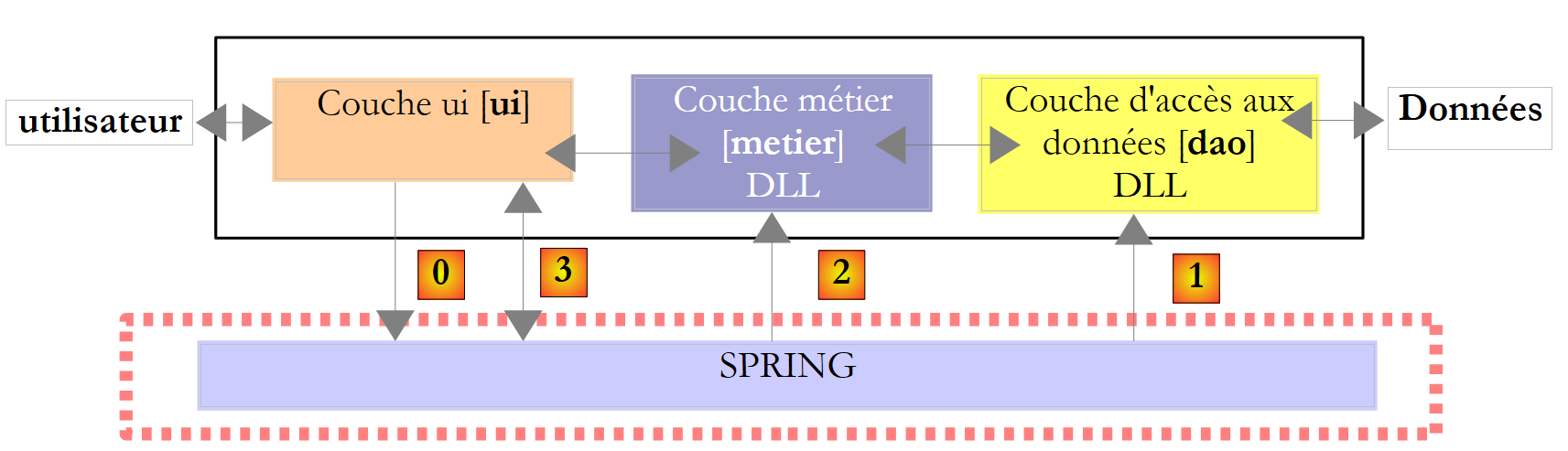 |
- the layers [metier] and [dao] were encapsulated in DLL
- the [ui] layer was a [console] layer
- The instantiation of the layers and their integration into the application were handled by Spring.
In this new version, the [ui] layer will be provided by the following graphical interface:
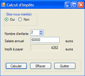 |
7.6.1. The Visual Studio Solution
The Visual Studio solution consists of the following elements:
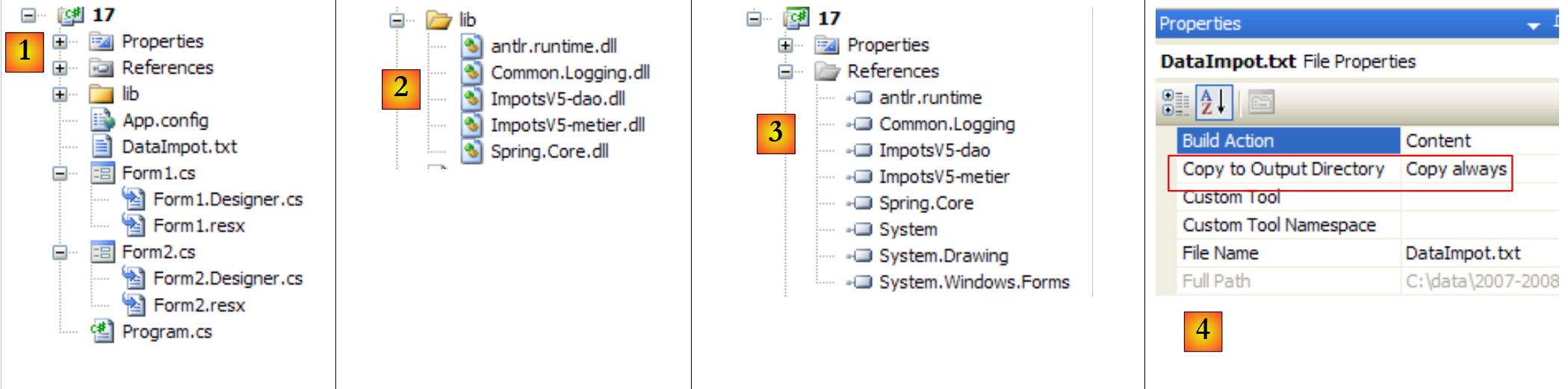 |
- [1]: the project consists of the following elements:
- [Program.cs]: the class that launches the application
- [Form1.cs]: the class for the first form
- [Form2]: the class for a second form
- [lib] detailed in [2]: all the DLL files necessary for the project have been placed here:
- [ImpotsV5-dao.dll]: the DLL for the [dao] layer generated in section 6.4.3;
- [ImpotsV5-metier.dll]: the DLL from the [dao] layer generated in section 6.4.4;
- [Spring.Core.dll], [Common.Logging.dll], [antlr.runtime.dll]: the Spring DLLs already used in the previous version (see section 6.4.6).
- [references] detailed in [3]: the project references. A reference has been added for each of the DLL files in the [lib] folder
- [App.config]: the project configuration file. It is identical to that of the previous version described in section 6.4.6;
- [DataImpot.txt]: the tax bracket file configured to be automatically copied to the project execution folder [4]
The [Form1] form is the input form for the parameters of the [A] tax calculation, which was already presented above. The [Form2] and [B] forms are used to display an error message:
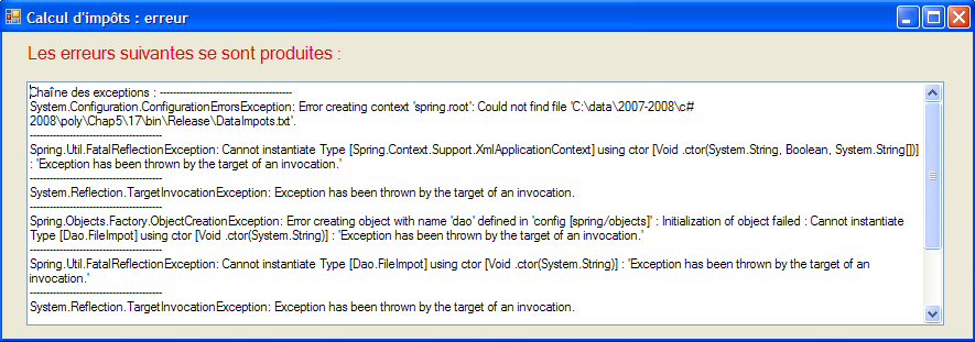 |
7.6.2. The [Program.cs] class
The [Program.cs] class launches the application. Its code is as follows:
using System;
using System.Windows.Forms;
using Spring.Context;
using Spring.Context.Support;
using Metier;
using System.Text;

namespace Chap5 {
    static class Program {
        /// <summary>
        /// The main entry point for the application.
        /// </summary>
        [STAThread]
        static void Main() {
            // code generated by Vs
            Application.EnableVisualStyles();
            Application.SetCompatibleTextRenderingDefault(false);

            // --------------- Developer code
            // instantiations layers [metier] and [dao]
            IApplicationContext ctx = null;
            Exception ex = null;
            IImpotMetier metier = null;
            try {
                // spring context
                ctx = ContextRegistry.GetContext();
                // a reference is requested on the [metier] layer
                metier = (IImpotMetier)ctx.GetObject("metier");
            } catch (Exception e1) {
                // memory exception
                ex = e1;
            }
            // form to display
            Form form = null;
            // was there an exception?
            if (ex != null) {
                // yes - create the error message to be displayed
                StringBuilder msgErreur = new StringBuilder(String.Format("Chaîne des exceptions : {0}{1}", "".PadLeft(40, '-'), Environment.NewLine));
                Exception e = ex;
                while (e != null) {
                    msgErreur.Append(String.Format("{0}: {1}{2}", e.GetType().FullName, e.Message, Environment.NewLine));
                    msgErreur.Append(String.Format("{0}{1}", "".PadLeft(40, '-'), Environment.NewLine));
                    e = e.InnerException;
                }
                // creation of an error window to which the error message to be displayed is passed
                Form2 form2 = new Form2();
                form2.MsgErreur = msgErreur.ToString();
                // this will be the window to display
                form = form2;
            } else {
                // all went well
                // creation of a graphical interface [Form1] to which we pass the reference on the [metier] layer
                Form1 form1 = new Form1();
                form1.Metier = metier;
                // this will be the window to display
                form = form1;
            }
            // window display
            Application.Run(form);
        }
    }
}
The code generated by Visual Studio has been completed starting from line 19. The application uses the following [App.config] file:
<?xml version="1.0" encoding="utf-8" ?>
<configuration>

    <configSections>
        <sectionGroup name="spring">
            <section name="context" type="Spring.Context.Support.ContextHandler, Spring.Core" />
            <section name="objects" type="Spring.Context.Support.DefaultSectionHandler, Spring.Core" />
        </sectionGroup>
    </configSections>

    <spring>
        <context>
            <resource uri="config://spring/objects" />
        </context>
        <objects xmlns="http://www.springframework.net">
            <object name="dao" type="Dao.FileImpot, ImpotsV5-dao">
                <constructor-arg index="0" value="DataImpot.txt"/>
            </object>
            <object name="metier" type="Metier.ImpotMetier, ImpotsV5-metier">
                <constructor-arg index="0" ref="dao"/>
            </object>
        </objects>
    </spring>
</configuration>
- lines 24-32: use of the previous [App.config] file to instantiate the [metier] and [dao] layers
- line 26: using the [App.config] file
- line 28: retrieving a reference to the [metier] layer
- line 31: logging any exceptions
- line 34: the "form" reference will specify the form to display (form1 or form2)
- lines 36-50: if an exception occurred, prepare to display a form of type [Form2]
- lines 38–44: the error message to be displayed is constructed. It consists of the concatenation of the error messages from the various exceptions present in the exception chain.
- line 46: a form of type [Form2] is created.
- line 47: as we will see later, this form has a public property MsgErreur, which is the error message to be displayed:
public string MsgErreur { private get; set; }
We populate this property.
- Line 49: The form reference that designates the window to be displayed is initialized. Note the polymorphism at work. form2 is not of type [Form] but of type [Form2], a type derived from [Form].
- Lines 50–57: No exceptions occurred. Preparing to display a form of type [Form1].
- Line 53: A form of type [Form1] is created.
- line 54: as we will see later, this form has a public Metier property that is a reference to the [metier] layer:
public IImpotMetier Metier { private get; set; }
We populate this property.
- Line 56: The form reference that designates the window to be displayed is initialized. Note again the polymorphism at work. form1 is not of type [Form] but of type [Form1], a type derived from [Form].
- Line 59: The window referenced by form is displayed.
7.6.3. The [Form1] form
In mode [conception], the form [Form1] is as follows:
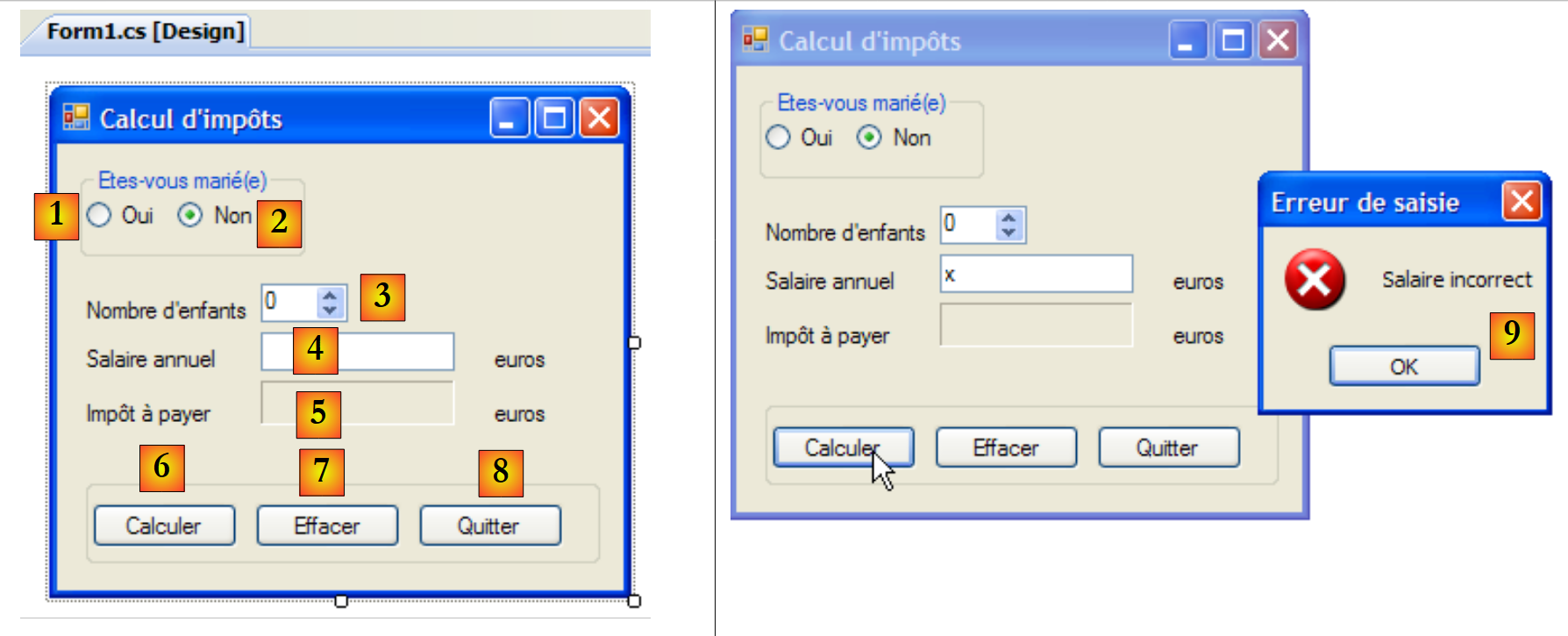 |
The controls are as follows
No. | Type | name | role |
0 | GroupBox | groupBox1 | Text=Are you married? |
1 | RadioButton | radioButtonOui | Checked if married |
2 | RadioButton | radioButtonNon | Checked if not married Checked=True |
3 | NumericUpDown | numericUpDownEnfants | number of the taxpayer's children Minimum=0, Maximum=20, Increment=1 |
4 | TextBox | textSalaire | taxpayer's annual salary in euros |
5 | Label | labelImpot | Amount of tax due BorderStyle=Fixed3D |
6 | Button | buttonCalculer | calculate tax |
7 | Button | buttonEffacer | resets the form to its state when it was loaded |
8 | Button | buttonQuitter | to exit the application |
Form operating rules
- The Calculate button remains disabled as long as the salary field is empty
- if, when the calculation is run, the salary turns out to be incorrect, an error is reported [9]
The class code is as follows:
using System.Windows.Forms;
using Metier;
using System;

namespace Chap5 {
    public partial class Form1 : Form {
        // business] layer
        public IImpotMetier Metier { private get; set; }

        public Form1() {
            InitializeComponent();
        }

        private void buttonCalculer_Click(object sender, System.EventArgs e) {
            // is the salary correct?
            int salaire;
            bool ok=int.TryParse(textSalaire.Text.Trim(), out salaire);
            if (! ok  || salaire < 0) {
                // error msg
                MessageBox.Show("Salaire incorrect", "Erreur de saisie", MessageBoxButtons.OK, MessageBoxIcon.Error);
                // back to the wrong field
                textSalaire.Focus();
                // select text for input field
                textSalaire.SelectAll();
                // back to input interface
                return;
            }
            // salary is correct - tax can be calculated
            labelImpot.Text = Metier.CalculerImpot(radioButtonOui.Checked, (int)numericUpDownEnfants.Value, salaire).ToString();
        }

        private void buttonQuitter_Click(object sender, System.EventArgs e) {
            Environment.Exit(0);
        }

        private void buttonEffacer_Click(object sender, System.EventArgs e) {
            // raz form
            labelImpot.Text = "";
            numericUpDownEnfants.Value = 0;
            textSalaire.Text = "";
            radioButtonNon.Checked = true;
        }

        private void textSalaire_TextChanged(object sender, EventArgs e) {
            // calculate] button status
            buttonCalculer.Enabled=textSalaire.Text.Trim()!="";
        }

    }
}
We will only comment on the important parts:
- line [8]: the public property Metier, which allows the launch class [Program.cs] to inject a reference to the layer [metier] into [Form1].
- line [14]: the tax calculation procedure
- lines 15–27: verification of the validity of the salary (an integer >= 0).
- line 29: calculation of the tax using the [CalculerImpot] method of the [metier] layer. Note the simplicity of this operation, achieved by encapsulating the [metier] layer within a DLL layer.
7.6.4. The [Form2] form
In [conception] mode, the [Form2] form is as follows:
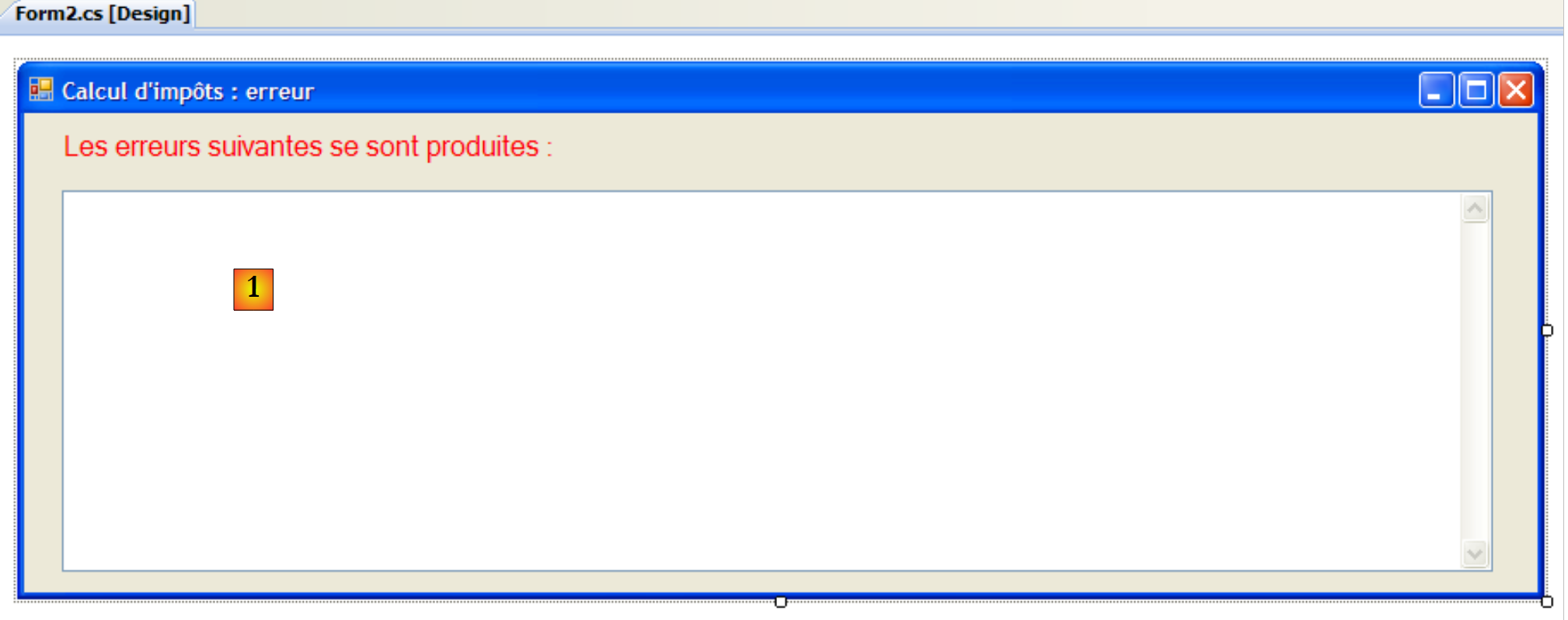 |
The controls are as follows
No. | type | name | role |
1 | TextBox | textBoxErreur | Multiline=True, Scrollbars=Both |
The class code is as follows:
using System.Windows.Forms;

namespace Chap5 {
    public partial class Form2 : Form {
        // error msg
        public string MsgErreur { private get; set; }

        public Form2() {
            InitializeComponent();
        }

        private void Form2_Load(object sender, System.EventArgs e) {
            // error msg is displayed
            textBoxErreur.Text = MsgErreur;
            // deselect all text
            textBoxErreur.Select(0, 0);
        }
    }
}
- line 6: the public property MsgErreur, which allows the launch class [Program.cs] to inject the error message to be displayed into [Form2]. This message is displayed during the processing of the Load event, lines 12–16.
- line 14: the error message is placed in TextBox
- Line 16: The selection made in the previous operation is removed. [TextBox].Select(start,length) selects (highlights) length characters starting from character number start. [TextBox].Select(0,0) deselects all text.
7.6.5. Conclusion
Let’s revisit the three-tier architecture used:
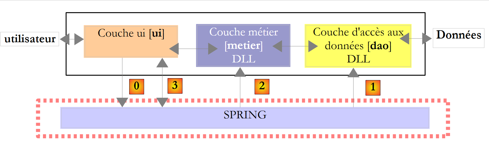 |
This architecture allowed us to replace the console implementation of the existing [ui] layer with a graphical implementation, without changing anything in the [metier] and [dao] layers. We were able to focus on the [ui] layer without worrying about potential impacts on the other layers. This is the main advantage of three-layer architectures. We will see another example of this later, when the [dao] layer, which currently processes data from a text file, is replaced by a [dao] layer that processes data from a database. We will see that this will be done without affecting the [ui] and [metier] layers.