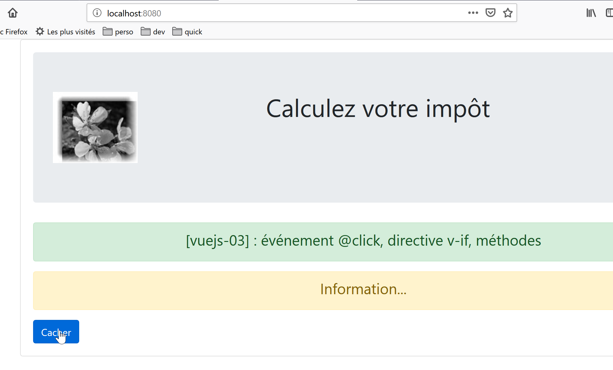
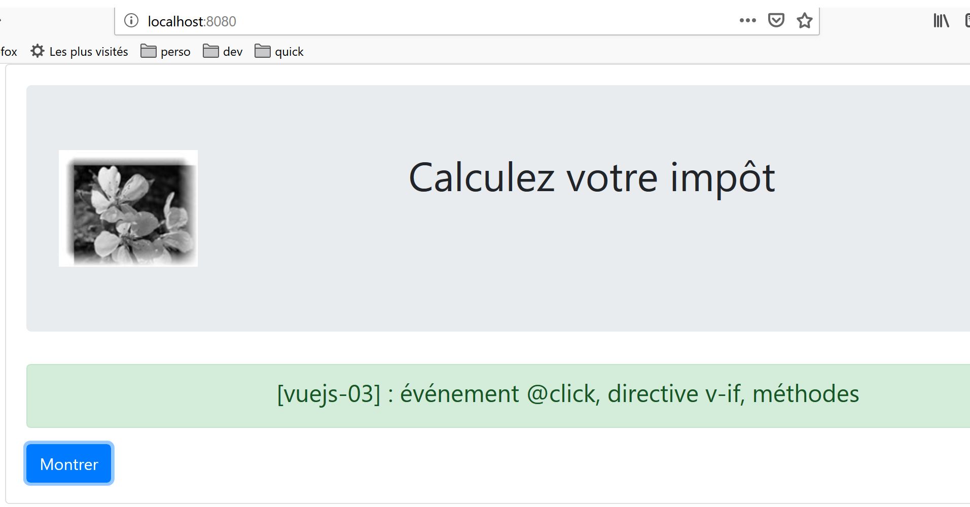
5. [vuejs-03] project: event handling
The [vuejs-03] project introduces two concepts:
- handling a [clic] event on a button;
- the [v-if] directive, which allows a HTML block to be displayed conditionally;
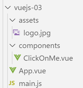
The project structure is as follows:
5.1. The main script [main.js]
The script [main.js] remains unchanged:
// imports
import Vue from 'vue'
import App from './App.vue'

// plugins
import BootstrapVue from 'bootstrap-vue'
Vue.use(BootstrapVue);

// bootstrap
import 'bootstrap/dist/css/bootstrap.css'
import 'bootstrap-vue/dist/bootstrap-vue.css'

// configuration
Vue.config.productionTip = false

// instantiation project [App]
new Vue({
  render: h => h(App),
}).$mount('#app')
5.2. The main component [App.vue]
The main component [App.vue] uses the component [ClickOnMe] instead of the component [HelloBootstrap]:
<template>
  <b-container>
    <b-card>
    <!-- Bootstrap Jumbotron -->
    <b-jumbotron>
      <!-- line -->
      <b-row>
        <!-- column width 4 -->
        <b-col cols="4">
          <img src="./assets/logo.jpg" alt="Cerisier en fleurs" />
        </b-col>
        <!-- column width 8 -->
        <b-col cols="8">
          <h1>Calculez votre impôt</h1>
        </b-col>
      </b-row>
    </b-jumbotron>
    <!-- component -->
    <ClickOnMe msg="Information..." />
    </b-card>
  </b-container>
</template>


<script>
import ClickOnMe from "./components/ClickOnMe.vue";

export default {
  name: "app",
  components: {
    ClickOnMe
  }
};
</script>
5.3. The [ClickOnMe] component
The [ClickOnMe] component introduces the following new concepts:
<template>
  <div>
    <!-- message on green background -->
    <b-alert show variant="success" align="center">
      <h4>[vuejs-03] : événement @click, directive v-if, méthodes</h4>
    </b-alert>
    <!-- message on yellow background -->
    <b-alert show variant="warning" align="center" v-if="show">
      <h4>{{msg}}</h4>
    </b-alert>
    <!-- blue button -->
    <b-button variant="primary" @click="changer">{{buttonTitle}}</b-button>
  </div>
</template>

<script>
  export default {
    name: "ClickOnMe",
    // component parameters
    props: {
      msg: String
    },
    // component attributes
    data() {
      return {
        // button title
        buttonTitle: "Cacher",
        // controls message display
        show: true
      };
    },
    // methods
    methods: {
      // show / hide message
      changer() {
        if (this.show) {
          // hide the message
          this.show = false;
          this.buttonTitle = "Montrer";
        } else {
          // we show the message
          this.show = true;
          this.buttonTitle = "Cacher";
        }
      }
    }
  };
</script>
Comments
- lines 4–6: a Bootstrap green alert. The number of columns used is not specified. In this case, Bootstrap’s 12 columns are used;
- lines 8–10: a Bootstrap yellow alert:
- line 8: the [v-if] directive from [Vue.js] controls the visibility of a HTML block. The alert is controlled here by a Boolean [show] (line 29). If [show==true], then the alert will be visible; otherwise, it will not be;
- line 9: the alert displays a message [msg], which is a property (lines 20–22) of the component;
- line 12: a blue button that you click to hide/show the alert [warning];
- lines 16–48: the component’s code jS. This code controls the component’s dynamic behavior:
- lines 20–22: the component’s properties;
- lines 24–31: the component’s attributes;
What is the difference between [propriétés] and [attributs] for a component, and between the fields [props] and [data] of the object exported by the component in lines 17–47?
- As we have already seen, the properties [props] of a component are component parameters. Their values are set from outside the component. A component A using a component B with properties [prop1, prop2, ..., propn] will use it as follows: <B :prop1='val1' :prop2='val2' ...> ;
- the object returned by the [data] function in lines 24–31 represents the component’s state or attributes. This state is manipulated by the component’s methods (lines 33–46). The <template> in lines 1–14 uses both [propriétés] and [attributs] elements:
- property values are set by a parent component;
- attribute values are initially set by the [data] function and can then be modified by methods;
- in both cases, the visual rendering reacts immediately to changes in a property (parent component) or an attribute (component method). This is referred to as a reactive interface;
In the [template] of a component, there is no difference between a [prop] property and a [data] attribute. To determine whether dynamic data from [template] should be placed in the [props] attribute or in the object returned by the [data] function, simply ask who sets the value of this data:
- if the answer is the parent component, then the data is placed in the [props] attribute;
- if the answer is the method handling that event in the component, then the data is placed in the object returned by the [data] function;
[template] uses the following dynamic data here:
- [show], line 8. This data is handled internally by the [changer] method, which handles the [click] event on the button in line 12. It is therefore an attribute created by the [data] function (line 29);
- [msg], line 9. This is a message set by the parent component. It is therefore placed in the [props] attribute (line 21);
- [buttonTitle], line 12. This data is handled internally by the [changer] method, which manages the [click] event on the button in line 12. It is therefore an attribute created by the [data] function (line 27);
- the names of the [name, props, data, methods] attributes of the object exported by the component are predefined. Other names cannot be used;
- line 12: the button’s [@click] attribute is used to specify the method that should respond to a click on the button. This method must be located in the component’s [methods] property;
- line 33: the component’s [methods] attribute contains all of its methods. Most of the time, these are functions that respond to a component event;
- lines 35–46: the [changer] method is called when the user clicks the button:
- if the [warning] alert is displayed, it is hidden and the button text changes to [Montrer] (line 39);
- if the [warning] alert is hidden, it is displayed and the button text becomes [Cacher] (line 43);
- To show or hide the alert [warning], the value of the boolean [show] is modified (lines 38 and 42);
- When a method needs to reference the attribute [attr] returned by the function [data], we write [this.attr] (lines 38 and 42). This means that the attributes of the object returned by the function [data] are direct attributes of the component [this];
5.4. Project Execution
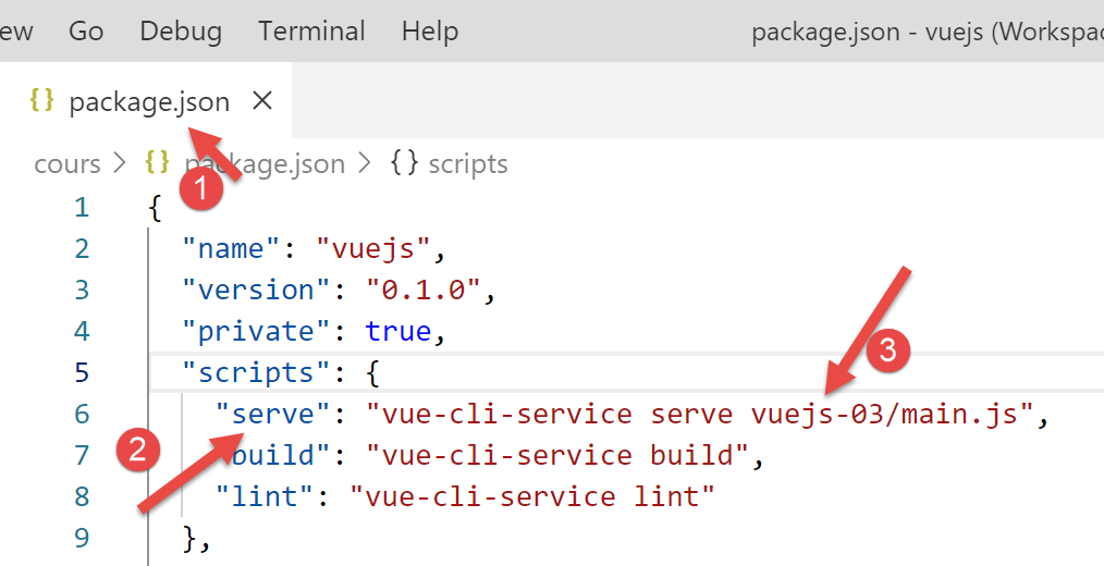
The result is as follows: