6. Project [vuejs-04]: directives [v-model, v-bind], calculated attributes, input form
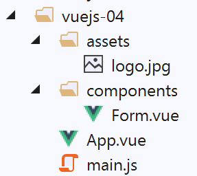
The project tree for [vuejs-04] is as follows:
6.1. The main script [main.js]
It is the same as in the previous example.
6.2. The main component [App]
The code for [App.vue] is as follows:
<template>
  <b-container>
    <b-card>
      <!-- presentation message -->
      <b-row>
        <b-col cols="8">
          <b-alert show variant="success" align="center">
            <h4>[vuejs-04] : directives [v-model, v-bind], attributs calculés, formulaire de saisie</h4>
          </b-alert>
        </b-col>
      </b-row>
      <Form />
    </b-card>
  </b-container>
</template>


<script>
  import Form from "./components/Form.vue";

  export default {
    name: "app",
    components: {
      Form
    }
  };
</script>
The [App.vue] component uses the new [Form] component (lines 12, 19, 24).
6.3. The [Form] component
The code for component [Form] is as follows:
<template>
  <div>
    <!-- form -->
    <b-form>
      <!-- form elements -->
      <b-row>
        <b-col cols="4">
          <b-card bg-variant="light">
            <b-form-group label="Nombre d'enfants à charge" label-for="enfants">
              <b-input type="text"
                       id="enfants"
                       placeholder="Indiquez votre nombre d'enfants"
                       v-model="enfants"
                       v-bind:state="enfantsValide" />
              <b-form-invalid-feedback :state="enfantsValide">Vous devez saisir un nombre positif ou nul</b-form-invalid-feedback>
            </b-form-group>
            <!-- button -->
            <b-button variant="primary" :disabled="formInvalide" @click="doSomething">Valider</b-button>
          </b-card>
        </b-col>
      </b-row>
    </b-form>
    <b-row class="mt-3">
      <b-col cols="4">
        <b-alert show variant="warning" align="center">
          <h4>enfants= {{enfants}}</h4>
        </b-alert>
      </b-col>
    </b-row>
  </div>
</template>

<!-- script -->
<script>
  export default {
    // name
    name: "Form",
    // static component attributes
    data() {
      return {
        // no. of children
        enfants: ""
      };
    },

    // calculated attributes
    computed: {
      // attribute [formInvalide]
      formInvalide() {
        return !this.enfantsValide;
      },
      // attribute [enfantsInvalide]
      enfantsValide() {
        return Boolean(this.enfants.match(/^\s*\d+\s*$/));
      }
    },
    // methods
    methods: {
      doSomething() {
        // the number of children is known when validation takes place
        alert("Nombre d'enfants : " + this.enfants);
      }
    }
  };
</script>
Visual rendering
Comments
- lines 4–32: the <b-form> tag introduces a Bootstrap form;
- line 6: the <b-row> tag introduces a row in the form;
- line 7: the <b-col cols='4'> tag introduces a column spanning 4 Bootstrap columns;
- line 8: the <b-card> tag introduces a Bootstrap card, an area framed by a border;
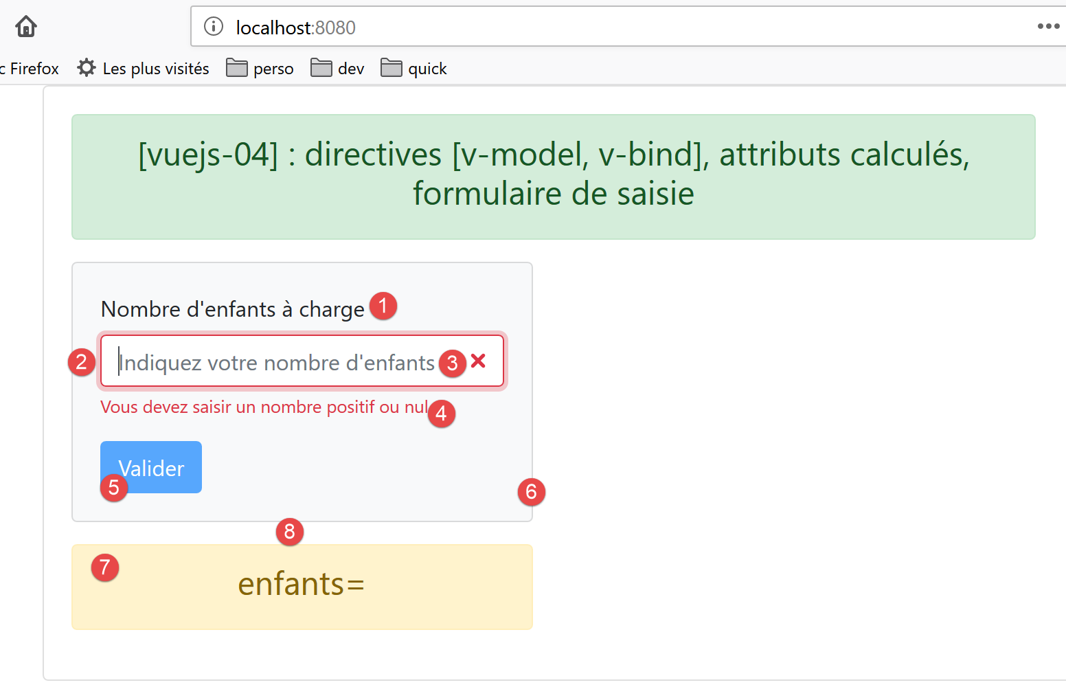
- line 9: the <b-form-group> tag adds a group of interrelated form elements. Here, a text field (attribute [label]) [1] is linked to an input field (attribute [label-for]). The value of [label-for] is the value of field [id], line 12, of the input field;
- lines 10–14: the <b-input> tag [2] introduces an input field:
- line 10: [type=’text’] indicates that text can be entered in the input field. We could have written [type=’number’] with constraints [min=’val1’ max=’val2’ step=’val3’] since we expect a number of children. We used [type=’text’] to demonstrate how to validate an input;
- line 12: the attribute [placeholder] [3] sets the message displayed in the input field as long as the user has not entered anything;
- line 13: the directive [v-model] bidirectionally links the entered value with the attribute [enfants], line 42, of the component:
- When the entered value changes, the value of the [enfants] attribute also changes;
- When the value of the [enfants] attribute changes, the entered value also changes, i.e., the content of [2] changes;
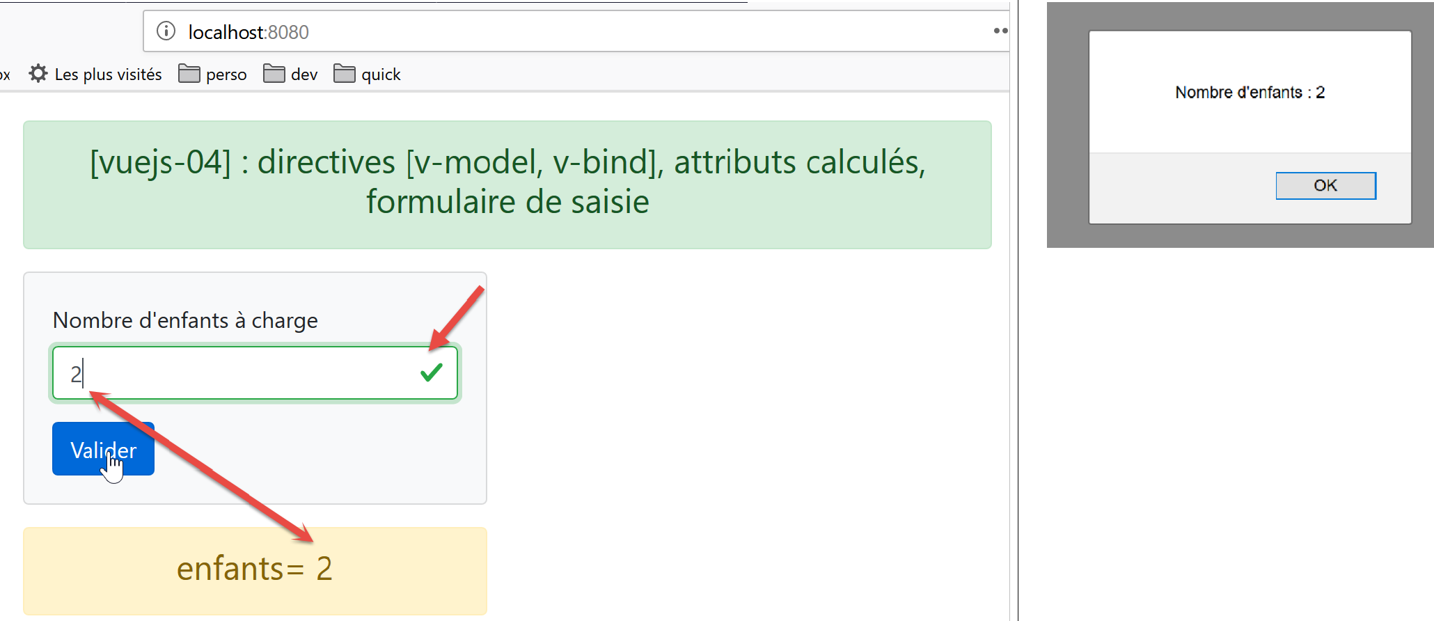
- The important point to understand is that, thanks to the mechanism described above, when the user clicks the [Valider] [5] button, the [enfants] attribute on line 42 takes on the value entered in [2];
- Line 14: The directive [v-bind] establishes a link between, on one side, an attribute of the <b-input> tag—here, the attribute [state]—and, on the other side, an attribute of the component—here, [enfantsValide], line 53. The [enfantsValide] attribute is unique in that it is a function that returns the attribute’s value. This type of attribute is called a calculated attribute. Calculated attributes are found in the [computed] property, line 47, of the component. Calculated attributes are used in the same way as the static attributes of the [data] function: On line 14, we do not write [v-bind:state=’enfantsValide()’] but [v-bind:state=’enfantsValide’], without the parentheses. Also, when reading [template], it is not possible to distinguish a calculated attribute from a static attribute. To do so, you must examine the component’s script code;
- line 14: the attribute [state] determines whether the entered value is valid or invalid: if [enfantsValide] returns the value [true], the entered value is considered valid; otherwise, it is considered invalid. The screenshot above shows the [b-input] component when the [enfantsValide] function returns the value [false];
- Line 15: The <b-form-invalid-feedback> tag [4] displays a message when the input in [2] is invalid. Its attribute [:state=’enfantsValide’] is identical to the attribute [v-bind:state=’enfantsValide’] in line 14. The directive [v-bind] can be omitted, but the sign [:] must be retained. The error message therefore appears when the attribute [enfantsValide] is set to [false];
- line 16: end of the <b-group> element group;
- line 18: the [5] button that will allow the entry to be validated:
- it will be blue [variant=’primary’];
- [:disabled="formInvalide"]: the [disabled] attribute enables/disables the button. This attribute is bound (v-bind) to the calculated attribute [formInvalide] on line 49;
- [@click="doSomething"]: when the user clicks the button, the method [doSomething] on line 59 will be executed;
- lines 19–22: closing the various open tags;
- lines 23–29: a new line in [template]. [class=’mt-3’] refers to [margin (m) top (t) égale à 3 spacers]. [spacer] is a Bootstrap spacing measure. This class generates the [8] spacing in the screenshot above. Without this class, the [7] area is flush with the [1-6] area;
- line 24: a column spanning 4 Bootstrap columns;
- Lines 25–27: An alert labeled [warning] displaying the value of the static attribute [enfants] (line 42). Since this attribute has a two-way binding with the input field, as soon as the user modifies the field, the value displayed in the alert also changes;
- lines 34-65: the component’s code jS;
- line 42: the component’s single static attribute;
- lines 47–56: the component’s calculated attributes;
- lines 53–55: the input is considered valid if it is a positive integer, possibly preceded or followed by spaces;
- lines 49–51: the form is considered valid if the number of children entered is valid. Generally, a form has multiple fields and is considered valid if all of them are valid;
- lines 58–63: the component’s methods that respond to its events. Here, there is only one event: [click] on the button. We simply display the entered value to show that we have access to it;
6.4. Running the project
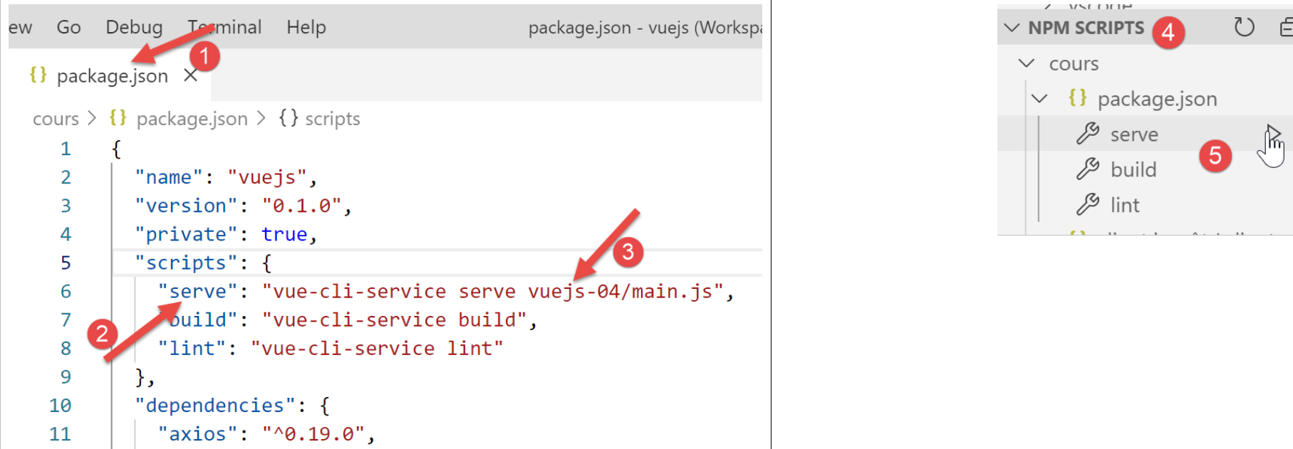
We modify the [package.json] file and run the project: