8. Project [vuejs-06]: Layout of a view with slots
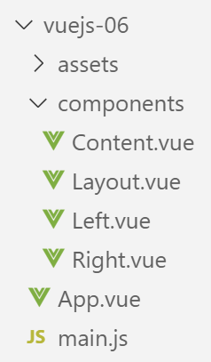
8.1. The main script [main.js]
The main script [main.js] remains unchanged.
8.2. The main component [App]
The code for the component [App] is as follows:
<template>
  <div class="container">
    <b-card>
      <b-alert show variant="success" align="center">
        <h4>[vuejs-06] : mise en page avec des slots</h4>
      </b-alert>
      <Content />
    </b-card>
  </div>
</template>


<script>
  import Content from './components/Content'
  export default {
    name: "app",
    // components used
    components: {
      Content
    }
  };
</script>
Component [App] introduces a new component called [Content] (lines 7, 14, 19).
8.3. The [Layout] component
The [Layout] component is used to define the layout of the application views:
<template>
  <!-- line -->
  <b-row>
    <!-- three-column zone -->
    <b-col cols="3" v-if="left">
      <slot name="slot-left" />
    </b-col>
    <!-- nine-column zone -->
    <b-col cols="9" v-if="right">
      <slot name="slot-right" />
    </b-col>
  </b-row>
</template>

<script>
  export default {
    name: "patron",
    // settings
    props: {
      left: {
        type: Boolean
      },
      right: {
        type: Boolean
      }
    }
  };
</script>
Comments
- The [Layout] component defines a single row (lines 3–12). This row is divided into two columns:
- a column consisting of 3 Bootstrap columns (lines 5–7);
- a column consisting of 9 Bootstrap columns (lines 9–11);
- line 5: the presence of the left column (lines 5–7) depends on the value of the [left] parameter, defined in the component’s [props] property (lines 20–22);
- line 9: the presence of the right column (lines 9–11) depends on the value of the [right] parameter, defined in the [props] property of the component (lines 23–25);
- the values of the [left, right] parameters must be set by a parent component of the [Layout] component;
- line 6: the content of the left column is not set. We simply give this column a name using the <slot> tag. Here, it will be called [slot-left]. A component using the [Content] component must specify what it wants to place in the area named [slot-left];
- line 10: the right-hand column will be named [slot-right];
8.4. The [Right] component
The [Right] component is as follows:
<template>
  <!-- a message in a warning-type alert -->
  <b-alert show variant="warning" align="center">
    <h4>{{msg}}</h4>
  </b-alert>
</template>

<!-- script -->
<script>
  export default {
    name: "droite",
    // settings
    props: {
      msg: String
    }
  };
</script>
- lines 3-5: the [Right] component displays a message in a [warning]-type alert. This [msg] message is defined as a component parameter, line 14. The parent component must therefore assign a value to it;
8.5. The [Left] component
The [Left] component is as follows:
<template>
  <!-- a message in a primary alert -->
  <b-alert show variant="primary" align="center">
    <h4>{{msg}}</h4>
  </b-alert>
</template>

<!-- script -->
<script>
  export default {
    name: "gauche",
    // settings
    props: {
      msg: String
    }
  };
</script>
- lines 3-5: the [Left] component displays a message in a [primary]-type alert. This message [msg] is defined as a component parameter, line 14. The parent component must therefore assign a value to it;
8.6. The [Content] component
Recall that the [Content] component is the component displayed by the main view [App.vue]:
<template>
  <div>
    <!-- left and right columns filled -->
    <Layout :left="true" :right="true">
      <Right slot="slot-right" msg="slot [slot-right] présent et rempli" />
      <Left slot="slot-left" msg="slot [slot-left] présent et rempli" />
    </Layout>
    <!-- left column low. right column full -->
    <Layout :left="false" :right="true">
      <Right slot="slot-right" msg="slot [slot-right] présent et rempli, slot [slot-left] absent" />
    </Layout>
    <!-- left column filled, right column missing -->
    <Layout :left="true" :right="false">
      <Left slot="slot-left" msg="slot [slot-left] présent et rempli, slot [slot-right] absent" />
    </Layout>
    <!-- left column present but not filled, right column filled -->
    <Layout :left="true" :right="true">
      <Right slot="slot-right" msg="slot [slot-right] présent et rempli, slot [slot-left] présent mais vide" />
    </Layout>
  </div>
</template>

<!-- script -->
<script>
  import Layout from "./Layout";
  import Left from "./Left";
  import Right from "./Right";
  export default {
    name: "contenu",
    // components
    components: {
      Layout,
      Left,
      Right
    }
  };
</script>
Visual rendering
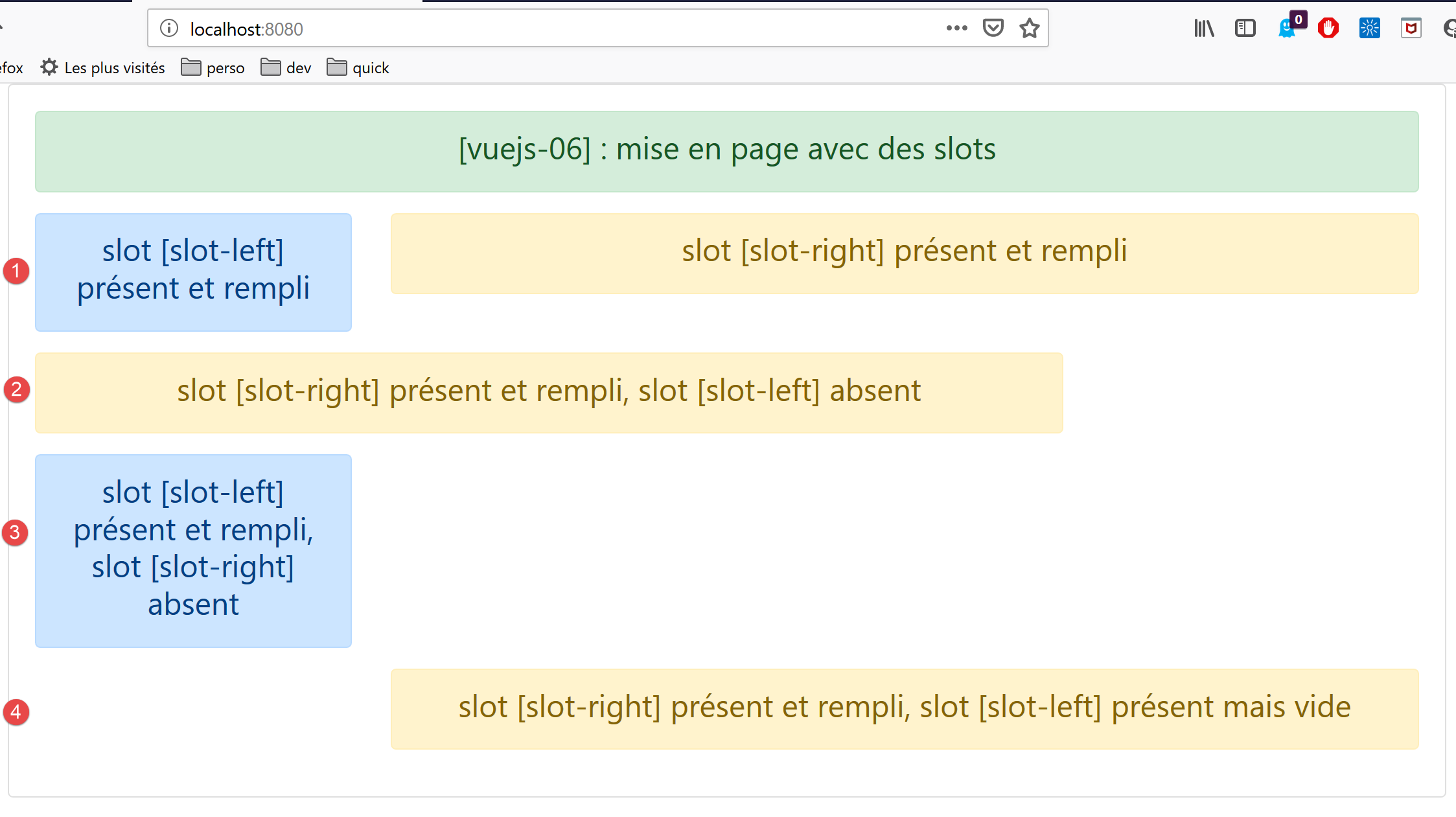
Comments
- The [Layout] component is used 4 times (lines 4–7, 9–11, 13–15, 17–19). Recall that the [Layout] component defines 1 row; the [template] above defines four rows. Also note that the [Layout] row defines two columns:
- a column named [slot-left] that occupies the 3 left Bootstrap columns;
- a column named [slot-Right] that occupies the 9 right Bootstrap columns;
- Lines 4–7: defines a row [1] where the component [Left] occupies the column [slot-left] and the component [Right] occupies the column [slot-right];
- lines 9–11: defines a row [2] where the column [slot-left] is not displayed and the component [Right] occupies the column [slot-right];
- lines 13–15: defines a row [3] where the column [slot-right] is not displayed and the component [Left] occupies the column [slot-left];
- lines 17–19: defines a row [4] where the column [slot-left] is displayed as [:left=’true’] but not populated, and the component [Right] occupies the column [slot-right];
Ultimately, the [Layout] component served as the layout for the [Content] component.