4. The Components
The previous chapter introduced the components of [Material 3] and the state. This chapter shows how to write YOUR OWN components: their parameters, how they notify their parent, composition, their lifecycle, the data provided to them remotely, and reusable behaviors. With [Compose], a component is a simple [@Composable] function: the equivalent of [Flutter] widgets.
4.1. Example 10: Components and Their Parameters
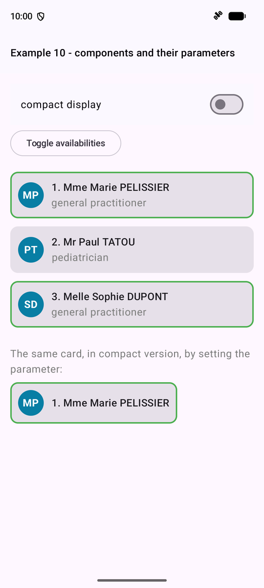
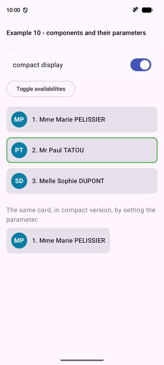
A card displaying a doctor, used multiple times on a screen. The data type, shared by the parent and child:
| // the data type shared by the parent (DoctorsPage) and the child (DoctorCard)
package fr.stahe.examples.ex10
data class Doctor(
val id: Int,
val title: String,
val firstName: String,
val lastName: String,
val specialty: String,
val available: Boolean,
)
|
The CHILD, the card:
| // =========================================================================
// ex10/DoctorCard.kt - a CHILD component
// -------------------------------------------------------------------------
// It receives its data from its parent through its PARAMETERS. Their type is
// checked at compile time: DoctorCard(doctor = 42, ...) would be rejected.
// - a parameter without a default value: the parent MUST provide it;
// - compact: Boolean = false: an optional parameter, with its default
// value;
// - modifier: Modifier = Modifier: the Compose convention, the parent
// can adjust the size, the margins... of the child.
//
// Golden rule: a component NEVER MODIFIES its parameters (they are
// val). The data flow down from the parent to the child; to request a
// change, the child calls a function that the parent has passed to it
// (cf. example 11). When the parent changes its data, Compose RE-EXECUTES
// the child with new parameters.
// =========================================================================
package fr.stahe.examples.ex10
import androidx.compose.foundation.BorderStroke
import androidx.compose.foundation.background
import androidx.compose.foundation.layout.Box
import androidx.compose.foundation.layout.Column
import androidx.compose.foundation.layout.Row
import androidx.compose.foundation.layout.Spacer
import androidx.compose.foundation.layout.padding
import androidx.compose.foundation.layout.size
import androidx.compose.foundation.layout.width
import androidx.compose.foundation.shape.CircleShape
import androidx.compose.foundation.shape.RoundedCornerShape
import androidx.compose.material3.Card
import androidx.compose.material3.MaterialTheme
import androidx.compose.material3.Text
import androidx.compose.runtime.Composable
import androidx.compose.ui.Alignment
import androidx.compose.ui.Modifier
import androidx.compose.ui.graphics.Color
import androidx.compose.ui.text.font.FontWeight
import androidx.compose.ui.unit.dp
// the "style" of the card: constants PRIVATE to this file. No other
// component can see them, nor be bothered by them
private val initialsColor = Color(0xFF087EA4)
@Composable
fun DoctorCard(doctor: Doctor, rank: Int, modifier: Modifier = Modifier, compact: Boolean = false) {
// a value computed from the parameters
val initials = "${doctor.firstName.first()}${doctor.lastName.first()}"
Card(
modifier = modifier.padding(vertical = 4.dp),
shape = RoundedCornerShape(12.dp),
// a green border for an available doctor (null: no border)
border = if (doctor.available) BorderStroke(2.dp, Color(0xFF4CAF50)) else null,
) {
Row(Modifier.padding(12.dp), verticalAlignment = Alignment.CenterVertically) {
// a colored circle, with the initials in the center
Box(
contentAlignment = Alignment.Center,
modifier = Modifier.size(40.dp).background(initialsColor, CircleShape),
) {
Text(initials, color = Color.White, fontWeight = FontWeight.Bold)
}
Spacer(Modifier.width(12.dp))
// weight(1f): the text takes all the remaining width
Column(Modifier.weight(1f)) {
Text("$rank. ${doctor.title} ${doctor.firstName} ${doctor.lastName}", style = MaterialTheme.typography.titleMedium)
if (!compact) {
Text(doctor.specialty, color = Color.Gray)
}
}
}
}
}
|
- Line 43: a constant [private]: visible only in this file;
- line 46: the card's parameters. Their type is verified at compile time; [doctor] and [rank] are required; [compact] is optional; [modifier: Modifier = Modifier] is the CONVENTION of [Compose]: the parent can adjust the size, margins, etc., of the child, which applies this [modifier] to its outermost component;
- Line 48: a value calculated from the parameters;
- lines 49–53: [Card], a [Material] card, with a green border for an available doctor ([null]: no border);
- lines 57–61: a colored circle ([CircleShape]) with the initials;
- lines 67–68: the specialty is displayed only in normal mode.
The golden rule: a component NEVER MODIFIES its parameters (these are [val]; in fact, the compiler prohibits this). Data flows from the parent to the child; when the parent changes its data, [Compose] RE-EXECUTES the child with its new parameters. The PARENT:
| // =========================================================================
// ex10/Ex10Activity.kt - the PARENT component
// -------------------------------------------------------------------------
// It uses the DoctorCard component, as many times as needed, like
// any Compose component: a @Composable function is a
// REUSABLE piece of interface, with its own parameters and its
// style. Writing one's own components is the heart of working with
// Compose: a well-written screen is made of small components.
// =========================================================================
package fr.stahe.examples.ex10
import android.os.Bundle
import androidx.activity.ComponentActivity
import androidx.activity.compose.setContent
import androidx.activity.enableEdgeToEdge
import androidx.compose.foundation.layout.Spacer
import androidx.compose.foundation.layout.height
import androidx.compose.foundation.layout.width
import androidx.compose.material3.ListItem
import androidx.compose.material3.OutlinedButton
import androidx.compose.material3.Switch
import androidx.compose.material3.Text
import androidx.compose.runtime.Composable
import androidx.compose.runtime.getValue
import androidx.compose.runtime.key
import androidx.compose.runtime.mutableStateOf
import androidx.compose.runtime.remember
import androidx.compose.runtime.setValue
import androidx.compose.ui.Modifier
import androidx.compose.ui.graphics.Color
import androidx.compose.ui.unit.dp
import fr.stahe.examples.common.ExamplePage
import fr.stahe.examples.common.ExamplesTheme
class Ex10Activity : ComponentActivity() {
override fun onCreate(savedInstanceState: Bundle?) {
super.onCreate(savedInstanceState)
enableEdgeToEdge()
setContent { ExamplesTheme { DoctorsPage() } }
}
}
@Composable
fun DoctorsPage() {
var doctors by remember {
mutableStateOf(
listOf(
Doctor(1, "Mme", "Marie", "PELISSIER", "general practitioner", true),
Doctor(2, "Mr", "Paul", "TATOU", "pediatrician", false),
Doctor(3, "Melle", "Sophie", "DUPONT", "general practitioner", true),
),
)
}
var compact by remember { mutableStateOf(false) }
ExamplePage("Example 10 - components and their parameters") {
ListItem(
headlineContent = { Text("compact display") },
trailingContent = { Switch(checked = compact, onCheckedChange = { compact = it }) },
)
// the parent changes ITS data: Compose re-executes this function, which
// calls the children again with their new parameters
OutlinedButton(onClick = { doctors = doctors.map { it.copy(available = !it.available) } }) {
Text("Toggle availabilities")
}
Spacer(Modifier.height(8.dp))
doctors.forEachIndexed { i, d ->
// each card receives ITS parameters; key: its identity (cf. example 04)
key(d.id) {
DoctorCard(doctor = d, rank = i + 1, compact = compact)
}
}
Spacer(Modifier.height(16.dp))
Text("The same card, in compact version, by setting the parameter:", color = Color.Gray)
// the parent also sets the WIDTH of the child, through the modifier parameter
DoctorCard(doctor = doctors[0], rank = 1, compact = true, modifier = Modifier.width(260.dp))
}
}
|
- line 63: the parent changes ITS data: a new list, where each doctor is replaced by a copy;
- lines 67–70: one record per doctor, each with ITS parameters; [key(d.id)]: the doctor’s identity (see example 04);
- line 76: the parent also sets the child’s WIDTH using the parameter [modifier].
4.2. Example 11: The child notifies its parent
Data is passed down through parameters; information GOES UP via functions that the parent passes to the child (by convention, their names begin with [on]). A first child, a counter, which has its own state and notifies its parent:
| // =========================================================================
// ex11/Counter.kt - a child that NOTIFIES its parent
// -------------------------------------------------------------------------
// The parent passes FUNCTIONS to it as parameters (by convention, their
// name starts with "on"), and the child calls them when something
// happens:
// Counter(label = "Coffees", max = 3, onIncrement = { ... }, onLimit = { ... })
// The type of a function is written (parameters) -> result:
// - (Int) -> Unit : a function that receives an Int and returns nothing;
// - () -> Unit : a function without parameters, which returns nothing.
// =========================================================================
package fr.stahe.examples.ex11
import androidx.compose.foundation.layout.Row
import androidx.compose.foundation.layout.Spacer
import androidx.compose.foundation.layout.width
import androidx.compose.material3.OutlinedButton
import androidx.compose.material3.SuggestionChip
import androidx.compose.material3.Text
import androidx.compose.runtime.Composable
import androidx.compose.runtime.getValue
import androidx.compose.runtime.mutableIntStateOf
import androidx.compose.runtime.remember
import androidx.compose.runtime.setValue
import androidx.compose.ui.Alignment
import androidx.compose.ui.Modifier
import androidx.compose.ui.unit.dp
@Composable
fun Counter(label: String, max: Int, onIncrement: (Int) -> Unit, onLimit: () -> Unit) {
// the state SPECIFIC to this counter: each Counter has its own
var value by remember { mutableIntStateOf(0) }
fun plus() {
if (value >= max) {
onLimit()
return
}
value++
// we NOTIFY the parent, passing it the new value
onIncrement(value)
}
Row(verticalAlignment = Alignment.CenterVertically) {
Text(label, Modifier.width(110.dp))
OutlinedButton(onClick = { plus() }) { Text("+1") }
Spacer(Modifier.width(12.dp))
SuggestionChip(onClick = {}, label = { Text("$value / $max") })
}
}
|
- line 30: the type of a function is written as [(parameters) -> result]: [(Int) -> Unit] receives a [Int] and returns nothing; [() -> Unit] has no parameters;
- line 32: the counter's OWN state: each [Counter] has its own;
- lines 34–41: when it reaches the maximum, the counter notifies the parent ([onLimit()]); otherwise, it increments and transmits its new value ([onIncrement(value)]).
A second child, a CONTROLLED component, which is used like the fields of [Compose]: the value belongs to the parent, which passes it to the child ([value]) and which the child notifies of each keystroke ([onChange]). The component has no state:
| // =========================================================================
// ex11/TextField.kt - a CONTROLLED component
// -------------------------------------------------------------------------
// A "home-made" form field (label + field + help + character
// counter) that is used like the Compose fields:
// TextField(value = firstName, onChange = { firstName = it }, ...)
// The value belongs to the PARENT, which passes it (value) and which it
// notifies of each keystroke (onChange). It is the parent that decides.
// The component has no state: it displays what it is given. If the
// parent itself changes the value ("Clear" button), the field follows, with
// nothing more to write.
// =========================================================================
package fr.stahe.examples.ex11
import androidx.compose.foundation.layout.fillMaxWidth
import androidx.compose.material3.OutlinedTextField
import androidx.compose.material3.Text
import androidx.compose.runtime.Composable
import androidx.compose.ui.Modifier
@Composable
fun TextField(value: String, onChange: (String) -> Unit, label: String, max: Int, help: String = "") {
val full = value.length == max
OutlinedTextField(
value = value,
// the field rejects the extra characters: the keystroke is only passed
// to the parent if the text does not exceed max characters
onValueChange = { text -> if (text.length <= max) onChange(text) },
label = { Text(label) },
singleLine = true,
// the border turns red when the field is full
isError = full,
supportingText = { Text(if (full) "Maximum length reached - ${value.length}/$max" else "$help - ${value.length}/$max") },
modifier = Modifier.fillMaxWidth(),
)
}
|
- line 28: the keystroke is sent to the parent only if the text does not exceed [max] characters: the field “rejects” any excess characters;
- lines 32–33: the border turns red when the field is full, and the tooltip indicates this.
The parent:
| // =========================================================================
// ex11/Ex11Activity.kt - the parent listens to its children
// -------------------------------------------------------------------------
// The data flow down (parameters); the information goes up through
// functions passed as parameters:
// 1. "events" of the child: onIncrement, onLimit;
// 2. a controlled component: value + onChange, like a TextField.
// The state remains the property of the parent, which can modify it itself
// (Clear).
// =========================================================================
package fr.stahe.examples.ex11
import android.os.Bundle
import androidx.activity.ComponentActivity
import androidx.activity.compose.setContent
import androidx.activity.enableEdgeToEdge
import androidx.compose.foundation.layout.Column
import androidx.compose.foundation.layout.Spacer
import androidx.compose.foundation.layout.height
import androidx.compose.foundation.layout.padding
import androidx.compose.material3.Card
import androidx.compose.material3.MaterialTheme
import androidx.compose.material3.OutlinedButton
import androidx.compose.material3.Text
import androidx.compose.runtime.Composable
import androidx.compose.runtime.getValue
import androidx.compose.runtime.mutableIntStateOf
import androidx.compose.runtime.mutableStateOf
import androidx.compose.runtime.remember
import androidx.compose.runtime.setValue
import androidx.compose.ui.Modifier
import androidx.compose.ui.text.SpanStyle
import androidx.compose.ui.text.buildAnnotatedString
import androidx.compose.ui.text.font.FontStyle
import androidx.compose.ui.text.font.FontWeight
import androidx.compose.ui.text.withStyle
import androidx.compose.ui.unit.dp
import fr.stahe.examples.common.ExamplePage
import fr.stahe.examples.common.ExamplesTheme
class Ex11Activity : ComponentActivity() {
override fun onCreate(savedInstanceState: Bundle?) {
super.onCreate(savedInstanceState)
enableEdgeToEdge()
setContent { ExamplesTheme { ParentPage() } }
}
}
@Composable
fun ParentPage() {
var total by remember { mutableIntStateOf(0) }
var message by remember { mutableStateOf("") }
var firstName by remember { mutableStateOf("Marie") }
var lastName by remember { mutableStateOf("PELISSIER") }
// the function called by a counter: it receives the value the counter passes on
fun onIncrement(label: String, value: Int) {
total++
message = "$label is now $value"
}
val titleStyle = MaterialTheme.typography.titleSmall
ExamplePage("Example 11 - the child notifies its parent") {
Card {
Column(Modifier.padding(12.dp)) {
Text("1. Functions called by the children", style = titleStyle)
Counter(
label = "Coffees",
max = 3,
onIncrement = { v -> onIncrement("Coffees", v) },
onLimit = { message = "No more than 3 coffees!" },
)
Counter(
label = "Glasses of water",
max = 8,
onIncrement = { v -> onIncrement("Glasses of water", v) },
onLimit = { message = "Enough drinking." },
)
Spacer(Modifier.height(8.dp))
Text("Total of clicks: $total - $message", fontStyle = FontStyle.Italic)
}
}
Card {
Column(Modifier.padding(12.dp)) {
Text("2. Controlled components", style = titleStyle)
TextField(value = firstName, onChange = { firstName = it }, label = "First name", max = 20, help = "Required")
TextField(value = lastName, onChange = { lastName = it }, label = "Last name", max = 20, help = "Displayed in upper case")
Spacer(Modifier.height(8.dp))
Text(
buildAnnotatedString {
append("Data of the parent: ")
withStyle(SpanStyle(fontWeight = FontWeight.Bold)) { append("$firstName ${lastName.uppercase()}") }
},
)
Spacer(Modifier.height(8.dp))
OutlinedButton(onClick = {
firstName = ""
lastName = ""
}) { Text("Clear (from the parent)") }
}
}
}
}
|
- lines 57–59: the function called by the counters;
- lines 68–71: each counter receives two lambda expressions; the first receives the passed value ([v]) and appends the counter’s label to it;
- lines 86–87: the controlled fields: the value, and what to do with each keystroke;
- lines 97–99: the parent modifies its own data: the fields follow, with nothing else to write.
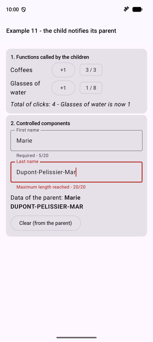
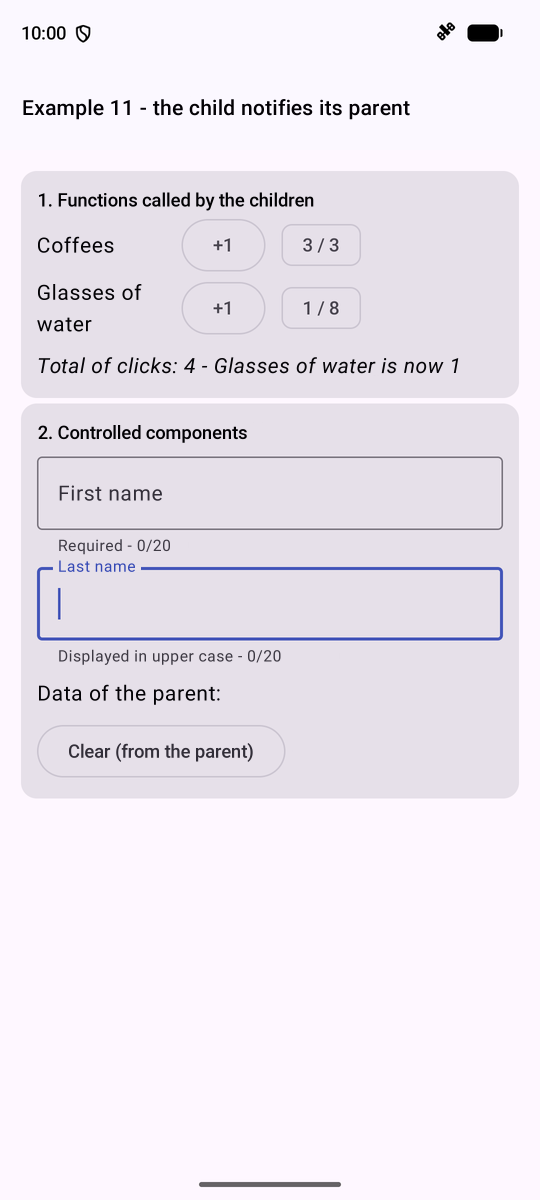
On the left, the maximum number of coffees has been reached, and the name is 20 characters long; on the right, after “Clear (from the parent).”
4.3. Example 12: Composition
A component’s parameters pass DATA... but also CONTENT: a parameter can be a function [@Composable], which the component calls wherever it wants. This is what [Compose] does everywhere ([Card], [Scaffold], the [label] of a field...). A first template, a card with three slots:
| // =========================================================================
// ex12/Card.kt - a reusable TEMPLATE
// -------------------------------------------------------------------------
// The parameters of a component pass DATA... but also
// CONTENT: a parameter can be a @Composable function, which the
// component calls wherever it wants. Compose uses this everywhere: the content
// of a Card, the topBar of a Scaffold, the label of a field...
// - content: by convention, the LAST parameter, the "main"
// content. It is written after the parentheses of the call:
// Card(color = ...) { Text("the content") }
// - header, footer: other places ("slots"), provided by the
// parent; the header has a default content, the footer is optional.
// The card sets the frame (border, header, footer), the parent provides what
// goes inside.
// =========================================================================
package fr.stahe.examples.ex12
import androidx.compose.foundation.BorderStroke
import androidx.compose.foundation.background
import androidx.compose.foundation.layout.Box
import androidx.compose.foundation.layout.Column
import androidx.compose.foundation.layout.fillMaxWidth
import androidx.compose.foundation.layout.padding
import androidx.compose.foundation.shape.RoundedCornerShape
import androidx.compose.material3.Card
import androidx.compose.material3.ProvideTextStyle
import androidx.compose.material3.Text
import androidx.compose.runtime.Composable
import androidx.compose.ui.Modifier
import androidx.compose.ui.graphics.Color
import androidx.compose.ui.text.TextStyle
import androidx.compose.ui.text.font.FontWeight
import androidx.compose.ui.unit.dp
import androidx.compose.ui.unit.sp
@Composable
fun Card(
color: Color? = null, // "?": optional (null by default)
header: @Composable () -> Unit = { Text("Untitled") },
footer: (@Composable () -> Unit)? = null,
content: @Composable () -> Unit,
) {
val fill = color ?: Color(0xFFE0E0E0) // "?:": color, or else this grey
Card(
modifier = Modifier.padding(vertical = 4.dp),
shape = RoundedCornerShape(8.dp),
border = BorderStroke(1.dp, fill),
) {
Column {
Box(Modifier.fillMaxWidth().background(fill).padding(10.dp)) {
// ProvideTextStyle: the style of ALL the texts of the header,
// whatever the content provided by the parent
ProvideTextStyle(TextStyle(color = if (color == null) Color.Black else Color.White, fontWeight = FontWeight.Bold)) {
header()
}
}
Box(Modifier.padding(10.dp)) { content() }
// no footer provided: no footer at all
if (footer != null) {
Box(Modifier.fillMaxWidth().background(Color(0xFFF5F5F5)).padding(8.dp)) {
ProvideTextStyle(TextStyle(color = Color.Gray, fontSize = 12.sp)) { footer() }
}
}
}
}
}
|
- lines 38–41: three content parameters: [header], with default content; [footer], OPTIONAL ([(@Composable () -> Unit)?]: a function, or [null]); [content], the last one, which is written after the parentheses in the call;
- lines 53–54: [ProvideTextStyle] sets the style of ALL the header texts, regardless of the content provided by the parent;
- lines 59–61: no footer provided, no footer at all.
A second template, a GENERIC table: it can traverse the rows, but cannot display ONE cell; the parent tells it what to do by describing the columns:
| // =========================================================================
// ex12/DataTable.kt - a GENERIC table
// -------------------------------------------------------------------------
// DataTable<T> is a generic component: it displays rows of
// any type T. It knows how to go through the rows, but not how to
// display ONE cell: it is the parent that tells it, by describing its
// columns. Each TableColumn<T> has a title, a relative width (weight) and
// a @Composable FUNCTION, cell(row, index), which displays its cell.
// The content provided by the parent uses data that belong to
// the child (the row, its rank): it is the principle of the Compose lists
// (LazyColumn and its items { ... } function).
// =========================================================================
package fr.stahe.examples.ex12
import androidx.compose.foundation.layout.Box
import androidx.compose.foundation.layout.Column
import androidx.compose.foundation.layout.Row
import androidx.compose.foundation.layout.padding
import androidx.compose.material3.HorizontalDivider
import androidx.compose.material3.ProvideTextStyle
import androidx.compose.material3.Text
import androidx.compose.runtime.Composable
import androidx.compose.ui.Alignment
import androidx.compose.ui.Modifier
import androidx.compose.ui.graphics.Color
import androidx.compose.ui.text.TextStyle
import androidx.compose.ui.text.font.FontWeight
import androidx.compose.ui.unit.dp
// a column of a table of T
class TableColumn<T>(val title: String, val weight: Float = 1f, val cell: @Composable (row: T, index: Int) -> Unit)
@Composable
fun <T> DataTable(
rows: List<T>,
columns: List<TableColumn<T>>,
// displayed when there is no row
empty: @Composable () -> Unit = { Text("No data.") },
) {
Column {
// the row of the titles
Row {
for (c in columns) {
Text(c.title, Modifier.weight(c.weight).padding(6.dp), fontWeight = FontWeight.Bold)
}
}
HorizontalDivider()
if (rows.isEmpty()) {
Box(Modifier.padding(6.dp)) { ProvideTextStyle(TextStyle(color = Color.Gray)) { empty() } }
}
rows.forEachIndexed { i, row ->
if (i > 0) HorizontalDivider(color = Color(0xFFE0E0E0))
Row(verticalAlignment = Alignment.CenterVertically) {
// the cells of THIS row, displayed by the parent's functions
for (c in columns) {
Box(Modifier.weight(c.weight).padding(6.dp)) { c.cell(row, i) }
}
}
}
}
}
|
- line 31: a column of a table of [T]: a title, a relative width, and a function [@Composable] that displays the cell in a row;
- Lines 55–56: the cells in each row, displayed by the parent’s functions. The content provided by the parent uses data belonging to the child (the row, its rank): this is the principle behind the lists in [Compose] ([LazyColumn], see the case study).
The screen that uses both templates:
| // =========================================================================
// ex12/Ex12Activity.kt - using the Card and DataTable templates
// =========================================================================
package fr.stahe.examples.ex12
import android.os.Bundle
import androidx.activity.ComponentActivity
import androidx.activity.compose.setContent
import androidx.activity.enableEdgeToEdge
import androidx.compose.foundation.layout.Row
import androidx.compose.foundation.layout.Spacer
import androidx.compose.foundation.layout.width
import androidx.compose.material.icons.Icons
import androidx.compose.material.icons.filled.DateRange
import androidx.compose.material3.Icon
import androidx.compose.material3.SuggestionChip
import androidx.compose.material3.SuggestionChipDefaults
import androidx.compose.material3.Text
import androidx.compose.runtime.Composable
import androidx.compose.ui.Alignment
import androidx.compose.ui.Modifier
import androidx.compose.ui.graphics.Color
import androidx.compose.ui.unit.dp
import fr.stahe.examples.common.ExamplePage
import fr.stahe.examples.common.ExamplesTheme
// a slot; patient: null if the slot is free
data class Slot(val id: Int, val timeRange: String, val patient: String?)
val slots = listOf(
Slot(1, "8:00 - 8:20", null),
Slot(2, "8:20 - 8:40", "Mme Alice DURAND"),
Slot(3, "8:40 - 9:00", null),
)
data class Person(val id: Int, val name: String)
class Ex12Activity : ComponentActivity() {
override fun onCreate(savedInstanceState: Bundle?) {
super.onCreate(savedInstanceState)
enableEdgeToEdge()
setContent { ExamplesTheme { CompositionPage() } }
}
}
@Composable
fun CompositionPage() {
val free = slots.count { it.patient == null }
ExamplePage("Example 12 - composition") {
// header and footer: @Composable functions passed as parameters;
// the content: the lambda written AFTER the parentheses
Card(
color = Color(0xFF3F51B5),
header = {
Row(verticalAlignment = Alignment.CenterVertically) {
Icon(Icons.Default.DateRange, contentDescription = null, tint = Color.White)
Spacer(Modifier.width(8.dp))
Text("Schedule of Mme PELISSIER")
}
},
footer = { Text("$free free slot(s)") },
) {
// DataTable<Slot>: T is deduced from the type of rows
DataTable(
rows = slots,
columns = listOf(
// s receives the row, i its rank
TableColumn("#", 0.4f) { _, i -> Text("${i + 1}") },
TableColumn("Slot", 1.2f) { s, _ -> Text(s.timeRange) },
TableColumn("Status", 1.6f) { s, _ ->
if (s.patient != null) {
SuggestionChip(onClick = {}, label = { Text(s.patient) })
} else {
SuggestionChip(
onClick = {},
label = { Text("Free") },
colors = SuggestionChipDefaults.suggestionChipColors(containerColor = Color(0xFFC8E6C9)),
)
}
},
),
)
}
Card(color = Color(0xFF4CAF50), header = { Text("A card without a footer") }) {
Text("The footer is not provided: the card does not display it.")
}
// no header provided: the default content, "Untitled"
Card {
DataTable(
rows = emptyList<Person>(),
columns = listOf(TableColumn("Name") { p, _ -> Text(p.name) }),
empty = { Text("Nobody for now.") },
)
}
}
}
|
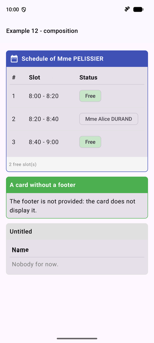
- lines 52–61: the header and footer, lambda functions passed by name; the content, the lambda function written AFTER the parentheses;
- lines 64–70: [DataTable<Slot>]: [T] is DEDUCED, which defines the line type. Each column receives the line and its rank; [_]: an unused parameter;
- Lines 88–92: a card without a header (the default content, “Untitled”) and an empty table.
4.4. Example 13: The Lifecycle of a Component
A component ENTERS the composition (its function is executed for the first time), is RECOMPOSED as many times as necessary, then LEAVES the composition, for good. [Compose] provides “effects” to trigger at these points:
- [LaunchedEffect(key) [ ... ]]: launches a COROUTINE (code that can wait; see Example 19) on entry, relaunches it if [key] changes, and CANCELS it on exit;
- [DisposableEffect(key) { ... ; onDispose [ ... ] }]: code on entry, and cleanup on exit.
A clock that starts a timer... and must stop it when it disappears:
| // =========================================================================
// ex13/Clock.kt - a component that starts and stops
// -------------------------------------------------------------------------
// The life of a component in the screen ("the composition"):
// 1. it ENTERS the composition: its function is executed for the
// first time. What must be started is started there;
// 2. it is RECOMPOSED as many times as needed (its state or its
// parameters have changed);
// 3. it LEAVES the composition: it disappears from the screen, forever.
// What was started is STOPPED there.
// Compose provides "effects" to act at those moments, outside of
// the display itself:
// - LaunchedEffect(key) { ... }: launches a COROUTINE (code that can
// wait, cf. example 19) on entering the composition, relaunches it
// if key changes, CANCELS it on leaving;
// - DisposableEffect(key) { ...; onDispose { ... } }: code on
// entering, and its cleanup (onDispose) on leaving.
// A clock starts a timer when it appears... and must
// absolutely stop it when it disappears: with LaunchedEffect,
// it is automatic.
// =========================================================================
package fr.stahe.examples.ex13
import androidx.compose.material3.Text
import androidx.compose.runtime.Composable
import androidx.compose.runtime.DisposableEffect
import androidx.compose.runtime.LaunchedEffect
import androidx.compose.runtime.getValue
import androidx.compose.runtime.mutableStateOf
import androidx.compose.runtime.remember
import androidx.compose.runtime.rememberUpdatedState
import androidx.compose.runtime.setValue
import androidx.compose.ui.graphics.Color
import androidx.compose.ui.text.font.FontFamily
import androidx.compose.ui.unit.sp
import kotlinx.coroutines.delay
import java.time.LocalTime
import java.time.format.DateTimeFormatter
fun currentTime(): String = LocalTime.now().format(DateTimeFormatter.ofPattern("HH:mm:ss"))
@Composable
fun Clock(onLog: (String) -> Unit, color: Color = Color(0xFF3F51B5)) {
var time by remember { mutableStateOf(currentTime()) }
// the LAST onLog function received (the effects below last
// longer than one execution of the function)
val log by rememberUpdatedState(onLog)
// entering the composition, and leaving it
DisposableEffect(Unit) {
log("Clock: entering the composition - timer started")
onDispose { log("Clock: leaving the composition - timer stopped") }
}
// the timer: a coroutine, CANCELLED automatically on leaving
LaunchedEffect(Unit) {
while (true) {
delay(1000) // wait one second, without blocking the phone
time = currentTime()
}
}
// a parameter that changes: the effect is relaunched (except the first time)
var firstColor by remember { mutableStateOf(true) }
LaunchedEffect(color) {
if (firstColor) firstColor = false else log("Clock: recomposed with a new color")
}
Text(time, fontSize = 40.sp, fontFamily = FontFamily.Monospace, color = color)
}
|
- line 47: [rememberUpdatedState]: the effects last longer than a single function call; they must call the LAST function received ([onLog]), not the first one;
- lines 50–52: entry into the composition, and exit ([onDispose]);
- lines 57–59: the timer, an infinite loop… in a coroutine: [delay(1000)] waits one second WITHOUT blocking the phone; the coroutine is canceled upon exiting the composition, and the loop with it;
- line 65: an effect whose key is a parameter: it is triggered again when the color changes.
The screen:
| // =========================================================================
// ex13/Ex13Activity.kt - the lifecycle
// -------------------------------------------------------------------------
// - if (withClock) Clock(...): checking / unchecking the box makes
// the clock enter / leave the composition (cf. Clock.kt);
// changing its color recomposes it;
// - a field that takes the focus as soon as it appears (the phone's
// keyboard opens);
// - the title of the application follows the input (TaskTitle);
// - the life of the ACTIVITY itself (its "Lifecycle"): on a phone,
// it goes to the background (another application is opened, the screen
// turns off), then comes back: we can react to it (save, stop a
// timer...).
// =========================================================================
package fr.stahe.examples.ex13
import android.os.Bundle
import androidx.activity.ComponentActivity
import androidx.activity.compose.setContent
import androidx.activity.enableEdgeToEdge
import androidx.compose.foundation.layout.Column
import androidx.compose.foundation.layout.fillMaxWidth
import androidx.compose.foundation.layout.padding
import androidx.compose.foundation.selection.toggleable
import androidx.compose.material3.Card
import androidx.compose.material3.Checkbox
import androidx.compose.material3.ListItem
import androidx.compose.material3.MaterialTheme
import androidx.compose.material3.OutlinedButton
import androidx.compose.material3.OutlinedTextField
import androidx.compose.material3.Text
import androidx.compose.runtime.Composable
import androidx.compose.runtime.DisposableEffect
import androidx.compose.runtime.LaunchedEffect
import androidx.compose.runtime.getValue
import androidx.compose.runtime.mutableStateListOf
import androidx.compose.runtime.mutableStateOf
import androidx.compose.runtime.remember
import androidx.compose.runtime.setValue
import androidx.compose.ui.Modifier
import androidx.compose.ui.focus.FocusRequester
import androidx.compose.ui.focus.focusRequester
import androidx.compose.ui.graphics.Color
import androidx.compose.ui.unit.dp
import androidx.compose.ui.unit.sp
import androidx.lifecycle.LifecycleEventObserver
import androidx.lifecycle.compose.LocalLifecycleOwner
import fr.stahe.examples.common.ExamplePage
import fr.stahe.examples.common.ExamplesTheme
import fr.stahe.examples.common.TaskTitle
class Ex13Activity : ComponentActivity() {
override fun onCreate(savedInstanceState: Bundle?) {
super.onCreate(savedInstanceState)
enableEdgeToEdge()
setContent { ExamplesTheme { LifecyclePage() } }
}
}
@Composable
fun LifecyclePage() {
var withClock by remember { mutableStateOf(true) }
var red by remember { mutableStateOf(false) }
val log = remember { mutableStateListOf<String>() }
var search by remember { mutableStateOf("") }
var showSearch by remember { mutableStateOf(false) }
fun trace(message: String) {
log.add("${currentTime()} $message")
}
// the life of the activity: we SUBSCRIBE to its state changes on entering
// the composition, we UNSUBSCRIBE on leaving (onDispose)
val lifecycle = LocalLifecycleOwner.current.lifecycle
DisposableEffect(lifecycle) {
val observer = LifecycleEventObserver { _, event -> trace("Activity: ${event.name}") }
lifecycle.addObserver(observer)
onDispose { lifecycle.removeObserver(observer) }
}
TaskTitle(if (search.isEmpty()) "Example 13" else "Search: $search")
ExamplePage("Example 13 - the lifecycle") {
Card {
Column(Modifier.padding(12.dp)) {
CheckboxRow("show the clock", withClock) { withClock = it }
CheckboxRow("in red", red) { red = it }
if (withClock) {
Clock(onLog = { trace(it) }, color = if (red) Color.Red else Color(0xFF3F51B5))
}
}
}
Card {
Column(Modifier.padding(12.dp)) {
if (!showSearch) {
OutlinedButton(onClick = { showSearch = true }) { Text("Search...") }
} else {
// a field that takes the focus as soon as it appears
val focus = remember { FocusRequester() }
OutlinedTextField(
value = search,
onValueChange = { search = it },
placeholder = { Text("the title follows the input") },
modifier = Modifier.fillMaxWidth().focusRequester(focus),
)
LaunchedEffect(Unit) { focus.requestFocus() }
}
}
}
Text("Log", style = MaterialTheme.typography.titleSmall)
log.forEachIndexed { i, line -> Text("${i + 1}. $line", fontSize = 12.sp) }
}
}
// a checkbox and its label; the whole line reacts to the press.
// onChange is the LAST parameter: it can be written after the parentheses
@Composable
fun CheckboxRow(label: String, checked: Boolean, onChange: (Boolean) -> Unit) {
ListItem(
modifier = Modifier.toggleable(value = checked, onValueChange = onChange),
leadingContent = { Checkbox(checked = checked, onCheckedChange = null) },
headlineContent = { Text(label) },
)
}
|
- lines 74–78: the lifecycle of the ACTIVITY itself: on a phone, it goes into the background (another app, the screen turns off) and then returns. We subscribe to its changes ([addObserver]) when entering the composition, and unsubscribe when exiting;
- lines 4–89: [if (withClock) Clock(...)]: unchecking the box makes the clock LEAVE the composition; checking it again creates a NEW one;
- lines 99–106: a field that gains focus as soon as it appears: [LaunchedEffect] runs AFTER the display, when the field exists.
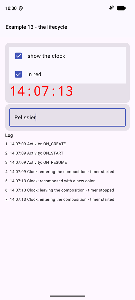
The log shows the sequence: the activity is created, started, and resumed ([ON_CREATE], [ON_START], [ON_RESUME]); the clock is added to the layout; its color changes; then it is unchecked and checked again.
4.5. Example 14: The Data Provided
How can data be shared between distant components without passing it from parameter to parameter through all the intermediaries? Using a [CompositionLocal], a piece of data that is “local to the composition”: it is DECLARED once; a component passes it to all its descendants ([CompositionLocalProvider]); any descendant READS it. [Compose] uses it itself: [MaterialTheme.colorScheme], [LocalContext.current], [LocalDensity.current]... This is the equivalent of [InheritedWidget] and the [provider] package from [Flutter].
A log, displayed full-screen:
| // =========================================================================
// ex14/providers/Log.kt - a piece of data for the WHOLE application
// -------------------------------------------------------------------------
// How to share data and functions between distant components,
// without passing them from parameter to parameter through all the
// intermediaries? With a CompositionLocal, a piece of data "local to the
// composition":
// 1. it is DECLARED once: val LocalLog = staticCompositionLocalOf<Log> { ... };
// 2. a component placed high in the tree PROVIDES it to all its
// descendants: CompositionLocalProvider(LocalLog provides log) { ... };
// 3. any descendant, at any depth, READS it:
// LocalLog.current.
// It is the mechanism that Compose uses itself: MaterialTheme.colorScheme,
// LocalContext.current, LocalDensity.current... are readings of
// CompositionLocal.
//
// The log itself is an ordinary object, whose state (its lines) is
// OBSERVED by Compose (mutableStateListOf): a component that reads its
// lines is recomposed when they change.
// =========================================================================
package fr.stahe.examples.ex14.providers
import androidx.compose.runtime.mutableStateListOf
import androidx.compose.runtime.staticCompositionLocalOf
import java.time.LocalTime
import java.time.format.DateTimeFormatter
class Log {
// the observed list; outside, it is only seen as an UNMODIFIABLE List
private val _lines = mutableStateListOf<String>()
val lines: List<String> get() = _lines
fun trace(message: String) {
_lines.add(0, "${LocalTime.now().format(DateTimeFormatter.ofPattern("HH:mm:ss"))} $message")
if (_lines.size > 6) _lines.removeAt(_lines.lastIndex)
}
}
// the declaration: the type of the data, and what happens if nobody
// provides it (here, an explicit error).
// static: the provided log never changes (it is its CONTENT that changes)
val LocalLog = staticCompositionLocalOf<Log> { error("LocalLog: no log provided above this component") }
|
- lines 30–31: the log status, an observed list, which is exposed externally only as a NON-modifiable [List];
- line 8: the declaration: the data type, and what happens if no one provides it (an explicit error). [static]: the provided data never changes (it is its CONTENT that changes).
A shopping cart, provided to a part of the screen by a provider component, which creates it:
| // =========================================================================
// ex14/providers/Cart.kt - a piece of data provided by ONE component
// -------------------------------------------------------------------------
// The cart is only provided to a part of the tree: the components
// that CartProvider wraps (cf. Ex14Activity.kt). Two providers
// placed at two places of the screen would give two independent carts.
// It is the provider that CREATES the cart (remember); it
// itself uses the log.
// =========================================================================
package fr.stahe.examples.ex14.providers
import androidx.compose.runtime.Composable
import androidx.compose.runtime.CompositionLocalProvider
import androidx.compose.runtime.mutableStateListOf
import androidx.compose.runtime.remember
import androidx.compose.runtime.staticCompositionLocalOf
data class Item(val label: String, val price: Double)
class Cart(private val log: Log) {
private val _items = mutableStateListOf<Item>()
val items: List<Item> get() = _items
// a computed value: sumOf adds up a value of each item
val total: Double get() = _items.sumOf { it.price }
fun add(item: Item) {
_items.add(item)
log.trace("cart: + ${item.label}")
}
fun remove(index: Int) {
log.trace("cart: - ${_items[index].label}")
_items.removeAt(index)
}
}
val LocalCart = staticCompositionLocalOf<Cart> { error("LocalCart: no cart provided above this component") }
// the provider: it creates the cart ONCE, and provides it to its content
@Composable
fun CartProvider(content: @Composable () -> Unit) {
val log = LocalLog.current
val cart = remember { Cart(log) }
CompositionLocalProvider(LocalCart provides cart, content = content)
}
|
- line 25: [total], a calculated property; [sumOf] adds up the value of each item;
- lines 42–45: the provider creates the shopping cart ONCE ([remember]) and populates it with its contents; it reads the log itself, provided above.
A clock, provided with a configurable period:
| // =========================================================================
// ex14/providers/Clock.kt - a PARAMETERIZED provider
// -------------------------------------------------------------------------
// A clock, whose refresh period is a parameter of the
// provider: ClockProvider(periodMs = 5000) { ... }.
// Two nested providers: a component reads the one that is the
// NEAREST above it.
// This time, the provided data CHANGES (the time, on each tick):
// compositionLocalOf (and not staticCompositionLocalOf). Compose then only
// recomposes the components that READ the time.
// The clock stops when its provider disappears (LaunchedEffect).
// =========================================================================
package fr.stahe.examples.ex14.providers
import androidx.compose.runtime.Composable
import androidx.compose.runtime.CompositionLocalProvider
import androidx.compose.runtime.LaunchedEffect
import androidx.compose.runtime.compositionLocalOf
import androidx.compose.runtime.getValue
import androidx.compose.runtime.mutableStateOf
import androidx.compose.runtime.remember
import androidx.compose.runtime.setValue
import kotlinx.coroutines.delay
import java.time.LocalDateTime
// the default value: a frozen date, read by a component without a provider
val LocalClock = compositionLocalOf { LocalDateTime.of(2026, 1, 1, 0, 0) }
@Composable
fun ClockProvider(periodMs: Long = 1000, content: @Composable () -> Unit) {
var now by remember { mutableStateOf(LocalDateTime.now()) }
// if the period changes, the coroutine is cancelled and relaunched
LaunchedEffect(periodMs) {
while (true) {
delay(periodMs)
now = LocalDateTime.now()
}
}
CompositionLocalProvider(LocalClock provides now, content = content)
}
|
- line 27: this time, the data provided CHANGES (the time, at each tick): [compositionLocalOf], not [staticCompositionLocalOf]. [Compose] then reconstructs only the components that READ the time;
- lines 33–36: if the period changes, the coroutine is canceled and restarted.
Two descendants that use the basket:
| // ex14/Catalog.kt - a descendant that ADDS to the cart
package fr.stahe.examples.ex14
import androidx.compose.foundation.layout.Column
import androidx.compose.material.icons.Icons
import androidx.compose.material.icons.filled.ShoppingCart
import androidx.compose.material3.Card
import androidx.compose.material3.Icon
import androidx.compose.material3.IconButton
import androidx.compose.material3.ListItem
import androidx.compose.material3.Text
import androidx.compose.runtime.Composable
import fr.stahe.examples.ex14.providers.Item
import fr.stahe.examples.ex14.providers.LocalCart
val catalog = listOf(Item("Consultation", 30.0), Item("Vaccine", 12.5), Item("Certificate", 5.0))
@Composable
fun Catalog() {
// the cart provided by ShopPage (an error if nobody provides it)
val cart = LocalCart.current
Card {
Column {
for (item in catalog) {
ListItem(
headlineContent = { Text("${item.label} (€${item.price})") },
trailingContent = {
IconButton(onClick = { cart.add(item) }) {
Icon(Icons.Default.ShoppingCart, contentDescription = "add ${item.label}")
}
},
)
}
}
}
}
// =========================================================================
// ex14/CartSummary.kt
// -------------------------------------------------------------------------
// Another descendant: the SAME cart as Catalog, but ITS OWN
// clock, refreshed every 5 seconds. A component only reads the
// providers placed ABOVE it: CartSummary therefore places a second
// ClockProvider around its content, which it hands over to a small
// component, Content, which reads the NEAREST clock: the 5 s one.
// =========================================================================
package fr.stahe.examples.ex14
import androidx.compose.foundation.layout.Column
import androidx.compose.foundation.layout.Row
import androidx.compose.foundation.layout.padding
import androidx.compose.material3.Card
import androidx.compose.material3.MaterialTheme
import androidx.compose.material3.Text
import androidx.compose.material3.TextButton
import androidx.compose.runtime.Composable
import androidx.compose.ui.Alignment
import androidx.compose.ui.Modifier
import androidx.compose.ui.text.font.FontWeight
import androidx.compose.ui.unit.dp
import fr.stahe.examples.ex14.providers.ClockProvider
import fr.stahe.examples.ex14.providers.LocalClock
import fr.stahe.examples.ex14.providers.LocalCart
@Composable
fun CartSummary() {
ClockProvider(periodMs = 5000) { Content() }
}
@Composable
private fun Content() {
val cart = LocalCart.current
val now = LocalClock.current // the nearest one: the 5 s one
Card {
Column(Modifier.padding(12.dp)) {
Text(
"Cart (${cart.items.size} item(s)) - ${now.toLocalTime().withNano(0)}",
style = MaterialTheme.typography.titleSmall,
)
cart.items.forEachIndexed { i, item ->
Row(verticalAlignment = Alignment.CenterVertically) {
Text(item.label)
TextButton(onClick = { cart.remove(i) }) { Text("remove") }
}
}
Text("Total: €${cart.total}", fontWeight = FontWeight.Bold)
}
}
}
|
- lines 29–30: [CartSummary] places a SECOND clock provider (5 seconds) around its content: a component reads the NEAREST clock provider above it.
The screen:
| // =========================================================================
// ex14/Ex14Activity.kt - three levels of provided data
// -------------------------------------------------------------------------
// - the log: provided at the very top, by the activity, to the whole screen;
// - the cart, provided by ShopPage: shared by Catalog and
// CartSummary, which see the SAME cart;
// - the clock, provided by ShopPage (default period, 1 s) AND by
// CartSummary (5 s): each one its own.
// =========================================================================
package fr.stahe.examples.ex14
import android.os.Bundle
import androidx.activity.ComponentActivity
import androidx.activity.compose.setContent
import androidx.activity.enableEdgeToEdge
import androidx.compose.foundation.layout.Spacer
import androidx.compose.foundation.layout.height
import androidx.compose.material3.MaterialTheme
import androidx.compose.material3.Text
import androidx.compose.runtime.Composable
import androidx.compose.runtime.CompositionLocalProvider
import androidx.compose.ui.Modifier
import androidx.compose.ui.graphics.Color
import androidx.compose.ui.unit.dp
import androidx.compose.ui.unit.sp
import fr.stahe.examples.common.ExamplePage
import fr.stahe.examples.common.ExamplesTheme
import fr.stahe.examples.ex14.providers.ClockProvider
import fr.stahe.examples.ex14.providers.CartProvider
import fr.stahe.examples.ex14.providers.Log
import fr.stahe.examples.ex14.providers.LocalClock
import fr.stahe.examples.ex14.providers.LocalLog
class Ex14Activity : ComponentActivity() {
// the log: an object created with the activity
private val log = Log()
override fun onCreate(savedInstanceState: Bundle?) {
super.onCreate(savedInstanceState)
enableEdgeToEdge()
setContent {
// the log, provided to the WHOLE screen
CompositionLocalProvider(LocalLog provides log) {
ExamplesTheme { ShopPage() }
}
}
}
}
// the time of the page's clock: a small component, placed UNDER the provider
@Composable
private fun PageTime() {
Text("Clock of the page: ${LocalClock.current.toLocalTime().withNano(0)}", color = Color.Gray)
}
@Composable
fun ShopPage() {
// the page reads the log: it will be recomposed on each new line
val log = LocalLog.current
ClockProvider {
CartProvider {
ExamplePage("Example 14 - provided data") {
PageTime()
Catalog()
CartSummary()
Spacer(Modifier.height(12.dp))
Text("Log (provided to the whole screen)", style = MaterialTheme.typography.titleSmall)
for (line in log.lines) {
Text(line, fontSize = 12.sp)
}
}
}
}
}
|
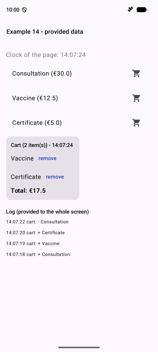
- lines 43–44: the log, an activity object, rendered on the screen;
- lines 60–65: the clock (1 s) and the shopping cart, provided to the page; [Catalog] and [CartSummary] see the SAME shopping cart.
4.6. Example 15: Reusing behaviors
Reusing a DISPLAY involves writing a component. To reuse a BEHAVIOR (and its state), [Compose] offers two tools: a “wrapper” component, or a [remember...] function. A wrapper that highlights its content when it is touched:
| // =========================================================================
// ex15/Highlighter.kt - a behaviour in a "wrapper" component
// -------------------------------------------------------------------------
// The first way to reuse a BEHAVIOUR (with its state): a
// component that wraps any content and adds this
// behaviour to it:
// Highlighter(color = ...) { ListItem(...) }
// This one highlights its content while it is being TOUCHED (the finger on
// the screen), and, with a mouse (tablet, ChromeOS), while it is
// HOVERED. Each Highlighter has its own state: two lines do not interfere.
// =========================================================================
package fr.stahe.examples.ex15
import androidx.compose.animation.animateColorAsState
import androidx.compose.animation.core.tween
import androidx.compose.foundation.background
import androidx.compose.foundation.gestures.awaitEachGesture
import androidx.compose.foundation.gestures.awaitFirstDown
import androidx.compose.foundation.gestures.waitForUpOrCancellation
import androidx.compose.foundation.hoverable
import androidx.compose.foundation.interaction.MutableInteractionSource
import androidx.compose.foundation.interaction.collectIsHoveredAsState
import androidx.compose.foundation.layout.Box
import androidx.compose.runtime.Composable
import androidx.compose.runtime.getValue
import androidx.compose.runtime.mutableStateOf
import androidx.compose.runtime.remember
import androidx.compose.runtime.setValue
import androidx.compose.ui.Modifier
import androidx.compose.ui.graphics.Color
import androidx.compose.ui.input.pointer.pointerInput
@Composable
fun Highlighter(color: Color = Color(0xFFFFF3CD), content: @Composable () -> Unit) {
var touched by remember { mutableStateOf(false) }
// hovering by a mouse: an "interaction source", whose
// "hovered" state is observed
val interactions = remember { MutableInteractionSource() }
val hovered by interactions.collectIsHoveredAsState()
// an ANIMATED color change (200 ms)
val fill by animateColorAsState(if (touched || hovered) color else Color.Transparent, tween(200), label = "fill")
Box(
Modifier
.background(fill)
.hoverable(interactions)
// the finger's contacts, at the lowest level: the finger touches down,
// then lifts (or the gesture is cancelled). requireUnconsumed = false:
// even if the content (a button) has already handled the press
.pointerInput(Unit) {
awaitEachGesture {
awaitFirstDown(requireUnconsumed = false)
touched = true
waitForUpOrCancellation()
touched = false
}
},
) {
content()
}
}
|
- lines 38–39: mouse hover (tablet, [ChromeOS]): an “interaction source,” whose “hovered” state is observed;
- line 41: [animateColorAsState]: an ANIMATED color change;
- lines 49–54: finger touches at the lowest level: for each gesture ([awaitEachGesture]), we wait for the finger to touch the screen, then for it to lift. [requireUnconsumed = false]: even if the content (a button) has already processed the press.
A component with an animation: a button that must be held down for one second while a ring fills up:
| // =========================================================================
// ex15/LongPressButton.kt - a long-press button
// -------------------------------------------------------------------------
// LongPressButton(durationMs = 1000, onAction = { remove() }) { Text(...) }
// The action is only executed if the button is held down for
// the whole duration: a protection against unfortunate presses. A ring
// fills up during the press.
// The filling is an ANIMATION: an Animatable is a value (from 0 to 1)
// that a coroutine varies, frame after frame (animateTo). Cancelling the
// coroutine (the finger lifts too early) stops the animation.
// =========================================================================
package fr.stahe.examples.ex15
import androidx.compose.animation.core.Animatable
import androidx.compose.animation.core.LinearEasing
import androidx.compose.animation.core.tween
import androidx.compose.foundation.gestures.detectTapGestures
import androidx.compose.foundation.layout.Row
import androidx.compose.foundation.layout.Spacer
import androidx.compose.foundation.layout.size
import androidx.compose.foundation.layout.width
import androidx.compose.material3.CircularProgressIndicator
import androidx.compose.runtime.Composable
import androidx.compose.runtime.getValue
import androidx.compose.runtime.remember
import androidx.compose.runtime.rememberCoroutineScope
import androidx.compose.runtime.rememberUpdatedState
import androidx.compose.ui.Alignment
import androidx.compose.ui.Modifier
import androidx.compose.ui.graphics.Color
import androidx.compose.ui.input.pointer.pointerInput
import androidx.compose.ui.unit.dp
import kotlinx.coroutines.launch
@Composable
fun LongPressButton(durationMs: Int = 1000, onAction: () -> Unit, content: @Composable () -> Unit) {
val progress = remember { Animatable(0f) }
// the scope of the component's coroutines: they are cancelled if it disappears
val scope = rememberCoroutineScope()
val action by rememberUpdatedState(onAction)
Row(
verticalAlignment = Alignment.CenterVertically,
modifier = Modifier.pointerInput(Unit) {
detectTapGestures(
// onPress: the finger touches down; tryAwaitRelease WAITS for it to lift
onPress = {
val filling = scope.launch {
progress.animateTo(1f, tween(durationMs, easing = LinearEasing))
// the animation has gone to the end: the press lasted long enough
progress.snapTo(0f)
action()
}
tryAwaitRelease()
// the finger lifts too early: the filling is stopped, the ring empties
if (filling.isActive) {
filling.cancel()
scope.launch { progress.animateTo(0f, tween(200)) }
}
},
)
},
) {
CircularProgressIndicator(
progress = { progress.value },
modifier = Modifier.size(22.dp),
color = Color.Red,
strokeWidth = 3.dp,
trackColor = Color(0xFFFFEBEE),
)
Spacer(Modifier.width(8.dp))
content()
}
}
|
- lines 37–39: a [Animatable], a value (from 0 to 1) that a coroutine increments frame by frame; [rememberCoroutineScope]: a scope for launching coroutines from an event;
- lines 47–58: the finger is placed: the fill is launched ([animateTo(1f)], in [durationMs]); if it reaches the end, the action is executed. [tryAwaitRelease()] WAITS for the finger to be lifted: if the fill operation is still in progress, it is canceled, and the ring is emptied.
A function [remember...], which RETURNS an object after setting up its state and effects (this is the convention for [Compose]: [rememberScrollState()], [rememberCoroutineScope()]...), is as follows:
| // =========================================================================
// ex15/FocusOnStart.kt - a behaviour in a "remember..." function
// -------------------------------------------------------------------------
// The second way to reuse a behaviour: a
// @Composable function that RETURNS an object, after having set up its state and
// its effects. It is the Compose convention (rememberScrollState(),
// rememberCoroutineScope()...): its name starts with "remember".
// val focus = rememberFocusOnStart()
// OutlinedTextField(..., modifier = Modifier.focusRequester(focus))
// The field that uses this FocusRequester receives the focus as soon as the screen
// is displayed.
// =========================================================================
package fr.stahe.examples.ex15
import androidx.compose.runtime.Composable
import androidx.compose.runtime.LaunchedEffect
import androidx.compose.runtime.remember
import androidx.compose.ui.focus.FocusRequester
@Composable
fun rememberFocusOnStart(): FocusRequester {
val focus = remember { FocusRequester() }
// after the first display: the field exists, it is given the focus
LaunchedEffect(Unit) { focus.requestFocus() }
return focus
}
|
The screen:
| // =========================================================================
// ex15/Ex15Activity.kt - reusing behaviours
// -------------------------------------------------------------------------
// Three Compose tools to reuse a BEHAVIOUR (and its state),
// and not a mere display:
// - a "wrapper" component (Highlighter);
// - a component that carries an animation (LongPressButton);
// - a "remember..." function (rememberFocusOnStart).
// =========================================================================
package fr.stahe.examples.ex15
import android.os.Bundle
import androidx.activity.ComponentActivity
import androidx.activity.compose.setContent
import androidx.activity.enableEdgeToEdge
import androidx.compose.foundation.layout.Spacer
import androidx.compose.foundation.layout.fillMaxWidth
import androidx.compose.foundation.layout.height
import androidx.compose.material3.ListItem
import androidx.compose.material3.ListItemDefaults
import androidx.compose.material3.OutlinedTextField
import androidx.compose.material3.Text
import androidx.compose.runtime.Composable
import androidx.compose.runtime.getValue
import androidx.compose.runtime.key
import androidx.compose.runtime.mutableStateListOf
import androidx.compose.runtime.mutableStateOf
import androidx.compose.runtime.remember
import androidx.compose.runtime.setValue
import androidx.compose.ui.Modifier
import androidx.compose.ui.focus.focusRequester
import androidx.compose.ui.graphics.Color
import androidx.compose.ui.unit.dp
import fr.stahe.examples.common.ExamplePage
import fr.stahe.examples.common.ExamplesTheme
class Ex15Activity : ComponentActivity() {
override fun onCreate(savedInstanceState: Bundle?) {
super.onCreate(savedInstanceState)
enableEdgeToEdge()
setContent { ExamplesTheme { BehavioursPage() } }
}
}
@Composable
fun BehavioursPage() {
val doctors = remember { mutableStateListOf("Mme Marie PELISSIER", "Mr Paul TATOU", "Melle Sophie DUPONT") }
var message by remember { mutableStateOf("") }
// the FocusRequester prepared by rememberFocusOnStart
val focus = rememberFocusOnStart()
var input by remember { mutableStateOf("") }
ExamplePage("Example 15 - reusing behaviours") {
OutlinedTextField(
value = input,
onValueChange = { input = it },
placeholder = { Text("this field received the focus on its own") },
modifier = Modifier.fillMaxWidth().focusRequester(focus),
)
Spacer(Modifier.height(12.dp))
Text("Touch the lines; hold a button down for one second to delete.", color = Color.Gray)
doctors.forEachIndexed { i, d ->
key(d) {
// one line out of two: the default color; the others, green
Highlighter(color = if (i % 2 == 0) Color(0xFFFFF3CD) else Color(0xFFD1E7DD)) {
ListItem(
// a transparent background: the Highlighter's one shows through
colors = ListItemDefaults.colors(containerColor = Color.Transparent),
headlineContent = { Text(d) },
trailingContent = {
LongPressButton(onAction = {
doctors.remove(d)
message = "$d has been deleted."
}) {
Text("Delete", color = Color.Red)
}
},
)
}
}
}
Spacer(Modifier.height(12.dp))
if (message.isNotEmpty()) {
Text(message, color = Color(0xFF3F51B5))
}
}
}
|
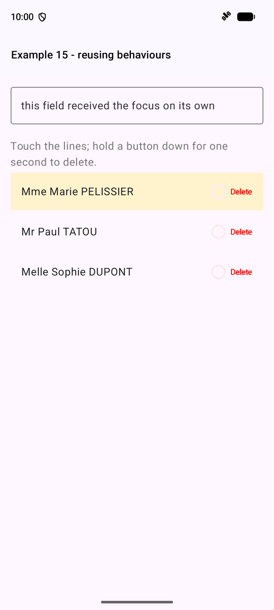
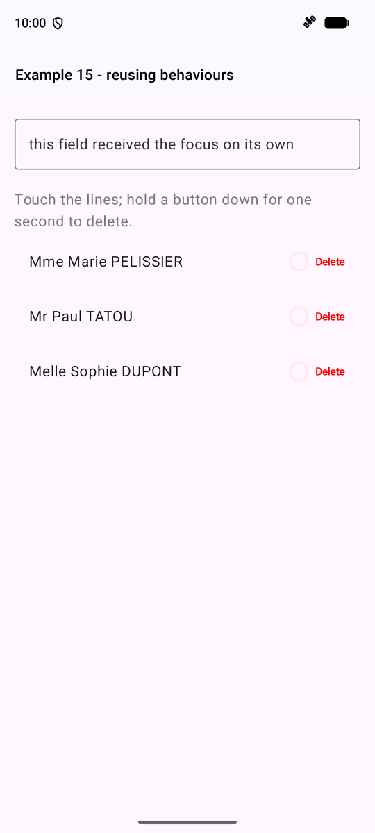
On the left, the finger is resting on the first line: it is highlighted; on the right, the “Delete” button was held down for a second.
4.7. Example 16: A Reusable Confirmation Window
With [Compose], a window ([AlertDialog]) is a component like any other: it is displayed as long as a state requests it. To ask a question and provide the answer, we write a small class whose [confirm] function is a SUSPEND function (see Example 19):
| // =========================================================================
// ex16/Confirmation.kt - "Are you sure?"
// -------------------------------------------------------------------------
// With Compose, a dialog (AlertDialog) is a component like any other:
// it is displayed as long as a state asks for it. To ask a question
// and WAIT for the answer, we write a small class, Confirmation, whose
// confirm function is a SUSPEND function (suspend, cf. example
// 19): it opens the dialog, then waits, without blocking the phone, for
// the user to answer. The calling code is then written very simply,
// in a coroutine:
//
// if (confirmation.confirm("Delete this doctor?")) { ... }
//
// Closing the dialog WITHOUT answering (press outside, the phone's Back
// button) is treated as a "no".
// The dialog itself is displayed by ConfirmDialog(confirmation),
// placed once in the screen.
// =========================================================================
package fr.stahe.examples.ex16
import androidx.compose.material3.AlertDialog
import androidx.compose.material3.Button
import androidx.compose.material3.ButtonDefaults
import androidx.compose.material3.Text
import androidx.compose.material3.TextButton
import androidx.compose.runtime.Composable
import androidx.compose.runtime.getValue
import androidx.compose.runtime.mutableStateOf
import androidx.compose.runtime.remember
import androidx.compose.runtime.setValue
import androidx.compose.ui.graphics.Color
import kotlinx.coroutines.CompletableDeferred
class Confirmation {
// the question asked (null: no dialog)
var question by mutableStateOf<String?>(null)
private set
// the expected answer: a value that will arrive LATER
private var answer: CompletableDeferred<Boolean>? = null
suspend fun confirm(message: String): Boolean {
val waiting = CompletableDeferred<Boolean>()
answer = waiting
question = message // the dialog is displayed
try {
return waiting.await() // the coroutine is suspended until the answer
} finally {
question = null // the dialog disappears
}
}
fun respond(yes: Boolean) {
answer?.complete(yes)
}
}
// remember: the Confirmation survives the recompositions of the screen
@Composable
fun rememberConfirmation(): Confirmation = remember { Confirmation() }
@Composable
fun ConfirmDialog(confirmation: Confirmation) {
// ?: return: no question, nothing to display
val question = confirmation.question ?: return
// AlertDialog: a Material dialog, with title, content and buttons
AlertDialog(
onDismissRequest = { confirmation.respond(false) }, // closed without answer: "no"
title = { Text("Confirmation") },
text = { Text(question) },
dismissButton = { TextButton(onClick = { confirmation.respond(false) }) { Text("No, go back") } },
confirmButton = {
Button(
onClick = { confirmation.respond(true) },
colors = ButtonDefaults.buttonColors(containerColor = Color(0xFFD32F2F)),
) { Text("Yes, confirm") }
},
)
}
|
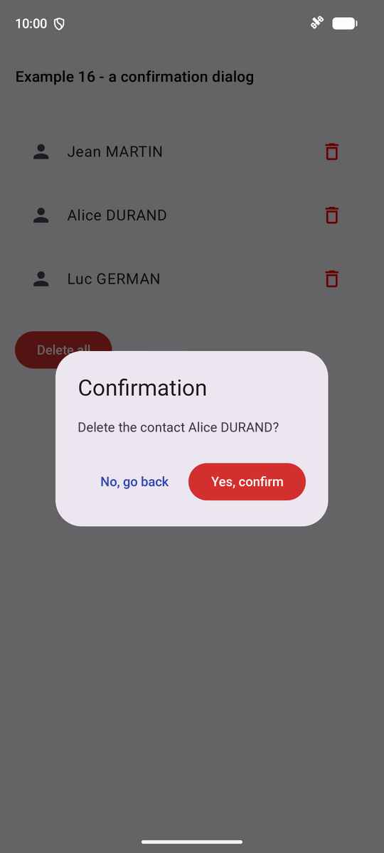
- lines 36–37: the question asked ([null]: no window), an observed state;
- lines 42–49: [CompletableDeferred]: a value that will arrive LATER. [confirm] displays the window, then WAITS for the response ([await()]), without freezing the phone; [finally]: in any case, the window disappears;
- lines 53–54: a button of the window PROVIDES the response: the waiting coroutine resumes;
- lines 63–68: the window: nothing if there is no question ([?: return]); closing it without answering (tapping outside the window or pressing the phone’s Back button) is treated as “no.”
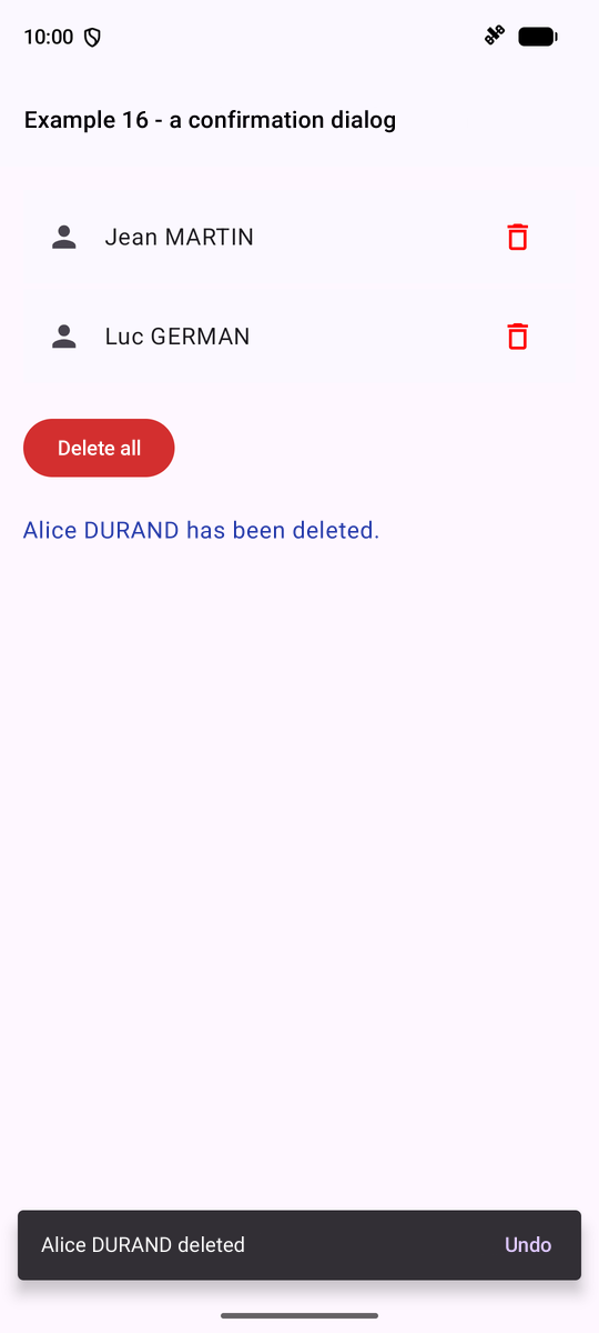
The screen: a list of contacts, and, after each deletion, a pop-up message ([Snackbar]) with a “Undo” button—another method, very common on mobile devices, to protect the user from making a mistake:
| // =========================================================================
// ex16/Ex16Activity.kt - using the confirmation dialog
// -------------------------------------------------------------------------
// A deletion, then a short-lived message at the bottom of the screen (Snackbar),
// with an "Undo" button: the other way, very common on mobile, to
// protect the user from a mistake.
// The two waits (the answer to the question, the "Undo" button of the
// message) are done in a COROUTINE, launched by rememberCoroutineScope.
// =========================================================================
package fr.stahe.examples.ex16
import android.os.Bundle
import androidx.activity.ComponentActivity
import androidx.activity.compose.setContent
import androidx.activity.enableEdgeToEdge
import androidx.compose.foundation.layout.Spacer
import androidx.compose.foundation.layout.height
import androidx.compose.material.icons.Icons
import androidx.compose.material.icons.filled.Person
import androidx.compose.material.icons.outlined.Delete
import androidx.compose.material3.Button
import androidx.compose.material3.ButtonDefaults
import androidx.compose.material3.Icon
import androidx.compose.material3.IconButton
import androidx.compose.material3.ListItem
import androidx.compose.material3.SnackbarDuration
import androidx.compose.material3.SnackbarHostState
import androidx.compose.material3.SnackbarResult
import androidx.compose.material3.Text
import androidx.compose.runtime.Composable
import androidx.compose.runtime.getValue
import androidx.compose.runtime.mutableStateListOf
import androidx.compose.runtime.mutableStateOf
import androidx.compose.runtime.remember
import androidx.compose.runtime.rememberCoroutineScope
import androidx.compose.runtime.setValue
import androidx.compose.ui.Modifier
import androidx.compose.ui.graphics.Color
import androidx.compose.ui.unit.dp
import fr.stahe.examples.common.ExamplePage
import fr.stahe.examples.common.ExamplesTheme
import kotlinx.coroutines.launch
data class Contact(val id: Int, val name: String)
class Ex16Activity : ComponentActivity() {
override fun onCreate(savedInstanceState: Bundle?) {
super.onCreate(savedInstanceState)
enableEdgeToEdge()
setContent { ExamplesTheme { ContactsPage() } }
}
}
@Composable
fun ContactsPage() {
val contacts = remember { mutableStateListOf(Contact(1, "Jean MARTIN"), Contact(2, "Alice DURAND"), Contact(3, "Luc GERMAN")) }
var message by remember { mutableStateOf("") }
val confirmation = rememberConfirmation()
// the area of the short-lived messages, and a scope to launch coroutines
val messages = remember { SnackbarHostState() }
val scope = rememberCoroutineScope()
// a suspend function: it "waits" for the user's answer
suspend fun remove(c: Contact) {
if (!confirmation.confirm("Delete the contact ${c.name}?")) {
message = "Deletion abandoned."
return
}
val position = contacts.indexOf(c)
contacts.remove(c)
message = "${c.name} has been deleted."
// a short-lived message at the bottom of the screen; showSnackbar waits for its
// disappearance, and tells whether its button has been touched
val result = messages.showSnackbar("${c.name} deleted", actionLabel = "Undo", duration = SnackbarDuration.Short)
if (result == SnackbarResult.ActionPerformed) {
contacts.add(position, c)
message = "${c.name} is back."
}
}
suspend fun removeAll() {
if (confirmation.confirm("Delete the ${contacts.size} contacts?")) {
contacts.clear()
message = "All the contacts have been deleted."
}
}
ExamplePage("Example 16 - a confirmation dialog", messages = messages) {
for (c in contacts) {
ListItem(
leadingContent = { Icon(Icons.Default.Person, contentDescription = null) },
headlineContent = { Text(c.name) },
trailingContent = {
// launch: a coroutine, to be able to call the suspend function
IconButton(onClick = { scope.launch { remove(c) } }) {
Icon(Icons.Outlined.Delete, contentDescription = "delete ${c.name}", tint = Color.Red)
}
},
)
}
if (contacts.isEmpty()) {
ListItem(headlineContent = { Text("No contact.", color = Color.Gray) })
}
Spacer(Modifier.height(12.dp))
Button(
onClick = { scope.launch { removeAll() } },
// the button is disabled when the list is empty
enabled = contacts.isNotEmpty(),
colors = ButtonDefaults.buttonColors(containerColor = Color(0xFFD32F2F)),
) { Text("Delete all") }
Spacer(Modifier.height(12.dp))
if (message.isNotEmpty()) {
Text(message, color = Color(0xFF3F51B5))
}
}
// the dialog, when a question is asked
ConfirmDialog(confirmation)
}
|
- lines 60–61: the area for pop-up messages, passed to [ExamplePage] (which passes it to [Scaffold]), and a coroutine scope;
- lines 64–77: a suspended function that reads like ordinary code: make a request, wait for the response; delete; display the message, WAIT for its disappearance ([showSnackbar] indicates whether its button was tapped), and cancel if necessary;
- line 95: [scope.launch [ ... ]]: a coroutine, to be able to call a suspended function from an event;
- line 117: the window, placed on the screen once.