3. Getting Started with Kotlin and Jetpack Compose
3.1. Example 01: The Structure of an Android App
3.1.1. The Project
The example project was created by [Android Studio] (template [Empty Activity], see previous chapter), and then completed. A [Android] project is a [Gradle] project: the tool that downloads the libraries, compiles the [Kotlin] code, and generates the [.apk] file installed on the phone. It is described by a few files written in [Kotlin] (the [.kts] files, “Kotlin script”).
3.1.2. The settings.gradle.kts file
| // =========================================================================
// settings.gradle.kts - the GLOBAL configuration of the Gradle project
// (generated by Android Studio; only rootProject.name has been changed)
// =========================================================================
// where Gradle looks for its PLUGINS (the Android plugin, the Compose plugin...)
pluginManagement {
repositories {
google {
content {
includeGroupByRegex("com\\.android.*")
includeGroupByRegex("com\\.google.*")
includeGroupByRegex("androidx.*")
}
}
mavenCentral()
gradlePluginPortal()
}
}
plugins {
id("org.gradle.toolchains.foojay-resolver-convention") version "1.0.0"
}
// where Gradle looks for the LIBRARIES: google() for AndroidX and Compose,
// mavenCentral() for OkHttp, kotlinx.serialization, AndroidSVG
dependencyResolutionManagement {
repositoriesMode.set(RepositoriesMode.FAIL_ON_PROJECT_REPOS)
repositories {
google()
mavenCentral()
}
}
rootProject.name = "examples_kotlin"
// a single module: the application, in the app/ folder
include(":app")
|
- lines 7–17: where [Gradle] looks for its PLUGINS (extensions of [Gradle]: the [Android] plugin, the [Compose] compiler...) : the Google repository and the central Java libraries repository ([Maven Central]);
- lines 25–29: where [Gradle] looks for the application’s LIBRARIES;
- lines 3–11: the project name and its single module, the application, in the [app/] folder.
3.1.3. The version catalog: gradle/libs.versions.toml
All plugin and library versions are combined into a single file in the TOML format:
| # =========================================================================
# gradle/libs.versions.toml - the "version catalog" of the project
# -------------------------------------------------------------------------
# ALL the versions of the plugins and libraries, in a single place.
# The build.gradle.kts files refer to them by names
# (libs.okhttp, libs.plugins.kotlin.compose...). It is the equivalent of the
# dependencies section of Flutter's pubspec.yaml.
# =========================================================================
[versions]
agp = "9.4.1"
kotlin = "2.2.10"
coreKtx = "1.17.0"
lifecycle = "2.9.4"
activityCompose = "1.11.0"
composeBom = "2026.02.01"
appcompat = "1.7.1"
navigation = "2.9.5"
datastore = "1.1.7"
okhttp = "4.12.0"
kotlinxSerializationJson = "1.9.0"
androidsvg = "1.4"
junit = "4.13.2"
junitVersion = "1.3.0"
espressoCore = "3.7.0"
testRunner = "1.7.0"
[libraries]
# --- generated by Android Studio ("Empty Activity" template) ---
androidx-core-ktx = { group = "androidx.core", name = "core-ktx", version.ref = "coreKtx" }
androidx-lifecycle-runtime-ktx = { group = "androidx.lifecycle", name = "lifecycle-runtime-ktx", version.ref = "lifecycle" }
androidx-activity-compose = { group = "androidx.activity", name = "activity-compose", version.ref = "activityCompose" }
androidx-compose-bom = { group = "androidx.compose", name = "compose-bom", version.ref = "composeBom" }
androidx-compose-ui = { group = "androidx.compose.ui", name = "ui" }
androidx-compose-ui-graphics = { group = "androidx.compose.ui", name = "ui-graphics" }
androidx-compose-ui-tooling = { group = "androidx.compose.ui", name = "ui-tooling" }
androidx-compose-ui-tooling-preview = { group = "androidx.compose.ui", name = "ui-tooling-preview" }
androidx-compose-ui-test-manifest = { group = "androidx.compose.ui", name = "ui-test-manifest" }
androidx-compose-ui-test-junit4 = { group = "androidx.compose.ui", name = "ui-test-junit4" }
androidx-compose-material3 = { group = "androidx.compose.material3", name = "material3" }
junit = { group = "junit", name = "junit", version.ref = "junit" }
androidx-junit = { group = "androidx.test.ext", name = "junit", version.ref = "junitVersion" }
androidx-espresso-core = { group = "androidx.test.espresso", name = "espresso-core", version.ref = "espressoCore" }
androidx-test-runner = { group = "androidx.test", name = "runner", version.ref = "testRunner" }
# --- added for the examples ---
# the basic Material icons (Add, Delete, Search...)
androidx-compose-material-icons-core = { group = "androidx.compose.material", name = "material-icons-core" }
# the lifecycle of the activity seen from Compose (examples 13, 20)
androidx-lifecycle-runtime-compose = { group = "androidx.lifecycle", name = "lifecycle-runtime-compose", version.ref = "lifecycle" }
# viewModel() in a @Composable function (examples 20, 24, 25)
androidx-lifecycle-viewmodel-compose = { group = "androidx.lifecycle", name = "lifecycle-viewmodel-compose", version.ref = "lifecycle" }
# the application's OWN language (examples 21, 25)
androidx-appcompat = { group = "androidx.appcompat", name = "appcompat", version.ref = "appcompat" }
# the router (examples 17, 18)
androidx-navigation-compose = { group = "androidx.navigation", name = "navigation-compose", version.ref = "navigation" }
# a small key -> value dictionary, kept on the device (example 20)
androidx-datastore-preferences = { group = "androidx.datastore", name = "datastore-preferences", version.ref = "datastore" }
# the HTTP client (examples 22 to 25)
okhttp = { group = "com.squareup.okhttp3", name = "okhttp", version.ref = "okhttp" }
# JSON (de)serialization (examples 17, 18, 22 to 25)
kotlinx-serialization-json = { group = "org.jetbrains.kotlinx", name = "kotlinx-serialization-json", version.ref = "kotlinxSerializationJson" }
# drawing an SVG image (example 03, captcha of examples 22 to 25)
androidsvg = { group = "com.caverock", name = "androidsvg-aar", version.ref = "androidsvg" }
[plugins]
android-application = { id = "com.android.application", version.ref = "agp" }
kotlin-compose = { id = "org.jetbrains.kotlin.plugin.compose", version.ref = "kotlin" }
# generates the (de)serialization code of the @Serializable classes
kotlin-serialization = { id = "org.jetbrains.kotlin.plugin.serialization", version.ref = "kotlin" }
|
- section [[versions]]: version numbers, named;
- section [[libraries]]: the libraries, identified by their group and name ([Maven]), and their version. The [Compose] libraries do not have a version: it is “BOM” ([compose-bom], “Bill of Materials”) that sets compatible versions for all of them at once;
- Section [[plugins]]: the plugins for [Gradle]. The [build.gradle.kts] files reference them by name: [libs.okhttp], [libs.plugins.kotlin.compose] (dashes are replaced with periods).
The purpose of each library is explained in the comments; each will be demonstrated in the example that uses it.
3.1.4. The file app/build.gradle.kts
The application’s configuration itself:
| // =========================================================================
// app/build.gradle.kts - the configuration of the "app" module: the application
// of the 25 examples. Generated by Android Studio ("Empty Activity" template),
// then completed (lines marked "added").
// =========================================================================
plugins {
// the Android plugin: compiles the Kotlin code (the Android 9 plugin itself
// includes the Kotlin support) and produces the .apk file
alias(libs.plugins.android.application)
// the Compose compiler: transforms the @Composable functions
alias(libs.plugins.kotlin.compose)
// added: the kotlinx.serialization plugin (@Serializable classes)
alias(libs.plugins.kotlin.serialization)
}
android {
// the base "package" of the code (R class, BuildConfig...)
namespace = "fr.stahe.examples"
// the version of the Android API used to COMPILE
compileSdk {
version = release(37)
}
defaultConfig {
// the UNIQUE identifier of the application on the phone
applicationId = "fr.stahe.examples"
// the oldest accepted Android version: Android 8.0 (API 26)
minSdk = 26
// the Android version the application has been tested for
targetSdk = 37
versionCode = 1
versionName = "1.0"
// added: the address of the JSON server (examples 22 to 25), can be changed at
// compile time: gradlew installDebug -Pserver=http://192.168.1.20:8080
val server = providers.gradleProperty("server").getOrElse("http://localhost:8080")
buildConfigField("String", "SERVER_URL", "\"$server\"")
testInstrumentationRunner = "androidx.test.runner.AndroidJUnitRunner"
}
buildTypes {
release {
optimization {
enable = false
}
}
}
compileOptions {
sourceCompatibility = JavaVersion.VERSION_11
targetCompatibility = JavaVersion.VERSION_11
}
buildFeatures {
compose = true
// added: the BuildConfig class (BuildConfig.SERVER_URL)
buildConfig = true
}
}
dependencies {
// the Compose "BOM": mutually compatible versions for all the
// Compose libraries, declared below WITHOUT a version number
implementation(platform(libs.androidx.compose.bom))
implementation(libs.androidx.activity.compose)
implementation(libs.androidx.compose.material3)
implementation(libs.androidx.compose.ui)
implementation(libs.androidx.compose.ui.graphics)
implementation(libs.androidx.compose.ui.tooling.preview)
implementation(libs.androidx.core.ktx)
implementation(libs.androidx.lifecycle.runtime.ktx)
// added for the examples
implementation(libs.androidx.compose.material.icons.core)
implementation(libs.androidx.lifecycle.runtime.compose)
implementation(libs.androidx.lifecycle.viewmodel.compose)
implementation(libs.androidx.appcompat)
implementation(libs.androidx.navigation.compose)
implementation(libs.androidx.datastore.preferences)
implementation(libs.okhttp)
implementation(libs.kotlinx.serialization.json)
implementation(libs.androidsvg)
// the tests: here, the making of the course screenshots (androidTest folder)
testImplementation(libs.junit)
androidTestImplementation(platform(libs.androidx.compose.bom))
androidTestImplementation(libs.androidx.compose.ui.test.junit4)
androidTestImplementation(libs.androidx.espresso.core)
androidTestImplementation(libs.androidx.junit)
androidTestImplementation(libs.androidx.test.runner)
debugImplementation(libs.androidx.compose.ui.test.manifest)
debugImplementation(libs.androidx.compose.ui.tooling)
}
|
- lines 6–13: the plugins applied to the module: the [Android] plugin (which also compiles [Kotlin]), the [Compose] compiler (which transforms the [@Composable] functions), and the [kotlinx.serialization] plugin (which writes the JSON conversion code for the [@Serializable] classes; see Example 05);
- lines 18–21: [namespace], the base code package (that of the [R] resource class); [compileSdk], the version of API and [Android] used for compilation;
- lines 24–32: [applicationId], the application’s unique identifier on the phone; [minSdk = 26]: the application installs on [Android] 8.0 and later; [targetSdk], the version for which it was tested;
- lines 33–36: a field of the [BuildConfig] class, generated at compile time: the address of the JSON server (examples 22–25), which can be changed at compile time ([-Pserver=...]);
- lines 52–55: [compose = true] activates [Compose]; [buildConfig = true], the class [BuildConfig];
- Lines 59–88: the libraries for the application ([implementation]), the instrumented tests ([androidTestImplementation]), and the debug-only version ([debugImplementation]).
3.1.5. The AndroidManifest.xml file
The manifest is the application’s “identity card” for the [Android] system: its permissions, its [Application] class, its ACTIVITIES—the screens that [Android] can launch:
| <?xml version="1.0" encoding="utf-8"?>
<!-- =====================================================================
AndroidManifest.xml - the "identity card" of the application
............................................................................
Its permissions, its Application class, its activities (one per
example, plus the menu).
===================================================================== -->
<manifest xmlns:android="http://schemas.android.com/apk/res/android"
xmlns:tools="http://schemas.android.com/tools">
<!-- network access (examples 22 to 25): granted automatically, without
asking the user -->
<uses-permission android:name="android.permission.INTERNET" />
<!-- android:name: the Application class (ExamplesApplication.kt).
android:usesCleartextTraffic="true": allows "cleartext" HTTP
(http:// and not https://), blocked by default since Android 9: the
JSON server of this course listens in plain HTTP.
android:localeConfig: the languages of the application (example 21) -->
<application
android:name=".ExamplesApplication"
android:allowBackup="true"
android:dataExtractionRules="@xml/data_extraction_rules"
android:fullBackupContent="@xml/backup_rules"
android:icon="@mipmap/ic_launcher"
android:label="@string/app_name"
android:localeConfig="@xml/locales_config"
android:roundIcon="@mipmap/ic_launcher_round"
android:supportsRtl="true"
android:theme="@style/Theme.Examples"
android:usesCleartextTraffic="true"
tools:targetApi="33">
<!-- the menu: the activity launched by the application icon
(the MAIN / LAUNCHER filter) -->
<activity
android:name=".MainActivity"
android:exported="true">
<intent-filter>
<action android:name="android.intent.action.MAIN" />
<category android:name="android.intent.category.LAUNCHER" />
</intent-filter>
</activity>
<!-- the examples. exported="false": only the application can
open them (adb, however, always can).
windowSoftInputMode="adjustResize": the keyboard shrinks the screen
instead of hiding it -->
<activity android:name=".ex01.Ex01Activity" android:exported="false" android:windowSoftInputMode="adjustResize" />
<activity android:name=".ex02.Ex02Activity" android:exported="false" android:windowSoftInputMode="adjustResize" />
<activity android:name=".ex03.Ex03Activity" android:exported="false" android:windowSoftInputMode="adjustResize" />
<activity android:name=".ex04.Ex04Activity" android:exported="false" android:windowSoftInputMode="adjustResize" />
<activity android:name=".ex05.Ex05Activity" android:exported="false" android:windowSoftInputMode="adjustResize" />
<activity android:name=".ex06.Ex06Activity" android:exported="false" android:windowSoftInputMode="adjustResize" />
<activity android:name=".ex07.Ex07Activity" android:exported="false" android:windowSoftInputMode="adjustResize" />
<activity android:name=".ex08.Ex08Activity" android:exported="false" android:windowSoftInputMode="adjustResize" />
<activity android:name=".ex09.Ex09Activity" android:exported="false" android:windowSoftInputMode="adjustResize" />
<activity android:name=".ex10.Ex10Activity" android:exported="false" android:windowSoftInputMode="adjustResize" />
<activity android:name=".ex11.Ex11Activity" android:exported="false" android:windowSoftInputMode="adjustResize" />
<activity android:name=".ex12.Ex12Activity" android:exported="false" android:windowSoftInputMode="adjustResize" />
<activity android:name=".ex13.Ex13Activity" android:exported="false" android:windowSoftInputMode="adjustResize" />
<activity android:name=".ex14.Ex14Activity" android:exported="false" android:windowSoftInputMode="adjustResize" />
<activity android:name=".ex15.Ex15Activity" android:exported="false" android:windowSoftInputMode="adjustResize" />
<activity android:name=".ex16.Ex16Activity" android:exported="false" android:windowSoftInputMode="adjustResize" />
<activity android:name=".ex19.Ex19Activity" android:exported="false" android:windowSoftInputMode="adjustResize" />
<activity android:name=".ex20.Ex20Activity" android:exported="false" android:windowSoftInputMode="adjustResize" />
<activity android:name=".ex21.Ex21Activity" android:exported="false" android:windowSoftInputMode="adjustResize" />
<activity android:name=".ex22.Ex22Activity" android:exported="false" android:windowSoftInputMode="adjustResize" />
<activity android:name=".ex23.Ex23Activity" android:exported="false" android:windowSoftInputMode="adjustResize" />
<activity android:name=".ex24.Ex24Activity" android:exported="false" android:windowSoftInputMode="adjustResize" />
<activity android:name=".ex25.Ex25Activity" android:exported="false" android:windowSoftInputMode="adjustResize" />
<!-- examples 17 and 18: addresses app://examples/... and
app://examples18/... ("deep links"), that another
application (or adb) can open: a VIEW intent filter -->
<activity android:name=".ex17.Ex17Activity" android:exported="true" android:windowSoftInputMode="adjustResize">
<intent-filter>
<action android:name="android.intent.action.VIEW" />
<category android:name="android.intent.category.DEFAULT" />
<data android:scheme="app" android:host="examples" />
</intent-filter>
</activity>
<activity android:name=".ex18.Ex18Activity" android:exported="true" android:windowSoftInputMode="adjustResize">
<intent-filter>
<action android:name="android.intent.action.VIEW" />
<category android:name="android.intent.category.DEFAULT" />
<data android:scheme="app" android:host="examples18" />
</intent-filter>
</activity>
<!-- example 21: before Android 13, it is AppCompat that stores the
language chosen by the application (autoStoreLocales) -->
<service
android:name="androidx.appcompat.app.AppLocalesMetadataHolderService"
android:enabled="false"
android:exported="false">
<meta-data
android:name="autoStoreLocales"
android:value="true" />
</service>
</application>
</manifest>
|
- line 13: permission to access the network (examples 22 through 25);
- lines 20–32: the application: its class [Application] (example 23), its icon, its name ([@string/app_name], a resource, see example 21), its theme, and “plaintext” traffic HTTP (this course’s server does not use HTTPS);
- lines 37–43: the menu, the startup activity: the intent filter [MAIN] / [LAUNCHER] actually represents the activity launched by the application icon;
- lines 49–71: an example activity; [exported="false"]: only the application can open these.
3.1.6. The activity: Ex01Activity.kt
Code for Example 01:
| // =========================================================================
// ex01/Ex01Activity.kt - a first application
// -------------------------------------------------------------------------
// A screen of an Android application is an ACTIVITY: a class that
// inherits from ComponentActivity, which the system creates when the
// application is launched. With Jetpack Compose, the activity does almost nothing:
// it hands its screen over to @Composable functions (setContent).
// A @Composable function DESCRIBES a piece of the screen (a text, a
// button, a column...) by calling other @Composable functions:
// they form a TREE. Compose executes these functions to build
// the screen; it EXECUTES THEM AGAIN when a piece of data they read (a "state")
// changes: this is RECOMPOSITION. We never modify the screen ourselves.
// =========================================================================
@file:OptIn(ExperimentalMaterial3Api::class)
package fr.stahe.examples.ex01
import android.os.Bundle
import androidx.activity.ComponentActivity
import androidx.activity.compose.setContent
import androidx.activity.enableEdgeToEdge
import androidx.compose.foundation.layout.Column
import androidx.compose.foundation.layout.Spacer
import androidx.compose.foundation.layout.height
import androidx.compose.foundation.layout.padding
import androidx.compose.material3.Button
import androidx.compose.material3.ExperimentalMaterial3Api
import androidx.compose.material3.MaterialTheme
import androidx.compose.material3.Scaffold
import androidx.compose.material3.Text
import androidx.compose.material3.TopAppBar
import androidx.compose.runtime.Composable
import androidx.compose.runtime.getValue
import androidx.compose.runtime.mutableIntStateOf
import androidx.compose.runtime.mutableStateOf
import androidx.compose.runtime.saveable.rememberSaveable
import androidx.compose.runtime.setValue
import androidx.compose.ui.Modifier
import androidx.compose.ui.graphics.Color
import androidx.compose.ui.text.font.FontWeight
import androidx.compose.ui.unit.dp
import fr.stahe.examples.common.ExamplesTheme
import java.time.LocalTime
import java.time.format.DateTimeFormatter
// "ordinary" data, outside the @Composable functions: they never change
const val TITLE = "Welcome to Kotlin"
val languages = listOf("Kotlin", "Jetpack Compose", "Material Design")
// "12:05:09": the current time
fun currentTime(): String = LocalTime.now().format(DateTimeFormatter.ofPattern("HH:mm:ss"))
// the activity: the entry point of the screen (declared in AndroidManifest.xml)
class Ex01Activity : ComponentActivity() {
// onCreate: called by Android when the activity is created
override fun onCreate(savedInstanceState: Bundle?) {
super.onCreate(savedInstanceState)
// the application also draws under the status bar and the navigation bar
enableEdgeToEdge()
// setContent: Compose takes over the screen, and displays in it the
// given @Composable function, wrapped by the theme of the examples
setContent {
ExamplesTheme {
HomePage()
}
}
}
}
// a @Composable function: its name starts with an uppercase letter, like a
// class (it is a piece of interface), and it returns nothing (Unit)
@Composable
fun HomePage() {
// the STATE: variables observed by Compose. Modifying them causes
// the re-execution (recomposition) of the functions that read them.
// rememberSaveable: the value is kept from one execution of the function
// to the next... and even when Android recreates the activity (screen
// rotation, change of language)
var counter by rememberSaveable { mutableIntStateOf(0) }
var time by rememberSaveable { mutableStateOf(currentTime()) }
// Scaffold: the structure of a Material screen (top bar, content...)
Scaffold(
topBar = { TopAppBar(title = { Text("Example 01 - a first application") }) },
) { insets ->
// Column: children placed one below the other; the insets
// of the Scaffold (the room for the top bar), then 16 dp more
Column(modifier = Modifier.padding(insets).padding(16.dp)) {
Text(TITLE, style = MaterialTheme.typography.headlineSmall)
Spacer(Modifier.height(12.dp))
Text(
"This screen is built by Jetpack Compose, from the activity " +
"Ex01Activity and the function HomePage.",
)
Spacer(Modifier.height(8.dp))
// ${expression} inserts the value of an expression into a string
Text("It is written in ${languages.joinToString(", ")} (${languages.size} technologies).")
Spacer(Modifier.height(16.dp))
// onClick: the function (here a "lambda") called when pressed.
// We modify the STATE; Compose updates the screen
Button(onClick = {
counter++
time = currentTime()
}) {
Text("Click me")
}
Spacer(Modifier.height(16.dp))
Text(
"You clicked $counter times (last click: $time).",
fontWeight = FontWeight.Bold,
color = Color(0xFF087EA4),
)
}
}
}
|
- line 16: the package ([package]) of the file: each example has its own, which allows for identical names (a function [HomePage]) to appear in two examples;
- line 14: [@file:OptIn(...)]: some functions of [Material 3] ([TopAppBar]) are still marked as “experimental”; we declare that we are using them with full knowledge of the risks;
- lines 47–48: ordinary data, outside of any [@Composable] function; [const val]: a constant known at compile time;
- line 54: the ACTIVITY, a class that inherits from [ComponentActivity]. [Android] creates it when the screen is launched, then calls its function [onCreate];
- lines 59–64: [enableEdgeToEdge()]: the application also draws below the status bar and below the phone’s navigation bar (this has been the rule since [Android] 15) ; [setContent [ ... ]]: [Compose] takes control of the screen and displays the block’s content there. [ExamplesTheme] (file [common/Theme.kt]) applies the colors from [Material 3] to everything it contains;
- lines 7–73: a function [@Composable]: it DESCRIBES a portion of the screen by calling other functions [@Composable]. By convention, its name begins with a capital letter, like a class; it returns nothing;
- lines 79–80: the STATE. [mutableIntStateOf(0)] creates a value OBSERVED by [Compose]: when it changes, [Compose] re-executes the functions that read it (recomposition). [by] passes the variable [counter] to this state: [counter++] is written just as for an ordinary variable. [rememberSaveable]: the value is preserved from one execution of the function to the next (without [remember], each execution would reset the state to 0)... and even when [Android] RECREATES the activity—which it does every time the screen rotates;
- Lines 83–85: [Scaffold], the structure of a screen [Material]: a top bar ([topBar]) and content. The content is a lambda that receives the MARGINS to be respected (the position of the top bar);
- line 88: [Column] places its children one below the other. [Modifier]: [Compose]’s method for adjusting a component (margins, size, background, gesture response, etc.): modifiers are chained together in the order in which they are applied;
- lines 89–97: text and spacing ([Spacer]); [MaterialTheme.typography.headlineSmall]: one of the theme’s text styles; ["$[...]"] inserts an expression into a string;
- lines 101–105: a button. [onClick] receives the function (a lambda) to be executed when the button is pressed: it changes the state, and that’s it. We never interact with the screen directly: [Compose] re-executes [HomePage], which displays the new counter; the last lambda, enclosed in curly braces after the parentheses, is the button’s CONTENT (its text);
- lines 109–111: text that reads the state; it will be updated with each click.
The theme for the examples, [common/Theme.kt]:
| // =========================================================================
// common/Theme.kt - the theme shared by all the examples
// -------------------------------------------------------------------------
// MaterialTheme: the colors, texts and shapes of Material
// Design 3, that ALL the Material components placed inside use
// (buttons, fields, cards...). We give it a set of colors (a
// ColorScheme), light or dark, built around an indigo blue.
// ExamplesTheme(dark = true): the dark theme (cf. example 20).
// =========================================================================
package fr.stahe.examples.common
import androidx.compose.material3.MaterialTheme
import androidx.compose.material3.darkColorScheme
import androidx.compose.material3.lightColorScheme
import androidx.compose.runtime.Composable
import androidx.compose.ui.graphics.Color
// the colors of the light theme: the others are Material 3's defaults
private val lightColors = lightColorScheme(
primary = Color(0xFF4355B9),
onPrimary = Color.White,
primaryContainer = Color(0xFFDEE0FF),
onPrimaryContainer = Color(0xFF00105C),
secondaryContainer = Color(0xFFE0E1F9),
onSecondaryContainer = Color(0xFF181A2C),
surface = Color(0xFFFBF8FF),
surfaceContainer = Color(0xFFEFEDF4),
surfaceContainerLow = Color(0xFFF5F2FA),
)
// the colors of the dark theme
private val darkColors = darkColorScheme(
primary = Color(0xFFBAC3FF),
onPrimary = Color(0xFF08218A),
primaryContainer = Color(0xFF293CA0),
onPrimaryContainer = Color(0xFFDEE0FF),
secondaryContainer = Color(0xFF434659),
onSecondaryContainer = Color(0xFFE0E1F9),
)
// a @Composable function that "wraps" a content: the content
// parameter is itself a @Composable function (cf. example 12)
@Composable
fun ExamplesTheme(dark: Boolean = false, content: @Composable () -> Unit) {
MaterialTheme(
colorScheme = if (dark) darkColors else lightColors,
content = content,
)
}
|
- [lightColorScheme(...)], [darkColorScheme(...)]: the colors for [Material 3], light and dark; unspecified colors retain their default values;
- [ExamplesTheme(dark, content)]: a function [@Composable] that receives... another function [@Composable], its content. This is the core mechanism of composition (see Example 12): [ExamplesTheme [ HomePage() ]] calls [MaterialTheme] with this content.
3.1.7. Execution
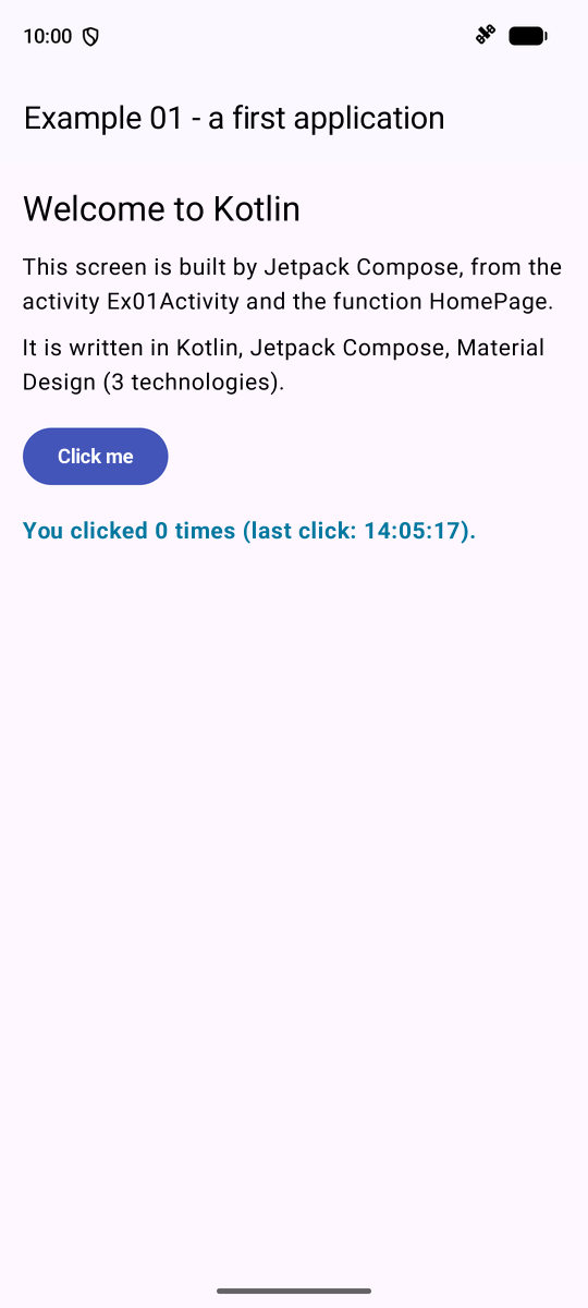
In [Android Studio], the [Run] button launches the application: the examples menu appears; the first line opens Example 01. After two clicks on the button:
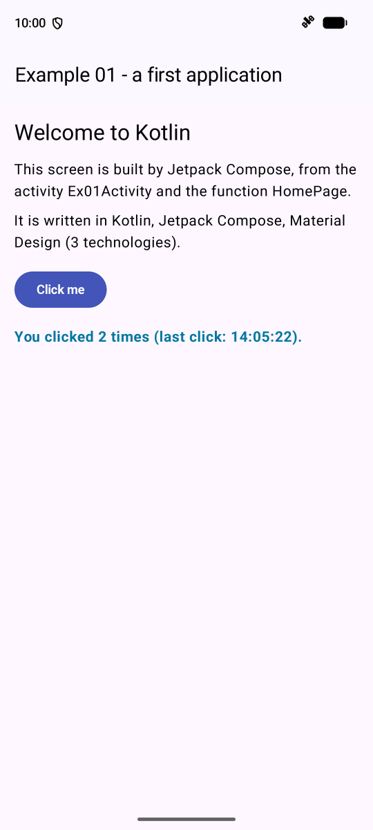
Rotate the phone (or the emulator, using the rotation button on its toolbar): the activity is destroyed and then recreated by [Android], yet the counter remains the same, thanks to [rememberSaveable]. Replace [rememberSaveable] with [remember]: the counter resets to 0 with each rotation. This is a key difference from [Flutter], where the screen persists through rotation: with [Android], the device’s settings (orientation, language, text size, etc.) change, and the activity is recreated.
3.2. Example 02: State and Calculated Values
A simple calculator of prices including VAT, which distinguishes between the state (what the user has entered) and the resulting calculation. In this example, the screen structure (top bar, scrolling content) is defined once and for all in [common/ExamplePage.kt]:
| // =========================================================================
// common/ExamplePage.kt - the common structure of the examples' screens
// -------------------------------------------------------------------------
// All the examples (from 02 on) have the same screen structure: a
// top bar with a title, then a content in a column, which SCROLLS if it
// exceeds the height of the screen. Rather than rewriting it 25 times, we
// write it once, in a @Composable function that receives the content as a
// parameter (cf. example 12):
//
// ExamplePage("Example 02 - state") {
// Text("...") // the content: components, one below the other
// Button(...) { ... }
// }
// =========================================================================
@file:OptIn(ExperimentalMaterial3Api::class)
package fr.stahe.examples.common
import androidx.compose.foundation.layout.Arrangement
import androidx.compose.foundation.layout.Column
import androidx.compose.foundation.layout.ColumnScope
import androidx.compose.foundation.layout.RowScope
import androidx.compose.foundation.layout.consumeWindowInsets
import androidx.compose.foundation.layout.fillMaxSize
import androidx.compose.foundation.layout.imePadding
import androidx.compose.foundation.layout.padding
import androidx.compose.foundation.rememberScrollState
import androidx.compose.foundation.verticalScroll
import androidx.compose.material3.ExperimentalMaterial3Api
import androidx.compose.material3.MaterialTheme
import androidx.compose.material3.Scaffold
import androidx.compose.material3.SnackbarHost
import androidx.compose.material3.SnackbarHostState
import androidx.compose.material3.Text
import androidx.compose.material3.TopAppBar
import androidx.compose.runtime.Composable
import androidx.compose.ui.Modifier
import androidx.compose.ui.unit.dp
@Composable
fun ExamplePage(
title: String,
// an icon to the left of the title (none by default)
icon: @Composable () -> Unit = {},
// buttons on the right of the top bar (none by default)
actions: @Composable RowScope.() -> Unit = {},
// the area of the short-lived messages (Snackbar, cf. example 16), optional
messages: SnackbarHostState? = null,
// the content: a @Composable function, called INSIDE a Column
content: @Composable ColumnScope.() -> Unit,
) {
Scaffold(
topBar = {
TopAppBar(
title = { Text(title, style = MaterialTheme.typography.titleMedium, maxLines = 2) },
navigationIcon = icon,
actions = actions,
)
},
snackbarHost = { if (messages != null) SnackbarHost(messages) },
) { insets ->
Column(
modifier = Modifier
// the Scaffold's insets: below the top bar, above
// the phone's navigation bar
.padding(insets)
.consumeWindowInsets(insets)
// the phone's keyboard does not hide the bottom of the screen
.imePadding()
.fillMaxSize()
// the column scrolls if it is taller than the screen
.verticalScroll(rememberScrollState())
.padding(16.dp),
verticalArrangement = Arrangement.spacedBy(4.dp),
content = content,
)
}
}
|
- [content: @Composable ColumnScope.() -> Unit]: the content is a function [@Composable] called INSIDE a [Column] (it can therefore use column-specific modifiers, such as [weight]);
- [verticalScroll(rememberScrollState())]: the column scrolls if it exceeds the screen height; [imePadding()]: the phone’s keyboard does not hide the bottom of the screen;
- It is called with a trailing lambda: [ExamplePage("title") [ Text(...) ; Button(...) ]].
The code from the example:
| // =========================================================================
// ex02/Ex02Activity.kt - state and computed values
// -------------------------------------------------------------------------
// A small calculator of prices including VAT:
// - the STATE: mutableStateOf variables; changing them re-executes
// (recomposes) the function that reads them, which builds the screen with the
// new values;
// - a value COMPUTED from the state is NOT a state: it is a
// simple local variable, recomputed on each execution of the function.
// It is always up to date, with nothing to synchronize;
// - a piece of data that depends on the SUCCESSIVE values of the state (the history
// of the totals) is updated where the state changes;
// - the title of the application in the list of recent applications
// follows the state, like the rest of the screen (TaskTitle).
// =========================================================================
@file:OptIn(ExperimentalMaterial3Api::class)
package fr.stahe.examples.ex02
import android.os.Bundle
import androidx.activity.ComponentActivity
import androidx.activity.compose.setContent
import androidx.activity.enableEdgeToEdge
import androidx.compose.foundation.layout.Column
import androidx.compose.foundation.layout.Row
import androidx.compose.foundation.layout.Spacer
import androidx.compose.foundation.layout.fillMaxWidth
import androidx.compose.foundation.layout.height
import androidx.compose.foundation.layout.padding
import androidx.compose.foundation.text.KeyboardOptions
import androidx.compose.material.icons.Icons
import androidx.compose.material.icons.filled.Add
import androidx.compose.material.icons.filled.KeyboardArrowDown
import androidx.compose.material3.Card
import androidx.compose.material3.ExperimentalMaterial3Api
import androidx.compose.material3.HorizontalDivider
import androidx.compose.material3.Icon
import androidx.compose.material3.IconButton
import androidx.compose.material3.MaterialTheme
import androidx.compose.material3.OutlinedButton
import androidx.compose.material3.OutlinedTextField
import androidx.compose.material3.SegmentedButton
import androidx.compose.material3.SegmentedButtonDefaults
import androidx.compose.material3.SingleChoiceSegmentedButtonRow
import androidx.compose.material3.Text
import androidx.compose.runtime.Composable
import androidx.compose.runtime.getValue
import androidx.compose.runtime.mutableDoubleStateOf
import androidx.compose.runtime.mutableIntStateOf
import androidx.compose.runtime.mutableStateOf
import androidx.compose.runtime.saveable.rememberSaveable
import androidx.compose.runtime.setValue
import androidx.compose.ui.Alignment
import androidx.compose.ui.Modifier
import androidx.compose.ui.text.TextStyle
import androidx.compose.ui.text.font.FontWeight
import androidx.compose.ui.text.input.KeyboardType
import androidx.compose.ui.unit.dp
import fr.stahe.examples.common.ExamplePage
import fr.stahe.examples.common.ExamplesTheme
import fr.stahe.examples.common.TaskTitle
import java.text.NumberFormat
import java.util.Locale
// a formatter of amounts in euros, the English way (€1,234.50), cf. example 09
val euros: NumberFormat = NumberFormat.getCurrencyInstance(Locale.US).apply { currency = java.util.Currency.getInstance("EUR") }
// the proposed VAT rates
val rates = listOf(5.5, 10.0, 20.0)
// "2,5" or "2.5" -> 2.5; a text that is not a number -> 0
fun price(text: String): Double = text.replace(',', '.').toDoubleOrNull() ?: 0.0
// the total incl. VAT: a PURE function (its result only depends on its parameters)
fun totalInclVat(priceExclVat: Double, quantity: Int, vatRate: Double): Double = quantity * priceExclVat * (1 + vatRate / 100)
class Ex02Activity : ComponentActivity() {
override fun onCreate(savedInstanceState: Bundle?) {
super.onCreate(savedInstanceState)
enableEdgeToEdge()
setContent { ExamplesTheme { CalculatorPage() } }
}
}
@Composable
fun CalculatorPage() {
// the state: what the user has typed or chosen
var label by rememberSaveable { mutableStateOf("Pen") }
var priceText by rememberSaveable { mutableStateOf("2.5") } // the text of the field, as typed
var quantity by rememberSaveable { mutableIntStateOf(1) }
var vatRate by rememberSaveable { mutableDoubleStateOf(20.0) }
// the history of the last 5 changes of the total incl. VAT: an UNMODIFIABLE
// list, replaced by a new list on each change
var history by rememberSaveable { mutableStateOf(listOf<String>()) }
// COMPUTED values: simple local variables, recomputed on
// each execution of the function
val priceExclVat = price(priceText)
val totalExclVat = quantity * priceExclVat
val vatAmount = totalExclVat * vatRate / 100
val inclVat = totalExclVat + vatAmount
// ALL the changes of the state go through this local function: it
// notes the total incl. VAT before the change, applies the change, and
// completes the history if the total has changed
fun change(update: () -> Unit) {
val old = inclVat
update()
// the state variables ALREADY have their new value
val newTotal = totalInclVat(price(priceText), quantity, vatRate)
if (newTotal != old) {
history = (listOf("${euros.format(old)} -> ${euros.format(newTotal)}") + history).take(5)
}
}
// the title of the application FOLLOWS the state, like everything else
TaskTitle("Incl. VAT: ${euros.format(inclVat)}")
val totalStyle = MaterialTheme.typography.titleMedium.copy(fontWeight = FontWeight.Bold)
ExamplePage("Example 02 - state") {
Card {
Column(Modifier.padding(16.dp)) {
// a CONTROLLED field: it displays value, and calls onValueChange
// on each keystroke, with the new text
OutlinedTextField(
value = label,
// changing the item resets the quantity to 1: it is done where
// we know WHY the state changes
onValueChange = { newValue ->
change {
label = newValue
quantity = 1
}
},
label = { Text("Item") },
modifier = Modifier.fillMaxWidth(),
)
OutlinedTextField(
value = priceText,
onValueChange = { text -> change { priceText = text } },
label = { Text("Unit price excl. VAT") },
// the phone's numeric keyboard
keyboardOptions = KeyboardOptions(keyboardType = KeyboardType.Decimal),
modifier = Modifier.fillMaxWidth(),
)
Spacer(Modifier.height(12.dp))
Row(verticalAlignment = Alignment.CenterVertically) {
// weight(1f): the text takes all the remaining width
Text("Quantity (back to 1 if the item changes)", Modifier.weight(1f))
// enabled = false: the button is disabled
IconButton(onClick = { change { quantity-- } }, enabled = quantity > 0) {
Icon(Icons.Default.KeyboardArrowDown, contentDescription = "minus")
}
Text("$quantity", style = totalStyle)
IconButton(onClick = { change { quantity++ } }) {
Icon(Icons.Default.Add, contentDescription = "plus")
}
}
Spacer(Modifier.height(8.dp))
// buttons of which only ONE is selected: the VAT rate
SingleChoiceSegmentedButtonRow(Modifier.fillMaxWidth()) {
rates.forEachIndexed { i, t ->
SegmentedButton(
selected = t == vatRate,
onClick = { change { vatRate = t } },
shape = SegmentedButtonDefaults.itemShape(index = i, count = rates.size),
) {
Text("${t.toString().removeSuffix(".0")} %")
}
}
}
Spacer(Modifier.height(12.dp))
OutlinedButton(onClick = {
change {
label = "Pen"
priceText = "2.5"
quantity = 1
vatRate = 20.0
}
}) {
Text("Reset")
}
}
}
Card {
Column(Modifier.padding(16.dp)) {
Text("$quantity x $label", style = MaterialTheme.typography.titleLarge)
HorizontalDivider(Modifier.padding(vertical = 8.dp))
Line("Total excl. VAT", euros.format(totalExclVat))
Line("VAT ($vatRate %)", euros.format(vatAmount))
Line("Total incl. VAT", euros.format(inclVat), totalStyle)
}
}
Card {
Column(Modifier.padding(16.dp).fillMaxWidth()) {
Text("History of the total incl. VAT", style = MaterialTheme.typography.titleSmall)
// one line of text per element of the history (cf. example 03)
for (line in history) {
Text("• $line")
}
}
}
}
}
// a "label ....... amount" line: a @Composable function that builds
// others. style: an optional parameter, with its default value
@Composable
fun Line(label: String, amount: String, style: TextStyle = MaterialTheme.typography.bodyLarge) {
Row(Modifier.padding(vertical = 4.dp)) {
Text(label, Modifier.weight(1f), style = style)
Text(amount, style = style)
}
}
|
- lines 72–75: PURE functions, off-screen: the entered price (["2,5"] or ["2.5"]) converted to a number, the total including VAT;
- lines 88–94: the state. [history] is an UNMODIFIABLE list ([listOf]): it is replaced by a new list with each change, which [Compose] detects (the state assignment);
- lines 98–101: the COMPUTED values are simply local variables. The function is re-executed with every state change: they are always up to date, so there is nothing to synchronize;
- lines 106–112: a LOCAL function, through which all changes pass: it records the total before the change, applies the change ([update()]: the function passed as a parameter), calculates the new total, and updates the history. The state variables already have their new values immediately after the assignment; [take(5)] retains the first five lines;
- line 117: the application title in the list of recent applications follows the state (function [TaskTitle] from [common/TaskTitle.kt], which calls [setTaskDescription] from the activity);
- lines 125–136: a CONTROLLED field: it displays [value] and calls [onValueChange] with each keystroke, using the new text. With [Compose], the text in a field is just another state: no controller needs to be created or released, and [Reset] simply needs to change the state;
- line 143: [KeyboardOptions(keyboardType = KeyboardType.Decimal)]: the phone’s numeric keypad;
- lines 147–156: the quantity: [enabled = quantity > 0] disables the “minus” button at 0; [Modifier.weight(1f)]: the text takes up the entire remaining width of the line;
- lines 44–168: “segmented” buttons, of which only ONE is selected: the VAT rate. [forEachIndexed] iterates through the list with the rank of each element; [itemShape] rounds the corners of the first and last elements;
- lines 209–212: [Line], a function [@Composable] with parameters, one of which is optional ([style], with its default value).
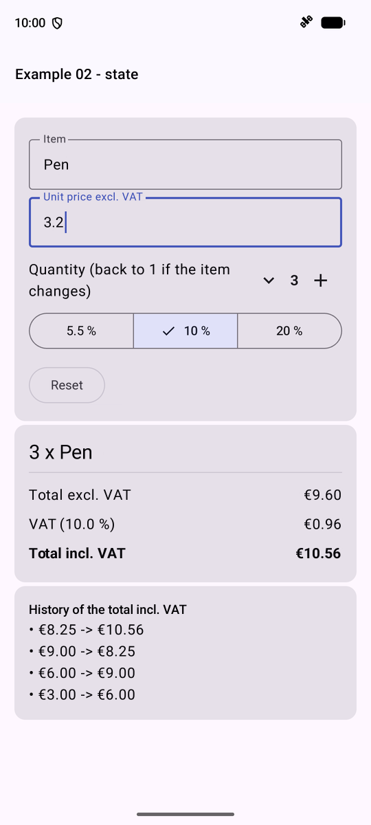
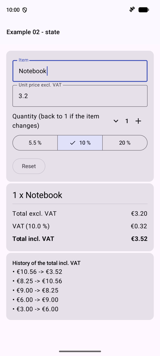
On the left, after tapping [+] twice, selecting 10%, and entering 3.2; on the right, the item has changed: the quantity has reverted to 1, and the history has recorded each change to the total.
3.3. Example 03: Writing a Component Tree
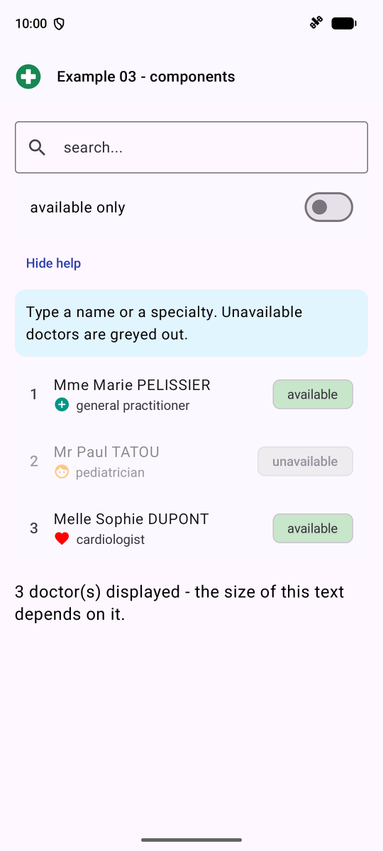
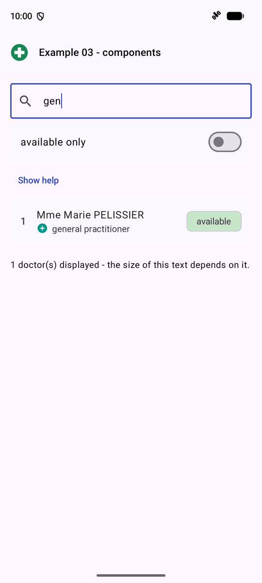
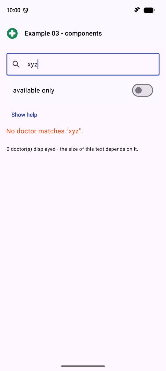
[Compose] does not have a template language: for conditions and loops, we use the instructions from [Kotlin], directly within the [@Composable] function. A list of doctors, filtered by an input:
| // =========================================================================
// ex03/Ex03Activity.kt - writing a tree of components
// -------------------------------------------------------------------------
// Compose has no template language (no HTML, no XML): the
// screens are written in Kotlin, with nested calls of @Composable
// functions. And for conditions and loops, we use... the
// ordinary Kotlin statements, DIRECTLY in the function:
// - if (condition) { Component() } : a component that only EXISTS
// if the condition is true;
// - if (c) { A() } else { B() } : one OR the other;
// - for (x in list) { Component(x) } : one component per element;
// - when (value) { case -> ... } : one value among several.
// A @Composable function is a function like any other: the whole
// language is available to describe the screen.
// =========================================================================
@file:OptIn(ExperimentalMaterial3Api::class, ExperimentalLayoutApi::class)
package fr.stahe.examples.ex03
import android.os.Bundle
import androidx.activity.ComponentActivity
import androidx.activity.compose.setContent
import androidx.activity.enableEdgeToEdge
import androidx.compose.foundation.Image
import androidx.compose.foundation.layout.Arrangement
import androidx.compose.foundation.layout.Column
import androidx.compose.foundation.layout.ExperimentalLayoutApi
import androidx.compose.foundation.layout.FlowRow
import androidx.compose.foundation.layout.Spacer
import androidx.compose.foundation.layout.fillMaxWidth
import androidx.compose.foundation.layout.height
import androidx.compose.foundation.layout.padding
import androidx.compose.foundation.layout.size
import androidx.compose.material.icons.Icons
import androidx.compose.material.icons.filled.AddCircle
import androidx.compose.material.icons.filled.Face
import androidx.compose.material.icons.filled.Favorite
import androidx.compose.material.icons.filled.Search
import androidx.compose.material3.Card
import androidx.compose.material3.CardDefaults
import androidx.compose.material3.ExperimentalMaterial3Api
import androidx.compose.material3.Icon
import androidx.compose.material3.ListItem
import androidx.compose.material3.MaterialTheme
import androidx.compose.material3.OutlinedTextField
import androidx.compose.material3.SuggestionChip
import androidx.compose.material3.SuggestionChipDefaults
import androidx.compose.material3.Switch
import androidx.compose.material3.Text
import androidx.compose.material3.TextButton
import androidx.compose.runtime.Composable
import androidx.compose.runtime.getValue
import androidx.compose.runtime.mutableStateOf
import androidx.compose.runtime.saveable.rememberSaveable
import androidx.compose.runtime.setValue
import androidx.compose.ui.Modifier
import androidx.compose.ui.draw.alpha
import androidx.compose.ui.graphics.Color
import androidx.compose.ui.graphics.vector.ImageVector
import androidx.compose.ui.res.painterResource
import androidx.compose.ui.unit.dp
import androidx.compose.ui.unit.sp
import fr.stahe.examples.R
import fr.stahe.examples.common.ExamplePage
import fr.stahe.examples.common.ExamplesTheme
// an "enumeration": the only possible values of a specialty
enum class Specialty { GENERAL_PRACTITIONER, PEDIATRICIAN, CARDIOLOGIST }
// a DATA class: its properties are val, a Doctor object never
// changes. Kotlin adds equals, hashCode, toString and copy to it
data class Doctor(
val id: Int,
val title: String,
val firstName: String,
val lastName: String,
val specialty: Specialty,
val available: Boolean,
)
val doctors = listOf(
Doctor(1, "Mme", "Marie", "PELISSIER", Specialty.GENERAL_PRACTITIONER, true),
Doctor(2, "Mr", "Paul", "TATOU", Specialty.PEDIATRICIAN, false),
Doctor(3, "Melle", "Sophie", "DUPONT", Specialty.CARDIOLOGIST, true),
)
// "one value among several, depending on a value": a when EXPRESSION.
// The compiler checks that all the cases of the enumeration are handled
fun label(s: Specialty): String = when (s) {
Specialty.GENERAL_PRACTITIONER -> "general practitioner"
Specialty.PEDIATRICIAN -> "pediatrician"
Specialty.CARDIOLOGIST -> "cardiologist"
}
// an icon and its color: a "pair" of values (Pair), written with "to"
fun icon(s: Specialty): Pair<ImageVector, Color> = when (s) {
Specialty.PEDIATRICIAN -> Icons.Default.Face to Color(0xFFFF9800)
Specialty.CARDIOLOGIST -> Icons.Default.Favorite to Color.Red
else -> Icons.Default.AddCircle to Color(0xFF009688) // else: all the other cases
}
class Ex03Activity : ComponentActivity() {
override fun onCreate(savedInstanceState: Bundle?) {
super.onCreate(savedInstanceState)
enableEdgeToEdge()
setContent { ExamplesTheme { DoctorsPage() } }
}
}
@Composable
fun DoctorsPage() {
var filter by rememberSaveable { mutableStateOf("") } // the searched text
var onlyAvailable by rememberSaveable { mutableStateOf(false) }
var showHelp by rememberSaveable { mutableStateOf(true) }
// the displayed list: an ordinary variable, recomputed on each execution
val text = filter.trim().lowercase()
val displayed = doctors.filter { d ->
(!onlyAvailable || d.available) &&
"${d.firstName} ${d.lastName} ${label(d.specialty)}".lowercase().contains(text)
}
ExamplePage(
title = "Example 03 - components",
// a vector image shipped with the application (res/drawable/doctor.xml)
icon = {
Image(
painter = painterResource(R.drawable.doctor),
contentDescription = null,
modifier = Modifier.padding(12.dp).size(28.dp),
)
},
) {
OutlinedTextField(
value = filter,
onValueChange = { filter = it }, // it: the single parameter of a lambda
placeholder = { Text("search...") },
leadingIcon = { Icon(Icons.Default.Search, contentDescription = null) },
modifier = Modifier.fillMaxWidth(),
)
// a switch, with its label
ListItem(
headlineContent = { Text("available only") },
trailingContent = { Switch(checked = onlyAvailable, onCheckedChange = { onlyAvailable = it }) },
)
TextButton(onClick = { showHelp = !showHelp }) {
Text(if (showHelp) "Hide help" else "Show help")
}
// an if: this component only EXISTS if showHelp is true
if (showHelp) {
Card(colors = CardDefaults.cardColors(containerColor = Color(0xFFE1F5FE))) {
Text(
"Type a name or a specialty. Unavailable doctors are greyed out.",
Modifier.padding(12.dp),
)
}
}
// "one of the three blocks": a when without argument, like a series of if
when {
doctors.isEmpty() -> Text("No doctor.")
displayed.isEmpty() -> Text("No doctor matches \"$filter\".", color = Color(0xFFFF5722))
else -> Column {
// one component per doctor, with its rank: withIndex()
for ((i, d) in displayed.withIndex()) {
DoctorRow(i + 1, d)
}
}
}
Spacer(Modifier.height(12.dp))
// a COMPUTED style: the size of the text depends on the number of displayed doctors
Text(
"${displayed.size} doctor(s) displayed - the size of this text depends on it.",
fontSize = (12 + displayed.size * 2).sp,
)
}
}
// a line of the list: a @Composable function with parameters
@Composable
fun DoctorRow(rank: Int, d: Doctor) {
val (image, color) = icon(d.specialty) // a "destructuring" of the pair
ListItem(
// alpha: unavailable doctors are greyed out
modifier = Modifier.alpha(if (d.available) 1f else 0.5f),
leadingContent = { Text("$rank", style = MaterialTheme.typography.titleMedium) },
headlineContent = { Text("${d.title} ${d.firstName} ${d.lastName}") },
// FlowRow: like a Row, but that wraps to the next line if room is lacking
supportingContent = {
FlowRow(horizontalArrangement = Arrangement.spacedBy(6.dp)) {
Icon(image, contentDescription = null, tint = color, modifier = Modifier.size(18.dp))
Text(label(d.specialty))
}
},
trailingContent = {
SuggestionChip(
onClick = {},
label = { Text(if (d.available) "available" else "unavailable") },
// a color chosen by a conditional expression
colors = SuggestionChipDefaults.suggestionChipColors(
containerColor = if (d.available) Color(0xFFC8E6C9) else Color(0xFFE0E0E0),
),
)
},
)
}
|
- lines 68–78: an enumeration and a data class ([data class]): [Kotlin] writes [equals], [hashCode], [toString], and [copy];
- lines 89–99: a [when] EXPRESSION: one value among several; the compiler verifies that all cases in the enumeration are handled ([else]: all others). [to] creates a pair ([Pair]);
- lines 117–120: the displayed list, calculated on each execution based on the state ([filter]);
- lines 126–130: [icon]: a slot of [ExamplePage] for the top bar icon. [painterResource(R.drawable.doctor)]: an image from the application (a VECTOR file, the vector format of [Android], converted from the SVG file in the Flutter example using [New / Vector Asset] from [Android Studio]). [R]: the generated class that assigns a number to each resource;
- line 136: [it]: the name of a lambda’s single parameter;
- line 150: a [if]: the component only EXISTS if the condition is true;
- lines 159–165: a [when] without arguments (a sequence of [if]): one of the three blocks; a [for] loop, with the rank of each element ([withIndex()] and a [(i, d)] destructuring);
- line 173: a calculated style: the text size depends on the number of doctors ([sp]: the unit for text, which follows the phone’s text size setting; [dp]: the unit for distances);
- lines 180–199: a list line ([ListItem], with its positions [leadingContent], [headlineContent]...), grayed out by [Modifier.alpha] if the doctor is unavailable; [FlowRow]: a line that wraps to the next line if there isn’t enough space; a bullet ([SuggestionChip]) whose color depends on the doctor.
3.4. Example 04: Events
A to-do list: you can add items, check them off, and delete them (using a button or by swiping the line—the typical gesture on a mobile device), along with a touch-sensitive area. An interactive component receives FUNCTIONS as parameters to be called when something happens: these are the “events” of [Compose].
| // =========================================================================
// ex04/Ex04Activity.kt - reacting to the user's actions
// -------------------------------------------------------------------------
// An interactive component receives as parameters the FUNCTIONS to call
// when something happens ("callbacks", Kotlin lambdas):
// - onClick = { ... } : called on press (buttons);
// - onClick = { remove(t) } : the lambda passes its own arguments;
// - onValueChange, onCheckedChange : the function receives a value (the
// text, the checked box...);
// - Modifier.pointerInput : adds gestures (tap, double
// tap, long press...) to ANY
// component;
// - SwipeToDismissBox : swiping a line to
// remove it, the typical mobile gesture.
// To give the focus to a field from the code, we associate a
// FocusRequester with it.
// =========================================================================
@file:OptIn(ExperimentalMaterial3Api::class)
package fr.stahe.examples.ex04
import android.os.Bundle
import androidx.activity.ComponentActivity
import androidx.activity.compose.setContent
import androidx.activity.enableEdgeToEdge
import androidx.compose.foundation.background
import androidx.compose.foundation.gestures.detectTapGestures
import androidx.compose.foundation.layout.Box
import androidx.compose.foundation.layout.Row
import androidx.compose.foundation.layout.Spacer
import androidx.compose.foundation.layout.fillMaxSize
import androidx.compose.foundation.layout.fillMaxWidth
import androidx.compose.foundation.layout.height
import androidx.compose.foundation.layout.padding
import androidx.compose.foundation.layout.width
import androidx.compose.foundation.shape.RoundedCornerShape
import androidx.compose.foundation.text.KeyboardActions
import androidx.compose.foundation.text.KeyboardOptions
import androidx.compose.material.icons.Icons
import androidx.compose.material.icons.filled.Delete
import androidx.compose.material.icons.outlined.Delete
import androidx.compose.material3.Button
import androidx.compose.material3.Checkbox
import androidx.compose.material3.ExperimentalMaterial3Api
import androidx.compose.material3.Icon
import androidx.compose.material3.IconButton
import androidx.compose.material3.ListItem
import androidx.compose.material3.MaterialTheme
import androidx.compose.material3.OutlinedTextField
import androidx.compose.material3.SwipeToDismissBox
import androidx.compose.material3.Text
import androidx.compose.material3.rememberSwipeToDismissBoxState
import androidx.compose.runtime.Composable
import androidx.compose.runtime.getValue
import androidx.compose.runtime.key
import androidx.compose.runtime.mutableIntStateOf
import androidx.compose.runtime.mutableStateListOf
import androidx.compose.runtime.mutableStateOf
import androidx.compose.runtime.remember
import androidx.compose.runtime.setValue
import androidx.compose.ui.Alignment
import androidx.compose.ui.Modifier
import androidx.compose.ui.focus.FocusRequester
import androidx.compose.ui.focus.focusRequester
import androidx.compose.ui.graphics.Color
import androidx.compose.ui.input.key.Key
import androidx.compose.ui.input.key.key
import androidx.compose.ui.input.key.onPreviewKeyEvent
import androidx.compose.ui.input.pointer.pointerInput
import androidx.compose.ui.platform.LocalDensity
import androidx.compose.ui.text.TextStyle
import androidx.compose.ui.text.input.ImeAction
import androidx.compose.ui.text.style.TextDecoration
import androidx.compose.ui.unit.dp
import androidx.compose.ui.unit.sp
import fr.stahe.examples.common.ExamplePage
import fr.stahe.examples.common.ExamplesTheme
import java.time.LocalTime
import java.time.format.DateTimeFormatter
import kotlin.math.roundToInt
// a task: an UNMODIFIABLE data class; to "check" it, we
// make a copy of it: task.copy(done = true)
data class Task(val id: Int, val label: String, val done: Boolean = false)
class Ex04Activity : ComponentActivity() {
override fun onCreate(savedInstanceState: Bundle?) {
super.onCreate(savedInstanceState)
enableEdgeToEdge()
setContent { ExamplesTheme { TasksPage() } }
}
}
@Composable
fun TasksPage() {
// lists OBSERVED by Compose: adding, removing or replacing an
// element causes the recomposition. (remember, and not rememberSaveable:
// they are lost if the activity is recreated, cf. example 20)
val tasks = remember {
mutableStateListOf(Task(1, "Install Android Studio", done = true), Task(2, "Read the chapter on events"))
}
val log = remember { mutableStateListOf<String>() }
var input by remember { mutableStateOf("") }
var nextId by remember { mutableIntStateOf(3) }
// the FocusRequester: a way to give the focus to the field (the cursor and the
// phone's keyboard) from the code
val focus = remember { FocusRequester() }
fun trace(message: String) {
val time = LocalTime.now().format(DateTimeFormatter.ofPattern("HH:mm"))
log.add(0, "$time $message")
}
// called by the button AND by the keyboard's "OK" key (keyboardActions)
fun add() {
val label = input.trim()
if (label.isEmpty()) {
return
}
tasks.add(Task(nextId++, label))
trace("added \"$label\"")
input = ""
// the focus returns to the field: the next task can be typed
focus.requestFocus()
}
fun toggle(task: Task, done: Boolean) {
// we REPLACE the task with a modified copy
tasks[tasks.indexOf(task)] = task.copy(done = done)
trace("\"${task.label}\": ${if (done) "done" else "to do"}")
}
fun remove(task: Task, how: String) {
tasks.remove(task)
trace("removed \"${task.label}\" ($how)")
}
// the screen density: to convert pixels into dp
val density = LocalDensity.current.density
ExamplePage("Example 04 - events") {
Row(verticalAlignment = Alignment.CenterVertically) {
OutlinedTextField(
value = input,
onValueChange = { input = it },
placeholder = { Text("new task (Escape to clear)") },
singleLine = true,
// the "OK" key of the phone's keyboard adds the task
keyboardOptions = KeyboardOptions(imeAction = ImeAction.Done),
keyboardActions = KeyboardActions(onDone = { add() }),
modifier = Modifier
.weight(1f)
.focusRequester(focus)
// a physical keyboard (emulator, tablet): Escape clears the field
.onPreviewKeyEvent { event ->
if (event.key == Key.Escape) {
input = ""
true // the event is handled
} else {
false // the event continues on its way
}
},
)
Spacer(Modifier.width(8.dp))
Button(onClick = { add() }) { Text("Add") }
}
Spacer(Modifier.height(12.dp))
for (t in tasks) {
// key(t.id): the IDENTITY of the line. The state of each line (its
// swipe) follows ITS task, even if the list changes (cf. the course)
key(t.id) {
TaskRow(
task = t,
onToggle = { done -> toggle(t, done) },
onRemove = { how -> remove(t, how) },
)
}
}
Spacer(Modifier.height(12.dp))
// pointerInput: any component becomes sensitive to gestures
Box(
contentAlignment = Alignment.Center,
modifier = Modifier
.fillMaxWidth()
.height(80.dp)
.background(Color(0xFFE7F5FF), RoundedCornerShape(8.dp))
.pointerInput(Unit) {
detectTapGestures(
// the position of the press, relative to the component (in pixels)
onPress = { p -> trace("press at (${(p.x / density).roundToInt()}, ${(p.y / density).roundToInt()})") },
onDoubleTap = { trace("double tap") },
onLongPress = { trace("long press") },
)
},
) {
Text("Touch this area (tap, double tap, long press)")
}
Spacer(Modifier.height(16.dp))
Text("Log", style = MaterialTheme.typography.titleSmall)
for (line in log) {
Text(line, fontSize = 12.sp)
}
}
}
// a line of the list: the task, and TWO functions to notify the caller
@Composable
fun TaskRow(task: Task, onToggle: (Boolean) -> Unit, onRemove: (String) -> Unit) {
// the swipe state of the line (where is it?)
val swipe = rememberSwipeToDismissBoxState()
// SwipeToDismissBox: swiping the line to the left removes it
SwipeToDismissBox(
state = swipe,
enableDismissFromStartToEnd = false,
// onDismiss: called when the line has been swiped all the way
onDismiss = { onRemove("swipe") },
// what appears UNDER the line when it is swiped
backgroundContent = {
Box(
contentAlignment = Alignment.CenterEnd,
modifier = Modifier.fillMaxSize().background(Color(0xFFFFCDD2)).padding(end = 16.dp),
) {
Icon(Icons.Default.Delete, contentDescription = null)
}
},
) {
ListItem(
// the box is ON THE LEFT, as on a task list; it
// passes on its new value (a Boolean)
leadingContent = { Checkbox(checked = task.done, onCheckedChange = onToggle) },
headlineContent = {
Text(
task.label,
style = if (task.done) {
TextStyle(textDecoration = TextDecoration.LineThrough, color = Color.Gray)
} else {
TextStyle.Default
},
)
},
trailingContent = {
IconButton(onClick = { onRemove("button") }) {
Icon(Icons.Outlined.Delete, contentDescription = "remove", tint = Color.Red)
}
},
)
}
}
|
- line 84: a task, an UNMODIFIABLE object; checking it creates a copy ([copy(done = true)]) that REPLACES it;
- Lines 99–102: [mutableStateListOf]: a list OBSERVED by [Compose]; adding, removing, or replacing an element triggers a rebuild. Here, we retain [remember] (not [rememberSaveable]): these lists are lost if the activity is recreated;
- line 107: a [FocusRequester], through which the code gives focus (the cursor and keyboard) to the field after each addition ([focus.requestFocus()]);
- lines 115–135: three local functions that modify the state and maintain the log;
- lines 149–150: [imeAction = ImeAction.Done]: the phone’s keyboard confirmation key becomes “OK,” and [keyboardActions] specifies what to do when it is pressed: add the task;
- lines 68–160: [onPreviewKeyEvent] receives keystrokes from a PHYSICAL keyboard (the one for PC in the emulator, or a tablet’s keyboard): [Escape] clears the field. Returning [true] stops the event;
- lines 171–175: [key(t.id)] assigns an IDENTITY to each line. Without [key], [Compose] associates a row’s state (in this case, its scroll position) with its POSITION in the list: after a deletion, the next row would inherit the state of the deleted row. The two lambda expressions [onToggle] and [onRemove] “capture” the task [t] and pass on whatever the line passes to them;
- lines 187–192: [Modifier.pointerInput] makes ANY component gesture-sensitive: it distinguishes between a single tap, a double tap, and a long press. The position is given in pixels: it is converted to [dp] using the screen density ([LocalDensity]);
- line 208: [TaskRow] receives the task, and TWO functions to notify its caller: it does not modify the list itself (see Example 11);
- lines 212–218: [SwipeToDismissBox]: the line moves to the left ([enableDismissFromStartToEnd = false] prevents movement in the other direction), revealing [backgroundContent]; Upon reaching the end, [onDismiss] is called;
- line 230: the checkbox transmits its new value ([Boolean]): [onToggle], which has the correct type [(Boolean) -> Unit], is passed directly to it.
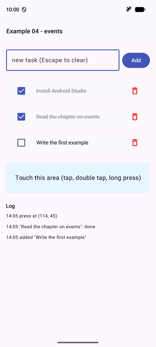
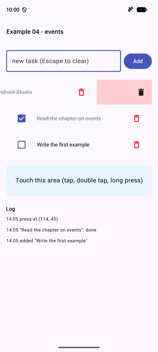
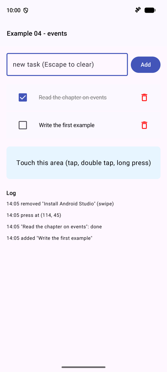
On the left, a task has been added, another checked, and the area has been tapped; in the middle, the first row slides to the left; on the right, it has been deleted, and the log confirms this.
3.5. Example 05: All Field Types
With [Compose], ALL the fields are CONTROLLED: the field displays a value from the state and notifies of each change via a function that updates the state. What this function transmits depends on the field:
- [OutlinedTextField]: the new text ([String]);
- [Checkbox], [Switch]: a [Boolean];
- [RadioButton], [FilterChip]: nothing—the entry IS selected;
- [Slider]: a [Float];
- [DatePickerDialog]: a date, upon confirmation.
For the drop-down list, [Material 3] does not provide a single, self-contained component: it is assembled once and for all in [common/DropdownList.kt]:
| // =========================================================================
// common/DropdownList.kt - a drop-down list, ready to use
// -------------------------------------------------------------------------
// Material 3 for Compose has no "drop-down list" component in a
// single piece: it is assembled from three elements - ExposedDropdownMenuBox,
// a read-only text field, and the ExposedDropdownMenu menu. We
// do it here once and for all (examples 05 to 08, 24, 25):
//
// DropdownList("Country", value = country, choices = listOf("fr", "be", "ch"),
// text = { countryNames[it] }, onChange = { country = it })
//
// The function is GENERIC (<T>): the choices can be strings,
// numbers, doctors... text says how to DISPLAY a choice. A choice
// can be null ("-- choose --") if T is a "nullable" type (Int?).
// =========================================================================
@file:OptIn(ExperimentalMaterial3Api::class)
package fr.stahe.examples.common
import androidx.compose.foundation.layout.fillMaxWidth
import androidx.compose.material3.DropdownMenuItem
import androidx.compose.material3.ExperimentalMaterial3Api
import androidx.compose.material3.ExposedDropdownMenuAnchorType
import androidx.compose.material3.ExposedDropdownMenuBox
import androidx.compose.material3.ExposedDropdownMenuDefaults
import androidx.compose.material3.OutlinedTextField
import androidx.compose.material3.Text
import androidx.compose.runtime.Composable
import androidx.compose.runtime.getValue
import androidx.compose.runtime.mutableStateOf
import androidx.compose.runtime.remember
import androidx.compose.runtime.setValue
import androidx.compose.ui.Modifier
@Composable
fun <T> DropdownList(
label: String,
value: T,
choices: List<T>,
onChange: (T) -> Unit,
modifier: Modifier = Modifier,
text: (T) -> String = { it.toString() },
// an error message under the field (cf. examples 07 and 25)
error: String? = null,
) {
// is the menu open? a state SPECIFIC to each drop-down list
var open by remember { mutableStateOf(false) }
ExposedDropdownMenuBox(expanded = open, onExpandedChange = { open = it }, modifier = modifier) {
// the field that displays the current choice; menuAnchor makes it the
// anchor point of the menu (touching it opens the menu)
OutlinedTextField(
value = text(value),
onValueChange = {},
readOnly = true,
singleLine = true,
label = { Text(label) },
trailingIcon = { ExposedDropdownMenuDefaults.TrailingIcon(expanded = open) },
isError = error != null,
supportingText = if (error == null) null else { { Text(error) } },
modifier = Modifier.menuAnchor(ExposedDropdownMenuAnchorType.PrimaryNotEditable).fillMaxWidth(),
)
// the menu: one line per choice
ExposedDropdownMenu(expanded = open, onDismissRequest = { open = false }) {
for (c in choices) {
DropdownMenuItem(
text = { Text(text(c)) },
onClick = {
onChange(c)
open = false
},
)
}
}
}
}
|
- lines 36–44: [fun <T> DropdownList]: a GENERIC function: the choices can be strings, numbers, doctors... [text] specifies how to display a selection (by default, its [toString()]);
- line 47: the state specific to each list: is the menu open?
- lines 48–49: [ExposedDropdownMenuBox] associates a READ-ONLY field ([readOnly = true]), which displays the current option, with a menu; [menuAnchor] makes the field the anchor point for the menu;
- lines 63–68: one menu line per option; pressing it notifies the caller ([onChange(c)]) and closes the menu.
The code for the example:
| // =========================================================================
// ex05/Ex05Activity.kt - all kinds of fields
// -------------------------------------------------------------------------
// With Compose, ALL the fields are CONTROLLED: a field displays a
// value of the state (value, checked, selected...) and notifies each
// change through a function (onValueChange, onCheckedChange, onClick...),
// which updates the state. The state is the single source of truth: modifying
// the state (from the code) modifies the field. What the function passes on
// depends on the field:
// - OutlinedTextField -> the new text (String);
// - Checkbox, Switch -> Boolean;
// - RadioButton -> nothing: onClick is the choice;
// - DropdownList (common/) -> the value of the chosen element;
// - FilterChip -> nothing: onClick toggles the chip;
// - Slider -> Float;
// - DatePickerDialog (a dialog) -> a date, on confirmation.
// Everything happens on the phone, without a server.
// =========================================================================
@file:OptIn(ExperimentalMaterial3Api::class, ExperimentalLayoutApi::class)
package fr.stahe.examples.ex05
import android.os.Bundle
import androidx.activity.ComponentActivity
import androidx.activity.compose.setContent
import androidx.activity.enableEdgeToEdge
import androidx.compose.foundation.background
import androidx.compose.foundation.layout.Arrangement
import androidx.compose.foundation.layout.ExperimentalLayoutApi
import androidx.compose.foundation.layout.FlowRow
import androidx.compose.foundation.layout.Row
import androidx.compose.foundation.layout.Spacer
import androidx.compose.foundation.layout.fillMaxWidth
import androidx.compose.foundation.layout.height
import androidx.compose.foundation.layout.padding
import androidx.compose.foundation.layout.width
import androidx.compose.foundation.selection.selectable
import androidx.compose.foundation.selection.selectableGroup
import androidx.compose.foundation.selection.toggleable
import androidx.compose.foundation.text.KeyboardOptions
import androidx.compose.material.icons.Icons
import androidx.compose.material.icons.filled.DateRange
import androidx.compose.material3.Button
import androidx.compose.material3.Checkbox
import androidx.compose.material3.DatePicker
import androidx.compose.material3.DatePickerDialog
import androidx.compose.material3.ExperimentalMaterial3Api
import androidx.compose.material3.FilterChip
import androidx.compose.material3.Icon
import androidx.compose.material3.ListItem
import androidx.compose.material3.MaterialTheme
import androidx.compose.material3.OutlinedButton
import androidx.compose.material3.OutlinedTextField
import androidx.compose.material3.RadioButton
import androidx.compose.material3.Slider
import androidx.compose.material3.Text
import androidx.compose.material3.TextButton
import androidx.compose.material3.rememberDatePickerState
import androidx.compose.runtime.Composable
import androidx.compose.runtime.getValue
import androidx.compose.runtime.mutableFloatStateOf
import androidx.compose.runtime.mutableStateOf
import androidx.compose.runtime.saveable.rememberSaveable
import androidx.compose.runtime.setValue
import androidx.compose.ui.Alignment
import androidx.compose.ui.Modifier
import androidx.compose.ui.focus.onFocusChanged
import androidx.compose.ui.graphics.Color
import androidx.compose.ui.semantics.Role
import androidx.compose.ui.text.font.FontFamily
import androidx.compose.ui.text.input.KeyboardType
import androidx.compose.ui.unit.dp
import androidx.compose.ui.unit.sp
import fr.stahe.examples.common.DropdownList
import fr.stahe.examples.common.ExamplePage
import fr.stahe.examples.common.ExamplesTheme
import kotlinx.serialization.Serializable
import kotlinx.serialization.json.Json
import java.time.Instant
import java.time.LocalDate
import java.time.ZoneOffset
val titles = listOf("Mr", "Mme", "Melle")
val hobbies = listOf("sport", "music", "reading", "cinema")
val countries = mapOf("fr" to "France", "be" to "Belgium", "ch" to "Switzerland")
val languages = mapOf("fr" to "French", "en" to "English", "es" to "Spanish")
// all the values, gathered in one object (what would be sent to a server).
// @Serializable: the kotlinx.serialization plugin can convert it to JSON
@Serializable
data class Model(
val title: String,
val name: String,
val age: Int?,
val presentation: String,
val newsletter: Boolean,
val hobbies: List<String>,
val country: String,
val languages: List<String>,
val birthDate: String?,
val satisfaction: Int,
)
// the JSON converter: prettyPrint, indented JSON
val indentedJson = Json { prettyPrint = true }
class Ex05Activity : ComponentActivity() {
override fun onCreate(savedInstanceState: Bundle?) {
super.onCreate(savedInstanceState)
enableEdgeToEdge()
setContent { ExamplesTheme { FormPage() } }
}
}
@Composable
fun FormPage() {
// one state per field of the form
var title by rememberSaveable { mutableStateOf("Mme") }
var name by rememberSaveable { mutableStateOf("") }
var age by rememberSaveable { mutableStateOf("30") }
var presentation by rememberSaveable { mutableStateOf("") } // the VALIDATED value
var draft by rememberSaveable { mutableStateOf("") } // the text being typed
var newsletter by rememberSaveable { mutableStateOf(false) }
var myHobbies by rememberSaveable { mutableStateOf(setOf("reading")) } // a SET: no duplicate
var myCountry by rememberSaveable { mutableStateOf("fr") }
var myLanguages by rememberSaveable { mutableStateOf(setOf<String>()) }
var birthDate by rememberSaveable { mutableStateOf<LocalDate?>(null) } // null: not chosen yet
var satisfaction by rememberSaveable { mutableFloatStateOf(3f) }
var sent by rememberSaveable { mutableStateOf<String?>(null) }
var calendarOpen by rememberSaveable { mutableStateOf(false) }
// the model: a value COMPUTED from the state
val model = Model(
title = title,
name = name.trim(),
age = age.toIntOrNull(), // null if the field is empty
presentation = presentation,
newsletter = newsletter,
hobbies = myHobbies.toList(),
country = myCountry,
languages = myLanguages.toList(),
birthDate = birthDate?.toString(), // "2026-10-05": the date format of the RdvMedecins API
satisfaction = satisfaction.toInt(),
)
val titleStyle = MaterialTheme.typography.titleSmall
ExamplePage("Example 05 - controlled fields") {
Text("Title", style = titleStyle)
// selectableGroup: a group of radio buttons (for accessibility)
Row(Modifier.selectableGroup(), verticalAlignment = Alignment.CenterVertically) {
for (t in titles) {
// selectable: the WHOLE line (button + text) reacts to the press
Row(
verticalAlignment = Alignment.CenterVertically,
modifier = Modifier.selectable(selected = title == t, onClick = { title = t }, role = Role.RadioButton),
) {
RadioButton(selected = title == t, onClick = null)
Text(t)
Spacer(Modifier.width(12.dp))
}
}
}
Row {
OutlinedTextField(value = name, onValueChange = { name = it }, label = { Text("Name") }, modifier = Modifier.weight(2f))
Spacer(Modifier.width(12.dp))
OutlinedTextField(
value = age,
onValueChange = { age = it },
label = { Text("Age") },
keyboardOptions = KeyboardOptions(keyboardType = KeyboardType.Number),
modifier = Modifier.weight(1f),
)
}
// onFocusChanged: notifies when the field GAINS or LOSES the focus. The
// presentation is only copied into the state when leaving the field
OutlinedTextField(
value = draft,
onValueChange = { draft = it },
label = { Text("Presentation (updated when leaving the field)") },
minLines = 2,
modifier = Modifier.fillMaxWidth().onFocusChanged { state ->
if (!state.isFocused) presentation = draft
},
)
// a single box: true / false. toggleable: the whole line reacts
ListItem(
modifier = Modifier.toggleable(value = newsletter, onValueChange = { newsletter = it }, role = Role.Checkbox),
leadingContent = { Checkbox(checked = newsletter, onCheckedChange = null) },
headlineContent = { Text("Receive the newsletter") },
)
Text("Hobbies", style = titleStyle)
// several chips for ONE set: the value is added or removed
FlowRow(horizontalArrangement = Arrangement.spacedBy(8.dp)) {
for (h in hobbies) {
FilterChip(
selected = h in myHobbies,
onClick = { myHobbies = if (h in myHobbies) myHobbies - h else myHobbies + h },
label = { Text(h) },
)
}
}
// a drop-down list: value says which element is chosen
DropdownList(
label = "Country",
value = myCountry,
choices = countries.keys.toList(),
text = { code -> countries.getValue(code) },
onChange = { myCountry = it },
modifier = Modifier.width(220.dp),
)
Text("Spoken languages", style = titleStyle)
FlowRow(horizontalArrangement = Arrangement.spacedBy(8.dp)) {
for ((code, label) in languages) {
FilterChip(
selected = code in myLanguages,
onClick = { myLanguages = if (code in myLanguages) myLanguages - code else myLanguages + code },
label = { Text(label) },
)
}
}
Row(verticalAlignment = Alignment.CenterVertically) {
Text("Satisfaction: ${satisfaction.toInt()} / 5", style = titleStyle)
// a slider from 1 to 5: 3 intermediate steps (2, 3, 4)
Slider(
value = satisfaction,
onValueChange = { satisfaction = it },
valueRange = 1f..5f,
steps = 3,
modifier = Modifier.weight(1f).padding(start = 8.dp),
)
}
ListItem(
leadingContent = { Icon(Icons.Default.DateRange, contentDescription = null) },
headlineContent = { Text("Date of birth") },
supportingContent = { Text(birthDate?.toString() ?: "not chosen") },
trailingContent = { OutlinedButton(onClick = { calendarOpen = true }) { Text("Choose") } },
)
// FlowRow: the buttons wrap to the next line on a narrow screen
FlowRow(horizontalArrangement = Arrangement.spacedBy(8.dp)) {
Button(onClick = { sent = Json.encodeToString(Model.serializer(), model) }) { Text("Send") }
// the state modified BY THE CODE: the fields follow
OutlinedButton(onClick = {
title = "Mr"
name = "MARTIN"
age = "42"
myHobbies = setOf("sport", "cinema")
myCountry = "be"
}) { Text("Fill in by code") }
}
Spacer(Modifier.height(8.dp))
Text("The model, live", style = titleStyle)
Text(
indentedJson.encodeToString(Model.serializer(), model),
fontFamily = FontFamily.Monospace,
fontSize = 12.sp,
modifier = Modifier.fillMaxWidth().background(Color(0xFFF5F5F5)).padding(8.dp),
)
// a block that only exists after a submission; ?.let: only if sent is not null
sent?.let { json ->
Text("Last submission", style = titleStyle)
Text(
json,
fontFamily = FontFamily.Monospace,
fontSize = 12.sp,
modifier = Modifier.fillMaxWidth().background(Color(0xFFE8F5E9)).padding(8.dp),
)
}
}
// the calendar dialog: it only exists if calendarOpen is true
if (calendarOpen) {
// the state of the calendar: the selected date, in milliseconds (UTC)
val calendarState = rememberDatePickerState(
initialSelectedDateMillis = (birthDate ?: LocalDate.of(2000, 1, 1)).atStartOfDay(ZoneOffset.UTC).toInstant().toEpochMilli(),
)
DatePickerDialog(
onDismissRequest = { calendarOpen = false },
confirmButton = {
TextButton(onClick = {
calendarState.selectedDateMillis?.let { ms ->
birthDate = Instant.ofEpochMilli(ms).atZone(ZoneOffset.UTC).toLocalDate()
}
calendarOpen = false
}) { Text("OK") }
},
dismissButton = { TextButton(onClick = { calendarOpen = false }) { Text("Cancel") } },
) {
DatePicker(state = calendarState)
}
}
}
|
- lines 89–101: all form values, grouped into a class [@Serializable]: the [kotlinx.serialization] plugin generates code at compile time that converts it to JSON ([Json.encodeToString(Model.serializer(), model)]);
- Lines 118–130: one state per field. [myHobbies] is an unmodifiable SET ([Set]): [myHobbies + h] and [myHobbies - h] generate new ones; [birthDate] is a “nullable” date ([LocalDate?]): [null] until a value is selected;
- lines 133–143: the model, a value COMPUTED on each execution; [toIntOrNull()]: the number, or [null] if the text is not a number;
- lines 150–157: radio buttons. [Modifier.selectable] makes the WHOLE line (the button and the text) clickable; the button itself therefore has no action ([onClick = null]); [selectableGroup] groups the buttons for accessibility tools;
- Lines 177–182: The presentation is copied into the state only when LEAVING the field; [onFocusChanged] triggers a notification when the field gains or loses focus;
- lines 187–189: a checkbox, which works the same way as radio buttons ([Modifier.toggleable] across the entire line);
- lines 193–198: checkboxes ([FilterChip]) for selecting multiple values; [FlowRow] wraps them to the next line if there isn’t enough space;
- lines 203–208: the drop-down list from [common/];
- lines 224–228: a slider from 1 to 5: [steps = 3] with intermediate steps;
- lines 236–248: “Fill in by code”: the state is modified, and the fields follow;
- lines 251–259: the model displayed in JSON, indented ([Json [ prettyPrint = true ]]); [sent?.let [ ... ]]: the block exists only if [sent] is not [null];
- Lines 271–288: The calendar window exists only if [calendarOpen] is true. [DatePicker] operates in milliseconds since January 1, 1970 (time UTC): conversion works both ways with [java.time] ([LocalDate], [Instant], [ZoneOffset.UTC]).
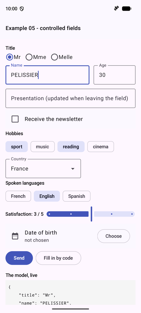
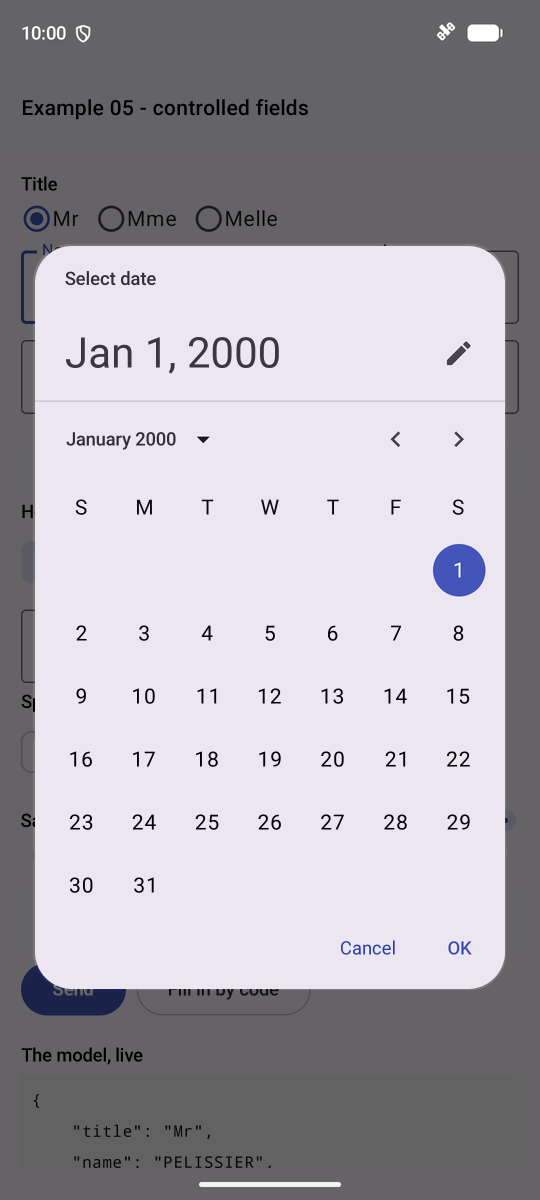
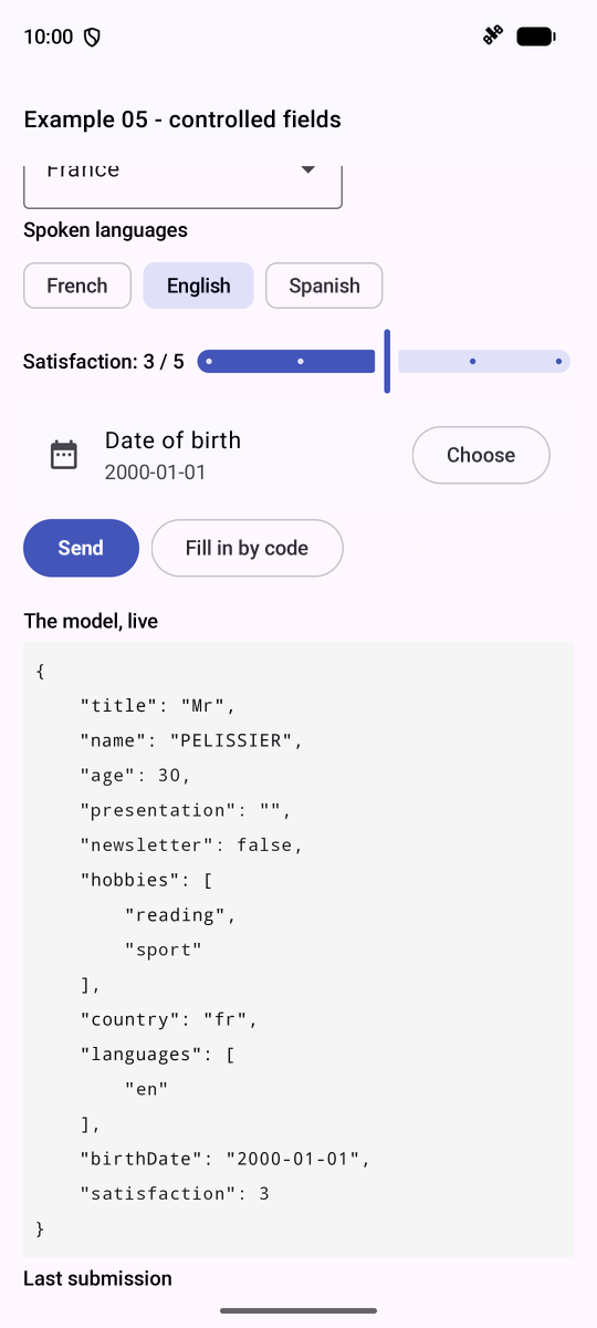
The calendar ([DatePickerDialog]) is in English: [Material 3] follows the application’s language (see Example 21).
Example 05 had one state variable per field. For a real form, we prefer ONE object that contains all the values, and we describe its changes in a single PURE function, the REDUCER: [reducer(currentState, action) -> newState]. The screen no longer modifies the state: it reports what has happened (“the LASTNAME field now has the value ‘Dupont’,” “the LASTNAME field has been exited”), and the reducer deduces the new state from this.
| // =========================================================================
// ex06/Ex06Activity.kt - a form, an object, a reducer
// -------------------------------------------------------------------------
// Example 05 had one state variable per field of the form. For a
// real form, we prefer ONE object that contains all the values, the
// MODEL (here a Profile object, unmodifiable), and we describe its
// changes in a single function, the REDUCER:
//
// reducer(currentState, action) -> newState
//
// The screen no longer modifies the state: it DESCRIBES what happened, with a
// ProfileAction object (Update(Field.LASTNAME, "Dupont"), Leave(Field.LASTNAME)...),
// and the reducer deduces the new state from it. All the logic is in one
// place, in a PURE function (same input, same output, no side
// effect), easy to test.
// Kotlin is well suited to it: a "sealed" interface lists all the possible
// actions, and a when on an action is checked by the compiler (a
// forgotten case is an error).
//
// The state also keeps, for each field, whether it has been "touched" (left at
// least once); from that we deduce whether it is "modified" (its value differs from
// the initial value) and whether it is disabled.
// =========================================================================
@file:OptIn(ExperimentalMaterial3Api::class, ExperimentalLayoutApi::class)
package fr.stahe.examples.ex06
import android.os.Bundle
import androidx.activity.ComponentActivity
import androidx.activity.compose.setContent
import androidx.activity.enableEdgeToEdge
import androidx.compose.foundation.background
import androidx.compose.foundation.layout.Arrangement
import androidx.compose.foundation.layout.ExperimentalLayoutApi
import androidx.compose.foundation.layout.FlowRow
import androidx.compose.foundation.layout.Row
import androidx.compose.foundation.layout.Spacer
import androidx.compose.foundation.layout.fillMaxWidth
import androidx.compose.foundation.layout.height
import androidx.compose.foundation.layout.padding
import androidx.compose.foundation.layout.width
import androidx.compose.foundation.selection.selectable
import androidx.compose.material3.ExperimentalMaterial3Api
import androidx.compose.material3.HorizontalDivider
import androidx.compose.material3.ListItem
import androidx.compose.material3.MaterialTheme
import androidx.compose.material3.OutlinedButton
import androidx.compose.material3.OutlinedTextField
import androidx.compose.material3.RadioButton
import androidx.compose.material3.Slider
import androidx.compose.material3.Switch
import androidx.compose.material3.Text
import androidx.compose.runtime.Composable
import androidx.compose.runtime.getValue
import androidx.compose.runtime.mutableStateOf
import androidx.compose.runtime.remember
import androidx.compose.runtime.setValue
import androidx.compose.ui.Alignment
import androidx.compose.ui.Modifier
import androidx.compose.ui.focus.onFocusChanged
import androidx.compose.ui.graphics.Color
import androidx.compose.ui.text.buildAnnotatedString
import androidx.compose.ui.text.font.FontFamily
import androidx.compose.ui.text.font.FontWeight
import androidx.compose.ui.text.withStyle
import androidx.compose.ui.text.SpanStyle
import androidx.compose.ui.unit.dp
import androidx.compose.ui.unit.sp
import fr.stahe.examples.common.DropdownList
import fr.stahe.examples.common.ExamplePage
import fr.stahe.examples.common.ExamplesTheme
import kotlinx.serialization.json.Json
import kotlinx.serialization.json.JsonPrimitive
import kotlinx.serialization.json.JsonObject
// the name of each field of the form
enum class Field { TITLE, FIRSTNAME, LASTNAME, AGE, NEWSLETTER, EMAIL, COUNTRY, PRESENTATION }
// the data of the form: an UNMODIFIABLE object (everything is val). To
// "modify" it, we make a copy of it: profile.copy(lastName = "DUPONT"). The
// copy function is written by Kotlin for any "data" class
data class Profile(
val title: String,
val firstName: String,
val lastName: String,
val age: Int,
val newsletter: Boolean,
val email: String,
val country: String,
val presentation: String,
) {
// the value of a field, designated by its name
fun value(f: Field): Any = when (f) {
Field.TITLE -> title
Field.FIRSTNAME -> firstName
Field.LASTNAME -> lastName
Field.AGE -> age
Field.NEWSLETTER -> newsletter
Field.EMAIL -> email
Field.COUNTRY -> country
Field.PRESENTATION -> presentation
}
// a copy in which ONE field, designated by its name, has a new value
fun withValue(f: Field, v: Any): Profile = when (f) {
Field.TITLE -> copy(title = v as String)
Field.FIRSTNAME -> copy(firstName = v as String)
Field.LASTNAME -> copy(lastName = v as String)
Field.AGE -> copy(age = v as Int)
Field.NEWSLETTER -> copy(newsletter = v as Boolean)
Field.EMAIL -> copy(email = v as String)
Field.COUNTRY -> copy(country = v as String)
Field.PRESENTATION -> copy(presentation = v as String)
}
// the JSON object of the profile: one JSON field per field of the form
fun toJson(): JsonObject = JsonObject(
Field.entries.associate { f ->
val v = value(f)
f.name.lowercase() to when (v) {
is Int -> JsonPrimitive(v) // "is": a type test; v is then an Int
is Boolean -> JsonPrimitive(v)
else -> JsonPrimitive(v.toString())
}
},
)
}
val initial = Profile(
title = "Mme",
firstName = "Marie",
lastName = "PELISSIER",
age = 30,
newsletter = false,
email = "",
country = "fr",
presentation = "",
)
// the complete state: the values, and the fields already left
data class State(val values: Profile, val touched: Set<Field>)
// the possible actions. "sealed": there are no others than those
// declared here, the compiler knows it
sealed interface ProfileAction {
data class Update(val field: Field, val value: Any) : ProfileAction
data class Leave(val field: Field) : ProfileAction
data object Uppercase : ProfileAction // a unique object: the action has no data
data object Reset : ProfileAction
}
// the reducer: it NEVER modifies the received state, it returns a new one.
// In each branch of the when, action has the type of the branch ("smart cast"):
// action.field is accessible for an Update
fun reducer(state: State, action: ProfileAction): State = when (action) {
is ProfileAction.Update -> state.copy(values = state.values.withValue(action.field, action.value))
is ProfileAction.Leave -> state.copy(touched = state.touched + action.field)
ProfileAction.Uppercase -> state.copy(
values = state.values.copy(firstName = state.values.firstName.uppercase(), lastName = state.values.lastName.uppercase()),
)
ProfileAction.Reset -> State(initial, emptySet())
}
val titles = listOf("Mr", "Mme", "Melle")
val trackedFields = listOf(Field.FIRSTNAME, Field.LASTNAME, Field.AGE, Field.EMAIL)
val countryNames = mapOf("fr" to "France", "be" to "Belgium", "ch" to "Switzerland")
val indentedJson = Json { prettyPrint = true }
class Ex06Activity : ComponentActivity() {
override fun onCreate(savedInstanceState: Bundle?) {
super.onCreate(savedInstanceState)
enableEdgeToEdge()
setContent { ExamplesTheme { ProfilePage() } }
}
}
@Composable
fun ProfilePage() {
var state by remember { mutableStateOf(State(initial, emptySet())) }
// THE only way to change the state: describing what happened
fun dispatch(action: ProfileAction) {
state = reducer(state, action)
}
val v = state.values
// values DEDUCED from the state
fun modified(f: Field) = v.value(f) != initial.value(f)
fun disabled(f: Field) = f == Field.EMAIL && !v.newsletter // the e-mail requires the newsletter
val formModified = Field.entries.any { modified(it) }
val titleStyle = MaterialTheme.typography.titleSmall
// a text field bound to the model: a LOCAL @Composable function
@Composable
fun TextField(field: Field, label: String, modifier: Modifier = Modifier, lines: Int = 1) {
// has the field already had the focus? (a state specific to EACH field)
var hadFocus by remember { mutableStateOf(false) }
OutlinedTextField(
value = v.value(field) as String,
onValueChange = { text -> dispatch(ProfileAction.Update(field, text)) },
label = { Text(label) },
enabled = !disabled(field),
minLines = lines,
// the field is LEFT when it loses the focus... after having had it
modifier = modifier.onFocusChanged { f ->
if (f.isFocused) {
hadFocus = true
} else if (hadFocus) {
dispatch(ProfileAction.Leave(field))
}
},
)
}
ExamplePage("Example 06 - a reducer") {
Row(verticalAlignment = Alignment.CenterVertically) {
for (t in titles) {
Row(
verticalAlignment = Alignment.CenterVertically,
modifier = Modifier.selectable(selected = v.title == t, onClick = { dispatch(ProfileAction.Update(Field.TITLE, t)) }),
) {
RadioButton(selected = v.title == t, onClick = null)
Text(t)
Spacer(Modifier.width(12.dp))
}
}
}
Row {
TextField(Field.FIRSTNAME, "First name", Modifier.weight(1f))
Spacer(Modifier.width(12.dp))
TextField(Field.LASTNAME, "Last name", Modifier.weight(1f))
}
Row(verticalAlignment = Alignment.CenterVertically) {
Text("Age: ${v.age}", style = titleStyle)
Slider(
value = v.age.toFloat(),
onValueChange = { a -> dispatch(ProfileAction.Update(Field.AGE, a.toInt())) },
valueRange = 0f..120f,
steps = 119,
// the slider is released: the field has been "left"
onValueChangeFinished = { dispatch(ProfileAction.Leave(Field.AGE)) },
modifier = Modifier.weight(1f).padding(start = 8.dp),
)
}
ListItem(
headlineContent = { Text("Receive the newsletter") },
trailingContent = {
Switch(checked = v.newsletter, onCheckedChange = { yes -> dispatch(ProfileAction.Update(Field.NEWSLETTER, yes)) })
},
)
TextField(Field.EMAIL, "E-mail (if newsletter)", Modifier.fillMaxWidth())
DropdownList(
label = "Country",
value = v.country,
choices = countryNames.keys.toList(),
text = { countryNames.getValue(it) },
onChange = { c -> dispatch(ProfileAction.Update(Field.COUNTRY, c)) },
modifier = Modifier.width(220.dp),
)
TextField(Field.PRESENTATION, "About you", Modifier.fillMaxWidth(), lines = 2)
Spacer(Modifier.height(8.dp))
FlowRow(horizontalArrangement = Arrangement.spacedBy(8.dp)) {
OutlinedButton(onClick = { dispatch(ProfileAction.Uppercase) }) { Text("Name in uppercase") }
OutlinedButton(onClick = { dispatch(ProfileAction.Reset) }) { Text("Reset") }
}
Spacer(Modifier.height(8.dp))
Text("The model, live", style = titleStyle)
Text(
indentedJson.encodeToString(JsonObject.serializer(), v.toJson()),
fontFamily = FontFamily.Monospace,
fontSize = 12.sp,
modifier = Modifier.fillMaxWidth().background(Color(0xFFF5F5F5)).padding(8.dp),
)
Spacer(Modifier.height(8.dp))
Text("The state of the fields", style = titleStyle)
// a small table: one Row per line, columns of the same width (weight)
val headers = listOf("field", "touched", "modified", "disabled")
Row { for (h in headers) Text(h, Modifier.weight(1f), fontWeight = FontWeight.Bold) }
HorizontalDivider()
for (f in trackedFields) {
Row {
Text(f.name.lowercase(), Modifier.weight(1f))
Text("${f in state.touched}", Modifier.weight(1f))
Text("${modified(f)}", Modifier.weight(1f))
Text("${disabled(f)}", Modifier.weight(1f))
}
}
Spacer(Modifier.height(8.dp))
// a text with several styles: buildAnnotatedString
Text(
buildAnnotatedString {
append("form modified: ")
withStyle(SpanStyle(fontWeight = FontWeight.Bold)) { append("$formModified") }
},
)
}
}
|
- line 77: the name of each field, a list;
- lines 82–113: the profile, which cannot be modified, with two functions to read or replace the field designated by its name ([v as String]: a type conversion, verified at runtime);
- lines 117–123: the profile in JSON: [Field.entries], the list of enumeration values; [associate] generates a [Map]; [is Int]: a type check, after which [v] is recognized as a [Int] (the “smart cast”);
- line 141: the complete state: the values and all fields that have already been exited (“touched”);
- lines 145–149: the possible actions. [sealed]: there are no others besides those declared here, and the compiler knows this. [data object]: an action with no data, a single object;
- lines 155–161: the reducer: a [when] on the action, without [else]: the compiler verifies that ALL the actions are processed. In each branch, [action] has the branch type: [action.field] is accessible for an [Update];
- lines 179–183: the state, and the ONLY way to change it, [dispatch(action)];
- lines 188–190: values DEDUCED from the state: a field is “modified” if its value differs from the initial value; email is disabled without the newsletter;
- lines 195–209: a LOCAL [@Composable] function (defined in another): a text field bound to the model. Each field has its own state ([hadFocus]): it is “exited” when it loses focus after having had it;
- lines 236–241: the age slider: [onValueChangeFinished] is called when it is released;
- lines 277–285: a simple table, one [Row] per row, with columns of equal width ([weight(1f)]);
- lines 291–293: text with multiple styles: [buildAnnotatedString].
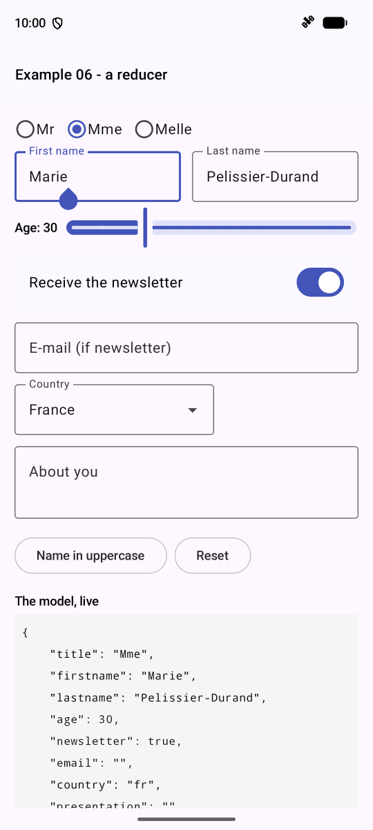
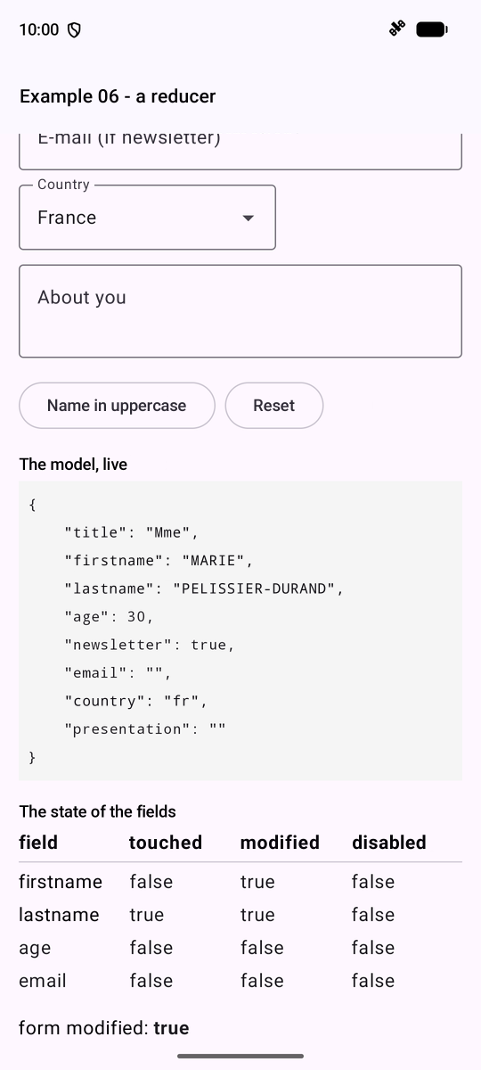
The reducer is a regular function: it can be tested without a screen, using a simple unit test ([assertEquals(expected, reducer(state, action))]).
The “Create an Account” form from the RdvMedecins application, with the same rules as the server. A pure function, [validate(account)], returns errors; these are only displayed for fields that have already been exited, or after an attempt to submit the form.
| // =========================================================================
// ex07/Ex07Activity.kt - validating a form, by hand
// -------------------------------------------------------------------------
// A PURE function, validate(account), returns the errors of the fields; we
// call it on each execution of the @Composable function: the errors
// are therefore always up to date.
// We do not show them right away (an empty form covered in red is
// unpleasant): only for a field already left ("touched"). Submitting
// marks all the fields as touched, then only acts if the form
// is valid. An OutlinedTextField displays an error under the field when
// it is given isError = true and a supportingText.
//
// Same rules as the RdvMedecins server ("Create an account" form).
// WARNING: this validation is only a CONVENIENCE for the user (an
// immediate answer, without a round trip to the server). It protects
// nothing: anyone can send the server a request made by
// hand (curl...). The server therefore ALWAYS revalidates everything (cf. example 25).
// =========================================================================
@file:OptIn(ExperimentalMaterial3Api::class)
package fr.stahe.examples.ex07
import android.os.Bundle
import androidx.activity.ComponentActivity
import androidx.activity.compose.setContent
import androidx.activity.enableEdgeToEdge
import androidx.compose.foundation.background
import androidx.compose.foundation.layout.Spacer
import androidx.compose.foundation.layout.fillMaxWidth
import androidx.compose.foundation.layout.height
import androidx.compose.foundation.layout.padding
import androidx.compose.foundation.layout.width
import androidx.compose.foundation.shape.RoundedCornerShape
import androidx.compose.material.icons.Icons
import androidx.compose.material.icons.filled.CheckCircle
import androidx.compose.material3.Button
import androidx.compose.material3.ExperimentalMaterial3Api
import androidx.compose.material3.Icon
import androidx.compose.material3.OutlinedTextField
import androidx.compose.material3.Text
import androidx.compose.runtime.Composable
import androidx.compose.runtime.getValue
import androidx.compose.runtime.mutableStateOf
import androidx.compose.runtime.remember
import androidx.compose.runtime.setValue
import androidx.compose.ui.Modifier
import androidx.compose.ui.focus.onFocusChanged
import androidx.compose.ui.graphics.Color
import androidx.compose.ui.text.input.PasswordVisualTransformation
import androidx.compose.ui.text.input.VisualTransformation
import androidx.compose.ui.unit.dp
import fr.stahe.examples.common.DropdownList
import fr.stahe.examples.common.ExamplePage
import fr.stahe.examples.common.ExamplesTheme
enum class Field { TITLE, FIRSTNAME, LASTNAME, LOGIN, PASSWORD, CONFIRMATION }
// the account, as typed
data class Account(
val title: String,
val firstName: String,
val lastName: String,
val login: String,
val password: String,
val confirmation: String,
)
val titles = listOf("Mr", "Mme", "Melle")
val loginFormat = Regex("^[a-z0-9._-]{1,30}$")
const val PASSWORD_MIN = 6
// the rules: a pure function, which only depends on its argument. It
// returns, for each field in error, its message. buildMap: we fill
// a modifiable Map, the function returns an UNMODIFIABLE Map
fun validate(a: Account): Map<Field, String> = buildMap {
if (a.title !in titles) put(Field.TITLE, "Choose a title from the list.")
when {
a.firstName.isBlank() -> put(Field.FIRSTNAME, "The first name is required.")
a.firstName.length > 20 -> put(Field.FIRSTNAME, "The first name must not exceed 20 characters.")
}
when {
a.lastName.isBlank() -> put(Field.LASTNAME, "The last name is required.")
a.lastName.length > 20 -> put(Field.LASTNAME, "The last name must not exceed 20 characters.")
}
when {
a.login.isEmpty() -> put(Field.LOGIN, "The login is required.")
!loginFormat.matches(a.login) -> put(Field.LOGIN, "Unaccented lower-case letters, digits, dot, hyphen, underscore.")
}
when {
a.password.isEmpty() -> put(Field.PASSWORD, "The password is required.")
a.password.length < PASSWORD_MIN -> put(Field.PASSWORD, "At least $PASSWORD_MIN characters.")
}
// a rule that compares TWO fields
if (a.confirmation != a.password) put(Field.CONFIRMATION, "The confirmation does not match the password.")
}
class Ex07Activity : ComponentActivity() {
override fun onCreate(savedInstanceState: Bundle?) {
super.onCreate(savedInstanceState)
enableEdgeToEdge()
setContent { ExamplesTheme { AccountPage() } }
}
}
@Composable
fun AccountPage() {
var account by remember { mutableStateOf(Account("Mr", "", "", "", "", "")) }
var touched by remember { mutableStateOf(setOf<Field>()) }
var submitAttempted by remember { mutableStateOf(false) }
var success by remember { mutableStateOf(false) }
// the errors: recomputed on each execution, never stored in the state
val errors = validate(account)
// the error to DISPLAY for a field: only if it has been touched
fun error(f: Field): String? = if (f in touched) errors[f] else null
fun send() {
submitAttempted = true
touched = Field.entries.toSet() // all the errors appear
// here, the account would be sent to the server (cf. example 25)
success = errors.isEmpty()
}
// a text field: label, error, and a green check mark if it is
// touched and valid. value: the value of the field; update: the function that
// builds the modified account
@Composable
fun AccountField(f: Field, label: String, value: String, update: (String) -> Account, secret: Boolean = false) {
var hadFocus by remember { mutableStateOf(false) }
val message = error(f)
OutlinedTextField(
value = value,
onValueChange = { text ->
account = update(text)
success = false
},
label = { Text(label) },
singleLine = true,
isError = message != null,
supportingText = message?.let { m -> { Text(m) } },
// the characters of a password are hidden
visualTransformation = if (secret) PasswordVisualTransformation() else VisualTransformation.None,
trailingIcon = if (f in touched && message == null) {
{ Icon(Icons.Default.CheckCircle, contentDescription = null, tint = Color(0xFF2E7D32)) }
} else {
null
},
// the field left (after having had the focus) becomes "touched"
modifier = Modifier.fillMaxWidth().onFocusChanged { fs ->
if (fs.isFocused) hadFocus = true else if (hadFocus) touched = touched + f
},
)
}
ExamplePage("Example 07 - validation") {
DropdownList(
label = "Title",
value = account.title,
choices = titles,
onChange = { t -> account = account.copy(title = t) },
modifier = Modifier.width(200.dp),
)
AccountField(Field.FIRSTNAME, "First name", account.firstName, { account.copy(firstName = it) })
AccountField(Field.LASTNAME, "Last name", account.lastName, { account.copy(lastName = it) })
AccountField(Field.LOGIN, "Login", account.login, { account.copy(login = it) })
AccountField(Field.PASSWORD, "Password", account.password, { account.copy(password = it) }, secret = true)
AccountField(Field.CONFIRMATION, "Confirmation", account.confirmation, { account.copy(confirmation = it) }, secret = true)
Spacer(Modifier.height(16.dp))
Button(onClick = { send() }) { Text("Create the account") }
Spacer(Modifier.height(12.dp))
if (submitAttempted && errors.isNotEmpty()) {
Message("The form contains ${errors.size} error(s).", Color(0xFFFFEBEE))
}
if (success) {
Message("Valid form: it could be sent to the server.", Color(0xFFE8F5E9))
}
}
}
// a small component private to this file: a message on a colored background
@Composable
private fun Message(text: String, color: Color) {
Text(text, Modifier.fillMaxWidth().background(color, RoundedCornerShape(8.dp)).padding(12.dp))
}
|
- lines 69–70: a regular expression ([Regex]) and a constant;
- lines 75–94: the rules. [buildMap [ ... ]]: a modifiable [Map] (via [put]) is populated; the function returns a NON-modifiable [Map]. The last rule compares TWO fields;
- line 113: errors are RECALCULATED on every execution, never cleared from the status: they are always up to date;
- line 116: the error TO DISPLAY for a field: only if it has been modified;
- Lines 118–122: The submission marks all fields as touched (all errors are displayed), and succeeds only if there are no errors;
- lines 129–151: a field of the account. [update] is a function that generates the modified account ([[ account.copy(firstName = it) ]]); [isError] and [supportingText] display the error below the field; [PasswordVisualTransformation] masks the characters; a green checkmark ([trailingIcon]) for a field that has been updated and is valid;
- line 183: [private]: a component visible only in this file.
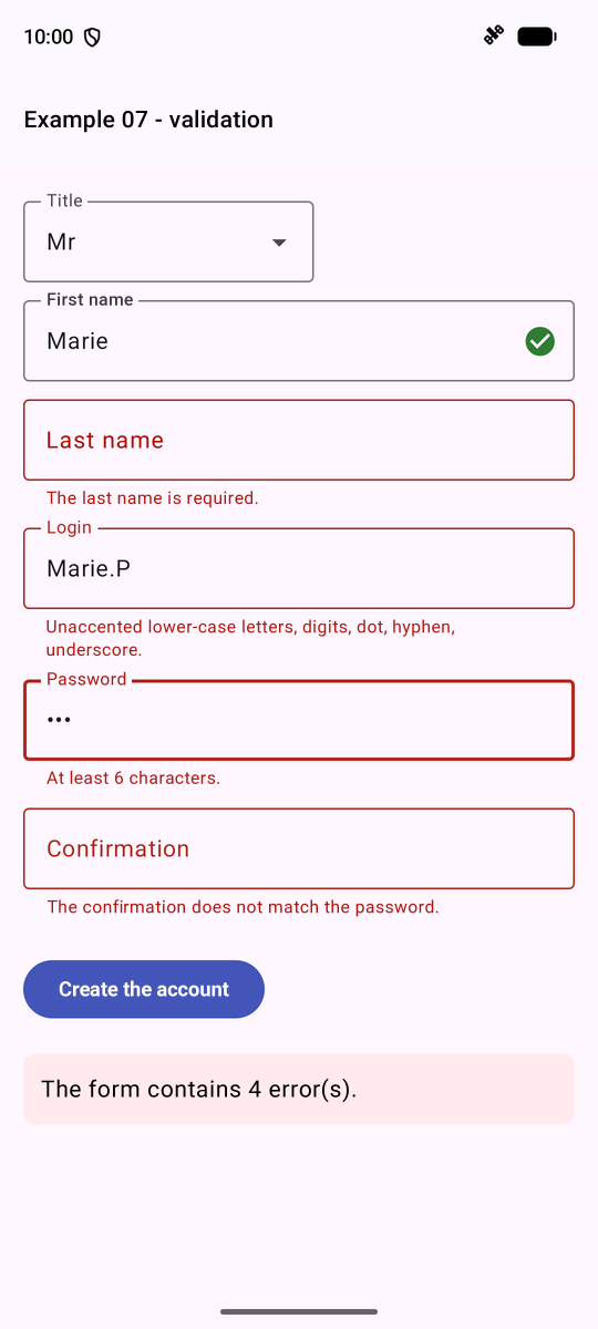
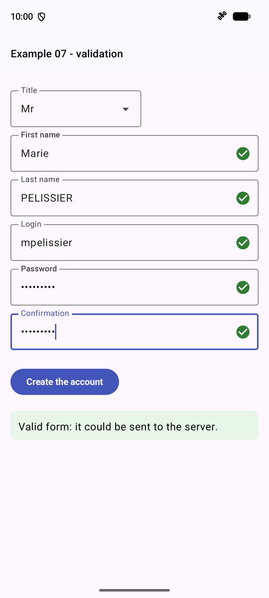
ATTENTION: this validation is simply a CONVENIENCE for the user (an immediate response, without a round trip to the server). It doesn’t protect anything: anyone can send a manually crafted request to the server (using [curl]; see the chapter on the server). The server therefore ALWAYS revalidates everything (see Example 25).
3.8. Example 08: Fields That Can Validate Themselves
[Flutter] has its own forms ([Form], [FormField]); [Compose] does not. So we write the tool ourselves, in just a few lines, using ordinary classes that HOLD a state observed by [Compose] (“state holders”): this is the standard approach with [Compose].
| // =========================================================================
// ex08/Form.kt - fields that can validate themselves
// -------------------------------------------------------------------------
// Compose provides no form tool (no equivalent of Flutter's Form
// or of Angular's forms): we write it ourselves, in
// a few lines, with ordinary classes that HOLD a state
// observed by Compose ("state holders"):
// - a RULE is a function: (value) -> null if the value is fine,
// otherwise the error message;
// - a FormField keeps its value and its error, and validates itself:
// first on demand (validate()), then on each keystroke, as soon as
// the user has modified it;
// - a Form groups fields: validate() validates them ALL,
// displays their errors, and returns true if everything is fine.
// =========================================================================
package fr.stahe.examples.ex08
import androidx.compose.runtime.getValue
import androidx.compose.runtime.mutableStateOf
import androidx.compose.runtime.setValue
// typealias: a more meaningful name for a function type
typealias Rule = (String) -> String?
// rule FACTORIES: each one returns a validation function
fun required(message: String): Rule = { v -> if (v.isBlank()) message else null }
// a rule that COMPLETES another one: "?:" (the Elvis operator) gives the
// result of other, if it is not null, otherwise that of the rest
fun maximum(max: Int, other: Rule): Rule = { v -> other(v) ?: if (v.length > max) "$max characters at most." else null }
class FormField(initialValue: String = "", private val rule: Rule = { null }) {
// the state of the field: observed by Compose, modifiable only HERE (private set)
var value by mutableStateOf(initialValue)
private set
var error by mutableStateOf<String?>(null)
private set
// has the user already modified the field?
private var modified = false
// a keystroke: the field validates itself as soon as the user has modified it
fun change(newValue: String) {
value = newValue
modified = true
error = rule(value)
}
fun validate(): Boolean {
error = rule(value)
return error == null
}
// revalidate, only if the user has already modified the field
fun revalidate() {
if (modified) validate()
}
}
// vararg: any number of fields, Form(firstName, lastName, login...)
class Form(private vararg val fields: FormField) {
// map first (ALL the fields are validated, and display their error),
// all next (are they all fine?)
fun validate(): Boolean = fields.map { it.validate() }.all { it }
}
|
- line 23: [typealias]: a name for a function type: a RULE receives the value and returns [null] if it is valid, otherwise an error message;
- lines 26–30: rule FACTORIES (functions that return a function). [?:], the “Elvis” operator: the value on the left if it is not [null]; otherwise, the value on the right;
- lines 32–56: a field: its value and error are [Compose] ([mutableStateOf]) states that can only be modified from within the class ([private set]). A field is validated on demand ([validate()]), then with each keystroke once the user has modified it;
- lines 61–64: a form groups fields together ([vararg]: any number of parameters). First, [map]: ALL the fields are validated and display any errors; then, [all]: are all of them valid?
Example 07, rewritten using these classes:
| // =========================================================================
// ex08/Ex08Activity.kt - a reusable form
// -------------------------------------------------------------------------
// The form of example 07, written with the classes of Form.kt:
// the rules are attached to the fields, the screen only has to display
// each field and to call form.validate() on submission.
// The fields are stored in a class, AccountForm, created ONCE
// (remember): it survives the recompositions.
// =========================================================================
@file:OptIn(ExperimentalMaterial3Api::class)
package fr.stahe.examples.ex08
import android.os.Bundle
import androidx.activity.ComponentActivity
import androidx.activity.compose.setContent
import androidx.activity.enableEdgeToEdge
import androidx.compose.foundation.background
import androidx.compose.foundation.layout.Spacer
import androidx.compose.foundation.layout.fillMaxWidth
import androidx.compose.foundation.layout.height
import androidx.compose.foundation.layout.padding
import androidx.compose.foundation.layout.width
import androidx.compose.foundation.shape.RoundedCornerShape
import androidx.compose.material3.Button
import androidx.compose.material3.ExperimentalMaterial3Api
import androidx.compose.material3.OutlinedTextField
import androidx.compose.material3.Text
import androidx.compose.runtime.Composable
import androidx.compose.runtime.getValue
import androidx.compose.runtime.mutableStateOf
import androidx.compose.runtime.remember
import androidx.compose.runtime.setValue
import androidx.compose.ui.Modifier
import androidx.compose.ui.graphics.Color
import androidx.compose.ui.text.input.PasswordVisualTransformation
import androidx.compose.ui.text.input.VisualTransformation
import androidx.compose.ui.unit.dp
import fr.stahe.examples.common.DropdownList
import fr.stahe.examples.common.ExamplePage
import fr.stahe.examples.common.ExamplesTheme
import kotlinx.serialization.json.JsonObject
import kotlinx.serialization.json.JsonPrimitive
val titles = listOf("Mr", "Mme", "Melle")
// the fields of the form, and their rules
class AccountForm {
var title by mutableStateOf("Mr")
val firstName = FormField(rule = maximum(20, required("The first name is required.")))
val lastName = FormField(rule = maximum(20, required("The last name is required.")))
// a rule written directly: a lambda
val login = FormField(
rule = { v ->
when {
v.isEmpty() -> "The login is required."
!Regex("^[a-z0-9._-]{1,30}$").matches(v) -> "Unaccented lower-case letters, digits, dot, hyphen, underscore."
else -> null
}
},
)
val password = FormField(
rule = { v ->
when {
v.isEmpty() -> "The password is required."
v.length < 6 -> "At least 6 characters."
else -> null
}
},
)
// a rule that reads ANOTHER field
val confirmation = FormField(
rule = { v -> if (v == password.value) null else "The confirmation does not match the password." },
)
val form = Form(firstName, lastName, login, password, confirmation)
// the values, in JSON (what would be sent to the server)
fun toJson(): String = JsonObject(
mapOf(
"title" to JsonPrimitive(title),
"firstName" to JsonPrimitive(firstName.value.trim()),
"lastName" to JsonPrimitive(lastName.value.trim()),
"login" to JsonPrimitive(login.value),
"password" to JsonPrimitive(password.value),
),
).toString()
}
class Ex08Activity : ComponentActivity() {
override fun onCreate(savedInstanceState: Bundle?) {
super.onCreate(savedInstanceState)
enableEdgeToEdge()
setContent { ExamplesTheme { AccountPage() } }
}
}
@Composable
fun AccountPage() {
val account = remember { AccountForm() }
// null: no submission yet; "": submission rejected; otherwise, the sent JSON
var sent by remember { mutableStateOf<String?>(null) }
ExamplePage("Example 08 - a reusable form") {
DropdownList(
label = "Title",
value = account.title,
choices = titles,
onChange = { account.title = it },
modifier = Modifier.width(200.dp),
)
TextField(account.firstName, "First name")
TextField(account.lastName, "Last name")
TextField(account.login, "Login")
// the password changes: the confirmation is revalidated (if it has already been typed)
TextField(account.password, "Password", secret = true, after = { account.confirmation.revalidate() })
TextField(account.confirmation, "Confirmation", secret = true)
Spacer(Modifier.height(16.dp))
Button(onClick = { sent = if (account.form.validate()) account.toJson() else "" }) {
Text("Create the account")
}
Spacer(Modifier.height(12.dp))
// ?.let: this block only exists if sent is not null
sent?.let { s ->
Text(
if (s.isEmpty()) "Invalid form." else "Valid form: $s",
Modifier
.fillMaxWidth()
.background(if (s.isEmpty()) Color(0xFFFFEBEE) else Color(0xFFE8F5E9), RoundedCornerShape(8.dp))
.padding(12.dp),
)
}
}
}
// the display of a FormField: its value, its error. after: what must
// be done after each keystroke (nothing, by default)
@Composable
fun TextField(field: FormField, label: String, secret: Boolean = false, after: () -> Unit = {}) {
OutlinedTextField(
value = field.value,
onValueChange = {
field.change(it)
after()
},
label = { Text(label) },
singleLine = true,
isError = field.error != null,
supportingText = field.error?.let { m -> { Text(m) } },
visualTransformation = if (secret) PasswordVisualTransformation() else VisualTransformation.None,
modifier = Modifier.fillMaxWidth(),
)
}
|
- Lines 48–77: the form fields and their rules, grouped into a class; the confirmation has a rule that reads ANOTHER field ([password.value]);
- line 101: [remember [ AccountForm() ]]: the object is created ONCE and survives recompositions;
- line 120: submission: [account.form.validate()] validates everything and determines whether submission is possible;
- lines 140–152: displaying a field: its value, its error, and [after], which specifies what to do after each keystroke: when the password changes, the confirmation is revalidated.
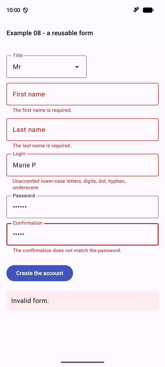
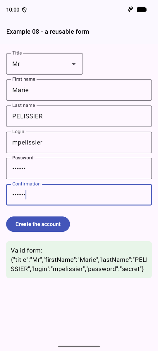
In a [@Composable] function, values are formatted using standard functions. The functions used in the application are compiled into a single file:
| // =========================================================================
// ex09/Formatting.kt - "home-made" formatting functions
// -------------------------------------------------------------------------
// Compose has no mechanism of its own for formatting (Angular has its
// "pipes"): in a @Composable function, we call ordinary
// FUNCTIONS, stored in a file and testable separately:
// timeRange(slot) -> "8:00 - 8:20"
// timeRange(slot, Part.START) -> "8:00"
// Kotlin also allows ADDING functions and properties to an
// existing type, through EXTENSIONS: "marie pelissier".capitalized ->
// "Marie Pelissier".
// For dates, numbers, amounts, the Java classes
// (java.time, java.text) know the conventions of each language
// (cf. Ex09Activity.kt).
// =========================================================================
package fr.stahe.examples.ex09
// a time slot, as described by the RdvMedecins API
data class Slot(val startHour: Int, val startMinute: Int, val endHour: Int, val endMinute: Int)
enum class Part { ALL, START, END }
// "8:05" rather than "8:5"; private: invisible outside this file
private fun time(h: Int, m: Int) = "$h:${m.toString().padStart(2, '0')}"
// an OPTIONAL parameter, with its default value: part = Part.ALL
fun timeRange(s: Slot, part: Part = Part.ALL): String = when (part) {
Part.START -> time(s.startHour, s.startMinute)
Part.END -> time(s.endHour, s.endMinute)
Part.ALL -> "${time(s.startHour, s.startMinute)} - ${time(s.endHour, s.endMinute)}"
}
// EXTENSIONS of the String type: new properties for ALL the
// strings. In the body, this designates the string
// "marie pelissier" -> "Marie Pelissier"; \p{L}: a letter, accented or not
val String.capitalized: String
get() = Regex("\\p{L}+").replace(this) { m ->
m.value.lowercase().replaceFirstChar { it.uppercase() }
}
// "Marie PELISSIER" -> "MP"
val String.initials: String
get() = split(Regex("\\s+")).filter { it.isNotEmpty() }.joinToString("") { it.first().uppercase() }
|
- lines 24–30: an OPTIONAL parameter, with its default value ([part = Part.ALL]); [padStart(2, '0')]: “8:05” instead of “8:5”;
- Lines 36–43: EXTENSIONS: [Kotlin] allows you to assign properties (and functions) to an existing type—in this case, to all strings. In the body, [this] refers to the string: ["marie pelissier".capitalized] is “Marie Pelissier.”
For dates, numbers, and amounts, the classes of [Java] ([java.time], [java.text]) follow the conventions of each language:
| // =========================================================================
// ex09/Ex09Activity.kt - formatting values
// -------------------------------------------------------------------------
// Each row of the table shows a piece of code and what it displays.
// The formatters (DateTimeFormatter, NumberFormat) are created once and for
// all, outside the @Composable functions: building them costs more
// than using them.
// Java knows from the start the names of the days and months of each language:
// nothing to load before using them.
// =========================================================================
@file:OptIn(ExperimentalMaterial3Api::class)
package fr.stahe.examples.ex09
import android.os.Bundle
import androidx.activity.ComponentActivity
import androidx.activity.compose.setContent
import androidx.activity.enableEdgeToEdge
import androidx.compose.foundation.layout.Row
import androidx.compose.foundation.layout.Spacer
import androidx.compose.foundation.layout.height
import androidx.compose.foundation.layout.padding
import androidx.compose.material3.ExperimentalMaterial3Api
import androidx.compose.material3.HorizontalDivider
import androidx.compose.material3.MaterialTheme
import androidx.compose.material3.OutlinedButton
import androidx.compose.material3.Text
import androidx.compose.runtime.Composable
import androidx.compose.runtime.getValue
import androidx.compose.runtime.mutableStateOf
import androidx.compose.runtime.remember
import androidx.compose.runtime.setValue
import androidx.compose.ui.Modifier
import androidx.compose.ui.graphics.Color
import androidx.compose.ui.text.font.FontFamily
import androidx.compose.ui.text.font.FontWeight
import androidx.compose.ui.unit.dp
import androidx.compose.ui.unit.sp
import fr.stahe.examples.common.ExamplePage
import fr.stahe.examples.common.ExamplesTheme
import kotlinx.serialization.json.JsonObject
import kotlinx.serialization.json.JsonPrimitive
import java.text.NumberFormat
import java.time.LocalDate
import java.time.LocalDateTime
import java.time.format.DateTimeFormatter
import java.time.format.FormatStyle
import java.util.Locale
// dates: "ready-made" formats (SHORT, MEDIUM, LONG, FULL), or a pattern
val shortDate: DateTimeFormatter = DateTimeFormatter.ofLocalizedDate(FormatStyle.MEDIUM).withLocale(Locale.US)
val fullDate: DateTimeFormatter = DateTimeFormatter.ofLocalizedDate(FormatStyle.FULL).withLocale(Locale.US)
val timeOnly: DateTimeFormatter = DateTimeFormatter.ofLocalizedTime(FormatStyle.MEDIUM).withLocale(Locale.US)
val frenchDay: DateTimeFormatter = DateTimeFormatter.ofLocalizedDate(FormatStyle.LONG).withLocale(Locale.FRANCE)
val pattern: DateTimeFormatter = DateTimeFormatter.ofPattern("MM/dd/yyyy HH:mm", Locale.US)
// numbers and amounts
val euros: NumberFormat = NumberFormat.getCurrencyInstance(Locale.US).apply { currency = java.util.Currency.getInstance("EUR") }
val integer: NumberFormat = NumberFormat.getNumberInstance(Locale.US)
// apply: configures the object just created, and returns it
val percent: NumberFormat = NumberFormat.getPercentInstance(Locale.US).apply { minimumFractionDigits = 1 }
const val DAY = "2026-10-05" // a date in the format of the RdvMedecins API
const val PRICE = 1234.5
const val RATE = 0.055
const val NAME = "marie pelissier"
val doctor = mapOf("title" to "Mme", "firstName" to "Marie", "lastName" to "PELISSIER")
val languages = listOf("Kotlin", "Compose", "Dart", "Swift", "SQL")
val slots = listOf(Slot(8, 0, 8, 20), Slot(8, 20, 8, 40), Slot(14, 5, 14, 25))
class Ex09Activity : ComponentActivity() {
override fun onCreate(savedInstanceState: Bundle?) {
super.onCreate(savedInstanceState)
enableEdgeToEdge()
setContent { ExamplesTheme { FormattingPage() } }
}
}
@Composable
fun FormattingPage() {
var now by remember { mutableStateOf(LocalDateTime.now()) }
// (displayed code, value): a row of the table, as a pair
val rows = listOf(
"shortDate.format(now)" to shortDate.format(now),
"fullDate.format(now)" to fullDate.format(now),
"timeOnly.format(now)" to timeOnly.format(now),
"pattern.format(now)" to pattern.format(now),
"fullDate.format(LocalDate.parse(DAY))" to fullDate.format(LocalDate.parse(DAY)),
"frenchDay.format(LocalDate.parse(DAY))" to frenchDay.format(LocalDate.parse(DAY)),
"now.toString()" to now.toString(),
"euros.format(PRICE)" to euros.format(PRICE),
"integer.format(PRICE)" to integer.format(PRICE),
"\"%.1f\".format(Locale.ROOT, PRICE)" to "%.1f".format(Locale.ROOT, PRICE),
"percent.format(RATE)" to percent.format(RATE),
"NAME.uppercase()" to NAME.uppercase(),
"NAME.capitalized" to NAME.capitalized,
"\"RDV\".lowercase()" to "RDV".lowercase(),
"languages.take(3).joinToString(\", \")" to languages.take(3).joinToString(", "),
"JsonObject(...).toString()" to JsonObject(doctor.mapValues { JsonPrimitive(it.value) }).toString(),
// two transformations in a row: the result of the first goes to the second
"NAME.capitalized.initials" to NAME.capitalized.initials,
)
ExamplePage("Example 09 - formatting") {
// a table: the first column takes 55 % of the width (weight)
Row(Modifier.padding(4.dp)) {
Text("In the code", Modifier.weight(0.55f), fontWeight = FontWeight.Bold)
Text("Displayed", Modifier.weight(0.45f), fontWeight = FontWeight.Bold)
}
// a pair can be "destructured": (code, value)
for ((code, value) in rows) {
HorizontalDivider()
Row(Modifier.padding(4.dp)) {
Text(code, Modifier.weight(0.55f), fontFamily = FontFamily.Monospace, fontSize = 11.sp, color = Color(0xFFC7254E))
Text(value, Modifier.weight(0.45f))
}
}
Spacer(Modifier.height(16.dp))
Text("Going through the entries of a Map", style = MaterialTheme.typography.titleSmall)
for ((key, value) in doctor) {
Text("$key = $value")
}
Spacer(Modifier.height(16.dp))
Text("A home-made function: timeRange", style = MaterialTheme.typography.titleSmall)
for (s in slots) {
Text("${timeRange(s)} (start: ${timeRange(s, Part.START)})")
}
Spacer(Modifier.height(16.dp))
OutlinedButton(onClick = { now = LocalDateTime.now() }) { Text("Refresh the time") }
}
}
|
- lines 51–62: the formatters, created once and for all outside the [@Composable] functions (creating them costs more than using them). [FormatStyle.MEDIUM], [FULL]...: “ready-made” formats; [ofPattern]: a pattern; [apply [ ... ]] configures the object that has just been created and returns it;
- lines 85–103: Each line in the array is a pair (displayed code, value), generated by [to];
- line 113: a pair, such as an entry from [Map], is “unpacked”: [for ((code, value) in rows)].
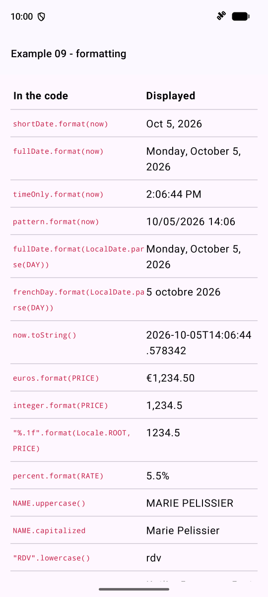
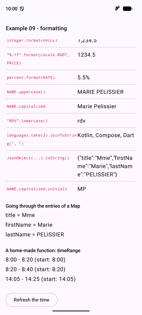
Note ["%.1f".format(Locale.ROOT, PRICE)]: without the “neutral” language [Locale.ROOT], [format] would use the phone’s language and write “1234,5” in French. This is what’s needed for display purposes, not for data sent to a server.