3. Getting Started with Ionic
3.1. Example 01: The Structure of an Ionic Application
3.1.1. The project
An [Ionic] application, created using [Angular], is initially a standard [Angular] application: it is created using the [Angular] command-line tool, [ng], and then the components from [Ionic] and [Capacitor] are added to it; this tool will turn it into a [Android] application:
| npm install -g @angular/cli
ng new examples_ionic --style=scss --skip-tests --ssr=false
cd examples_ionic
npm install @ionic/angular ionicons @capacitor/core @capacitor/android @capacitor/preferences
npm install -D @capacitor/cli
npx cap init "Ionic Examples" fr.stahe.examples --web-dir dist/examples_ionic/browser
|
- Line 1: Installs [Angular CLI], the [ng] command, for the entire computer ([-g], “global”);
- line 2: builds the [examples_ionic] project: a complete [Angular] application, ready to run. [--style=scss]: the style sheets will be written in [SCSS], the CSS enhanced with variables and nesting; [--skip-tests]: no unit test files; [--ssr=false]: no server-side rendering, unnecessary for a mobile application;
- Line 4: the packages for [Ionic] (its components for [Angular], and its icon font [ionicons]) and those for [Capacitor] (its core, the [Android] platform, and the key-value storage on the device, which will be used starting in Example 20);
- line 5: the command-line tool for [Capacitor], the command [cap], which is used only for development ([-D]);
- line 6: writes the file [capacitor.config.ts]: the application name and its identifier (the prefix [fr.stahe], reversed like a domain name, followed by the application name; two applications installed on the same phone must have different identifiers), and the folder where [ng build] stores the compiled application.
The sample project was created this way, and then its [src/app] folder was filled in manually to combine twenty-five samples into a single application: a home page (the sample menu) and one page per sample. This way, they share the same packages, which are downloaded only once. Its directory structure:
| examples_ionic
├── angular.json the Angular project configuration
├── capacitor.config.ts the Capacitor configuration
├── package.json the packages and the scripts of the project
├── package-lock.json the exact versions of the installed packages
├── proxy.conf.json the relay to the JSON server (examples 22 to 25)
├── tsconfig.json the TypeScript configuration
├── tsconfig.app.json
├── captures/ the scripts that make the screenshots of the course
├── node_modules/ the installed packages (npm install)
├── public/ files delivered as is (icon, images, dictionaries)
├── android/ the Android Studio project (after npx cap add android)
└── src/
├── index.html the page that hosts the application
├── main.ts the entry point
├── styles.scss the styles of the whole application
└── app/
├── app.ts the root component
├── back-button.ts Android's Back button
├── app.routes.ts the routes: one address per example
├── examples.ts the list of the 25 examples
├── home/ the menu of the examples
│ ├── home.page.ts
│ └── home.page.html
├── common/ the code shared by examples 22 to 25
├── ex01-first-application/
│ ├── ex01.page.ts
│ └── ex01.page.html
├── ex02-state/
│ ├── ex02.page.ts
│ └── ex02.page.html
└── ...
|
Each example has its own folder, [src/app/exNN-short-name]. A page consists of two files: a class [TypeScript] ([exNN.page.ts]) and its template [HTML] ([exNN.page.html]).
3.1.2. The package.json file
The [package.json] file describes the project for [npm], the package manager for [Node.js]: its name, its scripts, and the packages it requires.
| {
"name": "examples-ionic",
"version": "0.0.0",
"scripts": {
"ng": "ng",
"start": "ng serve",
"build": "ng build",
"watch": "ng build --watch --configuration development",
"android": "ng build && cap sync android && cap run android",
"captures": "node captures/captures.mjs"
},
"private": true,
"packageManager": "npm@10.9.4",
"dependencies": {
"@angular/common": "^22.2.0",
"@angular/compiler": "^22.2.0",
"@angular/core": "^22.2.0",
"@angular/forms": "^22.2.0",
"@angular/platform-browser": "^22.2.0",
"@angular/router": "^22.2.0",
"@capacitor/android": "^8.5.2",
"@capacitor/app": "^8.1.2",
"@capacitor/core": "^8.5.2",
"@capacitor/preferences": "^8.0.1",
"@ionic/angular": "^9.0.6",
"ionicons": "^8.1.0",
"rxjs": "~7.8.0",
"tslib": "^2.3.0"
},
"devDependencies": {
"@angular/build": "^22.2.1",
"@angular/cli": "^22.2.1",
"@angular/compiler-cli": "^22.2.0",
"@capacitor/cli": "^8.5.2",
"playwright": "^1.56.1",
"prettier": "^3.8.1",
"typescript": "~6.0.2"
}
}
|
- lines 2–3: the project name and version;
- lines 4–11: the scripts, which are launched by [npm run name] (or [npm start] for the script [start]): [npm start] launches [ng serve], the development server; [npm run build] launches [ng build], which builds the application to be deployed; [npm run android] performs the compilation, copies the application to the [Android] project, and launches it on the phone (see “Execution”); [npm run captures] generates the screenshots for this course;
- line 12: [private]: this project is not a library; it will never be published to the [npm] repository;
- Lines 14–29: The packages required by the application, which will be included with it. The [@angular/...] packages are components of the [Angular] framework: [core] (components, signals, dependency injection), [common] (pipes, the HTTP client), [forms] (forms), [router] (the router), [platform-browser] (browser rendering), [compiler] (the template compiler). Next come [Capacitor] and its plugins [app] (the Back button from [Android], see below) and [preferences] (the device’s memory, see Example 20), [@ionic/angular] (the components of [Ionic]), [ionicons] (its icons), [rxjs] (asynchronous data streams, see Example 19), and [tslib] (small functions used by the compiled code);
- lines 30–38: packages used solely for development: [@angular/build] (the application compiler, built on [esbuild] and [Vite]), [@angular/cli] (the [ng] command), [@capacitor/cli] (the [cap] command), [typescript], [prettier] (automatic code formatting), and [playwright] (browser control, for screenshots).
The prefix [^] for a version ([^22.2.0]) accepts any newer version of the same major version (22.3.0, but not 23.0.0); the prefix [~] ([~6.0.2]) accepts only patch releases (6.0.3, but not 6.1.0). The command [npm install] downloads the packages to the [node_modules] folder and writes the exact selected versions to the [package-lock.json] file. To add a package, type [npm install package-name]: the command installs it and adds its line to [package.json].
3.1.3. The file angular.json
The file [angular.json] tells [Angular CLI] how to compile and serve the application. Lines 14–36 (not shown) configure the files generated by the [ng generate] command (styles in [SCSS], no tests). The rest:
| "root": "",
"sourceRoot": "src",
"prefix": "app",
"architect": {
"build": {
"builder": "@angular/build:application",
"options": {
"browser": "src/main.ts",
"tsConfig": "tsconfig.app.json",
"inlineStyleLanguage": "scss",
"assets": [
{
"glob": "**/*",
"input": "public"
}
],
"styles": [
"src/styles.scss"
]
},
"configurations": {
"production": {
"budgets": [
{
"type": "initial",
"maximumWarning": "2MB",
"maximumError": "5MB"
},
{
"type": "anyComponentStyle",
"maximumWarning": "8kB",
"maximumError": "16kB"
}
],
"outputHashing": "all"
},
"development": {
"optimization": false,
"extractLicenses": false,
"sourceMap": true
}
},
"defaultConfiguration": "production"
},
"serve": {
"builder": "@angular/build:dev-server",
"configurations": {
"production": {
"buildTarget": "examples_ionic:build:production"
},
"development": {
"buildTarget": "examples_ionic:build:development"
}
},
"defaultConfiguration": "development",
"options": {
"proxyConfig": "proxy.conf.json",
"port": 8100
}
}
|
- lines 38–40: the project is located at the root of the folder; its source code is in [src/]. [prefix]: the prefix for component tags ([app-root], [app-ex01]...);
- lines 42–43: the compilation ([ng build]), handled by the builder [@angular/build:application];
- line 45: the application's entry point, [src/main.ts];
- line 47: the styles written within the components themselves are in [SCSS];
- Lines 48–53: The contents of the folder [public/] are copied as-is into the compiled application: the icon [favicon.ico], the image [ex03/doctor.svg] from Example 03, and the dictionaries [i18n/] from Examples 21 and 25;
- lines 54–56: the global stylesheet, [src/styles.scss];
- lines 59–73: the configuration [production], which is the one for the shipped application: the code is optimized (this is the default), “budgets” warn if the application becomes too large, and the names of the compiled files contain a hash of their content ([outputHashing]), so that the browser does not cache an old version;
- Lines 74–78: the [development] configuration: no optimization, and “source maps,” which allow the browser’s development tools to display the original [TypeScript] code;
- line 80: [ng build] uses the [production] configuration; [ng build --configuration development] uses the other one;
- Lines 82–97: the development server ([ng serve]), configured as [development] (line 92), on port 8100 (line 95), with a relay to the server JSON (line 94).
3.1.4. The file proxy.conf.json
| {
"/api": {
"target": "http://localhost:8080",
"secure": false,
"changeOrigin": false,
"logLevel": "warn"
}
}
|
This file will only be used for examples 22 through 25. The [Angular] development server forwards to the JSON and [RdvMedecins] ([http://localhost:8080]) any request whose address begins with [/api]. For the browser, the application, and API, the origin is then the same ([http://localhost:8100]): no CORS check, and the session cookie is accepted without any special configuration. These examples will revisit this point.
3.1.5. The capacitor.config.ts file
| // =========================================================================
// capacitor.config.ts - the Capacitor configuration
// -------------------------------------------------------------------------
// Capacitor turns the web application (the folder produced by ng build)
// into an Android application: it wraps it in an Android Studio project
// (android/ folder), where it is displayed by a "WebView", the engine of
// the phone's Chrome browser. Commands (see example 01, "Running"):
// npx cap add android (only once: creates the android/ folder)
// ng build (builds the web application)
// npx cap sync android (copies it into the Android project)
// npx cap run android (runs it on an emulator or a phone)
// =========================================================================
import type { CapacitorConfig } from '@capacitor/cli';
const config: CapacitorConfig = {
// the unique identifier of the application on the phone (and on the Play Store)
appId: 'fr.stahe.examples',
// the name displayed under the icon
appName: 'Ionic Examples',
// the folder of the compiled web application (ng build)
webDir: 'dist/examples_ionic/browser',
server: {
// allows unencrypted HTTP requests (http://10.0.2.2:8080) to
// the development JSON server (examples 22 to 25)
cleartext: true,
},
plugins: {
// CapacitorHttp: the HTTP requests of the application are no longer made
// by the WebView but by Android's native code. Consequences (see
// examples 22 and 23): no CORS check (the JSON server has nothing to
// allow), and the cookies (the one of the authentication token) are
// stored by Android and sent back automatically
CapacitorHttp: {
enabled: true,
},
},
};
export default config;
|
- line 18: the application ID on the phone, [fr.stahe.examples];
- line 20: its name, displayed under its icon;
- line 22: the folder for the compiled web application, which [Capacitor] copies into the [Android] project;
- lines 23–27: By default, [Android] rejects unencrypted HTTP requests; these are allowed in order to connect to the JSON development server (examples 22–25);
- lines 28–37: HTTP requests will be made by the native code of [Android] rather than by the built-in browser. Again, examples 22 and 23 explain why.
This is the main architectural difference from [Flutter]: a [Ionic] application is a **web** application (HTML, CSS, JavaScript), which [Capacitor] wraps into a [Android] application. This application displays only “WebView”—the phone’s [Chrome] browser engine, in full-screen mode—which loads the web application included with it. [Capacitor] also gives the code JavaScript access to the phone’s features (storage, camera, notifications, etc.) via plugins. [Flutter], on the other hand, renders every pixel on the screen using its own engine.
3.1.6. The file tsconfig.json
| /* To learn more about Typescript configuration file: https://www.typescriptlang.org/docs/handbook/tsconfig-json.html. */
/* To learn more about Angular compiler options: https://angular.dev/reference/configs/angular-compiler-options. */
{
"compileOnSave": false,
"compilerOptions": {
"strict": true,
"noImplicitOverride": true,
"noPropertyAccessFromIndexSignature": true,
"noImplicitReturns": true,
"noFallthroughCasesInSwitch": true,
"skipLibCheck": true,
"isolatedModules": true,
"experimentalDecorators": true,
"importHelpers": true,
"target": "ES2022",
"module": "preserve"
},
"angularCompilerOptions": {
"enableI18nLegacyMessageIdFormat": false,
"strictInjectionParameters": true,
"strictInputAccessModifiers": true,
"strictTemplates": true
},
"files": [],
"references": [
{
"path": "./tsconfig.app.json"
}
]
}
|
The [TypeScript] compiler settings. Note the following:
- line 6: [strict]: the strictest typing. A variable of type [string] cannot hold [null]; a parameter must have a type, etc.;
- line 8: a property of a “dictionary” object (of type [{ [key: string]: value }]) is accessed using square brackets: [errors['required']], not [errors.required] (see Example 08);
- Lines 9–10: A function must return a value in all cases; a [case] from a [switch] must not “fall” into the next one;
- line 22: [strictTemplates]: [HTML] templates are checked with the same rigor as the [TypeScript] code: a misspelled property or an argument of the wrong type are compilation errors (see example 06).
3.1.7. The page src/index.html
| <!doctype html>
<html lang="en">
<head>
<meta charset="utf-8">
<title>Ionic Examples</title>
<base href="/">
<!-- viewport-fit=cover: the application fills the whole phone screen, notch included;
user-scalable=no: no two-finger zoom, as in a native application -->
<meta name="viewport" content="viewport-fit=cover, width=device-width, initial-scale=1.0, minimum-scale=1.0, maximum-scale=1.0, user-scalable=no">
<meta name="color-scheme" content="light dark">
<link rel="icon" type="image/x-icon" href="favicon.ico">
</head>
<body>
<app-root></app-root>
</body>
</html>
|
The web application consists of this single page, which the browser (or the phone's WebView) loads upon startup:
- line 2: the page’s language, English;
- line 6: the application’s base URL; page URLs ([/ex01], [/ex02]...) will be relative to the root;
- line 9: the page spans the full width of the screen, without zooming—this is the behavior of an app, not a website;
- line 14: the [app-root] tag, empty: [Angular] will insert the application’s root component there.
3.1.8. The entry point: src/main.ts
| // =========================================================================
// src/main.ts - the entry point of the application
// -------------------------------------------------------------------------
// An Angular application starts with bootstrapApplication: Angular creates
// the ROOT component (App) and inserts it into the <app-root> tag of the
// index.html page. The second parameter gives the "providers"
// of the whole application: Ionic, the router, the HTTP client, the language.
// =========================================================================
import { registerLocaleData } from '@angular/common';
import { provideHttpClient } from '@angular/common/http';
import localeFr from '@angular/common/locales/fr';
import { LOCALE_ID } from '@angular/core';
import { bootstrapApplication } from '@angular/platform-browser';
import { provideRouter, withComponentInputBinding } from '@angular/router';
import { provideIonicAngular } from '@ionic/angular';
import { App } from './app/app';
import { routes } from './app/app.routes';
// the French formatting rules (dates, numbers, amounts) of Angular's
// "pipes", for the second language of examples 09 and 21 (en-US is built in)
registerLocaleData(localeFr);
bootstrapApplication(App, {
providers: [
// Ionic: 'md' mode (Material Design) = the look of Android, even in
// a computer's browser (otherwise Ionic takes the iOS look on an iPhone)
provideIonicAngular({ mode: 'md' }),
// the router: the list of routes (app.routes.ts);
// withComponentInputBinding: the parameters of a route are given to the
// inputs (input) of the page's component (see example 17)
provideRouter(routes, withComponentInputBinding()),
// Angular's HTTP client (examples 22 to 25)
provideHttpClient(),
// the language of the application: (American) English
{ provide: LOCALE_ID, useValue: 'en-US' },
],
}).catch((err) => console.error(err));
|
- line 22: French formatting rules for dates and numbers, for the “pipes” in [Angular], used as the second language in examples 09 and 21 ([en-US] is built in);
- line 24: [bootstrapApplication] starts [Angular]: it creates the root component, [App], and inserts it into the [app-root] tag of [index.html]. The second parameter specifies the “providers” ([providers]) for the entire application: the services that dependency injection (Example 14) will provide to the components that request them;
- line 28: [Ionic], in [md] mode ([Material Design], the aspect of [Android]). Without this setting, [Ionic] would take on the appearance of [iOS] on a iPhone, and that of [Material Design] elsewhere;
- line 32: the router for [Angular], and its routes (the [app.routes.ts] file). The router maps a page to each address;
- line 34: the client HTTP for [Angular] (examples 22 through 25);
- line 36: the application language, [en-US] (American English), for formatting dates and numbers.
A note on what is **not** in this file: [zone.js]. Up through version 20, a [Angular] application would load this library, which monitored all asynchronous code (events, timers, requests) to determine when to update the screen. Starting with version 21, a new “zoneless” application does without it: [Angular] updates the screen when a **signal** read by a template changes, and after every event handled by a template (a tap, a keystroke). This is how all the examples in this course work, and the reason why their changing data are signals.
3.1.9. Styles: src/styles.scss
| // =========================================================================
// src/styles.scss - the styles of the whole application
// -------------------------------------------------------------------------
// Ionic's style sheets: without them, its components do not have
// their look. core.css is essential; the others are utilities
// (margins, alignments, ion-padding, ion-text-center classes...).
// =========================================================================
@use '@ionic/angular/css/core.css';
@use '@ionic/angular/css/normalize.css';
@use '@ionic/angular/css/structure.css';
@use '@ionic/angular/css/typography.css';
@use '@ionic/angular/css/padding.css';
@use '@ionic/angular/css/float-elements.css';
@use '@ionic/angular/css/text-alignment.css';
@use '@ionic/angular/css/text-transformation.css';
@use '@ionic/angular/css/flex-utils.css';
@use '@ionic/angular/css/display.css';
// Ionic's dark theme, enabled by the ion-palette-dark CSS class set
// on the <html> tag (see example 20)
@use '@ionic/angular/css/palettes/dark.class.css';
// the main colour of the application (buttons, top bar): an indigo,
// as in the Flutter examples. Ionic derives from --ion-color-primary the
// lighter (tint) and darker (shade) variants
:root {
--ion-color-primary: #3f51b5;
--ion-color-primary-rgb: 63, 81, 181;
--ion-color-primary-contrast: #ffffff;
--ion-color-primary-contrast-rgb: 255, 255, 255;
--ion-color-primary-shade: #37479f;
--ion-color-primary-tint: #5262bc;
}
|
- lines 9–18: the style sheets for [Ionic]: [core.css] is essential; the others provide utility classes ([ion-padding], [ion-text-center], [ion-margin-top]...);
- line 22: the dark theme, enabled by the CSS class (example 20);
- lines 27–34: the application’s primary color ([primary]), an indigo, as in the examples [Flutter]. The components of [Ionic] have a property [color] ([color="primary"], [color="danger"], [color="success"]...) that draws from this palette.
3.1.10. The root component: src/app/app.ts
| // =========================================================================
// src/app/app.ts - the ROOT component of the application
// -------------------------------------------------------------------------
// It only contains two Ionic components:
// - <ion-app>: the container of every Ionic application;
// - <ion-router-outlet>: the place where the router displays the page of
// the current address. Ionic's one (and not Angular's <router-outlet>)
// animates the transition from one page to another and keeps the previous
// pages in memory: the phone's Back button returns to them without recreating them.
// Its constructor wires Android's Back button (see back-button.ts).
// =========================================================================
import { Component } from '@angular/core';
import { IonApp, IonRouterOutlet } from '@ionic/angular';
import { handleBackButton } from './back-button';
@Component({
selector: 'app-root',
imports: [IonApp, IonRouterOutlet],
template: `
<ion-app>
<ion-router-outlet />
</ion-app>
`,
})
export class App {
constructor() {
handleBackButton();
}
}
|
- line 14: the components of [Ionic] are imported from the [@ionic/angular] package. Each is a [TypeScript] class: [IonApp] for the [<ion-app>] tag, [IonRouterOutlet] for [<ion-router-outlet>], and so on;
- Lines 17–25: An [Angular] component is a class decorated by [@Component]. The decorator provides the name of its tag ([selector]), the components used by its template ([imports]: a component only knows what it imports), and its template, which is written directly in the decorator ([template]);
- line 21: [<ion-app>], the container for the entire application [Ionic];
- line 22: [<ion-router-outlet>], the location where the router displays the page for the current address. This is the one for [Ionic], not the [<router-outlet>] for [Angular]: it handles navigation between pages, just as [Android] does, and keeps the previous pages in memory;
- lines 26–30: The class itself has neither its own data nor its own behavior. Its constructor, which is executed only once at startup, connects the Back button from [Android] (line 28).
A [Android] phone has a Back button (or gesture). In a [Flutter] app, it works on its own: it closes the open window, returns to the previous screen, and exits the app from the first screen. In a [Ionic] app, [Capacitor] receives the Back event; if it cannot find anyone to handle it, it simply moves backward through the history of WebView and closes the app when that history is empty. [Ionic] is not notified of this: an open window (example 16) does not close, and you can exit the application from a page other than the menu. You must therefore connect it using the [@capacitor/app] plugin:
| // =========================================================================
// src/app/back-button.ts - Android's Back button
// -------------------------------------------------------------------------
// On the phone, Capacitor receives the press on the Back button. If it has
// no listener for this event, it simply goes back in
// the WebView's history, then closes the application: Ionic knows nothing
// about it (an open dialog does not close, nor does the side menu).
// The @capacitor/app plugin lets us subscribe to it: as soon as there is a
// listener, Capacitor passes the press on to Ionic, which calls the handler
// with the highest priority:
// - 100: an open dialog (alert, ion-modal...) closes;
// - 99: the open side menu closes;
// - 1: (ours) we go back to the previous screen; if there is none,
// we quit the application.
// In the browser, there is no Back button: we do nothing.
// =========================================================================
import { inject } from '@angular/core';
import { NavController, Platform } from '@ionic/angular';
import { App as CapacitorApp } from '@capacitor/app';
import { Capacitor } from '@capacitor/core';
// to be called in the constructor of the root component (injection context)
export function handleBackButton(): void {
if (!Capacitor.isNativePlatform()) return;
const navigation = inject(NavController);
// an (empty) listener: Capacitor now passes the press on to Ionic
void CapacitorApp.addListener('backButton', () => {});
inject(Platform).backButton.subscribeWithPriority(1, async () => {
// pop(): back to the previous screen of Ionic's stack; false: the
// stack only contains the displayed screen, there is nothing left behind
if (!(await navigation.pop())) {
await CapacitorApp.exitApp();
}
});
}
|
- line 20: the [App] plugin from [Capacitor] (installed by [npm install @capacitor/app]). It is named [App], like the root component: it is renamed during import ([as CapacitorApp]) to avoid confusion;
- line 24: a regular function, called by the root component’s constructor. It uses [inject]: it can only be called where [Angular] is able to provide services (a constructor, property initialization), the “injection context”;
- line 25: In a browser ([ng serve]), there is no Back button: no action is taken. [Capacitor.isNativePlatform()] is equivalent to [true] in the [Android] application;
- line 26: the [NavController] service of [Ionic]: it knows the page stacks of [<ion-router-outlet>];
- line 28: a listener for the [backButton] event, which does nothing. Its mere presence is enough: as soon as there is a listener, [Capacitor] no longer automatically moves backward in the history, and passes the support to [Ionic];
- Lines 29–35: [Ionic] receives the support and calls ONE and ONLY ONE handler: the one with the highest priority. The windows ([AlertController], [ion-modal], the list in [ion-select]...) are assigned priority 100, while the drop-down menu has priority 99: when one of them is open, that one closes. Otherwise, our handling takes precedence (priority 1): [navigation.pop()] returns to the previous page, and returns [false] if there is none; the application is then exited ([exitApp()]).
In this project, the menu is the only starting page: the Back button takes you from an example back to the menu, then exits the application.
3.1.12. The routes: src/app/app.routes.ts
| // =========================================================================
// src/app/app.routes.ts - the routes of the examples application
// -------------------------------------------------------------------------
// A route associates an ADDRESS (path) with a PAGE (a component). The home
// page ('') is the menu of the examples; each example has its address:
// /ex01, /ex02... The code of an example is only loaded when we go there
// (loadComponent, loadChildren: "lazy" loading, see example 17).
// =========================================================================
import { Routes } from '@angular/router';
export const routes: Routes = [
{ path: '', loadComponent: () => import('./home/home.page').then((m) => m.HomePage) },
{ path: 'ex01', loadComponent: () => import('./ex01-first-application/ex01.page').then((m) => m.Ex01Page) },
{ path: 'ex02', loadComponent: () => import('./ex02-state/ex02.page').then((m) => m.Ex02Page) },
{ path: 'ex03', loadComponent: () => import('./ex03-templates/ex03.page').then((m) => m.Ex03Page) },
{ path: 'ex04', loadComponent: () => import('./ex04-events/ex04.page').then((m) => m.Ex04Page) },
{ path: 'ex05', loadComponent: () => import('./ex05-controlled-fields/ex05.page').then((m) => m.Ex05Page) },
{ path: 'ex06', loadComponent: () => import('./ex06-reducer/ex06.page').then((m) => m.Ex06Page) },
{ path: 'ex07', loadComponent: () => import('./ex07-validation/ex07.page').then((m) => m.Ex07Page) },
{ path: 'ex08', loadComponent: () => import('./ex08-reactive-forms/ex08.page').then((m) => m.Ex08Page) },
{ path: 'ex09', loadComponent: () => import('./ex09-formatting/ex09.page').then((m) => m.Ex09Page) },
{ path: 'ex10', loadComponent: () => import('./ex10-component-inputs/ex10.page').then((m) => m.Ex10Page) },
{ path: 'ex11', loadComponent: () => import('./ex11-lifting-state-up/ex11.page').then((m) => m.Ex11Page) },
{ path: 'ex12', loadComponent: () => import('./ex12-composition/ex12.page').then((m) => m.Ex12Page) },
{ path: 'ex13', loadComponent: () => import('./ex13-lifecycle/ex13.page').then((m) => m.Ex13Page) },
{ path: 'ex14', loadComponent: () => import('./ex14-injection/ex14.page').then((m) => m.Ex14Page) },
{ path: 'ex15', loadComponent: () => import('./ex15-behaviours/ex15.page').then((m) => m.Ex15Page) },
{ path: 'ex16', loadComponent: () => import('./ex16-confirmation/ex16.page').then((m) => m.Ex16Page) },
// examples 17 and 18 have their own routes, "children" of /ex17 and /ex18
{ path: 'ex17', loadChildren: () => import('./ex17-router/routes').then((m) => m.routes) },
{ path: 'ex18', loadChildren: () => import('./ex18-guards/routes').then((m) => m.routes) },
{ path: 'ex19', loadComponent: () => import('./ex19-asynchronous/ex19.page').then((m) => m.Ex19Page) },
{ path: 'ex20', loadComponent: () => import('./ex20-shared-state/ex20.page').then((m) => m.Ex20Page) },
{ path: 'ex21', loadComponent: () => import('./ex21-i18n/ex21.page').then((m) => m.Ex21Page) },
{ path: 'ex22', loadComponent: () => import('./ex22-http/ex22.page').then((m) => m.Ex22Page) },
{ path: 'ex23', loadComponent: () => import('./ex23-login/ex23.page').then((m) => m.Ex23Page) },
{ path: 'ex24', loadComponent: () => import('./ex24-api-layer/ex24.page').then((m) => m.Ex24Page) },
{ path: 'ex25', loadComponent: () => import('./ex25-server-errors/ex25.page').then((m) => m.Ex25Page) },
// any other address leads back to the menu
{ path: '**', redirectTo: '' },
];
|
- Line 12: Routes: an array of [Route] objects;
- Line 13: The empty URL ([http://localhost:8100/]) displays the home page, [HomePage]. [loadComponent] contains a function that imports the component file: this file is loaded only when you navigate to that address (lazy loading; see Example 17). At startup, the application therefore loads only the menu;
- lines 14–29: a route, for example: [/ex01], [/ex02]...;
- lines 31–32: Examples 17 and 18 have their own routes (Example 17);
- line 41: any other address returns to the menu.
3.1.13. List of examples: src/app/examples.ts
| // =========================================================================
// src/app/examples.ts - the list of the 25 examples
// -------------------------------------------------------------------------
// A single source for the home page (the menu of the examples). Each
// example has a number, a title and a chapter; its address (/ex01, /ex02...)
// is declared in app.routes.ts.
// =========================================================================
export interface Example {
number: string; // '01'...'25'
title: string;
chapter: string;
}
export const EXAMPLES: Example[] = [
{ number: '01', title: 'a first application', chapter: 'First steps' },
{ number: '02', title: 'state and computed values', chapter: 'First steps' },
{ number: '03', title: 'writing a template', chapter: 'First steps' },
{ number: '04', title: 'events', chapter: 'First steps' },
{ number: '05', title: 'all the field types', chapter: 'First steps' },
{ number: '06', title: 'a form, an object, a reducer', chapter: 'First steps' },
{ number: '07', title: 'validating a form, by hand', chapter: 'First steps' },
{ number: '08', title: 'reactive forms', chapter: 'First steps' },
{ number: '09', title: 'formatting values', chapter: 'First steps' },
{ number: '10', title: 'components and their inputs', chapter: 'Components' },
{ number: '11', title: 'the child notifies its parent', chapter: 'Components' },
{ number: '12', title: 'composition', chapter: 'Components' },
{ number: '13', title: 'the lifecycle of a component', chapter: 'Components' },
{ number: '14', title: 'dependency injection', chapter: 'Components' },
{ number: '15', title: 'reusing behaviours', chapter: 'Components' },
{ number: '16', title: 'a reusable confirmation dialog', chapter: 'Components' },
{ number: '17', title: 'the router', chapter: 'Routing' },
{ number: '18', title: 'navigation guards', chapter: 'Routing' },
{ number: '19', title: 'promises, observables and timers', chapter: 'Asynchrony and shared state' },
{ number: '20', title: 'a shared state', chapter: 'Asynchrony and shared state' },
{ number: '21', title: 'an application in two languages', chapter: 'Internationalization' },
{ number: '22', title: 'a first HTTP request', chapter: 'Talking to the server' },
{ number: '23', title: 'login, cookie and session', chapter: 'Talking to the server' },
{ number: '24', title: 'an API access layer', chapter: 'Talking to the server' },
{ number: '25', title: 'the errors returned by the server', chapter: 'Talking to the server' },
];
|
- lines 9–13: a [TypeScript] interface describes the structure of an object: in this case, a number, a title, and a chapter—three strings;
- lines 15–41: the 25 examples, an array of [Example] objects. The keyword [export] makes the constant visible to other files, which import it via [import { EXAMPLES } from '../examples'].
3.1.14. The Home Page
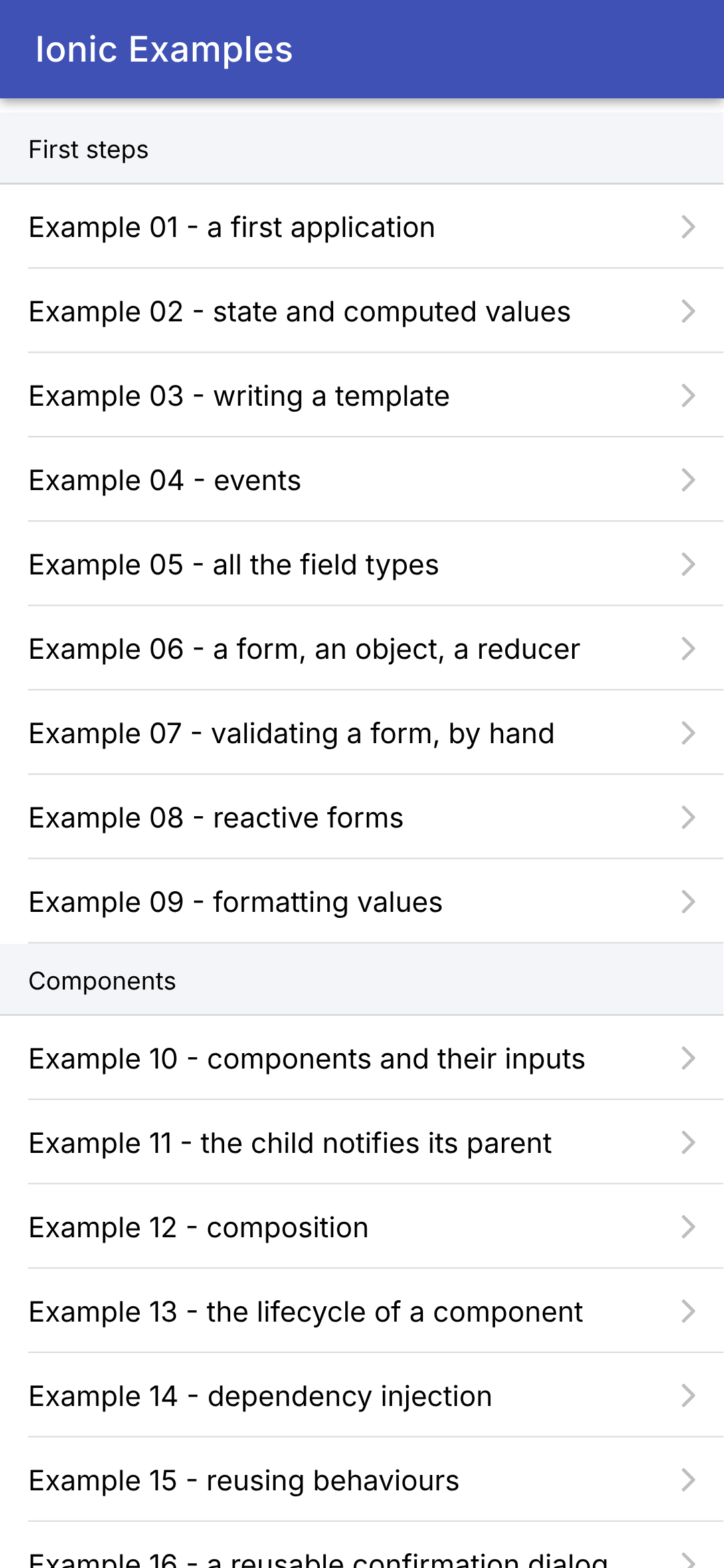
The home page displays this table, grouped by chapter:
| // =========================================================================
// src/app/home/home.page.ts - the menu of the 25 examples
// -------------------------------------------------------------------------
// The first page of the application: the list of the examples, grouped by
// chapter. A tap on an example opens its page (/ex01, /ex02...).
// =========================================================================
import { Component } from '@angular/core';
import { RouterLink } from '@angular/router';
import {
IonContent, IonHeader, IonItem, IonItemDivider, IonItemGroup, IonLabel, IonList, IonTitle, IonToolbar,
} from '@ionic/angular';
import { EXAMPLES, Example } from '../examples';
@Component({
selector: 'app-home',
imports: [RouterLink, IonHeader, IonToolbar, IonTitle, IonContent, IonList, IonItemGroup, IonItemDivider, IonItem, IonLabel],
templateUrl: './home.page.html',
})
export class HomePage {
// the examples, grouped by chapter: [{ chapter, examples: [...] }, ...]
readonly chapters: { chapter: string; examples: Example[] }[] = [];
constructor() {
for (const example of EXAMPLES) {
let group = this.chapters.find((c) => c.chapter === example.chapter);
if (!group) {
group = { chapter: example.chapter, examples: [] };
this.chapters.push(group);
}
group.examples.push(example);
}
}
}
|
- lines 15–19: the component, its tag, its subcomponents, and its template, which is now stored in a separate file ([templateUrl]);
- line 22: a field of the class, which the template reads: the list of chapters, each with its examples;
- lines 24–33: the constructor places each example in its chapter’s group, creating the group as needed.
| <!-- the menu of the examples -->
<ion-header>
<ion-toolbar color="primary">
<ion-title>Ionic Examples</ion-title>
</ion-toolbar>
</ion-header>
<ion-content>
<ion-list>
@for (group of chapters; track group.chapter) {
<ion-item-group>
<ion-item-divider color="light">
<ion-label>{{ group.chapter }}</ion-label>
</ion-item-divider>
@for (example of group.examples; track example.number) {
<!-- routerLink: a tap on the item opens the page of the example;
detail: the small arrow on the right -->
<ion-item [routerLink]="'/ex' + example.number" detail>
<ion-label>Example {{ example.number }} - {{ example.title }}</ion-label>
</ion-item>
}
</ion-item-group>
}
</ion-list>
</ion-content>
|
- lines 2–6: the top bar: [<ion-header>] contains a toolbar, [<ion-toolbar>], in the application’s colors ([color="primary"]), and its title, [<ion-title>];
- line 8: [<ion-content>]: the body of the page, which scrolls when it exceeds the screen height;
- line 9: [<ion-list>]: a list;
- line 10: [@for] repeats its block for each element of a table (see example 03): one group per chapter;
- lines 12–14: the group title, a separator line ([<ion-item-divider>]);
- line 18: a list line ([<ion-item>]), for example. [[routerLink]]: tapping the line takes you to the example’s URL; [detail]: the small arrow on the right.
3.1.15. The page from Example 01
An example is a page—that is, a component—routed to its address. The one for Example 01:
| // =========================================================================
// src/app/ex01-first-application/ex01.page.ts - a first application
// -------------------------------------------------------------------------
// An Ionic page is an Angular COMPONENT: a TypeScript class, decorated
// with @Component, associated with an HTML TEMPLATE that describes what
// it displays. The template mixes ordinary HTML tags, Ionic
// components (<ion-button>, <ion-card>...) and {{ ... }}
// expressions that display the data of the class.
// The data that change are SIGNALS: when the value of a signal
// changes, Angular updates, on the screen, what displays it.
// =========================================================================
import { Component, signal } from '@angular/core';
import {
IonBackButton, IonButton, IonButtons, IonContent, IonHeader, IonText, IonTitle, IonToolbar,
} from '@ionic/angular';
// "ordinary" data, outside the component: they never change
const title = 'Welcome to Ionic';
const languages = ['TypeScript', 'Angular', 'Ionic'];
// "12:05:09": the current time, on two digits
function currentTime(): string {
const d = new Date();
const twoDigits = (n: number) => n.toString().padStart(2, '0');
return `${twoDigits(d.getHours())}:${twoDigits(d.getMinutes())}:${twoDigits(d.getSeconds())}`;
}
@Component({
// the name of the component's tag (<app-ex01>): the router inserts it
// itself, we never write it
selector: 'app-ex01',
// the Ionic components used by the template: a component only
// knows what it imports
imports: [IonHeader, IonToolbar, IonButtons, IonBackButton, IonTitle, IonContent, IonButton, IonText],
// the template, in a separate file
templateUrl: './ex01.page.html',
})
export class Ex01Page {
// data read by the template: simple fields of the class
readonly title = title;
readonly languages = languages;
// the STATE: signals. signal(0) creates a signal with initial value 0;
// we read its value by calling it like a function: counter()
readonly counter = signal(0);
readonly time = signal(currentTime());
// the method called by the button
increment(): void {
// set: the new value; update: the new value, computed from
// the old one. Angular then updates the screen: we never
// modify it ourselves
this.counter.update((n) => n + 1);
this.time.set(currentTime());
}
}
|
- Line 13: [Component] (the component decorator) and [signal] come from the core of [Angular];
- lines 14–16: the components of [Ionic] used by the template;
- lines 19–20: two ordinary data values, declared outside the component: they never change. [const]: a variable that is assigned a value only once;
- lines 23–27: a regular function that returns the current time in the format “12:05:09.” It contains a small arrow function, [twoDigits]. [
...${expression}...] is a string template: the value of each expression is inserted into it;
- lines 29–38: the decorator [@Component]: the component’s tag (line 32, which the router inserts itself: we never write it), the components of [Ionic] used by its template (line 35), and the file containing its template (line 37);
- line 39: the component’s class. [export]: the route file imports it;
- lines 41–42: two fields of the class, read by the template. [readonly]: these will not be reassigned;
- lines 46–47: the component’s **state**, the data that changes: two **signals**. [signal(0)] creates a signal with an initial value of 0, whose type ([number]) is inferred from this value. You read the value of a signal by calling it as a function: [counter()];
- Lines 50–56: The method called by the button. It does not interact with the screen; it changes the state. [update] calculates the new value based on the old one (line 54), and [set] returns it directly (line 55). [Angular] then knows that the parts of the screen that read these signals need to be redrawn, and redraws them.
The template:
| <!-- ======================================================================
ex01.page.html - the template of the page of example 01
====================================================================== -->
<!-- ion-header: the top bar, with a Back button and a title -->
<ion-header>
<ion-toolbar color="primary">
<ion-buttons slot="start">
<!-- the Back button: it leads back to the menu of the examples (defaultHref)
if we arrived directly on this page -->
<ion-back-button defaultHref="/" />
</ion-buttons>
<ion-title>Example 01 - a first application</ion-title>
</ion-toolbar>
</ion-header>
<!-- ion-content: the body of the page, which scrolls if needed;
ion-padding: a margin all around -->
<ion-content class="ion-padding">
<h2>{{ title }}</h2>
<p>This screen is built by Ionic and Angular, from the Ex01Page component and its template.</p>
<!-- {{ expression }}: the value of a TypeScript expression, inserted into the text -->
<p>It is written in {{ languages.join(', ') }} ({{ languages.length }} languages).</p>
<!-- (click): the method to call when the button is pressed (see example 04) -->
<ion-button (click)="increment()">Click me</ion-button>
<p>
<!-- counter(): we READ a signal by calling it -->
<ion-text color="primary">
<strong>You clicked {{ counter() }} times (last click: {{ time() }}).</strong>
</ion-text>
</p>
</ion-content>
|
- lines 6–15: the top bar. [<ion-buttons slot="start">] places buttons at the beginning of the bar (on the left): a Back button, [<ion-back-button>], which takes you back to the previous page. If there isn’t one (you typed the address directly, [/ex01]), [defaultHref] specifies the page to go to: the menu;
- line 19: the body of the page, with a margin all around it (class [ion-padding]);
- line 20: [{{ title }}]: an “interpolation”—the value of an expression inserted into the text. The expression is evaluated in the context of the class: [title] is the field on line 41 of the component;
- line 23: an expression can call methods: [languages.join(', ')], [languages.length];
- Line 26: [(click)="increment()"]: when the button is pressed, [Angular] executes the instruction written within the quotation marks. The call is written with parentheses: the instruction is executed only when the button is pressed (see Example 04);
- lines 30–32: text that depends on the state. [counter()] reads the signal: when it changes, this text changes. [<ion-text color="primary">] colors its content.
The screen component tree, as shown by the [Angular DevTools] extension of the [Chrome] development tools ([Angular] tab), supplemented with the HTML elements:
| App (app-root)
└── ion-app
└── ion-router-outlet
└── Ex01Page (app-ex01)
├── ion-header
│ └── ion-toolbar
│ ├── ion-buttons
│ │ └── ion-back-button
│ └── ion-title
└── ion-content
├── h2 (the title)
├── p
├── p
├── ion-button
└── p
└── ion-text
└── strong (the counter)
|
As with [Flutter], we write very little “implementation” code and a lot of “descriptive” code. But whereas [Flutter] describes the screen in [Dart] using nested widget constructors, [Angular] separates the two: the [TypeScript] class contains the data and behaviors, while the [HTML] template describes the screen. The components of [Ionic] ([<ion-button>], [<ion-toolbar>]...) are true HTML elements, “web components " ("Web Components") created by the [@ionic/core] library: they work in any browser, and [@ionic/angular] wraps them so that [Angular] can treat them as its own components. That is why the same [Ionic] also exists for [React] and [Vue.js].
3.1.16. Execution
In the console open to the [examples_ionic] folder (the packages having been installed once by [npm install]):
The console displays:
| > examples-ionic@0.0.0 start
> ng serve
Initial chunk files | Names | Raw size
styles.css | styles | 56.90 kB |
main.js | main | 6.35 kB |
| Initial total | 63.25 kB
Lazy chunk files | Names | Raw size
chunk-QC4MGRJ7.js | home-page | 7.15 kB |
chunk-IMCNE3A4.js | ex01-page | 6.23 kB |
...
Application bundle generation complete. [6.046 seconds]
Watch mode enabled. Watching for file changes...
➜ Local: http://localhost:8100/
|
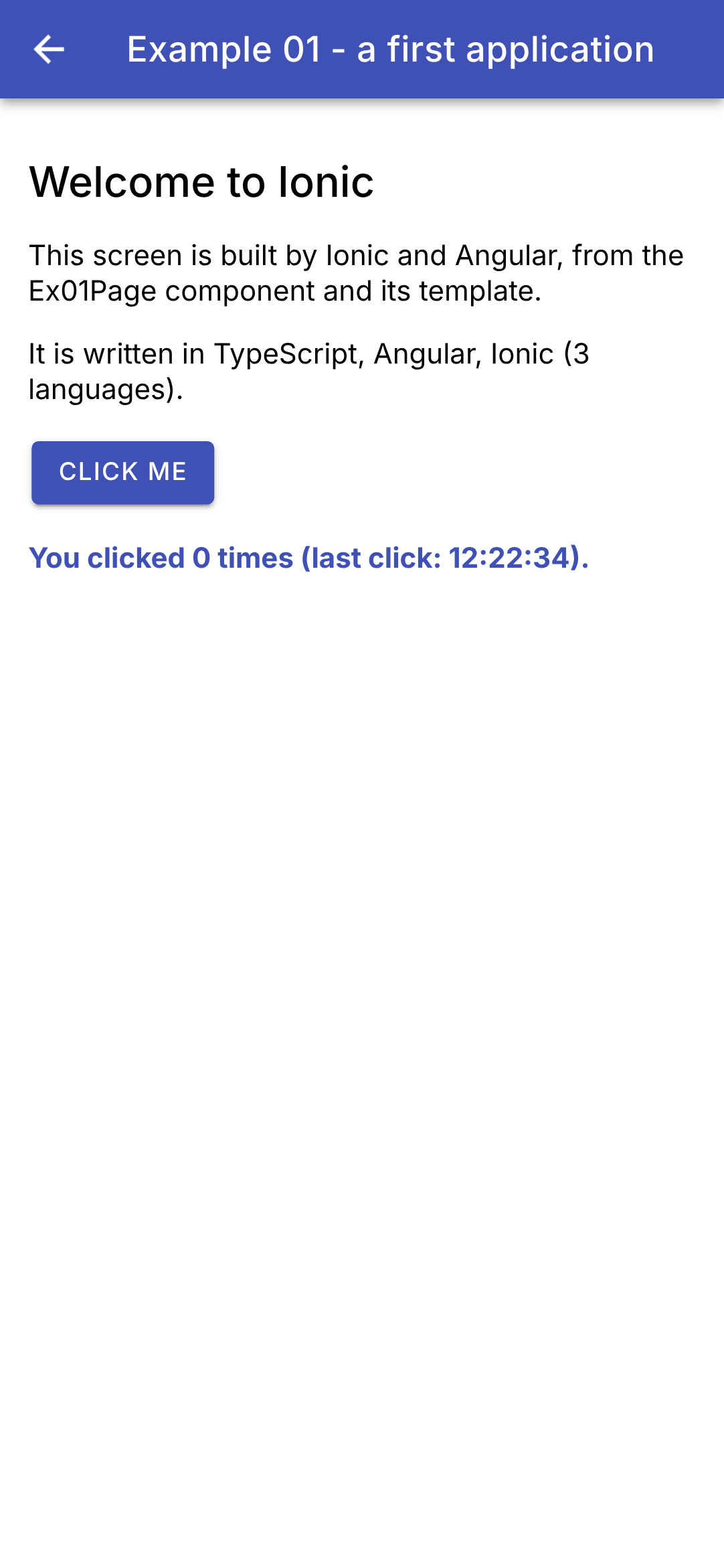
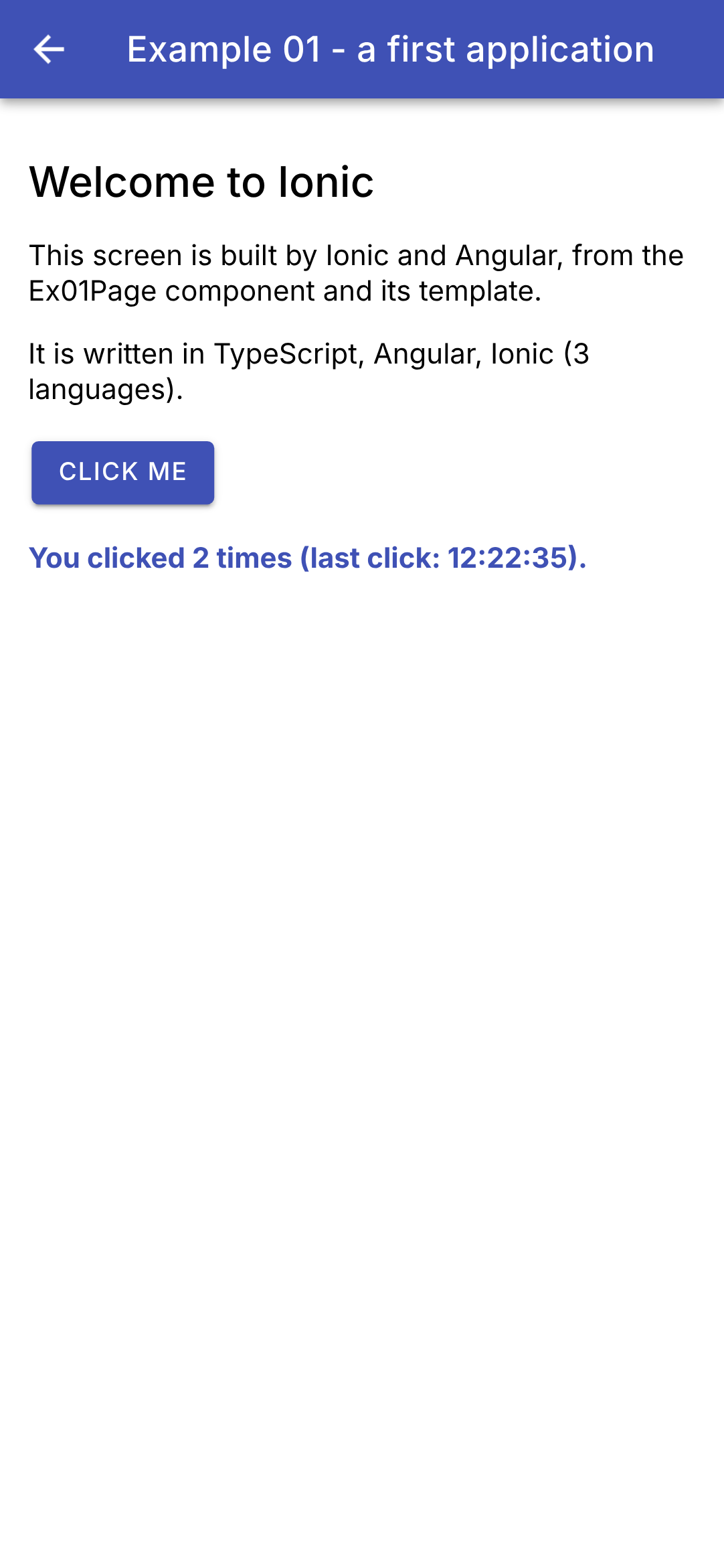
The application compiles in a few seconds: a [main.js] file loaded at startup, and a small file per page (“lazy chunk”), loaded on demand. Open the URL [http://localhost:8100] in [Chrome]. To view the app at phone size, open the development tools (F12), then the device emulation bar (Ctrl+Shift+M), and select a phone from the list (a [Pixel 7], for example), or specify dimensions (the screenshots in this tutorial are 412 x 892 pixels). On the left, the starting screen of Example 01; on the right, after tapping the button twice:
Two experiments to try:
- Edit the text on line 21 of [ex01.page.html] and save the file: the console displays [Component update sent to client(s)], and the screen changes immediately, with the counter retaining its value. This is a hot reload: the new template replaces the old one in the currently running application. A change to the code [TypeScript] ([ex01.page.ts]), on the other hand, reloads the entire page ([Page reload sent to client(s)]): the counter resets to 0, as with the “hot restart” of [Flutter];
- Explore the application using the development tools: the [Elements] tab displays the page’s [<ion-...>] tags, the [Console] tab shows any errors, and the [Sources] tab displays the [TypeScript] code (thanks to “source maps”), where you can set breakpoints.
Now on to [Android]. First, you need to create the project [Android]:
This command creates the [android/] folder: a complete [Android Studio] project that simply displays the WebView file and loads the web application into it. Changes are rarely made to it (the icon, permissions). However, one adjustment is necessary with recent versions of [Android Studio]: their JDK is a [Java] 25, which is not supported by the version of [Gradle] selected by [Capacitor] 8 (version 8.14). The build then fails with the error [Unsupported class file major version 69]. Simply switch to [Gradle] 9.1 by modifying one line in the [android/gradle/wrapper/gradle-wrapper.properties] file:
| distributionUrl=https\://services.gradle.org/distributions/gradle-9.1.0-all.zip
|
(instead of [gradle-8.14.3-all.zip]). The first build downloads this version of [Gradle] (approximately 200 MB). Then, each time the application has changed:
| npx ng build
npx cap sync android
npx cap run android
|
- Line 1: builds the web application in the [dist/examples_ionic/browser] folder ([production] configuration);
- line 2: copies it to the [Android] project (using the configuration from [capacitor.config.ts] and the plugins from [Capacitor]);
- line 3: builds the [Android] application (using the [Gradle] tool), installs it on a running emulator or a connected phone, and launches it. The command prompts you to select a device if multiple devices are available.
On the phone, the Back button takes you back one screen to the menu, and exits the application from the menu (see [back-button.ts]).
You can also open the project in [Android Studio] ([npx cap open android]) and launch the application using its button [Run]. The first build takes one or two minutes; subsequent builds take just a few seconds. On the phone, the screen is the same as in the browser, rendered by the same engine—that of [Chrome]. It is also debugged using the same tools: the address [chrome://inspect], within the computer’s [Chrome], lists the WebView of applications currently running on the emulator and opens their development tools.
This cycle (compile, copy, build) does not support hot reloading of [ng serve]. To enable it on the phone, you can instruct the app to fetch its code from the computer’s development server rather than from its embedded copy:
| npx ng serve --host 0.0.0.0
npx cap run android --live-reload --host=192.168.1.20 --port=8100
|
- line 1: the development server accepts connections from machines other than the computer itself (by default, it only listens for [localhost]);
- line 2: [192.168.1.20] is the computer’s address on the local network ([ipconfig] under [Windows] provides it). The installed application then loads [http://192.168.1.20:8100] and reloads it whenever a change is made.
Use with caution: The phone must be connected to the computer (same Wi-Fi network, computer firewall open on port 8100), and the app installed in this way will no longer work without the development server. Once the work is finished, run [npx ng build] again, followed by [npx cap sync android], so that the app re-embeds its own code. In this course, we’ll develop in the browser and then run [Android] to verify.
3.2. Example 02: State and Calculated Values
The state is at the heart of [Angular], as well as [Flutter] and [React]. This example calculates the price incl. VAT of an item:
| // =========================================================================
// src/app/ex02-state/ex02.page.ts - state and computed values
// -------------------------------------------------------------------------
// A small price calculator (incl. VAT):
// - the STATE: signals (signal()). Changing their value (set, update)
// updates, on the screen, what displays them;
// - a value COMPUTED from the state is NOT state: it is a
// computed signal (computed()), recomputed when one of the signals it
// reads changes. It is always up to date, with nothing to synchronize;
// - a piece of data that depends on the SUCCESSIVE values of the state (the history
// of the totals) is updated where the state changes: in the method
// change(), through which all the changes go;
// - the title of the application (browser tab) is not in the
// template: it is an EFFECT (effect()), a function that Angular reruns
// each time one of the signals it reads changes.
// =========================================================================
import { Component, computed, DestroyRef, effect, inject, signal } from '@angular/core';
import { Title } from '@angular/platform-browser';
import {
IonBackButton, IonButton, IonButtons, IonCard, IonCardContent, IonCardHeader, IonCardSubtitle, IonCardTitle,
IonContent, IonHeader, IonIcon, IonInput, IonItem, IonLabel, IonList, IonNote, IonSegment, IonSegmentButton,
IonTitle, IonToolbar, SegmentValue,
} from '@ionic/angular';
import { addIcons } from 'ionicons';
import { add, remove } from 'ionicons/icons';
// a formatter of amounts in euros, English style (€1,234.50), see example 09
const euros = new Intl.NumberFormat('en-US', { style: 'currency', currency: 'EUR' });
// the starting values (Reset button)
const LABEL = 'Pen';
const PRICE = '2.5';
@Component({
selector: 'app-ex02',
imports: [
IonHeader, IonToolbar, IonButtons, IonBackButton, IonTitle, IonContent, IonCard, IonCardHeader, IonCardTitle,
IonCardSubtitle, IonCardContent, IonInput, IonButton, IonIcon, IonSegment, IonSegmentButton, IonList, IonItem,
IonLabel, IonNote,
],
templateUrl: './ex02.page.html',
styles: `
.quantity { display: flex; align-items: center; margin: 12px 0 8px; }
.quantity span { flex: 1; }
.quantity strong { font-size: 1.1em; min-width: 1.5em; text-align: center; }
.bold { font-weight: bold; }
ion-note { font-size: 1rem; }
`,
})
export class Ex02Page {
// the state: four signals, typed by their starting value
// (the price is kept as TEXT: the one we type, separator included)
readonly label = signal(LABEL);
readonly priceText = signal(PRICE);
readonly quantity = signal(1);
readonly vatRate = signal(20); // in %
// the history of the last 5 changes of the total incl. VAT
readonly history = signal<string[]>([]);
// COMPUTED values: computed() memorizes the result, and only
// recomputes it if one of the signals read has changed
readonly priceExclVat = computed(() => Number(this.priceText().replace(',', '.')) || 0);
readonly totalExclVat = computed(() => this.quantity() * this.priceExclVat());
readonly vatAmount = computed(() => (this.totalExclVat() * this.vatRate()) / 100);
readonly totalInclVat = computed(() => this.totalExclVat() + this.vatAmount());
// the rows of the results card: DATA, which the template iterates over
readonly lines = computed(() => [
{ label: 'Total excl. VAT', amount: euros.format(this.totalExclVat()), bold: false },
{
label: `VAT (${this.vatRate()} %)`,
amount: euros.format(this.vatAmount()),
bold: false,
},
{ label: 'Total incl. VAT', amount: euros.format(this.totalInclVat()), bold: true },
]);
constructor() {
// the icons used by the template (<ion-icon name="add" />)
addIcons({ add, remove });
// Angular's Title service changes the title of the page (the browser
// tab). effect() reruns the function each time totalInclVat changes
const title = inject(Title);
effect(() => title.setTitle(`Incl. VAT: ${euros.format(this.totalInclVat())}`));
// when we leave the page (the component is destroyed), we restore the title of the application
inject(DestroyRef).onDestroy(() => title.setTitle('Ionic Examples'));
}
// ALL the changes of the state go through this method: it notes the
// total incl. VAT before the change, applies the change, and completes
// the history if the total has changed
change(apply: () => void): void {
const oldTotal = this.totalInclVat();
apply();
// reading a computed after a change recomputes it immediately
const newTotal = this.totalInclVat();
if (newTotal !== oldTotal) {
const line = `${euros.format(oldTotal)} -> ${euros.format(newTotal)}`;
// a NEW array (and not push): the signal sees that its value has changed
this.history.update((h) => [line, ...h].slice(0, 5));
}
}
// changing the item resets the quantity to 1: we do it where we know
// WHY the state changes
changeLabel(newValue: string): void {
this.change(() => {
this.label.set(newValue);
this.quantity.set(1);
});
}
changePrice(text: string): void {
this.change(() => this.priceText.set(text));
}
// delta: -1 or +1
addQuantity(delta: number): void {
this.change(() => this.quantity.update((q) => q + delta));
}
// the value of a segment is of type SegmentValue (string | number), or
// undefined if no button is chosen: Number() converts it into a number
changeRate(value: SegmentValue | undefined): void {
this.change(() => this.vatRate.set(Number(value)));
}
reset(): void {
this.change(() => {
this.label.set(LABEL);
this.priceText.set(PRICE);
this.quantity.set(1);
this.vatRate.set(20);
});
}
}
|
- Line 18: [Angular] functions used: [signal], [computed], [effect], [inject], and [DestroyRef];
- line 19: the [Title] service, which provides access to the page title;
- lines 25–26: the icons. [Ionic] only provides the icons it declares with the application: they are imported from [ionicons/icons] (here, [add], the “+”, and [remove], the “-”) and saved by [addIcons] (line 80); the template then refers to them by name ([<ion-icon name="add" />]);
- line 29: an English-style amount formatter (€1,234.50), created once and for all outside the component, using the JavaScript API [Intl] (see example 09);
- lines 43–49: styles specific to this component. [Angular] “encapsulates” them: the [.bold] class for this component applies only to its template and does not extend to other pages;
- lines 54–57: four state variables, four signals. Their type is inferred from their initial values: [signal('Pen')] is a string signal, [signal(1)] is a numeric signal. [TypeScript] has only one type—numbers—specifically [number]. The price is retained exactly as entered, as text: we’ll see why;
- line 59: the history of the last five changes to the total. [signal<string[]>([])]: when the initial value is not sufficient to determine the type (an empty array—of what?), it is enclosed in angle brackets;
- Lines 63–66: four values **calculated** from the state. These are NOT states; they are calculated signals ([computed(() => ...)]). [Angular] tracks the signals read by the function (here, [priceText], then [quantity] and [priceExclVat]...) and calls the function again only if one of them has changed; otherwise, it returns the cached result. A calculated signal is read like any other ([totalInclVat()]), but is not written. This is the same rule we’ve already seen with [Flutter] and [React]: only what cannot be calculated is stored in the state; everything else is calculated;
- line 63: the price, derived from the entered text. [Number('3.2')] converts text to a number and returns [NaN] (“not a number”) if the text is not a number: [|| 0] then replaces [NaN] (and 0) with 0. The French comma is accepted by replacing it with a period;
- lines 68–76: the three lines of the results table, in data format: an array of objects that the template will iterate through. The VAT label depends on the rate: it, too, is a calculated value;
- Lines 84–85: The page title (the browser tab) follows the total. The title is not part of the page template: it is a side **effect**, handled by [effect()]. Like [computed], [effect] tracks the signals read by its function and calls it whenever one of them changes. The [Title] service is obtained by [inject(Title)], the dependency injection from [Angular] (Example 14); [inject] is called only during component construction;
- line 87: when the page is exited, the component is destroyed; [DestroyRef.onDestroy] records a function called at that moment, which restores the application title. The effect itself is automatically stopped;
- lines 93–103: the history of the totals depends on the **successive** values of the total, which a calculated signal cannot express. We therefore pass ALL state changes through the [change] method, which receives as a parameter the change to be made—a function with no parameters or return value (of type [() => void]): it records the total before the change, applies the change, reads the total after the change (a calculated signal read after a change is immediately recalculated), and updates the history if it has changed. This is the natural place for this calculation: where the state changes;
- Line 101: [update] receives the old array and returns the new one: the new row, followed by the old ones ([...h] “spreads” them out), of which only the first five are retained. We create a NEW array, instead of modifying the old one via [push]: a signal compares the old value to the new one to determine if it has changed, and an array modified in place would, from the signal’s perspective, remain the same array;
- lines 107–112: Changing the item resets the quantity to 1. This is done in the method that handles the field change, where we know why the state is changing;
- lines 125–127: the rate selected from the radio buttons. Its value is of type [SegmentValue] (a string or a number), or [undefined] if no button is selected: [Number] converts it to a number;
- lines 129–136: several consecutive state changes: [Angular] will update the screen only once, after the method.
The template:
| <!-- ======================================================================
ex02.page.html - the template of the price calculator (incl. VAT)
====================================================================== -->
<ion-header>
<ion-toolbar color="primary">
<ion-buttons slot="start">
<ion-back-button defaultHref="/" />
</ion-buttons>
<ion-title>Example 02 - state</ion-title>
</ion-toolbar>
</ion-header>
<ion-content class="ion-padding">
<ion-card>
<ion-card-content>
<!-- [value]: the field DISPLAYS the value of the signal;
(ionInput): called on each keystroke; $event.detail.value is the new text -->
<ion-input label="Item" labelPlacement="floating" [value]="label()"
(ionInput)="changeLabel($event.detail.value ?? '')" />
<!-- inputmode="decimal": the phone's numeric keyboard, with the decimal separator -->
<ion-input label="Unit price excl. VAT" labelPlacement="floating" inputmode="decimal" [value]="priceText()"
(ionInput)="changePrice($event.detail.value ?? '')" />
<div class="quantity">
<span>Quantity (back to 1 if the item changes)</span>
<!-- [disabled]: the button is disabled as long as the condition is true -->
<ion-button fill="clear" [disabled]="quantity() <= 0" (click)="addQuantity(-1)">
<ion-icon slot="icon-only" name="remove" />
</ion-button>
<strong>{{ quantity() }}</strong>
<ion-button fill="clear" (click)="addQuantity(1)">
<ion-icon slot="icon-only" name="add" />
</ion-button>
</div>
<!-- buttons of which only ONE is selected: the VAT rate -->
<ion-segment [value]="vatRate()" (ionChange)="changeRate($event.detail.value)">
<ion-segment-button [value]="5.5"><ion-label>5.5 %</ion-label></ion-segment-button>
<ion-segment-button [value]="10"><ion-label>10 %</ion-label></ion-segment-button>
<ion-segment-button [value]="20"><ion-label>20 %</ion-label></ion-segment-button>
</ion-segment>
<div class="ion-text-center ion-margin-top">
<ion-button fill="outline" shape="round" (click)="reset()">Reset</ion-button>
</div>
</ion-card-content>
</ion-card>
<ion-card>
<ion-card-header>
<!-- {{ }}: we read the signals by calling them -->
<ion-card-title>{{ quantity() }} x {{ label() }}</ion-card-title>
</ion-card-header>
<ion-list lines="none">
<!-- one row per element of the computed array lines() (see example 03) -->
@for (line of lines(); track line.label) {
<ion-item>
<ion-label [class.bold]="line.bold">{{ line.label }}</ion-label>
<ion-note slot="end" color="dark" [class.bold]="line.bold">{{ line.amount }}</ion-note>
</ion-item>
}
</ion-list>
</ion-card>
<ion-card>
<ion-card-header>
<ion-card-subtitle>History of the total incl. VAT</ion-card-subtitle>
</ion-card-header>
<ion-card-content>
@for (line of history(); track $index) {
<div>• {{ line }}</div>
}
</ion-card-content>
</ion-card>
</ion-content>
|
- line 15: [<ion-card>], a card: a block with rounded corners, slightly raised;
- lines 19–20: an input field, [<ion-input>], with its label ([label]) “floating” above the text ([labelPlacement="floating"]). [[value]="label()"] is a property binding: the component’s [value] property receives the value of the expression, and receives it again each time it changes. [(ionInput)] is the event triggered with each keystroke; [$event] is the event object, whose property [detail.value] contains the new text (a string, [null] or [undefined]: [?? ''] replaces the latter two with an empty string). The field is thus **monitored**: it displays the current state and alerts the user to every change;
- lines 22–23: the price. [inputmode="decimal"] selects the phone’s keypad: the numeric keypad, with the comma. If the field were linked to the price (a number), entering “3,2” would result in 3.2, which the [[value]] link would rewrite in the field as “3.2.” Linked to the typed text, the field retains what the user has entered;
- lines 25–35: the quantity, with two buttons, “–” and “+.” [fill="clear"]: a button with no background; [slot="icon-only"]: the icon is its entire content. [[disabled]] disables the button as long as the expression is true: the quantity cannot go below 0;
- Lines 38–42: the VAT rate, three “segmented” buttons, only one of which is selected, [<ion-segment>]. Its value is that of the selected button; [(ionChange)] is triggered when another one is selected. [[value]="5.5"] sets the button’s value to the NUMBER 5.5; [value="5.5"], without square brackets, would set it to the string “5.5”;
- line 45: the Reset button, outlined ([fill="outline"]) and rounded ([shape="round"]);
- line 53: [{{ quantity() }} x {{ label() }}]: two signals, read from the text;
- Lines 57–62: One list line per element of the calculated table [lines()] ([@for]; see Example 03). [<ion-note slot="end">] places the amount at the end of the line; [[class.bold]] sets the CSS class [bold] if the expression is true;
- Lines 71–73: one text line per history entry.
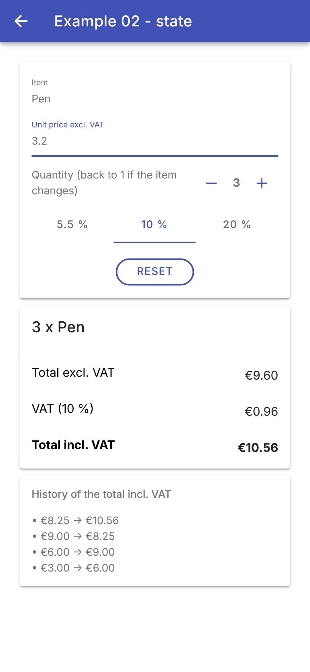
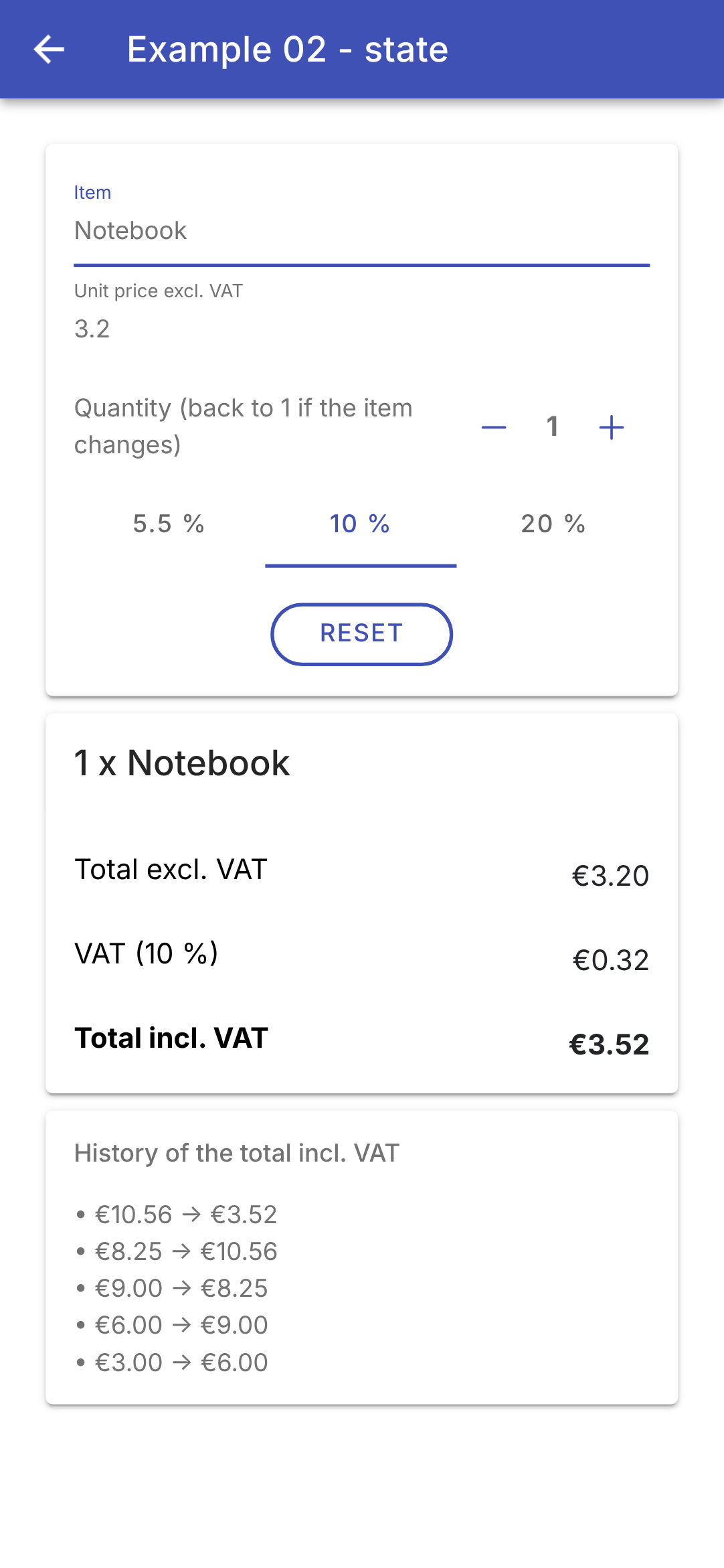
We change the quantity (by pressing “+” twice), the rate (10%), and the price (3.2), then the item:
Each time the total incl. VAT changes, a line is added to the history. Changing the item resets the quantity to 1 (on the right). Meanwhile, the browser tab displays “Incl. VAT: €10.56,” then “Incl. VAT: €3.52”; when you return to the menu, it displays “Ionic Examples” again.
The signals from [Angular] are derived from both [Flutter] and [React]. As in [Flutter], the state resides in an **object** (the component), created once and retained: these are its fields, and there are no hooks or invocation rules. But whereas [Flutter] reloads the entire [build] when [setState] is called, without knowing what has changed, a signal knows who is reading it: [Angular] updates only those parts of the template that depend on the modified signal. Therefore, there is no need to call [setState]: writing to a signal ([set], [update]) is sufficient. [computed] is the counterpart to the getters of [Flutter] (and to [useMemo] for [React]), with the added functionality of storing the value; [effect] is the counterpart to [useEffect] of [React], without the list of dependencies to keep up to date, since the effect discovers them on its own. The page title is a case where [Flutter] is simpler: its title is a widget, [Title], described by [build] just like the rest of the screen; that of a web page belongs to the document ([document.title]), outside the component’s template, hence the effect.
3.3. Example 03: Writing a Template
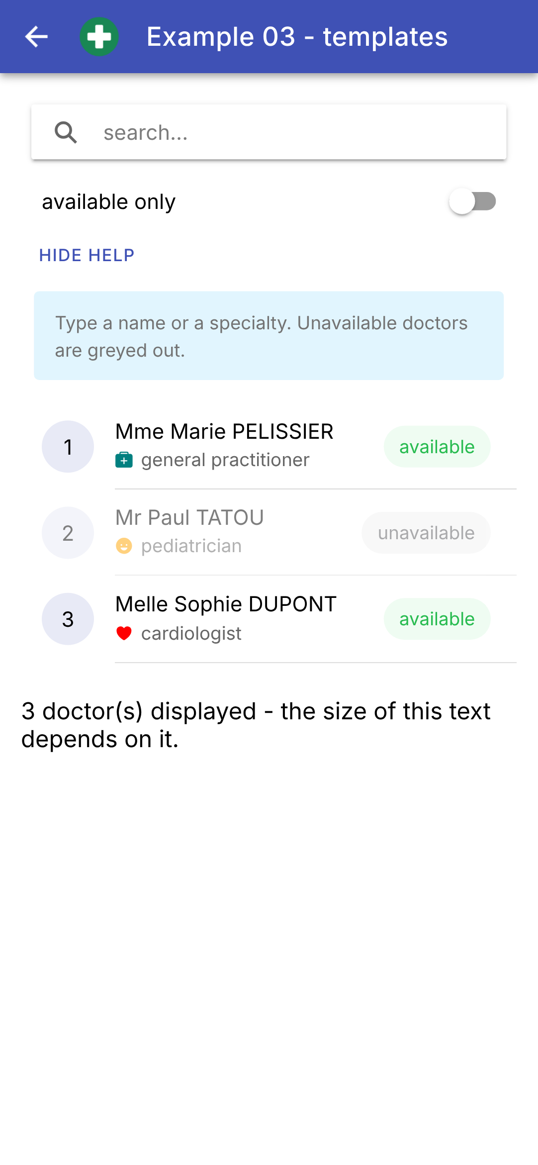
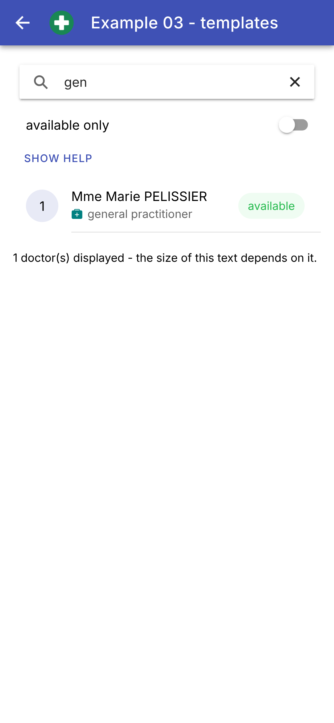
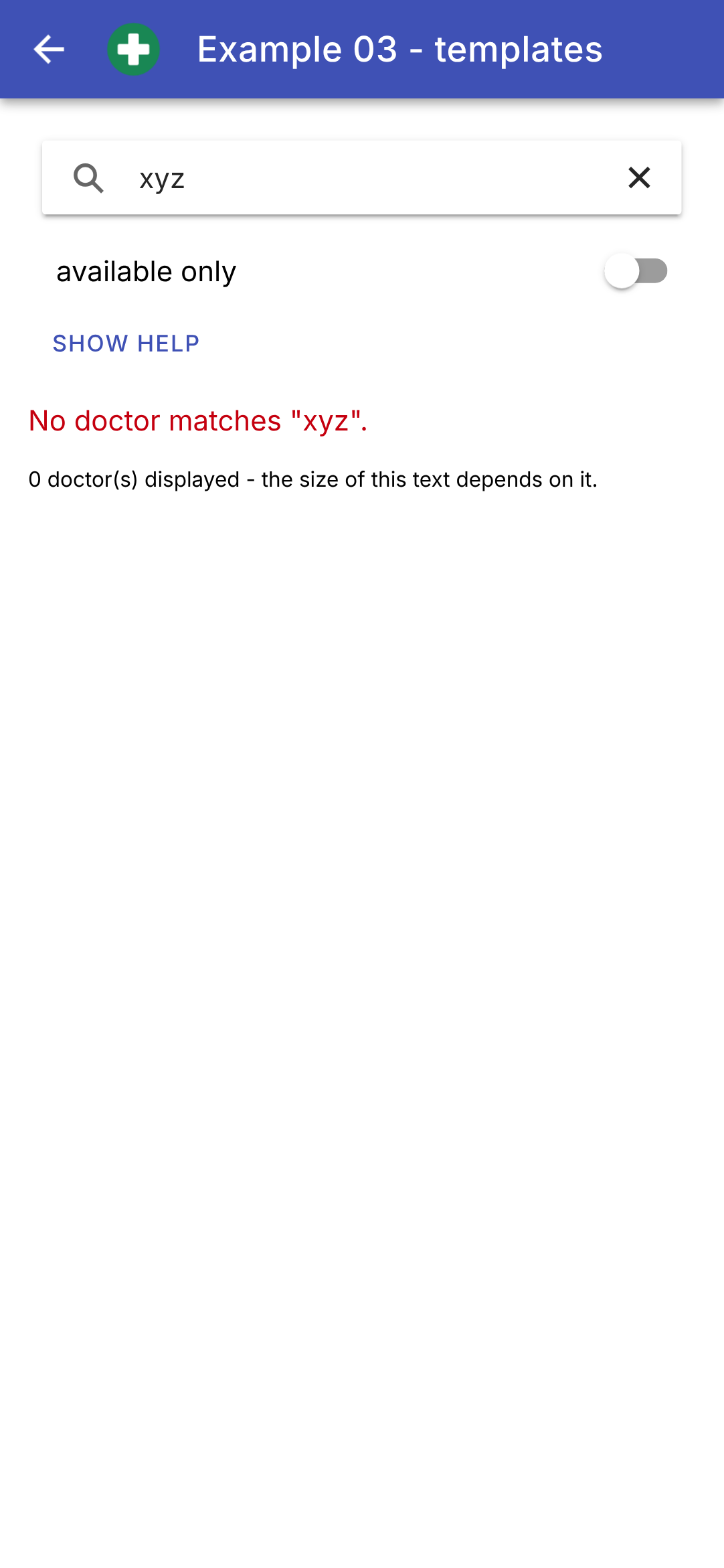
[Flutter] has no template language: the screen is written in [Dart]. [Angular] does have one: HTML, enhanced with syntax specific to [Angular] for bindings, conditions, and loops. This example displays a list of doctors that can be filtered:
| // =========================================================================
// src/app/ex03-templates/ex03.page.ts - writing a template
// -------------------------------------------------------------------------
// The template of an Angular component is HTML, enriched with a syntax
// specific to Angular (see ex03.page.html):
// - {{ expression }} : a value inserted into the text;
// - [property]="expression" : a property of an element bound to an
// expression ([class.x], [style.x] for
// a CSS class or a style);
// - @if / @else if / @else : a block that only EXISTS if the
// condition is true;
// - @for (x of list; track ...) : one block per element of the list;
// - @switch / @case : one block among several, depending on a value;
// - @let name = expression : a local variable of the template.
// The template expressions only see the members (public or
// protected) of the class: the data, the signals, the methods.
// =========================================================================
import { Component, computed, signal } from '@angular/core';
import {
IonAvatar, IonBackButton, IonButton, IonButtons, IonCard, IonCardContent, IonChip, IonContent, IonHeader, IonIcon,
IonItem, IonLabel, IonList, IonSearchbar, IonText, IonTitle, IonToggle, IonToolbar,
} from '@ionic/angular';
import { addIcons } from 'ionicons';
import { happy, heart, medkit } from 'ionicons/icons';
// a "union type" of strings: the only possible values of a specialty
type Specialty = 'generalist' | 'pediatrician' | 'cardiologist';
// the shape of a doctor: an interface (it only exists for the compiler)
interface Doctor {
readonly id: number;
readonly title: string;
readonly firstName: string;
readonly lastName: string;
readonly specialty: Specialty;
readonly available: boolean;
}
const doctors: readonly Doctor[] = [
{ id: 1, title: 'Mme', firstName: 'Marie', lastName: 'PELISSIER', specialty: 'generalist', available: true },
{ id: 2, title: 'Mr', firstName: 'Paul', lastName: 'TATOU', specialty: 'pediatrician', available: false },
{ id: 3, title: 'Melle', firstName: 'Sophie', lastName: 'DUPONT', specialty: 'cardiologist', available: true },
];
// "one value among several, depending on a value": an object of type
// Record<Specialty, string>. The compiler checks that all the
// specialties have their label (forgetting one is an error)
const labels: Record<Specialty, string> = {
generalist: 'general practitioner',
pediatrician: 'pediatrician',
cardiologist: 'cardiologist',
};
@Component({
selector: 'app-ex03',
imports: [
IonHeader, IonToolbar, IonButtons, IonBackButton, IonTitle, IonContent, IonSearchbar, IonItem, IonToggle,
IonButton, IonCard, IonCardContent, IonText, IonList, IonAvatar, IonLabel, IonIcon, IonChip,
],
templateUrl: './ex03.page.html',
styles: `
.logo { width: 32px; height: 32px; margin-inline-start: 8px; }
.help { background: #e1f5fe; box-shadow: none; }
.unavailable { opacity: 0.5; }
.rank {
display: flex; align-items: center; justify-content: center;
height: 100%; border-radius: 50%; background: #e8eaf6;
}
.specialty { display: flex; align-items: center; gap: 6px; }
`,
})
export class Ex03Page {
// the data, read by the template
readonly doctors = doctors;
// the state of the screen
readonly filter = signal(''); // the searched text
readonly onlyAvailable = signal(false);
readonly showHelp = signal(true);
// the displayed list: a COMPUTED value, recomputed when the filter or
// the toggle change. filter keeps the elements that satisfy a condition
readonly displayed = computed(() => {
const text = this.filter().trim().toLowerCase();
return doctors.filter(
(m) =>
(!this.onlyAvailable() || m.available) &&
`${m.firstName} ${m.lastName} ${labels[m.specialty]}`.toLowerCase().includes(text),
);
});
constructor() {
addIcons({ happy, heart, medkit });
}
// a method called by the template
label(s: Specialty): string {
return labels[s];
}
}
|
- line 28: a “union” type of strings: the only three possible values for a specialty. This is the counterpart to the enumeration in [Dart]: [let s: Specialty = 'dentist'] results in a compilation error;
- lines 31–38: an interface describes the structure of a doctor. Its fields are [readonly]: a doctor never changes. The interface exists only for the compiler, which verifies that each doctor has all its fields, with the correct type; it disappears from the compiled code;
- lines 40–44: doctors, literal objects. [readonly Doctor[]]: an array that cannot be modified (no additions or removals);
- lines 49–53: “one value among several, depending on a value”: an object whose keys are the specialties. [Record<Specialty, string>] is the type of an object that has a property of type [string] for EACH specialty: omitting one or adding one without completing this object would result in a compilation error, as with [switch] for [Dart];
- Lines 62–71: the component’s styles: [logo] (the size of the image in the top bar), [help] (the light blue background of the help card), [unavailable] (a semi-transparent doctor), [rank] (a circle around the row);
- line 75: the doctors, provided to the template. The template only sees the members of the class—not the constants in the file;
- lines 78–80: the screen state;
- lines 84–91: the displayed list: a calculated value that is recalculated when the filter or switch changes. [filter] retains the array elements that satisfy a condition; [includes] determines whether one string contains another;
- lines 98–100: a method that the template will call: the label for a specialty.
The template:
| <!-- ======================================================================
ex03.page.html - the list of doctors, filtered
====================================================================== -->
<ion-header>
<ion-toolbar color="primary">
<ion-buttons slot="start">
<ion-back-button defaultHref="/" />
<!-- an SVG image shipped with the application (public/ folder of the project) -->
<img class="logo" src="ex03/doctor.svg" alt="" />
</ion-buttons>
<ion-title>Example 03 - templates</ion-title>
</ion-toolbar>
</ion-header>
<ion-content class="ion-padding">
<!-- ion-searchbar: a search field, with its magnifying glass -->
<ion-searchbar placeholder="search..." [value]="filter()" (ionInput)="filter.set($event.detail.value ?? '')" />
<!-- a toggle, with its label -->
<ion-item lines="none">
<ion-toggle [checked]="onlyAvailable()" (ionChange)="onlyAvailable.set($event.detail.checked)">
available only
</ion-toggle>
</ion-item>
<ion-button fill="clear" size="small" (click)="showHelp.set(!showHelp())">
{{ showHelp() ? "Hide help" : "Show help" }}
</ion-button>
<!-- @if: this card only EXISTS if showHelp() is true -->
@if (showHelp()) {
<ion-card class="help">
<ion-card-content>Type a name or a specialty. Unavailable doctors are greyed out.</ion-card-content>
</ion-card>
}
<!-- one block among three: @if / @else if / @else -->
@if (doctors.length === 0) {
<p>No doctor.</p>
} @else if (displayed().length === 0) {
<p><ion-text color="danger">No doctor matches "{{ filter() }}".</ion-text></p>
} @else {
<ion-list>
<!-- one item per doctor; track: the IDENTITY of each item (see example 04);
$index: the rank of the item (0, 1, 2...) -->
@for (m of displayed(); track m.id; let i = $index) {
<!-- [class.unavailable]: the CSS class is set if the expression is true -->
<ion-item [class.unavailable]="!m.available">
<ion-avatar slot="start">
<div class="rank">{{ i + 1 }}</div>
</ion-avatar>
<ion-label>
<h2>{{ m.title }} {{ m.firstName }} {{ m.lastName }}</h2>
<p class="specialty">
<!-- @switch: one icon among several, depending on the specialty -->
@switch (m.specialty) {
@case ('pediatrician') { <ion-icon name="happy" style="color: orange" /> }
@case ('cardiologist') { <ion-icon name="heart" style="color: red" /> }
@default { <ion-icon name="medkit" style="color: teal" /> }
}
{{ label(m.specialty) }}
</p>
</ion-label>
<!-- [color]: a property computed by a conditional expression -->
<ion-chip slot="end" [color]="m.available ? 'success' : 'medium'">
{{ m.available ? 'available' : 'unavailable' }}
</ion-chip>
</ion-item>
}
</ion-list>
}
<!-- @let: a template variable; [style.font-size.px]: a COMPUTED style,
the size of the text depends on the number of doctors displayed -->
@let count = displayed().length;
<p [style.font-size.px]="12 + count * 2">{{ count }} doctor(s) displayed - the size of this text depends on it.</p>
</ion-content>
|
- line 10: an image SVG, included with the application: the project’s [public/ex03/doctor.svg] file, copied as-is into the compiled application (see the [angular.json] file). The browser can display the SVG; a simple [<img>] tag is sufficient;
- line 18: [<ion-searchbar>], a search field, with its magnifying glass, its prompt text ([placeholder]), and a cross to clear it. [filter.set(...)]: an instruction from a template can write to a signal;
- Lines 21–25: a switch, [<ion-toggle>], and its label (the tag’s content). [(ionChange)] is emitted when it is toggled; [$event.detail.checked] is its new value, either [true] or [false];
- lines 27–29: a button with no background, whose text depends on its state: a conditional expression [? :] in an interpolation;
- lines 32–36: [@if (condition) { ... }]: the help card **exists** only if [showHelp()] is true. There is no “hidden” card: when the condition is false, the card is removed from the page and recreated when the condition becomes true again;
- lines 39–72: one of three blocks, with [@if], [@else if], and [@else];
- line 42: [<ion-text color="danger">]: colored text, in this case red;
- line 47: [@for (m of displayed(); track m.id; let i = $index)] repeats its block for each doctor displayed. [track] provides the identifier for each element (its [id]): when the list changes, [Angular] uses this to determine which elements it can keep, move, or delete (see Example 04). [$index] is the element’s rank (0, 1, 2…), which [let i = $index] renames to [i];
- line 49: [[class.unavailable]="!m.available"]: the CSS class [unavailable] is applied to the element if the expression is true, and removed otherwise: unavailable doctors are grayed out;
- lines 49–69: [<ion-item>] is the list entry for [Ionic]. Its locations ([slot]) determine the placement of its contents: [slot="start"] at the beginning (here, a disk with the rank, within a [<ion-avatar>]), [slot="end"] at the end (a bullet point, [<ion-chip>]). Between the two, [<ion-label>] contains the title ([<h2>]) and a subtitle ([<p>]), which [Ionic] formats;
- lines 57–61: [@switch (value)] selects one block from several based on a value: the first block, [@case], if it equals the value; otherwise, the block [@default]. Here, the specialty icon;
- line 62: a call to a method of the class;
- line 66: [[color]]: a property whose value is calculated by a conditional expression;
- line 76: [@let count = displayed().length;] declares a template variable that can be used later in the template; this avoids having to write the same expression twice;
- line 77: [[style.font-size.px]]: a calculated style. The text size, in pixels, depends on the number of doctors displayed.
To summarize what is written in template [Angular] and its equivalent in [Dart]:
Angular (template) | Flutter (Dart) | Role |
{{ expression }} | Text('$x') | a value inserted into the text |
[property]="expression" | parameter: expression | a property linked to an expression |
[class.x]="c", [style.x]="v" | style: c ? ... : ... | a class CSS, a style, calculated |
@if (c) { ... } | if (c) widget | a block that exists only if the condition is true |
@if (c) { A } @else { B } | if (c) A else B | one or the other |
c? a : b | c? a : b | either one, in an expression |
@for (x of list; track x.id) { ... } | for (final x in list) widget | one block per element in the list |
@switch (v) { @case (a) { ... } } | switch (v) { a => widget } | one block out of several, depending on a value |
@let n = expression; | final n = ...; (before the return) | a local variable |
At startup, then after typing “gen” and hiding the help, then with “xyz”:
The template for [Angular] is closer to HTML than JSX is to [React] (where conditions and loops are written in JavaScript, along with [&&], [? :], and [map]) and the widget tree of [Flutter] (written in [Dart]). The trade-off is having to learn one more syntax; the benefit is a template that is readable by anyone familiar with HTML and verified by the compiler ([strictTemplates]): a misspelled property name or an expression of the wrong type is flagged during compilation.
3.4. Example 04: Events
In a template, [(event)="statement"] executes the instruction when the element triggers the event. This example manages a task list:
| // =========================================================================
// src/app/ex04-events/ex04.page.ts - reacting to the user's actions
// -------------------------------------------------------------------------
// In the template, (event)="statement" executes the statement when
// the element emits the event:
// - (click)="add()" : a tap on a button;
// - (click)="remove(t, 'x')" : we pass our own arguments;
// - (ionChange)="f($event)" : $event is the event object, here a
// CustomEvent whose detail carries the data
// (the checked box, the text...);
// - (keyup.enter), (keyup.escape) : a specific key of the keyboard;
// - (dblclick), (contextmenu) : the browser's events, on
// ANY element;
// - ion-item-sliding : swiping a row to remove it,
// the typical gesture of a mobile.
// To act on an input field from the code (give it the focus), we
// designate it with a template variable (#field) and get it in the
// class with viewChild().
// =========================================================================
import { Component, signal, viewChild } from '@angular/core';
import {
CheckboxCustomEvent, IonBackButton, IonButton, IonButtons, IonCheckbox, IonContent, IonHeader, IonIcon, IonInput,
IonItem, IonItemOption, IonItemOptions, IonItemSliding, IonList, IonTitle, IonToolbar,
} from '@ionic/angular';
import { addIcons } from 'ionicons';
import { trash, trashOutline } from 'ionicons/icons';
interface Task {
readonly id: number;
readonly label: string;
readonly done: boolean;
}
// "3:30 PM": the current time, English style
function time(): string {
return new Date().toLocaleTimeString('en-US', { hour: '2-digit', minute: '2-digit' });
}
@Component({
selector: 'app-ex04',
imports: [
IonHeader, IonToolbar, IonButtons, IonBackButton, IonTitle, IonContent, IonInput, IonButton, IonList,
IonItemSliding, IonItem, IonCheckbox, IonIcon, IonItemOptions, IonItemOption,
],
templateUrl: './ex04.page.html',
styles: `
.input { display: flex; align-items: center; gap: 8px; }
.input ion-input { flex: 1; }
.done { text-decoration: line-through; color: gray; }
.area {
height: 80px; display: flex; align-items: center; justify-content: center;
margin-top: 12px; border-radius: 8px; background: #e7f5ff; user-select: none;
}
.log { font-size: 12px; }
`,
})
export class Ex04Page {
readonly tasks = signal<Task[]>([
{ id: 1, label: 'Install Ionic', done: true },
{ id: 2, label: 'Read the chapter on events', done: false },
]);
readonly log = signal<string[]>([]);
// the text of the input field
readonly input = signal('');
// the <ion-input #field> component of the template (to give it the focus)
private readonly field = viewChild.required<IonInput>('field');
// a field of the class that is NOT displayed: a simple field, not a signal
private nextId = 3;
constructor() {
addIcons({ trash, trashOutline });
}
private trace(message: string): void {
this.log.update((j) => [`${time()} ${message}`, ...j]);
}
// called by the button AND by the Enter key of the keyboard (keyup.enter)
add(): void {
const label = this.input().trim();
if (!label) {
return;
}
// a NEW array: the old one, plus the new task
this.tasks.update((ts) => [...ts, { id: this.nextId++, label, done: false }]);
this.trace(`added "${label}"`);
this.input.set('');
// the focus returns to the field: we can type the next task
this.field().setFocus();
}
// $event is a CheckboxCustomEvent: detail.checked tells whether the box is checked
toggle(task: Task, event: CheckboxCustomEvent): void {
const done = event.detail.checked;
// we replace the task with a modified COPY: { ...task, done }
this.tasks.update((ts) => ts.map((t) => (t.id === task.id ? { ...t, done } : t)));
this.trace(`"${task.label}": ${done ? 'done' : 'to do'}`);
}
remove(task: Task, how: string): void {
this.tasks.update((ts) => ts.filter((t) => t.id !== task.id));
this.trace(`removed "${task.label}" (${how})`);
}
// a tap in the area: MouseEvent gives the position of the finger in the
// page; we make it relative to the touched area (currentTarget)
position(event: MouseEvent): void {
const area = (event.currentTarget as HTMLElement).getBoundingClientRect();
const x = Math.round(event.clientX - area.left);
const y = Math.round(event.clientY - area.top);
this.trace(`tap at (${x}, ${y})`);
}
// a long press normally opens the browser's context menu:
// preventDefault() prevents it
longPress(event: Event): void {
event.preventDefault();
this.trace('long press');
}
// the double tap event
doubleTap(): void {
this.trace('double tap');
}
}
|
- lines 29–33: a task. Its fields are read-only: to check off a task, replace it with a modified copy;
- lines 36–38: the current time, “3:30 PM,” formatted by [toLocaleTimeString] according to English (US) conventions;
- lines 59–63: the status: the task list and an event log;
- line 65: the text in the input field;
- line 67: To interact with the input field from the code (give it focus), we need the component itself. The template refers to it via a template variable, [#field]; [viewChild.required<IonInput>('field')] retrieves it. This is a signal: [this.field()] is the component [IonInput]. [required]: it still exists (it is not inside a [@if]);
- line 69: a field in the class that is not displayed—an ordinary field, not a signal. Modifying it does not update anything on the screen. This is what [React] calls a “reference” ([useRef]);
- lines 75–77: one additional line at the top of the log;
- lines 80–91: adding a task, triggered by the button AND by pressing the Enter key on the keyboard. The task is added to the end of a new array ([[...ts, { id: this.nextId++, label, done: false }]]), the field is cleared, and focus is returned to it via its method [setFocus()]: you can then type the next task;
- Lines 94–99: Check or uncheck a task. The received event is a [CheckboxCustomEvent]: [detail.checked] indicates whether the checkbox is checked. The task is replaced with a modified copy ([{ ...t, done }]: all fields from [t], plus [done] with its new value) in a new array ([map]). Unlike [Flutter], where [setState] alerts that “something has changed,” a signal only detects a change if its value is a NEW object: modifying the task in place ([task.done = true]) would not be detected;
- lines 101–104: deletion, either via the button or by swiping: [filter] keeps all tasks except that one;
- lines 108–113: a tap in the bottom area. The event is a [MouseEvent] (a finger tap produces the same events as a mouse click): [clientX] and [clientY] represent the finger’s position in the window; this position is relative to the touched area, the element listening for the event ([currentTarget]), whose position is given by [getBoundingClientRect()];
- Lines 117–120: A long press normally opens the browser’s context menu (the [contextmenu] event); [preventDefault()] prevents this from happening.
The template:
| <!-- ======================================================================
ex04.page.html - a task list and its events
====================================================================== -->
<ion-header>
<ion-toolbar color="primary">
<ion-buttons slot="start">
<ion-back-button defaultHref="/" />
</ion-buttons>
<ion-title>Example 04 - events</ion-title>
</ion-toolbar>
</ion-header>
<ion-content class="ion-padding">
<div class="input">
<!-- #field: a template variable, which designates this component (see viewChild);
(keyup.enter): the Enter key; (keyup.escape): the Escape key;
enterkeyhint="done": the Enter key of the phone's keyboard -->
<ion-input #field placeholder="new task (Escape to clear)" enterkeyhint="done"
[value]="input()" (ionInput)="input.set($event.detail.value ?? '')"
(keyup.enter)="add()" (keyup.escape)="input.set('')" />
<ion-button shape="round" (click)="add()">Add</ion-button>
</div>
<ion-list>
<!-- track t.id: the IDENTITY of each row (see the explanation in the course) -->
@for (t of tasks(); track t.id) {
<!-- ion-item-sliding: a row that is swiped with the finger -->
<ion-item-sliding>
<ion-item>
<!-- the box is on the LEFT (justify="start"), its label on its right -->
<ion-checkbox justify="start" labelPlacement="end" [checked]="t.done" (ionChange)="toggle(t, $event)">
<span [class.done]="t.done">{{ t.label }}</span>
</ion-checkbox>
<!-- a "trash" button: the task of THIS row as argument -->
<ion-button slot="end" fill="clear" color="danger" (click)="remove(t, 'button')">
<ion-icon slot="icon-only" name="trash-outline" />
</ion-button>
</ion-item>
<!-- what appears under the row when it is swiped to the left (side="end");
(ionSwipe): the row has been swiped all the way (option "expandable") -->
<ion-item-options side="end" (ionSwipe)="remove(t, 'swipe')">
<ion-item-option color="danger" expandable (click)="remove(t, 'swipe')">
<ion-icon slot="icon-only" name="trash" />
</ion-item-option>
</ion-item-options>
</ion-item-sliding>
}
</ion-list>
<!-- a simple <div> box, sensitive to three browser events -->
<div class="area" (click)="position($event)" (dblclick)="doubleTap()" (contextmenu)="longPress($event)">
Touch this area (tap, double tap, long press)
</div>
<h3>Log</h3>
@for (line of log(); track $index) {
<div class="log">{{ line }}</div>
}
</ion-content>
|
- lines 19–21: the input field, named [#field]. Its text is linked to the signal [input]. [(keyup.enter)] is triggered only by the Enter key, and [(keyup.escape)] by the Esc key (on a physical keyboard: computer, emulator, tablet): a “pseudo-event” of [Angular], which filters the keyboard keys for us. [enterkeyhint="done"] determines the appearance of the Enter key on the phone’s keyboard;
- line 22: the button calls the same method;
- line 27: [track t.id]: the identifier for each line. When a list changes, [Angular] compares the old list to the new one to determine which items to keep: with [track $index], it would match them by their rank (the first to the first, the second to the second, and so on). If the first task disappears, the second task’s row would take its place… along with the first task’s state (its scroll position, for example). With [track t.id], each row has a stable identity: that of its task. This is the role of the keys in [Flutter];
- lines 29–47: a line that you drag with your finger, [<ion-item-sliding>]—the typical gesture for scrolling through a list on a phone. It contains the row itself ([<ion-item>]) and what appears below it when you swipe it ([<ion-item-options>]);
- Line 32: a checkbox, [<ion-checkbox>], on the left ([justify="start"]), followed by its label ([labelPlacement="end"]). [(ionChange)="toggle(t, $event)"] passes the task for this line and the event object to the method;
- line 33: the label is crossed out and grayed out if the task is complete (the [done] class);
- lines 36–38: a “trash can” button at the end of the line: [(click)="remove(t, 'button')"] passes its own arguments to the method;
- Lines 42–46: The options that appear on the right ([side="end"]) when you drag the row to the left: a red button with a trash can icon. [expandable]: if you drag the line all the way to the end, the option extends to the entire line, and [<ion-item-options>] triggers the event [(ionSwipe)];
- Line 52: a simple box, a [<div>], that responds to three browser events: [(click)] (a tap), [(dblclick)] (a double-tap), and [(contextmenu)] (a long press on a touchscreen). Any element can listen for any browser event.
Add a task (press Enter), check the second one, tap the bottom area; then drag the first task to the left (to the middle while dragging; to the right once it has been dragged all the way):
In [Flutter], each interactive widget declares its events using typed parameters ([onPressed], [onChanged], [onSubmitted]...), and [GestureDetector] adds gestures to those that do not have them. In [Angular], we find the browser model: every element emits the events of DOM ([click], [keyup], [dblclick]...), and the components of [Ionic] add their own, prefixed by [ion] ([ionInput], [ionChange], [ionSwipe]....). Thanks to [strictTemplates], [$event] has the exact event type ([CheckboxCustomEvent], [MouseEvent]...), and the editor suggests the properties of its [detail] as you type. For more complex gestures (dragging, pinching), [Ionic] provides [GestureController].
3.5. Example 05: All Field Types
This example uses the form from Example 05 of the [Flutter] course, with the input fields from [Ionic]: text boxes, radio buttons, checkboxes, bulleted lists, drop-down lists, sliders, and calendars.
| // =========================================================================
// src/app/ex05-controlled-fields/ex05.page.ts - all the field types
// -------------------------------------------------------------------------
// A CONTROLLED field displays a value of the state and notifies the component
// of each change, which updates the state: the state is the single source
// of truth. Modifying the state (by code) modifies the field.
// Two ways of writing a field bound to a signal:
// - [value]="name()" (ionChange)="name.set($event.detail.value)": by hand;
// - [(ngModel)]="name": the "two-way binding" of FormsModule, which
// directly accepts a writable signal (WritableSignal) and does
// both at once: read the signal, and write it on each change.
// What the event of a field carries ($event.detail) depends on the field:
// - ion-input, ion-textarea -> value: the text (string | null);
// - ion-checkbox, ion-toggle -> checked: boolean;
// - ion-radio-group, ion-select -> value: the value of the chosen option;
// - ion-select multiple -> value: the ARRAY of the chosen values;
// - ion-range -> value: a number;
// - ion-datetime -> value: the date, an ISO 8601 string.
// Same form as example 05 of the Flutter course; everything happens on the
// phone, without a server.
// =========================================================================
import { JsonPipe } from '@angular/common';
import { Component, computed, signal } from '@angular/core';
import { FormsModule } from '@angular/forms';
import {
IonBackButton, IonButton, IonButtons, IonCheckbox, IonChip, IonCol, IonContent, IonDatetime, IonGrid, IonHeader,
IonIcon, IonInput, IonItem, IonLabel, IonModal, IonRadio, IonRadioGroup, IonRange, IonRow, IonSelect,
IonSelectOption, IonTextarea, IonTitle, IonToolbar, RangeChangeEventDetail,
} from '@ionic/angular';
import { addIcons } from 'ionicons';
import { checkmark, gift } from 'ionicons/icons';
const titles = ['Mr', 'Mme', 'Melle'];
const hobbies = ['sport', 'music', 'reading', 'cinema'];
// lists of pairs (code, name): the code is the value, the name is displayed
const countries = [
{ code: 'fr', name: 'France' },
{ code: 'be', name: 'Belgium' },
{ code: 'ch', name: 'Switzerland' },
];
const languages = [
{ code: 'fr', name: 'French' },
{ code: 'en', name: 'English' },
{ code: 'es', name: 'Spanish' },
];
@Component({
selector: 'app-ex05',
imports: [
FormsModule, JsonPipe, IonHeader, IonToolbar, IonButtons, IonBackButton, IonTitle, IonContent, IonLabel,
IonRadioGroup, IonRadio, IonGrid, IonRow, IonCol, IonInput, IonTextarea, IonItem, IonCheckbox, IonChip, IonIcon,
IonSelect, IonSelectOption, IonRange, IonButton, IonModal, IonDatetime,
],
templateUrl: './ex05.page.html',
styles: `
h3 { font-size: 0.95em; font-weight: bold; margin: 16px 0 4px; }
.titles { display: flex; gap: 24px; padding: 8px 0; }
pre { background: #f5f5f5; padding: 8px; font-size: 12px; white-space: pre-wrap; word-break: break-all; }
pre.sent { background: #e8f5e9; }
/* the calendar dialog: the size of its content, instead of the whole screen */
ion-modal.calendar { --width: fit-content; --height: fit-content; --border-radius: 8px; }
`,
})
export class Ex05Page {
// the lists of choices, read by the template
readonly titles = titles;
readonly hobbies = hobbies;
readonly countries = countries;
readonly languages = languages;
// the most recent date that can be chosen: today ("2026-10-06"), IN THE DEVICE'S TIME ZONE
readonly today = new Date(Date.now() - new Date().getTimezoneOffset() * 60_000).toISOString().slice(0, 10);
// one signal per field of the form
readonly title = signal('Mme');
readonly name = signal('');
readonly age = signal<number | null>(30);
readonly presentation = signal('');
readonly newsletter = signal(false);
readonly chosenHobbies = signal<ReadonlySet<string>>(new Set(['reading'])); // a SET: no duplicate
readonly chosenCountry = signal('fr');
readonly chosenLanguages = signal<string[]>([]);
readonly birthDate = signal<string | null>(null); // null: not chosen yet
readonly satisfaction = signal(3);
readonly sent = signal<string | null>(null);
// the text of the presentation WHILE typing: a simple field, which
// is not a signal. Modifying it updates nothing
private presentationDraft = '';
// all the values, gathered in an object (what we would send to a server)
readonly model = computed(() => ({
title: this.title(),
name: this.name().trim(),
age: this.age(),
presentation: this.presentation(),
newsletter: this.newsletter(),
hobbies: [...this.chosenHobbies()],
country: this.chosenCountry(),
languages: this.chosenLanguages(),
birthDate: this.birthDate(),
satisfaction: this.satisfaction(),
}));
constructor() {
addIcons({ checkmark, gift });
}
// the presentation: we note the text on each keystroke, WITHOUT touching
// the state; it is only copied into the state when leaving the field (ionBlur)
notePresentation(text: string | null | undefined): void {
this.presentationDraft = text ?? '';
}
commitPresentation(): void {
this.presentation.set(this.presentationDraft);
}
// a chip chosen or not: we build a NEW set, with or without the value
toggleHobby(hobby: string): void {
this.chosenHobbies.update((old) => {
const newSet = new Set(old);
if (newSet.has(hobby)) {
newSet.delete(hobby);
} else {
newSet.add(hobby);
}
return newSet;
});
}
// the value of an ion-range is a number, or an interval { lower, upper }
// for a slider with two knobs (dualKnobs): here, it is a number
changeSatisfaction(value: RangeChangeEventDetail['value']): void {
this.satisfaction.set(value as number);
}
// ion-datetime gives an ISO 8601 date ("2000-01-15T00:00:00"): we only
// keep the day, in the date format of the RdvMedecins API
chooseBirthDate(value: string | string[] | null | undefined): void {
if (typeof value === 'string') {
this.birthDate.set(value.substring(0, 10));
}
}
// the state modified BY CODE: the fields follow
example(): void {
this.title.set('Mr');
this.name.set('MARTIN');
this.age.set(42);
this.chosenHobbies.set(new Set(['sport', 'cinema']));
this.chosenCountry.set('be');
}
send(): void {
// JSON.stringify(object): the JSON on one line
this.sent.set(JSON.stringify(this.model()));
}
}
|
A **controlled** field displays a value from the state and notifies the component of any changes, which updates the state: the state is the single source of truth. Until now, this has been written manually: [[value]="name()"] to display the value, [(ionInput)="name.set($event.detail.value ?? '')"] to update it. The [FormsModule] module of [Angular] does both at once: [[(ngModel)]="name"], the “two-way” connection (the “banana box” [[( )]], a combination of [[ ]] and [( )]), which directly accepts a modifiable signal.
- line 25: the [FormsModule] module, which provides [ngModel] (line 51: it is imported into the component);
- Lines 34–46: the drop-down lists. Countries and languages are arrays of (code, name) pairs: the code is the field value, and the name is displayed;
- line 72: the most recent date that can be selected from the calendar: today, in the format “2026-10-06.” [toISOString()] returns the date in Coordinated Universal Time (UTC): between midnight and 2 a.m. in Paris, it would still be the previous day. So first, we shift the current time by the difference between local time and Coordinated Universal Time ([getTimezoneOffset()], in minutes); Example 24 will address this pitfall;
- lines 75–85: one signal per field. [signal<number | null>(30)]: a number, or [null] if the age field is empty; [ReadonlySet<string>]: a set (without duplicates) of hobbies; [signal<string | null>(null)]: a date, or [null] until one is selected;
- line 89: the text of the presentation WHILE typing, a regular field: we’ll come back to this;
- lines 92–103: all values, combined into a single object (what would be sent to a server): a calculated value, always up to date. [[...this.chosenHobbies()]] creates an array of the set’s elements;
- lines 111–117: the presentation: each keystroke places the text in the ordinary field; this does NOT affect the state: nothing is updated. The text is copied into the [presentation] signal only when exiting the field;
- lines 120–130: an optional hobby bullet point: a NEW set is created, a copy of the previous one ([new Set(old)]), with or without the hobby;
- Lines 134–136: The value of a [<ion-range>] is a number, or a [{ lower, upper }] range for a two-handle slider: here, it is a number, which is specified to the compiler using [as number];
- lines 140–144: the calendar provides a date in the ISO 8601 format (“2000-01-15T00:00:00,” or an array of dates if multiple are selected): only the day is retained, in the date format of API [RdvMedecins];
- lines 147–153: the record modified by the code; the fields follow;
- line 157: [JSON.stringify] generates the JSON for an object, on a single line.
The fields in the template:
| <!-- ======================================================================
ex05.page.html - a form, with all the field types
====================================================================== -->
<ion-header>
<ion-toolbar color="primary">
<ion-buttons slot="start">
<ion-back-button defaultHref="/" />
</ion-buttons>
<ion-title>Example 05 - controlled fields</ion-title>
</ion-toolbar>
</ion-header>
<ion-content class="ion-padding">
<h3>Title</h3>
<!-- radio buttons: the group carries the chosen value ([value]) and notifies
when another one is chosen (ionChange) -->
<ion-radio-group [value]="title()" (ionChange)="title.set($event.detail.value)">
<div class="titles">
@for (t of titles; track t) {
<ion-radio [value]="t" labelPlacement="end">{{ t }}</ion-radio>
}
</div>
</ion-radio-group>
<!-- two fields side by side: a grid of 12 columns, 8 for the name, 4 for the age -->
<ion-grid class="ion-no-padding">
<ion-row>
<ion-col size="8">
<!-- [(ngModel)]="name": the field reads AND writes the name signal -->
<ion-input label="Name" labelPlacement="floating" [(ngModel)]="name" />
</ion-col>
<ion-col size="4">
<!-- type="number": the numeric keyboard; ngModel receives a number (or null) -->
<ion-input label="Age" labelPlacement="floating" type="number" [(ngModel)]="age" />
</ion-col>
</ion-row>
</ion-grid>
<!-- a field NOT bound to the state on each keystroke: its text is only copied
into the state when leaving the field (ionBlur) -->
<ion-textarea label="Presentation (updated when leaving the field)" labelPlacement="floating" [rows]="2"
(ionInput)="notePresentation($event.detail.value)" (ionBlur)="commitPresentation()" />
<!-- a single box: true / false -->
<ion-checkbox justify="start" labelPlacement="end" class="ion-margin-vertical" [(ngModel)]="newsletter">
Receive the newsletter
</ion-checkbox>
<h3>Hobbies</h3>
<!-- several chips for ONE set: a tap adds or removes the value -->
@for (l of hobbies; track l) {
@let chosen = chosenHobbies().has(l);
<ion-chip [outline]="!chosen" [color]="chosen ? 'primary' : 'medium'" (click)="toggleHobby(l)">
@if (chosen) {
<ion-icon name="checkmark" />
}
<ion-label>{{ l }}</ion-label>
</ion-chip>
}
<!-- a drop-down list; interface="popover": a small list, under the field -->
<ion-select label="Country" interface="popover" [(ngModel)]="chosenCountry">
@for (p of countries; track p.code) {
<ion-select-option [value]="p.code">{{ p.name }}</ion-select-option>
}
</ion-select>
<!-- a MULTIPLE choice list: the value is an array -->
<ion-select label="Spoken languages" placeholder="none" [multiple]="true" cancelText="Cancel"
[(ngModel)]="chosenLanguages">
@for (l of languages; track l.code) {
<ion-select-option [value]="l.code">{{ l.name }}</ion-select-option>
}
</ion-select>
<!-- a slider: 5 steps, from 1 to 5; (ionInput): during the move -->
<ion-range [label]="'Satisfaction: ' + satisfaction() + ' / 5'" [min]="1" [max]="5" [step]="1" [snaps]="true"
[ticks]="true" [value]="satisfaction()" (ionInput)="changeSatisfaction($event.detail.value)" />
<!-- the birth date: the button opens a dialog (ion-modal) that contains a calendar -->
<ion-item lines="none" class="ion-no-padding">
<ion-icon slot="start" name="gift" />
<ion-label>
Birth date
<p>{{ birthDate() ?? 'not chosen' }}</p>
</ion-label>
<ion-button id="choose-birth-date" slot="end" fill="outline" shape="round">Choose</ion-button>
</ion-item>
<!-- trigger: the id of the button that opens the dialog -->
<ion-modal trigger="choose-birth-date" class="calendar">
<ng-template>
<!-- showDefaultButtons: the Cancel and OK buttons; ionChange is only emitted when OK is pressed -->
<ion-datetime presentation="date" locale="en-US" [firstDayOfWeek]="1" [showDefaultButtons]="true"
cancelText="Cancel" doneText="OK" [max]="today" [value]="birthDate() ?? '2000-01-01'"
(ionChange)="chooseBirthDate($event.detail.value)">
<span slot="title">Select a date</span>
</ion-datetime>
</ng-template>
</ion-modal>
<div class="ion-margin-vertical">
<ion-button shape="round" (click)="send()">Send</ion-button>
<ion-button shape="round" fill="outline" (click)="example()">Fill by code</ion-button>
</div>
<h3>The model, live</h3>
<!-- the json pipe: the object, as indented JSON -->
<pre>{{ model() | json }}</pre>
<!-- a block that only exists after a submission -->
@if (sent(); as submission) {
<h3>Last submission</h3>
<pre class="sent">{{ submission }}</pre>
}
</ion-content>
|
- lines 18–24: radio buttons. The group, [<ion-radio-group>], holds the selected value ([[value]]) and triggers a notification when another is selected ([(ionChange)]); it contains the buttons [<ion-radio>], each with its own value;
- lines 27–38: two fields side by side in a grid: [<ion-grid>] contains rows ([<ion-row>]), divided into twelve columns; [<ion-col size="8">] takes up eight: the name takes up twice as much space as the age;
- line 31: [[(ngModel)]="name"]: the field displays the signal [name] and writes it with each keystroke;
- line 35: a numeric field ([type="number"]): the phone’s keyboard is numeric, and [ngModel] receives a number (or [null] if the field is empty);
- lines 42–43: a multi-line text field, [<ion-textarea>], NOT linked to the state with each keystroke: [(ionInput)] stores the text in the regular field, [(ionBlur)], which is triggered when the field loses focus, and copies it back to the state. The template displayed at the bottom is updated only when the field is exited;
- lines 46–48: a single checkbox, [true] or [false], linked to the signal [newsletter] via [ngModel];
- lines 52–60: multiple options for ONE set: bullet points, [<ion-chip>]. For each hobby, [@let chosen] indicates whether it is in the set; the bullet is then filled in (otherwise, only circled: [[outline]]), colored, and preceded by a checkmark. Tapping adds or removes the hobby;
- lines 63–67: a drop-down list, [<ion-select>], whose items are [<ion-select-option>], each with its own value. [interface="popover"]: the list opens below the field (by default, in a window);
- lines 70–75: a multiple-choice list ([[multiple]="true"]): its value is the array of selected codes. It opens in a window, with a checkbox for each item, and the buttons [Cancel] ([cancelText]) and [OK];
- lines 78–79: a slider, [<ion-range>], ranging from 1 to 5 in increments of 1 ([step]), with notches ([ticks]) to which the slider snaps ([snaps]). [(ionInput)] is emitted while moving, and [(ionChange)] when released;
- lines 82–89: the date of birth, and the button [Choose], whose identifier ([id]) is [choose-birth-date];
- lines 91–100: a window, [<ion-modal>], opened by the button whose identifier is [trigger]. Its content is in a [<ng-template>]: it is created only when the window is opened;
- Lines 94–98: the calendar, [<ion-datetime>]: selecting a single date ([presentation="date"]), in English, weeks starting on Monday ([[firstDayOfWeek]="1"]), with the buttons [Cancel] and [OK] ([showDefaultButtons]); [(ionChange)] is only generated when [OK] is selected. If no date is selected, it opens on January 1, 2000. The text from location [title] appears at the top;
- line 109: the template, in real time: the pipe [json] (see example 09) writes the object to JSON, indented. The tag [<pre>] preserves line breaks and spaces;
- Lines 112–115: a block that exists only after a submission. [@if (sent(); as submission)] assigns the value of the condition to [submission], which is used in the block.
You choose a name, a hobby (sports), and a language (English); then you open the calendar; then you choose a date and send:
The following table summarizes what each field transmits in its event ([$event.detail]):
Field | Event | Transmitted Value |
ion-input, ion-textarea, ion-searchbar | ionInput, ionChange | value: the text (string, null, or undefined) |
ion-input type="number" (with ngModel) | ngModelChange | a number, or null if the field is empty |
ion-checkbox, ion-toggle | ionChange | checked: true or false |
ion-radio-group | ionChange | value: the value of the selected button |
ion-select | ionChange | value: the value of the selected option |
ion-select multiple | ionChange | value: the array of selected values |
ion-segment | ionChange | value: the value of the selected button (string or number) |
ion-range | ionInput, ionChange | value: a number (or { lower, upper }) |
ion-datetime | ionChange | value: the selected date, a string ISO 8601 |
With [[(ngModel)]], you no longer need to know these details: each field in [Ionic] can read and write its own value (it is a “ControlValueAccessor,” the interface that connects a field to the forms in [Angular]). Compared to [Flutter], note that there is no need to create and release a controller for text fields: a text field is controlled just like any other, through its value. And the calendar is not a function that returns a [Future] ([showDatePicker]): it is a component, placed in the template, within a window that is also defined in the template.
Example 05 had one signal per form field. For a real form, we prefer **one** object that contains all the values—the **model**—and we describe its changes in a single function, the **reducer**: [reduce(currentState, action) -> newState]. This is what the hook [useReducer] does for [React], and what Example 06 from the course [Flutter] writes to [Dart]; in [Angular], there is nothing to import: [TypeScript] and a signal are sufficient.
| // =========================================================================
// src/app/ex06-reducer/ex06.page.ts - a form, an object, a reducer
// -------------------------------------------------------------------------
// Example 05 had one signal per field of the form. For a real
// form, we prefer ONE object that contains all the values, the
// MODEL (here a Profile object, not modifiable), and we describe its
// changes in a single function, the REDUCER:
//
// reduce(currentState, action) -> newState
//
// The component no longer modifies the state: it DESCRIBES what happened, with
// an Action object ({ type: 'edit', field: 'lastName', value: 'Dupont' },
// { type: 'leave', field: 'lastName' }...), and the reducer deduces the
// new state from it. All the logic is in one place, in a PURE function
// (same input, same output, no side effect), easy to test.
// TypeScript lends itself well to it: a "discriminated union" type lists all
// the possible actions, and a switch on action.type is checked by the
// compiler (a forgotten case is an error).
//
// The state also keeps, for each field, whether it has been "touched" (left at
// least once); we deduce from it whether it is "modified" (its value differs from
// the starting value) and whether it is disabled.
// =========================================================================
import { JsonPipe } from '@angular/common';
import { Component, computed, signal } from '@angular/core';
import {
IonBackButton, IonButton, IonButtons, IonCol, IonContent, IonGrid, IonHeader, IonInput, IonRadio, IonRadioGroup,
IonRange, IonRow, IonSelect, IonSelectOption, IonTextarea, IonTitle, IonToggle, IonToolbar,
} from '@ionic/angular';
// ---------------------------------------------------------------- the model
// the data of the form: a NON-MODIFIABLE object (Readonly: all its
// fields are read-only). To "modify" it, we build a
// new one: { ...old, lastName: 'Dupont' }
type Profile = Readonly<{
title: string;
firstName: string;
lastName: string;
age: number;
newsletter: boolean;
email: string;
country: string;
birthDate: string;
presentation: string;
}>;
// the name of a field of the form: 'title' | 'firstName' | 'lastName' | ...
type Field = keyof Profile;
const initial: Profile = {
title: 'Mme',
firstName: 'Marie',
lastName: 'PELISSIER',
age: 30,
newsletter: false,
email: '',
country: 'fr',
birthDate: '',
presentation: '',
};
// the complete state: the values, and the set of the fields already left
interface State {
readonly values: Profile;
readonly touched: ReadonlySet<Field>;
}
// ---------------------------------------------------------------- the actions
// a "discriminated union": an action is one of these objects, which we
// tell apart by their common property type. For 'edit', the type of the
// value depends on the field: { [F in Field]: ... }[Field] builds one action
// per field ({ field: 'age', value: number } | { field: 'lastName', value: string } | ...)
type Action =
| { [F in Field]: { type: 'edit'; field: F; value: Profile[F] } }[Field]
| { type: 'leave'; field: Field }
| { type: 'uppercase' }
| { type: 'reset' };
// ---------------------------------------------------------------- the reducer
// it NEVER modifies the received state, it returns a new one
function reduce(state: State, action: Action): State {
switch (action.type) {
case 'edit':
// { ...object, [key]: value }: a copy of the object, of which ONE property changes
return { ...state, values: { ...state.values, [action.field]: action.value } };
case 'leave':
// a new set: the elements of the old one, plus the field left
return { ...state, touched: new Set([...state.touched, action.field]) };
case 'uppercase':
return {
...state,
values: { ...state.values, firstName: state.values.firstName.toUpperCase(), lastName: state.values.lastName.toUpperCase() },
};
case 'reset':
return { values: initial, touched: new Set() };
}
}
const titles = ['Mr', 'Mme', 'Melle'];
const trackedFields: Field[] = ['firstName', 'lastName', 'age', 'email'];
@Component({
selector: 'app-ex06',
imports: [
JsonPipe, IonHeader, IonToolbar, IonButtons, IonBackButton, IonTitle, IonContent, IonRadioGroup, IonRadio,
IonGrid, IonRow, IonCol, IonInput, IonRange, IonToggle, IonSelect, IonSelectOption, IonTextarea, IonButton,
],
templateUrl: './ex06.page.html',
styles: `
h3 { font-size: 0.95em; font-weight: bold; margin: 16px 0 4px; }
.titles { display: flex; gap: 24px; padding: 8px 0; }
pre { background: #f5f5f5; padding: 8px; font-size: 12px; }
table { width: 100%; border-collapse: collapse; font-size: 14px; }
th { text-align: left; font-weight: 500; }
th, td { padding: 6px 4px; border-bottom: 1px solid #ddd; }
`,
})
export class Ex06Page {
readonly titles = titles;
// the state of the page: ONE signal, which contains the whole State object
readonly state = signal<State>({ values: initial, touched: new Set() });
// THE only way to change the state: describe what happened
dispatch(action: Action): void {
this.state.update((s) => reduce(s, action));
}
// values DEDUCED from the state
readonly v = computed(() => this.state().values);
modified(f: Field): boolean {
return this.v()[f] !== initial[f];
}
disabled(f: Field): boolean {
return f === 'email' && !this.v().newsletter; // the e-mail requires the newsletter
}
readonly formModified = computed(() => (Object.keys(initial) as Field[]).some((f) => this.modified(f)));
// the rows of the "state of the fields" table
readonly fieldStates = computed(() =>
trackedFields.map((f) => ({
field: f,
touched: this.state().touched.has(f),
modified: this.modified(f),
disabled: this.disabled(f),
})),
);
}
|
The template:
- Lines 36–46: Form data. [type Profile = ...] assigns a name to a type; [Readonly<...>] makes all its fields read-only; [profile.lastName = 'Dupont'] is a compilation error. To “modify” a profile, create a copy with one field changed: [{ ...profile, lastName: 'Dupont' }]. This is the [copyWith] derived from [Dart], with nothing written to it: the [...] operator “spreads” the properties of an object into a new object, and any properties written afterward replace the old ones;
- line 49: [keyof Profile] is the type of the profile field names: ['title' | 'firstName' | 'lastName' | ...]. No enumeration is needed: the type of the field names is inferred from the model itself;
- lines 51–61: the initial values;
- lines 64–67: the complete state: the values and all fields that have already been exited (“touched”).
Actions and the reducer:
- lines 74–78: the possible actions, a “discriminated union”: an action is one of these four types of objects, distinguished by their common property [type] (the “discriminator”). An action describes what happened: [{ type: 'edit', field: 'lastName', value: 'Dupont' }], [{ type: 'leave', field: 'lastName' }]... This is the counterpart to the sealed class ([sealed]) of [Dart] and its subclasses;
- Line 75: The action [edit] is itself a union of one action per field: [{ [F in Field]: ... }] creates an object that has a property per field [F], whose value is the type of the action for that field (the value has the field’s type: [Profile[F]]); [[Field]] extracts the union of these types. Result: [{ type: 'edit', field: 'age', value: 30 }] is accepted, [{ type: 'edit', field: 'age', value: 'thirty' }] is rejected by the compiler. [Dart] checked this type at runtime ([v as int]); [TypeScript] checks it at compile time;
- lines 82–98: the reducer. It is a pure function: same input, same output, no side effects; it never modifies the received state, but returns a new one. [switch] deals with the discriminant: in each [case], [TypeScript] knows the type of the action (in [case 'leave'], [action] has a field [field]; in [case 'uppercase'], it does not have one). The compiler also verifies that all cases are handled: the function must return a [State] (line 82), and a missing case would cause it to terminate without returning anything, which would be a compilation error;
- line 86: [[action.field]: action.value]: a property whose NAME is calculated (in square brackets);
- line 89: a new set, consisting of elements from the old set ([...state.touched]) and the left field.
The component:
- line 123: the screen state: ONE signal, which contains the object [State];
- lines 126–128: the ONLY way of changing the state: describing what happened. [dispatch] (“ship,” the name given to it by [React]) calculates the new state using the reducer. Unlike the [Flutter] example, there are no field controllers that need to be resynchronized afterward (“Capitalize Name” and “Reset” buttons): each field displays its value via a [[value]] binding, which tracks the state on its own;
- lines 131–147: values derived from the state: the form’s values ([v], to abbreviate the template); A field is modified if its value differs from the initial value; the email is disabled without the newsletter; the form is modified if any of its fields are modified ([some]); the rows of the field status table.
The template:
| <!-- ======================================================================
ex06.page.html - each field DESCRIBES its changes with an action
====================================================================== -->
<ion-header>
<ion-toolbar color="primary">
<ion-buttons slot="start">
<ion-back-button defaultHref="/" />
</ion-buttons>
<ion-title>Example 06 - a reducer</ion-title>
</ion-toolbar>
</ion-header>
<ion-content class="ion-padding">
<ion-radio-group [value]="v().title"
(ionChange)="dispatch({ type: 'edit', field: 'title', value: $event.detail.value })">
<div class="titles">
@for (t of titles; track t) {
<ion-radio [value]="t" labelPlacement="end">{{ t }}</ion-radio>
}
</div>
</ion-radio-group>
<ion-grid class="ion-no-padding">
<ion-row>
<ion-col>
<!-- (ionInput): an 'edit' action on each keystroke;
(ionBlur): a 'leave' action when the field loses the focus -->
<ion-input label="First name" labelPlacement="floating" [value]="v().firstName"
(ionInput)="dispatch({ type: 'edit', field: 'firstName', value: $event.detail.value ?? '' })"
(ionBlur)="dispatch({ type: 'leave', field: 'firstName' })" />
</ion-col>
<ion-col>
<ion-input label="Last name" labelPlacement="floating" [value]="v().lastName"
(ionInput)="dispatch({ type: 'edit', field: 'lastName', value: $event.detail.value ?? '' })"
(ionBlur)="dispatch({ type: 'leave', field: 'lastName' })" />
</ion-col>
</ion-row>
</ion-grid>
<!-- (ionKnobMoveEnd): the slider is released, the field has been "left" -->
<ion-range [label]="'Age: ' + v().age" [min]="0" [max]="120" [value]="v().age"
(ionInput)="dispatch({ type: 'edit', field: 'age', value: +$event.detail.value })"
(ionKnobMoveEnd)="dispatch({ type: 'leave', field: 'age' })" />
<ion-toggle [checked]="v().newsletter"
(ionChange)="dispatch({ type: 'edit', field: 'newsletter', value: $event.detail.checked })">
Receive the newsletter
</ion-toggle>
<!-- [disabled]: a value deduced from the state -->
<ion-input label="E-mail (if newsletter)" labelPlacement="floating" type="email"
[value]="v().email" [disabled]="disabled('email')"
(ionInput)="dispatch({ type: 'edit', field: 'email', value: $event.detail.value ?? '' })"
(ionBlur)="dispatch({ type: 'leave', field: 'email' })" />
<ion-select label="Country" interface="popover" [value]="v().country"
(ionChange)="dispatch({ type: 'edit', field: 'country', value: $event.detail.value })">
<ion-select-option value="fr">France</ion-select-option>
<ion-select-option value="be">Belgium</ion-select-option>
<ion-select-option value="ch">Switzerland</ion-select-option>
</ion-select>
<ion-textarea label="Presentation" labelPlacement="floating" [rows]="2" [value]="v().presentation"
(ionInput)="dispatch({ type: 'edit', field: 'presentation', value: $event.detail.value ?? '' })"
(ionBlur)="dispatch({ type: 'leave', field: 'presentation' })" />
<div class="ion-margin-vertical">
<ion-button fill="outline" shape="round" (click)="dispatch({ type: 'uppercase' })">Name in upper case</ion-button>
<ion-button fill="outline" shape="round" (click)="dispatch({ type: 'reset' })">Reset</ion-button>
</div>
<h3>The model, live</h3>
<pre>{{ v() | json }}</pre>
<h3>The state of the fields</h3>
<!-- an ordinary HTML table, one row per tracked field -->
<table>
<tr><th>field</th><th>touched</th><th>modified</th><th>disabled</th></tr>
@for (row of fieldStates(); track row.field) {
<tr>
<td>{{ row.field }}</td>
<td>{{ row.touched }}</td>
<td>{{ row.modified }}</td>
<td>{{ row.disabled }}</td>
</tr>
}
</table>
<p>form modified: <strong>{{ formModified() }}</strong></p>
</ion-content>
|
- Each field displays a value from the model ([[value]="v().firstName"]...) and describes its changes with an action: [dispatch({ type: 'edit', field: 'firstName', value: ... })] with each keystroke ([(ionInput)]), [dispatch({ type: 'leave', field: 'firstName' })] when it loses focus ([(ionBlur)]). An object can be written directly into a template instruction, and it is validated by the compiler as in the code [TypeScript]: thanks to [strictTemplates], a value of the wrong type for a field ([value: 'thirty'] for age) is a compilation error, reported in the file [HTML];
- Lines 42–44: age, a slider ranging from 0 to 120. [+$event.detail.value]: the operator [+] converts the value to a number. [(ionKnobMoveEnd)] is generated when the slider is released: the field has been “exited”;
- lines 46–49: the newsletter, a toggle switch;
- line 53: [[disabled]]: the email field is disabled until the newsletter is requested—a value derived from the state;
- lines 69–70: the buttons describe their actions, without fields or values;
- line 74: the template, in real time;
- lines 78–88: a standard HTML table, [<table>], with its rows ([<tr>]), its header cells ([<th>]), and its cells ([<td>]): the status of each field is tracked;
- line 89: text consisting of several segments with different styles: in HTML, a single [<strong>] tag is sufficient (the [Text.rich] of [Flutter]).
Change the name, exit the field, subscribe to the newsletter; then capitalize the name:
On the right, the first name is also “touched”: it was selected before clicking the button, and clicking the button caused it to lose focus. All the form’s logic is contained in the reducer—a function of just a few lines, with no components, that can be tested on its own. The component now simply displays the state and describes what is happening.
A **pure** function, [validate(account)], returns field errors; a calculated signal calls it whenever the account changes, so the errors are always up to date. We don’t display them right away (an empty form covered in red is unpleasant), only for a field that has already been left. Submitting the form reveals all the errors.
| // =========================================================================
// src/app/ex07-validation/ex07.page.ts - validating a form, by hand
// -------------------------------------------------------------------------
// A PURE function, validate(account), returns the errors of the fields; a
// computed signal (computed) calls it each time the account changes:
// the errors are therefore always up to date.
// We do not show them right away (an empty form covered in red is
// unpleasant): only for a field already left ("touched"). Submitting
// marks all the fields as touched, then only acts if the form
// is valid. The error message is displayed by the template, under the
// field (the errorText property of ion-input is used with
// Angular's forms: see example 08).
//
// Same rules as the RdvMedecins server ("Create an account" form).
// WARNING: this validation is only a CONVENIENCE for the user (an
// immediate answer, without a round trip to the server). It protects
// nothing: anyone can send the server a request crafted by
// hand (curl...). The server therefore ALWAYS revalidates everything (see example 25).
// =========================================================================
import { Component, computed, input, signal } from '@angular/core';
import {
IonBackButton, IonButton, IonButtons, IonContent, IonHeader, IonIcon, IonInput, IonSelect, IonSelectOption,
IonText, IonTitle, IonToolbar,
} from '@ionic/angular';
import { addIcons } from 'ionicons';
import { checkmarkCircle } from 'ionicons/icons';
// the account being typed
interface Account {
title: string;
firstName: string;
lastName: string;
login: string;
password: string;
confirmation: string;
}
type Field = keyof Account;
// for each field in error, its message: an object all of whose keys
// are optional (Partial)
type Errors = Partial<Record<Field, string>>;
const titles = ['Mr', 'Mme', 'Melle'];
const loginFormat = /^[a-z0-9._-]{1,30}$/;
const passwordMin = 6;
// the rules: a pure function, which only depends on its argument
function validate(c: Account): Errors {
const errors: Errors = {};
if (!titles.includes(c.title)) errors.title = 'Choose a title from the list.';
if (!c.firstName.trim()) {
errors.firstName = 'The first name is required.';
} else if (c.firstName.length > 20) {
errors.firstName = 'The first name must not exceed 20 characters.';
}
if (!c.lastName.trim()) {
errors.lastName = 'The last name is required.';
} else if (c.lastName.length > 20) {
errors.lastName = 'The last name must not exceed 20 characters.';
}
if (!c.login) {
errors.login = 'The login is required.';
} else if (!loginFormat.test(c.login)) {
errors.login = 'Unaccented lower-case letters, digits, dot, hyphen, underscore.';
}
if (!c.password) {
errors.password = 'The password is required.';
} else if (c.password.length < passwordMin) {
errors.password = `At least ${passwordMin} characters.`;
}
// a rule that compares TWO fields
if (c.confirmation !== c.password) {
errors.confirmation = 'The confirmation does not match the password.';
}
return errors;
}
// a small component: a message on a coloured background. It receives its text and
// its colour through INPUTS, input() (see example 10)
@Component({
selector: 'app-message',
template: `<div class="message" [style.background]="color()">{{ text() }}</div>`,
styles: `.message { padding: 12px; border-radius: 8px; margin-top: 12px; }`,
})
export class Message {
readonly text = input.required<string>();
readonly color = input.required<string>();
}
@Component({
selector: 'app-ex07',
imports: [
Message, IonHeader, IonToolbar, IonButtons, IonBackButton, IonTitle, IonContent, IonSelect, IonSelectOption,
IonInput, IonIcon, IonText, IonButton,
],
templateUrl: './ex07.page.html',
styles: `
/* the label of a field in error, in red */
.wrong { color: var(--ion-color-danger); }
.error { font-size: 12px; padding: 4px 0; }
`,
})
export class Ex07Page {
readonly titles = titles;
// the text fields, described by data: the template loops over them
readonly textFields: { field: Field; label: string; secret: boolean }[] = [
{ field: 'firstName', label: 'First name', secret: false },
{ field: 'lastName', label: 'Last name', secret: false },
{ field: 'login', label: 'Login', secret: false },
{ field: 'password', label: 'Password', secret: true },
{ field: 'confirmation', label: 'Confirmation', secret: true },
];
// the state: the account being typed, the fields already left, the result of the submission
readonly account = signal<Account>({ title: 'Mr', firstName: '', lastName: '', login: '', password: '', confirmation: '' });
readonly touched = signal<ReadonlySet<Field>>(new Set());
readonly submitAttempted = signal(false);
readonly success = signal(false);
// the errors: COMPUTED from the account, never stored in the state
readonly errors = computed(() => validate(this.account()));
readonly errorCount = computed(() => Object.keys(this.errors()).length);
constructor() {
addIcons({ checkmarkCircle });
}
update(field: Field, value: string | null | undefined): void {
this.account.update((c) => ({ ...c, [field]: value ?? '' }));
this.success.set(false);
}
leave(field: Field): void {
this.touched.update((t) => new Set([...t, field]));
}
// the error to DISPLAY for a field: only if it has been touched
error(field: Field): string | undefined {
return this.touched().has(field) ? this.errors()[field] : undefined;
}
// a field touched and without error: it will get its green tick
valid(field: Field): boolean {
return this.touched().has(field) && !this.errors()[field];
}
send(): void {
this.submitAttempted.set(true);
// all the fields are touched: all the errors appear
this.touched.set(new Set(Object.keys(this.account()) as Field[]));
// here, we would send the account to the server (see example 25)
this.success.set(this.errorCount() === 0);
}
}
|
- lines 30–38: the entered account and the names of its fields;
- line 41: the errors: an object whose keys are field names and whose values are error messages. [Record<Field, string>] would have a property for EACH field; [Partial<...>] makes them all optional: only fields with errors are listed there;
- lines 44–45: a regular expression (the format of a login) and a constant: the same rules as the [RdvMedecins] server;
- lines 48–76: the rules: a pure function that depends only on its argument and returns any errors. The last rule compares the TWO fields: the confirmation and the password;
- lines 80–88: a small component, to avoid repeating the same colored box twice: a message on a colored background. It receives its text and color from its parent via two **inputs**: [input.required<string>()] creates a required input, which reads as a signal ([text()]). Example 10 will present the inputs in detail. The component is declared in the same file as the page that uses it; it is exported ([export]) so it can be reused elsewhere; this is not required to use it in this file;
- lines 106–112: the text fields, described by data: the template will loop through them;
- lines 115–118: the status: the account, the fields already processed, and the result of the submission;
- lines 121–122: errors, COMPUTED from the account, never included in the status; and their number ([Object.keys] provides the array of keys for an object);
- lines 128–131: typing in a field changes the record (a copy, in which one field changes);
- lines 138–140: the error to display for a field: only if it has been edited;
- lines 143–145: a field that has been edited and has no errors will display a green checkmark;
- lines 147–153: Submission marks all fields as entered (errors appear), then takes action only if the form is valid.
| <!-- ======================================================================
ex07.page.html - the fields and their errors
====================================================================== -->
<ion-header>
<ion-toolbar color="primary">
<ion-buttons slot="start">
<ion-back-button defaultHref="/" />
</ion-buttons>
<ion-title>Example 07 - validation</ion-title>
</ion-toolbar>
</ion-header>
<ion-content class="ion-padding">
<ion-select label="Title" interface="popover" [value]="account().title"
(ionChange)="update('title', $event.detail.value)">
@for (t of titles; track t) {
<ion-select-option [value]="t">{{ t }}</ion-select-option>
}
</ion-select>
<!-- one field per element of textFields: the template is written only once -->
@for (f of textFields; track f.field) {
<ion-input labelPlacement="floating" [type]="f.secret ? 'password' : 'text'" [value]="account()[f.field]"
(ionInput)="update(f.field, $event.detail.value)" (ionBlur)="leave(f.field)">
<!-- slot="label": a label written by us, instead of the label property;
[class.wrong]: the CSS class that colours it red if the field is in error -->
<div slot="label" [class.wrong]="!!error(f.field)">{{ f.label }}</div>
<!-- slot="end": an icon on the right of the field, a green tick if it is touched and valid -->
@if (valid(f.field)) {
<ion-icon slot="end" name="checkmark-circle" color="success" />
}
</ion-input>
<!-- the error message, under the field; "as message" names the value of the condition -->
@if (error(f.field); as message) {
<ion-text color="danger"><div class="error">{{ message }}</div></ion-text>
}
}
<ion-button expand="block" shape="round" class="ion-margin-top" (click)="send()">Create the account</ion-button>
<!-- the messages at the end of the form: the <app-message> component and its inputs -->
@if (submitAttempted() && errorCount() > 0) {
<app-message [text]="'The form contains ' + errorCount() + ' error(s).'" color="#ffebee" />
}
@if (success()) {
<app-message text="Valid form: it could be sent to the server." color="#e8f5e9" />
}
</ion-content>
|
- lines 15–20: a drop-down list for the title;
- lines 23–38: one field per element of [textFields]: a field’s template is written only once. Its type depends on the field: [password] masks the characters in a password;
- Line 28: the field label. Instead of the property [label], we specify it using the location [slot="label"]: it then becomes an element of our template that we can style. [[class.wrong]] colors it red when the field contains an error;
- lines 30–32: [slot="end"]: an icon to the right of the field; a green checkmark ([color="success"]) appears if the field is selected and valid;
- lines 35–37: the error message, in red, below the field. [@if (error(f.field); as message)]: this block exists only if there is an error to display, and [message] is its text;
- lines 43–48: the end-of-form messages: the component [<app-message>] and its two entries. [[text]="..."] provides it with the value of an expression; [text="..."], without square brackets, provides a fixed string.
Fill in a few fields, then submit; then correct everything and resubmit:
Why not use the [errorText] property of [<ion-input>], which can display an error below the field? Because [Ionic] only displays it if the field has the classes CSS, [ion-invalid] (which is incorrect), and [ion-touched] (it has been exited), and it manages these two classes itself by copying them from those set by the [Angular] forms ([ng-invalid], [ng-touched]): Since they are set manually, they are cleared by [Ionic] on the next keystroke. [errorText] therefore works with the forms from [Angular], which the following example uses. Here, without a form from [Angular], we display the message ourselves: three lines of template.
ATTENTION: This validation is merely a **convenience** for the user—an immediate response without a round trip to the server. It doesn’t protect anything: anyone can send a manually crafted request ([curl]...) to the server, and the code of a mobile app can be modified. The server therefore always revalidates everything (see Example 25).
The form in Example 07, written using the tools provided by [Angular] itself. Whereas [Flutter] has its own form widgets ([Form], [TextFormField]), [Angular] uses “reactive forms” ([ReactiveFormsModule]): the form is defined in the class using objects, and the template binds its fields to them.
| // =========================================================================
// src/app/ex08-reactive-forms/ex08.page.ts - reactive forms
// -------------------------------------------------------------------------
// The form of example 07, written with the form tools
// that Angular provides itself (ReactiveFormsModule):
// - FormGroup: a group of fields (FormControl), described in the class,
// bound to the template by [formGroup] and formControlName;
// - Validators: ready-made rules (required, maxLength, pattern,
// minLength...). A rule (ValidatorFn) is a function:
// (control) -> null if the value is good, otherwise an errors object
// ({ blank: true }, { maxlength: {...} }...);
// - a GROUP validator receives the whole group: it compares two fields;
// - form.valid, form.markAllAsTouched(), getRawValue()...:
// the state of the form, read and modified by the code.
// Ionic's fields plug into it on their own: ion-input receives the classes
// ion-invalid and ion-touched when its control is wrong and has been left,
// and then displays its errorText.
// =========================================================================
import { Component, inject, signal } from '@angular/core';
import {
AbstractControl, NonNullableFormBuilder, ReactiveFormsModule, ValidationErrors, ValidatorFn, Validators,
} from '@angular/forms';
import {
IonBackButton, IonButton, IonButtons, IonContent, IonHeader, IonInput, IonSelect, IonSelectOption, IonText,
IonTitle, IonToolbar,
} from '@ionic/angular';
const titles = ['Mr', 'Mme', 'Melle'];
// the text fields that have rules, and their "required" message
type TextField = 'firstName' | 'lastName' | 'login' | 'password';
const requiredMessages: Record<TextField, string> = {
firstName: 'The first name is required.',
lastName: 'The last name is required.',
login: 'The login is required.',
password: 'The password is required.',
};
// a CUSTOM validator: the value must not be empty or made
// of spaces (Validators.required accepts " ")
const notBlank: ValidatorFn = (control: AbstractControl): ValidationErrors | null =>
String(control.value ?? '').trim() ? null : { blank: true };
// a GROUP validator: it receives the FormGroup, and compares two of its fields
const sameConfirmation: ValidatorFn = (group: AbstractControl): ValidationErrors | null =>
group.get('confirmation')?.value === group.get('password')?.value ? null : { confirmation: true };
@Component({
selector: 'app-ex08',
imports: [
ReactiveFormsModule, IonHeader, IonToolbar, IonButtons, IonBackButton, IonTitle, IonContent, IonSelect,
IonSelectOption, IonInput, IonText, IonButton,
],
templateUrl: './ex08.page.html',
styles: `
.error { font-size: 12px; }
.result { padding: 12px; border-radius: 8px; margin-top: 12px; word-break: break-all; }
`,
})
export class Ex08Page {
readonly titles = titles;
// the FormBuilder builds the controls; "NonNullable": a field
// reset (reset) gets back its starting value, and not null
private readonly fb = inject(NonNullableFormBuilder);
// the form: for each field, [starting value, rules]
readonly form = this.fb.group(
{
title: ['Mr'],
firstName: ['', [notBlank, Validators.maxLength(20)]],
lastName: ['', [notBlank, Validators.maxLength(20)]],
login: ['', [Validators.required, Validators.pattern(/^[a-z0-9._-]{1,30}$/)]],
password: ['', [Validators.required, Validators.minLength(6)]],
confirmation: [''],
},
// the rules of the group itself
{ validators: sameConfirmation },
);
// null: no submission yet; '': submission refused; otherwise, the JSON sent
readonly sent = signal<string | null>(null);
// the error message of a field, from the errors of its control
// (errors: null, or an object each key of which is the name of a broken rule)
error(field: TextField): string {
const errors = this.form.controls[field].errors;
if (errors?.['blank'] || errors?.['required']) {
return requiredMessages[field];
}
if (errors?.['maxlength']) {
return `${errors['maxlength'].requiredLength} characters at most.`;
}
if (errors?.['pattern']) {
return 'Unaccented lower-case letters, digits, dot, hyphen, underscore.';
}
if (errors?.['minlength']) {
return `At least ${errors['minlength'].requiredLength} characters.`;
}
return '';
}
// the error of the GROUP, displayed under the confirmation as soon as it has been touched
confirmationError(): boolean {
const confirmation = this.form.controls.confirmation;
return this.form.hasError('confirmation') && (confirmation.dirty || confirmation.touched);
}
create(): void {
if (this.form.invalid) {
// all the errors appear
this.form.markAllAsTouched();
this.sent.set('');
return;
}
// getRawValue(): the values of all the fields; we do not keep the confirmation
const { confirmation, ...account } = this.form.getRawValue();
this.sent.set(JSON.stringify(account));
}
}
|
- lines 21–23: the tools for reactive forms, in the [@angular/forms] package;
- lines 32–38: text fields with validation rules and their “required” message;
- lines 42–43: a custom validator. A validator ([ValidatorFn]) is a function that receives control of a field ([control.value] is its value) and returns [null] if the value is correct; otherwise, it returns an object that describes the error: here, [{ blank: true }]. [Angular] has its own, [Validators.required], but it accepts a value consisting of spaces;
- Lines 46–47: a validator for the GROUP: it receives the entire form ([group.get('password')] handles password validation) and compares two of its fields. [Angular] triggers it again whenever one of the fields in the group changes: when the password changes, the confirmation is re-validated without requiring any input (the example [Flutter] had to revalidate the confirmation itself, using its field key);
- line 52: the reactive forms module, imported by the component;
- Line 66: [FormBuilder], obtained through dependency injection. It generates the controls in abbreviated form. [NonNullable]: a field that has been reset ([reset()]) reverts to its initial value, not [null]: the values are then [string], not [string | null];
- lines 69–80: the form, a [FormGroup]: for each field, its initial value and its rules. [Validators.maxLength(20)], [Validators.pattern(...)], and [Validators.minLength(6)] are validator factories: they take a parameter and return the rule. The second argument of [group] specifies the rules for the group itself;
- lines 87–102: the error message for a field. [this.form.controls[field].errors] is [null] if the field is valid; otherwise, it is an object whose keys are the names of the violated rules: [{ blank: true }], [{ maxlength: { requiredLength: 20, actualLength: 23 } }], [{ pattern: ... }]... The message is selected based on the rule;
- lines 105–108: the group error, to be displayed below the confirmation as soon as it is selected. A control is [dirty] as soon as the user changes its value, and [touched] as soon as the user leaves it;
- lines 110–120: submission. [form.invalid] is true if any of the rules (for fields or the group) are not met; in that case, all fields are marked as modified ([markAllAsTouched()]), and their errors are displayed. Otherwise, [getRawValue()] returns the values of all fields—a typed object ([TypeScript] knows its properties, inferred from [group])—from which the confirmation is extracted via “destructuring”: [confirmation] receives the property of the same name, and [account] receives everything else.
| <!-- ======================================================================
ex08.page.html - a reactive form
====================================================================== -->
<ion-header>
<ion-toolbar color="primary">
<ion-buttons slot="start">
<ion-back-button defaultHref="/" />
</ion-buttons>
<ion-title>Example 08 - FormGroup</ion-title>
</ion-toolbar>
</ion-header>
<ion-content class="ion-padding">
<!-- [formGroup]: the form of the class; (ngSubmit): the method called on submission -->
<form [formGroup]="form" (ngSubmit)="create()">
<!-- formControlName: the control of the group to which this field is bound -->
<ion-select label="Title" labelPlacement="floating" interface="popover" formControlName="title">
@for (t of titles; track t) {
<ion-select-option [value]="t">{{ t }}</ion-select-option>
}
</ion-select>
<!-- errorText: the message displayed, in red, when the control is wrong AND has been left -->
<ion-input label="First name" labelPlacement="floating" formControlName="firstName" [errorText]="error('firstName')" />
<ion-input label="Last name" labelPlacement="floating" formControlName="lastName" [errorText]="error('lastName')" />
<ion-input label="Login" labelPlacement="floating" formControlName="login" [errorText]="error('login')" />
<ion-input label="Password" labelPlacement="floating" type="password" formControlName="password"
[errorText]="error('password')" />
<ion-input label="Confirmation" labelPlacement="floating" type="password" formControlName="confirmation" />
<!-- the error of the GROUP belongs to no field: we display it ourselves -->
@if (confirmationError()) {
<ion-text color="danger">
<div class="error">The confirmation does not match the password.</div>
</ion-text>
}
<!-- type="submit": the button submits the form (ngSubmit) -->
<ion-button type="submit" expand="block" shape="round" class="ion-margin-top">Create the account</ion-button>
</form>
@if (sent() !== null) {
<div class="result" [style.background]="sent() ? '#e8f5e9' : '#ffebee'">
{{ sent() ? 'Valid form: ' + sent() : 'Invalid form.' }}
</div>
}
</ion-content>
|
- line 16: [[formGroup]] links the [<form>] tag to the class form; [(ngSubmit)] is generated when it is submitted;
- Line 18: [formControlName="title"] links the drop-down list to the group’s [title] control: it displays its value and updates it;
- lines 25–30: the text fields, linked in the same way. [[errorText]]: the field’s error message. [Ionic] displays it in red and highlights the field when the control is invalid and has been exited: the classes [ng-invalid] and [ng-touched] that [Angular] sets on the field are copied by [Ionic] to [ion-invalid] and [ion-touched]. There is nothing else to write;
- lines 32–36: the group error is not associated with any field: we display it ourselves, below the confirmation;
- line 39: [type="submit"]: the button submits the form;
- lines 42–46: the result of the submission, on a red or green background.
We enter incorrect values and submit; then we correct them:
A difference in behavior compared to the example [Flutter]: [AutovalidateMode.onUserInteraction] displayed a field error as soon as the first character was typed; [Ionic] waits until you’ve exited the field ([ion-touched]), which prevents an error message from appearing while you’re still typing. The equivalents of [form.validate()] and [form.save()] here are [form.invalid] and [form.getRawValue()].
Which of the two methods should you choose? Reactive forms are sufficient for a form whose rules are written within the application ([Angular] 22 also offers, in [@angular/forms/signals], forms built on signals, which follow the same principle). But in this course, it is the **server**’s rules that take precedence: the case study has no rules in the application and displays the error returned by the server beneath each field (Example 25). This is the method used in Example 07, which covers fields and their errors.
This example shows two ways to format dates, numbers, and text: in the [TypeScript] code, using the API, [Intl], and JavaScript functions along with custom functions; in the template, using the “pipes” from [Angular]. Each row in the two tables shows a piece of code and what it displays.
The custom functions, along with the formatters from API and [Intl], are stored in a separate file that can be tested independently:
| // =========================================================================
// src/app/ex09-formatting/formatting.ts - formatting functions
// -------------------------------------------------------------------------
// Ordinary FUNCTIONS, stored in a file and testable on their own:
// timeRange(slot) -> "8:00 - 8:20"
// timeRange(slot, 'start') -> "8:00"
// capitalize('marie pelissier') -> "Marie Pelissier"
// For dates, numbers, amounts, JavaScript's Intl API
// knows the conventions of each language: we build a "formatter"
// once and for all, then we use it (format) as often as we want.
// =========================================================================
// ---------------------------------------------------------------- the Intl formatters
// dates: "ready-made" styles (dateStyle, timeStyle: short, medium, long, full)...
export const shortDate = new Intl.DateTimeFormat('en-US', { dateStyle: 'medium' });
export const fullDate = new Intl.DateTimeFormat('en-US', { dateStyle: 'full' });
export const timeOnly = new Intl.DateTimeFormat('en-US', { timeStyle: 'medium' });
export const frenchDay = new Intl.DateTimeFormat('fr-FR', { dateStyle: 'long' });
// ... or else the parts to display, each with its form ("2-digit": on two digits)
export const pattern = new Intl.DateTimeFormat('en-US', {
day: '2-digit',
month: '2-digit',
year: 'numeric',
hour: '2-digit',
minute: '2-digit',
});
// a duration relative to now: "3 days ago", "in 2 hours"
export const relative = new Intl.RelativeTimeFormat('en-US', { numeric: 'auto' });
// numbers and amounts
export const euros = new Intl.NumberFormat('en-US', { style: 'currency', currency: 'EUR' });
export const integer = new Intl.NumberFormat('en-US');
export const percent = new Intl.NumberFormat('en-US', { style: 'percent', minimumFractionDigits: 1 });
// ---------------------------------------------------------------- home-made functions
// a time slot, as described by the RdvMedecins API
export interface Slot {
startHour: number;
startMinute: number;
endHour: number;
endMinute: number;
}
export type Part = 'all' | 'start' | 'end';
// "8:05" rather than "8:5": padStart pads on the left with zeros
function time(h: number, m: number): string {
return `${h}:${m.toString().padStart(2, '0')}`;
}
// an OPTIONAL parameter, with its default value: part = 'all'
export function timeRange(c: Slot, part: Part = 'all'): string {
switch (part) {
case 'start':
return time(c.startHour, c.startMinute);
case 'end':
return time(c.endHour, c.endMinute);
case 'all':
return `${time(c.startHour, c.startMinute)} - ${time(c.endHour, c.endMinute)}`;
}
}
// "marie pelissier" -> "Marie Pelissier"; \p{L}: a letter, accented or
// not (the u flag, "unicode", is required for \p{...})
export function capitalize(text: string): string {
return text.replace(/\p{L}+/gu, (word) => word[0].toUpperCase() + word.substring(1).toLowerCase());
}
// "Marie PELISSIER" -> "MP"
export function initials(text: string): string {
return text
.split(/\s+/)
.filter((word) => word.length > 0)
.map((word) => word[0].toUpperCase())
.join('');
}
// "2026-10-05" (the format of the RdvMedecins API) -> a date, at midnight LOCAL
// TIME. WARNING: new Date('2026-10-05') would give midnight in universal
// time (UTC), that is to say the previous evening on a phone set to
// New York time
export function toDate(day: string): Date {
const [year, month, d] = day.split('-').map(Number);
return new Date(year, month - 1, d); // the months are numbered from 0
}
|
- Lines 15–18: date formatters from API and [Intl], which are recognized by all browsers (and the WebView on mobile devices). The first parameter is the language ([fr-FR], [en-US]); the second is the desired format: “predefined” styles for the date ([dateStyle]) and for the time ([timeStyle]), ranging from the shortest ([short]) to the most complete ([full]);
- lines 20–26: you can also specify which parts to display, each with its own format: the day and month as two-digit numbers, the full year... The order of the parts and the separators follow the language’s conventions: there is no pattern like ['dd/MM/yyyy HH:mm'] (the pipe [date] from [Angular], however, does accept it);
- line 28: a relative time: “3 days ago,” “tomorrow” ([numeric: 'auto'] prefers “tomorrow” to “in 1 day”);
- lines 30–32: number formatters: amounts ([style: 'currency'], including the currency), numbers, percentages (with at least one digit after the decimal point);
- lines 36–41: a time slot, as described by API [RdvMedecins]: hours and minutes, in numerical form;
- line 47: “8:05” rather than “8:5”: [padStart(2, '0')] pads with zeros on the left;
- lines 51–60: a function with an optional parameter and its default value: [timeRange(c)] or [timeRange(c, 'start')]. The parameter type—a union of three strings—limits the possible values;
- lines 64–66: each word (a sequence of letters, accented or unaccented: [\p{L}+], with the flag [u], “Unicode”; the flag [g] specifies that all occurrences should be replaced, not just the first) is replaced by what the function returns: its first letter capitalized, the rest in lowercase. [TypeScript] does not have the extensions of [Dart] (which added methods to the [String] type): these are ordinary functions;
- lines 69–75: the initials: the text is split by spaces ([split]), empty segments are removed, the first letter of each segment is kept ([map]), and everything is rejoined;
- lines 81–84: “2026-10-05” (the format of API) → a date. We split the string, convert each segment to a number, and construct the date at midnight, local time. ATTENTION: [new Date('2026-10-05')] reads the date as a Coordinated Universal Time (UTC) date (UTC): on a phone set to New York time, this would be October 4 at 8:00 p.m. The months in the [Date] object from JavaScript are numbered from 0 to 11.
3.9.2. A custom pipe
A “pipe” formats a value within the template: [{{ value | pipe }}]. [Angular] provides about ten examples; you can write your own:
| // =========================================================================
// src/app/ex09-formatting/initials.pipe.ts - a home-made "pipe"
// -------------------------------------------------------------------------
// A pipe formats a value IN THE TEMPLATE: {{ name | initials }}.
// It is a class decorated with @Pipe, whose transform method receives the
// value (and, possibly, parameters: {{ x | myPipe:p1:p2 }}).
// A "pure" pipe (the default) is only called again if its input value changes.
// =========================================================================
import { Pipe, PipeTransform } from '@angular/core';
import { initials } from './formatting';
@Pipe({ name: 'initials' })
export class InitialsPipe implements PipeTransform {
transform(text: string): string {
// the pipe simply calls the function of formatting.ts
return initials(text);
}
}
|
- line 13: a pipe is a class decorated by [@Pipe], which provides its name in the templates: [initials];
- lines 15–18: its method [transform] receives the value to be formatted (and, if any, the pipe’s parameters: [{{ x | myPipe:p1:p2 }}]) and returns the result. Here, it simply calls the function of [formatting.ts].
A pipe is "pure" by default: [Angular] is only called again if its input value changes, and it stores the result. This is what distinguishes it from a method call in the template, which is reevaluated every time the screen is checked.
3.9.3. The screen
| // =========================================================================
// src/app/ex09-formatting/ex09.page.ts - formatting values
// -------------------------------------------------------------------------
// Two ways of formatting a value:
// - in the CODE: the formatters of the Intl API and the home-made functions
// of formatting.ts (first table: each row shows a piece of
// code and what it displays);
// - in the TEMPLATE: Angular's "pipes", {{ value | pipe:parameters }}
// (second table, written in ex09.page.html). The date, number,
// currency, percent pipes follow the language of the application (LOCALE_ID,
// en-US; the French rules are registered by registerLocaleData in main.ts).
// =========================================================================
import {
CurrencyPipe, DatePipe, DecimalPipe, JsonPipe, KeyValuePipe, PercentPipe, SlicePipe, TitleCasePipe, UpperCasePipe,
} from '@angular/common';
import { Component, computed, signal } from '@angular/core';
import { IonBackButton, IonButton, IonButtons, IonContent, IonHeader, IonTitle, IonToolbar } from '@ionic/angular';
import {
Slot, fullDate, shortDate, integer, euros, timeOnly, timeRange, initials, frenchDay, capitalize,
pattern, percent, relative, toDate,
} from './formatting';
import { InitialsPipe } from './initials.pipe';
const day = '2026-10-05'; // a date in the format of the RdvMedecins API
const price = 1234.5;
const rate = 0.055;
const name = 'marie pelissier';
const doctor = { title: 'Mme', firstName: 'Marie', lastName: 'PELISSIER' };
const languages = ['TypeScript', 'Angular', 'Ionic', 'Kotlin', 'SQL'];
const slots: Slot[] = [
{ startHour: 8, startMinute: 0, endHour: 8, endMinute: 20 },
{ startHour: 8, startMinute: 20, endHour: 8, endMinute: 40 },
{ startHour: 14, startMinute: 5, endHour: 14, endMinute: 25 },
];
@Component({
selector: 'app-ex09',
imports: [
DatePipe, DecimalPipe, CurrencyPipe, PercentPipe, UpperCasePipe, TitleCasePipe, SlicePipe, JsonPipe, KeyValuePipe,
InitialsPipe, IonHeader, IonToolbar, IonButtons, IonBackButton, IonTitle, IonContent, IonButton,
],
templateUrl: './ex09.page.html',
styles: `
/* table-layout: fixed: the width of the columns is that of the first row (55 % for the code) */
table { width: 100%; border-collapse: collapse; font-size: 14px; table-layout: fixed; }
th { text-align: left; padding: 4px; }
th:first-child { width: 55%; }
td { padding: 4px; border-top: 1px solid #ddd; vertical-align: top; }
td.code { font-family: monospace; font-size: 11px; color: #c7254e; word-break: break-all; }
h3 { font-size: 0.95em; font-weight: bold; margin: 16px 0 4px; }
`,
})
export class Ex09Page {
// the data, read by the template (pipes)
readonly day = day;
readonly price = price;
readonly rate = rate;
readonly name = name;
readonly doctor = doctor;
readonly languages = languages;
readonly slots = slots;
readonly timeRange = timeRange;
readonly now = signal(new Date());
// (displayed code, value): a row of the first table
readonly rows = computed(() => {
const now = this.now();
return [
['shortDate.format(now)', shortDate.format(now)],
['fullDate.format(now)', fullDate.format(now)],
['timeOnly.format(now)', timeOnly.format(now)],
['pattern.format(now)', pattern.format(now)],
['fullDate.format(toDate(day))', fullDate.format(toDate(day))],
['frenchDay.format(toDate(day))', frenchDay.format(toDate(day))],
['now.toISOString()', now.toISOString()],
["relative.format(-3, 'day')", relative.format(-3, 'day')],
['euros.format(price)', euros.format(price)],
['integer.format(price)', integer.format(price)],
['price.toFixed(1)', price.toFixed(1)],
['percent.format(rate)', percent.format(rate)],
['name.toUpperCase()', name.toUpperCase()],
['capitalize(name)', capitalize(name)],
["'APPOINTMENT'.toLowerCase()", 'APPOINTMENT'.toLowerCase()],
["languages.slice(0, 3).join(', ')", languages.slice(0, 3).join(', ')],
['JSON.stringify(doctor)', JSON.stringify(doctor)],
// two functions in a row: the result of the first goes to the second
['initials(capitalize(name))', initials(capitalize(name))],
];
});
// the keyvalue pipe sorts the entries in the alphabetical order of the keys;
// this comparison function (always 0: "equal") keeps their original order
originalOrder(): number {
return 0;
}
refresh(): void {
this.now.set(new Date());
}
}
|
- lines 14–16: the pipes from [Angular], in the [@angular/common] package. Each is a class, which is imported into the component (lines 40–41), just like the custom pipe;
- lines 25–35: the data to be formatted;
- lines 56–63: the data read by the template. The template only sees the members of the class: to call the function [timeRange] within it, we declare it as a field (line 63);
- line 65: the current time, a signal: the [Refresh the time] button changes it;
- lines 68–91: the first array: a list of [displayed code, value] pairs, a calculated value that depends on the current time;
- lines 95–97: a comparison function for the pipe [keyvalue] (see below).
| <!-- ======================================================================
ex09.page.html - formatting, in the code and in the template
====================================================================== -->
<ion-header>
<ion-toolbar color="primary">
<ion-buttons slot="start">
<ion-back-button defaultHref="/" />
</ion-buttons>
<ion-title>Example 09 - formatting</ion-title>
</ion-toolbar>
</ion-header>
<ion-content class="ion-padding">
<!-- first table: the formatting done in the CODE (ex09.page.ts) -->
<table>
<tr><th>In the code</th><th>Displayed</th></tr>
@for (row of rows(); track row[0]) {
<tr><td class="code">{{ row[0] }}</td><td>{{ row[1] }}</td></tr>
}
</table>
<!-- second table: the formatting done in the TEMPLATE, by pipes.
The first column is the text of the expression, the second its result -->
<h3>In the template: the pipes</h3>
<table>
<tr><th>In the template</th><th>Displayed</th></tr>
<tr><td class="code">now() | date</td><td>{{ now() | date }}</td></tr>
<tr><td class="code">now() | date:'fullDate'</td><td>{{ now() | date:'fullDate' }}</td></tr>
<tr><td class="code">now() | date:'mediumTime'</td><td>{{ now() | date:'mediumTime' }}</td></tr>
<tr>
<td class="code">now() | date:'dd/MM/yyyy HH:mm'</td>
<td>{{ now() | date:'dd/MM/yyyy HH:mm' }}</td>
</tr>
<tr><td class="code">day | date:'fullDate'</td><td>{{ day | date:'fullDate' }}</td></tr>
<tr><td class="code">day | date:'longDate':'':'fr-FR'</td><td>{{ day | date:'longDate':'':'fr-FR' }}</td></tr>
<tr><td class="code">price | currency:'EUR'</td><td>{{ price | currency:'EUR' }}</td></tr>
<tr><td class="code">price | number</td><td>{{ price | number }}</td></tr>
<tr><td class="code">price | number:'1.2-2'</td><td>{{ price | number:'1.2-2' }}</td></tr>
<tr><td class="code">rate | percent:'1.1-1'</td><td>{{ rate | percent:'1.1-1' }}</td></tr>
<tr><td class="code">name | uppercase</td><td>{{ name | uppercase }}</td></tr>
<tr><td class="code">name | titlecase</td><td>{{ name | titlecase }}</td></tr>
<tr><td class="code">(languages | slice:0:3).join(', ')</td><td>{{ (languages | slice:0:3).join(', ') }}</td></tr>
<tr><td class="code">doctor | json</td><td>{{ doctor | json }}</td></tr>
<!-- two pipes in a row: the result of the first goes to the second (initials: a home-made pipe) -->
<tr><td class="code">name | titlecase | initials</td><td>{{ name | titlecase | initials }}</td></tr>
</table>
<h3>Iterating over the entries of an object</h3>
<!-- the keyvalue pipe turns an object into a list of pairs { key, value } -->
@for (entry of doctor | keyvalue: originalOrder; track entry.key) {
<div>{{ entry.key }} = {{ entry.value }}</div>
}
<h3>A home-made function: timeRange</h3>
@for (c of slots; track $index) {
<div>{{ timeRange(c) }} (start: {{ timeRange(c, 'start') }})</div>
}
<ion-button fill="outline" shape="round" class="ion-margin-top" (click)="refresh()">Refresh the time</ion-button>
</ion-content>
|
- lines 16–21: the first array: one line per pair. [row[0]] is the code, [row[1]] is its value;
- lines 26–47: the second table, written directly into the template: each line shows an expression (like text) and its result;
- line 28: [date]: a date, formatted according to the application’s language ([LOCALE_ID], [en-US]; the French rules are registered by [registerLocaleData] in [main.ts]). Without parameters, the format is [mediumDate];
- lines 29–34: a pipe may have parameters, separated by [:]: a “ready-made” form ([fullDate], [mediumTime]...) or a pattern (['dd/MM/yyyy HH:mm']);
- lines 35–36: the pipe [date] also accepts a date in the format ISO (“2026-10-05”), which it interprets as a local date. The third parameter (after the format and time zone, which is empty here) is the language: [fr-FR];
- lines 37–40: numbers: an amount ([currency:'EUR']), a number ([number] and [number:'1.2-2']: at least one digit before the decimal point, exactly two after), a percentage ([percent]);
- lines 41–42: text: in all caps, with the first letter of each word capitalized ([titlecase], the counterpart to our function [capitalize]);
- line 43: [slice] retains a portion of an array (or string): elements 0 through 2;
- line 44: [json], the object in JSON;
- line 46: pipes in sequence: the result of the first is passed to the second. [initials] is our custom pipe;
- lines 51–53: iterate over the entries of an object: the pipe [keyvalue] converts an object into an array of tuples [{ key, value }]. It sorts them in alphabetical order by key ([firstName], [lastName], [title]); we provide it with a comparison function that always returns “equal” to preserve the original order;
- Line 57: the custom function, called from the template.
The top of the page; then the bottom, after pressing [Refresh the time]:
For dates, numbers, and amounts, the API, [Intl], and [Angular] pipes serve the same purpose as the [intl] package from [Flutter]: they recognize the conventions of each language (separators, month names, order of components). Note, in English, the comma separating the thousands (€1,234.50) and the “month-day-year” order, while the French row follows the French conventions (“5 octobre 2026”). [Flutter] did not have its own formatting mechanism: functions were called within [build]. [Angular] offers both: functions in the code and pipes in the template—reusable, chained, and cached.