4. Components
Writing your own components is at the heart of working with [Angular] and [Ionic]: a well-written screen is made up of small components, each with its own inputs, template, style, and, if necessary, state. This chapter shows how they communicate with each other (inputs and outputs), how they are assembled (content rendering, templates), how they function (lifecycle), how they share data without passing it back and forth (dependency injection), and how to reuse behavior (directives). This is the counterpart to the “Widgets” chapter in the [Flutter] course: same examples, same screens, but using the tools from [Angular].
4.1.1. Data Type
The parent and child share a type, stored in its own file:
| // =========================================================================
// src/app/ex10-component-inputs/doctor.ts - the type of the data
// -------------------------------------------------------------------------
// The type shared by the parent (Ex10Page) and the child (DoctorCard).
// A TypeScript interface produces no code: it is only used by the
// compiler, which checks that each object has all its fields.
// readonly: we never modify a doctor; we build another one.
// =========================================================================
export interface Doctor {
readonly id: number;
readonly title: string;
readonly firstName: string;
readonly lastName: string;
readonly specialty: string;
readonly available: boolean;
}
// a copy where only the availability changes: ...m copies all the fields
// of m, then available replaces them
export function withAvailability(m: Doctor, available: boolean): Doctor {
return { ...m, available };
}
|
- lines 10–17: a [TypeScript] interface: the form of a doctor. It does not generate any code at runtime; it is used only by the compiler, which verifies that each object has all its fields of the correct type. [readonly] prohibits modifying a field after the object is created;
- lines 21–23: a copy where only availability changes. [{ ...m, available }] copies all fields from [m] (the decomposition operator [...]), then the field [available] replaces the one in [m]: the original object never changes.
Where [Dart] defines a class with a named-parameter constructor, [TypeScript] uses only an interface and object literals; [{ id: 1, title: 'Mme', ... }] already has “named parameters.”
4.1.2. The child
The [DoctorCard] component displays a doctor in a card from [Ionic]. Like the rest of the course, it is written in two files: the class ([doctor-card.ts]) and its template ([doctor-card.html]).
| // =========================================================================
// src/app/ex10-component-inputs/doctor-card.ts - a CHILD component
// -------------------------------------------------------------------------
// It receives its data from its parent through its INPUTS, declared
// by the functions input() and input.required(). Their type is checked at
// compile time (strictTemplates): [doctor]="42" would be refused.
// - input.required<T>(): the parent MUST provide this input;
// - input(false) : an optional input, with its default value;
// - transform : a function that converts the received value
// (booleanAttribute, numberAttribute: Angular's, to write
// compact or rank="1" as simple HTML attributes).
// An input is a read-only SIGNAL: we read it by calling it,
// doctor(), and the screen follows its changes.
//
// Golden rule: a component NEVER MODIFIES its inputs (the compiler
// forbids it anyway: an input() has neither set nor update). The data
// flow down from the parent to the child; to request a change,
// the child notifies its parent with an output (see example 11).
// =========================================================================
import { booleanAttribute, Component, computed, input, numberAttribute } from '@angular/core';
import { IonAvatar, IonCard, IonCardContent, IonLabel, IonText } from '@ionic/angular';
import { Doctor } from './doctor';
@Component({
selector: 'app-doctor-card',
imports: [IonCard, IonCardContent, IonAvatar, IonLabel, IonText],
templateUrl: './doctor-card.html',
// the "style" of the card: it ONLY applies to the template of this component.
// Angular adds to the tags of the template an attribute of its own, and
// rewrites the selectors accordingly: no other component can
// be affected by these rules (style encapsulation)
styles: `
ion-card { margin: 6px 0; border: 2px solid transparent; border-radius: 12px; }
ion-card.available { border-color: #4caf50; }
ion-card-content { display: flex; align-items: center; gap: 12px; padding: 12px; }
ion-avatar {
width: 40px; height: 40px; display: flex; align-items: center; justify-content: center;
background: #087ea4; color: white; font-weight: bold;
}
h2 { margin: 0; font-size: 17px; color: var(--ion-text-color); }
`,
})
export class DoctorCard {
// the inputs: a required doctor and rank, an optional compact display
readonly doctor = input.required<Doctor>();
// numberAttribute: rank="1" (a string) becomes the number 1
readonly rank = input.required({ transform: numberAttribute });
// booleanAttribute: the attribute alone (<app-doctor-card compact />) is true
readonly compact = input(false, { transform: booleanAttribute });
// a value computed from the inputs: it follows their changes
readonly initials = computed(() => this.doctor().firstName[0] + this.doctor().lastName[0]);
}
|
- line 26: the selector—the component’s tag name. The parent will write [<app-doctor-card ... />];
- line 27: the components from [Ionic] used by the template. A component only knows what it imports;
- Lines 33–42: the card’s “style.” These rules apply only to the template for this component. [Angular] adds a unique attribute to the template’s tags and rewrites the selectors accordingly (style encapsulation). The rule [ion-card { ... }] therefore does not affect any other cards in the application. This is equivalent to the private style constants of the [Flutter] widget, or the “CSS modules” of [React]: a component’s style is stored with it and does not interfere with anything else;
- line 35: a green border for the [available] class, which the template applies to the card of an available doctor;
- lines 37–40: the initials circle, in a blue specific to the card;
- line 46: a first, required input: [input.required<Doctor>()]. The parent MUST provide this; otherwise, the compiler rejects the template. It must also provide a [Doctor]: [[doctor]="42"] would also be rejected (project option [strictTemplates]);
- Line 48: a second required entry, the rank, with a transformation: [numberAttribute], a function of [Angular] that converts the received value to a number. The parent can then enter either [rank="1"] (a string, like any HTML attribute) or [[rank]="i + 1"] (a number);
- Line 50: an optional entry, with its default value ([false]) and another transformation: [booleanAttribute]. The attribute alone, [<app-doctor-card compact />], is then equal to [true], just like the attribute [disabled] of a button HTML;
- line 53: a value calculated from the inputs. An input is a read-only SIGNAL: it is read by calling it ([this.doctor()]), and [computed] recalculates the initials each time the parent specifies a different doctor.
| <!-- ======================================================================
doctor-card.html - the template of the DoctorCard component
It only reads the inputs of the component: doctor(), rank(), compact().
====================================================================== -->
<!-- [class.available]: the CSS class available (a green border)
is only set if the doctor is available -->
<ion-card [class.available]="doctor().available">
<ion-card-content>
<!-- a coloured disc, with the initials -->
<ion-avatar>{{ initials() }}</ion-avatar>
<ion-label>
<h2>{{ rank() }}. {{ doctor().title }} {{ doctor().firstName }} {{ doctor().lastName }}</h2>
<!-- the specialty only exists in non-compact display -->
@if (!compact()) {
<ion-text color="medium">{{ doctor().specialty }}</ion-text>
}
</ion-label>
</ion-card-content>
</ion-card>
|
- line 8: [[class.available]="..."] places the CSS class [available] on the card when the expression is true, and removes it otherwise;
- line 11: a [ion-avatar] (a disk), with the initials;
- line 13: the doctor’s rank and name, read from the inputs;
- lines 15–17: the specialty is displayed only in non-compact mode.
Golden rule: a component never modifies its inputs. The compiler prohibits this, in fact: a signal created by [input()] has neither [set] nor [update]. Data flows from the parent to the child; to request a change, the child notifies its parent via an output (Example 11). When the parent changes its data, [Angular] assigns the new values to its children’s inputs, and the screen updates accordingly.
4.1.3. The parent
| // =========================================================================
// src/app/ex10-component-inputs/ex10.page.ts - the PARENT component
// -------------------------------------------------------------------------
// It imports the DoctorCard component and uses it, as many times as
// needed, like any Ionic component: a component is a
// REUSABLE piece of interface, with its own inputs, its template
// and its style. Writing your own components is the heart of the work
// with Angular: a well-written screen is made of small components.
// =========================================================================
import { Component, signal } from '@angular/core';
import {
IonBackButton, IonButton, IonButtons, IonContent, IonHeader, IonText, IonTitle, IonToggle, IonToolbar,
} from '@ionic/angular';
import { DoctorCard } from './doctor-card';
import { withAvailability, Doctor } from './doctor';
@Component({
selector: 'app-ex10',
// we import DoctorCard as we import Ionic's components
imports: [
IonHeader, IonToolbar, IonButtons, IonBackButton, IonTitle, IonContent, IonToggle, IonButton, IonText,
DoctorCard,
],
templateUrl: './ex10.page.html',
})
export class Ex10Page {
// the state of the parent: the list of doctors (which will be replaced by
// another one, never modified in place) and the compact display
readonly doctors = signal<Doctor[]>([
{ id: 1, title: 'Mme', firstName: 'Marie', lastName: 'PELISSIER', specialty: 'general practitioner', available: true },
{ id: 2, title: 'Mr', firstName: 'Paul', lastName: 'TATOU', specialty: 'pediatrician', available: false },
{ id: 3, title: 'Melle', firstName: 'Sophie', lastName: 'DUPONT', specialty: 'general practitioner', available: true },
]);
readonly compact = signal(false);
// the parent changes ITS data: a new list, made of copies.
// Angular updates the inputs of the cards, which follow
toggleAvailability(): void {
this.doctors.update((list) => list.map((m) => withAvailability(m, !m.available)));
}
}
|
- line 15: the parent imports the component [DoctorCard]...
- lines 21–24: ... and declares it in its [imports], exactly like the components in [Ionic]: a custom component is used just like a framework component;
- lines 30–35: the parent’s state: the list of doctors (a signal whose value will be replaced by another list, never modified in place) and the compact display;
- lines 39–41: the parent replaces ITS data with a new list consisting of copies of the doctors. [Angular] provides the cards with their new entries, and they update.
| <!-- ======================================================================
ex10.page.html - the template of the parent: it uses <app-doctor-card>
====================================================================== -->
<ion-header>
<ion-toolbar color="primary">
<ion-buttons slot="start">
<ion-back-button defaultHref="/" />
</ion-buttons>
<ion-title>Example 10 - components and their inputs</ion-title>
</ion-toolbar>
</ion-header>
<ion-content class="ion-padding">
<!-- justify="space-between": the label on the left, the toggle on the right -->
<ion-toggle justify="space-between" [checked]="compact()" (ionChange)="compact.set($event.detail.checked)">
compact display
</ion-toggle>
<ion-button fill="outline" (click)="toggleAvailability()">Toggle the availabilities</ion-button>
<!-- one card per doctor; each card receives ITS inputs through [input]="expression" -->
@for (m of doctors(); track m.id; let i = $index) {
<app-doctor-card [doctor]="m" [rank]="i + 1" [compact]="compact()" />
}
<p><ion-text color="medium">The same card, in its compact version, by fixing the input:</ion-text></p>
<!-- rank="1" and compact: simple attributes, converted by the transformations
numberAttribute and booleanAttribute -->
<div style="width: 260px">
<app-doctor-card [doctor]="doctors()[0]" rank="1" compact />
</div>
</ion-content>
|
- lines 16–18: a toggle switch from [Ionic] ([ion-toggle]), the counterpart to [SwitchListTile] from [Flutter]. [justify="space-between"] places the label on the left and the switch on the right; [(ionChange)] is the event triggered with each change, and [$event.detail.checked] is its new state;
- line 20: a button with a border ([fill="outline"]), the counterpart to [OutlinedButton];
- lines 23–25: one card per doctor. [track m.id] tells [Angular] how to identify a doctor from one list to another (the counterpart to the key [ValueKey(m.id)] of [Flutter]); [let i = $index] specifies the element’s rank. Each card receives ITS inputs, using the syntax [[input]="expression"]: the expression is evaluated in the parent, and its value is passed to the child’s input;
- line 31: the same card, in a compact version, in a box 260 pixels wide. [rank="1"] and [compact] are written as simple HTML attributes: the child’s transformations [numberAttribute] and [booleanAttribute] convert them to [1] and [true].
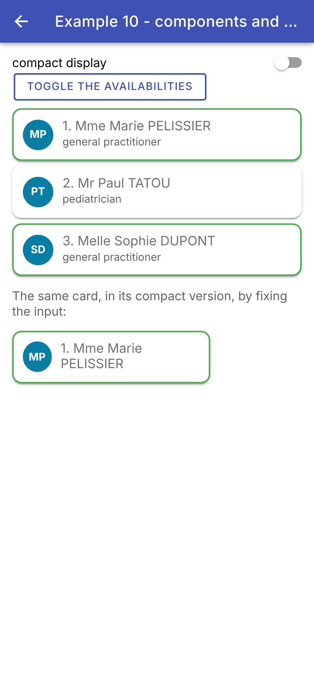
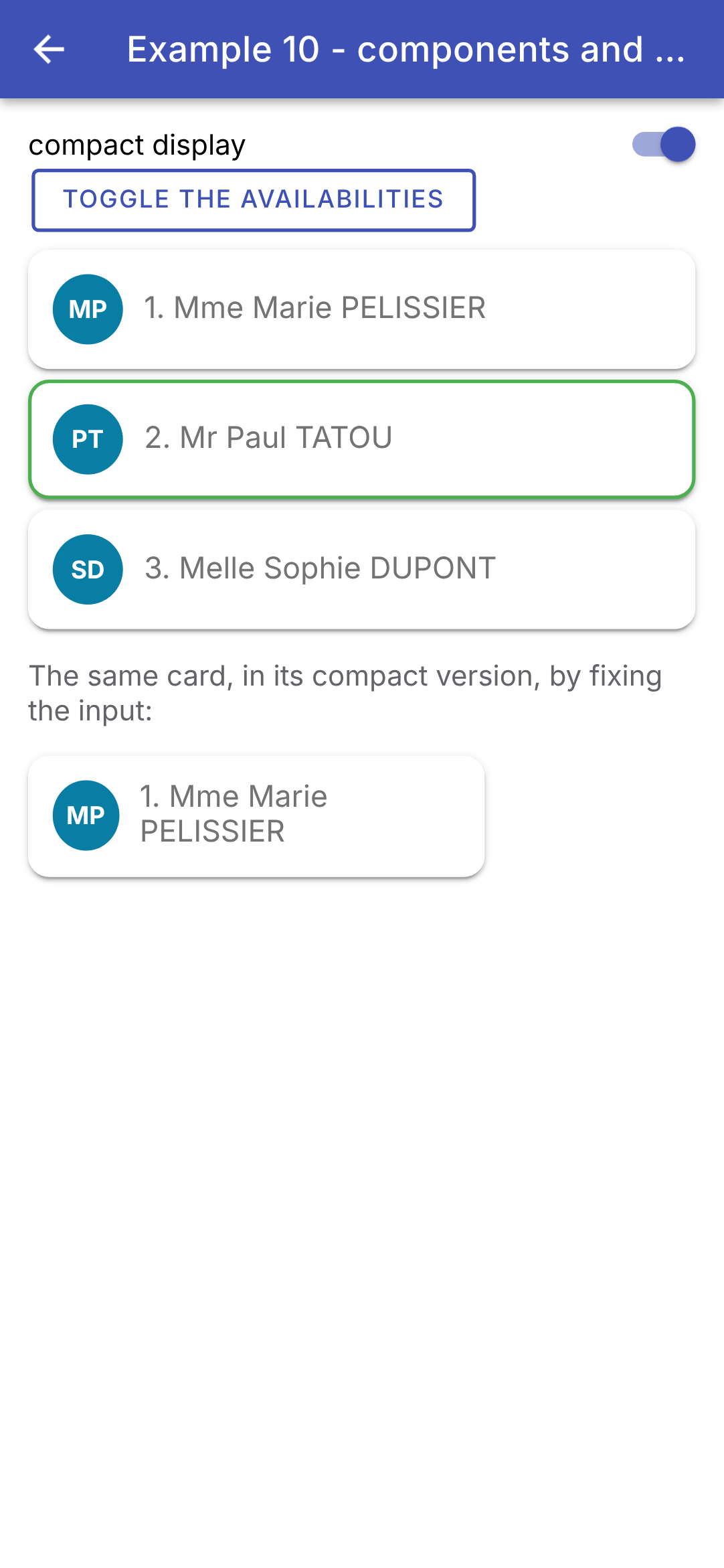
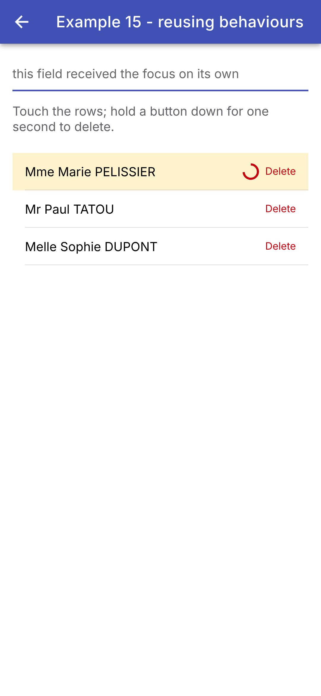
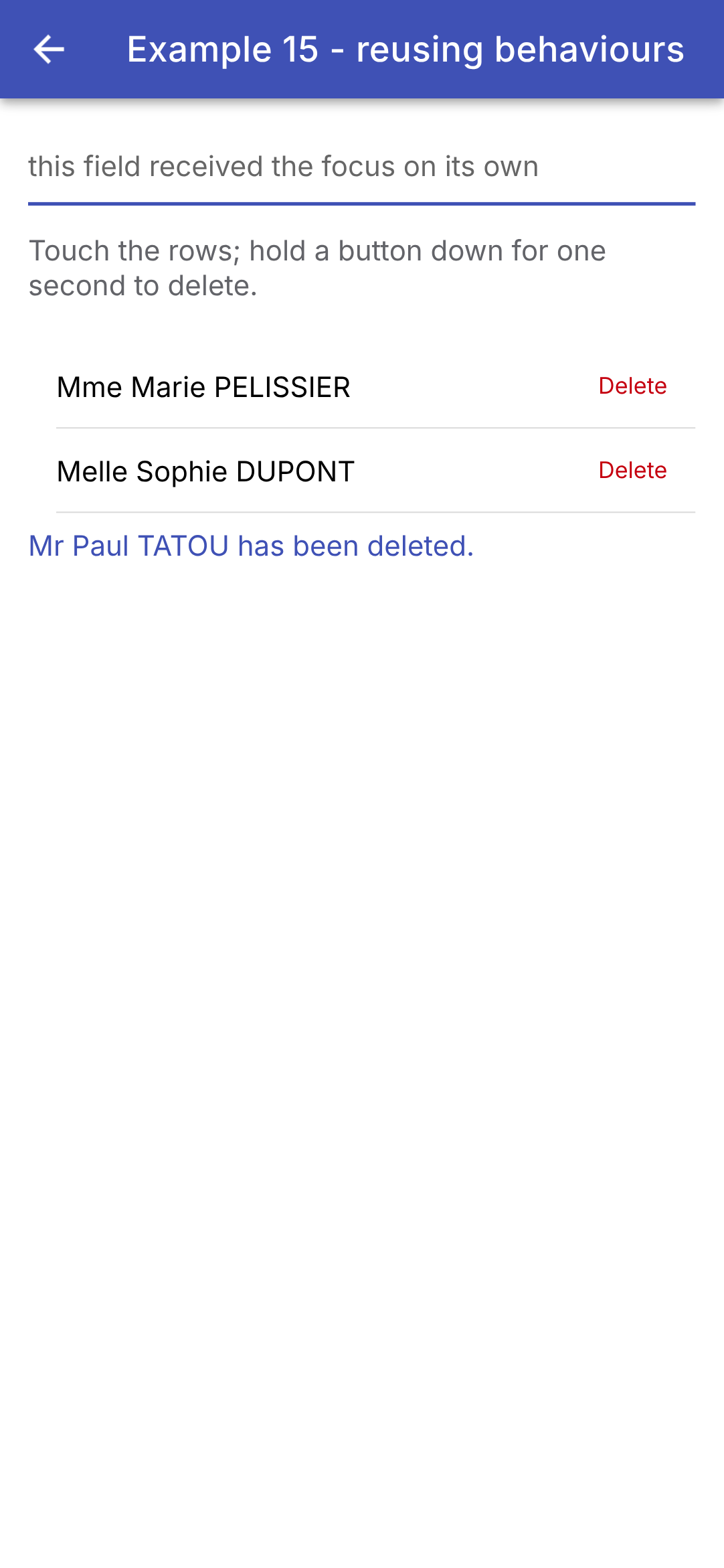
Initially, and then in compact view, the availability is reversed:
Is this a method that creates a template fragment, or an actual component? [Angular] leaves little room for choice: a reusable interface fragment is a component. This is a good thing: it has a name, its inputs are typed and validated at compile time, its styling is encapsulated, and it can be reused elsewhere. Whereas [Flutter] passes data through the constructor parameters of a widget, [Angular] passes it through inputs, which are signals: the child doesn’t have to do anything to track their changes.
4.2. Example 11: The child notifies its parent
Data flows down through inputs; information flows back up through outputs: events that the child emits and the parent listens for, just as it listens for the [(click)] event from a button.
4.2.1. "Events" from the child
| // =========================================================================
// src/app/ex11-lifting-state-up/counter.ts
// -------------------------------------------------------------------------
// A child that NOTIFIES its parent: it declares OUTPUTS,
// with the function output(), and "emits" them when something happens.
// The parent subscribes to them in its template, as to the (click) event of a
// button:
// <app-counter label="Coffees" [max]="3" (incremented)="..." (limit)="..." />
// - output<number>(): an event that carries a number ($event);
// - output<void>() : an event without data.
// =========================================================================
import { Component, input, output, signal } from '@angular/core';
import { IonButton, IonChip } from '@ionic/angular';
@Component({
selector: 'app-counter',
imports: [IonButton, IonChip],
templateUrl: './counter.html',
styles: `
:host { display: flex; align-items: center; }
.label { width: 110px; }
`,
})
export class Counter {
// the inputs (what flows down)...
readonly label = input.required<string>();
readonly max = input.required<number>();
// ... and the outputs (what flows up)
readonly incremented = output<number>(); // with the new value
readonly limit = output<void>(); // without data
// the state SPECIFIC to this counter: each Counter has its own
readonly value = signal(0);
plus(): void {
if (this.value() >= this.max()) {
// emit(): notifies all those listening to the output
this.limit.emit();
return;
}
this.value.update((v) => v + 1);
// we NOTIFY the parent, passing it the new value
this.incremented.emit(this.value());
}
}
|
- lines 20–23: the component’s style. [:host] refers to the component’s tag itself ([<app-counter>]), whose children are aligned on a single line ([display: flex]);
- lines 27–28: the inputs: what flows down from the parent;
- lines 30–31: the outputs: what flows back up to the parent. [output<number>()] declares an event that carries a number; [output<void>()] declares an event with no data. These are the counterparts of the parameters [onIncrement] (a [ValueChanged<int>]) and [onLimit] (a [VoidCallback]) of the [Flutter] counter: instead of receiving functions from the parent, the child emits events, to which the parent subscribes;
- line 34: the state SPECIFIC to this counter; each [Counter] has its own;
- lines 36–45: if the maximum is exceeded, the counter notifies its parent ([this.limit.emit()]); otherwise, it changes its state and then notifies its parent by transmitting the new value ([this.incremented.emit(...)]). The signal already has its new value when it is read on line 44.
| <!-- ======================================================================
counter.html - a label, a +1 button and the value of the counter
====================================================================== -->
<span class="label">{{ label() }}</span>
<ion-button fill="outline" (click)="plus()">+1</ion-button>
<ion-chip [outline]="true">{{ value() }} / {{ max() }}</ion-chip>
|
- Lines 4–6: a label, a button ([+1]), and a chip ([ion-chip]) that displays the value and the maximum.
4.2.2. A controlled component
A custom form field (label + field + tooltip + character counter) that functions as a controlled field: the value belongs to the parent, which passes it to the field and is notified of each keystroke. [Angular] has a ready-made function for this purpose, [model()].
| // =========================================================================
// src/app/ex11-lifting-state-up/text-field.ts - a CONTROLLED component
// -------------------------------------------------------------------------
// A "home-made" form field (label + field + help + character
// counter) that is used like a controlled field, with a
// TWO-WAY binding:
// <app-text-field [(value)]="firstName" label="First name" [max]="20" />
// The value belongs to the PARENT (its firstName signal). model() declares at
// once an input (value) and an output (valueChange):
// - the parent passes its value to the field: [value]="firstName()";
// - the field changes the value: value.set(...), which emits valueChange;
// - the syntax [(value)]="firstName" (the "banana in a box") writes
// both at once: the parent's signal follows the typing.
// When the parent itself changes the value (Clear button), the field follows,
// with nothing more to write: an input is a signal.
//
// The error message (errorText): Ionic only displays it if the field carries
// the classes ion-invalid and ion-touched, which it copies itself from the state
// of Angular's form control (ngModel, see examples 07 and 08).
// We therefore go through ngModel, and set the error of its control.
// =========================================================================
import { Component, computed, effect, input, model, viewChild } from '@angular/core';
import { FormsModule, NgModel } from '@angular/forms';
import { IonInput } from '@ionic/angular';
@Component({
selector: 'app-text-field',
imports: [IonInput, FormsModule],
templateUrl: './text-field.html',
})
export class TextField {
// model.required: a required input... that the component can modify
readonly value = model.required<string>();
readonly label = input.required<string>();
readonly max = input.required<number>();
readonly help = input('');
// is the field full?
readonly full = computed(() => this.value().length === this.max());
// the ngModel of the template, and the form control it manages
private readonly model = viewChild.required(NgModel);
constructor() {
// an effect: it is rerun each time full() changes. It declares
// the control "touched" and "in error" when the field is full
effect(() => {
const control = this.model().control;
control.markAsTouched();
control.setErrors(this.full() ? { full: true } : null);
});
}
}
|
- Line 34: [model.required<string>()] declares both an input ([value]) and an output ([valueChange]). This is a signal that the component itself can modify: [this.value.set('...')] changes its value; AND emits [valueChange], which notifies the parent. The parent will write [[(value)]="firstName"] (the “banana in a box”): its signal [firstName] is passed to the field, and it tracks the input;
- lines 35–37: the other entries: the label, the maximum length, and an optional help text (empty by default);
- line 40: Is the field full? A value calculated from the value and the maximum;
- line 43: [viewChild.required(NgModel)]: the template directive [ngModel] (the form control from [Angular], seen in examples 07 and 08), in the form of a signal;
- Lines 48–52: an EFFECT: a function that is re-executed whenever a signal it monitors changes (here, [full()]). It marks the control as “touched” and sets it to an error when the field is full. Why go through the form check? Because [Ionic] only displays the error message for a [ion-input] ([errorText]) unless the field has the CSS classes [ion-invalid] and [ion-touched]; and with [Angular], it generates these classes itself based on the state of the form control (its classes [ng-invalid] and [ng-touched]). Setting them manually would be pointless: [Ionic] would remove them on the next keystroke.
| <!-- ======================================================================
text-field.html - an ion-input, driven by the parent's value
====================================================================== -->
<!-- [(ngModel)]="value": the two-way binding between the field and the
value signal (the model() of the component): each keystroke does value.set(...),
which emits valueChange to the parent; a new value from the parent
is displayed in the field.
[maxlength]: the field refuses the extra characters;
[counter]: it displays a counter ("5 / 20");
errorText replaces helperText (and the field turns red) when the control is in error -->
<ion-input
[(ngModel)]="value"
[label]="label()"
labelPlacement="floating"
[maxlength]="max()"
[counter]="true"
[helperText]="help()"
errorText="Maximum length reached"
/>
|
- Line 13: [[(ngModel)]="value"]: the bidirectional link between the field and the signal [value]. [ngModel] accepts an editable signal: each keystroke triggers [value.set(...)], which notifies the parent; a new value from the parent is displayed in the field;
- lines 14–15: the label, which “floats” above the field when it has a value or is in focus;
- line 16: the field rejects any extra characters;
- line 17: it displays a counter (“5 / 20”);
- line 18: a tooltip below the field;
- line 19: the message that replaces the tooltip and turns the field red when the control is in error (the field is full).
The [Flutter] field had a unique challenge: a [TextField] stores its text in a controller, which had to be kept up to date in [didUpdateWidget] whenever the parent changed the value itself (using the “Clear” button). Nothing like that here: the parent’s value arrives via a signal, and [ngModel] copies it back into the field as soon as it changes.
4.2.3. The parent
| // =========================================================================
// src/app/ex11-lifting-state-up/ex11.page.ts - the parent listens to its children
// -------------------------------------------------------------------------
// The data flow down (inputs); the information flows up through the
// OUTPUTS of the children:
// 1. "events" of the child: (incremented), (limit);
// 2. a controlled component: [(value)], like the [(ngModel)] of a field.
// The state remains the property of the parent, which can modify it itself (Clear).
// =========================================================================
import { Component, signal } from '@angular/core';
import {
IonBackButton, IonButton, IonButtons, IonCard, IonCardContent, IonCardHeader, IonCardSubtitle, IonContent,
IonHeader, IonTitle, IonToolbar,
} from '@ionic/angular';
import { TextField } from './text-field';
import { Counter } from './counter';
@Component({
selector: 'app-ex11',
imports: [
IonHeader, IonToolbar, IonButtons, IonBackButton, IonTitle, IonContent, IonCard, IonCardHeader,
IonCardSubtitle, IonCardContent, IonButton, Counter, TextField,
],
templateUrl: './ex11.page.html',
})
export class Ex11Page {
readonly total = signal(0);
readonly message = signal('');
readonly firstName = signal('Marie');
readonly lastName = signal('PELISSIER');
// the method called by a counter: it receives the value it passes
onIncrement(label: string, value: number): void {
this.total.update((t) => t + 1);
this.message.set(`${label} is now ${value}`);
}
// the parent changes its data: the fields follow
clear(): void {
this.firstName.set('');
this.lastName.set('');
}
}
|
- lines 30–31: the values of both fields belong to the parent: two signals;
- lines 34–37: the method called when a counter emits [incremented]: it receives the value it transmits;
- lines 40–43: the parent changes the value itself: the fields are cleared.
| <!-- ======================================================================
ex11.page.html - the template of the parent: it listens to the children's outputs
====================================================================== -->
<ion-header>
<ion-toolbar color="primary">
<ion-buttons slot="start">
<ion-back-button defaultHref="/" />
</ion-buttons>
<ion-title>Example 11 - the child notifies its parent</ion-title>
</ion-toolbar>
</ion-header>
<ion-content class="ion-padding">
<ion-card>
<ion-card-header>
<ion-card-subtitle>1. Outputs listened to by the parent</ion-card-subtitle>
</ion-card-header>
<ion-card-content>
<!-- (output)="statement": $event is the data emitted by the child -->
<app-counter
label="Coffees"
[max]="3"
(incremented)="onIncrement('Coffees', $event)"
(limit)="message.set('No more than 3 coffees!')"
/>
<app-counter
label="Glasses of water"
[max]="8"
(incremented)="onIncrement('Glasses of water', $event)"
(limit)="message.set('Enough drinking.')"
/>
<p><em>Total clicks: {{ total() }} - {{ message() }}</em></p>
</ion-card-content>
</ion-card>
<ion-card>
<ion-card-header>
<ion-card-subtitle>2. Controlled components</ion-card-subtitle>
</ion-card-header>
<ion-card-content>
<!-- [(value)]="firstName": the two-way binding with a signal of the parent -->
<app-text-field [(value)]="firstName" label="First name" [max]="20" help="Required" />
<app-text-field [(value)]="lastName" label="Last name" [max]="20" help="Displayed in upper case" />
<!-- the data of the parent, which follow the typing -->
<p>Data of the parent: <strong>{{ firstName() }} {{ lastName().toUpperCase() }}</strong></p>
<ion-button fill="outline" (click)="clear()">Clear (from the parent)</ion-button>
</ion-card-content>
</ion-card>
</ion-content>
|
- lines 21–26: a counter, its inputs, and its outputs. [(incremented)="onIncrement('Coffees', $event)"]: with each transmission, [Angular] executes the instruction, where [$event] is the data transmitted by the child; the parent adds its own argument (the label) to it. [(limit)] directly executes an instruction: [message.set(...)];
- line 30: the second counter, whose outputs are listened to in the same way, with its own label (“Glasses of water”);
- lines 43–44: two controlled fields, linked to the parent’s signals [firstName] and [lastName] via [[(value)]]. The parent passes the signal itself ([firstName], without parentheses): [Angular] reads and modifies it;
- line 46: the parent’s data, which follows the entry;
- line 47: the parent changes the value itself: the fields are cleared.
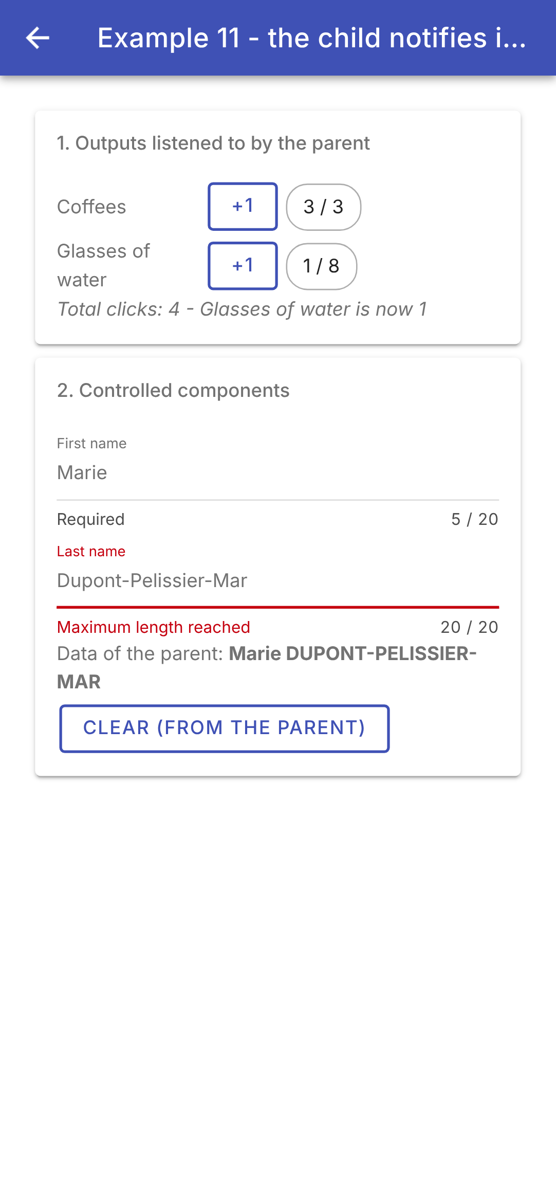
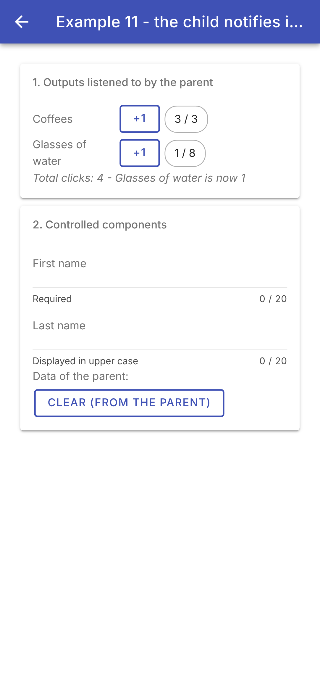
Press the first counter four times (the fourth time, it outputs [limit]), once on the second, and fill in the name; then clear the fields from the parent:
Inputs and outputs—that’s the entire dialogue between a parent and its children in [Angular]. [Flutter] passed functions as parameters ([onIncrement: (v) => ...]), just as [React] passes functions as “props”; [Angular] prefers events, which are listened to using the same syntax as those in the browser ([(click)], [(incremented)]). And the bidirectional binding [[( )]]—which [Flutter] and [React] write manually (a value + a function [onChanged])—is here a template syntax.
4.3. Example 12: Composition
4.3.1. A card
A component's inputs transmit data... The content itself is written between its tags, as with an HTML tag: [<app-card>...here...</app-card>]. The component places it wherever it wants in its template, using the tag [<ng-content>]: this is content projection. [Ionic] uses it everywhere: the text of a [ion-button], the content of a [ion-card], or a [ion-item] is projected. This is the counterpart to the [child], [title], or [body] parameters of the [Flutter] widgets, which receive other widgets.
| // =========================================================================
// src/app/ex12-composition/card.ts - a reusable TEMPLATE
// -------------------------------------------------------------------------
// The inputs of a component pass DATA... The CONTENT, for its part,
// is written between its tags, as for an HTML tag, and the component
// places it where it wants, with the <ng-content> tag: this is content
// PROJECTION. Ionic uses it everywhere: the content of an <ion-button>,
// of an <ion-card>, of an <ion-item>...
// - <ng-content />: the "main" content (everything that is not elsewhere);
// - <ng-content select="[header]">: another place (a "slot"),
// for the parent's tags that carry the header attribute; what we
// write between <ng-content> and </ng-content> is the default content;
// - the footer is optional: the card looks for it in its content
// (contentChild) and only displays it if it is there.
// The card sets the frame (border, header, footer), the parent provides what
// goes inside.
// =========================================================================
import { Component, computed, contentChild, Directive, input } from '@angular/core';
// a MARKER: a directive without code, set by the parent on its footer
// (<span footer>...</span>), so that the card can find it
@Directive({ selector: '[footer]' })
export class CardFooter {}
@Component({
selector: 'app-card',
templateUrl: './card.html',
styles: `
:host { display: block; margin: 0 0 12px; border: 1px solid var(--bg); border-radius: 8px; overflow: hidden; }
.header { background: var(--bg); padding: 10px; font-weight: bold; }
.header.colored { color: white; }
.body { padding: 10px; }
.footer { background: #f5f5f5; padding: 8px; color: #757575; font-size: 12px; }
`,
// host: bindings on the <app-card> tag itself. Here, a
// CSS variable (--bg), read by the rules above
host: { '[style.--bg]': 'background()' },
})
export class Card {
// an Ionic colour, optional ('primary', 'success'...): undefined by default
readonly color = input<string>();
readonly background = computed(() => (this.color() ? `var(--ion-color-${this.color()})` : '#e0e0e0'));
// contentChild: the first element of the CONTENT that carries the directive
// CardFooter; a signal, undefined if there is none
readonly footer = contentChild(CardFooter);
}
|
- lines 23–24: a MARKER—a directive (a class without a template; see Example 15)—that does nothing. The parent places it on its footer, [<span footer>...</span>], so that the card can locate it within its content;
- lines 29–35: the card’s style. The colors come from a CSS variable, [--bg];
- line 38: [host]: bindings on the component’s tag itself ([<app-card>]). Here, the CSS variable [--bg] is assigned the calculated value [background()];
- line 42: an optional entry with no default value: [undefined] if the parent does not provide it. Like the components of [Ionic], the card is given the name of a color from the theme ([primary], [success]...);
- line 43: the background color: the [Ionic] CSS variable that corresponds to this color ([var(--ion-color-primary)]...), or light gray;
- line 47: [contentChild(CardFooter)] searches the CONTENT provided by the parent for the first element containing the directive [CardFooter]. This is a signal: [undefined] if none is found.
| <!-- ======================================================================
card.html - the frame of the card, and three places for the content
====================================================================== -->
<!-- the header: the styles of .header (bold, white on a colour)
apply, by inheritance, to ALL the texts provided by the parent -->
<div class="header" [class.colored]="color()">
<ng-content select="[header]">Untitled</ng-content>
</div>
<!-- the main content, provided by the parent -->
<div class="body">
<ng-content />
</div>
<!-- no footer provided: no footer at all -->
@if (footer()) {
<div class="footer">
<ng-content select="[footer]" />
</div>
}
|
- lines 7–9: the header. [<ng-content select="[header]">] is a slot: it receives the content tags that match the CSS selector [[header]], that is, those that carry the attribute [header]. The text between [<ng-content>] and [</ng-content>] (“Untitled”) is the default content, displayed when the parent does not provide a header. The styles of [.header] (bold, white text on a colored background) are applied, by inheritance, to all text provided by the parent: this is the counterpart to [DefaultTextStyle] in [Flutter];
- lines 12–14: the main content: [<ng-content />], without a selector, receives everything that did not go into any other location;
- lines 17–21: no footer provided: no footer at all (neither its margin nor its gray background).
4.3.2. A generic table
| // =========================================================================
// src/app/ex12-composition/data-table.ts - a GENERIC table
// -------------------------------------------------------------------------
// DataTable<T> is a generic component: it displays rows of
// any type T. It knows how to iterate over the rows, but not how to
// display ONE cell: it is the parent that tells it, by passing it,
// in its content, a TEMPLATE (<ng-template>) per column:
// <app-data-table [rows]="slots">
// <ng-template column="Slot" let-c>{{ c.time }}</ng-template>
// </app-data-table>
// An <ng-template> is not displayed where it is written: it is a piece
// of template "on hold", which the table displays itself, as many times
// as needed (ngTemplateOutlet), giving it its data (the row,
// its rank): let-c receives the row, let-i="index" its rank.
// The content is provided by the parent, but it uses data that
// belong to the child: it is the counterpart of Flutter's "builders"
// (ListView.builder) and of React's "render props".
// =========================================================================
import { NgTemplateOutlet } from '@angular/common';
import { Component, contentChildren, Directive, inject, input, TemplateRef } from '@angular/core';
// the data that a cell template receives: $implicit is the value of
// let-c (without a name), index that of let-i="index"
export interface CellContext<T> {
$implicit: T;
index: number;
}
// a COLUMN: a directive set on an <ng-template>. It carries the title
// of the column, and gives access to the template (TemplateRef) on which it is set
@Directive({ selector: 'ng-template[column]' })
export class Column {
readonly title = input.required<string>({ alias: 'column' });
readonly template = inject<TemplateRef<CellContext<unknown>>>(TemplateRef);
}
@Component({
selector: 'app-data-table',
imports: [NgTemplateOutlet],
templateUrl: './data-table.html',
styles: `
table { width: 100%; border-collapse: collapse; }
th { text-align: left; padding: 6px; border-bottom: 1px solid #ccc; }
td { padding: 6px; border-top: 1px solid #e0e0e0; }
tbody tr:first-child td { border-top: none; }
.empty { color: #9e9e9e; padding: 6px; }
`,
})
export class DataTable<T> {
// T is deduced from the type of [rows]: DataTable<Slot>...
readonly rows = input.required<readonly T[]>();
// contentChildren: ALL the columns of the content, in order (a signal)
readonly columns = contentChildren(Column);
}
|
- lines 25–28: the data that a cell template receives from the table: the row ([$implicit], the default value) and its column ([index]);
- lines 32–36: a COLUMN—a directive that applies only to a [<ng-template>] (its selector, [ng-template[column]]). A [<ng-template>] is not displayed where it is written: it is a “pending” template fragment—a TEMPLATE—that someone else will display as many times as necessary. The directive bears the column title (the input [title], which takes the name of the directive via the alias: [column="Slot"]), and provides access to the template on which it is placed ([inject(TemplateRef)]);
- Line 50: [DataTable<T>] is a generic component: it displays rows of any [T] type. It knows how to iterate through rows, but not how to display a cell—the parent component tells it how by passing a template for each column. This is the principle behind the “builders” in [Flutter] ([ListView.builder], the [cells] function from the [Flutter] example) and the “render props” in [React]: the content is provided by the parent, but it uses data that belongs to the child (the row, its rank);
- line 52: the rows. [T] is inferred from the type of the value provided by the parent: with [[rows]="slots"], it is a [DataTable<Slot>];
- line 54: [contentChildren(Column)]: ALL the columns of the content, in the order in which the parent wrote them (a signal containing an array).
| <!-- ======================================================================
data-table.html - a row of titles, then one row per element
====================================================================== -->
<table>
<thead>
<tr>
@for (col of columns(); track col) {
<th>{{ col.title() }}</th>
}
</tr>
</thead>
<tbody>
@for (row of rows(); track $index; let i = $index) {
<tr>
@for (col of columns(); track col) {
<!-- the cell of THIS row and of this column, built by the
parent's template, with its data (context) -->
<td>
<ng-container *ngTemplateOutlet="col.template; context: { $implicit: row, index: i }" />
</td>
}
</tr>
}
</tbody>
</table>
<!-- no row: the [empty] content provided by the parent, or a default text -->
@if (rows().length === 0) {
<div class="empty">
<ng-content select="[empty]">No data.</ng-content>
</div>
}
|
- lines 6–10: a row of headers, one per column;
- lines 13–23: one table row per element, and, in each row, one cell per column;
- line 19: [*ngTemplateOutlet] displays the column template ([col.template]) at this location, providing it with its data ([context]): the row and its rank. [<ng-container>] is a tag that does not exist on the page: it is used solely to carry the directive;
- Lines 27–31: no row—the content [[empty]] provided by the parent, or default text. The column headers remain displayed.
The table itself creates the cells ([<td>]) around the templates: their style (margins, borders) is therefore that of the table, and the parent element only needs to provide the content inside them.
4.3.3. The parent
| // =========================================================================
// src/app/ex12-composition/ex12.page.ts - using the Card and DataTable templates
// =========================================================================
import { Component } from '@angular/core';
import {
IonBackButton, IonButtons, IonChip, IonContent, IonHeader, IonIcon, IonTitle, IonToolbar,
} from '@ionic/angular';
import { addIcons } from 'ionicons';
import { calendar } from 'ionicons/icons';
import { Card, CardFooter } from './card';
import { Column, DataTable } from './data-table';
// a slot: a type written inline (no need for an interface named elsewhere)
type Slot = { id: number; time: string; patient: string | null };
const slots: Slot[] = [
{ id: 1, time: '8:00 - 8:20', patient: null },
{ id: 2, time: '8:20 - 8:40', patient: 'Mme Alice DURAND' },
{ id: 3, time: '8:40 - 9:00', patient: null },
];
@Component({
selector: 'app-ex12',
imports: [
IonHeader, IonToolbar, IonButtons, IonBackButton, IonTitle, IonContent, IonIcon, IonChip,
Card, CardFooter, DataTable, Column,
],
templateUrl: './ex12.page.html',
})
export class Ex12Page {
readonly slots = slots;
readonly free = slots.filter((c) => c.patient === null).length;
// an empty list, of an explicitly given type (nothing allows guessing it)
readonly persons: { id: number; name: string }[] = [];
constructor() {
addIcons({ calendar });
}
}
|
- line 15: a time slot—an inline type. [string | null]: a patient, or no one;
- line 27: the parent imports the components [Card] and [DataTable], as well as the directives [CardFooter] and [Column], which it uses in its template;
- line 33: the number of available time slots;
- line 35: an empty list, whose type is explicitly specified (there is no way to infer it otherwise).
| <!-- ======================================================================
ex12.page.html - cards, and what we put inside them
====================================================================== -->
<ion-header>
<ion-toolbar color="primary">
<ion-buttons slot="start">
<ion-back-button defaultHref="/" />
</ion-buttons>
<ion-title>Example 12 - composition</ion-title>
</ion-toolbar>
</ion-header>
<ion-content class="ion-padding">
<!-- the header (header attribute) and the footer (footer attribute) go into their
places; the rest is the main content -->
<app-card color="primary">
<div header style="display: flex; align-items: center; gap: 8px">
<ion-icon name="calendar" />
<span>Schedule of Mme PELISSIER</span>
</div>
<span footer>{{ free }} free slot(s)</span>
<!-- the main content: a table of slots, one template per column -->
<app-data-table [rows]="slots">
<!-- let-i="index": the rank of the row -->
<ng-template column="#" let-i="index">{{ i + 1 }}</ng-template>
<!-- let-c: the row itself -->
<ng-template column="Slot" let-c>{{ c.time }}</ng-template>
<ng-template column="Status" let-c>
@if (c.patient) {
<ion-chip [outline]="true">{{ c.patient }}</ion-chip>
} @else {
<ion-chip color="success">Free</ion-chip>
}
</ng-template>
</app-data-table>
</app-card>
<app-card color="success">
<span header>A card without a footer</span>
The footer is not provided: the card does not display it.
</app-card>
<!-- no header provided: the default content, "Untitled" -->
<app-card>
<app-data-table [rows]="persons">
<ng-template column="Name" let-p>{{ p.name }}</ng-template>
<span empty>Nobody for now.</span>
</app-data-table>
</app-card>
</ion-content>
|
- lines 17–37: a card, with the color [primary];
- lines 18–21: its header: a tag with the attribute [header], which therefore goes in the [select="[header]"] slot of the card; it contains an icon and text;
- line 22: its footer, which has the attribute [footer] (and therefore the directive [CardFooter]);
- lines 24–36: the main content: a table of slots, with one template per column. [let-c] declares a template variable, which is assigned the value [$implicit] from the context (the row); [let-i="index"] is a variable that receives the value [index] (the rank). The template for the “Status” column contains a [@if] and components of [Ionic] ([ion-chip]): a template is just like any other template;
- lines 39–42: a card without a footer;
- lines 45–50: a card without a header (the default content, “Untitled”); its table is empty and displays the [empty] content provided by the parent.
The template variables ([c], [p]) are of type [any] here: [Angular] does not link the type of a [<ng-template>] to the [T] in the table that will display it (we could help it do so by writing a [ngTemplateContextGuard] method in the directive, as [NgFor] does; that goes beyond the scope of this example).
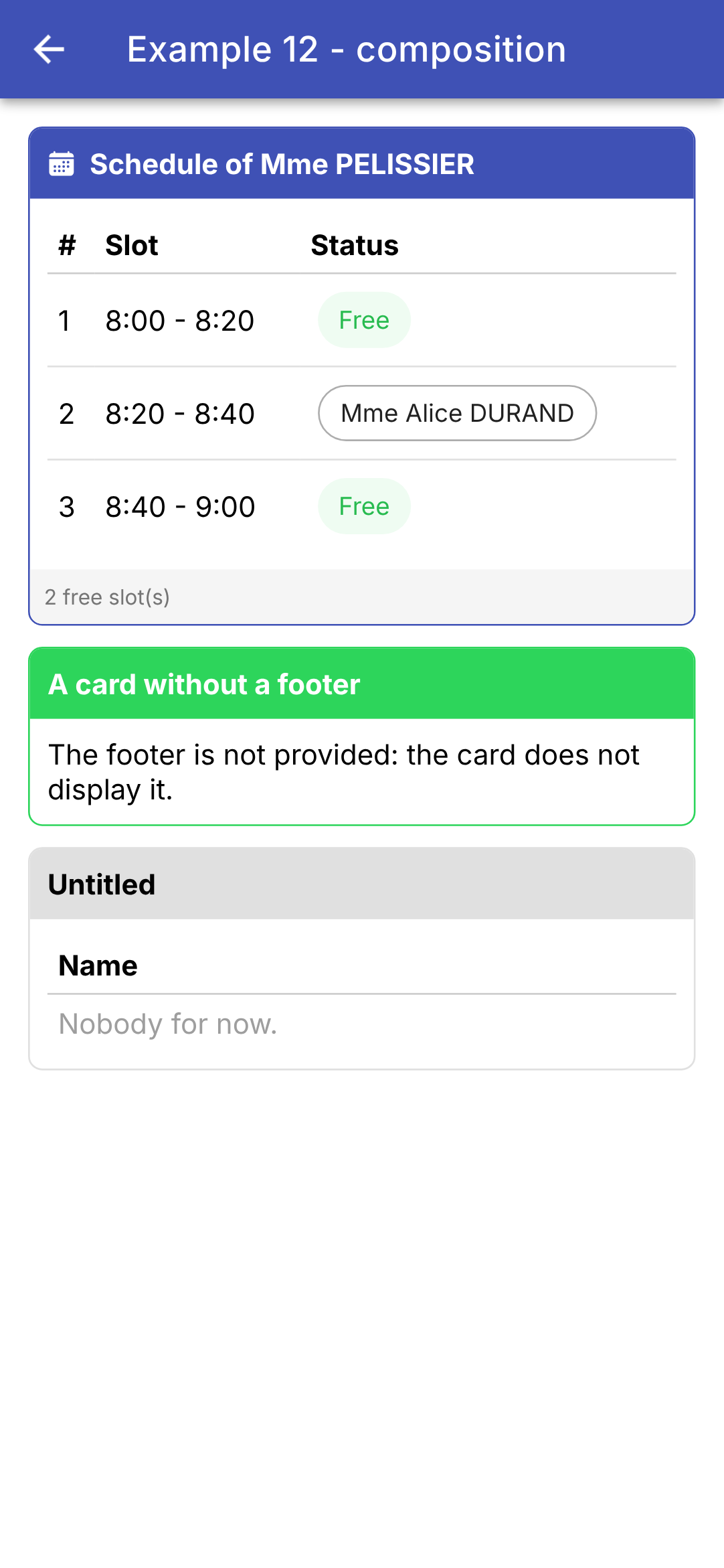
The card defines the framework (border, header, footer); the parent provides the content inside it. This is how the components of [Ionic] themselves are constructed: [ion-card] receives its header and content, while [ion-item] receives elements placed at the beginning ([slot="start"]) or at the end ([slot="end"]). [Flutter] passes content via a widget’s parameters, and [Angular] writes it between the component’s tags; when the content depends on child data, [Flutter] passes a function, and [Angular] passes a template ([<ng-template>]).
4.4. Example 13: The Lifecycle of a Component
4.4.1. A clock
| // =========================================================================
// src/app/ex13-lifecycle/clock.ts - a component that starts and stops
// -------------------------------------------------------------------------
// The life of an Angular component:
// 1. constructor() : the object is created; its inputs do not
// have their value yet;
// 2. ngOnChanges(changes) : its inputs have just received a value
// (the first time), then each time the
// parent gives them a new one;
// 3. ngOnInit() : once, after the first ngOnChanges. The
// component is about to appear: we start there what
// must be started;
// 4. afterNextRender(...) : after its first rendering (its tags
// exist in the page);
// 5. ngOnDestroy() : the component disappears forever. We
// STOP there what has been started.
// A clock starts a timer (setInterval) when it appears... and
// must absolutely stop it when it disappears: otherwise the timer
// would keep running for nothing, on a dead component.
// =========================================================================
import { afterNextRender, Component, input, OnChanges, OnDestroy, OnInit, output, signal, SimpleChanges }
from '@angular/core';
// "12:05:09": the current time
export function currentTime(): string {
return new Date().toLocaleTimeString('en-GB');
}
@Component({
selector: 'app-clock',
templateUrl: './clock.html',
styles: `.time { font-size: 40px; font-family: 'Roboto Mono', monospace; }`,
})
export class Clock implements OnChanges, OnInit, OnDestroy {
// an Ionic colour: 'primary', 'danger'...
readonly color = input('primary');
// the clock notifies its parent of each stage of its life
readonly log = output<string>();
readonly time = signal(currentTime());
// the identifier of the timer, to be able to stop it
private timer?: ReturnType<typeof setInterval>;
constructor() {
// afterNextRender: a function to execute ONCE, after the next
// rendering. It is registered in the constructor (an "injection
// context" is required, see example 14)
afterNextRender(() => this.log.emit('Clock: afterNextRender - displayed'));
}
// changes: the inputs that have changed, with their old and their new value
ngOnChanges(changes: SimpleChanges<Clock>): void {
const color = changes.color;
// firstChange: the first value, received at creation; we only note
// the following changes
if (color && !color.firstChange) {
this.log.emit(`Clock: ngOnChanges - ${color.previousValue} -> ${color.currentValue}`);
}
}
ngOnInit(): void {
this.log.emit('Clock: ngOnInit - starting the timer');
// every second, the time changes: the screen follows the signal
this.timer = setInterval(() => this.time.set(currentTime()), 1000);
}
ngOnDestroy(): void {
clearInterval(this.timer); // the CLEANUP
this.log.emit('Clock: ngOnDestroy - timer stopped');
}
}
|
The life cycle of an [Angular] component:
Method | When? |
constructor() | The object has just been created; its inputs do not yet have values. Here, we call inject(), effect(), afterNextRender(), etc. |
ngOnChanges(changes) | Its inputs have just received a value (the first time), and then every time the parent assigns them a new one |
ngOnInit() | Once, immediately after the first ngOnChanges: the component is about to appear. Here, we start whatever needs to be started (timer, subscription, etc.) |
afterNextRender(...) | after the next render: the component’s tags exist on the page |
ngOnDestroy() | The component disappears permanently. Stop whatever was started here |
- lines 26–28: the current time, in the 24-hour format of [en-GB] (“12:05:09”);
- line 35: [implements OnChanges, OnInit, OnDestroy]: interfaces of [Angular], which require the class to implement the corresponding methods (the compiler checks their names and parameters). [Angular] calls these methods if it finds them, whether they are interfaces or not;
- line 37: the clock’s color: a color from [Ionic];
- line 39: the clock notifies its parent of each stage in its lifecycle via an output (Example 11);
- lines 41–43: the state: the displayed time and the timer’s identifier, so it can be stopped;
- line 49: [afterNextRender] registers a function to be executed once, after the next display. It is called in the constructor because it requires an “injection context” (example 14). It does not output its results within the constructor itself: at that point, the parent has not yet subscribed to it;
- Lines 53–60: [ngOnChanges] receives the inputs that have changed, each with its old value ([previousValue]), its new value ([currentValue]), and [firstChange], which is true for the first value, received upon creation. Only the following changes are noted: the parent has changed the color. This is the counterpart to [didUpdateWidget] from [Flutter];
- lines 62–66: [ngOnInit]: a periodic timer ([setInterval]) is started; its function is called every second and updates the time. This is the counterpart to [initState];
- lines 68–71: cleanup: the timer is stopped ([clearInterval]). Without this, it would continue to run needlessly on a dead component and keep it in memory (a memory leak). This is the counterpart to [dispose].
| <!-- ======================================================================
clock.html - the time, in large, in the requested colour
====================================================================== -->
<div class="time" [style.color]="'var(--ion-color-' + color() + ')'">{{ time() }}</div>
|
- Line 4: The time, displayed prominently; its color is determined by the [Ionic] CSS variable which corresponds to the received name ([var(--ion-color-danger)]...).
With signals, you can often do without [ngOnChanges]: an input is a signal, which is followed automatically by either a [computed] or a [effect] (Example 11). [ngOnChanges] remains useful, as here, for determining the OLD value.
4.4.2. The parent
| // =========================================================================
// src/app/ex13-lifecycle/ex13.page.ts - the lifecycle
// -------------------------------------------------------------------------
// - @if (withClock()) { <app-clock ... /> }: checking / unchecking the box
// makes the component appear / disappear (ngOnInit, then ngOnDestroy,
// see clock.ts); changing its colour changes its input (ngOnChanges);
// - a search field that takes the focus as soon as it appears
// (afterNextRender);
// - the title of the browser tab follows the typing (an effect, effect());
// - Ionic's PAGE events (ionViewDidEnter, ionViewWillLeave...):
// the page becomes visible, or stops being so, without being destroyed;
// - the life of the APPLICATION: on a phone, it goes to the background
// (another application is opened, the screen turns off), then comes back.
// =========================================================================
import {
afterNextRender, Component, DestroyRef, effect, inject, Injector, signal, viewChild,
} from '@angular/core';
import { Title } from '@angular/platform-browser';
import {
IonBackButton, IonButton, IonButtons, IonCard, IonCardContent, IonCheckbox, IonContent, IonHeader, IonInput,
IonTitle, IonToolbar, ViewDidEnter, ViewWillLeave,
} from '@ionic/angular';
import { currentTime, Clock } from './clock';
@Component({
selector: 'app-ex13',
imports: [
IonHeader, IonToolbar, IonButtons, IonBackButton, IonTitle, IonContent, IonCard, IonCardContent, IonCheckbox,
IonButton, IonInput, Clock,
],
templateUrl: './ex13.page.html',
})
export class Ex13Page implements ViewDidEnter, ViewWillLeave {
readonly withClock = signal(true);
readonly red = signal(false);
readonly log = signal<string[]>([]);
readonly search = signal('');
readonly showSearch = signal(false);
// the search field: a signal, undefined as long as the field does not exist
private readonly field = viewChild(IonInput);
private readonly injector = inject(Injector);
constructor() {
// Angular's Title service: the title of the HTML page (the browser
// tab). An EFFECT: the function is rerun each time a
// signal it reads (search) changes
const title = inject(Title);
const initialTitle = title.getTitle();
effect(() => title.setTitle(this.search() === '' ? 'Example 13' : `Search: ${this.search()}`));
// the application goes to the background (hidden) or comes back (visible)
const onVisibility = () => this.trace(`Application: ${document.visibilityState}`);
document.addEventListener('visibilitychange', onVisibility);
// DestroyRef: another way of writing ngOnDestroy, where we start
// something. The cleanup is written right next to the start
inject(DestroyRef).onDestroy(() => {
document.removeEventListener('visibilitychange', onVisibility);
title.setTitle(initialTitle);
});
}
trace(message: string): void {
this.log.update((j) => [...j, `${currentTime()} ${message}`]);
}
// Ionic's page events: the page has entered the screen...
ionViewDidEnter(): void {
this.trace('Page: ionViewDidEnter');
}
// ... or is about to leave it (another page comes in front, or we go back)
ionViewWillLeave(): void {
this.trace('Page: ionViewWillLeave');
}
openSearch(): void {
this.showSearch.set(true);
// the field will only exist after the next rendering: we give it the
// focus at that moment (the phone's keyboard opens). Outside the
// constructor, afterNextRender needs the injector of the component.
// getInputElement(): the <input> tag that <ion-input> contains, once
// Ionic has built it (a promise)
afterNextRender(async () => (await this.field()?.getInputElement())?.focus(), { injector: this.injector });
}
}
|
- Line 34: The page implements two interfaces of [Ionic]: [ViewDidEnter] and [ViewWillLeave] (see below);
- line 42: [viewChild(IonInput)]: the template’s search field, in the form of a signal, [undefined], as long as the field does not exist;
- line 43: the component injector (example 14), which [afterNextRender] will need on line 85;
- lines 49–51: the [Title] service of [Angular] changes the title of the HTML page (the one displayed in the browser tab). An EFFECT ([effect]): the function is re-executed every time a signal it reads changes; the title therefore updates as text is entered. This is the counterpart to the [Title] widget from [Flutter];
- lines 54–55: the life cycle of the application itself. On a phone, it goes into the background (when another app is opened or the screen turns off) and then returns: the [visibilitychange] event in the document signals this ([document.visibilityState] is then equal to [hidden] or [visible]). You would respond to this to save a draft or stop a timer. This is the counterpart to [AppLifecycleListener] for [Flutter]; a [Capacitor] application also has the [@capacitor/app] plugin for this purpose;
- lines 58–61: [DestroyRef]: another way to write [ngOnDestroy]. [onDestroy(...)] registers a function called when the component is destroyed; the cleanup code is thus written right next to what it cleans up: the listener is removed, and the page’s title is restored;
- lines 69–76: the [Ionic] PAGE events, which have no equivalent in [Flutter]. When switching from one page to another, [Ionic] keeps the previous page in memory, hidden, without destroying it (so it can be returned to without having to be recreated): [ngOnInit] and [ngOnDestroy] therefore do not indicate when a page becomes visible or ceases to be visible. These roles are handled by [ionViewWillEnter] and [ionViewDidEnter] (the page is about to appear / has appeared on the screen), and [ionViewWillLeave] and [ionViewDidLeave] (the page is about to leave / has left the screen). This is where the page data is reloaded when you return to it, for example;
- lines 78–86: the search field will not exist until the next page load; focus is given to it at that moment using [afterNextRender] (the counterpart to [addPostFrameCallback]). Outside the constructor, [afterNextRender] requires that the component’s injector be provided to it. [getInputElement()] returns (in a promise) the tag [<input>] contained in the component [ion-input], once [Ionic] has created it; we give it focus, and the phone’s keyboard opens.
| <!-- ======================================================================
ex13.page.html - a clock that we make appear and disappear
====================================================================== -->
<ion-header>
<ion-toolbar color="primary">
<ion-buttons slot="start">
<ion-back-button defaultHref="/" />
</ion-buttons>
<ion-title>Example 13 - the lifecycle</ion-title>
</ion-toolbar>
</ion-header>
<ion-content class="ion-padding">
<ion-card>
<ion-card-content>
<ion-checkbox labelPlacement="end" [checked]="withClock()" (ionChange)="withClock.set($event.detail.checked)">
show the clock
</ion-checkbox>
<br />
<ion-checkbox labelPlacement="end" [checked]="red()" (ionChange)="red.set($event.detail.checked)">
in red
</ion-checkbox>
<!-- the component only exists if the box is checked -->
@if (withClock()) {
<app-clock [color]="red() ? 'danger' : 'primary'" (log)="trace($event)" />
}
</ion-card-content>
</ion-card>
<ion-card>
<ion-card-content>
@if (!showSearch()) {
<ion-button fill="outline" (click)="openSearch()">Search...</ion-button>
} @else {
<ion-input
placeholder="the title follows the typing"
[value]="search()"
(ionInput)="search.set($event.detail.value ?? '')"
/>
}
</ion-card-content>
</ion-card>
<h6>Log</h6>
@for (line of log(); track $index) {
<div style="font-size: 12px">{{ $index + 1 }}. {{ line }}</div>
}
</ion-content>
|
- lines 17–23: two checkboxes from [Ionic] ([ion-checkbox]), the label after the checkbox ([labelPlacement="end"]);
- Lines 25–27: Checking the box displays the clock ([ngOnInit]); unchecking it hides it ([ngOnDestroy]): [@if] actually creates and destroys the component. Changing its color changes its input ([ngOnChanges]);
- lines 33–41: a field that only appears after clicking “Search…”;
- lines 46–48: the log.
We change the color, remove and then restore the clock, open the search, and type in a name:
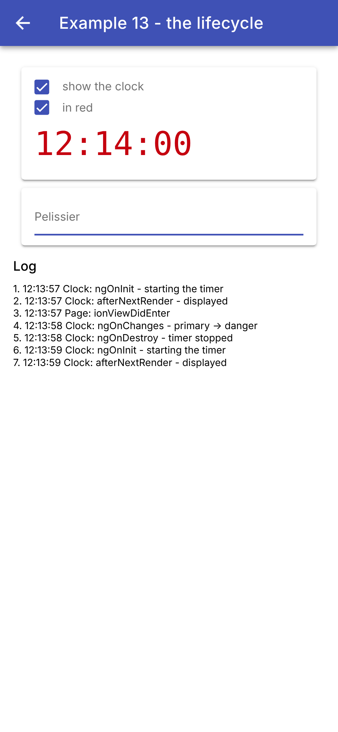
The log shows the clock’s activity: startup and initial display, color change, shutdown, and restart; and, in between, the page appearing on the screen ([ionViewDidEnter]). The field gained focus on its own: we typed the name on the keyboard without touching it, and the browser tab title updated as we typed (“Search: Pelissier,” not visible in the screenshot).
The mapping for [Flutter] is direct: [initState] becomes [ngOnInit] (or the constructor, for elements that do not depend on inputs), [didUpdateWidget] becomes [ngOnChanges] (or [effect] for an input), [dispose] becomes [ngOnDestroy] (or [DestroyRef.onDestroy]), [addPostFrameCallback] becomes [afterNextRender]. A reader of the course [React] will recognize [effect] and [DestroyRef] as the two halves of [useEffect]: the effect and its cleanup function.
4.5. Example 14: Dependency Injection
How can data and functions be shared between distant components without passing them from input to input through all the intermediaries? [Flutter] addresses this through inherited data ([InheritedWidget]), and [React] through contexts; [Angular] uses services and dependency injection. This is the mechanism that [Angular] and [Ionic] themselves use: [Router], [HttpClient], [Title], [AlertController]... are services requested by [inject(...)].
The principle:
- A service is an ordinary class, marked [@Injectable];
- a PROVIDER tells [Angular] how to create an instance of it. It is declared at the root of the application or by a component;
- a component (or another service) requests the object via [inject(Class)]: [Angular] searches for a provider within the component itself, then in its parent, then in that parent’s parent..., all the way to the root, and returns the object from the NEAREST provider. Each provider creates its object only once: those that request it share the same one.
4.5.1. One data instance for the entire application
| // =========================================================================
// src/app/ex14-injection/providers/log.ts - a piece of data for the WHOLE application
// -------------------------------------------------------------------------
// How do we share data and functions between distant
// components, without passing them from input to input through all the
// intermediaries? With a SERVICE and Angular's DEPENDENCY INJECTION:
// 1. a service is an ordinary class, marked @Injectable;
// 2. a PROVIDER tells Angular how to build an object of it;
// 3. any component asks for it with inject(Log): Angular
// gives it the object of the NEAREST provider above it.
// providedIn: 'root': the provider is that of the root of
// the application. There is only ONE log, shared by all (a "singleton"),
// created the first time it is requested.
// It is the mechanism that Angular and Ionic use themselves: Router,
// HttpClient, AlertController... are services that we inject.
//
// The data of the service are SIGNALS: the components that read them
// in their template are updated when they change.
// =========================================================================
import { Injectable, signal } from '@angular/core';
import { currentTime } from './clock';
@Injectable({ providedIn: 'root' })
export class Log {
// private and modifiable; the public only has a read-only view
private readonly _lines = signal<string[]>([]);
readonly lines = this._lines.asReadonly();
trace(message: string): void {
// the most recent line first; six lines at most
this._lines.update((l) => [`${currentTime()} ${message}`, ...l].slice(0, 6));
}
}
|
- line 24: [providedIn: 'root']: the log provider is the one at the root of the application. There is only ONE log, shared by all (a “singleton”), created the first time it is requested;
- Lines 27–28: The service data are SIGNALS: The components that read them in their templates are updated when the data change (the counterpart to [ChangeNotifier] and [notifyListeners()] of [Flutter]). The editable signal is private; the public only receives a read-only view of it ([asReadonly()]): only the service can modify the log using its methods;
- Lines 30–33: The only way to modify the log is by adding a new line at the top, with a maximum of six lines.
4.5.2. Data provided by a component
| // =========================================================================
// src/app/ex14-injection/providers/cart.ts - a piece of data provided by ONE component
// -------------------------------------------------------------------------
// This service does NOT have providedIn: nobody provides it... except a
// component that declares it in its providers:
// @Component({ ..., providers: [Cart] })
// This component then receives ITS cart, which it and all its
// descendants see (the components of its template, and those of their templates...),
// and only them. Two components that provide it have two independent
// carts. The cart is born with its component, and dies with it
// (ngOnDestroy of the service).
// A service can itself inject other services: here, the log.
// =========================================================================
import { computed, inject, Injectable, OnDestroy, signal } from '@angular/core';
import { Log } from './log';
export interface Item {
label: string;
price: number;
}
@Injectable()
export class Cart implements OnDestroy {
private readonly log = inject(Log);
private readonly _items = signal<Item[]>([]);
readonly items = this._items.asReadonly();
// a computed value: reduce "folds" the list into a single value
readonly total = computed(() => this._items().reduce((sum, a) => sum + a.price, 0));
add(item: Item): void {
this._items.update((a) => [...a, item]);
this.log.trace(`cart: + ${item.label}`);
}
remove(index: number): void {
this.log.trace(`cart: - ${this._items()[index].label}`);
this._items.update((a) => a.filter((_, i) => i !== index));
}
// a service provided by a component is destroyed with it
ngOnDestroy(): void {
this.log.trace('cart: destroyed');
}
}
|
- line 23: [@Injectable()], without [providedIn]: no one provides the shopping cart... except for a component that declares it in its [providers] (see [ex14.page.ts]). This component then receives ITS shopping cart, which it and all its descendants (the components of its template, those of their templates...) can see—and only they. Two components that provide it have two independent shopping carts: this is exactly how a [InheritedWidget] placed in the tree behaves;
- line 25: a service can itself inject other services: the shopping cart logs every addition and every removal in the log;
- line 29: the total, a calculated value. [reduce] “collapses” the list into a single value: the sum of the prices;
- lines 31–39: changes to the shopping cart, which generate a new list each time;
- Lines 42–44: A service provided by a component is created along with the component and ends along with it: [Angular] then calls its [ngOnDestroy]. When you return to the page later, you’ll find the line “cart: destroyed” in the log, which belongs to the entire application.
| // =========================================================================
// src/app/ex14-injection/providers/clock.ts - a PARAMETERIZED provider
// -------------------------------------------------------------------------
// A clock, whose refresh period is a parameter of the
// provider:
// @Component({ ..., providers: [provideClock(5000)] })
// The parameter is itself an injected value, designated by a TOKEN
// (InjectionToken): a provider { provide: PERIOD, useValue: 5000 }
// gives it its value. provideClock(period) returns the two
// providers: that of the period and that of the clock.
// Two components that each provide a clock: a descendant receives
// that of the NEAREST one above it.
// The clock stops when its component disappears (ngOnDestroy).
// =========================================================================
import { inject, Injectable, InjectionToken, OnDestroy, Provider, Signal, signal } from '@angular/core';
// "12:05:09": the time of a date
export function currentTime(d = new Date()): string {
return d.toLocaleTimeString('en-GB');
}
// a token: it designates a value that is not a class (here a number).
// factory: the default value, when nobody provides it
export const CLOCK_PERIOD = new InjectionToken<number>('period of the clock (ms)', {
factory: () => 1000,
});
@Injectable()
export class Clock implements OnDestroy {
private readonly period = inject(CLOCK_PERIOD);
private readonly _now = signal(new Date());
readonly now = this._now.asReadonly();
private readonly timer = setInterval(() => this._now.set(new Date()), this.period);
ngOnDestroy(): void {
clearInterval(this.timer);
}
}
// the parameterized provider: a function that returns providers
export function provideClock(period = 1000): Provider[] {
return [{ provide: CLOCK_PERIOD, useValue: period }, Clock];
}
// the reading, with a default value: a frozen date, for a
// component above which nobody provides a clock.
// optional: true: inject returns null instead of throwing an error
export function injectNow(): Signal<Date> {
return inject(Clock, { optional: true })?.now ?? signal(new Date(2026, 0, 1)).asReadonly();
}
|
- lines 25–27: a TOKEN ([InjectionToken]) refers to injectable data that is not a class: in this case, a number—the clock period. [factory] provides its default value when no one else does;
- lines 29–39: the clock, a service that also lacks a [providedIn]. It injects its period (line 31) and starts a timer for that period as soon as it is created (line 34); it stops the timer when its component is destroyed (lines 36–38);
- lines 42–44: the configured provider: a function that returns two providers. [{ provide: CLOCK_PERIOD, useValue: period }] assigns the received value to the token; [Clock] (the class alone) is the shorthand notation for [{ provide: Clock, useClass: Clock }]. A component will write [providers: [provideClock(5000)]]. This is how the providers for [Angular] itself are written: [provideRouter(routes)], [provideHttpClient()] within [main.ts];
- Lines 49–51: a reading, with a default value: a fixed date, for a component for which no one provides a clock. [{ optional: true }]: [inject] returns [null] instead of raising an error; [?.] and [??] then take the default value. A function such as [injectXxx()] is called wherever [inject] is permitted: in a field or the constructor of a component or service (an “injection context”).
4.5.4. The components
| // =========================================================================
// src/app/ex14-injection/catalog.ts - a descendant that ADDS to the cart
// =========================================================================
import { CurrencyPipe } from '@angular/common';
import { Component, inject } from '@angular/core';
import { IonButton, IonCard, IonIcon, IonItem, IonLabel, IonList } from '@ionic/angular';
import { addIcons } from 'ionicons';
import { cartOutline } from 'ionicons/icons';
import { Item, Cart } from './providers/cart';
const catalog: Item[] = [
{ label: 'Consultation', price: 30 },
{ label: 'Vaccine', price: 12.5 },
{ label: 'Certificate', price: 5 },
];
@Component({
selector: 'app-catalog',
imports: [IonCard, IonList, IonItem, IonLabel, IonButton, IonIcon, CurrencyPipe],
templateUrl: './catalog.html',
})
export class Catalog {
readonly catalog = catalog;
// the cart provided by Ex14Page (an error if nobody provides it)
readonly cart = inject(Cart);
constructor() {
addIcons({ cartOutline });
}
}
|
- Line 26: The catalog requests the shopping cart. [Angular] traces back from the catalog to the first component that provides it: the page. If no component provided it, [inject] would raise an error (“No provider for Cart”): a programming error, clearly indicated.
| <!-- ======================================================================
catalog.html - one item per row, and a button to add it
====================================================================== -->
<ion-card>
<ion-list lines="none">
@for (a of catalog; track a.label) {
<ion-item>
<!-- currency: the price in euros, English style ("€12.50") -->
<ion-label>{{ a.label }} ({{ a.price | currency: 'EUR' }})</ion-label>
<ion-button slot="end" fill="clear" (click)="cart.add(a)" [attr.aria-label]="'add ' + a.label">
<ion-icon slot="icon-only" name="cart-outline" />
</ion-button>
</ion-item>
}
</ion-list>
</ion-card>
|
- line 9: the item description and price; [currency: 'EUR'] formats the price in the English style (“€12.50”);
- lines 10–12: an icon button that adds the item to the cart. The template directly calls a method of the service. [[attr.aria-label]] assigns a name to the button, which has no text (for screen readers and for screen capture scenarios).
| // =========================================================================
// src/app/ex14-injection/cart-summary.ts
// -------------------------------------------------------------------------
// Another descendant: the SAME cart as Catalog (the page's one),
// but ITS OWN clock, refreshed every 5 seconds: the component
// provides it itself (providers). A component sees its own
// providers: inject(Clock) gives it the nearest one, its own.
// =========================================================================
import { CurrencyPipe, DatePipe } from '@angular/common';
import { Component, inject } from '@angular/core';
import { IonButton, IonCard, IonCardContent } from '@ionic/angular';
import { provideClock, Clock } from './providers/clock';
import { Cart } from './providers/cart';
@Component({
selector: 'app-cart-summary',
imports: [IonCard, IonCardContent, IonButton, CurrencyPipe, DatePipe],
templateUrl: './cart-summary.html',
// a 5 s clock, for this component and its descendants
providers: [provideClock(5000)],
})
export class CartSummary {
readonly cart = inject(Cart); // provided higher up, by the page
readonly clock = inject(Clock); // the nearest one: the 5 s one
}
|
- line 21: the summary provides ITS OWN timer, with a period of 5 seconds, to itself and its descendants;
- Lines 24–25: The SAME shopping cart as the catalog (the page’s), but the nearest timer is its own. A component sees its own suppliers: it does not need, as the [Flutter] [CartSummary] does, to entrust its content to a small widget placed under the supplier.
| <!-- ======================================================================
cart-summary.html - the content of the cart, and its total
====================================================================== -->
<ion-card>
<ion-card-content>
<!-- date: 'HH:mm:ss': the time of a date -->
<h2>Cart ({{ cart.items().length }} item(s)) - {{ clock.now() | date: 'HH:mm:ss' }}</h2>
@for (a of cart.items(); track $index) {
<div>
{{ a.label }}
<ion-button fill="clear" size="small" (click)="cart.remove($index)">remove</ion-button>
</div>
}
<strong>Total: {{ cart.total() | currency: 'EUR' }}</strong>
</ion-card-content>
</ion-card>
|
- line 7: the number of articles and the time from the 5-second clock ([date: 'HH:mm:ss']: the time for a specific date);
- Lines 8–13: one article per line, and a button to remove it;
- line 14: the total.
| // =========================================================================
// src/app/ex14-injection/ex14.page.ts - three levels of injection
// -------------------------------------------------------------------------
// - the log: provided at the root (providedIn: 'root'), to the whole
// application;
// - the cart, provided by the page (providers): shared by Catalog and
// CartSummary, which see the SAME cart;
// - the clock, provided by the page (default period, 1 s) AND by
// CartSummary (5 s): each its own.
// =========================================================================
import { DatePipe } from '@angular/common';
import { Component, inject } from '@angular/core';
import { IonBackButton, IonButtons, IonContent, IonHeader, IonText, IonTitle, IonToolbar } from '@ionic/angular';
import { Catalog } from './catalog';
import { provideClock, injectNow } from './providers/clock';
import { Log } from './providers/log';
import { Cart } from './providers/cart';
import { CartSummary } from './cart-summary';
@Component({
selector: 'app-ex14',
imports: [
IonHeader, IonToolbar, IonButtons, IonBackButton, IonTitle, IonContent, IonText, DatePipe,
Catalog, CartSummary,
],
templateUrl: './ex14.page.html',
// the page provides a clock (1 s) and a cart to itself and to everything it contains
providers: [provideClock(), Cart],
})
export class Ex14Page {
// the log of the whole application
readonly log = inject(Log);
// the time of the page's clock (the nearest one: that of the page itself)
readonly now = injectNow();
}
|
- line 29: the page provides a timer (default interval: one second) and a shopping cart to itself and to everything it contains;
- line 33: the page reads the log for the entire application;
- line 35: the time displayed on the page’s clock—the nearest one, the one provided by the page itself.
| <!-- ======================================================================
ex14.page.html - the shop: the catalog, the cart, the log
====================================================================== -->
<ion-header>
<ion-toolbar color="primary">
<ion-buttons slot="start">
<ion-back-button defaultHref="/" />
</ion-buttons>
<ion-title>Example 14 - dependency injection</ion-title>
</ion-toolbar>
</ion-header>
<ion-content class="ion-padding">
<ion-text color="medium">Clock of the page: {{ now() | date: 'HH:mm:ss' }}</ion-text>
<!-- no input: these components find the cart by injection -->
<app-catalog />
<app-cart-summary />
<h6>Log (provided to the whole application)</h6>
@for (line of log.lines(); track $index) {
<div style="font-size: 12px">{{ line }}</div>
}
</ion-content>
|
- lines 17–18: The catalog and summary do not receive any input; they obtain the shopping cart via injection;
- lines 20–22: the log, updated with each new line: this is a signal.
We add three items, then remove the first one:
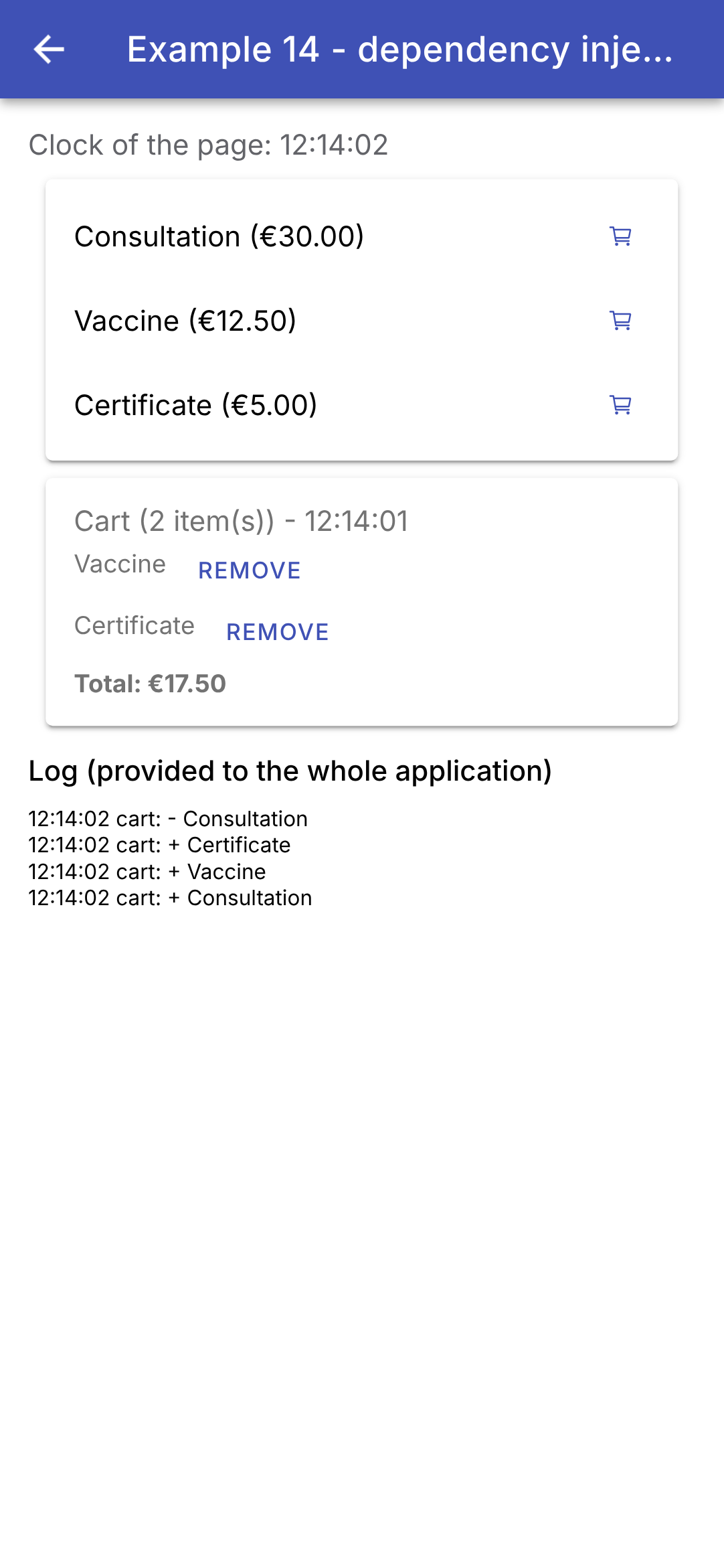
The clock on the page advances every second; the one in the shopping cart advances every five seconds. The log shows additions and removals. Example 20 will use the same mechanism for the shared state of an entire application: a service and its signals. Where [Flutter] needs a [InheritedWidget], a [ChangeNotifier], and a [of(context)] method (and, in practice, the [provider] package), [Angular] includes everything by default: [@Injectable], [providers], [inject], and the signals.
4.6. Example 15: Reusing Behaviors
A component reuses a layout (a template). How can you reuse a behavior, along with its state (highlighting what is touched, triggering an action after a long press, giving focus on startup)? [React] has “custom hooks”; [Flutter] has “wrapper” widgets and mixins; [Angular] has attribute directives, which can be applied as attributes to any tag, and their composition.
4.6.1. A “highlighter” directive
| // =========================================================================
// src/app/ex15-behaviours/highlighter.ts - a behaviour in a DIRECTIVE
// -------------------------------------------------------------------------
// A component reuses a DISPLAY (a template). To reuse a
// BEHAVIOUR (with its state), Angular has attribute DIRECTIVES: a
// class without a template, which we set like an attribute on any
// tag, and which acts on it (its "host"):
// <ion-item highlighter="#d1e7dd">...</ion-item>
// This one highlights its host while it is being TOUCHED (the finger on
// the screen), and, with a mouse (web, computer), while it is HOVERED.
// Each tag has its own directive, hence its own state: two rows
// do not interfere.
// =========================================================================
import { computed, Directive, input, signal } from '@angular/core';
@Directive({
selector: '[highlighter]',
// host: what the directive does on its host
host: {
// (event): the events of the host it listens to. The "pointer"
// events gather the finger, the mouse and the stylus
'(pointerdown)': 'touched.set(true)',
'(pointerup)': 'touched.set(false)',
'(pointercancel)': 'touched.set(false)',
'(mouseenter)': 'hovered.set(true)',
'(mouseleave)': 'hovered.set(false)',
// [property]: the properties of the host it sets. A CSS transition
// animates the colour change (200 ms)
'[style.backgroundColor]': 'background()',
'[style.transition]': '"background-color 200ms"',
// an ion-item draws its own background (the --background variable): we make
// it transparent, to let the directive's one show through
'[style.--background]': '"transparent"',
},
})
export class Highlighter {
// the input has the name of the directive: highlighter="#d1e7dd"; without
// a value (the attribute alone), the default colour
readonly color = input('#fff3cd', { alias: 'highlighter', transform: (c: string) => c || '#fff3cd' });
readonly touched = signal(false);
readonly hovered = signal(false);
readonly background = computed(() => (this.touched() || this.hovered() ? this.color() : 'transparent'));
}
|
- line 17: [@Directive]: a class without a template. It acts on the tag that carries it, its HOST;
- line 18: the selector: the directive applies to any tag that has the [highlighter] attribute;
- lines 20–35: [host]: what the directive does on its host;
- lines 23–27: [(event)]: the host events it listens for. "Pointer" events include the finger, mouse, and stylus: down, up, and canceled (the counterpart to [Listener] for [Flutter]); [mouseenter] and [mouseleave] signal the mouse entering and leaving the screen, whether on the web or a computer (the counterpart to [MouseRegion]);
- lines 30–31: [[property]]: the host properties it sets: the background color, and a CSS transition that animates its change over 200 milliseconds (the counterpart to [AnimatedContainer]);
- line 34: a [ion-item] draws its own background inside its component, based on its variable CSS [--background]: it is made transparent to reveal the background of the directive;
- line 40: the entry bears the name of the directive (the alias): [highlighter="#d1e7dd"] sets the directive; AND specifies the color. If no value is provided (the attribute alone, which is an empty string), the transformation uses the default color;
- lines 42–44: the directive’s state—touched, hovered over—and the resulting color. Each tag has its own directive, and thus its own state; the two lines do not conflict.
[Highlighter] adds its behavior to any tag: [<ion-item highlighter>...</ion-item>], without wrapping it in a component.
4.6.2. A gesture: long press
| // =========================================================================
// src/app/ex15-behaviours/long-press.ts - a gesture: the long press
// -------------------------------------------------------------------------
// <ion-item (longPress)="remove()" [longPressDuration]="1000">
// The longPress output is only emitted if the host is held down
// for the whole duration: a protection against unfortunate taps.
// The gesture is recognized by createGesture, Ionic's gesture
// library: it gathers the finger and mouse events, and
// notifies of the start (onStart) and the end (onEnd) of the gesture.
// The directive exposes its state (pressing): a component that uses it
// can display it (see long-press-button.ts).
// =========================================================================
import { DestroyRef, Directive, ElementRef, inject, input, numberAttribute, output, signal } from '@angular/core';
import { createGesture } from '@ionic/angular';
@Directive({
selector: '[longPress]',
// preventDefault: pressing the host does not take the focus away from the field
// being typed in (the phone's keyboard stays open)
host: { '(mousedown)': '$event.preventDefault()' },
})
export class LongPress {
// the duration of the press, in milliseconds
readonly duration = input(1000, { alias: 'longPressDuration', transform: numberAttribute });
// the output has the name of the directive: (longPress)="..."
readonly longPress = output<void>();
// is the press in progress?
readonly pressing = signal(false);
private timeout?: ReturnType<typeof setTimeout>;
constructor() {
// ElementRef: the host tag of the directive
const host: HTMLElement = inject(ElementRef).nativeElement;
const gesture = createGesture({
el: host,
gestureName: 'long-press',
// threshold: 0: the gesture starts as soon as the finger is down, without
// waiting for it to move
threshold: 0,
onStart: () => this.start(),
onEnd: () => this.stop(),
});
gesture.enable();
// the cleanup: when the host is removed, no orphan gesture or timeout left
inject(DestroyRef).onDestroy(() => {
gesture.destroy();
clearTimeout(this.timeout);
});
}
private start(): void {
this.pressing.set(true);
// the end of the delay: the press has lasted long enough
this.timeout = setTimeout(() => {
this.pressing.set(false);
this.longPress.emit();
}, this.duration());
}
// the finger is lifted (too early, or after the action)
private stop(): void {
clearTimeout(this.timeout);
this.pressing.set(false);
}
}
|
- line 21: [$event.preventDefault()] on [mousedown]: tapping the host does not remove focus from the field being edited (the phone’s keyboard remains open), just like with the buttons in [Flutter];
- line 25: the duration of the press, in milliseconds: a single entry, with a default value;
- line 27: the output bears the name of the directive: the parent will write [(longPress)="remove()"], which sets the directive AND listens to its output;
- line 29: the directive reports its status: a component that uses it can display it;
- line 35: [ElementRef]: the directive’s host, and [nativeElement] its tag on the page;
- Lines 36–45: [createGesture], the gesture library from [Ionic] (the one that lets you drag menus and windows). It combines finger and mouse events and signals the start ([onStart]) and end ([onEnd]) of the gesture. [threshold: 0]: The gesture begins as soon as the finger touches the screen, without waiting for it to move. A created gesture must be activated ([enable()]);
- lines 47–50: cleanup: when the host is removed, there are no more orphaned gestures or timers;
- lines 53–60: the finger is placed: a timer set for the desired duration. If it reaches its end, the press has lasted long enough: the directive outputs its result;
- lines 63–66: the finger is lifted: if it’s too early, the timer is canceled, and nothing happens.
4.6.3. A component that contains an animation
| // =========================================================================
// src/app/ex15-behaviours/long-press-button.ts - a long-press button
// -------------------------------------------------------------------------
// <app-long-press-button [duration]="1000" (action)="remove()">Delete</app-long-press-button>
// A component that carries an ANIMATION: a ring fills up during
// the press, and empties if the finger is lifted too early.
// - the behaviour (the gesture) is not rewritten: the component
// ATTACHES the LongPress directive to itself (hostDirectives), as if we had
// written <app-long-press-button longPress>; in passing it renames its
// input (duration) and its output (action);
// - the animation is made by createAnimation, Ionic's animation
// library (the one of its own transitions).
// =========================================================================
import { Component, effect, ElementRef, inject, viewChild } from '@angular/core';
import { Animation, createAnimation } from '@ionic/angular';
import { LongPress } from './long-press';
// the circumference of the ring (radius 10): the length of the stroke
const CIRCUMFERENCE = 2 * Math.PI * 10;
@Component({
selector: 'app-long-press-button',
templateUrl: './long-press-button.html',
// the LongPress directive, applied to the tag of the component
hostDirectives: [{ directive: LongPress, inputs: ['longPressDuration: duration'], outputs: ['longPress: action'] }],
styles: `
:host { display: inline-flex; align-items: center; gap: 8px; color: var(--ion-color-danger);
font-size: 13px; cursor: pointer; user-select: none; touch-action: none; }
svg { width: 22px; height: 22px; transform: rotate(-90deg); }
circle { fill: none; stroke: var(--ion-color-danger); stroke-width: 3; }
`,
})
export class LongPressButton {
// the attached directive: the component reads its state
private readonly press = inject(LongPress);
private readonly circle = viewChild.required<ElementRef<SVGCircleElement>>('circle');
readonly circumference = CIRCUMFERENCE;
private animation?: Animation;
private startTime = 0;
constructor() {
// an effect: it follows the start and the end of the press
effect(() => {
if (this.press.pressing()) {
this.fill();
} else {
this.empty();
}
});
}
// the ring fills up in duration milliseconds: the offset of the stroke
// (stroke-dashoffset) goes from the circumference (nothing drawn) to 0 (everything)
private fill(): void {
this.startTime = Date.now();
this.animation?.destroy();
this.animation = createAnimation()
.addElement(this.circle().nativeElement)
.duration(this.press.duration())
.easing('linear')
.fill('forwards')
.fromTo('strokeDashoffset', `${CIRCUMFERENCE}`, '0');
this.animation.play();
}
// the finger is lifted: the ring empties, from where it is, at the same speed
private empty(): void {
if (!this.animation) return;
const done = Math.min(1, (Date.now() - this.startTime) / this.press.duration());
this.animation.destroy();
this.animation = createAnimation()
.addElement(this.circle().nativeElement)
.duration(Math.max(1, done * this.press.duration()))
.easing('linear')
.fill('forwards')
.fromTo('strokeDashoffset', `${CIRCUMFERENCE * (1 - done)}`, `${CIRCUMFERENCE}`);
this.animation.play();
}
}
|
- line 20: the circumference of the ring (a circle with radius 10), which will be used to draw it;
- line 26: [hostDirectives]: the COMPOSITION directive. The component attaches the [LongPress] directive to itself, as if we had written [<app-long-press-button longPress>] each time it is used. It exposes the directive’s input and output, renaming them in the process: [[duration]] and [(action)]. The behavior is not rewritten; it is reused: this is the counterpart to the [Dart] mixin, which adds code to a class without inheritance;
- lines 27–32: the style—the text and the red ring; [touch-action: none] prevents the browser from interpreting user interactions (scrolling, zooming); the ring is rotated a quarter turn so that it fills from the top;
- line 36: the component injects the associated directive to read its state;
- line 37: [viewChild.required('circle')]: the template tag that references [#circle];
- lines 45–51: an effect that follows the start and end of the press;
- lines 56–66: [createAnimation], the animation library of [Ionic] (the one containing its own transitions). The ring is drawn with a dotted line whose first dash is the length of the circumference: by shifting this dash ([strokeDashoffset]) from the circumference to 0, for the entire duration of the press ([duration]), at a constant speed ([easing('linear')]), the circle is gradually drawn. [fill('forwards')]: At the end, the element retains the last state of the animation. This is the counterpart to [AnimationController] of [Flutter];
- lines 69–80: the finger rises: the ring empties, starting from its current position ([done]: the elapsed portion of the duration), at the same speed.
| <!-- ======================================================================
long-press-button.html - a ring (SVG drawing), then the content of the button
====================================================================== -->
<svg viewBox="0 0 24 24" aria-hidden="true">
<!-- #circle: a reference, read by viewChild('circle'). At the start, the
stroke is entirely offset: nothing is drawn -->
<circle #circle cx="12" cy="12" r="10" [attr.stroke-dasharray]="circumference"
[attr.stroke-dashoffset]="circumference" />
</svg>
<ng-content />
|
- lines 4–9: a drawing SVG: a circle, completely offset at the start (nothing is drawn). [[attr.stroke-dasharray]]: a link to an ATTRIBUTE of the tag (SVG has no corresponding properties);
- line 10: the button’s content, provided by the parent (example 12).
4.6.4. A “focus on startup” directive
| // =========================================================================
// src/app/ex15-behaviours/autofocus.ts - the focus at startup
// -------------------------------------------------------------------------
// <ion-input focusOnStart placeholder="..." />
// A directive that only applies to an <ion-input> (its selector):
// it can therefore inject the IonInput component of its host, and use
// its methods. After the first rendering, the field receives the focus (the
// phone's keyboard opens).
// (The autofocus attribute of ion-input does the same thing when the
// page loads: the directive shows the mechanism, reusable for something else.)
// =========================================================================
import { afterNextRender, Directive, inject } from '@angular/core';
import { IonInput } from '@ionic/angular';
@Directive({ selector: 'ion-input[focusOnStart]' })
export class FocusOnStart {
constructor() {
// the IonInput component set on the same tag as the directive
const field = inject(IonInput);
// after the first rendering: the <input> tag exists, we give it the focus
afterNextRender(async () => (await field.getInputElement()).focus());
}
}
|
- line 16: the selector [ion-input[focusOnStart]]: the directive applies only to a [ion-input] that carries the attribute. It can therefore...
- line 20: ... inject the [IonInput] component from its host and use its methods;
- line 22: After the initial display, the [<input>] tag in the field receives focus (Example 13).
The [Flutter] [FocusOnStart] mixin added a [FocusNode] to a screen’s [State] object; the directive, on the other hand, is added to the field itself. (The [autofocus] attribute of [ion-input] does the same thing when the page loads: the directive demonstrates the mechanism, which can be reused for other purposes.)
4.6.5. The use of
| // =========================================================================
// src/app/ex15-behaviours/ex15.page.ts - reusing behaviours
// -------------------------------------------------------------------------
// Three Angular and Ionic tools to reuse a BEHAVIOUR (and its
// state), and not a simple display:
// - an attribute directive, set on any tag (Highlighter,
// FocusOnStart);
// - a component that carries an animation (LongPressButton);
// - directive composition (hostDirectives): LongPressButton
// attaches the LongPress directive to itself.
// =========================================================================
import { Component, signal } from '@angular/core';
import {
IonBackButton, IonButtons, IonContent, IonHeader, IonInput, IonItem, IonLabel, IonList, IonText, IonTitle,
IonToolbar,
} from '@ionic/angular';
import { FocusOnStart } from './autofocus';
import { LongPressButton } from './long-press-button';
import { Highlighter } from './highlighter';
@Component({
selector: 'app-ex15',
imports: [
IonHeader, IonToolbar, IonButtons, IonBackButton, IonTitle, IonContent, IonInput, IonText, IonList, IonItem,
IonLabel, FocusOnStart, Highlighter, LongPressButton,
],
templateUrl: './ex15.page.html',
})
export class Ex15Page {
readonly doctors = signal(['Mme Marie PELISSIER', 'Mr Paul TATOU', 'Melle Sophie DUPONT']);
readonly message = signal('');
remove(name: string): void {
this.doctors.update((l) => l.filter((m) => m !== name));
this.message.set(`${name} has been deleted.`);
}
}
|
- line 26: the two directives and the component, declared as usual;
- lines 34–37: removing a doctor.
| <!-- ======================================================================
ex15.page.html - directives and a component, set on the list
====================================================================== -->
<ion-header>
<ion-toolbar color="primary">
<ion-buttons slot="start">
<ion-back-button defaultHref="/" />
</ion-buttons>
<ion-title>Example 15 - reusing behaviours</ion-title>
</ion-toolbar>
</ion-header>
<ion-content class="ion-padding">
<!-- focusOnStart: the directive gives the focus to the field -->
<ion-input focusOnStart placeholder="this field received the focus on its own" />
<p>
<ion-text color="medium">Touch the rows; hold a button down for one second to delete.</ion-text>
</p>
<ion-list>
@for (m of doctors(); track m; let even = $even) {
<!-- one row out of two: the default colour; the others, green -->
<ion-item [highlighter]="even ? '' : '#d1e7dd'">
<ion-label>{{ m }}</ion-label>
<!-- the action only takes place after a one-second press -->
<app-long-press-button slot="end" [duration]="1000" (action)="remove(m)">Delete</app-long-press-button>
</ion-item>
}
</ion-list>
@if (message()) {
<ion-text color="primary">{{ message() }}</ion-text>
}
</ion-content>
|
- line 16: the field that automatically receives focus: simply set the attribute;
- line 23: [let even = $even]: true for elements with even indices (0, 2, ...);
- Line 25: Each line is highlighted when tapped: every other line in the default color, the rest in green;
- Line 28: Its “Delete” button only takes effect after being held down for one second.
While holding down the first button (the ring fills up, the line is highlighted, and the field retains focus); then after fully pressing the second button:
So there are three tools: the attribute directive, which adds behavior to any tag (the lighter counterpart to the “wrapper” widget and the mixin); the component, when the behavior is accompanied by a visual element (the ring); and the composition ([hostDirectives]), which combines the two. [Ionic] provides the low-level building blocks: gestures ([createGesture]) and animations ([createAnimation]).
4.7. Example 16: A Reusable Confirmation Window
“Are you sure?”: [Ionic] provides everything you need. The [AlertController] service creates a modal alert window ([ion-alert]), displayed on top of the screen; and its method [onDidDismiss()] returns a promise ([Promise]), which resolves when the window closes, with the role of the button that closed it.
4.7.1. The window
| // =========================================================================
// src/app/ex16-confirmation/confirmation.ts - "Are you sure?"
// -------------------------------------------------------------------------
// Ionic provides everything needed: the AlertController service builds
// a MODAL alert dialog (<ion-alert>), displayed above the screen;
// onDidDismiss() returns a promise, resolved when the dialog closes,
// with the role of the button that closed it. The calling code is written
// therefore very simply:
//
// private readonly confirm = injectConfirmation(); // a field of the component
// if (await this.confirm('Delete this doctor?')) { ... }
//
// Closing the dialog WITHOUT answering (tap outside, Back button of the
// phone, Escape key) closes it with the role 'backdrop': we treat it
// as a "no".
// injectConfirmation() uses inject(): it is called where inject()
// is allowed (a field or the constructor of a component or of a service).
// =========================================================================
import { inject } from '@angular/core';
import { AlertController } from '@ionic/angular';
export function injectConfirmation(): (message: string) => Promise<boolean> {
const alerts = inject(AlertController);
// the returned function, usable at any time
return async (message: string) => {
const alert = await alerts.create({
header: 'Confirmation',
message,
// a CSS class for the dialog (see the styles of ex16.page.ts)
cssClass: 'confirmation-alert',
buttons: [
// role: 'cancel': the least dangerous choice, first
{ text: 'No, go back', role: 'cancel' },
{ text: 'Yes, confirm', role: 'confirm', cssClass: 'confirm-button' },
],
});
await alert.present();
// we wait for the dialog to close: role is that of the chosen button,
// 'backdrop' if we touched outside
const { role } = await alert.onDidDismiss();
return role === 'confirm';
};
}
|
- line 23: a function that returns a function. [injectConfirmation()] uses [inject]: it is called wherever [inject] is permitted (a field or the constructor of a component or service). The function it returns can be used at any time: [await confirm('...')];
- line 24: the [Ionic] service that creates alert windows;
- lines 27–37: the window: a title ([header]), a message, and two buttons. [create] returns (in a promise) the window object, which has not yet been displayed. Each button has a role ([role]): [cancel] for “No, go back”—the safest option—and [confirm] for “Yes, confirm.” [cssClass] assigns the class CSS to the window and the confirmation button to define their style;
- line 38: the window is displayed;
- lines 41–42: we wait for it to close. [role] is that of the selected button; closing the window WITHOUT responding (tapping outside the window, pressing the phone’s Back button, or pressing the Esc key) closes it with the role [backdrop], which is treated as a “no.”
The calling code is then just as simple to write as with the browser’s [window.confirm]: [if (await this.confirm('Delete this doctor?')) { ... }]. This is the exact counterpart of [showDialog] to [Flutter], which returns a [Future]; the client [React] required a context, a hand-crafted promise, and a “portal” to achieve the same result.
4.7.2. Using
| // =========================================================================
// src/app/ex16-confirmation/ex16.page.ts - using the confirmation dialog
// -------------------------------------------------------------------------
// A deletion, then a short-lived message at the bottom of the screen (ion-toast),
// with an "Undo" button: the other way, very common on mobile, of
// protecting the user from a mistake.
// =========================================================================
import { Component, inject, signal, ViewEncapsulation } from '@angular/core';
import {
IonBackButton, IonButton, IonButtons, IonContent, IonHeader, IonIcon, IonItem, IonLabel, IonList, IonText,
IonTitle, IonToolbar, ToastController,
} from '@ionic/angular';
import { addIcons } from 'ionicons';
import { person, trashOutline } from 'ionicons/icons';
import { injectConfirmation } from './confirmation';
interface Contact {
id: number;
name: string;
}
@Component({
selector: 'app-ex16',
imports: [
IonHeader, IonToolbar, IonButtons, IonBackButton, IonTitle, IonContent, IonList, IonItem, IonLabel, IonIcon,
IonButton, IonText,
],
templateUrl: './ex16.page.html',
// the alert dialog is not in the template of the page: Ionic adds it
// at the end of the document. Its styles must therefore be GLOBAL:
// ViewEncapsulation.None disables the style encapsulation of this component
encapsulation: ViewEncapsulation.None,
styles: `
.confirmation-alert { --max-width: 330px; }
.confirmation-alert .alert-button-group { flex-wrap: nowrap; }
.confirmation-alert .alert-button { white-space: nowrap; }
.confirmation-alert .confirm-button { background: var(--ion-color-danger); color: white; border-radius: 20px; }
`,
})
export class Ex16Page {
readonly contacts = signal<Contact[]>([
{ id: 1, name: 'Jean MARTIN' },
{ id: 2, name: 'Alice DURAND' },
{ id: 3, name: 'Luc GERMAN' },
]);
readonly message = signal('');
// the confirmation function, and the service of short-lived messages
private readonly confirm = injectConfirmation();
private readonly toasts = inject(ToastController);
constructor() {
addIcons({ person, trashOutline });
}
// an async method: it "waits" for the user's answer
async remove(c: Contact): Promise<void> {
const yes = await this.confirm(`Delete the contact ${c.name}?`);
if (!yes) {
this.message.set('Deletion abandoned.');
return;
}
const position = this.contacts().indexOf(c);
this.contacts.update((l) => l.filter((x) => x !== c));
this.message.set(`${c.name} has been deleted.`);
// ToastController: a short-lived message at the bottom of the screen, with a button
const toast = await this.toasts.create({
message: `${c.name} deleted`,
duration: 4000,
position: 'bottom',
buttons: [
{
text: 'Undo',
// the contact goes back to its place
handler: () => {
this.contacts.update((l) => [...l.slice(0, position), c, ...l.slice(position)]);
this.message.set(`${c.name} is back.`);
},
},
],
});
await toast.present();
}
async removeAll(): Promise<void> {
if (await this.confirm(`Delete the ${this.contacts().length} contacts?`)) {
this.contacts.set([]);
this.message.set('All the contacts have been deleted.');
}
}
}
|
- lines 33–39: the window’s style. It is not in the page template: [Ionic] adds it to the end of the document, above everything else. The page’s scoped styles would not affect it: [ViewEncapsulation.None] disables scoping, and the rules become global. They therefore target only the class [confirmation-alert], so as not to interfere with anything else. [--max-width] is a variable of CSS from [ion-alert]: a slightly wider window, so that the buttons fit on one line; the confirmation button is red (in a larger project, these rules would go in the global style sheet, [styles.scss]);
- line 50: the confirmation function, retrieved from a field of the component (an injection context);
- line 51: the ephemeral message service from [Ionic];
- lines 58–63: an [async] method: it “waits” for the user’s response. Unlike [Flutter], there is no need to check whether the screen is still present after [await] ([mounted]): modifying a signal from a destroyed component does not cause an error;
- lines 64–66: deletion, while storing the contact’s location;
- Lines 68–83: After deletion, a temporary message appears at the bottom of the screen ([ion-toast]) for four seconds, with an “Undo” button that restores the contact to its original location. This is another method, widely used on mobile devices, to protect the user from making a mistake: take immediate action, but allow the user to undo it. It is the counterpart to [SnackBar] from [Flutter];
- lines 86–91: delete everything, after confirmation.
| <!-- ======================================================================
ex16.page.html - a list of contacts, and confirmed deletions
====================================================================== -->
<ion-header>
<ion-toolbar color="primary">
<ion-buttons slot="start">
<ion-back-button defaultHref="/" />
</ion-buttons>
<ion-title>Example 16 - a confirmation dialog</ion-title>
</ion-toolbar>
</ion-header>
<ion-content class="ion-padding">
<ion-list>
@for (c of contacts(); track c.id) {
<ion-item>
<ion-icon slot="start" name="person" />
<ion-label>{{ c.name }}</ion-label>
<!-- aria-label: the name of the button, for screen readers (it has no text) -->
<ion-button slot="end" fill="clear" color="danger" [attr.aria-label]="'delete ' + c.name"
(click)="remove(c)">
<ion-icon slot="icon-only" name="trash-outline" />
</ion-button>
</ion-item>
} @empty {
<!-- @empty: what is displayed when the list is empty -->
<ion-item><ion-label color="medium">No contact.</ion-label></ion-item>
}
</ion-list>
<!-- [disabled]: the button is disabled when the list is empty -->
<ion-button color="danger" shape="round" [disabled]="contacts().length === 0" (click)="removeAll()">
Delete all
</ion-button>
@if (message()) {
<p><ion-text color="primary">{{ message() }}</ion-text></p>
}
</ion-content>
|
- lines 21–24: a red icon button that prompts the user to delete the contact;
- lines 26–29: [@empty]: what [@for] displays when the list is empty;
- line 33: [[disabled]] disables the button when the list is empty; [shape="round"] gives it rounded corners.
The confirmation window; then the deletion is complete, with its temporary message:
Alert windows ([AlertController]), pop-up messages ([ToastController]), as well as modal windows ([ModalController]), action menus ([ActionSheetController]), and loading indicators ([LoadingController]): [Ionic] provides, for each type of window, a service that is injected and returns promises. These “controllers” correspond to the functions [showDialog], [showModalBottomSheet], and [ScaffoldMessenger] from [Flutter].