Writing your own widgets is at the heart of working with [Flutter]: a well-written screen is made up of small widgets, each with its own parameters, its [build], and, if necessary, its state. This chapter shows how they communicate with each other (parameters, functions), how they are assembled (composition), how they function (lifecycle), how they share data without passing it from one to another (inherited data), and how to reuse behavior.
4.1.1. Data Type
The parent and child share a class, defined in its own file:
| // the data type shared by the parent (DoctorsPage) and the child (DoctorCard)
class Doctor {
final int id;
final String title;
final String firstName;
final String lastName;
final String specialty;
final bool available;
const Doctor({
required this.id,
required this.title,
required this.firstName,
required this.lastName,
required this.specialty,
required this.available,
});
// a copy in which only the availability changes
Doctor withAvailability(bool d) =>
Doctor(id: id, title: title, firstName: firstName, lastName: lastName, specialty: specialty, available: d);
}
|
- lines 10–16: a constructor with named parameters, all of which are required: [Doctor(id: 1, title: 'Mme', ...)]. Named parameters make the call readable, and their order does not matter;
- lines 20–21: a copy where only the availability changes (the object itself never changes).
4.1.2. The child
| // =========================================================================
// lib/ex10_widget_parameters/doctor_card.dart - a CHILD widget
// -------------------------------------------------------------------------
// It receives its data from its parent through the PARAMETERS of its
// constructor, stored in final fields. Their type is checked at
// compile time: DoctorCard(doctor: 42) would be refused.
// - required: the parent MUST provide this parameter;
// - this.compact = false: an optional parameter, with its default value.
//
// Golden rule: a widget NEVER MODIFIES its parameters (they are final).
// The data go down from the parent to the child; to request a
// change, the child calls a function that the parent passed to it
// (see example 11). When the parent changes its data, it REBUILDS its
// children with new parameters.
// =========================================================================
import 'package:flutter/material.dart';
import 'doctor.dart';
// the "style" of the card: constants PRIVATE to this file (the "_").
// No other widget can see them, nor be bothered by them
const _initialsColor = Color(0xFF087EA4);
const _initialsStyle = TextStyle(color: Colors.white, fontWeight: FontWeight.bold);
class DoctorCard extends StatelessWidget {
final Doctor doctor;
final int rank;
final bool compact;
// const: if all the parameters are constant, the widget is too
// (Flutter then does not even need to rebuild it)
const DoctorCard({super.key, required this.doctor, required this.rank, this.compact = false});
@override
Widget build(BuildContext context) {
// a value computed from the parameters
final initials = '${doctor.firstName[0]}${doctor.lastName[0]}';
return Card(
// a green border for an available doctor
shape: RoundedRectangleBorder(
borderRadius: BorderRadius.circular(12),
side: doctor.available ? const BorderSide(color: Colors.green, width: 2) : BorderSide.none,
),
child: Padding(
padding: const EdgeInsets.all(12),
child: Row(
children: [
CircleAvatar(
backgroundColor: _initialsColor,
child: Text(initials, style: _initialsStyle),
),
const SizedBox(width: 12),
// Expanded: the text takes all the remaining width
Expanded(
child: Column(
crossAxisAlignment: CrossAxisAlignment.start,
children: [
Text(
'$rank. ${doctor.title} ${doctor.firstName} ${doctor.lastName}',
style: Theme.of(context).textTheme.titleMedium,
),
if (!compact) Text(doctor.specialty, style: const TextStyle(color: Colors.grey)),
],
),
),
],
),
),
);
}
}
|
- lines 23–24: the card’s “style”: constants private to this file (the “_”). No other file can see them or be affected by them. This is the equivalent, in [Flutter], of the “CSS modules” in [React]: there is no global stylesheet; a widget’s style is embedded in its code;
- lines 27–29: the widget’s parameters, stored in [final] fields;
- line 33: the constructor. [required this.doctor]: a required parameter, stored directly in the field; [this.compact = false]: an optional parameter, with its default value. The constructor is [const]: if all arguments are constant, the card is also constant;
- line 38: a value calculated from the parameters;
- lines 42–44: the card’s shape ([Card]): rounded corners and a green border if a doctor is available ([BorderSide.none] otherwise);
- lines 50–52: a colored disc with the initials;
- line 64: the specialty is only displayed in non-compact view.
Golden rule: a widget never modifies its own parameters (they are [final]; the compiler prohibits this, by the way). Data flows from the parent to the child; to request a change, the child calls a function passed to it by the parent (Example 11). When the parent changes its data, it reconstructs its children with new parameters.
4.1.3. The parent
| // =========================================================================
// lib/ex10_widget_parameters/main.dart - the PARENT widget
// -------------------------------------------------------------------------
// It imports the DoctorCard widget and uses it, as many times as
// needed, like any Flutter widget: a widget is a piece
// of REUSABLE interface, with its own parameters, its build() and
// its style. Writing your own widgets is the heart of working with
// Flutter: a well-written screen is made of small widgets.
// =========================================================================
import 'package:flutter/material.dart';
import 'doctor_card.dart';
import 'doctor.dart';
void main() {
runApp(
MaterialApp(
debugShowCheckedModeBanner: false,
theme: ThemeData(colorSchemeSeed: Colors.indigo),
home: const DoctorsPage(),
),
);
}
class DoctorsPage extends StatefulWidget {
const DoctorsPage({super.key});
@override
State<DoctorsPage> createState() => _DoctorsPageState();
}
class _DoctorsPageState extends State<DoctorsPage> {
List<Doctor> _doctors = const [
Doctor(id: 1, title: 'Mme', firstName: 'Marie', lastName: 'PELISSIER', specialty: 'general practitioner', available: true),
Doctor(id: 2, title: 'Mr', firstName: 'Paul', lastName: 'TATOU', specialty: 'pediatrician', available: false),
Doctor(id: 3, title: 'Melle', firstName: 'Sophie', lastName: 'DUPONT', specialty: 'general practitioner', available: true),
];
bool _compact = false;
// the parent changes ITS data: Flutter calls its build() again, which
// rebuilds the children with their new parameters
void _toggleAvailability() {
setState(() {
_doctors = [for (final m in _doctors) m.withAvailability(!m.available)];
});
}
@override
Widget build(BuildContext context) {
return Scaffold(
appBar: AppBar(title: const Text('Example 10 - the widgets and their parameters')),
body: ListView(
padding: const EdgeInsets.all(16),
children: [
SwitchListTile(
contentPadding: EdgeInsets.zero,
title: const Text('compact display'),
value: _compact,
onChanged: (v) => setState(() => _compact = v),
),
Align(
alignment: Alignment.centerLeft,
child: OutlinedButton(onPressed: _toggleAvailability, child: const Text('Toggle the availabilities')),
),
const SizedBox(height: 8),
for (final (i, m) in _doctors.indexed)
// each card receives ITS parameters
DoctorCard(key: ValueKey(m.id), doctor: m, rank: i + 1, compact: _compact),
const SizedBox(height: 16),
const Text(
'The same card, in its compact version, by setting the parameter:',
style: TextStyle(color: Colors.grey),
),
SizedBox(width: 260, child: DoctorCard(doctor: _doctors[0], rank: 1, compact: true)),
],
),
);
}
}
|
- lines 34–39: the parent’s state: the list of doctors (a constant list, which will be replaced by another) and the compact display;
- lines 43–45: the parent changes ITS data to a new list consisting of copies of the doctors. [Flutter] calls its [build], which rebuilds the cards with their new parameters;
- line 69: one card per doctor, with ITS parameters. The [DoctorCard] widget is used exactly like a [Flutter] widget;
- line 75: the same card, in a compact version, in a box 260 points wide.
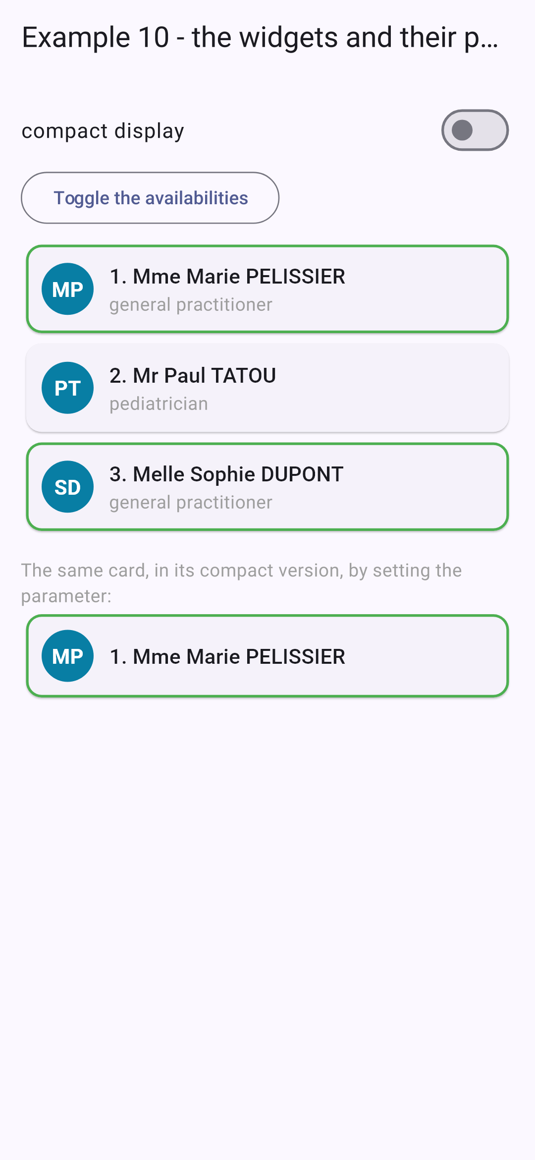
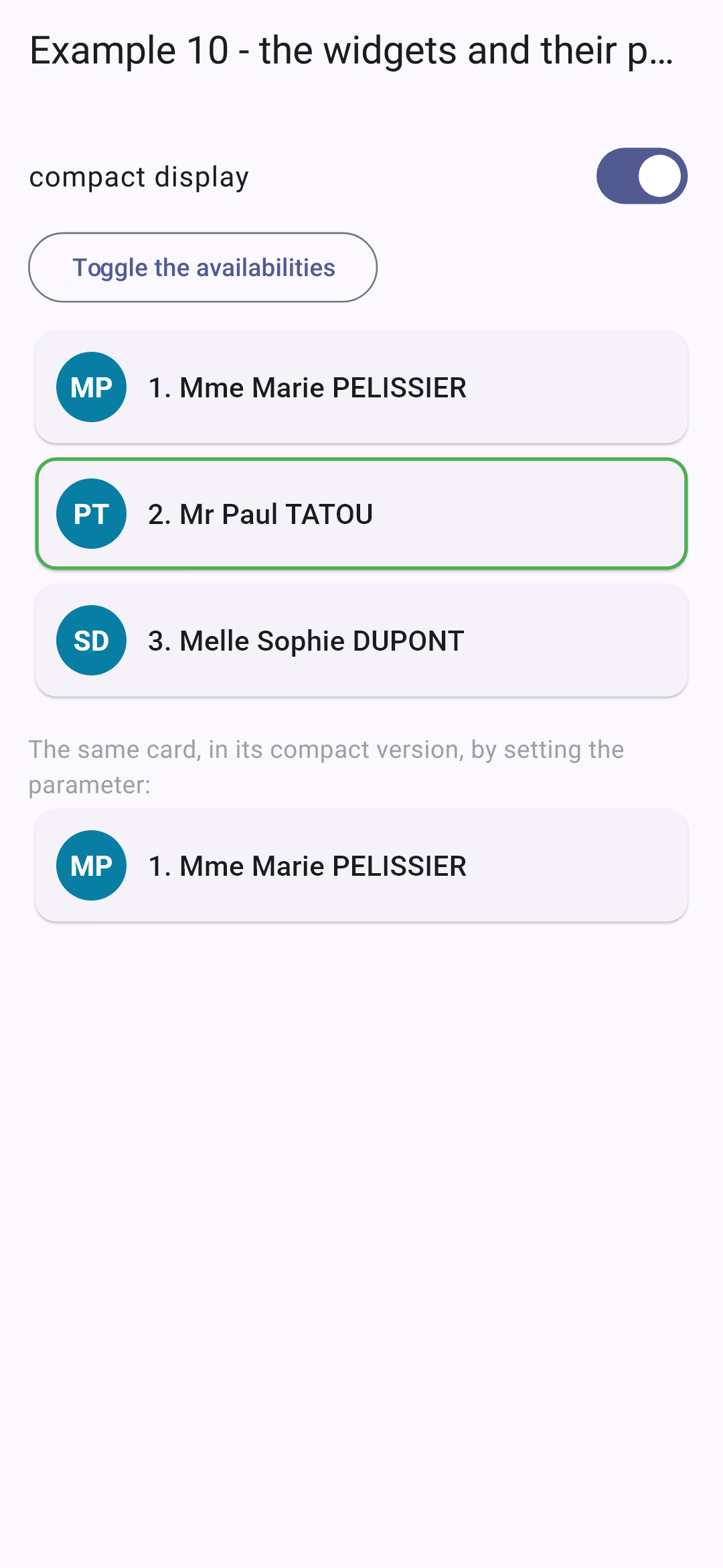
Initially, then in compact view, availability is reversed:
A method that creates widgets (like [_line] from Example 02) or a real widget ([DoctorCard])? The actual widget is almost always preferable: it has a name, its parameters are typed and documented, it can be reused elsewhere, and [Flutter] can avoid rebuilding it (if it is [const], or if its parameters haven’t changed).
4.2. Example 11: The child notifies its parent
Data flows down through parameters; information flows back up through functions passed as parameters.
4.2.1. "Events" from the child
| // =========================================================================
// lib/ex11_lifting_state_up/counter.dart
// -------------------------------------------------------------------------
// A child that NOTIFIES its parent: the parent passes it FUNCTIONS as
// parameters (by convention, their name starts with "on"), and the child
// calls them when something happens:
// Counter(label: 'Coffees', max: 3, onIncrement: ..., onLimit: ...)
// The types of these functions have ready-made names in Flutter:
// - ValueChanged<int> : a function that receives an int and returns nothing;
// - VoidCallback : a function without parameters, that returns nothing.
// =========================================================================
import 'package:flutter/material.dart';
class Counter extends StatefulWidget {
final String label;
final int max;
final ValueChanged<int> onIncrement; // with the new value
final VoidCallback onLimit; // without data
const Counter({
super.key,
required this.label,
required this.max,
required this.onIncrement,
required this.onLimit,
});
@override
State<Counter> createState() => _CounterState();
}
class _CounterState extends State<Counter> {
// the state SPECIFIC to this counter: each Counter has its own
int _value = 0;
void _plus() {
// widget: in the State object, gives access to the parameters of the widget
if (_value >= widget.max) {
widget.onLimit();
return;
}
setState(() => _value++);
// the parent is NOTIFIED, and receives the new value
widget.onIncrement(_value);
}
@override
Widget build(BuildContext context) {
return Row(
children: [
SizedBox(width: 110, child: Text(widget.label)),
OutlinedButton(onPressed: _plus, child: const Text('+1')),
const SizedBox(width: 12),
Chip(label: Text('$_value / ${widget.max}')),
],
);
}
}
|
- lines 18–19: two parameters that are functions, which the counter will call. [ValueChanged<int>] is the type of a function that takes a [int] and returns nothing; [VoidCallback] is the type of a function with no parameters. By convention, their names begin with “on,” such as [onPressed] or [onChanged] for the widgets of [Flutter];
- line 35: the state SPECIFIC to this counter: each [Counter] has its own;
- lines 37–45: within the [State] object, [widget] provides access to the widget’s settings: [widget.max], [widget.onLimit]... If the maximum is exceeded, the counter notifies its parent ([widget.onLimit()]); otherwise, it changes its state and then notifies its parent by transmitting the new value. Unlike [React], the state is updated immediately: [_value] already has its new value when it is transmitted.
| // =========================================================================
// lib/ex11_lifting_state_up/labeled_text_field.dart - a CONTROLLED widget
// -------------------------------------------------------------------------
// A "home-made" form field (label + field + help + character
// counter) that is used like a controlled field:
// LabeledTextField(value: _name, onChanged: (v) => setState(() => _name = v), ...)
// The value belongs to the PARENT, which passes it (value) and which it
// notifies of each keystroke (onChanged). The parent is the one who decides.
//
// A difficulty specific to Flutter: a TextField keeps its text in a
// controller, which must survive the rebuilds. The widget therefore has a
// state (the controller)... which it must keep UP TO DATE when the parent changes
// the value ("Clear" button): that is the role of didUpdateWidget.
// =========================================================================
import 'package:flutter/material.dart';
class LabeledTextField extends StatefulWidget {
final String value;
final ValueChanged<String> onChanged;
final String label;
final int max;
final String help;
const LabeledTextField({
super.key,
required this.value,
required this.onChanged,
required this.label,
required this.max,
this.help = '',
});
@override
State<LabeledTextField> createState() => _LabeledTextFieldState();
}
class _LabeledTextFieldState extends State<LabeledTextField> {
// late: the field will be initialized later (in initState), before any use
late final TextEditingController _controller;
@override
void initState() {
super.initState();
_controller = TextEditingController(text: widget.value);
}
// called when the PARENT rebuilds this widget with new parameters;
// oldWidget: the previous widget, to compare
@override
void didUpdateWidget(LabeledTextField oldWidget) {
super.didUpdateWidget(oldWidget);
if (widget.value != _controller.text) {
_controller.text = widget.value; // the parent changed the value itself
}
}
@override
void dispose() {
_controller.dispose();
super.dispose();
}
@override
Widget build(BuildContext context) {
final full = widget.value.length == widget.max;
return TextField(
controller: _controller,
maxLength: widget.max, // the field refuses the extra characters
decoration: InputDecoration(
labelText: widget.label,
helperText: widget.help,
// the border becomes red when the field is full
errorText: full ? 'Maximum length reached' : null,
),
onChanged: widget.onChanged, // the parent's function, passed as is
);
}
}
|
A “custom” form field (label + field + tooltip + character counter) that functions as a controlled field: the value belongs to the parent, which passes it to the field ([value]) and notifies the parent of each keystroke ([onChanged]).
- Line 40: [late]: This field will be initialized later (in [initState]), but before it is used. [Dart] checks it at runtime;
- Lines 43–45: The controller starts with the parent’s value;
- lines 51–54: This is the specific challenge with [Flutter]: a [TextField] stores its text in a controller, which must survive page rebuilds. The widget therefore has a state (the controller)... which it must keep up to date when the parent changes the value itself (Clear button). [didUpdateWidget] is called every time the parent rebuilds this widget with new parameters; it receives the old widget for comparison. If the parent’s value differs from the field’s text, it is copied over;
- line 69: the field rejects excess characters and displays a counter (“12/20”);
- line 72: a tooltip appears below the field;
- line 74: the border turns red when the field is full;
- line 76: the parent’s function, passed as-is to [TextField].
4.2.3. The parent
| // =========================================================================
// lib/ex11_lifting_state_up/main.dart - the parent listens to its children
// -------------------------------------------------------------------------
// The data go down (parameters); the information goes up through
// functions passed as parameters:
// 1. "events" of the child: onIncrement, onLimit;
// 2. a controlled widget: value + onChanged, like a Checkbox. The state
// remains the property of the parent, which can modify it itself (Clear).
// =========================================================================
import 'package:flutter/material.dart';
import 'labeled_text_field.dart';
import 'counter.dart';
void main() {
runApp(
MaterialApp(
debugShowCheckedModeBanner: false,
theme: ThemeData(colorSchemeSeed: Colors.indigo),
home: const ParentPage(),
),
);
}
class ParentPage extends StatefulWidget {
const ParentPage({super.key});
@override
State<ParentPage> createState() => _ParentPageState();
}
class _ParentPageState extends State<ParentPage> {
int _total = 0;
String _message = '';
String _firstName = 'Marie';
String _lastName = 'PELISSIER';
// the function called by a counter: it receives the value the counter passes
void _onIncrement(String label, int value) {
setState(() {
_total++;
_message = '$label is now $value';
});
}
void _clear() {
setState(() {
_firstName = '';
_lastName = '';
});
}
@override
Widget build(BuildContext context) {
final titleStyle = Theme.of(context).textTheme.titleSmall;
return Scaffold(
appBar: AppBar(title: const Text('Example 11 - the child notifies its parent')),
body: ListView(
padding: const EdgeInsets.all(16),
children: [
Card(
child: Padding(
padding: const EdgeInsets.all(12),
child: Column(
crossAxisAlignment: CrossAxisAlignment.start,
children: [
Text('1. Functions called by the children', style: titleStyle),
Counter(
label: 'Coffees',
max: 3,
onIncrement: (v) => _onIncrement('Coffees', v),
onLimit: () => setState(() => _message = 'No more than 3 coffees!'),
),
Counter(
label: 'Glasses of water',
max: 8,
onIncrement: (v) => _onIncrement('Glasses of water', v),
onLimit: () => setState(() => _message = 'Enough drinking.'),
),
const SizedBox(height: 8),
Text('Total of the clicks: $_total - $_message', style: const TextStyle(fontStyle: FontStyle.italic)),
],
),
),
),
Card(
child: Padding(
padding: const EdgeInsets.all(12),
child: Column(
crossAxisAlignment: CrossAxisAlignment.start,
children: [
Text('2. Controlled widgets', style: titleStyle),
LabeledTextField(
value: _firstName,
onChanged: (v) => setState(() => _firstName = v),
label: 'First name',
max: 20,
help: 'Required',
),
LabeledTextField(
value: _lastName,
onChanged: (v) => setState(() => _lastName = v),
label: 'Last name',
max: 20,
help: 'Upper-cased when displayed',
),
const SizedBox(height: 8),
Text.rich(
TextSpan(
children: [
const TextSpan(text: "Parent's data: "),
TextSpan(
text: '$_firstName ${_lastName.toUpperCase()}',
style: const TextStyle(fontWeight: FontWeight.bold),
),
],
),
),
const SizedBox(height: 8),
OutlinedButton(onPressed: _clear, child: const Text('Clear (from the parent)')),
],
),
),
),
],
),
);
}
}
|
- lines 40–43: the function called by a counter; it receives the value passed by the counter;
- lines 69–73: a counter and the functions it will call. [(v) => _onIncrement('Coffees', v)]: an anonymous function that adds its own argument (the label);
- lines 94–99: a controlled field: its value, and the function that changes the parent’s state;
- line 114: the parent’s data, which follows the entry;
- Line 121: The parent changes the value themselves: the fields are cleared (via their [didUpdateWidget]).
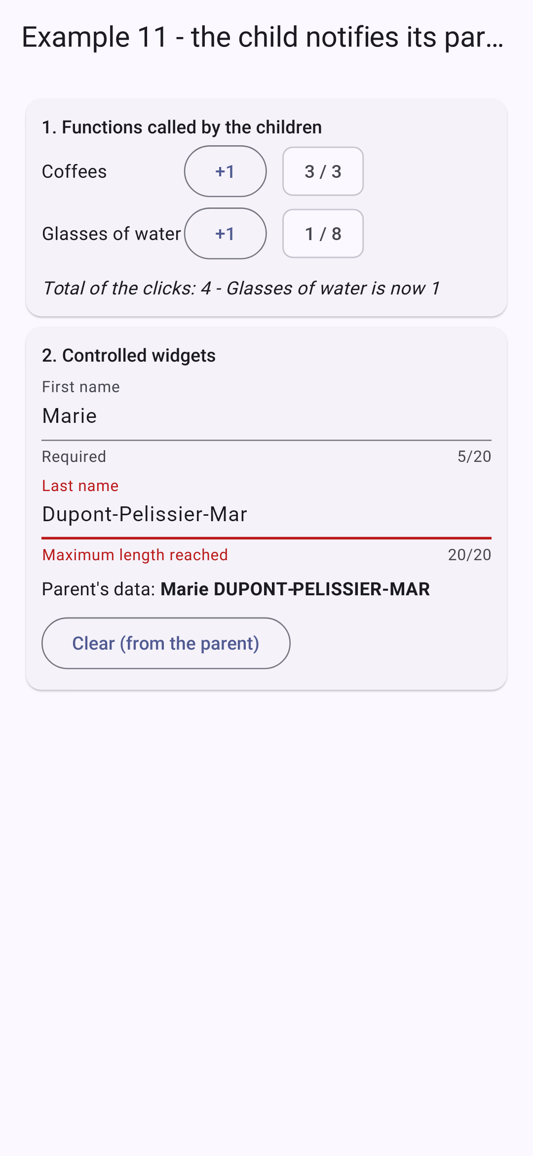
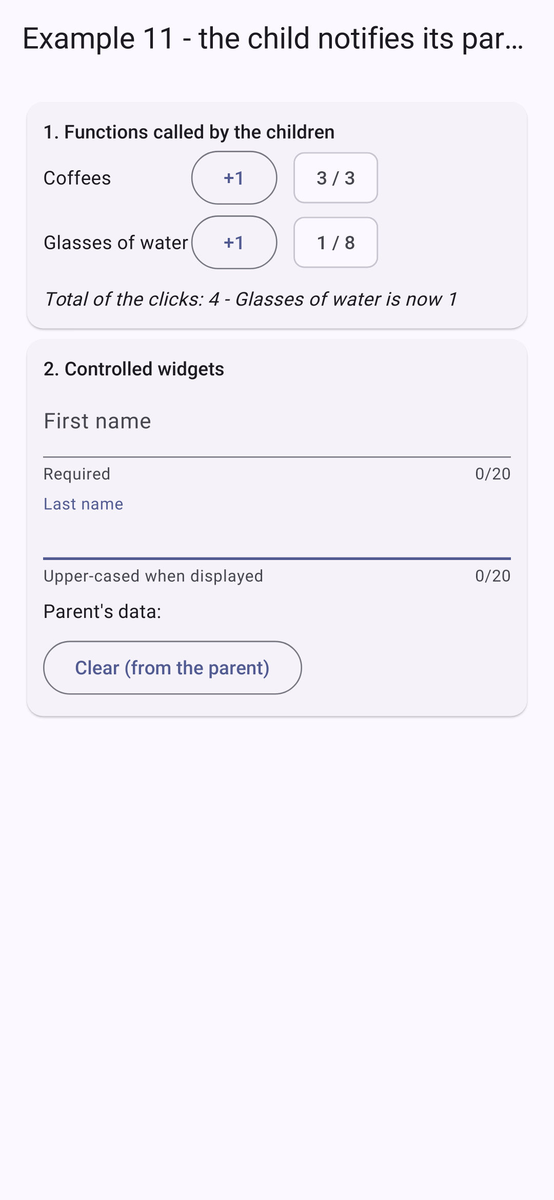
Press the first counter four times, the second counter once, and enter the name; then clear the fields from the parent:
4.3. Example 12: Composition
4.3.1. A card
A widget’s parameters transmit data… but also content: a widget is a value like any other, which can be passed to another widget. [Flutter] uses it everywhere: the [child] of a [Padding], the [title] of a [AppBar], the [body] of a [Scaffold].
| // =========================================================================
// lib/ex12_composition/info_card.dart - a reusable TEMPLATE
// -------------------------------------------------------------------------
// The parameters of a widget pass DATA... but also
// CONTENT: a widget is a value like any other, which can be passed to
// another widget, which places it wherever it wants. Flutter uses this everywhere:
// the child of a Padding, the title of an AppBar, the body of a Scaffold...
// - child: by convention, the "main" content;
// - header, footer: other places (some "slots"), provided by the
// parent; the header has a default content, the footer is optional.
// The card sets the frame (border, header, footer), the parent provides what
// goes inside.
// =========================================================================
import 'package:flutter/material.dart';
class InfoCard extends StatelessWidget {
final Color? color; // "?": optional (null by default)
final Widget header;
final Widget? footer;
final Widget child;
const InfoCard({super.key, this.color, this.header = const Text('Untitled'), this.footer, required this.child});
@override
Widget build(BuildContext context) {
final background = color ?? Colors.grey.shade300;
return Card(
// clipBehavior: the colored header follows the rounded corners of the card
clipBehavior: Clip.antiAlias,
shape: RoundedRectangleBorder(
borderRadius: BorderRadius.circular(8),
side: BorderSide(color: background),
),
child: Column(
crossAxisAlignment: CrossAxisAlignment.stretch,
children: [
Container(
color: background,
padding: const EdgeInsets.all(10),
// DefaultTextStyle: the style of ALL the texts of the header,
// whatever the widget provided by the parent
child: DefaultTextStyle.merge(
style: TextStyle(color: color == null ? Colors.black : Colors.white, fontWeight: FontWeight.bold),
child: header,
),
),
Padding(padding: const EdgeInsets.all(10), child: child),
// no footer provided: no footer at all
if (footer != null)
Container(
color: Colors.grey.shade100,
padding: const EdgeInsets.all(8),
child: DefaultTextStyle.merge(
style: const TextStyle(color: Colors.grey, fontSize: 12),
child: footer!,
),
),
],
),
);
}
}
|
- lines 18–21: Parameters: an optional color ([Color?]), and three slots for content: [header], [footer] (optional), and [child], the main content;
- line 23: the header has default content: a constant widget;
- line 27: the header color: the one provided, or light gray;
- line 30: the colored header is cropped to match the card’s rounded corners;
- lines 43–45: [DefaultTextStyle] sets the style of ALL the text in its subtree, regardless of the widget provided by the parent: the header is bold, white on a colored background;
- line 48: the main content, provided by the parent;
- lines 50–58: no footer provided; no footer at all. [footer!]: in this branch, [footer] is not [null] (the compiler cannot infer this for a field, hence the [!]).
4.3.2. A generic table
| // =========================================================================
// lib/ex12_composition/simple_table.dart - a GENERIC table
// -------------------------------------------------------------------------
// SimpleTable<T> is a generic widget: it displays rows of any
// type T. It knows how to go through the rows, but not how to display ONE
// row: the parent tells it, by passing it a FUNCTION,
// cells(row, index), which returns the widgets of the cells.
// It is the principle of Flutter's "builders" (ListView.builder,
// FutureBuilder...): the content provided by the parent uses data
// that belong to the child (the row, its rank).
// =========================================================================
import 'package:flutter/material.dart';
// the type of a function that builds the cells of a row
typedef CellsBuilder<T> = List<Widget> Function(T row, int index);
class SimpleTable<T> extends StatelessWidget {
final List<T> rows;
final List<String> columns;
final CellsBuilder<T> cells;
final Widget empty; // displayed when there is no row
const SimpleTable({
super.key,
required this.rows,
required this.columns,
required this.cells,
this.empty = const Text('No data.'),
});
// a cell: a little margin around its content
static Widget _cell(Widget content) => Padding(padding: const EdgeInsets.all(6), child: content);
@override
Widget build(BuildContext context) {
if (rows.isEmpty) {
return Column(
crossAxisAlignment: CrossAxisAlignment.start,
children: [
Text(columns.join(' '), style: const TextStyle(fontWeight: FontWeight.bold)),
const Divider(),
DefaultTextStyle.merge(
style: const TextStyle(color: Colors.grey),
child: empty,
),
],
);
}
return Table(
defaultVerticalAlignment: TableCellVerticalAlignment.middle,
border: TableBorder(horizontalInside: BorderSide(color: Colors.grey.shade300)),
children: [
TableRow(
children: [for (final c in columns) _cell(Text(c, style: const TextStyle(fontWeight: FontWeight.bold)))],
),
for (final (i, row) in rows.indexed)
// the cells of THIS row, built by the parent's function
TableRow(children: [for (final c in cells(row, i)) _cell(c)]),
],
);
}
}
|
- line 16: the type of a function that takes a row (of type [T]) and its index, and returns the widgets of its cells;
- line 18: a generic widget: it displays rows of any type ([T]). It knows how to iterate through the rows, but not how to display ONE row; the parent tells it how by passing it the function [cells]. This is the principle behind [Flutter] “builders” ([ListView.builder], [FutureBuilder]...): the content is provided by the parent, but it uses data that belongs to the child (the line, its index). [React] calls this a “render prop”;
- line 33: a [static] method, which does not use any fields from the widget;
- lines 37–45: no row: the column headers and the [empty] content, provided by the parent;
- lines 50–59: the table: a row of headers, followed by one row per line, whose cells are generated by the parent’s function.
4.3.3. The parent
| // =========================================================================
// lib/ex12_composition/main.dart - using the InfoCard and SimpleTable templates
// =========================================================================
import 'package:flutter/material.dart';
import 'info_card.dart';
import 'simple_table.dart';
// a slot: a named record (no need to write a class)
typedef Slot = ({int id, String timeRange, String? patient});
const slots = <Slot>[
(id: 1, timeRange: '8:00 - 8:20', patient: null),
(id: 2, timeRange: '8:20 - 8:40', patient: 'Mme Alice DURAND'),
(id: 3, timeRange: '8:40 - 9:00', patient: null),
];
void main() {
runApp(
MaterialApp(
debugShowCheckedModeBanner: false,
theme: ThemeData(colorSchemeSeed: Colors.indigo),
home: const CompositionPage(),
),
);
}
class CompositionPage extends StatelessWidget {
const CompositionPage({super.key});
@override
Widget build(BuildContext context) {
final free = slots.where((c) => c.patient == null).length;
return Scaffold(
appBar: AppBar(title: const Text('Example 12 - the composition')),
body: ListView(
padding: const EdgeInsets.all(16),
children: [
// header and footer: widgets passed as parameters; child: the content
InfoCard(
color: Colors.indigo,
header: const Row(
children: [
Icon(Icons.event, color: Colors.white),
SizedBox(width: 8),
// Expanded: the text takes the remaining space (and wraps)
Expanded(child: Text('Schedule of Mme PELISSIER')),
],
),
footer: Text('$free free slot(s)'),
// SimpleTable<Slot>: T is inferred from the type of rows
child: SimpleTable(
rows: slots,
columns: const ['#', 'Slot', 'Status'],
// the function that builds the cells of ONE row;
// c receives the row, i its rank
cells: (c, i) => [
Text('${i + 1}'),
Text(c.timeRange),
c.patient != null
? Chip(label: Text(c.patient!), visualDensity: VisualDensity.compact)
: Chip(
label: const Text('Free'),
backgroundColor: Colors.green.shade100,
visualDensity: VisualDensity.compact,
),
],
),
),
const InfoCard(
color: Colors.green,
header: Text('A card without a footer'),
child: Text('The footer is not provided: the card does not display it.'),
),
// no header provided: the default content, "Untitled"
InfoCard(
child: SimpleTable<({int id, String name})>(
rows: const [],
columns: const ['Name'],
cells: (p, _) => [Text(p.name)],
empty: const Text('Nobody for now.'),
),
),
],
),
);
}
}
|
- line 11: a slot, in the form of a named record;
- lines 42–52: a card: its color, a header (one line: an icon and text), a footer;
- lines 54–66: its content: a table of slots. [T] is derived from the type of [rows]: it is a [SimpleTable<Slot>]. The [cells] function takes a time slot ([c]) and its rank ([i]), and returns three widgets;
- lines 72–75: a card without a footer;
- lines 79–83: a card without a header (the default content, “Untitled”); its table is empty. [SimpleTable<({int id, String name})>]: the type [T] is specified explicitly, because [rows: const []] does not allow it to be inferred.
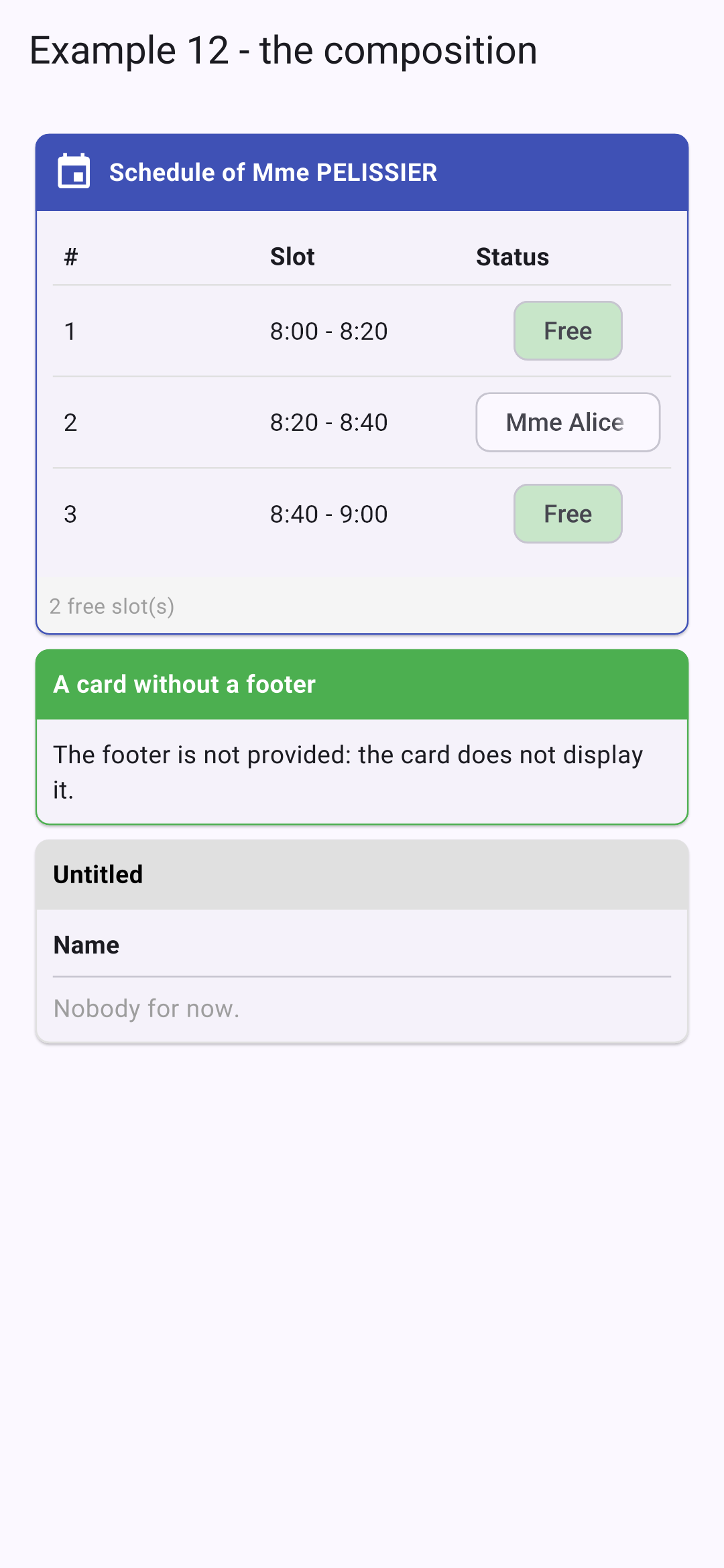
The card defines the framework (border, header, footer); the parent provides the content inside it. This is how the [Flutter] widgets themselves are built: [Scaffold] defines the structure of a screen and receives the top bar, the body, and the floating button.
4.4.1. A clock
| // =========================================================================
// lib/ex13_lifecycle/clock.dart - a widget that starts and stops
// -------------------------------------------------------------------------
// The life of the State object of a StatefulWidget:
// 1. initState() : it has just been created, the widget is about to
// appear. What must be started is started there;
// 2. didChangeDependencies() : right after, then each time an inherited
// piece of data it reads changes (see example 14);
// 3. build() : as many times as needed;
// 4. didUpdateWidget(old) : the parent rebuilt it with new
// parameters;
// 5. dispose() : the widget disappears for good. What
// has been started is STOPPED there.
// A clock launches a timer (Timer.periodic) when it appears...
// and must imperatively stop it when it disappears: otherwise the
// timer would keep running for nothing, and would call setState()
// on a dead object (an error).
// =========================================================================
import 'dart:async';
import 'package:flutter/material.dart';
String currentTime() => DateTime.now().toString().substring(11, 19); // "12:05:09"
class Clock extends StatefulWidget {
final ValueChanged<String> onLog;
final Color color;
const Clock({super.key, required this.onLog, this.color = Colors.indigo});
@override
State<Clock> createState() => _ClockState();
}
class _ClockState extends State<Clock> {
String _time = currentTime();
// late: initialized in initState
late final Timer _timer;
// notifying the parent... AFTER the construction of the current screen: we do not
// modify the state of a widget (the parent) while it is being built
void _log(String message) {
WidgetsBinding.instance.addPostFrameCallback((_) => widget.onLog(message));
}
@override
void initState() {
super.initState(); // always first
_log('Clock: initState - starting the timer');
_timer = Timer.periodic(const Duration(seconds: 1), (_) {
setState(() => _time = currentTime());
});
}
@override
void didUpdateWidget(Clock oldWidget) {
super.didUpdateWidget(oldWidget);
if (oldWidget.color != widget.color) {
_log('Clock: didUpdateWidget - new color');
}
}
@override
void dispose() {
_timer.cancel(); // the CLEANUP
_log('Clock: dispose - timer stopped');
super.dispose(); // always last
}
@override
Widget build(BuildContext context) {
return Text(
_time,
style: TextStyle(fontSize: 40, fontFamily: 'RobotoMono', color: widget.color),
);
}
}
|
The lifecycle of the [State] object within a [StatefulWidget]:
Method | When? |
initState() | The object has just been created; the widget will appear. This is where you start whatever needs to be started (timer, subscription, etc.) |
didChangeDependencies() | Immediately after initState, then whenever any inherited data it reads changes (see Example 14) |
build() | as many times as necessary |
didUpdateWidget(old) | the parent has rebuilt it with new parameters |
dispose() | the widget disappears permanently. Anything that was started there is stopped |
- lines 37–39: the state: the displayed time, and a timer ([Timer], from the [dart:async] library);
- lines 43–44: the clock notifies its parent of each stage of its lifecycle. But it does so during [initState] or [dispose]—that is, while [Flutter] is building the screen: the parent cannot modify its state at that moment ([setState] would cause an error). [addPostFrameCallback] defers the call until after the current image has finished rendering;
- lines 48–52: [super.initState()] first, always. Then a periodic timer is started: its function is called every second and updates the time;
- lines 57–60: The parent has redrawn the clock with a different color: this is noted;
- lines 65–68: cleanup: we stop the timer. Otherwise, it would continue to run needlessly and call [setState] on a dead object, resulting in an error (“setState() called after dispose()”) and a memory leak. [super.dispose()] always comes last.
4.4.2. The parent
| // =========================================================================
// lib/ex13_lifecycle/main.dart
// -------------------------------------------------------------------------
// - if (_withClock) Clock(...): checking / unchecking the box makes
// the widget appear / disappear (initState, then dispose, see
// clock.dart); changing its color rebuilds it (didUpdateWidget);
// - autofocus: an input field that takes the focus as soon as it appears
// (the phone's keyboard opens);
// - the title of the application follows the input (Title widget);
// - AppLifecycleListener: the life of the APPLICATION itself. On a
// phone, it goes to the background (another application is opened,
// the screen turns off), then comes back: we can react to it (save,
// stop a timer...).
// =========================================================================
import 'package:flutter/material.dart';
import 'clock.dart';
void main() {
runApp(
MaterialApp(
debugShowCheckedModeBanner: false,
theme: ThemeData(colorSchemeSeed: Colors.indigo),
home: const LifecyclePage(),
),
);
}
class LifecyclePage extends StatefulWidget {
const LifecyclePage({super.key});
@override
State<LifecyclePage> createState() => _LifecyclePageState();
}
class _LifecyclePageState extends State<LifecyclePage> {
bool _withClock = true;
bool _red = false;
final List<String> _log = [];
String _search = '';
bool _showSearch = false;
late final AppLifecycleListener _listener;
void _trace(String message) {
// the clock may notify AFTER the screen has disappeared (closing of the application)
if (!mounted) return;
setState(() => _log.add('${currentTime()} $message'));
}
@override
void initState() {
super.initState();
// the application changes state: resumed (in the foreground), inactive,
// hidden, paused (in the background)...
_listener = AppLifecycleListener(onStateChange: (state) => _trace('Application: ${state.name}'));
}
@override
void dispose() {
_listener.dispose();
super.dispose();
}
@override
Widget build(BuildContext context) {
return Title(
title: _search.isEmpty ? 'Example 13' : 'Search: $_search',
color: Colors.indigo,
child: Scaffold(
appBar: AppBar(title: const Text('Example 13 - the lifecycle')),
body: ListView(
padding: const EdgeInsets.all(16),
children: [
Card(
child: Padding(
padding: const EdgeInsets.all(12),
child: Column(
crossAxisAlignment: CrossAxisAlignment.start,
children: [
CheckboxListTile(
contentPadding: EdgeInsets.zero,
controlAffinity: ListTileControlAffinity.leading,
title: const Text('show the clock'),
value: _withClock,
onChanged: (v) => setState(() => _withClock = v!),
),
CheckboxListTile(
contentPadding: EdgeInsets.zero,
controlAffinity: ListTileControlAffinity.leading,
title: const Text('in red'),
value: _red,
onChanged: (v) => setState(() => _red = v!),
),
if (_withClock) Clock(onLog: _trace, color: _red ? Colors.red : Colors.indigo),
],
),
),
),
Card(
child: Padding(
padding: const EdgeInsets.all(12),
child: !_showSearch
? Align(
alignment: Alignment.centerLeft,
child: OutlinedButton(
onPressed: () => setState(() => _showSearch = true),
child: const Text('Search...'),
),
)
// autofocus: the focus as soon as the field appears
: TextField(
autofocus: true,
decoration: const InputDecoration(hintText: 'the title follows the input'),
onChanged: (v) => setState(() => _search = v),
),
),
),
Text('Log', style: Theme.of(context).textTheme.titleSmall),
for (final (i, line) in _log.indexed) Text('${i + 1}. $line', style: const TextStyle(fontSize: 12)),
],
),
),
);
}
}
|
- lines 56–61: the life of the application itself. On a phone, it goes into the background (you open another app, the screen turns off) and then returns: [AppLifecycleListener] notifies of each change ([resumed]: in the foreground; [inactive], [hidden], [paused]: switching to the background...). You would respond to these notifications to save a draft or stop a timer. The listener is created in [initState] and released in [dispose]: the same pattern as the clock timer;
- line 95: checking the box displays the clock ([initState]); unchecking it hides it ([dispose]); changing its color redraws it ([didUpdateWidget]);
- lines 112–115: a field that appears only after tapping “Search...”. [autofocus: true]: it gains focus as soon as it appears, and the phone’s keyboard opens;
- line 68: the app title updates as you type.
We change the color, remove and then re-add the clock, open the search, and type a name:
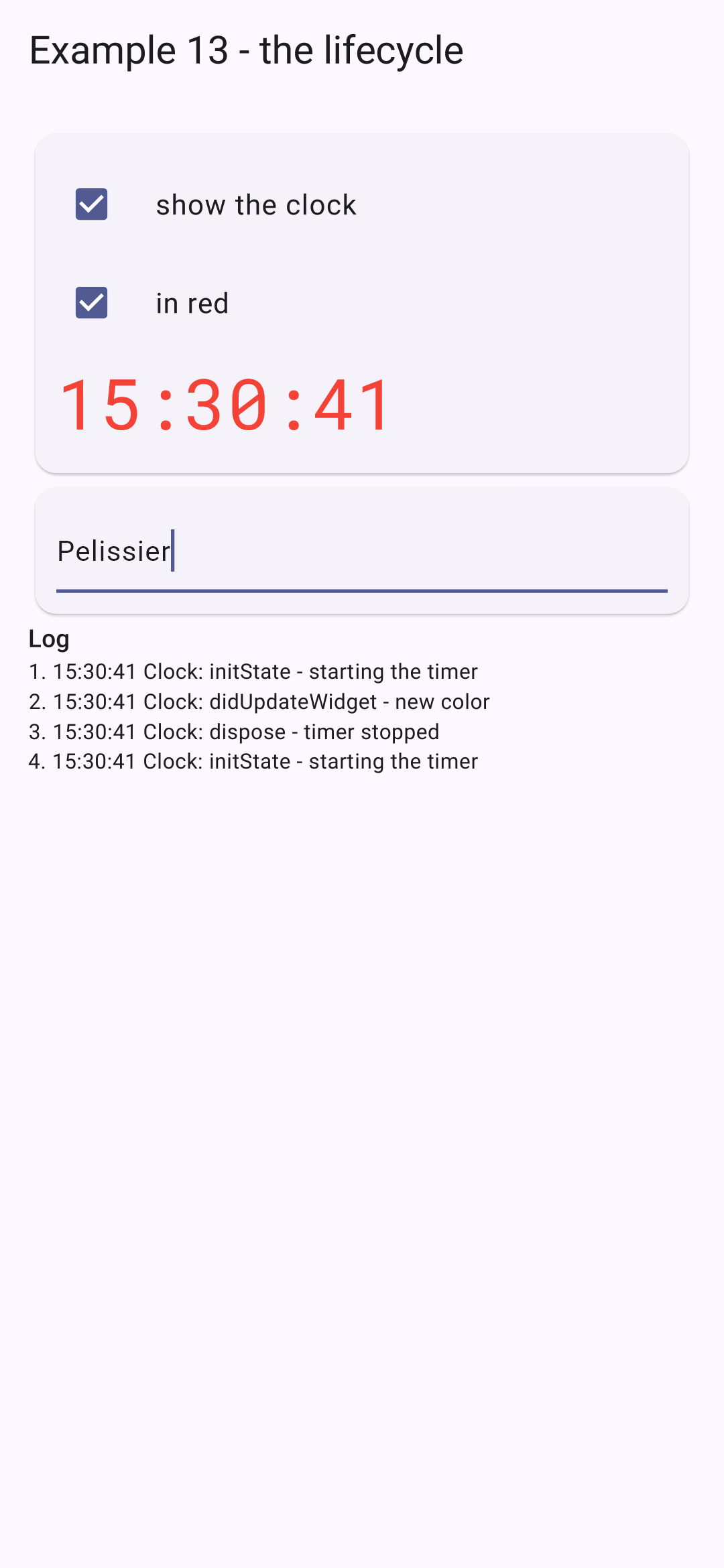
The log shows the clock’s activity: start, color change, stop, start.
Students taking the [React] course will compare it with [useEffect]: what [React] writes to an effect and its cleanup function; [Flutter] distributes it between [initState] and [dispose]; what [React] obtains from an effect’s dependency table, [Flutter] obtains it using [didUpdateWidget], by comparing the old widget to the new one.
4.5. Example 14: Inherited Data
How can you share data and functions between distant widgets without passing them from parameter to parameter through all the intermediaries? With inherited data, such as [InheritedWidget]. This is the mechanism that [Flutter] itself uses: [Theme.of(context)], [MediaQuery.of(context)], [Navigator.of(context)]... are inherited data reads. [React] calls this a context; [Angular] would refer to it as a service.
4.5.1. One data set for the entire application
| // =========================================================================
// lib/ex14_inherited_data/providers/log.dart - a piece of data for the WHOLE application
// -------------------------------------------------------------------------
// How can data and functions be shared between distant
// widgets, without passing them from parameter to parameter through all the
// intermediaries? With an InheritedWidget, an "inherited" piece of data:
// 1. a PROVIDER widget, placed high in the tree, carries the data;
// 2. any descendant, at any depth, READS it
// with context.dependOnInheritedWidgetOfExactType<Provider>();
// 3. the descendant that has read it is then SUBSCRIBED: it is rebuilt
// when the data change.
// It is the mechanism that Flutter itself uses: Theme.of(context),
// MediaQuery.of(context), Navigator.of(context)... are reads of
// inherited data.
//
// InheritedNotifier is a ready-made variant: the data is an object
// that NOTIFIES of its changes (a ChangeNotifier, which calls
// notifyListeners()), and the provider then rebuilds its readers.
// The convention: a static of(context) method to read the data.
// =========================================================================
import 'package:flutter/material.dart';
// the data: a ChangeNotifier. notifyListeners() notifies its subscribers
class Log extends ChangeNotifier {
final List<String> lines = [];
void trace(String message) {
lines.insert(0, '${DateTime.now().toString().substring(11, 19)} $message');
if (lines.length > 6) lines.removeLast();
notifyListeners();
}
}
// the provider: it carries the log, and rebuilds its readers when
// the log notifies a change
class LogProvider extends InheritedNotifier<Log> {
const LogProvider({super.key, required Log log, required super.child}) : super(notifier: log);
// the read: the CLOSEST provider above context
static Log of(BuildContext context) {
final provider = context.dependOnInheritedWidgetOfExactType<LogProvider>();
if (provider == null) {
throw FlutterError('LogProvider.of: no LogProvider above this widget');
}
return provider.notifier!;
}
}
|
- lines 25–31: the shared data: a log. It is a [ChangeNotifier], an object that notifies its listeners of changes: every method that modifies it calls [notifyListeners()];
- lines 37–38: the provider: a widget, located high in the tree, that holds the log. [InheritedNotifier] is a [InheritedWidget] ready for a [ChangeNotifier]: when the log notifies of a change, the provider rebuilds all the widgets that have read it;
- Lines 41–46: Reading, via a static method [of(context)], as used by [Flutter]. [context.dependOnInheritedWidgetOfExactType<LogProvider>()] traverses the tree from [context] up to the nearest provider and subscribes the widget that reads the data: it will be rebuilt when the data changes. If there is no provider above it, this is a programming error: it is clearly flagged.
| // =========================================================================
// lib/ex14_inherited_data/providers/cart.dart - a piece of data provided by ONE widget
// -------------------------------------------------------------------------
// The cart is only provided to a part of the tree: the widgets
// that CartProvider wraps (see main.dart). Two providers placed at
// two places of the screen would give two independent carts.
// The provider is a StatefulWidget here: it is the one that CREATES the cart
// (didChangeDependencies) and releases it (dispose). It uses the log itself.
// =========================================================================
import 'package:flutter/material.dart';
import 'log.dart';
typedef Item = ({String label, double price});
class Cart extends ChangeNotifier {
final Log _log;
final List<Item> items = [];
Cart(this._log);
// a computed value: fold "folds" the list into a single value
double get total => items.fold(0, (sum, a) => sum + a.price);
void add(Item item) {
items.add(item);
_log.trace('cart: + ${item.label}');
notifyListeners();
}
void remove(int index) {
_log.trace('cart: - ${items[index].label}');
items.removeAt(index);
notifyListeners();
}
}
class CartProvider extends StatefulWidget {
final Widget child;
const CartProvider({super.key, required this.child});
// the read, through the private widget _InheritedCart placed in build()
static Cart of(BuildContext context) {
final inherited = context.dependOnInheritedWidgetOfExactType<_InheritedCart>();
if (inherited == null) {
throw FlutterError('CartProvider.of: no CartProvider above this widget');
}
return inherited.notifier!;
}
@override
State<CartProvider> createState() => _CartProviderState();
}
class _CartProviderState extends State<CartProvider> {
Cart? _cart; // null as long as it is not created
// called right after initState: the widget can then READ the inherited
// data. getInheritedWidgetOfExactType: reading the log WITHOUT subscribing
// to its changes (the cart's provider does not have to be rebuilt
// each time the log changes)
@override
void didChangeDependencies() {
super.didChangeDependencies();
// ??=: the cart is only created the first time
_cart ??= Cart(context.getInheritedWidgetOfExactType<LogProvider>()!.notifier!);
}
@override
void dispose() {
_cart?.dispose();
super.dispose();
}
@override
Widget build(BuildContext context) => _InheritedCart(notifier: _cart!, child: widget.child);
}
class _InheritedCart extends InheritedNotifier<Cart> {
const _InheritedCart({required super.notifier, required super.child});
}
|
- lines 17–24: the shopping cart, another [ChangeNotifier]. It receives the log upon creation to record every addition and removal. [fold] “collapses” the list into a single value: the sum of the prices;
- lines 39–40: This time, the provider is a [StatefulWidget]: it is the one that creates the shopping cart and releases it. It is provided only to the widgets it encompasses ([child]);
- lines 45–50: the private widget [_InheritedCart], which the provider places above its child, reads the data;
- lines 65–68: the basket is created in [didChangeDependencies], which is called immediately after [initState], and from which a widget can read the inherited data. [??=]: this is created only the first time. [getInheritedWidgetOfExactType] reads the log WITHOUT subscribing to its changes: the shopping cart provider does not need to be rebuilt every time the log changes;
- line 78: the provider places the inherited data above its child;
- lines 81–82: the inherited data itself, which is private.
| // =========================================================================
// lib/ex14_inherited_data/providers/clock.dart - a PARAMETERIZED provider
// -------------------------------------------------------------------------
// A clock, whose refresh period is a parameter of the
// provider: ClockProvider(period: Duration(seconds: 5), ...).
// Two nested providers: a widget reads the one that is the CLOSEST
// to it. This time, we write an InheritedWidget "by hand": it is
// updateShouldNotify that tells whether the readers must be rebuilt.
// The clock stops when its provider disappears (dispose).
// =========================================================================
import 'dart:async';
import 'package:flutter/material.dart';
class ClockProvider extends StatefulWidget {
final Duration period;
final Widget child;
const ClockProvider({super.key, this.period = const Duration(seconds: 1), required this.child});
// the default value: a frozen date, read by a widget without a provider
static DateTime of(BuildContext context) =>
context.dependOnInheritedWidgetOfExactType<_InheritedClock>()?.now ?? DateTime(2026);
@override
State<ClockProvider> createState() => _ClockProviderState();
}
class _ClockProviderState extends State<ClockProvider> {
DateTime _now = DateTime.now();
Timer? _timer;
void _start() {
_timer?.cancel();
_timer = Timer.periodic(widget.period, (_) => setState(() => _now = DateTime.now()));
}
@override
void initState() {
super.initState();
_start();
}
// if the parent changes the period, the timer is restarted
@override
void didUpdateWidget(ClockProvider oldWidget) {
super.didUpdateWidget(oldWidget);
if (oldWidget.period != widget.period) _start();
}
@override
void dispose() {
_timer?.cancel();
super.dispose();
}
@override
Widget build(BuildContext context) => _InheritedClock(now: _now, child: widget.child);
}
class _InheritedClock extends InheritedWidget {
final DateTime now;
const _InheritedClock({required this.now, required super.child});
// called when the provider is rebuilt: must the readers be
// rebuilt? Yes, if the time has changed
@override
bool updateShouldNotify(_InheritedClock oldWidget) => oldWidget.now != now;
}
|
- line 23: the read operation; without a provider, a default value (a fixed date). [?.]: if no provider is found, the result is [null], and [??] then takes the default value;
- lines 34–36: a timer, with the period specified as a parameter;
- lines 47–49: if the parent changes the period, the timer is restarted;
- lines 62–70: this time, a [InheritedWidget] written “by hand.” It carries a piece of data (the time). Every time the provider is rebuilt (every second), [Flutter] calls [updateShouldNotify] with the old widget: if it returns [true], the widgets that read the data are rebuilt.
| // lib/ex14_inherited_data/catalog.dart - a descendant that ADDS to the cart
import 'package:flutter/material.dart';
import 'providers/cart.dart';
const catalog = <Item>[
(label: 'Consultation', price: 30),
(label: 'Vaccine', price: 12.5),
(label: 'Certificate', price: 5),
];
class Catalog extends StatelessWidget {
const Catalog({super.key});
@override
Widget build(BuildContext context) {
// the cart provided by ShopPage (an error if nobody provides it)
final cart = CartProvider.of(context);
return Card(
child: Column(
children: [
for (final a in catalog)
ListTile(
dense: true,
title: Text('${a.label} (${a.price} €)'),
trailing: IconButton(icon: const Icon(Icons.add_shopping_cart), onPressed: () => cart.add(a)),
),
],
),
);
}
}
|
- Line 18: The catalog reads the shopping cart provided above and adds items to it.
| // =========================================================================
// lib/ex14_inherited_data/cart_summary.dart
// -------------------------------------------------------------------------
// Another descendant: the SAME cart as Catalog, but ITS OWN
// clock, refreshed every 5 seconds. A widget only reads the
// providers placed ABOVE it: CartSummary therefore places a second
// ClockProvider around its content, which it hands over to a small
// widget, _Content (whose context is, itself, BELOW this provider).
// =========================================================================
import 'package:flutter/material.dart';
import 'providers/clock.dart';
import 'providers/cart.dart';
class CartSummary extends StatelessWidget {
const CartSummary({super.key});
@override
Widget build(BuildContext context) {
return const ClockProvider(period: Duration(seconds: 5), child: _Content());
}
}
class _Content extends StatelessWidget {
const _Content();
@override
Widget build(BuildContext context) {
final cart = CartProvider.of(context);
final now = ClockProvider.of(context); // the closest one: the 5 s one
return Card(
child: Padding(
padding: const EdgeInsets.all(12),
child: Column(
crossAxisAlignment: CrossAxisAlignment.start,
children: [
Text(
'Cart (${cart.items.length} item(s)) - ${now.toString().substring(11, 19)}',
style: Theme.of(context).textTheme.titleSmall,
),
for (final (i, a) in cart.items.indexed)
Row(
children: [
Text(a.label),
TextButton(onPressed: () => cart.remove(i), child: const Text('remove')),
],
),
Text('Total: ${cart.total} €', style: const TextStyle(fontWeight: FontWeight.bold)),
],
),
),
);
}
}
|
- Line 21: The summary places a second clock provider, with a 5-second period, around its content. A widget only reads the providers placed above it: that is why the content is a separate widget, [_Content], whose [context] is BELOW this provider (the [context] of [CartSummary], meanwhile, is above it);
- Lines 30–31: It reads the SAME cart as the catalog, but the closest clock is the 5-second one.
| // =========================================================================
// lib/ex14_inherited_data/main.dart - three levels of inherited data
// -------------------------------------------------------------------------
// - the log: provided at the very top (above MaterialApp), to the whole
// application;
// - the cart, provided by ShopPage: shared by Catalog and
// CartSummary, which see the SAME cart;
// - the clock, provided by ShopPage (default period, 1 s) AND by
// CartSummary (5 s): each one its own.
// =========================================================================
import 'package:flutter/material.dart';
import 'catalog.dart';
import 'providers/clock.dart';
import 'providers/log.dart';
import 'providers/cart.dart';
import 'cart_summary.dart';
void main() {
runApp(
LogProvider(
log: Log(),
child: MaterialApp(
debugShowCheckedModeBanner: false,
theme: ThemeData(colorSchemeSeed: Colors.indigo),
home: const ShopPage(),
),
),
);
}
// the time of the page's clock: a small widget, placed BELOW the provider
class _PageTime extends StatelessWidget {
const _PageTime();
@override
Widget build(BuildContext context) {
final time = ClockProvider.of(context).toString().substring(11, 19);
return Text('Clock of the page: $time', style: const TextStyle(color: Colors.grey));
}
}
class ShopPage extends StatelessWidget {
const ShopPage({super.key});
@override
Widget build(BuildContext context) {
// the page reads the log: it will be rebuilt on each new line
final log = LogProvider.of(context);
return ClockProvider(
child: CartProvider(
child: Scaffold(
appBar: AppBar(title: const Text('Example 14 - the inherited data')),
body: ListView(
padding: const EdgeInsets.all(16),
children: [
const _PageTime(),
const Catalog(),
const CartSummary(),
const SizedBox(height: 12),
Text('Log (provided to the whole application)', style: Theme.of(context).textTheme.titleSmall),
for (final line in log.lines) Text(line, style: const TextStyle(fontSize: 12)),
],
),
),
),
);
}
}
|
- lines 22–24: the log provider is placed above [MaterialApp]: the log is available in the WHOLE application, including in windows and other screens;
- lines 34–40: a small widget, placed below the page’s clock provider;
- line 50: the page reads the log; it will be rebuilt with each new line;
- lines 51–52: the page provides a clock (default period: one second) and a shopping cart for everything it contains.
We add three items, then remove one:
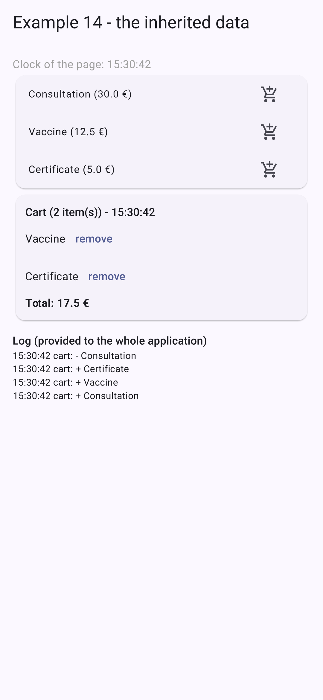
The page’s clock advances every second; the shopping cart’s clock advances every five seconds. The log shows the additions and the removal. Example 20 will delegate all this work to the [provider] package, which writes it in a single line but is based exactly on this mechanism.
4.6. Example 15: Reusing Behaviors
A widget reuses a view. How do you reuse a behavior, along with its state (highlighting what’s tapped, triggering an action after a long press, giving focus on startup)? [React] has “custom hooks”; [Flutter] and [Dart] have three tools.
| // =========================================================================
// lib/ex15_behaviors/highlighter.dart - a behavior in a widget
// -------------------------------------------------------------------------
// The first way of reusing a BEHAVIOR (with its state): a
// "wrapper" widget, which adds this behavior to any child.
// Highlighter(color: ..., child: ListTile(...))
// This one highlights its child while it is TOUCHED (the finger placed on
// the screen), and, with a mouse (web, computer), while it is HOVERED.
// Each Highlighter has its own state: two rows do not bother each other.
// =========================================================================
import 'package:flutter/material.dart';
class Highlighter extends StatefulWidget {
final Color color;
final Widget child;
const Highlighter({super.key, this.color = const Color(0xFFFFF3CD), required this.child});
@override
State<Highlighter> createState() => _HighlighterState();
}
class _HighlighterState extends State<Highlighter> {
bool _touched = false;
bool _hovered = false;
@override
Widget build(BuildContext context) {
// MouseRegion: the movements of the mouse; Listener: the contacts
// of the finger (or the clicks), at the lowest level
return MouseRegion(
onEnter: (_) => setState(() => _hovered = true),
onExit: (_) => setState(() => _hovered = false),
child: Listener(
onPointerDown: (_) => setState(() => _touched = true),
onPointerUp: (_) => setState(() => _touched = false),
onPointerCancel: (_) => setState(() => _touched = false),
// AnimatedContainer: an ANIMATED change of color (200 ms)
child: AnimatedContainer(
duration: const Duration(milliseconds: 200),
color: _touched || _hovered ? widget.color : Colors.transparent,
child: widget.child,
),
),
);
}
}
|
- lines 32–34: [MouseRegion] notifies when the mouse enters or exits the widget (on the web or a computer; a phone does not have a mouse);
- lines 35–38: [Listener] notifies, at the lowest level, of every finger touch (or every click): down, up, canceled;
- lines 40–42: an animated [Container]: when its color changes, it transitions from the old color to the new one in 200 milliseconds, without requiring any additional code. [Flutter] has a whole family of these “implicitly animated” widgets: [AnimatedOpacity], [AnimatedPadding], [AnimatedAlign]...
[Highlighter] applies its behavior to any child: [Highlighter(child: ListTile(...))].
| // =========================================================================
// lib/ex15_behaviors/long_press.dart - a long-press button
// -------------------------------------------------------------------------
// LongPressButton(duration: Duration(seconds: 1), onAction: remove, child: ...)
// The action is only executed if the button is held down for
// the whole duration: a protection against unfortunate presses. A ring
// fills up during the press.
// The filling is an ANIMATION: an AnimationController produces a
// value that goes from 0 to 1 during the given duration, on each frame of
// the screen. It needs a "ticker" (the heartbeat of the frames): the mixin
// SingleTickerProviderStateMixin adds it to the State object. A MIXIN is
// Dart's way of reusing code in several classes (see
// autofocus.dart).
// =========================================================================
import 'package:flutter/material.dart';
class LongPressButton extends StatefulWidget {
final Duration duration;
final VoidCallback onAction;
final Widget child;
const LongPressButton({
super.key,
this.duration = const Duration(seconds: 1),
required this.onAction,
required this.child,
});
@override
State<LongPressButton> createState() => _LongPressButtonState();
}
// "with": the State object receives, in addition, the code of the mixin
class _LongPressButtonState extends State<LongPressButton> with SingleTickerProviderStateMixin {
late final AnimationController _animation;
@override
void initState() {
super.initState();
// vsync: this: the ticker provided by the mixin
_animation = AnimationController(vsync: this, duration: widget.duration)
// the end of the animation: the press lasted long enough
..addStatusListener((status) {
if (status == AnimationStatus.completed) {
_animation.reset();
widget.onAction();
}
});
}
// when the widget is removed: no orphan animation
@override
void dispose() {
_animation.dispose();
super.dispose();
}
void _start() => _animation.forward(from: 0);
// the finger lifts too early: the ring empties
void _stop() {
if (_animation.isAnimating) _animation.reverse();
}
@override
Widget build(BuildContext context) {
return GestureDetector(
onTapDown: (_) => _start(),
onTapUp: (_) => _stop(),
onTapCancel: _stop,
// AnimatedBuilder: rebuilds ONLY this piece, on each frame
child: AnimatedBuilder(
animation: _animation,
builder: (context, child) => Row(
mainAxisSize: MainAxisSize.min,
children: [
SizedBox(
width: 22,
height: 22,
child: CircularProgressIndicator(value: _animation.value, strokeWidth: 3, color: Colors.red),
),
const SizedBox(width: 8),
child!, // the child, built once and for all
],
),
child: widget.child,
),
);
}
}
|
- line 35: [with]: the [State] object also receives the code from a mixin. A mixin is how [Dart] reuses code across multiple classes without inheritance. This mixin provides a “ticker”—the refresh rate of the screen (60 frames per second or more)—which an animation requires;
- lines 42–47: a [AnimationController] generates a value ranging from 0 to 1 for the specified duration, for each frame. [vsync: this]: the ticker provided by the mixin. [..addStatusListener(...)]: when the animation reaches the end ([completed]), the press has lasted long enough: the animation is reset to zero and the action is executed;
- lines 59–63: the finger touches the button: the animation starts from 0; if it lifts too early, the animation rewinds;
- lines 69–71: gestures: press, release, cancel (the finger has slipped off the button);
- lines 73–87: [AnimatedBuilder] reconstructs only this portion of the screen for each frame of the animation: a ring ([CircularProgressIndicator]) whose value corresponds to the animation. The fixed element (the button text) is constructed once and for all ([child]), and passed to [builder].
4.6.3. A behavior in a mixin
| // =========================================================================
// lib/ex15_behaviors/autofocus.dart - a behavior in a MIXIN
// -------------------------------------------------------------------------
// The second way of reusing a behavior: a mixin on State.
// class _MyPageState extends State<MyPage> with FocusOnStart { ... }
// The State object receives a FocusNode (startFocus), which takes the focus
// as soon as the screen is displayed, and which is released with it: the mixin
// completes the initState and dispose of the class that uses it.
// "on State<T>": this mixin only applies to a State object, whose
// methods it can therefore use (initState, dispose, mounted...).
// (For a simple field, the autofocus: true parameter of TextField does the
// same thing: the mixin shows the mechanism, reusable for something else.)
// =========================================================================
import 'package:flutter/widgets.dart';
mixin FocusOnStart<T extends StatefulWidget> on State<T> {
final startFocus = FocusNode();
@override
void initState() {
super.initState(); // the initState of the class (or of the mixin) "above"
// after the first display: the field exists, it is given the focus
WidgetsBinding.instance.addPostFrameCallback((_) {
if (mounted) startFocus.requestFocus();
});
}
@override
void dispose() {
startFocus.dispose();
super.dispose();
}
}
|
- line 17: a mixin that is applied only to an object [State] ([on State<T>]): it can therefore use its methods;
- line 18: the [State] object that uses the mixin receives this field;
- Lines 21–25: The mixin [initState] is completed: [super.initState()] calls the one from the "parent" class (that of [State], or another mixin). After the initial display, the field exists: focus is given to it. [mounted]: Is the [State] object still in the tree?;
- lines 30–32: it also completes [dispose], to free up [FocusNode].
4.6.4. Using
| // =========================================================================
// lib/ex15_behaviors/main.dart - reusing behaviors
// -------------------------------------------------------------------------
// Three tools of Flutter and Dart to reuse a BEHAVIOR (and
// its state), and not a simple display:
// - a "wrapper" widget (Highlighter);
// - a widget that carries an animation (LongPressButton);
// - a mixin on State (FocusOnStart).
// =========================================================================
import 'package:flutter/material.dart';
import 'long_press.dart';
import 'autofocus.dart';
import 'highlighter.dart';
void main() {
runApp(
MaterialApp(
debugShowCheckedModeBanner: false,
theme: ThemeData(colorSchemeSeed: Colors.indigo),
home: const BehaviorsPage(),
),
);
}
class BehaviorsPage extends StatefulWidget {
const BehaviorsPage({super.key});
@override
State<BehaviorsPage> createState() => _BehaviorsPageState();
}
// the FocusOnStart mixin: this State object receives startFocus
class _BehaviorsPageState extends State<BehaviorsPage> with FocusOnStart {
final List<String> _doctors = ['Mme Marie PELISSIER', 'Mr Paul TATOU', 'Melle Sophie DUPONT'];
String _message = '';
void _remove(String name) {
setState(() {
_doctors.remove(name);
_message = '$name has been deleted.';
});
}
@override
Widget build(BuildContext context) {
return Scaffold(
appBar: AppBar(title: const Text('Example 15 - reusing behaviors')),
body: ListView(
padding: const EdgeInsets.all(16),
children: [
TextField(
focusNode: startFocus, // the FocusNode provided by the mixin
decoration: const InputDecoration(hintText: 'this field received the focus on its own'),
),
const SizedBox(height: 12),
const Text(
'Touch the rows; hold a button pressed for one second to delete.',
style: TextStyle(color: Colors.grey),
),
for (final (i, m) in _doctors.indexed)
Highlighter(
key: ValueKey(m),
// one row out of two: the default color; the others, green
color: i.isEven ? const Color(0xFFFFF3CD) : const Color(0xFFD1E7DD),
child: ListTile(
title: Text(m),
trailing: LongPressButton(
onAction: () => _remove(m),
child: const Text('Delete', style: TextStyle(color: Colors.red)),
),
),
),
const SizedBox(height: 12),
if (_message.isNotEmpty) Text(_message, style: const TextStyle(color: Colors.indigo)),
],
),
);
}
}
|
- line 35: the screen uses the mixin;
- line 54: the [FocusNode] provided by the mixin;
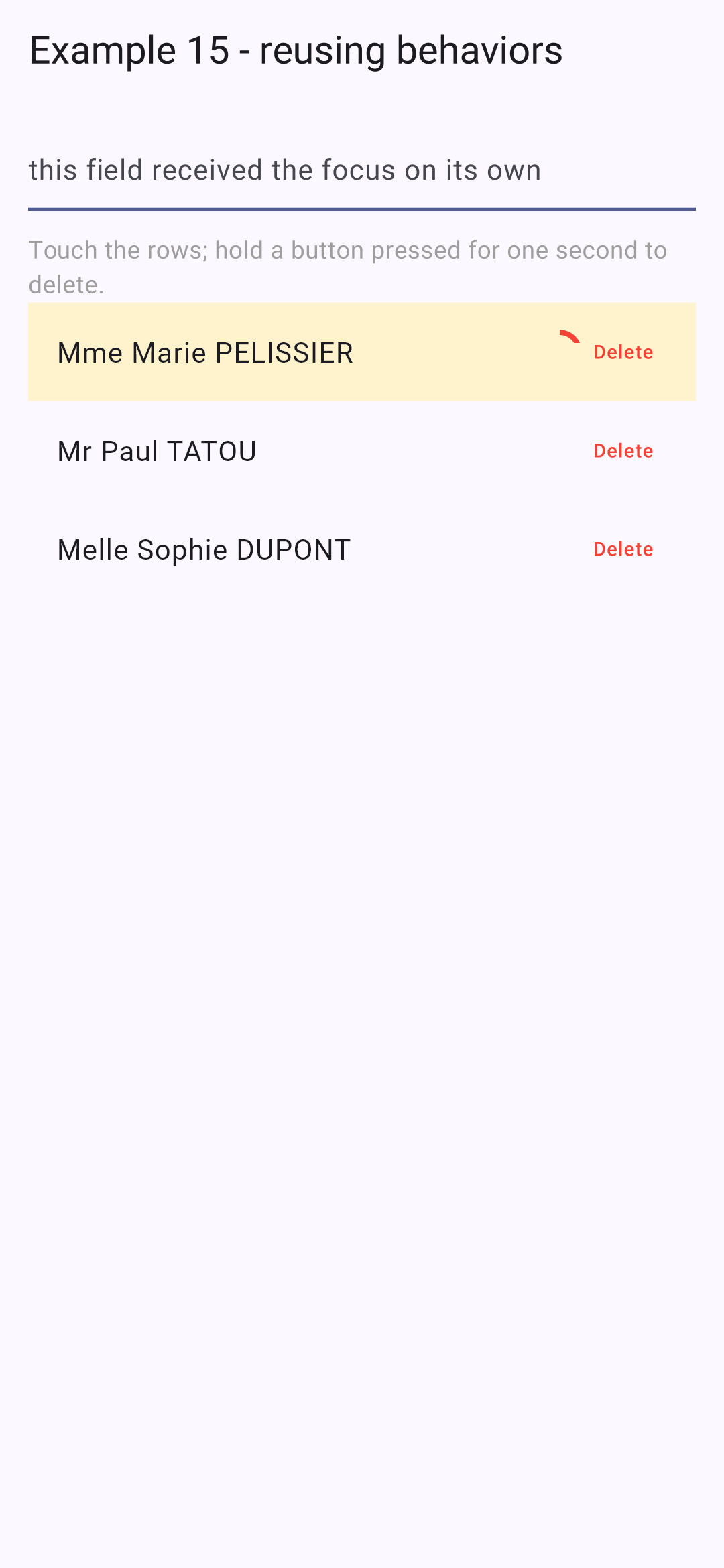
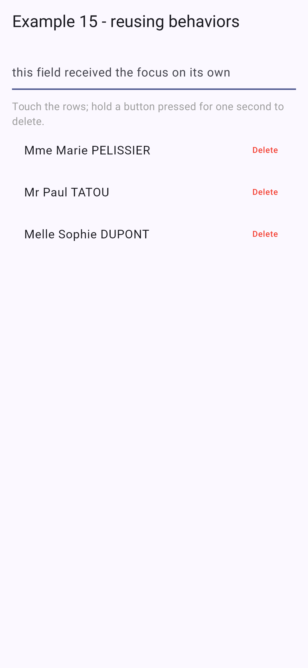
- lines 63–71: each line is highlighted when tapped; its “Delete” button only takes effect after being held down for one second.
While holding down the first button (the ring fills up, the line is highlighted); then after fully pressing the second button:
4.7. Example 16: A Reusable Confirmation Window
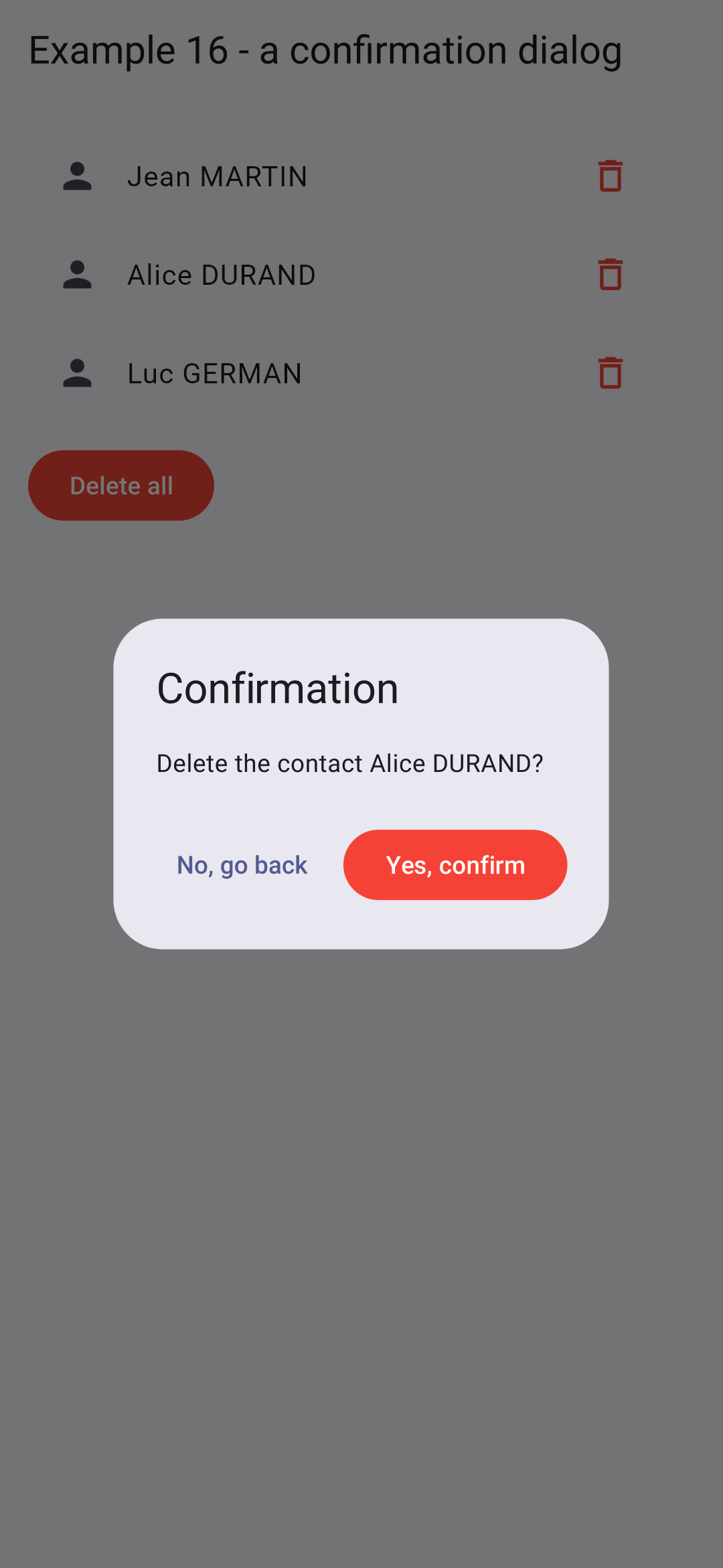
“Are you sure?”: [Flutter] provides everything you need. The [showDialog] function displays a modal window on top of the screen and returns a [Future], populated with the value the window transmits when it closes.
4.7.1. The window
| // =========================================================================
// lib/ex16_confirmation/confirmation.dart - "Are you sure?"
// -------------------------------------------------------------------------
// Flutter provides everything needed: showDialog() displays a MODAL
// dialog above the screen, and returns a Future, resolved with the value
// that the dialog passes when it closes: Navigator.pop(context, value).
// The calling code is therefore written very simply:
//
// if (await confirm(context, 'Delete this doctor?')) { ... }
//
// Closing the dialog WITHOUT answering (tap outside, Back button of the
// phone, Esc key) resolves the Future with null: it is treated
// as a "no".
// =========================================================================
import 'package:flutter/material.dart';
Future<bool> confirm(BuildContext context, String message) async {
final answer = await showDialog<bool>(
context: context,
// AlertDialog: a Material dialog, with a title, a content and buttons
builder: (context) => AlertDialog(
title: const Text('Confirmation'),
content: Text(message),
actions: [
// autofocus: the "No" button (the least dangerous choice) has the focus
TextButton(autofocus: true, onPressed: () => Navigator.pop(context, false), child: const Text('No, go back')),
FilledButton(
style: FilledButton.styleFrom(backgroundColor: Colors.red),
onPressed: () => Navigator.pop(context, true),
child: const Text('Yes, confirm'),
),
],
),
);
return answer ?? false; // null: dialog closed without an answer
}
|
- line 18: a standard function that can be used anywhere a [context] is available;
- lines 19–22: [showDialog] opens the window created by [builder] and returns a [Future<bool?>]: the value passed when the window closes;
- lines 23–25: [AlertDialog] is the dialog box for [Material Design]: a title, content, and buttons;
- line 27: [Navigator.pop(context, false)] closes the window by transmitting [false]. [autofocus]: the “No” button—the least risky option—has focus (accidentally pressing Enter does not delete anything);
- line 36: Closing the window WITHOUT responding (tapping outside the window, pressing the phone’s Back button, or pressing the Esc key) resolves [Future] to [null]: this is treated as a “no.”
The calling code is then just as simple to write as with the browser’s [window.confirm]: [if (await confirm(context, 'Delete this doctor?')) { ... }]. The client [React] required a context, a hand-crafted promise, and a “portal” to achieve the same result; with [Flutter], this is how windows normally works.
4.7.2. Using
| // =========================================================================
// lib/ex16_confirmation/main.dart - using the confirmation dialog
// -------------------------------------------------------------------------
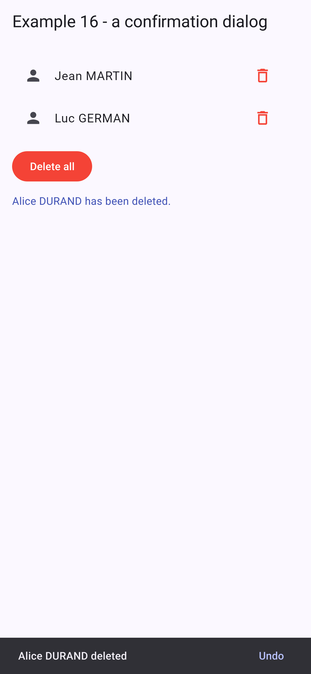
// A deletion, then a short-lived message at the bottom of the screen (SnackBar),
// with an "Undo" button: the other way, very common on mobile, of
// protecting the user from a mistake.
// =========================================================================
import 'package:flutter/material.dart';
import 'confirmation.dart';
typedef Contact = ({int id, String name});
void main() {
runApp(
MaterialApp(
debugShowCheckedModeBanner: false,
theme: ThemeData(colorSchemeSeed: Colors.indigo),
home: const ContactsPage(),
),
);
}
class ContactsPage extends StatefulWidget {
const ContactsPage({super.key});
@override
State<ContactsPage> createState() => _ContactsPageState();
}
class _ContactsPageState extends State<ContactsPage> {
final List<Contact> _contacts = [
(id: 1, name: 'Jean MARTIN'),
(id: 2, name: 'Alice DURAND'),
(id: 3, name: 'Luc GERMAN'),
];
String _message = '';
// an async function: it "waits" for the user's answer
Future<void> _remove(Contact c) async {
final yes = await confirm(context, 'Delete the contact ${c.name}?');
// after an await, the screen may have disappeared: we check that it is still there
if (!mounted) return;
if (!yes) {
setState(() => _message = 'Deletion abandoned.');
return;
}
final position = _contacts.indexOf(c);
setState(() {
_contacts.remove(c);
_message = '${c.name} has been deleted.';
});
// ScaffoldMessenger: displays a short-lived message at the bottom of the screen
ScaffoldMessenger.of(context).showSnackBar(
SnackBar(
content: Text('${c.name} deleted'),
action: SnackBarAction(
label: 'Undo',
onPressed: () => setState(() {
_contacts.insert(position, c);
_message = '${c.name} is back.';
}),
),
),
);
}
Future<void> _removeAll() async {
final yes = await confirm(context, 'Delete the ${_contacts.length} contacts?');
if (yes && mounted) {
setState(() {
_contacts.clear();
_message = 'All the contacts have been deleted.';
});
}
}
@override
Widget build(BuildContext context) {
return Scaffold(
appBar: AppBar(title: const Text('Example 16 - a confirmation dialog')),
body: ListView(
padding: const EdgeInsets.all(16),
children: [
for (final c in _contacts)
ListTile(
leading: const Icon(Icons.person),
title: Text(c.name),
trailing: IconButton(
icon: const Icon(Icons.delete_outline, color: Colors.red),
onPressed: () => _remove(c),
),
),
if (_contacts.isEmpty)
const ListTile(
title: Text('No contact.', style: TextStyle(color: Colors.grey)),
),
const SizedBox(height: 12),
Align(
alignment: Alignment.centerLeft,
child: FilledButton(
style: FilledButton.styleFrom(backgroundColor: Colors.red),
// null: button disabled when the list is empty
onPressed: _contacts.isEmpty ? null : _removeAll,
child: const Text('Delete all'),
),
),
const SizedBox(height: 12),
if (_message.isNotEmpty) Text(_message, style: const TextStyle(color: Colors.indigo)),
],
),
);
}
}
|
- lines 41–44: a [async] function: it waits for the user’s response. After a [await], the screen may have disappeared (the user has left): we check that the user is still there ([mounted]) before modifying the state or calling [context]. The analyzer flags that this check was omitted;
- lines 55–62: After deletion, a temporary message appears at the bottom of the screen ([SnackBar]), with an “Undo” button that restores the contact to its original position. This is another method, very common on mobile devices, to protect the user from making a mistake: take immediate action, but allow the user to undo it;
- line 105: [null] disables the button when the list is empty.
The confirmation window; then the deletion is complete, with its fleeting message: