3. The Components
A component is a reusable piece of the interface. This example displays doctors’ profiles: a component named [DoctorCard] (the child), used multiple times by the component [App] (the parent).
A component’s files are usually stored in a folder named after the component:
| 10-components/src/app/
├── doctor-card/
│ ├── doctor-card.ts the class of the component
│ ├── doctor-card.html its template
│ └── doctor-card.css its style
├── doctor.ts the Doctor type
├── app.ts
└── app.html
|
The data type shared by the parent and child:
| // the data type shared by the parent (App) and the child (DoctorCard)
export interface Doctor {
id: number;
title: string;
firstName: string;
lastName: string;
specialty: string;
available: boolean;
}
|
3.1.1. The child
| // =========================================================================
// 10-components/src/app/doctor-card/doctor-card.ts - a CHILD component
// -------------------------------------------------------------------------
// It receives its data from its parent through INPUTS, declared
// with input(): each input is a read-only SIGNAL, which follows the
// value passed by the parent. Their type is checked at compile time:
// <app-doctor-card [doctor]="42"> would be rejected.
//
// Golden rule: a component NEVER MODIFIES its inputs. The data
// goes down from the parent to the child; to request a change,
// the child emits an event (see example 11).
// =========================================================================
import { booleanAttribute, Component, computed, input } from '@angular/core';
import { Doctor } from '../doctor';
@Component({
// the selector: the tag that represents this component in its parent
selector: 'app-doctor-card',
templateUrl: './doctor-card.html',
styleUrl: './doctor-card.css',
})
export class DoctorCard {
// input.required: the parent MUST provide this input
readonly doctor = input.required<Doctor>();
readonly rank = input.required<number>();
// input(default value): an optional input. booleanAttribute
// allows simply writing <app-doctor-card compact> for true
readonly compact = input(false, { transform: booleanAttribute });
// a computed based on an input: recomputed if the parent changes it
protected readonly initials = computed(() => `${this.doctor().firstName[0]}${this.doctor().lastName[0]}`);
}
|
- Line 19: the selector: the parent will write [<app-doctor-card>];
- lines 25–29: the component’s inputs ([inputs])—the data passed to it by its parent. [input()] creates a read-only signal that tracks the value passed by the parent:
- lines 25–26: [input.required<T>()]: a required input. Omitting [[doctor]] from the parent’s template results in a compilation error;
- Line 29: [input(default value)]: an optional input. The [transform] option converts the received value: [booleanAttribute] checks for the presence of the attribute ([<app-doctor-card compact>], with no value) into a [true], as with the attribute HTML [disabled];
- line 32: a [computed] based on an input: recalculated if the parent changes the input.
The inputs are not [protected]: they are part of the component’s public interface, the one its parent uses.
Golden rule: a component never modifies its inputs (which are read-only, anyway). Data flows from the parent to the child; to request a change, the child emits an event (Example 11).
| <div class="card h-100" [class.border-success]="doctor().available">
<div class="card-body d-flex gap-3 align-items-center">
<div class="initials">{{ initials() }}</div>
<div>
<!-- the inputs are signals: they are read by calling them -->
<h2 class="h6 mb-1">{{ rank() }}. {{ doctor().title }} {{ doctor().firstName }} {{ doctor().lastName }}</h2>
@if (!compact()) {
<p class="mb-0 text-muted small">{{ doctor().specialty }}</p>
}
</div>
</div>
</div>
|
- lines 1, 6, 8: the inputs are signals: they are read by calling them;
- lines 7–9: the specialty is displayed only in the normal version of the card.
| /* the style of the component: it only applies to ITS elements */
.initials {
width: 2.5rem;
height: 2.5rem;
border-radius: 50%;
display: flex;
align-items: center;
justify-content: center;
background: #dd0031;
color: white;
font-weight: bold;
}
|
The class [initials] applies only to this component: another component could have its own class, [initials], without any conflict.
3.1.2. The parent
| // =========================================================================
// 10-components/src/app/app.ts - the PARENT component
// -------------------------------------------------------------------------
// It imports the DoctorCard component (imports array) and uses it as
// a new HTML tag, <app-doctor-card>, as many times as
// needed: a component is a REUSABLE piece of interface, with its
// own data, its template and its style.
// =========================================================================
import { Component, signal } from '@angular/core';
import { FormsModule } from '@angular/forms';
import { DoctorCard } from './doctor-card/doctor-card';
import { Doctor } from './doctor';
@Component({
selector: 'app-root',
imports: [FormsModule, DoctorCard],
templateUrl: './app.html',
})
export class App {
protected readonly doctors = signal<Doctor[]>([
{ id: 1, title: 'Mme', firstName: 'Marie', lastName: 'PELISSIER', specialty: 'general practitioner', available: true },
{ id: 2, title: 'Mr', firstName: 'Paul', lastName: 'TATOU', specialty: 'pediatrician', available: false },
{ id: 3, title: 'Melle', firstName: 'Sophie', lastName: 'DUPONT', specialty: 'general practitioner', available: true },
]);
protected readonly compact = signal(false);
// the parent modifies ITS data: the children concerned are updated
protected toggleAvailability(): void {
this.doctors.update((list) => list.map((m) => ({ ...m, available: !m.available })));
}
}
|
- line 17: the parent imports the child component; without this, [<app-doctor-card>] would be an unknown tag, and the compilation would fail;
- lines 29–31: the parent modifies ITS data. It replaces each doctor with a modified copy: the [m] object passed to each card changes, and the cards update.
| <div class="container py-4">
<h1 class="h3 mb-3">Example 10 - components and their inputs</h1>
<div class="d-flex gap-3 mb-3">
<label class="form-check-label">
<input type="checkbox" class="form-check-input" [(ngModel)]="compact"> compact display
</label>
<button class="btn btn-sm btn-outline-primary" (click)="toggleAvailability()">Toggle availability</button>
</div>
<div class="row g-3">
@for (m of doctors(); track m.id; let i = $index) {
<div class="col-md-4">
<!-- [doctor]="m" passes the OBJECT m (an expression);
doctor="m", without brackets, would pass the STRING "m" -->
<app-doctor-card [doctor]="m" [rank]="i + 1" [compact]="compact()" />
</div>
}
</div>
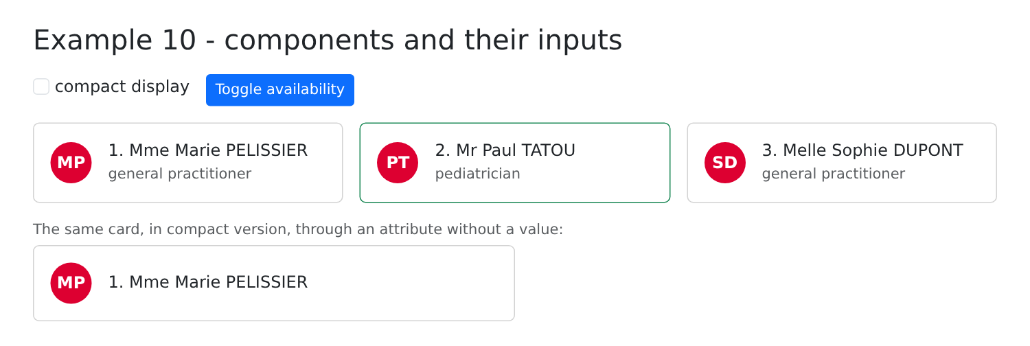
<p class="mt-3 mb-1 small text-muted">The same card, in compact version, through an attribute without a value:</p>
<div class="w-50">
<app-doctor-card [doctor]="doctors()[0]" [rank]="1" compact />
</div>
</div>
|
- line 14: the child is used as a HTML tag. [[doctor]="m"] is a property binding to the input [doctor]: it transmits the OBJECT [m]. Without square brackets, [doctor="m"] would pass the STRING ["m"], which the compiler would reject. A component with no content can be written using a self-closing tag ([/>]);
- line 20: [compact], with no value: thanks to [booleanAttribute], the input receives [true].
[npm start 10-components]; click “Toggle availability”:
3.2. Example 11: A component’s outputs and model()
A child has two ways to send information back to its parent:
- emit an event (an output, [output]), which the parent listens for as an event HTML; 2. a bidirectional connection, [[( )]], on a [model()].
3.2.1. Sending an Event
A counter that notifies its parent with every click and when it reaches its limit:
| // =========================================================================
// 11-outputs-model/src/app/counter/counter.ts
// -------------------------------------------------------------------------
// A child that NOTIFIES its parent: output() declares an event that the
// component can emit, with the type of its data. The parent listens to it
// like an HTML event: <app-counter (incremented)="..." (limit)="...">.
// =========================================================================
import { Component, input, output, signal } from '@angular/core';
@Component({
selector: 'app-counter',
template: `
<div class="d-flex align-items-center gap-2 mb-2">
<span class="w-25">{{ label() }}</span>
<button class="btn btn-sm btn-outline-primary" (click)="plus()">+1</button>
<span class="badge text-bg-secondary">{{ value() }} / {{ max() }}</span>
</div>
`,
})
export class Counter {
readonly label = input.required<string>();
readonly max = input.required<number>();
// two events: incremented (with the new value) and limit (without data)
readonly incremented = output<number>();
readonly limit = output<void>();
protected readonly value = signal(0);
protected plus(): void {
if (this.value() >= this.max()) {
this.limit.emit();
return;
}
this.value.update((v) => v + 1);
this.incremented.emit(this.value());
}
}
|
- lines 13–19: the component’s template, written in the decorator (property [template], enclosed in grave accents);
- lines 26–27: [output<T>()] declares an output: an event that the component can emit, along with the type of its data. [limit] has no data ([void]);
- lines 33 and 37: [emit(data)] emits the event; the parent receives the data.
Avoid naming an output after a browser event ([change], [click]...): browser events emitted by the component’s elements propagate up to its host element, and the parent would also receive them.
3.2.2. A two-way binding
A "custom" form field (label, field, tooltip, character counter) that links to parent data such as [ngModel]:
| // =========================================================================
// 11-outputs-model/src/app/text-field/text-field.ts
// -------------------------------------------------------------------------
// A "home-made" form field (label + field + help + character
// counter) that accepts a TWO-way binding, like ngModel:
// <app-text-field [(value)]="lastName" label="Last name" [max]="20" />
//
// model() creates a WRITABLE signal linked to the parent: READING it gives the
// parent's value, WRITING it (set) emits the valueChange event, which the
// [( )] syntax turns into an update of the parent's signal. The data
// thus really remains the property of the parent.
// =========================================================================
import { Component, input, model } from '@angular/core';
// a counter shared by all the instances: a unique identifier per
// field, to link <label for> and <input id>
let nextNumber = 0;
@Component({
selector: 'app-text-field',
template: `
<div class="mb-3">
<label class="form-label" [for]="id">{{ label() }}</label>
<!-- [value]: the value of the parent; (input): each keystroke replaces it -->
<input class="form-control" [id]="id" [value]="value()" [attr.maxlength]="max()"
[class.is-invalid]="value().length === max()" (input)="onInput($event)">
<div class="form-text">{{ help() }} ({{ value().length }} / {{ max() }})</div>
</div>
`,
})
export class TextField {
readonly value = model.required<string>();
readonly label = input.required<string>();
readonly max = input.required<number>();
readonly help = input('');
protected readonly id = `text-field-${++nextNumber}`;
protected onInput(event: Event): void {
this.value.set((event.target as HTMLInputElement).value);
}
}
|
- Line 33: [model()] creates a writable signal linked to the parent. READING it returns the parent’s value; WRITING it ([set], line 41) changes the value AND emits the event [valueChange] (the model name followed by [Change]). The parent that writes [[(value)]="signal"] thus has its signal updated;
- line 18: a module variable (outside the class) is shared by all instances of the component: a counter that assigns a unique identifier to each field (line 38), to link [<label for>] and [<input id>];
- lines 26–27: [[value]] displays the parent’s value; [(input)] replaces it with each keystroke (line 41). [[attr.maxlength]] is an attribute binding to HTML (the attribute [maxlength]), not a property binding.
3.2.3. The parent
| // =========================================================================
// 11-outputs-model/src/app/app.ts - the parent listens to its children
// -------------------------------------------------------------------------
// Two ways for a child to pass information up:
// 1. emitting an event (output), which the parent listens to with ( );
// 2. a two-way binding [( )] on a model(): a shortcut
// for the input [value] + the event (valueChange).
// =========================================================================
import { Component, computed, signal } from '@angular/core';
import { Counter } from './counter/counter';
import { TextField } from './text-field/text-field';
@Component({
selector: 'app-root',
imports: [Counter, TextField],
templateUrl: './app.html',
})
export class App {
protected readonly total = signal(0);
protected readonly message = signal('');
protected readonly firstName = signal('Marie');
protected readonly lastName = signal('PELISSIER');
protected readonly fullName = computed(() => `${this.firstName()} ${this.lastName().toUpperCase()}`);
// the handler of the incremented event: it receives the emitted data ($event)
protected onChange(label: string, value: number): void {
this.total.update((t) => t + 1);
this.message.set(`${label} is now ${value}`);
}
protected clear(): void {
this.firstName.set('');
this.lastName.set('');
}
}
|
| <div class="container py-4" style="max-width: 640px">
<h1 class="h3 mb-3">Example 11 - the outputs of a component and model()</h1>
<div class="card p-3 mb-4">
<h2 class="h6">1. Events emitted by the children</h2>
<!-- $event: the data emitted by the child (here, the new value) -->
<app-counter label="Coffees" [max]="3" (incremented)="onChange('Coffees', $event)"
(limit)="message.set('No more than 3 coffees!')" />
<app-counter label="Glasses of water" [max]="8" (incremented)="onChange('Glasses of water', $event)"
(limit)="message.set('Enough drinking.')" />
<p class="mb-0">Total clicks: {{ total() }} - <em>{{ message() }}</em></p>
</div>
<div class="card p-3">
<h2 class="h6">2. A two-way binding with model()</h2>
<!-- [(value)]="firstName": the firstName signal of the parent, read AND modified by the child -->
<app-text-field [(value)]="firstName" label="First name" [max]="20" help="Required" />
<app-text-field [(value)]="lastName" label="Last name" [max]="20" help="Displayed in upper case" />
<p class="mb-0">Data of the parent: <strong>{{ fullName() }}</strong></p>
<button class="btn btn-sm btn-outline-secondary mt-2 align-self-start" (click)="clear()">Clear (from the parent)</button>
</div>
</div>
|
- Line 7: [(incremented)="..."] listens to the output [incremented] from the counter; [$event] is the data output (the new value). [label="Coffees"], without square brackets: a string-type input can receive a constant value;
- line 8: [(limit)]: a method of a signal ([set]) can be called directly within the template;
- line 9: a second counter, with its own label, limit and messages;
- line 17: [[(value)]="firstName"]: the parent’s signal [firstName] (without parentheses: the signal itself is specified), read AND modified by the child. This is the abbreviation for [[value]="firstName()" (valueChange)="firstName.set($event)"];
- line 20: the parent modifies its data: the two fields follow.
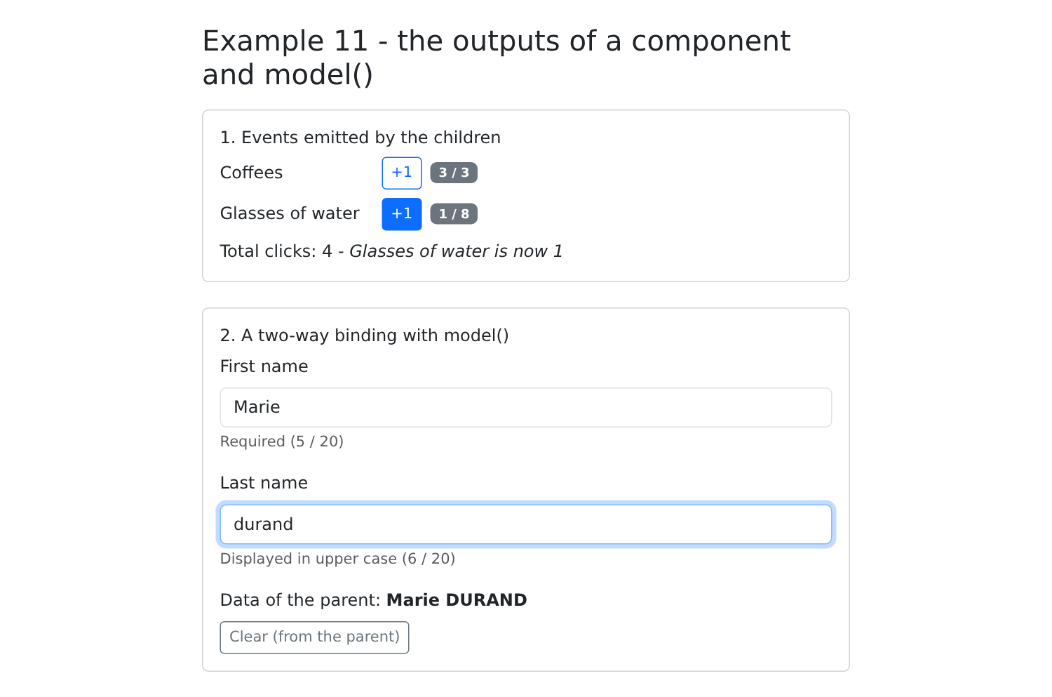
[npm start 11-outputs-model]; four clicks on the coffees, one on the water, then type a name:
3.3. Example 12: Content Projection
Inputs transmit data; content projection transmits content (from HTML and other components), written by the parent BETWEEN the component’s tags. This is the client-side equivalent of the [layout.hbs] template for the [NestJS] course and its [{{{body}}}].
3.3.1. A card
A reusable frame (border, header, footer), whose parent provides the content:
| // =========================================================================
// 12-projection/src/app/card/card.ts - a reusable TEMPLATE
// -------------------------------------------------------------------------
// The inputs pass DATA; content PROJECTION passes
// CONTENT (HTML, other components), written by the parent BETWEEN the
// <app-card> and </app-card> tags. The card sets the frame (border,
// header, footer), the parent provides what goes inside:
// - <ng-content /> : the "main" content;
// - <ng-content select="[header]" /> : only the elements that have
// the header attribute;
// - the content placed BETWEEN <ng-content> and </ng-content> is displayed if
// the parent provides nothing (default content).
// It is the client-side equivalent of the layout.hbs template and its {{{body}}}
// in the NestJS course.
// =========================================================================
import { Component, input } from '@angular/core';
@Component({
selector: 'app-card',
template: `
<div class="card mb-3" [class]="color() ? 'border-' + color() : ''">
<div class="card-header" [class]="color() ? 'text-bg-' + color() : ''">
<ng-content select="[header]">Untitled</ng-content>
</div>
<div class="card-body">
<ng-content />
</div>
<!-- an empty footer (the parent provided nothing) is hidden by the CSS :empty -->
<div class="card-footer text-muted small"><ng-content select="[footer]" /></div>
</div>
`,
styles: `
.card-footer:empty {
display: none;
}
`,
})
export class Card {
readonly color = input<'primary' | 'success' | 'danger'>();
}
|
- line 27: [<ng-content />]: the location where [Angular] places the content written by the parent between [<app-card>] and [</app-card>];
- line 24: [<ng-content select="[header]">]: only those content elements that have the [header] attribute. [select] accepts a CSS selector (a tag, a class, or an attribute). The text between [<ng-content>] and [</ng-content>] is displayed if the parent element does not provide any content: this is the default content;
- line 30: the footer: elements that have the [footer] attribute;
- lines 33–37: an empty footer (the parent element provided nothing) is hidden: the pseudo-class CSS [:empty] denotes an element with no content;
- Line 40: An optional input that can take only three values; if no default value is specified, it defaults to [undefined].
3.3.2. A generic array
An array that knows how to iterate through rows but doesn’t know how to display ONE row: its parent tells it how by passing it a row template.
| // =========================================================================
// 12-projection/src/app/data-table/data-table.ts - a GENERIC table
// -------------------------------------------------------------------------
// DataTable<T> is a generic class: it displays rows of any
// type T. It knows how to iterate over the rows, but not how to display ONE
// row: the parent tells it, by passing it a row TEMPLATE
// (an <ng-template #row>, a piece of HTML that is not displayed as
// is, but that can be displayed on demand, as many times as needed).
//
// contentChild('row'): the <ng-template #row> placed by the parent between
// <app-data-table> and </app-data-table>. The table displays it for each row
// with ngTemplateOutlet, passing it a CONTEXT: the row ($implicit)
// and its rank (index). The content provided by the parent thus uses
// data that belongs to the child.
// =========================================================================
import { Component, contentChild, input, TemplateRef } from '@angular/core';
import { NgTemplateOutlet } from '@angular/common';
// what the table passes to the template of each row
export interface RowContext<T> {
$implicit: T; // the value retrieved by let-row
index: number; // retrieved by let-i="index"
}
@Component({
selector: 'app-data-table',
imports: [NgTemplateOutlet],
template: `
<table class="table table-sm align-middle mb-0">
<thead>
<tr>
@for (c of columns(); track c) {
<th>{{ c }}</th>
}
</tr>
</thead>
<tbody>
@for (l of rows(); track l.id; let i = $index) {
<tr>
<ng-container [ngTemplateOutlet]="rowTemplate() ?? null" [ngTemplateOutletContext]="{ $implicit: l, index: i }" />
</tr>
} @empty {
<tr>
<td class="text-muted" [attr.colspan]="columns().length">
<ng-content select="[empty]">No data.</ng-content>
</td>
</tr>
}
</tbody>
</table>
`,
})
export class DataTable<T extends { id: number }> {
readonly rows = input.required<T[]>();
readonly columns = input.required<string[]>();
protected readonly rowTemplate = contentChild<TemplateRef<RowContext<T>>>('row');
}
|
- line 54: [DataTable<T>] is a generic class: it displays lines of any type [T], provided they have a [id] (for [track], line 39);
- Line 57: [contentChild('row')]: a signal that refers to the element of the projected content marked [#row]. This will be a [<ng-template>]: a portion of HTML that is not displayed as-is, but can be displayed on demand, as many times as necessary (a [TemplateRef]);
- line 41: the [ngTemplateOutlet] directive displays a template by passing it a context—an object whose properties become variables in the template. [$implicit] is the default value (lines 21–24);
- lines 43–49: if the list is empty, the block [@empty], with projected content ([[empty]]) and default content;
- line 45: [[attr.colspan]]: an attribute binding, since [colspan] is not a property of the [<td>] element.
3.3.3. The parent
| // =========================================================================
// 12-projection/src/app/app.ts - using the Card and DataTable templates
// =========================================================================
import { Component, computed, signal } from '@angular/core';
import { Card } from './card/card';
import { DataTable } from './data-table/data-table';
interface Slot {
id: number;
time: string;
patient: string | null;
}
@Component({
selector: 'app-root',
imports: [Card, DataTable],
templateUrl: './app.html',
})
export class App {
protected readonly slots = signal<Slot[]>([
{ id: 1, time: '8:00 - 8:20', patient: null },
{ id: 2, time: '8:20 - 8:40', patient: 'Mme Alice DURAND' },
{ id: 3, time: '8:40 - 9:00', patient: null },
]);
protected readonly free = computed(() => this.slots().filter((c) => c.patient === null).length);
protected readonly nobody: { id: number; name: string }[] = [];
}
|
| <div class="container py-4" style="max-width: 720px">
<h1 class="h3 mb-3">Example 12 - content projection</h1>
<app-card color="primary">
<!-- the header attribute: this <span> will go into the <ng-content select="[header]"> -->
<span header>Schedule of Mme PELISSIER</span>
<!-- everything that has neither header nor footer goes into the main <ng-content /> -->
<app-data-table [rows]="slots()" [columns]="['#', 'Slot', 'Status']">
<!-- the template of a row: let-c receives the row, let-i its rank -->
<ng-template #row let-c let-i="index">
<td>{{ i + 1 }}</td>
<td>{{ c.time }}</td>
<td>
@if (c.patient) {
<span class="badge text-bg-secondary">{{ c.patient }}</span>
} @else {
<span class="badge text-bg-success">Free</span>
}
</td>
</ng-template>
</app-data-table>
<span footer>{{ free() }} free slot(s)</span>
</app-card>
<app-card color="success">
<span header>A card without a footer</span>
<p class="mb-0">The footer is not provided: the card does not display it.</p>
</app-card>
<app-card>
<!-- no header provided: the default content, "Untitled" -->
<app-data-table [rows]="nobody" [columns]="['Name']">
<span empty>Nobody for now.</span>
</app-data-table>
</app-card>
</div>
|
- lines 4–23: a blue card. Its content is distributed by the card: [<span header>] (line 6) goes into the header, [<span footer>] (line 22) into the footer, and the rest (the table) into the body;
- lines 10–20: the template for a line. [let-c] retrieves the value [$implicit] from the context (the line), and [let-i="index"] retrieves its property [index]. The content provided by the parent thus uses data that belongs to the child;
- lines 25–28: a card without a footer;
- lines 30–35: a card without a header (the default content, “Untitled”), and an empty table.
[npm start 12-projection]:
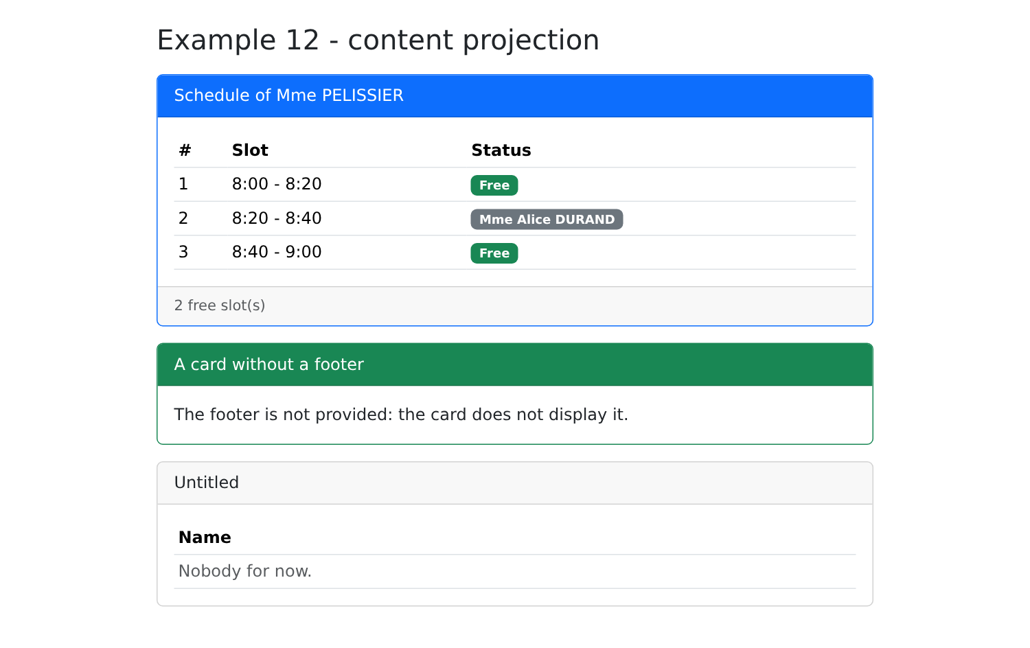
The compiler does not recognize the type of [c] in the template (lines 10–20): it treats it as [any]. This can be remedied (with a directive declaring the context type), at the cost of a little more code; this is the limitation of this technique.
3.4. Example 13: The Lifecycle of a Component
A component is created, displayed, exists, and then disappears. [Angular] allows you to take action at each stage: this is the component’s lifecycle.
3.4.1. A clock
A clock starts a timer when it is created... and must stop it when it disappears: otherwise, the timer would continue to run for no reason (memory leak).
| // =========================================================================
// 13-lifecycle/src/app/clock/clock.ts
// -------------------------------------------------------------------------
// The lifecycle of a component:
// 1. constructor : the class is created; the inputs are not
// available yet;
// 2. ngOnInit : the inputs have received their first value;
// 3. afterNextRender : the component is DISPLAYED, its HTML elements
// exist in the page;
// 4. ngOnDestroy : the component is about to be REMOVED from the page.
// A clock starts a timer (setInterval) at startup... and must
// absolutely stop it when it disappears: otherwise the timer would
// keep running for nothing (memory leak).
// =========================================================================
import { afterNextRender, Component, OnDestroy, OnInit, output, signal } from '@angular/core';
@Component({
selector: 'app-clock',
template: `<div class="display-6 font-monospace">{{ time() }}</div>`,
})
// implements OnInit, OnDestroy: TypeScript checks that the methods exist
export class Clock implements OnInit, OnDestroy {
readonly log = output<string>();
protected readonly time = signal(new Date().toLocaleTimeString());
private timer: number | undefined;
constructor() {
console.log('Clock: constructor'); // the parent does not listen to log yet
// afterNextRender is registered in the constructor; the function is
// called once, just after the first display of the component
afterNextRender(() => this.log.emit('Clock: afterNextRender - displayed'));
}
ngOnInit(): void {
this.log.emit('Clock: ngOnInit - starting the timer');
this.timer = window.setInterval(() => this.time.set(new Date().toLocaleTimeString()), 1000);
}
ngOnDestroy(): void {
window.clearInterval(this.timer);
this.log.emit('Clock: ngOnDestroy - timer stopped');
}
}
|
The steps:
- lines 28–33: the constructor: the class is created. The inputs have not yet been assigned values, and the parent is not yet listening to the outputs (hence the [console.log] on line 29, rather than a [emit]);
- lines 35–38: [ngOnInit()]: The inputs have received their first values. This is the usual place to trigger actions that depend on them: a load, a timer;
- line 32: [afterNextRender(function)], called in the constructor, records a function executed once, immediately after the component is first displayed: its elements HTML then exist on the page;
- Lines 40–43: [ngOnDestroy()]: the component is about to be removed from the page. The timer is stopped.
[implements OnInit, OnDestroy] (line 23) is not required: [Angular] calls [ngOnInit] if it exists. But [TypeScript] then verifies that the methods are written correctly.
[Angular] offers additional steps, which are less useful since the signals were introduced: [ngOnChanges] (an input has changed; we prefer a [computed] or a [effect] for that input), [ngAfterViewInit]... And an alternative to [ngOnDestroy]: [inject(DestroyRef).onDestroy(function)], which Example 14 will use.
3.4.2. The parent
| // =========================================================================
// 13-lifecycle/src/app/app.ts
// -------------------------------------------------------------------------
// - @if around <app-clock>: checking / unchecking the box creates / destroys
// the component (ngOnInit / ngOnDestroy, see clock.ts);
// - viewChild('field'): a signal that gives the HTML element marked #field
// in the template (undefined as long as it is not displayed);
// - effect: executed a first time, then on each change of the
// signals it reads. Here, to give the focus to the field as soon as it
// appears, and so that the title of the tab follows what is typed.
// =========================================================================
import { Component, effect, ElementRef, OnInit, signal, viewChild } from '@angular/core';
import { FormsModule } from '@angular/forms';
import { Clock } from './clock/clock';
@Component({
selector: 'app-root',
imports: [FormsModule, Clock],
templateUrl: './app.html',
})
export class App implements OnInit {
protected readonly withClock = signal(true);
protected readonly log = signal<string[]>([]);
protected readonly search = signal('');
protected readonly showSearch = signal(false);
// the <input #field> element of the template; ElementRef.nativeElement: the HTML element
private readonly field = viewChild<ElementRef<HTMLInputElement>>('field');
constructor() {
// the field appears (viewChild changes): we give it the focus
effect(() => this.field()?.nativeElement.focus());
// the title of the tab follows what is typed, from the start
effect(() => {
const text = this.search();
document.title = text ? `Search: ${text}` : 'Example 13';
});
}
ngOnInit(): void {
this.trace('App: ngOnInit');
}
protected trace(message: string): void {
this.log.update((j) => [...j, `${new Date().toLocaleTimeString()} ${message}`]);
}
}
|
- line 29: [viewChild('field')]: a signal that refers to the template element marked [#field]. It is set to [undefined] as long as the element does not exist (the field appears only after a click). [ElementRef] wraps the element HTML, which is accessible via its property [nativeElement];
- line 33: a [effect] that reads this signal: when the field appears, the effect is triggered again and gives it focus. There is no need to “wait” for the page to refresh: the signal only changes once the element has been created;
- lines 35–38: a second effect: the tab title updates as text is entered, starting from the very beginning (an effect always runs once at the start);
- lines 41–43: the parent element also has its own [ngOnInit].
| <div class="container py-4" style="max-width: 720px">
<h1 class="h3 mb-3">Example 13 - the lifecycle of a component</h1>
<div class="card p-3 mb-3">
<label class="form-check-label mb-2">
<input type="checkbox" class="form-check-input" [(ngModel)]="withClock"> show the clock
</label>
@if (withClock()) {
<app-clock (log)="trace($event)" />
}
</div>
<div class="card p-3 mb-3">
@if (!showSearch()) {
<button class="btn btn-outline-primary align-self-start" (click)="showSearch.set(true)">Search...</button>
} @else {
<!-- #field: the element designated by viewChild('field') -->
<input #field class="form-control" placeholder="the tab title follows what you type" [(ngModel)]="search">
}
</div>
<h2 class="h6">Log</h2>
<ol class="small">
@for (line of log(); track $index) {
<li>{{ line }}</li>
}
</ol>
</div>
|
- lines 8–10: Checking or unchecking the box creates or destroys the clock: [@if] actually adds or removes the component from the page;
- line 18: [#field], the element referred to by [viewChild('field')].
[npm start 13-lifecycle]; uncheck and then recheck the box, and click “Search...”:
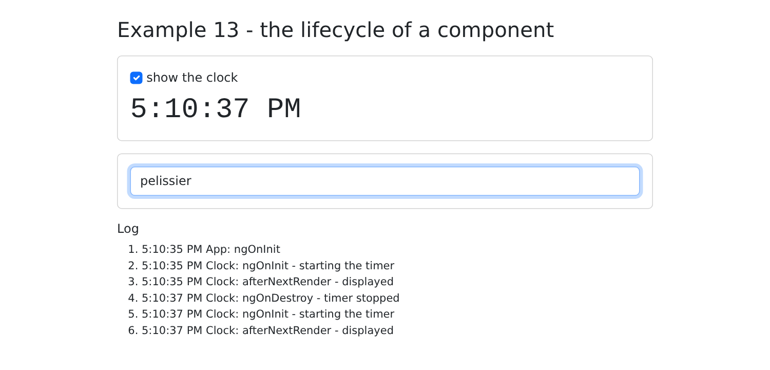
The log shows the order of the steps: first the parent ([App: ngOnInit]), then the clock ([ngOnInit], [afterNextRender]), its destruction ([ngOnDestroy]), and a new clock. The search field has focus.
3.5. Example 14: Services and Dependency Injection
A service is a class that groups together data and code shared by multiple components: server access, the logged-in user, a shopping cart, etc. Components do not create services (never [new CartService()]): they request them from [Angular], using the [inject()] function. This is dependency injection, the mechanism that the [NestJS] course presented on the server side.
When a component requests a service, [Angular] looks for who provides it: the component itself, then its parent, the parent of its parent… all the way up to the application. Depending on where it is provided, a service is therefore shared to a greater or lesser extent. This example shows three levels.
3.5.1. A root service
| import { Injectable, signal } from '@angular/core';
@Injectable({ providedIn: 'root' })
export class LogService {
private readonly _lines = signal<string[]>([]);
// asReadonly(): the components READ the lines; only the service modifies them
readonly lines = this._lines.asReadonly();
trace(message: string): void {
this._lines.update((l) => [`${new Date().toLocaleTimeString()} ${message}`, ...l].slice(0, 6));
}
}
|
- line 14: [@Injectable({ providedIn: 'root' })]: the service is provided at the root of the application. [Angular] creates a single instance the first time it is requested, and everyone who requests it receives that instance;
- Lines 16–18: The data in the lines is private; [asReadonly()] provides a public, read-only version of it. The components read the lines; only the service modifies them (line 21). This is the standard organization for a service that maintains state.
3.5.2. A service provided by a component
| import { computed, inject, Injectable, signal } from '@angular/core';
import { LogService } from './log.service';
export interface Item {
label: string;
price: number;
}
@Injectable()
export class CartService {
// a service can itself request other services
private readonly log = inject(LogService);
private readonly _items = signal<Item[]>([]);
readonly items = this._items.asReadonly();
readonly total = computed(() => this._items().reduce((sum, a) => sum + a.price, 0));
add(item: Item): void {
this._items.update((a) => [...a, item]);
this.log.trace(`cart: + ${item.label}`);
}
remove(index: number): void {
this.log.trace(`cart: - ${this._items()[index].label}`);
this._items.update((a) => a.filter((_, i) => i !== index));
}
}
|
- line 19: [@Injectable()] WITHOUT [providedIn]: the service is not provided by default anywhere. A component will provide it in its array [providers];
- line 22: a service can itself request other services: the shopping cart is logged;
- lines 24–26: the shopping cart's status (private), its read-only version, and its total;
- lines 28–36: the two actions that change the status.
| import { DestroyRef, inject, Injectable, InjectionToken, signal } from '@angular/core';
// factory: the value used if nobody provides this token
export const CLOCK_PERIOD = new InjectionToken<number>('period of the clock', { factory: () => 1000 });
@Injectable()
export class ClockService {
private readonly period = inject(CLOCK_PERIOD);
readonly now = signal(new Date());
constructor() {
const timer = window.setInterval(() => this.now.set(new Date()), this.period);
inject(DestroyRef).onDestroy(() => window.clearInterval(timer));
}
}
|
- line 15: an injection token ([InjectionToken]) refers to a value that is not a class: in this case, a number—the clock period. [factory] provides the value used if no one supplies this token;
- line 19: the token value is requested in the same way a service is requested;
- line 24: [DestroyRef] represents the “lifetime” of the component that provided the service; [onDestroy] registers a function to be executed when it is destroyed: the timer stops along with the component that provided the clock.
[inject()] is called only in an injection context: when initializing the properties of a class created by [Angular] (component, service, directive, pipe), or in its constructor. It cannot be called later, within an ordinary method.
3.5.4. Components
A catalog that adds items to the shopping cart:
| // 14-services/src/app/catalog/catalog.ts - a descendant that INJECTS the cart
import { Component, inject } from '@angular/core';
import { Item, CartService } from '../services/cart.service';
@Component({
selector: 'app-catalog',
template: `
<ul class="list-group">
@for (a of catalog; track a.label) {
<li class="list-group-item d-flex justify-content-between align-items-center">
{{ a.label }} (€{{ a.price }})
<button class="btn btn-sm btn-outline-primary" (click)="cart.add(a)">Add</button>
</li>
}
</ul>
`,
})
export class Catalog {
// the cart provided by App (error at runtime if nobody provides it)
protected readonly cart = inject(CartService);
protected readonly catalog: Item[] = [
{ label: 'Consultation', price: 30 },
{ label: 'Vaccine', price: 12.5 },
{ label: 'Certificate', price: 5 },
];
}
|
- line 20: [inject(CartService)]: the shopping cart provided by a parent ([App]). If no one provided it, [Angular] would report a runtime error;
- Line 12: The template directly calls a method of the service.
A summary of the shopping cart:
| import { Component, inject } from '@angular/core';
import { DatePipe } from '@angular/common';
import { CartService } from '../services/cart.service';
import { ClockService, CLOCK_PERIOD } from '../services/clock.service';
@Component({
selector: 'app-cart-summary',
imports: [DatePipe],
// a new instance of ClockService for THIS component, with another
// period: { provide: token, useValue: value }
providers: [ClockService, { provide: CLOCK_PERIOD, useValue: 5000 }],
template: `
<div class="card p-3">
<h2 class="h6">Cart ({{ cart.items().length }} item(s)) - {{ clock.now() | date: 'HH:mm:ss' }}</h2>
<ul class="mb-2">
@for (a of cart.items(); track $index) {
<li>{{ a.label }} <a href="#" (click)="$event.preventDefault(); cart.remove($index)">remove</a></li>
}
</ul>
<strong>Total: €{{ cart.total() }}</strong>
</div>
`,
})
export class CartSummary {
protected readonly cart = inject(CartService);
protected readonly clock = inject(ClockService);
}
|
- line 18: the component provides its own clock (a new instance of [ClockService]) and another time period: [{ provide: token, useValue: value }];
- Lines 32–33: The shopping cart is that of [App] (the same as the one in the catalog); the clock is its own.
And the root component:
| import { Component, inject } from '@angular/core';
import { DatePipe } from '@angular/common';
import { Catalog } from './catalog/catalog';
import { CartSummary } from './cart-summary/cart-summary';
import { ClockService } from './services/clock.service';
import { LogService } from './services/log.service';
import { CartService } from './services/cart.service';
@Component({
selector: 'app-root',
imports: [DatePipe, Catalog, CartSummary],
providers: [CartService, ClockService],
templateUrl: './app.html',
})
export class App {
protected readonly clock = inject(ClockService);
protected readonly log = inject(LogService);
}
|
- line 23: [App] provides a cart (shared by it and all its descendants) and a clock (default period: one second);
- line 28: the log, root service.
| <div class="container py-4" style="max-width: 720px">
<h1 class="h3 mb-3">Example 14 - services and dependency injection</h1>
<p class="text-muted">Clock of App: {{ clock.now() | date: 'HH:mm:ss' }}</p>
<div class="row g-3">
<div class="col-md-6"><app-catalog /></div>
<div class="col-md-6"><app-cart-summary /></div>
</div>
<h2 class="h6 mt-3">Log (LogService)</h2>
<ul class="small">
@for (line of log.lines(); track $index) {
<li>{{ line }}</li>
}
</ul>
</div>
|
[npm start 14-services]; three items are added, one is removed:
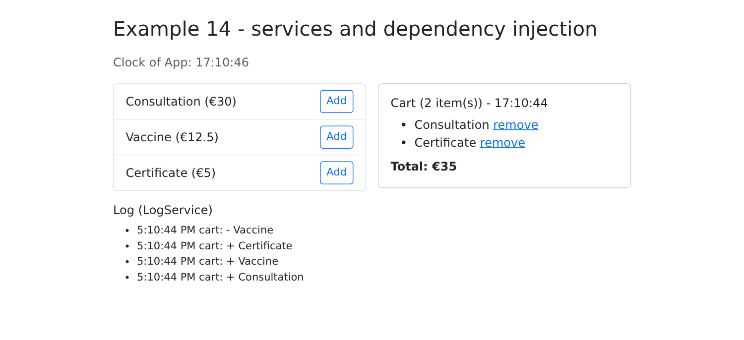
The two timers do not advance at the same rate: each component has received the instance closest to it. The shopping cart, meanwhile, is shared by both the catalog and the summary.
Services are the means, in [Angular], of sharing logic and data between components (the role played by “composables” and [provide] / [inject] in [Vue.js]). Example 20 will turn this into a state shared by the entire application.
3.6. Example 15: Writing Your Own Directives
A component is a directive that has a template. A directive “on its own” does not have one: it attaches to an existing element (its host) to modify its appearance or behavior. [Angular] provides some ([ngModel], [routerLink], [ngTemplateOutlet]...); you can write your own. Here are three examples.
3.6.1. Highlight an element on hover
| // =========================================================================
// 15-directives/src/app/directives/highlight.directive.ts
// -------------------------------------------------------------------------
// An ATTRIBUTE DIRECTIVE adds a behavior to an existing element,
// without a template of its own: <li appHighlight="gold">. Its selector is a
// CSS attribute selector ([appHighlight]).
// host: the bindings that the directive sets on the element that carries it
// (its "host"):
// - '[style.background-color]' : a property of the element;
// - '(mouseenter)' : an event of the element.
// =========================================================================
import { Directive, input, signal } from '@angular/core';
@Directive({
selector: '[appHighlight]',
host: {
'[style.background-color]': 'hovered() ? color() : null',
'[style.transition]': '"background-color 0.2s"',
'(mouseenter)': 'hovered.set(true)',
'(mouseleave)': 'hovered.set(false)',
},
})
export class HighlightDirective {
// the input has the name of the selector: <li appHighlight="gold"> sets it
readonly color = input('#fff3cd', { alias: 'appHighlight', transform: (c: string) => c || '#fff3cd' });
protected readonly hovered = signal(false);
}
|
- line 15: [@Directive] instead of [@Component]: no template;
- line 16: the selector is an attribute selector CSS: the directive applies to any element that has the attribute [appHighlight];
- lines 17–22: [host]: the bindings that the directive applies to its host, written as in a template:
- line 18: a property binding: the host’s background color when the mouse hovers over it ([null]: no color);
- lines 20–21: event bindings: mouse entry and exit;
- Line 26: An input named after the selector (option [alias]): [<li appHighlight="gold">] populates both the selector and the input. The function [transform] replaces an empty string with the default color.
3.6.2. Set focus
| // =========================================================================
// 15-directives/src/app/directives/autofocus.directive.ts
// -------------------------------------------------------------------------
// <input appAutofocus>: the field receives the focus as soon as it is displayed.
// inject(ElementRef) gives the host HTML element (nativeElement).
// (The HTML autofocus attribute only works when the page loads;
// in a single-page application, the fields appear later.)
// =========================================================================
import { afterNextRender, Directive, ElementRef, inject } from '@angular/core';
@Directive({ selector: '[appAutofocus]' })
export class AutofocusDirective {
constructor() {
const element = inject<ElementRef<HTMLElement>>(ElementRef).nativeElement;
afterNextRender(() => element.focus());
}
}
|
- line 15: [inject(ElementRef)] specifies the host element;
- line 16: focus is given to it as soon as it is displayed. The attribute HTML [autofocus] only works when the page loads; in a single-page application, the fields appear later.
3.6.3. A long click
A directive can also trigger events. This one triggers its event only if the host is held down for one second: a safeguard against accidental clicks.
| // =========================================================================
// 15-directives/src/app/directives/long-press.directive.ts
// -------------------------------------------------------------------------
// A directive can also EMIT events (output):
// <button (appLongPress)="remove()">
// The event is only emitted if the button is held down for one second:
// a protection against unfortunate clicks. During the press, the CSS
// class "pressed" is set on the button.
// =========================================================================
import { DestroyRef, Directive, inject, input, output, signal } from '@angular/core';
@Directive({
selector: '[appLongPress]',
host: {
'[class.pressed]': 'pressing()',
'(pointerdown)': 'start()',
'(pointerup)': 'stop()',
'(pointerleave)': 'stop()',
},
})
export class LongPressDirective {
readonly duration = input(1000); // in milliseconds
readonly appLongPress = output<void>();
protected readonly pressing = signal(false);
private timer: number | undefined;
constructor() {
inject(DestroyRef).onDestroy(() => window.clearTimeout(this.timer));
}
protected start(): void {
this.pressing.set(true);
this.timer = window.setTimeout(() => {
this.pressing.set(false);
this.appLongPress.emit();
}, this.duration());
}
protected stop(): void {
window.clearTimeout(this.timer);
this.pressing.set(false);
}
}
|
- line 16: while the host is pressed, the class [pressed] is applied to the host;
- lines 17–19: pointer events (mouse, finger, stylus): press, release, exit the element;
- line 24: an output bearing the selector’s name: we write [(appLongPress)="..."], and apply the directive at the same time as we listen for its event;
- line 29: the timer is stopped if the host disappears.
3.6.4. Usage
| // =========================================================================
// 15-directives/src/app/app.ts - writing your own directives
// -------------------------------------------------------------------------
// A component is a directive WITH a template. A "plain" directive
// has no template: it attaches itself to an existing element to
// modify its appearance or its behavior. Like a component, it must
// be imported by the component that uses it.
// =========================================================================
import { Component, signal } from '@angular/core';
import { AutofocusDirective } from './directives/autofocus.directive';
import { LongPressDirective } from './directives/long-press.directive';
import { HighlightDirective } from './directives/highlight.directive';
@Component({
selector: 'app-root',
imports: [AutofocusDirective, LongPressDirective, HighlightDirective],
templateUrl: './app.html',
styles: `
.pressed {
outline: 4px solid #dc3545;
}
`,
})
export class App {
protected readonly doctors = signal(['Mme Marie PELISSIER', 'Mr Paul TATOU', 'Melle Sophie DUPONT']);
protected readonly message = signal('');
protected remove(name: string): void {
this.doctors.update((m) => m.filter((x) => x !== name));
this.message.set(`${name} has been deleted.`);
}
}
|
- line 17: Like a component, a directive must be imported by the component that uses it;
- lines 19–23: the style of the [pressed] class, set by the long-click directive.
| <div class="container py-4" style="max-width: 640px">
<h1 class="h3 mb-3">Example 15 - writing your own directives</h1>
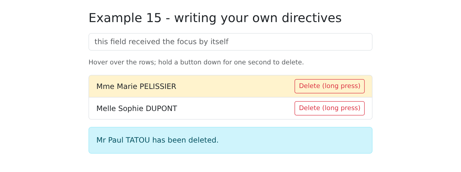
<!-- appAutofocus: the field has the focus as soon as the page is displayed -->
<input appAutofocus class="form-control mb-3" placeholder="this field received the focus by itself">
<p class="small text-muted">Hover over the rows; hold a button down for one second to delete.</p>
<ul class="list-group mb-3">
@for (m of doctors(); track m; let even = $even) {
<!-- appHighlight: without a value, the default color; with one, the given color -->
<li class="list-group-item d-flex justify-content-between align-items-center"
[appHighlight]="even ? '' : '#d1e7dd'">
{{ m }}
<button class="btn btn-sm btn-outline-danger" (appLongPress)="remove(m)">Delete (long press)</button>
</li>
}
</ul>
@if (message()) {
<p class="alert alert-info">{{ message() }}</p>
}
</div>
|
- Line 4: The field will have focus as soon as it is displayed;
- line 8: [let even = $even]: Is the row number even?
- line 11: every other row is highlighted in the default color, the other in green;
- Line 13: A long press removes the doctor.
[npm start 15-directives]; hold down the second button, then hover over the first row:
3.7. Example 16: A Reusable Confirmation Window
Before deleting an item, the user is asked to confirm. The browser provides [window.confirm()], but its window cannot be formatted or translated. This example replaces it with a [Bootstrap] window, combining what the previous examples have demonstrated: a service (Example 14) that carries the window’s state in a signal, and a component that displays it. The case study will use exactly this mechanism.
| 16-confirmation/src/app/
├── confirmation/
│ ├── confirmation.service.ts the service: the question asked, the answer
│ └── confirm-dialog.ts the modal dialog
├── app.ts
└── app.html
|
3.7.1. The service
| // =========================================================================
// 16-confirmation/src/app/confirmation/confirmation.service.ts
// -------------------------------------------------------------------------
// "Are you sure?": window.confirm() exists, but it can neither be
// styled, nor can its buttons be translated. We replace it with a Bootstrap
// dialog (confirm-dialog.ts), driven by this service.
//
// The trick: confirm(message) returns a PROMISE, resolved to true (Yes)
// or false (No) when the user answers. The calling code is
// then written as simply as with window.confirm:
//
// if (await this.confirmation.confirm('Delete this doctor?')) { ... }
//
// providedIn: 'root': only one service for the whole application, hence only one
// dialog, placed once in the root component.
// =========================================================================
import { Injectable, signal } from '@angular/core';
@Injectable({ providedIn: 'root' })
export class ConfirmationService {
private readonly _message = signal<string | null>(null); // null: dialog closed
readonly message = this._message.asReadonly();
private answer: ((yes: boolean) => void) | null = null;
confirm(text: string): Promise<boolean> {
this.answer?.(false); // a question still open? it counts as "no"
this._message.set(text);
return new Promise<boolean>((resolve) => {
this.answer = resolve;
});
}
respond(yes: boolean): void {
this._message.set(null);
const r = this.answer;
this.answer = null;
r?.(yes);
}
}
|
- line 20: a single service for the entire application; therefore, there will be only one window, placed once and for all in the root component;
- line 22: the displayed message; [null] means that the window is closed;
- line 23: [asReadonly()]: components can read the message, but only the service can modify it;
- line 24: the function that will resolve the current promise, which is awaiting a response;
- lines 26–32: [confirm] opens the window (line 28) and returns a promise. Its function [resolve] is set aside (line 30): the promise will not be resolved until later, when the user clicks a button;
- line 27: if a question were still open, it would be answered “no”: its promise will not remain pending forever;
- lines 34–39: [respond] is called by the window: it closes the window (line 35) and then resolves the promise with the user’s response (line 38).
This is the benefit of the promise: the code that asks the question writes it as a call to [window.confirm()], waiting for the response with [await], without a callback function.
3.7.2. The window
| // =========================================================================
// 16-confirmation/src/app/confirmation/confirm-dialog.ts
// -------------------------------------------------------------------------
// The modal dialog, placed ONCE in the root component:
// - same Bootstrap classes as a real modal (.modal, .modal-backdrop),
// displayed "statically" (show d-block): no need for the JavaScript of
// Bootstrap;
// - keyboard: Escape = No; the focus is put on the "No" button (the
// least dangerous choice) on opening.
// '(document:keydown.escape)' in host: an event listened to on the whole
// DOCUMENT, and not on the element of the component.
// =========================================================================
import { Component, effect, ElementRef, inject, viewChild } from '@angular/core';
import { ConfirmationService } from './confirmation.service';
@Component({
selector: 'app-confirm-dialog',
host: { '(document:keydown.escape)': 'confirmation.message() !== null && confirmation.respond(false)' },
template: `
@if (confirmation.message(); as message) {
<div class="modal-backdrop fade show"></div>
<div class="modal fade show d-block" tabindex="-1" role="alertdialog" aria-modal="true"
(click)="$event.target === $event.currentTarget && confirmation.respond(false)">
<div class="modal-dialog modal-dialog-centered">
<div class="modal-content">
<div class="modal-header">
<h5 class="modal-title">Confirmation</h5>
<button type="button" class="btn-close" aria-label="Close" (click)="confirmation.respond(false)"></button>
</div>
<div class="modal-body">
<p class="mb-0">{{ message }}</p>
</div>
<div class="modal-footer">
<button #noButton type="button" class="btn btn-secondary" (click)="confirmation.respond(false)">No, go back</button>
<button type="button" class="btn btn-danger" (click)="confirmation.respond(true)">Yes, confirm</button>
</div>
</div>
</div>
</div>
}
`,
})
export class ConfirmDialog {
protected readonly confirmation = inject(ConfirmationService);
private readonly noButton = viewChild<ElementRef<HTMLButtonElement>>('noButton');
constructor() {
// on opening, the "No" button appears: it receives the focus
effect(() => this.noButton()?.nativeElement.focus());
}
}
|
- line 19: [document:keydown.escape]: the event is listened for on the entire document, not on the component’s element. The Esc key responds with “no” if a question is asked;
- line 21: the window only appears if a message needs to be displayed; [as message] assigns a name to the signal’s value;
- Lines 22–23: The classes of a true modal [Bootstrap], displayed directly ([show d-block]): The [JavaScript] derived from [Bootstrap] is unnecessary, since [Angular] determines the display;
- line 24: a click next to the dialog box (on the gray background) responds with “no.” [$event.target === $event.currentTarget]: the click occurred on the [.modal] element itself, not on one of its children;
- lines 35–36: both responses. The “No” button carries the template variable [#noButton];
- line 46: [viewChild] (example 13) returns the element marked [#noButton] as a signal: it is equal to [undefined] as long as the window is closed;
- line 50: an effect that depends on this signal: each time the window is opened, the “No” button appears, the signal changes, and the button receives focus. We chose “No,” the least dangerous response: pressing the Enter key by mistake does not delete anything.
3.7.3. Usage
| // =========================================================================
// 16-confirmation/src/app/app.ts - using the confirmation dialog
// -------------------------------------------------------------------------
// Same page as example 21 of the NestJS course (links, buttons, confirmation),
// but without any round trip to a server.
// =========================================================================
import { Component, inject, signal } from '@angular/core';
import { ConfirmationService } from './confirmation/confirmation.service';
import { ConfirmDialog } from './confirmation/confirm-dialog';
interface Contact {
id: number;
name: string;
}
@Component({
selector: 'app-root',
imports: [ConfirmDialog],
templateUrl: './app.html',
})
export class App {
private readonly confirmation = inject(ConfirmationService);
protected readonly contacts = signal<Contact[]>([
{ id: 1, name: 'Jean MARTIN' },
{ id: 2, name: 'Alice DURAND' },
{ id: 3, name: 'Luc GERMAN' },
]);
protected readonly message = signal('');
// an async method: it "waits" for the answer of the user
protected async remove(c: Contact): Promise<void> {
if (!(await this.confirmation.confirm(`Delete the contact ${c.name}?`))) {
this.message.set('Deletion cancelled.');
return;
}
this.contacts.update((list) => list.filter((x) => x.id !== c.id));
this.message.set(`${c.name} has been deleted.`);
}
protected async removeAll(): Promise<void> {
if (await this.confirmation.confirm(`Delete the ${this.contacts().length} contacts?`)) {
this.contacts.set([]);
this.message.set('All the contacts have been deleted.');
}
}
}
|
- line 19: the root component imports the window, which it will place in its template;
- line 23: it requests the service;
- lines 32–39: a method named [async]. On line 33, [await] suspends execution until the user responds; during this time, the application remains active. The rest of the method executes only if the response is “Yes”;
- lines 41–46: same principle applies to deleting all contacts.
| <div class="container py-4" style="max-width: 640px">
<h1 class="h3 mb-3">Example 16 - a confirmation dialog</h1>
<ul class="list-group mb-3">
@for (c of contacts(); track c.id) {
<li class="list-group-item d-flex justify-content-between align-items-center">
{{ c.name }}
<button class="btn btn-sm btn-outline-danger" (click)="remove(c)">Delete</button>
</li>
} @empty {
<li class="list-group-item text-muted">No contact.</li>
}
</ul>
<button class="btn btn-danger" [disabled]="contacts().length === 0" (click)="removeAll()">Delete all</button>
@if (message()) {
<p class="alert alert-info mt-3">{{ message() }}</p>
}
</div>
<!-- the dialog, ONCE for the whole application -->
<app-confirm-dialog />
|
- lines 4–11: [@for] may be followed by a [@empty] block, displayed when the list is empty;
- line 13: the button is disabled when there is nothing left to delete;
- line 19: the window, positioned once for the entire application. Any component can then open it simply by calling the service.
[npm start 16-confirmation]; click the [Delete] button for Alice DURAND:
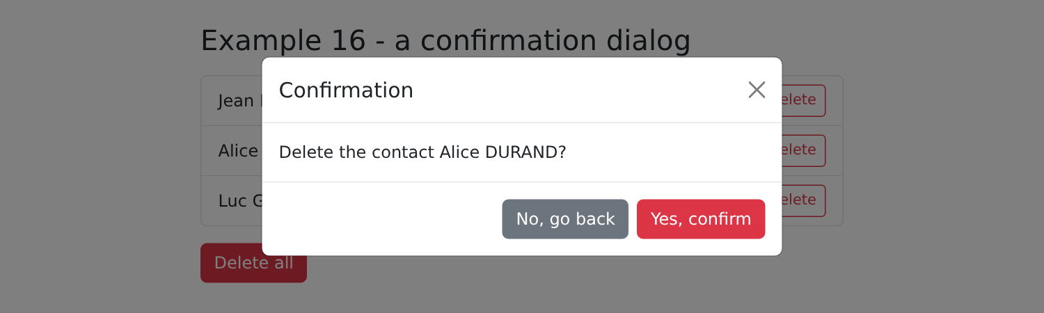
With [Vue.js], the window and its state were provided by a “composable”; with [Angular], it’s a service. The principle is the same: a shared state, in a signal, that multiple components read and modify.