3. Components
3.1. Example 10: Components and Their Props
A component is a reusable piece of the user interface. This example creates one, [DoctorCard], and uses it multiple times.
3.1.1. Data Type
| // the type of the data shared by the parent (App) and the child (DoctorCard)
export interface Doctor {
id: number;
title: string;
firstName: string;
lastName: string;
specialty: string;
available: boolean;
}
|
The type [Doctor] is shared by the parent and child: it is stored in a separate module.
3.1.2. The child
| // =========================================================================
// 10-components/src/DoctorCard.tsx - a CHILD component
// -------------------------------------------------------------------------
// It receives its data from its parent through PROPS (properties): the
// attributes written by the parent on <DoctorCard ... />, gathered by
// React into ONE object, first parameter of the function. Their type is
// checked at compile time: <DoctorCard doctor={42} /> would be rejected.
//
// Golden rule: a component NEVER MODIFIES its props. The data
// flow down from the parent to the child; to ask for a change,
// the child calls a function that the parent passed to it (cf. example 11).
// =========================================================================
import type { Doctor } from './doctor';
// styles: an object { initials: '_initials_x7f3a_1' } - the real name of each class
import styles from './DoctorCard.module.css';
// the type of the props: what the parent MAY (?) or MUST provide
interface Props {
doctor: Doctor;
rank: number;
compact?: boolean; // optional
}
// the props object is "destructured"; compact = false: its default value
export default function DoctorCard({ doctor, rank, compact = false }: Props) {
// a value computed from the props: recomputed if the parent changes them
const initials = `${doctor.firstName[0]}${doctor.lastName[0]}`;
return (
<div className={`card h-100 ${doctor.available ? 'border-success' : ''}`}>
<div className="card-body d-flex gap-3 align-items-center">
<div className={styles.initials}>{initials}</div>
<div>
<h2 className="h6 mb-1">{rank}. {doctor.title} {doctor.firstName} {doctor.lastName}</h2>
{!compact && <p className="mb-0 text-muted small">{doctor.specialty}</p>}
</div>
</div>
</div>
);
}
|
- line 14: a type import only;
- line 16: an import of the CSS module (see below);
- lines 19–23: the component’s prop types—the attributes that the parent writes to [<DoctorCard ... />]. [compact?] is optional;
- line 26: [React] combines the props into ONE object, which it passes as the first parameter to the function. It is immediately “unpacked”: [{ doctor, rank, compact = false }] yields three variables, with [compact] being equal to [false] if the parent does not provide it. The type of the props is checked at compile time: [<DoctorCard doctor={42} />] would be rejected, as would the omission of [rank];
- line 28: a value calculated from the props: if the parent changes the props, the component is re-invoked and the value is recalculated;
- line 33: the class CSS, read from the module CSS;
- line 36: the specialty is displayed only in normal mode.
Golden rule: a component never modifies its own props. Data flows from the parent to the child; to request a change, the child calls a function passed to it by the parent (see Example 11).
3.1.3. A CSS module
| /* a "CSS module" (file *.module.css): Vite renames each class
(.initials -> ._initials_x7f3a_1); it can therefore only apply to the
elements of the component that imports it */
.initials {
width: 2.5rem;
height: 2.5rem;
border-radius: 50%;
display: flex;
align-items: center;
justify-content: center;
background: #087ea4;
color: white;
font-weight: bold;
}
|
A file whose name ends with [.module.css] is a CSS module: [Vite] renames each of its classes ([.initials] becomes, for example, [._initials_x7f3a_1]) and, upon import, provides an object that associates the original name with the actual name: [styles.initials]. The class can therefore only be applied to elements of the component that imports it: this is equivalent to the style encapsulation in [Angular]. The classes in [Bootstrap], which are global, remain usable everywhere.
3.1.4. The parent
| // =========================================================================
// 10-components/src/App.tsx - the PARENT component
// -------------------------------------------------------------------------
// It imports the DoctorCard component and uses it as a new
// tag, <DoctorCard />, as many times as needed: a component is
// a REUSABLE piece of interface, with its own data, its JSX and
// its style. A tag that starts with an UPPERCASE letter is a component;
// in lowercase (<div>, <p>), it is an HTML element.
// =========================================================================
import { useState } from 'react';
import DoctorCard from './DoctorCard';
import type { Doctor } from './doctor';
export default function App() {
const [doctors, setDoctors] = useState<Doctor[]>([
{ id: 1, title: 'Mme', firstName: 'Marie', lastName: 'PELISSIER', specialty: 'general practitioner', available: true },
{ id: 2, title: 'Mr', firstName: 'Paul', lastName: 'TATOU', specialty: 'pediatrician', available: false },
{ id: 3, title: 'Melle', firstName: 'Sophie', lastName: 'DUPONT', specialty: 'general practitioner', available: true },
]);
const [compact, setCompact] = useState(false);
// the parent modifies ITS data: React calls the parent again, then the
// children, with their new props
function toggleAvailability() {
setDoctors((list) => list.map((m) => ({ ...m, available: !m.available })));
}
return (
<div className="container py-4">
<h1 className="h3 mb-3">Example 10 - components and their props</h1>
<div className="d-flex gap-3 mb-3">
<label className="form-check-label">
<input type="checkbox" className="form-check-input" checked={compact}
onChange={(e) => setCompact(e.target.checked)} /> compact display
</label>
<button className="btn btn-sm btn-outline-primary" onClick={toggleAvailability}>Toggle availabilities</button>
</div>
<div className="row g-3">
{doctors.map((m, i) => (
<div key={m.id} className="col-md-4">
{/* doctor={m} passes the OBJECT m (an expression);
doctor="m", without braces, would pass the STRING "m" */}
<DoctorCard doctor={m} rank={i + 1} compact={compact} />
</div>
))}
</div>
<p className="mt-3 mb-1 small text-muted">The same card, in compact version, by an attribute without a value:</p>
<div className="w-50">
{/* compact, without a value, is true */}
<DoctorCard doctor={doctors[0]} rank={1} compact />
</div>
</div>
);
}
|
- line 12: the child component is imported like any other module;
- lines 25–27: the parent modifies ITS data. [React] re-renders it, then re-renders the children with their new props: the maps update;
- line 44: the component is used as a new tag. [doctor={m}] passes the OBJECT [m] (an expression); [doctor="m"], without curly braces, would pass the STRING “m”;
- line 51: an attribute without a value ([compact]) is equal to [true].
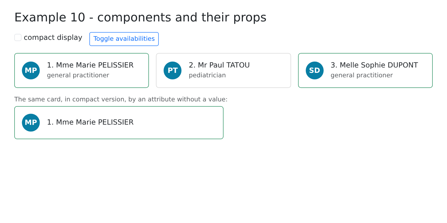
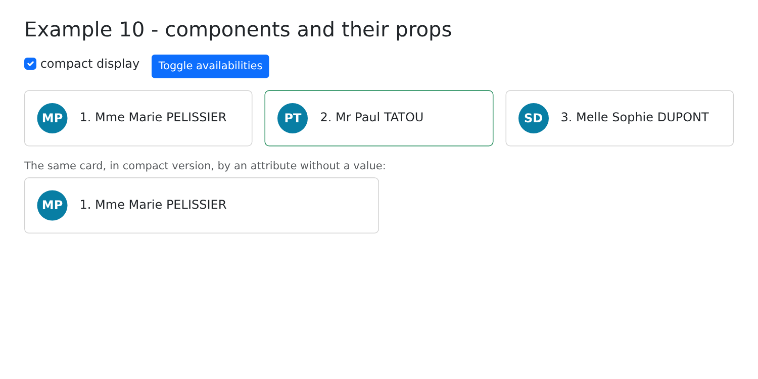
By checking “compact display” and then reversing the availability settings:
3.2. Example 11: The child notifies its parent
Data flows down through the props. To send information back up, the parent passes functions to the child, which the child then calls.
3.2.1. "Events" from the child
| // =========================================================================
// 11-lifting-state-up/src/Counter.tsx
// -------------------------------------------------------------------------
// A child that NOTIFIES its parent: the parent passes it FUNCTIONS
// in its props (by convention, their name starts with "on"), and the child
// calls them when something happens:
// <Counter label="Coffees" max={3} onIncrement={...} onLimit={...} />
// =========================================================================
import { useState } from 'react';
interface Props {
label: string;
max: number;
onIncrement: (value: number) => void; // with the new value
onLimit: () => void; // without data
}
export default function Counter({ label, max, onIncrement, onLimit }: Props) {
// the state OWN to this counter: each <Counter> has its own
const [value, setValue] = useState(0);
function plus() {
if (value >= max) {
onLimit();
return;
}
setValue(value + 1);
// value is not modified yet (it will be on the next call of the
// component): value + 1 is passed
onIncrement(value + 1);
}
return (
<div className="d-flex align-items-center gap-2 mb-2">
<span className="w-25">{label}</span>
<button className="btn btn-sm btn-outline-primary" onClick={plus}>+1</button>
<span className="badge text-bg-secondary">{value} / {max}</span>
</div>
);
}
|
- Lines 12–17: Two props are functions: [onIncrement] receives the new value, while [onLimit] receives nothing. By convention, their names begin with “on,” such as [onClick];
- Line 21: The state OWN to this counter: each [<Counter>] on the page has its own. The state is attached to the component’s position in the page tree;
- lines 23–32: the parent is notified. Note: [setValue(value + 1)] does not change the variable [value] (a constant set for THIS call of the component): it will be [value + 1] at the time of the NEXT call. Therefore, [value + 1] is passed to the parent.
3.2.2. A controlled component
| // =========================================================================
// 11-lifting-state-up/src/TextField.tsx - a CONTROLLED component
// -------------------------------------------------------------------------
// A "home-made" form field (label + field + help + character
// counter) used like a controlled <input> (cf. example 05):
// <TextField value={lastName} onChange={setLastName} label="Last name" max={20} />
// The component has NO state: the value belongs to the parent, which passes
// it (value) and which it notifies of each keystroke (onChange). It is the
// parent that decides on the new value.
// =========================================================================
import { useId } from 'react';
interface Props {
value: string;
onChange: (value: string) => void;
label: string;
max: number;
help?: string;
}
export default function TextField({ value, onChange, label, max, help = '' }: Props) {
// useId: a UNIQUE identifier, different for each <TextField> of the
// page, to link <label htmlFor> and <input id>
const id = useId();
return (
<div className="mb-3">
<label className="form-label" htmlFor={id}>{label}</label>
<input id={id} className={`form-control ${value.length === max ? 'is-invalid' : ''}`} value={value}
maxLength={max} onChange={(e) => onChange(e.target.value)} />
<div className="form-text">{help} ({value.length} / {max})</div>
</div>
);
}
|
A “custom” form field (label, field, tooltip, character counter) that is used as a controlled [<input>] (see Example 05): the parent passes it the value ([value]) and a function called with each keystroke ([onChange]).
- lines 14–20: the props; [help] is optional;
- line 25: [useId()] provides a unique identifier, different for each [<TextField>] on the page, to link [<label htmlFor>] and [<input id>];
- line 31: Each keystroke calls the parent’s function with the new text.
The component has no state: the value belongs to the parent, which determines the new value. This is called “lifting state up”: data shared by multiple components is stored in their closest common ancestor.
3.2.3. The parent
| // =========================================================================
// 11-lifting-state-up/src/App.tsx - the parent listens to its children
// -------------------------------------------------------------------------
// Data flows down (props); information flows up through
// functions passed in the props:
// 1. "events" of the child: onIncrement, onLimit;
// 2. a controlled component: value + onChange, like an <input>. The state
// remains the property of the parent, which can modify it itself (Clear).
// =========================================================================
import { useState } from 'react';
import Counter from './Counter';
import TextField from './TextField';
export default function App() {
const [total, setTotal] = useState(0);
const [message, setMessage] = useState('');
const [firstName, setFirstName] = useState('Marie');
const [lastName, setLastName] = useState('PELISSIER');
// the function called by a counter: it receives the value it passes
function onIncrement(label: string, value: number) {
setTotal((t) => t + 1);
setMessage(`${label} is now ${value}`);
}
function clear() {
setFirstName('');
setLastName('');
}
return (
<div className="container py-4" style={{ maxWidth: 640 }}>
<h1 className="h3 mb-3">Example 11 - the child notifies its parent</h1>
<div className="card p-3 mb-4">
<h2 className="h6">1. Functions called by the children</h2>
<Counter label="Coffees" max={3} onIncrement={(v) => onIncrement('Coffees', v)}
onLimit={() => setMessage('No more than 3 coffees!')} />
<Counter label="Glasses of water" max={8} onIncrement={(v) => onIncrement('Glasses of water', v)}
onLimit={() => setMessage('Enough drinking.')} />
<p className="mb-0">Total of the clicks: {total} - <em>{message}</em></p>
</div>
<div className="card p-3">
<h2 className="h6">2. Controlled components</h2>
{/* onChange={setFirstName}: the function of the state, passed as is */}
<TextField value={firstName} onChange={setFirstName} label="First name" max={20} help="Required" />
<TextField value={lastName} onChange={setLastName} label="Last name" max={20} help="Displayed in upper case" />
<p className="mb-0">Data of the parent: <strong>{firstName} {lastName.toUpperCase()}</strong></p>
<button className="btn btn-sm btn-outline-secondary mt-2 align-self-start" onClick={clear}>Clear (from the parent)</button>
</div>
</div>
);
}
|
- lines 22–25: the function called by a counter; it receives the value the counter passes to it;
- lines 38–39: the parent passes arrow functions, which add the counter’s label;
- line 48: [onChange={setFirstName}]: the state function is passed as-is; the child calls it with the new text;
- line 51: the parent modifies the values itself; the fields follow.
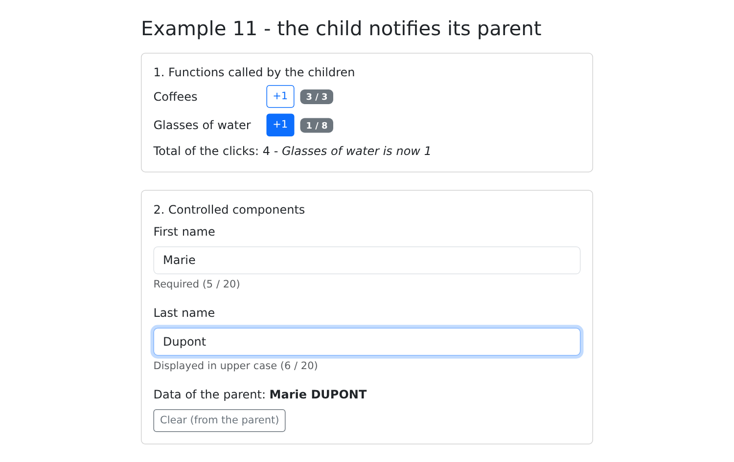
Click twice, then four times on the first “+1,” once on the second, and type “Dupont” in the Last name field:
3.3. Example 12: Composition
Props pass data... but also content: "JSX" is a value just like any other (such as "[ReactNode]"), which can be passed to a component, and the component can place it wherever it wants.
3.3.1. A card
| // =========================================================================
// 12-composition/src/Card.tsx - a reusable TEMPLATE
// -------------------------------------------------------------------------
// Props pass DATA... but also CONTENT: JSX is
// a value like any other (of type ReactNode), which can be passed to a
// component and which it places where it wants:
// - children: the special prop that receives what the parent writes BETWEEN
// <Card> and </Card> - the "main" content;
// - header, footer: other placeholders, provided by the parent in the
// form of props; header has a default content.
// The card sets the frame (border, header, footer), the parent provides what
// is inside. It is the client-side equivalent of the layout.hbs template
// and of its {{{body}}} in the NestJS course.
// =========================================================================
import type { ReactNode } from 'react';
interface Props {
color?: 'primary' | 'success' | 'danger';
header?: ReactNode;
footer?: ReactNode;
children: ReactNode;
}
export default function Card({ color, header = 'Untitled', footer, children }: Props) {
return (
<div className={`card mb-3 ${color ? `border-${color}` : ''}`}>
<div className={`card-header ${color ? `text-bg-${color}` : ''}`}>{header}</div>
<div className="card-body">{children}</div>
{/* no footer provided: no footer at all */}
{footer && <div className="card-footer text-muted small">{footer}</div>}
</div>
);
}
|
- lines 18–23: [header], [footer], and [children] are [ReactNode]: JSX, text, a number, or nothing;
- line 25: default content;
- line 29: [children] is a special property: it receives whatever the parent writes BETWEEN [<Card>] and [</Card>]—the “main” content;
- line 31: no footer provided—no footer at all.
The template defines the framework (border, header, footer); the parent provides the content inside it: this is equivalent to the content projection of [Angular] ([<ng-content>]) and the “slots” of [Vue.js], and, on the server side, the template [layout.hbs] and its [{{{body}}}] within the course [NestJS].
3.3.2. A generic table
| // =========================================================================
// 12-composition/src/DataTable.tsx - a GENERIC table
// -------------------------------------------------------------------------
// DataTable<T> is a generic component: it displays rows of
// any type T. It knows how to go through the rows, but not how to
// display ONE row: it is the parent that tells it, by passing it a
// FUNCTION, renderRow(row, index), which returns the JSX of the cells.
// This is what is called a "render prop": the content provided by the
// parent uses data that belong to the child (the row, its
// rank).
// =========================================================================
import type { ReactNode } from 'react';
interface Props<T> {
rows: T[];
columns: string[];
renderRow: (row: T, index: number) => ReactNode;
empty?: ReactNode; // displayed when there is no row
}
// <T extends { id: number }>: each row must have an id (the key)
export default function DataTable<T extends { id: number }>({ rows, columns, renderRow, empty = 'No data.' }: Props<T>) {
return (
<table className="table table-sm align-middle mb-0">
<thead>
<tr>
{columns.map((c) => <th key={c}>{c}</th>)}
</tr>
</thead>
<tbody>
{rows.length === 0 ? (
<tr>
<td className="text-muted" colSpan={columns.length}>{empty}</td>
</tr>
) : (
rows.map((l, i) => <tr key={l.id}>{renderRow(l, i)}</tr>)
)}
</tbody>
</table>
);
}
|
- lines 15–20: a generic type: the props of an array of lines of type [T], whatever they may be;
- line 18: a prop that is a function returning JSX: the array knows how to iterate over the rows, but not how to display ONE row; the parent tells it how. This process is called a “render prop”;
- line 23: a generic component: [T] is inferred at runtime from the type of the rows. Each row must have a [id], which serves as a key;
- line 37: For each line, the array calls the parent’s function, passing it data that belongs to it (the line, its index).
3.3.3. The parent
| // =========================================================================
// 12-composition/src/App.tsx - using the Card and DataTable templates
// =========================================================================
import { useState } from 'react';
import Card from './Card';
import DataTable from './DataTable';
interface Slot {
id: number;
time: string;
patient: string | null;
}
export default function App() {
const [slots] = useState<Slot[]>([
{ id: 1, time: '8:00 - 8:20', patient: null },
{ id: 2, time: '8:20 - 8:40', patient: 'Mme Alice DURAND' },
{ id: 3, time: '8:40 - 9:00', patient: null },
]);
const free = slots.filter((c) => c.patient === null).length;
return (
<div className="container py-4" style={{ maxWidth: 720 }}>
<h1 className="h3 mb-3">Example 12 - composition</h1>
{/* header and footer: JSX passed in props; between the tags: children */}
<Card color="primary" header={<span>Schedule of Mme PELISSIER</span>} footer={`${free} free slot(s)`}>
{/* DataTable<Slot>: T is deduced from the type of rows */}
<DataTable
rows={slots}
columns={['#', 'Slot', 'Status']}
// the "render prop": how to display ONE row; c receives the row, i its rank
renderRow={(c, i) => (
<>
<td>{i + 1}</td>
<td>{c.time}</td>
<td>
{c.patient ? (
<span className="badge text-bg-secondary">{c.patient}</span>
) : (
<span className="badge text-bg-success">Free</span>
)}
</td>
</>
)}
/>
</Card>
<Card color="success" header="A card without a footer">
<p className="mb-0">The footer is not provided: the card does not display it.</p>
</Card>
{/* no header provided: the default content, "Untitled" */}
<Card>
<DataTable<{ id: number; name: string }>
rows={[]}
columns={['Name']}
renderRow={(p) => <td>{p.name}</td>}
empty={<span>Nobody for now.</span>}
/>
</Card>
</div>
);
}
|
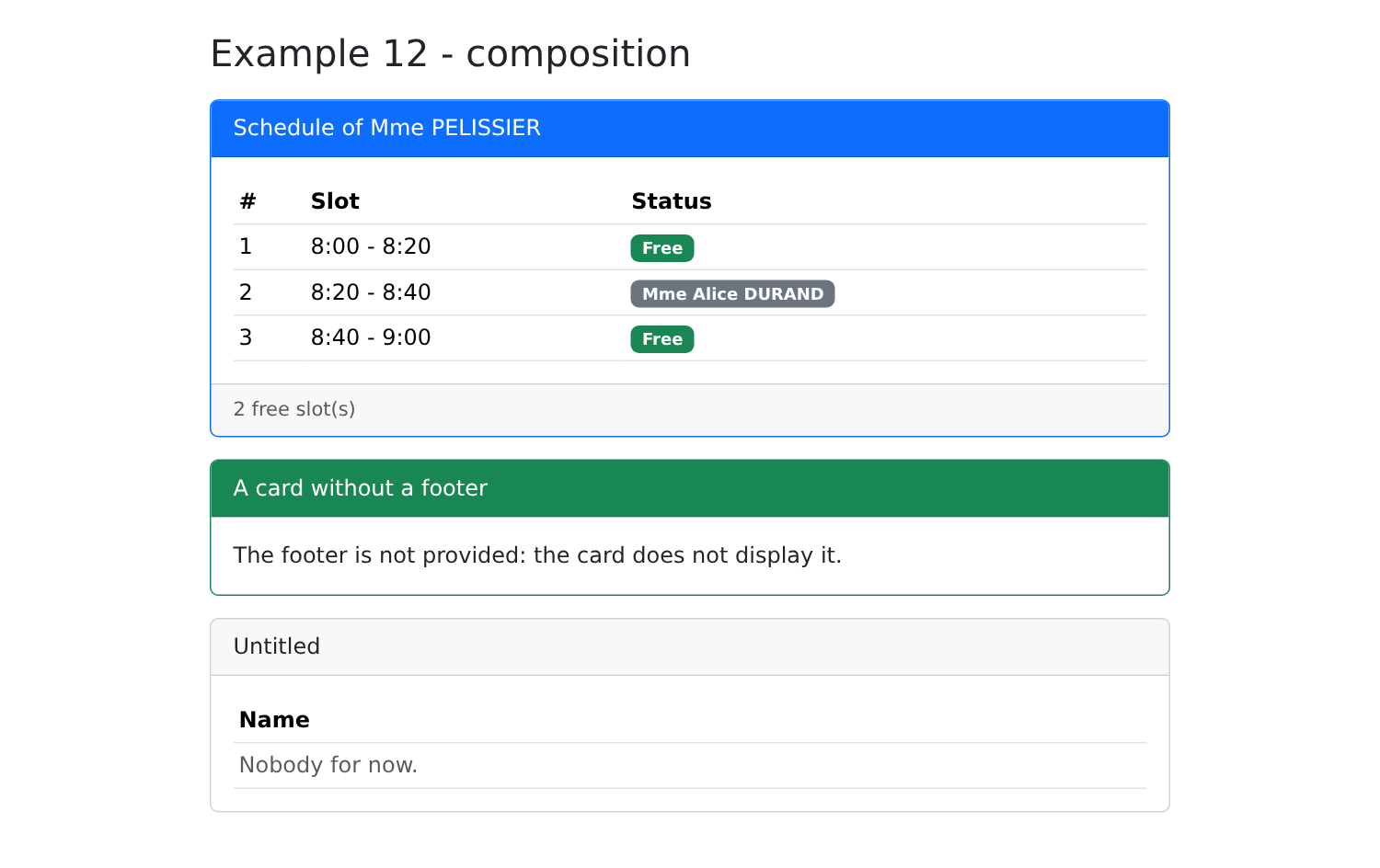
- Line 28: [header] and [footer] receive data from JSX or text; the [<DataTable>] written between the tags becomes the [children] of the card;
- Lines 34–43: the render prop: how to display ONE row; [c] receives the line (of type [Slot], derived from [rows]), with [i] as its rank;
- Line 56: With an empty list, [TypeScript] cannot deduce [T]: it is provided explicitly;
- line 60: the content displayed when there are no rows.
3.4. Example 13: The Lifecycle of a Component
3.4.1. A clock
| // =========================================================================
// 13-lifecycle/src/Clock.tsx - a component that starts and stops
// -------------------------------------------------------------------------
// The life of a component:
// 1. it is DISPLAYED (mounted): React calls the function and places its
// result in the page; then it executes its effects (useEffect);
// 2. it is UPDATED, as many times as needed (its state or its
// props change);
// 3. it is REMOVED from the page (unmounted): React executes the CLEANUP of
// its effects, the function that each effect returned.
// A clock starts a timer (setInterval) when it appears... and
// must absolutely stop it when it disappears: otherwise the timer
// would keep running for nothing (memory leak).
// =========================================================================
import { useEffect, useEffectEvent, useState } from 'react';
interface Props {
onLog: (message: string) => void;
}
export default function Clock({ onLog }: Props) {
const [time, setTime] = useState(() => new Date().toLocaleTimeString());
// useEffectEvent: a function called BY an effect, which always reads
// the most recent props, without being a dependency of the effect. Without
// it, onLog would have to be put in the dependencies [...] below,
// and, the parent passing a NEW function on each display, the
// timer would be stopped and restarted every second
const log = useEffectEvent((message: string) => onLog(message));
// []: no dependency. The effect runs ONCE, after the first
// display; the function it returns, ONCE, when the component is removed
useEffect(() => {
log('Clock: effect - starting the timer');
const timer = setInterval(() => setTime(new Date().toLocaleTimeString()), 1000);
// the CLEANUP
return () => {
clearInterval(timer);
log('Clock: cleanup - timer stopped');
};
}, []);
return <div className="display-6 font-monospace">{time}</div>;
}
|
The life cycle of a component (lines 4–10): it is mounted (displayed for the first time), updated as many times as necessary, and then unmounted (removed from the page). [React] does not have separate methods for each step: everything goes through [useEffect].
- Lines 34–42: [useEffect(effect, [])]: With an EMPTY dependency array, the effect is executed only once, after the first display. The function it returns (lines 38–41) handles cleanup: [React] executes it when the component is removed from the page (and before each new execution of the effect, when its dependencies change). A clock starts a timer ([setInterval]) on startup... and must stop it ([clearInterval]) when it disappears: otherwise, the timer would continue to run for no reason and attempt to modify the state of a component that no longer exists;
- Line 30: The effect calls the parent's [onLog] function. Strictly speaking, it should include it in its dependencies: since the effect uses a prop, it must be re-triggered if the prop changes. However, the parent creates a NEW function each time it is displayed: the timer would be stopped and restarted continuously. [useEffectEvent] ([React] 19.2) creates a function that always calls the most recent version of [onLog], without being a dependency of the effect. It is only called from within an effect.
3.4.2. The parent
| // =========================================================================
// 13-lifecycle/src/App.tsx
// -------------------------------------------------------------------------
// - {withClock && <Clock />}: checking / unchecking the box displays /
// removes the component (effect, then cleanup, cf. Clock.tsx);
// - useRef: a reference to the <input> element, null as long as it is not
// displayed; an effect gives it the focus as soon as it appears;
// - an effect that SYNCHRONIZES the title of the tab with the input.
//
// In development, StrictMode (cf. main.tsx) mounts each component,
// unmounts it, then remounts it at once: the log therefore shows start,
// stop, start. It is intentional: an effect whose cleanup is badly written
// (a timer never stopped) gives itself away immediately. In production, the
// component is only mounted once.
// =========================================================================
import { useEffect, useRef, useState } from 'react';
import Clock from './Clock';
export default function App() {
const [withClock, setWithClock] = useState(true);
const [log, setLog] = useState<string[]>([]);
const [search, setSearch] = useState('');
const [showSearch, setShowSearch] = useState(false);
const field = useRef<HTMLInputElement>(null);
function trace(message: string) {
setLog((j) => [...j, `${new Date().toLocaleTimeString()} ${message}`]);
}
// after the first display of App (twice in development: StrictMode)
useEffect(() => {
trace('App: effect of the first display');
}, []);
// the field has just appeared: it is given the focus
useEffect(() => {
if (showSearch) {
field.current?.focus();
}
}, [showSearch]);
// the title of the tab follows the input, from the start
useEffect(() => {
document.title = search ? `Search: ${search}` : 'Example 13';
}, [search]);
return (
<div className="container py-4" style={{ maxWidth: 720 }}>
<h1 className="h3 mb-3">Example 13 - the lifecycle of a component</h1>
<div className="card p-3 mb-3">
<label className="form-check-label mb-2">
<input type="checkbox" className="form-check-input" checked={withClock}
onChange={(e) => setWithClock(e.target.checked)} /> show the clock
</label>
{withClock && <Clock onLog={trace} />}
</div>
<div className="card p-3 mb-3">
{!showSearch ? (
<button className="btn btn-outline-primary align-self-start" onClick={() => setShowSearch(true)}>Search...</button>
) : (
<input ref={field} className="form-control" placeholder="the title of the tab follows the input" value={search}
onChange={(e) => setSearch(e.target.value)} />
)}
</div>
<h2 className="h6">Log</h2>
<ol className="small">
{log.map((line, i) => <li key={i}>{line}</li>)}
</ol>
</div>
);
}
|
- line 25: a reference to the search field, [null], as long as it is not displayed;
- lines 32–34: the effect for the first display of [App];
- lines 37–41: when the field appears, it is given focus: the effect executes AFTER the display, when the element exists and the reference points to it;
- lines 44–46: an effect that synchronizes the tab title with the state;
- line 57: checking/unchecking the box shows/hides the clock.
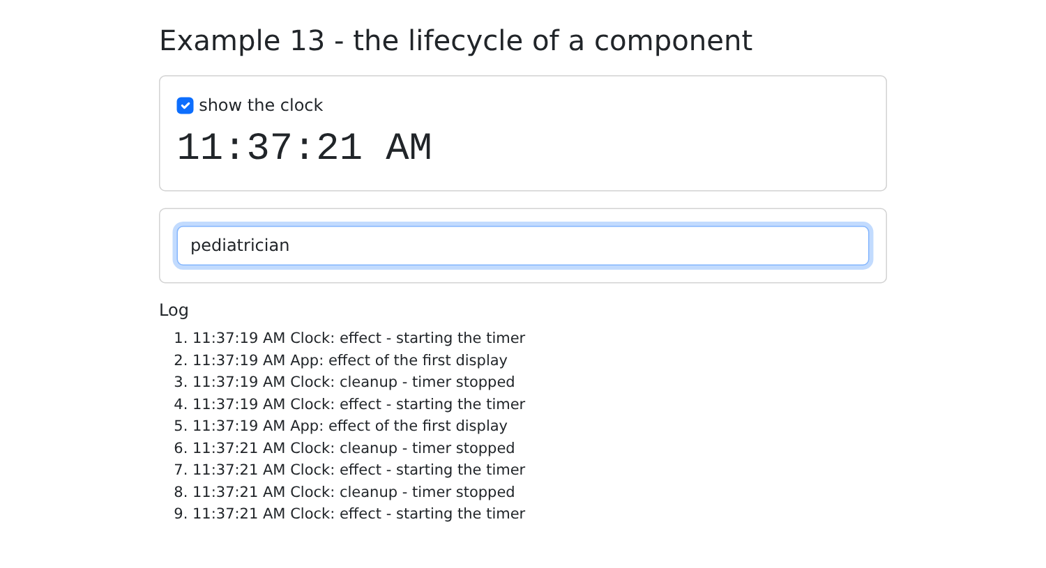
Upon startup, the log is surprising: the clock starts, stops, and restarts, and the effect [App] is executed twice. This is [<StrictMode>] (see [main.tsx]): in development only, [React] mounts each component, unmounts it, and then remounts it immediately to verify that its effects can clean up after themselves. A poorly written effect (such as a timer that never stops) is thus immediately revealed: the clock would advance by two seconds at a time. In production, the component is mounted only once. We also note that the effects of the children (the clock) run BEFORE those of the parent.
Then uncheck and recheck the box, and type “pediatrician” into the search field:
Effects are the most delicate part of [React]. A rule guides their use: an effect synchronizes the component with something outside of [React] (the tab title, a timer, a document event listener, a server). To calculate a value from another, use a variable (Example 02), not an effect. To respond to a user action, use an event handler, not an effect.
3.5. Example 14: Contexts
How can you share data and functions between distant components without passing them from props to props through all the intermediaries? With a context. This is how [React] shares what [Angular] stores in its services, which are provided via dependency injection.
3.5.1. A context for the entire application
| // =========================================================================
// 14-contexts/src/contexts/log.tsx - a context for the WHOLE application
// -------------------------------------------------------------------------
// How to share data and functions between distant components,
// without passing them from props to props through all the
// intermediaries? With a CONTEXT:
// 1. createContext(defaultValue) creates the context;
// 2. a PROVIDER component, <LogContext value={...}>, gives its
// value to ALL its descendants, at any depth;
// 3. a descendant READS it with use(LogContext) (or useContext).
// When the provided value changes, all the components that read it are
// called again.
//
// The custom: one file per context, which exports the provider (a
// component that holds the state) and a HOOK to read it (useLog).
// This is how React shares what Angular stores in its services.
// =========================================================================
import { createContext, use, useCallback, useMemo, useState, type ReactNode } from 'react';
interface Log {
lines: string[];
trace: (message: string) => void;
}
// null: the value read if NO provider wraps the component
const LogContext = createContext<Log | null>(null);
// the provider: it holds the state, and provides it to its descendants
export function LogProvider({ children }: { children: ReactNode }) {
const [lines, setLines] = useState<string[]>([]);
// useCallback: the SAME function from one display to the next (and not a
// new one each time), so that the components that receive it
// do not seem to have changed
const trace = useCallback((message: string) => {
setLines((l) => [`${new Date().toLocaleTimeString()} ${message}`, ...l].slice(0, 6));
}, []);
// useMemo: a new object only if lines has changed
const value = useMemo(() => ({ lines, trace }), [lines, trace]);
// React 19: the context itself is the provider component
return <LogContext value={value}>{children}</LogContext>;
}
// the reading hook: a name that starts with "use"
export function useLog(): Log {
// use(context): the value provided by the CLOSEST provider
const log = use(LogContext);
if (log === null) {
throw new Error('useLog must be used inside a <LogProvider>');
}
return log;
}
|
- lines 21–24: what the context provides: data and a function;
- line 27: [createContext(defaultValue)] creates the context. [null]: the value read by a component that is not encompassed by any provider;
- lines 30–45: the provider: a component that contains the state and passes it to all its descendants, at any depth:
- line 36: [useCallback(fn, [dependencies])] passes the SAME function from one view to the next (as long as the dependencies do not change), rather than creating a new one. Here, there are no dependencies: [setLines] never changes;
- line 41: the supplied object is only recreated if [lines] has changed. Without these precautions, the provider would supply a new object on every display, and all components that read the context would be called unnecessarily;
- line 44: starting with [React] 19, the context itself is the provider component (previously, we wrote [<LogContext.Provider>]);
- Lines 48–55: a read hook. [use(context)] ([React] 19; previously [useContext]) returns the value from the nearest provider. The hook checks to make sure there is one: a clear error is better than an unexpected [null].
3.5.2. A context provided by a component
| // =========================================================================
// 14-contexts/src/contexts/cart.tsx - a context provided by ONE component
// -------------------------------------------------------------------------
// The cart is only provided to a part of the tree of components: those
// wrapped by <CartProvider> (cf. App.tsx). Two providers placed at
// two places of the page would give two independent carts.
// A provider can itself read other contexts: the cart
// uses the log.
// =========================================================================
import { createContext, use, useMemo, useState, type ReactNode } from 'react';
import { useLog } from './log';
export interface Item {
label: string;
price: number;
}
interface Cart {
items: Item[];
total: number;
add: (item: Item) => void;
remove: (index: number) => void;
}
const CartContext = createContext<Cart | null>(null);
export function CartProvider({ children }: { children: ReactNode }) {
const { trace } = useLog();
const [items, setItems] = useState<Item[]>([]);
const value = useMemo<Cart>(
() => ({
items,
total: items.reduce((sum, a) => sum + a.price, 0),
add: (item) => {
setItems((a) => [...a, item]);
trace(`cart: + ${item.label}`);
},
remove: (index) => {
trace(`cart: - ${items[index].label}`);
setItems((a) => a.filter((_, i) => i !== index));
},
}),
[items, trace],
);
return <CartContext value={value}>{children}</CartContext>;
}
export function useCart(): Cart {
const cart = use(CartContext);
if (cart === null) {
throw new Error('useCart must be used inside a <CartProvider>');
}
return cart;
}
|
The shopping cart is provided only to a portion of the component tree: those encompassed by [<CartProvider>]. Two providers placed in different locations on the page would result in two independent shopping carts.
- Line 29: A provider is a component; it can itself read other contexts; the shopping cart uses the log;
- Lines 32–46: the data ([items], [total]) and the actions ([add], [remove]), which are recalculated when the items change.
3.5.3. A configured context
| // =========================================================================
// 14-contexts/src/contexts/clock.tsx - a PARAMETERIZED context
// -------------------------------------------------------------------------
// A clock, whose refresh period is a prop of the
// provider: <ClockProvider period={5000}>. Two nested
// providers: a component reads the one that is CLOSEST to it.
// The clock stops when its provider disappears (cleanup of the effect).
// =========================================================================
import { createContext, use, useEffect, useState, type ReactNode } from 'react';
// the default value: a frozen date, read by a component without a provider
const ClockContext = createContext<Date>(new Date());
export function ClockProvider({ period = 1000, children }: { period?: number; children: ReactNode }) {
const [now, setNow] = useState(() => new Date());
// [period]: if the parent changes the period, the timer is restarted
useEffect(() => {
const timer = setInterval(() => setNow(new Date()), period);
return () => clearInterval(timer);
}, [period]);
return <ClockContext value={now}>{children}</ClockContext>;
}
export function useClock(): Date {
return use(ClockContext);
}
|
- line 13: here, a true default value: a fixed date;
- line 15: the refresh period is a prop of the provider;
- lines 19–22: the timer; if the parent changes the period, the effect is cleared and then restarted.
3.5.4. The components
| // 14-contexts/src/Catalog.tsx - a descendant that ADDS to the cart
import { useCart, type Item } from './contexts/cart';
const CATALOG: Item[] = [
{ label: 'Consultation', price: 30 },
{ label: 'Vaccine', price: 12.5 },
{ label: 'Certificate', price: 5 },
];
export default function Catalog() {
// the cart provided by App (error if nobody provides it)
const cart = useCart();
return (
<ul className="list-group">
{CATALOG.map((a) => (
<li key={a.label} className="list-group-item d-flex justify-content-between align-items-center">
{a.label} (€{a.price})
<button className="btn btn-sm btn-outline-primary" onClick={() => cart.add(a)}>Add</button>
</li>
))}
</ul>
);
}
|
[useCart()]: the shopping cart provided by a parent (error if no parent provides it).
| // =========================================================================
// 14-contexts/src/CartSummary.tsx
// -------------------------------------------------------------------------
// Another descendant: the SAME cart as Catalog (provided by App), but
// ITS OWN clock, refreshed every 5 seconds. A component only reads
// the providers placed ABOVE it: CartSummary therefore places
// a second <ClockProvider> around its content, which it entrusts to a
// small component, Content.
// =========================================================================
import { ClockProvider, useClock } from './contexts/clock';
import { useCart } from './contexts/cart';
function Content() {
const cart = useCart();
const now = useClock(); // the closest clock: the 5 s one
return (
<div className="card p-3">
<h2 className="h6">
Cart ({cart.items.length} item(s)) - {now.toLocaleTimeString()}
</h2>
<ul className="mb-2">
{cart.items.map((a, i) => (
<li key={i}>
{a.label}{' '}
<button className="btn btn-link btn-sm p-0 align-baseline" onClick={() => cart.remove(i)}>remove</button>
</li>
))}
</ul>
<strong>Total: €{cart.total}</strong>
</div>
);
}
export default function CartSummary() {
return (
<ClockProvider period={5000}>
<Content />
</ClockProvider>
);
}
|
- lines 14–34: The summary content reads the shopping cart AND the clock. The closest clock is the 5-second one;
- lines 36–42: a component reads only the providers placed ABOVE it: [CartSummary] therefore places its own [<ClockProvider period={5000}>] around a subcomponent, [Content].
| // =========================================================================
// 14-contexts/src/App.tsx - three levels of contexts
// -------------------------------------------------------------------------
// - the log: provided at the very top (main.tsx), to the whole application;
// - the cart, provided by App: shared by Catalog and CartSummary,
// which see the SAME cart;
// - the clock, provided by App (default period, 1 s) AND by
// CartSummary (5 s): each one its own.
// =========================================================================
import Catalog from './Catalog';
import CartSummary from './CartSummary';
import { useLog } from './contexts/log';
import { ClockProvider, useClock } from './contexts/clock';
import { CartProvider } from './contexts/cart';
// the time of App's clock: a small component, placed UNDER the provider
function AppTime() {
return <p className="text-muted">Clock of App: {useClock().toLocaleTimeString()}</p>;
}
export default function App() {
const log = useLog();
return (
<ClockProvider>
<CartProvider>
<div className="container py-4" style={{ maxWidth: 720 }}>
<h1 className="h3 mb-3">Example 14 - contexts</h1>
<AppTime />
<div className="row g-3">
<div className="col-md-6"><Catalog /></div>
<div className="col-md-6"><CartSummary /></div>
</div>
<h2 className="h6 mt-3">Log (root context)</h2>
<ul className="small">
{log.lines.map((line, i) => <li key={i}>{line}</li>)}
</ul>
</div>
</CartProvider>
</ClockProvider>
);
}
|
- lines 18–20: [App] provides the clock; to read it, a component placed UNDER it is required: [AppTime];
- line 23: [App] reads the log, provided above;
- Lines 26–27: [App] provides the clock (1 s) and the basket to its descendants.
And the provider of the log, placed at the very top:
| // =========================================================================
// 14-contexts/src/main.tsx - the provider of the log wraps App: it
// is therefore available in the WHOLE application
// =========================================================================
import { StrictMode } from 'react';
import { createRoot } from 'react-dom/client';
import 'bootstrap/dist/css/bootstrap.min.css';
import App from './App';
import { LogProvider } from './contexts/log';
createRoot(document.getElementById('root')!).render(
<StrictMode>
<LogProvider>
<App />
</LogProvider>
</StrictMode>,
);
|
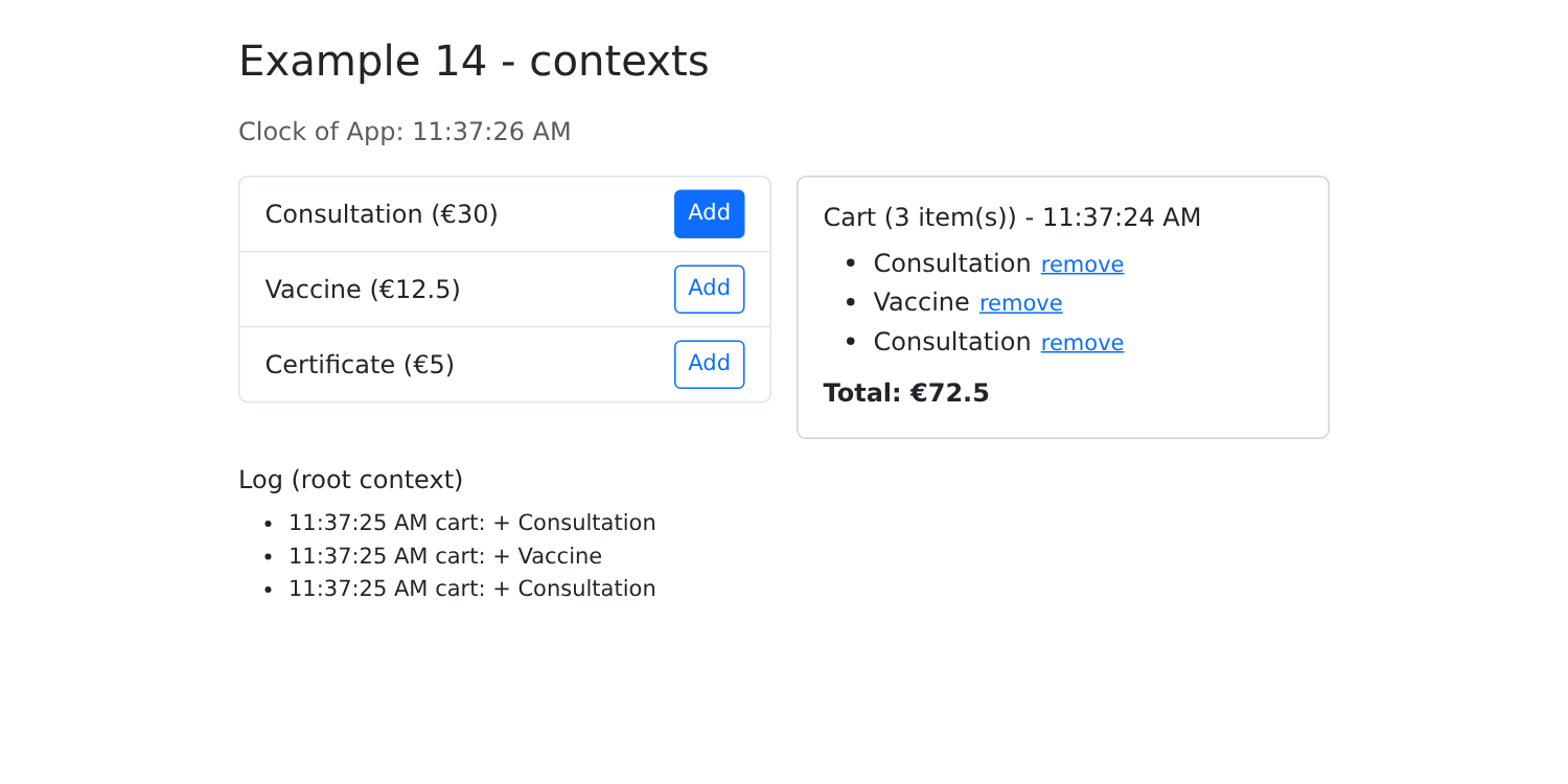
The clock for [App] advances every second, while the shopping cart’s clock advances every five seconds. Both components see the same shopping cart, and the log records every addition.
A context is sufficient for data that rarely changes (the logged-in user, the language, a theme) or that applies only to part of the page. When a state is shared across the entire application and changes frequently, a “store” is preferred (Example 20).
3.6. Example 15: Writing Your Own Hooks
A component reuses the view; a custom hook reuses a behavior, along with its state. It is a function whose name begins with [use], and which itself calls hooks. This example writes two of them, for the two behaviors that Example 15 of the [Angular] course assigned to directives.
3.6.1. Highlight an element on hover
| // =========================================================================
// 15-custom-hooks/src/hooks/useHover.ts
// -------------------------------------------------------------------------
// A CUSTOM HOOK is a function whose name starts with "use", and
// which itself calls hooks (useState, useEffect, useRef...). It
// allows reusing a BEHAVIOUR (with its state) in several
// components, as a component reuses display.
//
// This one highlights a hovered element. It returns the attributes to put
// on the element: <li {...useHover('#d1e7dd')}>. Each call has its
// own state: two highlighted elements do not interfere.
// =========================================================================
import { useState } from 'react';
export function useHover(color = '#fff3cd') {
const [hovered, setHovered] = useState(false);
return {
style: { backgroundColor: hovered ? color : undefined, transition: 'background-color 0.2s' },
onMouseEnter: () => setHovered(true),
onMouseLeave: () => setHovered(false),
};
}
|
The hook has its own state ([hovered]) and returns the attributes to be applied to the element: a style and two event handlers. Each component that calls it has its own state: two highlighted elements do not interfere with each other.
3.6.2. Long click
| // =========================================================================
// 15-custom-hooks/src/hooks/useLongPress.ts
// -------------------------------------------------------------------------
// const longPress = useLongPress(() => remove(m), 1000);
// <button {...longPress.handlers} className={longPress.pressing ? 'press' : ''}>
// The action is only executed if the button is held down for one
// second: a protection against unfortunate clicks. pressing tells whether a
// press is in progress (to display it).
// The timer is stopped if the component disappears during a press.
// =========================================================================
import { useEffect, useRef, useState } from 'react';
export function useLongPress(action: () => void, duration = 1000) {
const [pressing, setPressing] = useState(false);
// a value that survives the displays WITHOUT causing any: useRef
const timer = useRef<number | undefined>(undefined);
// when the component is removed: no orphan timer
useEffect(() => () => clearTimeout(timer.current), []);
function start() {
setPressing(true);
timer.current = window.setTimeout(() => {
setPressing(false);
action();
}, duration);
}
function stop() {
clearTimeout(timer.current);
setPressing(false);
}
return {
pressing,
handlers: { onPointerDown: start, onPointerUp: stop, onPointerLeave: stop },
};
}
|
- line 17: the timer’s identifier—a value that must persist across views but isn’t displayed—a reference;
- line 20: an effect with no action, which simply cleans up: if the component disappears while the button is held down, the timer is stopped;
- lines 22–28: the action is executed only if the button is held down for one second: a safeguard against accidental clicks;
- lines 35–38: the hook returns the state ([pressing], to display it) and the pointer event handlers (mouse, finger, or stylus).
3.6.3. Give focus
| // =========================================================================
// 15-custom-hooks/src/hooks/autofocus.ts - a "ref callback"
// -------------------------------------------------------------------------
// ref={function}: React calls the function with the HTML element as soon as it
// is placed in the page (and, in React 19, calls the function that it
// may return when it is removed from it). It is not a hook:
// a simple function, reusable everywhere:
// <input ref={autofocus} />
// (React also handles the autoFocus attribute, which does the same thing.)
// =========================================================================
export function autofocus(element: HTMLElement | null): void {
element?.focus();
}
|
A ref callback: you can assign a function to the [ref] attribute, which [React] calls with the HTML element as soon as it is placed on the page. This is not a hook, but a simple function.
3.6.4. Usage
| // =========================================================================
// 15-custom-hooks/src/App.tsx - reusing behaviours
// -------------------------------------------------------------------------
// Hooks are only called at the TOP LEVEL of a component (never in
// a loop, a condition or a nested function): React
// recognizes them by their ORDER of call. For a behaviour per row of a
// list, we therefore write a small component per row, which calls its hooks.
// =========================================================================
import { useState } from 'react';
import { useHover } from './hooks/useHover';
import { useLongPress } from './hooks/useLongPress';
import { autofocus } from './hooks/autofocus';
// the style of the button during a long press
const pressStyle = { outline: '4px solid #dc3545' };
// a row of the list: it calls ITS hooks
function DoctorRow({ name, even, onRemove }: { name: string; even: boolean; onRemove: () => void }) {
// one row out of two: the default color; the others, green
const hover = useHover(even ? undefined : '#d1e7dd');
const longPress = useLongPress(onRemove, 1000);
return (
<li className="list-group-item d-flex justify-content-between align-items-center" {...hover}>
{name}
<button className="btn btn-sm btn-outline-danger" style={longPress.pressing ? pressStyle : undefined}
{...longPress.handlers}>
Delete (long press)
</button>
</li>
);
}
export default function App() {
const [doctors, setDoctors] = useState(['Mme Marie PELISSIER', 'Mr Paul TATOU', 'Melle Sophie DUPONT']);
const [message, setMessage] = useState('');
function remove(name: string) {
setDoctors((m) => m.filter((x) => x !== name));
setMessage(`${name} has been deleted.`);
}
return (
<div className="container py-4" style={{ maxWidth: 640 }}>
<h1 className="h3 mb-3">Example 15 - writing your own hooks</h1>
<input ref={autofocus} className="form-control mb-3" placeholder="this field received the focus on its own" />
<p className="small text-muted">Hover over the rows; hold a button down for one second to delete.</p>
<ul className="list-group mb-3">
{doctors.map((m, i) => (
<DoctorRow key={m} name={m} even={i % 2 === 0} onRemove={() => remove(m)} />
))}
</ul>
{message && <p className="alert alert-info">{message}</p>}
</div>
);
}
|
Hooks follow a strict rule: they are called only at the top level of a component or another hook, never within a loop, a condition, or a nested function. [React] identifies each [useState] by its call order: if the order changed from one display to another, the states would become mixed up.
- Lines 19–33: For line-by-line behavior in a list, you cannot call the hooks directly in [map]; instead, write a small component for each line that calls ITS hooks;
- Line 25: The tooltip attributes, spread across the line;
- line 28: the long-press handlers for the button and its style while pressed;
- line 47: the callback reference;
- Line 52: one line per doctor.
Upon startup, the field has focus. While holding down the second button:
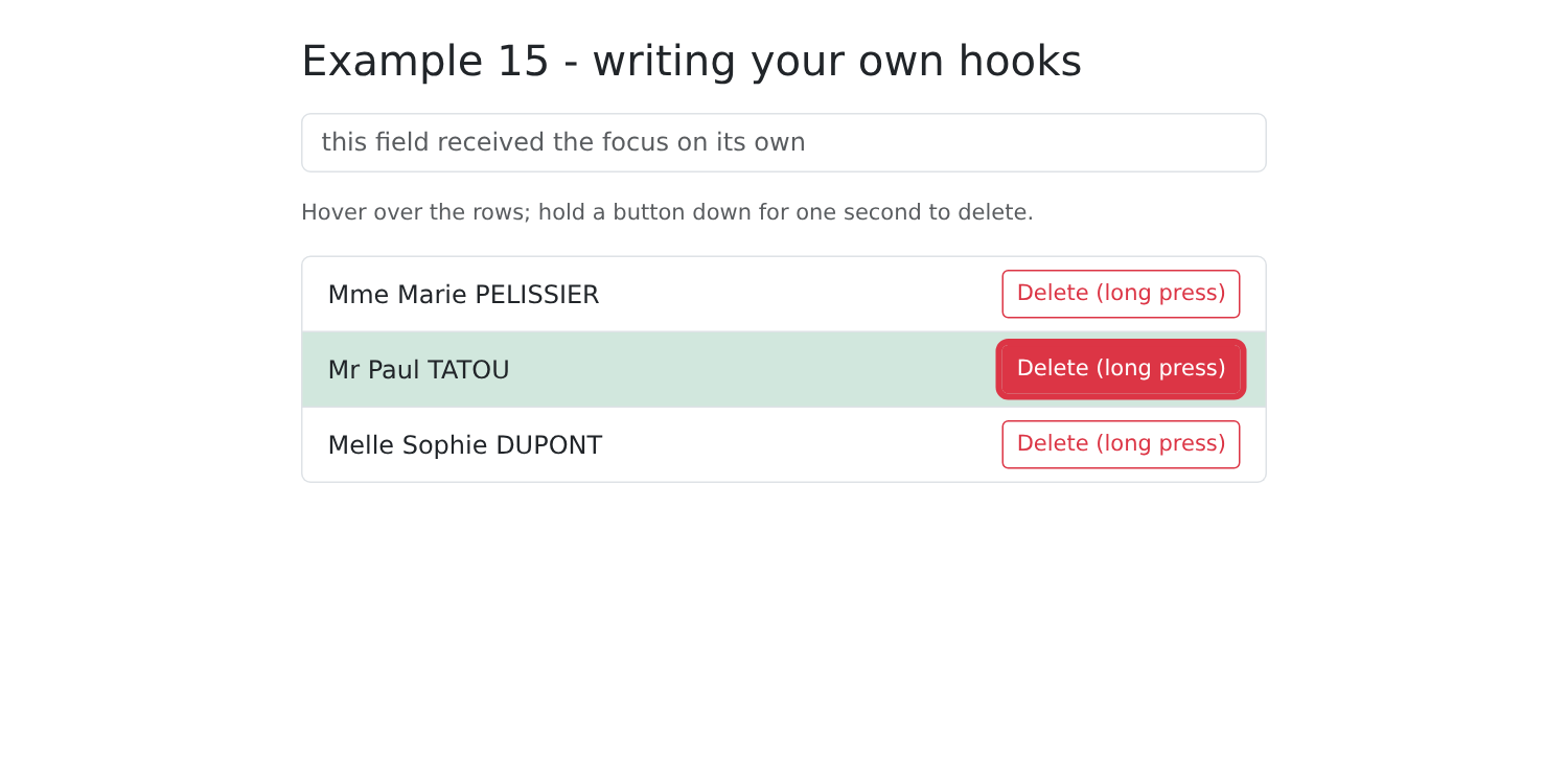
Then, once a second has elapsed:
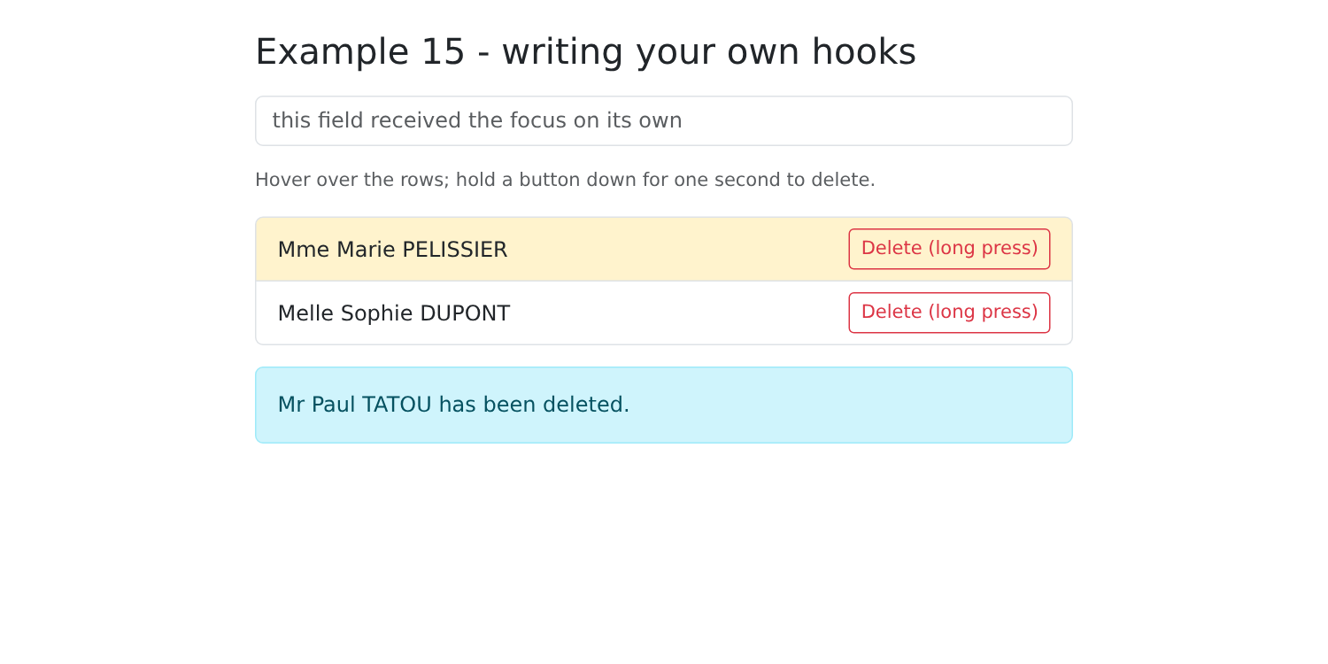
Custom hooks are the primary way to reuse code in [React]. The libraries provide many of them: [useForm] (example 08), [useNavigate] (example 17), [useTranslation] (example 21), [useQuery] (example 24)...
3.7. Example 16: A reusable confirmation window
“Are you sure?”: [window.confirm()] exists, but its buttons cannot be formatted or translated. It is replaced by a [Bootstrap] window, controlled by a context.
3.7.1. The context
| // =========================================================================
// 16-confirmation/src/confirmation/confirmation.tsx
// -------------------------------------------------------------------------
// "Are you sure?": window.confirm() exists, but it can neither be
// styled, nor can its buttons be translated. It is replaced by a Bootstrap
// dialog, driven by a context (cf. example 14).
//
// The trick: confirm(message) returns a PROMISE, resolved to true (Yes)
// or false (No) when the user answers. The calling code is then written
// as simply as with window.confirm:
//
// const confirm = useConfirmation();
// if (await confirm('Delete this doctor?')) { ... }
//
// The provider displays the dialog itself: it only has to be placed
// once, around the whole application (cf. main.tsx).
// =========================================================================
import { createContext, use, useCallback, useRef, useState, type ReactNode } from 'react';
import ConfirmDialog from './ConfirmDialog';
type Confirm = (message: string) => Promise<boolean>;
const ConfirmationContext = createContext<Confirm | null>(null);
export function ConfirmationProvider({ children }: { children: ReactNode }) {
const [message, setMessage] = useState<string | null>(null); // null: dialog closed
// the function that will resolve the current promise: it is not displayed,
// it is therefore a reference and not a state
const answer = useRef<((yes: boolean) => void) | null>(null);
const confirm = useCallback<Confirm>((text) => {
answer.current?.(false); // a question still open? it means "no"
setMessage(text);
return new Promise<boolean>((resolve) => {
answer.current = resolve;
});
}, []);
function respond(yes: boolean) {
setMessage(null);
const r = answer.current;
answer.current = null;
r?.(yes);
}
return (
<ConfirmationContext value={confirm}>
{children}
{message !== null && <ConfirmDialog message={message} onAnswer={respond} />}
</ConfirmationContext>
);
}
export function useConfirmation(): Confirm {
const confirm = use(ConfirmationContext);
if (confirm === null) {
throw new Error('useConfirmation must be used inside a <ConfirmationProvider>');
}
return confirm;
}
|
Tip: [confirm(message)] returns a promise, which resolves to [true] (Yes) or [false] (No) when the user responds. The calling code is then just as simple as with [window.confirm]: [if (await confirm('Delete this doctor?')) {...}].
- Line 22: what the context provides: a function;
- line 27: the message displayed; [null]: the window is closed;
- line 30: the function that will resolve the current promise. It is not displayed: it is a reference, not a state;
- Lines 32–38: Open the window and return a promise whose function is retained as [resolve]. An unanswered question is treated as “no”;
- lines 40–45: the response: close the window and resolve the promise;
- line 50: the provider displays the window itself when there is a question.
3.7.2. The window
| // =========================================================================
// 16-confirmation/src/confirmation/ConfirmDialog.tsx
// -------------------------------------------------------------------------
// The modal dialog:
// - same Bootstrap classes as a real modal (.modal, .modal-backdrop),
// displayed "hard-coded" (show d-block): no need for Bootstrap's
// JavaScript;
// - createPortal: the dialog is placed at the end of <body>, and not where
// the component is written. It thus escapes the styles of its
// ancestors (overflow, z-index...), while remaining an ordinary React
// component (props, events);
// - keyboard: Escape = No; the focus is placed on the "No" button (the
// least dangerous choice) on opening.
// =========================================================================
import { useEffect } from 'react';
import { createPortal } from 'react-dom';
interface Props {
message: string;
onAnswer: (yes: boolean) => void;
}
export default function ConfirmDialog({ message, onAnswer }: Props) {
// Escape, anywhere in the page: a listener put on the DOCUMENT
// on opening, removed on closing (cleanup of the effect)
useEffect(() => {
const onKeydown = (e: KeyboardEvent) => {
if (e.key === 'Escape') onAnswer(false);
};
document.addEventListener('keydown', onKeydown);
return () => document.removeEventListener('keydown', onKeydown);
}, [onAnswer]);
return createPortal(
<>
<div className="modal-backdrop fade show"></div>
{/* a click on the background (and not in the dialog) means "no" */}
<div className="modal fade show d-block" tabIndex={-1} role="alertdialog" aria-modal="true"
onClick={(e) => e.target === e.currentTarget && onAnswer(false)}>
<div className="modal-dialog modal-dialog-centered">
<div className="modal-content">
<div className="modal-header">
<h5 className="modal-title">Confirmation</h5>
<button type="button" className="btn-close" aria-label="Close" onClick={() => onAnswer(false)}></button>
</div>
<div className="modal-body">
<p className="mb-0">{message}</p>
</div>
<div className="modal-footer">
{/* autoFocus: React gives the focus to this button when it appears */}
<button type="button" className="btn btn-secondary" autoFocus onClick={() => onAnswer(false)}>No, go back</button>
<button type="button" className="btn btn-danger" onClick={() => onAnswer(true)}>Yes, confirm</button>
</div>
</div>
</div>
</div>
</>,
document.body,
);
}
|
- lines 27–33: the Esc key, anywhere on the page: a listener attached to DOCUMENT when the window opens, and removed when it closes (cleanup). This is typically the job of an effect: connecting to something external to [React];
- line 35: [createPortal(jsx, element)] displays JSX somewhere other than where the component is written: here, at the end of [<body>]. The window thus bypasses the styles of its ancestors ([overflow], [z-index]...), while remaining an ordinary [React] component (props, events);
- lines 37–39: the [Bootstrap] classes of a true modal window, hard-coded ([show d-block]): no need for the [JavaScript] from [Bootstrap];
- line 40: a click on the background (not inside the window) counts as “No”;
- line 52: [React] gives focus to the “No” button—the safest choice—when it appears.
3.7.3. Usage
| // =========================================================================
// 16-confirmation/src/App.tsx - using the confirmation dialog
// -------------------------------------------------------------------------
// Same page as example 21 of the NestJS course (links, buttons, confirmation),
// but without any round trip to a server.
// =========================================================================
import { useState } from 'react';
import { useConfirmation } from './confirmation/confirmation';
interface Contact {
id: number;
name: string;
}
export default function App() {
const confirm = useConfirmation();
const [contacts, setContacts] = useState<Contact[]>([
{ id: 1, name: 'Jean MARTIN' },
{ id: 2, name: 'Alice DURAND' },
{ id: 3, name: 'Luc GERMAN' },
]);
const [message, setMessage] = useState('');
// an async function: it "waits" for the user's answer
async function remove(c: Contact) {
if (!(await confirm(`Delete the contact ${c.name}?`))) {
setMessage('Deletion cancelled.');
return;
}
setContacts((list) => list.filter((x) => x.id !== c.id));
setMessage(`${c.name} has been deleted.`);
}
async function removeAll() {
if (await confirm(`Delete the ${contacts.length} contacts?`)) {
setContacts([]);
setMessage('All the contacts have been deleted.');
}
}
return (
<div className="container py-4" style={{ maxWidth: 640 }}>
<h1 className="h3 mb-3">Example 16 - a confirmation dialog</h1>
<ul className="list-group mb-3">
{contacts.map((c) => (
<li key={c.id} className="list-group-item d-flex justify-content-between align-items-center">
{c.name}
<button className="btn btn-sm btn-outline-danger" onClick={() => remove(c)}>Delete</button>
</li>
))}
{contacts.length === 0 && <li className="list-group-item text-muted">No contacts.</li>}
</ul>
<button className="btn btn-danger" disabled={contacts.length === 0} onClick={removeAll}>Delete all</button>
{message && <p className="alert alert-info mt-3">{message}</p>}
</div>
);
}
|
- line 17: the confirmation function;
- lines 26–33: a function [async]: it “waits” ([await]) for the user’s response without blocking the page.
| import { StrictMode } from 'react';
import { createRoot } from 'react-dom/client';
import 'bootstrap/dist/css/bootstrap.min.css';
import App from './App';
import { ConfirmationProvider } from './confirmation/confirmation';
// the confirmation dialog, ONCE for the whole application
createRoot(document.getElementById('root')!).render(
<StrictMode>
<ConfirmationProvider>
<App />
</ConfirmationProvider>
</StrictMode>,
);
|
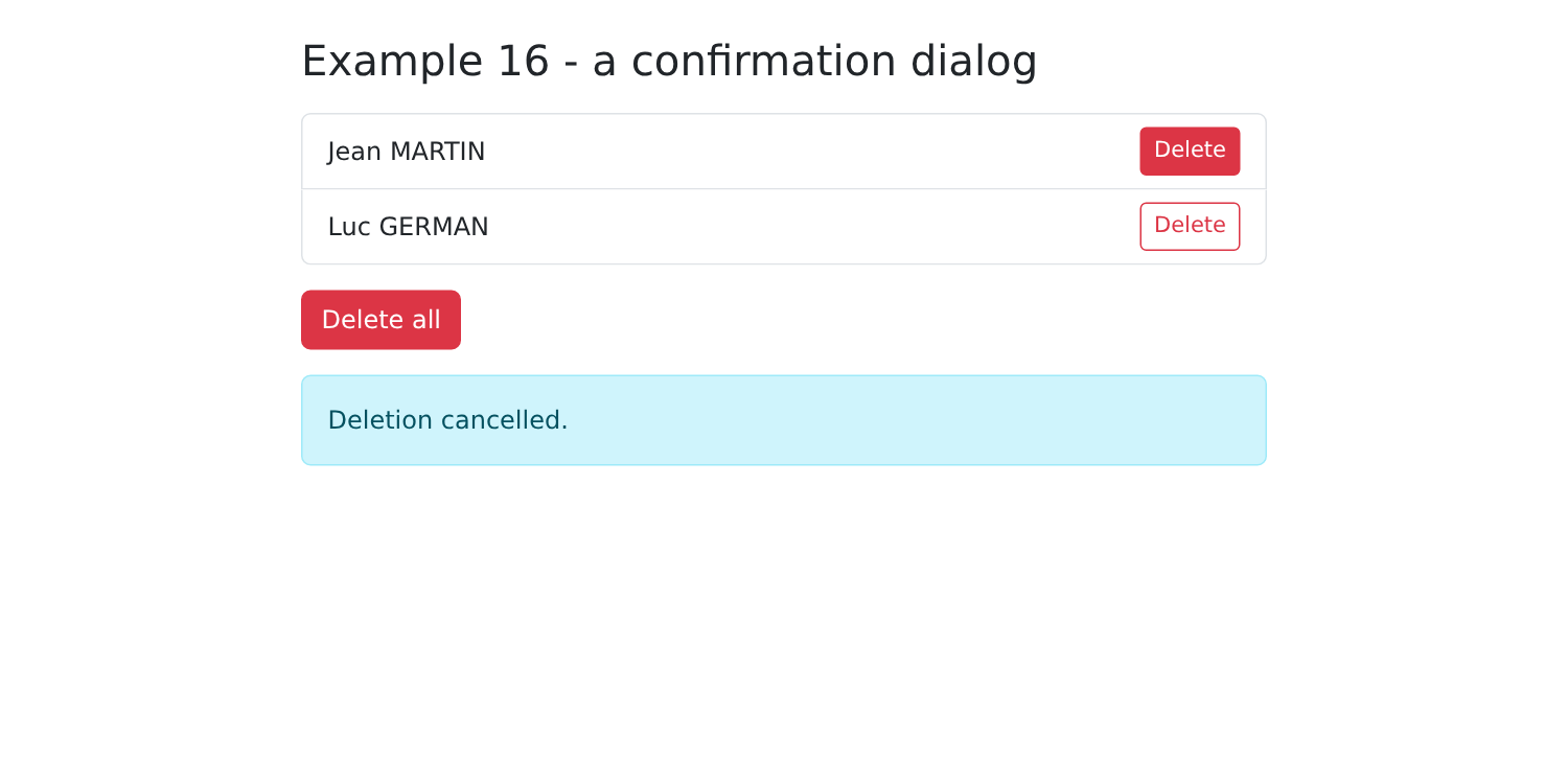
A SINGLE window is used for the entire application: its provider includes [App].
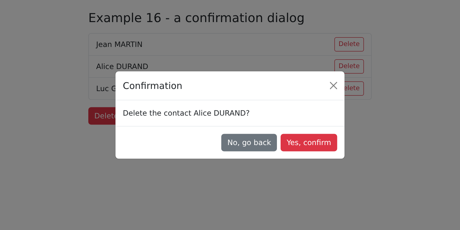
Confirm, then request another deletion and press Esc: