4. 组件
编写自己的组件是使用 [Angular] 和 [Ionic] 的核心:一个写得好的屏幕由小组件组成,每个组件都有自己的输入、模板、样式,必要时还有自己的状态。本章展示它们如何相互通信(输入和输出)、如何组装(内容渲染、模板)、如何运作(生命周期)、如何在无需来回传递的情况下共享数据(依赖注入),以及如何复用行为(指令)。这相当于 [Flutter] 课程中的“Widgets”一章:相同的示例、相同的屏幕,只是使用 [Angular] 的工具。
4.1. 示例 10:组件及其输入
4.1.1. 数据类型
父组件和子组件共用一个类型,存放在单独的文件中:
| // =========================================================================
// src/app/ex10-component-inputs/doctor.ts - 数据的类型
// -------------------------------------------------------------------------
// 父组件(Ex10Page)和子组件(DoctorCard)共用的类型。
// TypeScript 接口不产生任何代码:它只供编译器
// 使用,编译器会检查每个对象是否具有所有字段。
// readonly:我们从不修改医生;而是构建另一个医生。
// =========================================================================
export interface Doctor {
readonly id: number;
readonly title: string;
readonly firstName: string;
readonly lastName: string;
readonly specialty: string;
readonly available: boolean;
}
// 一个只有可用性发生变化的副本:...m 复制 m 的所有字段,
// 然后 available 替换其中的对应字段
export function withAvailability(m: Doctor, available: boolean): Doctor {
return { ...m, available };
}
|
- 第 10–17 行:一个 [TypeScript] 接口:医生的结构。它在运行时不生成任何代码;它只供编译器使用,编译器会验证每个对象都具有所有类型正确的字段。[readonly] 禁止在对象创建之后修改字段;
- 第 21–23 行:一个只有可用性发生变化的副本。[{ ...m, available }] 复制 [m] 的所有字段(展开运算符 [...]),然后字段 [available] 替换 [m] 中的对应字段:原始对象永远不会改变。
[Dart] 定义带有命名参数构造函数的类,而 [TypeScript] 只使用接口和对象字面量;[{ id: 1, title: 'Mme', ... }] 本身就已经有“命名参数”了。
4.1.2. 子组件
[DoctorCard] 组件在 [Ionic] 的卡片中显示一位医生。与课程的其余部分一样,它写在两个文件中:类([doctor-card.ts])和它的模板([doctor-card.html])。
| // =========================================================================
// src/app/ex10-component-inputs/doctor-card.ts - 子组件
// -------------------------------------------------------------------------
// 它通过由函数 input() 和 input.required() 声明的输入
// 从父组件接收数据。它们的类型在编译时检查
// (strictTemplates):[doctor]="42" 会被拒绝。
// - input.required<T>():父组件必须提供这个输入;
// - input(false) :可选输入,带有默认值;
// - transform :转换所接收值的函数
// (booleanAttribute、numberAttribute:Angular 提供的,使得
// compact 或 rank="1" 可以写成简单的 HTML 属性)。
// 输入是一个只读的信号:通过调用它来读取,
// doctor(),屏幕会随它的变化而变化。
//
// 黄金法则:组件绝不修改它的输入(编译器
// 无论如何都禁止这样做:input() 既没有 set 也没有 update)。数据
// 从父组件向下流向子组件;要请求更改,
// 子组件通过输出通知它的父组件(见示例 11)。
// =========================================================================
import { booleanAttribute, Component, computed, input, numberAttribute } from '@angular/core';
import { IonAvatar, IonCard, IonCardContent, IonLabel, IonText } from '@ionic/angular';
import { Doctor } from './doctor';
@Component({
selector: 'app-doctor-card',
imports: [IonCard, IonCardContent, IonAvatar, IonLabel, IonText],
templateUrl: './doctor-card.html',
// 卡片的“样式”:它只适用于此组件的模板。
// Angular 会给模板的标签添加它自己的属性,
// 并相应地重写选择器:其他任何组件都不会
// 受这些规则影响(样式封装)
styles: `
ion-card { margin: 6px 0; border: 2px solid transparent; border-radius: 12px; }
ion-card.available { border-color: #4caf50; }
ion-card-content { display: flex; align-items: center; gap: 12px; padding: 12px; }
ion-avatar {
width: 40px; height: 40px; display: flex; align-items: center; justify-content: center;
background: #087ea4; color: white; font-weight: bold;
}
h2 { margin: 0; font-size: 17px; color: var(--ion-text-color); }
`,
})
export class DoctorCard {
// 输入:必需的医生和序号,可选的紧凑显示
readonly doctor = input.required<Doctor>();
// numberAttribute:rank="1"(一个字符串)变成数字 1
readonly rank = input.required({ transform: numberAttribute });
// booleanAttribute:单独写属性(<app-doctor-card compact />)就是 true
readonly compact = input(false, { transform: booleanAttribute });
// 由输入计算得出的值:它随输入的变化而变化
readonly initials = computed(() => this.doctor().firstName[0] + this.doctor().lastName[0]);
}
|
- 第 26 行:选择器——组件的标签名。父组件将写 [<app-doctor-card ... />];
- 第 27 行:模板所使用的 [Ionic] 组件。组件只认识它导入的东西;
- 第 33–42 行:卡片的“样式”。这些规则只适用于此组件的模板。[Angular] 会给模板的标签添加一个唯一的属性,并相应地重写选择器(样式封装)。因此规则 [ion-card { ... }] 不会影响应用中的任何其他卡片。这相当于 [Flutter] widget 的私有样式常量,或 [React] 的“CSS 模块”:组件的样式与它存放在一起,不会干扰任何其他东西;
- 第 35 行:[available] 类的绿色边框,模板会把它应用到可预约医生的卡片上;
- 第 37–40 行:首字母圆圈,使用卡片专用的蓝色;
- 第 46 行:第一个必需的输入:[input.required<Doctor>()]。父组件必须提供它;否则,编译器会拒绝该模板。它还必须提供一个 [Doctor]:[[doctor]="42"] 同样会被拒绝(项目选项 [strictTemplates]);
- 第 48 行:第二个必需的输入,序号,带有转换:[numberAttribute],这是 [Angular] 的一个函数,用于把收到的值转换为数字。这样,父组件既可以写 [rank="1"] (一个字符串,如同任何 HTML 属性),也可以写 [[rank]="i + 1"] (一个数字);
- 第 50 行:一个可选的输入,带有默认值([false])和另一个转换:[booleanAttribute]。此时单独写属性 [<app-doctor-card compact />] 就等于 [true],就像 HTML 按钮的属性 [disabled] 一样;
- 第 53 行:由输入计算得出的值。输入是一个只读的**信号**:通过调用它来读取([this.doctor()]),并且每当父组件指定另一位医生时,[computed] 都会重新计算首字母。
| <!-- ======================================================================
doctor-card.html - the template of the DoctorCard component
It only reads the inputs of the component: doctor(), rank(), compact().
====================================================================== -->
<!-- [class.available]: the CSS class available (a green border)
is only set if the doctor is available -->
<ion-card [class.available]="doctor().available">
<ion-card-content>
<!-- 一个带首字母的彩色圆盘 -->
<ion-avatar>{{ initials() }}</ion-avatar>
<ion-label>
<h2>{{ rank() }}. {{ doctor().title }} {{ doctor().firstName }} {{ doctor().lastName }}</h2>
<!-- 专业只在非紧凑显示时才存在 -->
@if (!compact()) {
<ion-text color="medium">{{ doctor().specialty }}</ion-text>
}
</ion-label>
</ion-card-content>
</ion-card>
|
- 第 8 行:[[class.available]="..."] 在表达式为真时把 CSS 类 [available] 放到卡片上,否则移除它;
- 第 11 行:一个 [ion-avatar] (一个圆盘),里面是首字母;
- 第 13 行:医生的序号和姓名,从输入中读取;
- 第 15–17 行:专业仅在非紧凑模式下显示。
黄金法则:组件绝不修改它的输入。事实上,编译器禁止这样做:由 [input()] 创建的信号既没有 [set] 也没有 [update]。数据从父组件流向子组件;要请求更改,子组件通过输出通知它的父组件(示例 11)。当父组件更改其数据时,[Angular] 会把新值赋给其子组件的输入,屏幕也随之更新。
4.1.3. 父组件
| // =========================================================================
// src/app/ex10-component-inputs/ex10.page.ts - 父组件
// -------------------------------------------------------------------------
// 它导入 DoctorCard 组件,并根据需要使用任意多次,
// 就像任何 Ionic 组件一样:组件是一块
// 可复用的界面,有自己的输入、模板
// 和样式。编写自己的组件是使用 Angular 的核心:
// 一个写得好的屏幕由小组件组成。
// =========================================================================
import { Component, signal } from '@angular/core';
import {
IonBackButton, IonButton, IonButtons, IonContent, IonHeader, IonText, IonTitle, IonToggle, IonToolbar,
} from '@ionic/angular';
import { DoctorCard } from './doctor-card';
import { withAvailability, Doctor } from './doctor';
@Component({
selector: 'app-ex10',
// 我们像导入 Ionic 的组件一样导入 DoctorCard
imports: [
IonHeader, IonToolbar, IonButtons, IonBackButton, IonTitle, IonContent, IonToggle, IonButton, IonText,
DoctorCard,
],
templateUrl: './ex10.page.html',
})
export class Ex10Page {
// 父组件的状态:医生列表(它会被另一个列表
// 替换,而从不就地修改)以及紧凑显示
readonly doctors = signal<Doctor[]>([
{ id: 1, title: 'Mme', firstName: 'Marie', lastName: 'PELISSIER', specialty: 'general practitioner', available: true },
{ id: 2, title: 'Mr', firstName: 'Paul', lastName: 'TATOU', specialty: 'pediatrician', available: false },
{ id: 3, title: 'Melle', firstName: 'Sophie', lastName: 'DUPONT', specialty: 'general practitioner', available: true },
]);
readonly compact = signal(false);
// 父组件更改它自己的数据:一个由副本组成的新列表。
// Angular 会更新卡片的输入,卡片随之变化
toggleAvailability(): void {
this.doctors.update((list) => list.map((m) => withAvailability(m, !m.available)));
}
}
|
- 第 15 行:父组件导入组件 [DoctorCard]……
- 第 21–24 行:……并在它的 [imports] 中声明它,与 [Ionic] 中的组件完全相同:自定义组件的使用方式与框架组件一模一样;
- 第 30–35 行:父组件的状态:医生列表(一个信号,其值会被另一个列表替换,而从不就地修改)和紧凑显示;
- 第 39–41 行:父组件把它的数据替换为一个由医生副本组成的新列表。[Angular] 向卡片提供它们新的输入,卡片随之更新。
| <!-- ======================================================================
ex10.page.html - the template of the parent: it uses <app-doctor-card>
====================================================================== -->
<ion-header>
<ion-toolbar color="primary">
<ion-buttons slot="start">
<ion-back-button defaultHref="/" />
</ion-buttons>
<ion-title>Example 10 - components and their inputs</ion-title>
</ion-toolbar>
</ion-header>
<ion-content class="ion-padding">
<!-- justify="space-between":标签在左侧,开关在右侧 -->
<ion-toggle justify="space-between" [checked]="compact()" (ionChange)="compact.set($event.detail.checked)">
compact display
</ion-toggle>
<ion-button fill="outline" (click)="toggleAvailability()">Toggle the availabilities</ion-button>
<!-- 每位医生一张卡片;每张卡片通过 [input]="expression" 接收它的输入 -->
@for (m of doctors(); track m.id; let i = $index) {
<app-doctor-card [doctor]="m" [rank]="i + 1" [compact]="compact()" />
}
<p><ion-text color="medium">The same card, in its compact version, by fixing the input:</ion-text></p>
<!-- rank="1" and compact: simple attributes, converted by the transformations
numberAttribute and booleanAttribute -->
<div style="width: 260px">
<app-doctor-card [doctor]="doctors()[0]" rank="1" compact />
</div>
</ion-content>
|
- 第 16–18 行:来自 [Ionic] 的开关([ion-toggle]),相当于 [Flutter] 中的 [SwitchListTile]。[justify="space-between"] 把标签放在左侧,开关放在右侧;[(ionChange)] 是每次更改时触发的事件,而 [$event.detail.checked] 是它的新状态;
- 第 20 行:带边框的按钮([fill="outline"]),对应于 [OutlinedButton];
- 第 23–25 行:每位医生一张卡片。[track m.id] 告诉 [Angular] 如何在前后两次列表之间识别同一位医生(对应于 [ValueKey(m.id)] 在 [Flutter] 中的键);[let i = $index] 指定元素的序号。每张卡片使用如下语法接收属于它自己的输入:[[input]="expression"]:表达式在父组件中求值,其值被传递给子组件的输入;
- 第 31 行:同一张卡片的紧凑版本,放在 260 像素宽的容器中。[rank="1"] 和 [compact] 被写成普通的 HTML 属性:子组件的转换函数 [numberAttribute] 和 [booleanAttribute] 会把它们转换为 [1] 和 [true]。
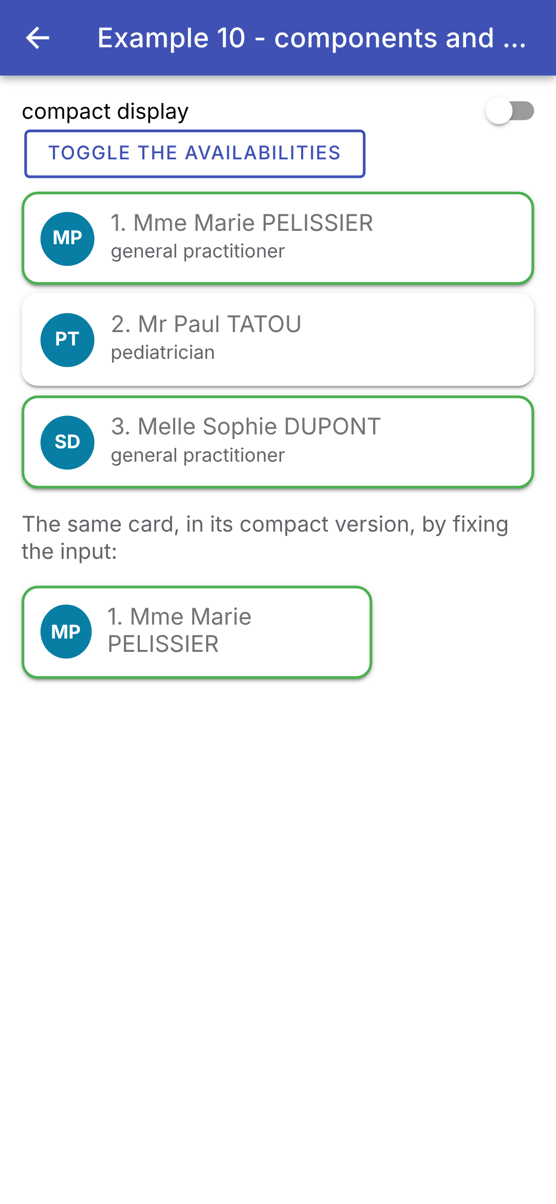
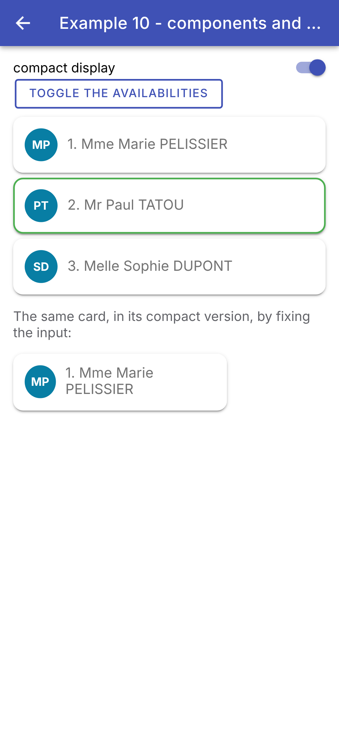
起初,以及在紧凑视图中,可用状态是相反的:
这是一个创建模板片段的方法,还是一个真正的组件?[Angular] 几乎没有给选择留下余地:可复用的界面片段就是组件。这是件好事:它有名称,其输入在编译时就有类型和验证,样式是封装的,并且可以在别处复用。[Flutter] 通过 widget 的构造函数参数传递数据,而 [Angular] 通过输入传递数据,这些输入是信号:子组件无需做任何事情就能跟踪其变化。
4.2. 示例 11:子组件通知其父组件
数据通过输入向下流动;信息通过输出向上回流:输出是子组件发出、由父组件监听的事件,就像监听按钮的 [(click)] 事件一样。
4.2.1. 来自子组件的“事件”
| // =========================================================================
// src/app/ex11-lifting-state-up/counter.ts
// -------------------------------------------------------------------------
// 一个通知其父组件的子组件:它用函数 output() 声明输出,
// 并在有事情发生时“发出”它们。
// 父组件在它的模板中订阅它们,就像订阅
// 按钮的 (click) 事件一样:
// <app-counter label="Coffees" [max]="3" (incremented)="..." (limit)="..." />
// - output<number>():携带一个数字($event)的事件;
// - output<void>() :不带数据的事件。
// =========================================================================
import { Component, input, output, signal } from '@angular/core';
import { IonButton, IonChip } from '@ionic/angular';
@Component({
selector: 'app-counter',
imports: [IonButton, IonChip],
templateUrl: './counter.html',
styles: `
:host { display: flex; align-items: center; }
.label { width: 110px; }
`,
})
export class Counter {
// 输入(向下流动的内容)……
readonly label = input.required<string>();
readonly max = input.required<number>();
// ……以及输出(向上流动的内容)
readonly incremented = output<number>(); // 携带新值
readonly limit = output<void>(); // 不带数据
// 此计数器专有的状态:每个 Counter 都有自己的状态
readonly value = signal(0);
plus(): void {
if (this.value() >= this.max()) {
// emit():通知所有监听该输出的对象
this.limit.emit();
return;
}
this.value.update((v) => v + 1);
// 我们通知父组件,并把新值传给它
this.incremented.emit(this.value());
}
}
|
- 第 20–23 行:组件的样式。[:host] 指组件自身的标签([<app-counter>]),其子元素排成一行([display: flex]);
- 第 27–28 行:输入:从父组件向下流动的内容;
- 第 30–31 行:输出:向上回流到父组件的内容。[output<number>()] 声明一个携带数字的事件;[output<void>()] 声明一个不带数据的事件。它们对应于 [Flutter] 计数器的参数 [onIncrement] (一个 [ValueChanged<int>])和 [onLimit] (一个 [VoidCallback]):子组件不再从父组件接收函数,而是发出事件,由父组件订阅;
- 第 34 行:此计数器特有的状态;每个 [Counter] 都有自己的状态;
- 第 36–45 行:如果超过最大值,计数器会通知其父组件([this.limit.emit()]);否则,它先修改自己的状态,然后传递新值来通知父组件([this.incremented.emit(...)])。在第 44 行读取信号时,它已经有了新值。
| <!-- ======================================================================
counter.html - a label, a +1 button and the value of the counter
====================================================================== -->
<span class="label">{{ label() }}</span>
<ion-button fill="outline" (click)="plus()">+1</ion-button>
<ion-chip [outline]="true">{{ value() }} / {{ max() }}</ion-chip>
|
- 第 4–6 行:一个标签、一个按钮([+1])和一个芯片([ion-chip]),用于显示当前值和最大值。
4.2.2. 受控组件
一个自定义表单字段(标签 + 字段 + 提示 + 字符计数器),作为受控字段工作:值属于父组件,父组件把它传给字段,并在每次按键时得到通知。[Angular] 为此提供了现成的函数 [model()]。
| // =========================================================================
// src/app/ex11-lifting-state-up/text-field.ts - 受控组件
// -------------------------------------------------------------------------
// 一个“自制的”表单字段(标签 + 字段 + 帮助 + 字符
// 计数器),像受控字段一样使用,采用
// 双向绑定:
// <app-text-field [(value)]="firstName" label="First name" [max]="20" />
// 值属于父组件(它的 firstName 信号)。model() 同时声明
// 一个输入(value)和一个输出(valueChange):
// - 父组件把它的值传给字段:[value]="firstName()";
// - 字段更改值:value.set(...),这会发出 valueChange;
// - 语法 [(value)]="firstName"(“盒子里的香蕉”)同时写入
// 这两者:父组件的信号会随输入而变化。
// 当父组件自己更改值时(Clear 按钮),字段随之变化,
// 无需再写任何东西:输入就是信号。
//
// 错误消息(errorText):Ionic 只有在字段带有
// ion-invalid 和 ion-touched 类时才会显示它,这两个类由它自己
// 从 Angular 表单控件的状态(ngModel,见示例 07 和 08)复制而来。
// 因此我们通过 ngModel,并设置其控件的错误。
// =========================================================================
import { Component, computed, effect, input, model, viewChild } from '@angular/core';
import { FormsModule, NgModel } from '@angular/forms';
import { IonInput } from '@ionic/angular';
@Component({
selector: 'app-text-field',
imports: [IonInput, FormsModule],
templateUrl: './text-field.html',
})
export class TextField {
// model.required:一个必需的输入……组件可以修改它
readonly value = model.required<string>();
readonly label = input.required<string>();
readonly max = input.required<number>();
readonly help = input('');
// 字段满了吗?
readonly full = computed(() => this.value().length === this.max());
// 模板的 ngModel,以及它所管理的表单控件
private readonly model = viewChild.required(NgModel);
constructor() {
// 一个 effect:每当 full() 变化时重新运行。当字段满了时,它把
// 控件声明为“touched”并“有错误”
effect(() => {
const control = this.model().control;
control.markAsTouched();
control.setErrors(this.full() ? { full: true } : null);
});
}
}
|
- 第 34 行:[model.required<string>()] 同时声明了一个输入([value])和一个输出([valueChange])。这是一个组件自身可以修改的信号:[this.value.set('...')] 会修改它的值,并且发出 [valueChange],从而通知父组件。父组件会写 [[(value)]="firstName"] (“盒子里的香蕉”):它的信号 [firstName] 被传给字段,并跟踪该输入;
- 第 35–37 行:其他输入:标签、最大长度,以及可选的帮助文本(默认为空);
- 第 40 行:字段是否已满?由值和最大值计算得出;
- 第 43 行:[viewChild.required(NgModel)]:模板指令 [ngModel] ([Angular] 的表单控件,见示例 07 和 08),以信号的形式提供;
- 第 48–52 行:一个副作用(EFFECT):每当它所监视的信号发生变化(此处为 [full()])时就会重新执行的函数。它把控件标记为“已触碰”,并在字段已满时将其设为错误状态。为什么要经过表单校验?因为 [Ionic] 只有在字段带有 CSS 类 [ion-invalid] 和 [ion-touched] 时,才会显示 [ion-input] 的错误消息([errorText]);而使用 [Angular] 时,它会根据表单控件的状态自行生成这些类(即 [ng-invalid] 和 [ng-touched])。手动设置它们毫无意义:[Ionic] 会在下一次按键时把它们移除。
| <!-- ======================================================================
text-field.html - an ion-input, driven by the parent's value
====================================================================== -->
<!-- [(ngModel)]="value": the two-way binding between the field and the
value signal (the model() of the component): each keystroke does value.set(...),
which emits valueChange to the parent; a new value from the parent
is displayed in the field.
[maxlength]: the field refuses the extra characters;
[counter]: it displays a counter ("5 / 20");
errorText replaces helperText (and the field turns red) when the control is in error -->
<ion-input
[(ngModel)]="value"
[label]="label()"
labelPlacement="floating"
[maxlength]="max()"
[counter]="true"
[helperText]="help()"
errorText="Maximum length reached"
/>
|
- 第 13 行:[[(ngModel)]="value"]:字段与信号 [value] 之间的双向绑定。[ngModel] 接受可编辑的信号:每次按键都会触发 [value.set(...)],从而通知父组件;来自父组件的新值会显示在字段中;
- 第 14–15 行:标签,当字段有值或获得焦点时,它会“浮”到字段上方;
- 第 16 行:字段拒绝任何多余的字符;
- 第 17 行:显示一个计数器(“5 / 20”);
- 第 18 行:字段下方的提示;
- 第 19 行:当控件处于错误状态(字段已满)时,用来替换提示并使字段变红的消息。
[Flutter] 的字段有一个独特的难题:[TextField] 把文本存放在控制器中,每当父组件自己修改值(通过“清除”按钮)时,都必须在 [didUpdateWidget] 中保持控制器同步。这里没有这类问题:父组件的值通过信号到达,而 [ngModel] 一旦它变化就会把它复制回字段中。
4.2.3. 父组件
| // =========================================================================
// src/app/ex11-lifting-state-up/ex11.page.ts - 父组件监听其子组件
// -------------------------------------------------------------------------
// 数据向下流动(输入);信息通过子组件的
// 输出向上流动:
// 1. 子组件的“事件”:(incremented)、(limit);
// 2. 受控组件:[(value)],就像字段的 [(ngModel)] 一样。
// 状态仍然属于父组件,父组件可以自己修改它(Clear)。
// =========================================================================
import { Component, signal } from '@angular/core';
import {
IonBackButton, IonButton, IonButtons, IonCard, IonCardContent, IonCardHeader, IonCardSubtitle, IonContent,
IonHeader, IonTitle, IonToolbar,
} from '@ionic/angular';
import { TextField } from './text-field';
import { Counter } from './counter';
@Component({
selector: 'app-ex11',
imports: [
IonHeader, IonToolbar, IonButtons, IonBackButton, IonTitle, IonContent, IonCard, IonCardHeader,
IonCardSubtitle, IonCardContent, IonButton, Counter, TextField,
],
templateUrl: './ex11.page.html',
})
export class Ex11Page {
readonly total = signal(0);
readonly message = signal('');
readonly firstName = signal('Marie');
readonly lastName = signal('PELISSIER');
// 由计数器调用的方法:它接收计数器传来的值
onIncrement(label: string, value: number): void {
this.total.update((t) => t + 1);
this.message.set(`${label} is now ${value}`);
}
// 父组件更改它的数据:各字段随之变化
clear(): void {
this.firstName.set('');
this.lastName.set('');
}
}
|
- 第 30–31 行:两个字段的值属于父组件:两个信号;
- 第 34–37 行:计数器发出 [incremented] 时调用的方法:它接收计数器传递的值;
- 第 40–43 行:父组件自己修改值:清空这些字段。
| <!-- ======================================================================
ex11.page.html - the template of the parent: it listens to the children's outputs
====================================================================== -->
<ion-header>
<ion-toolbar color="primary">
<ion-buttons slot="start">
<ion-back-button defaultHref="/" />
</ion-buttons>
<ion-title>Example 11 - the child notifies its parent</ion-title>
</ion-toolbar>
</ion-header>
<ion-content class="ion-padding">
<ion-card>
<ion-card-header>
<ion-card-subtitle>1. Outputs listened to by the parent</ion-card-subtitle>
</ion-card-header>
<ion-card-content>
<!-- (output)="statement":$event 是子组件发出的数据 -->
<app-counter
label="Coffees"
[max]="3"
(incremented)="onIncrement('Coffees', $event)"
(limit)="message.set('No more than 3 coffees!')"
/>
<app-counter
label="Glasses of water"
[max]="8"
(incremented)="onIncrement('Glasses of water', $event)"
(limit)="message.set('Enough drinking.')"
/>
<p><em>Total clicks: {{ total() }} - {{ message() }}</em></p>
</ion-card-content>
</ion-card>
<ion-card>
<ion-card-header>
<ion-card-subtitle>2. Controlled components</ion-card-subtitle>
</ion-card-header>
<ion-card-content>
<!-- [(value)]="firstName":与父组件的信号的双向绑定 -->
<app-text-field [(value)]="firstName" label="First name" [max]="20" help="Required" />
<app-text-field [(value)]="lastName" label="Last name" [max]="20" help="Displayed in upper case" />
<!-- 父组件的数据,随输入而变化 -->
<p>Data of the parent: <strong>{{ firstName() }} {{ lastName().toUpperCase() }}</strong></p>
<ion-button fill="outline" (click)="clear()">Clear (from the parent)</ion-button>
</ion-card-content>
</ion-card>
</ion-content>
|
- 第 21–26 行:一个计数器、它的输入和它的输出。[(incremented)="onIncrement('Coffees', $event)"]:每次传递时,[Angular] 都会执行该语句,其中 [$event] 是子组件传递的数据;父组件再为它添加自己的参数(标签)。[(limit)] 直接执行一条语句:[message.set(...)];
- 第 30 行:第二个计数器,其输出以同样的方式被监听,并带有它自己的标签(“Glasses of water”);
- 第 43–44 行:两个受控字段,通过 [firstName] 和 [lastName] 与父组件的信号相连,借助 [[(value)]]。父组件传递的是信号本身([firstName],不带括号):[Angular] 读取并修改它;
- 第 46 行:父组件的数据,跟随输入变化;
- 第 47 行:父组件自己修改值:清空这些字段。
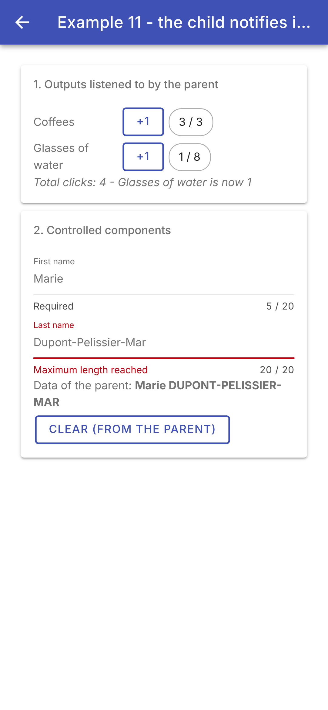
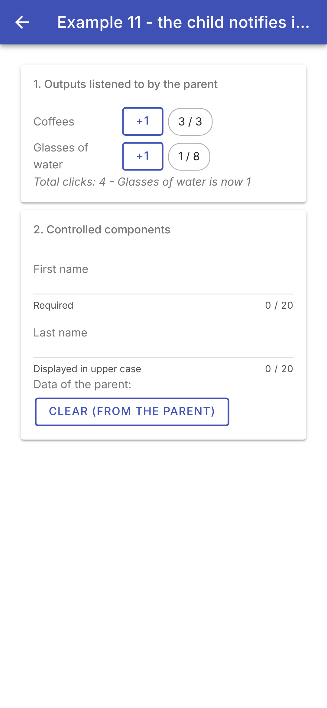
点击第一个计数器四次(第四次时它会发出 [limit]),点击第二个计数器一次,并填写姓名;然后从父组件清空这些字段:
输入和输出——这就是 [Angular] 中父组件与其子组件之间的全部对话。[Flutter] 把函数作为参数传递([onIncrement: (v) => ...]),就像 [React] 把函数作为“props”传递一样;[Angular] 更倾向于事件,监听事件所用的语法与浏览器中的事件相同([(click)]、[(incremented)])。而双向绑定 [[( )]]——[Flutter] 和 [React] 需要手动编写(一个值 + 一个函数 [onChanged])——在这里则是一种模板语法。
4.3. 示例 12:组合
4.3.1. 卡片
组件的输入传递数据……内容本身则像 HTML 标签一样写在它的标签之间:[<app-card>...here...</app-card>]。组件使用标签 [<ng-content>]把它放在模板中它想要的任何位置:这就是内容投影。[Ionic] 到处都在使用它:[ion-button] 的文本、[ion-card] 的内容或 [ion-item] 的内容都是被投影的。这对应于 [child]、[title]或 [body] 这些参数,它们属于 [Flutter] 中接收其他 widget 的 widget。
| // =========================================================================
// src/app/ex12-composition/card.ts - 可复用的模板
// -------------------------------------------------------------------------
// 组件的输入传递数据……而内容
// 则写在它的标签之间,就像 HTML 标签一样,组件
// 用 <ng-content> 标签把它放在想放的位置:这就是内容
// 投影。Ionic 到处都在使用它:<ion-button> 的内容、
// <ion-card> 的内容、<ion-item> 的内容……
// - <ng-content />:“主”内容(所有不在别处的内容);
// - <ng-content select="[header]">:另一个位置(一个“slot”),
// 用于带有 header 属性的父组件标签;写在
// <ng-content> 和 </ng-content> 之间的是默认内容;
// - 页脚是可选的:卡片在它的内容中查找页脚
// (contentChild),只有存在时才显示它。
// 卡片设定框架(边框、页眉、页脚),父组件提供
// 里面的内容。
// =========================================================================
import { Component, computed, contentChild, Directive, input } from '@angular/core';
// 一个标记:不含代码的指令,由父组件设置在它的页脚上
// (<span footer>...</span>),以便卡片能找到它
@Directive({ selector: '[footer]' })
export class CardFooter {}
@Component({
selector: 'app-card',
templateUrl: './card.html',
styles: `
:host { display: block; margin: 0 0 12px; border: 1px solid var(--bg); border-radius: 8px; overflow: hidden; }
.header { background: var(--bg); padding: 10px; font-weight: bold; }
.header.colored { color: white; }
.body { padding: 10px; }
.footer { background: #f5f5f5; padding: 8px; color: #757575; font-size: 12px; }
`,
// host:绑定在 <app-card> 标签本身上。这里是一个
// CSS 变量(--bg),由上面的规则读取
host: { '[style.--bg]': 'background()' },
})
export class Card {
// Ionic 颜色,可选('primary'、'success'……):默认为 undefined
readonly color = input<string>();
readonly background = computed(() => (this.color() ? `var(--ion-color-${this.color()})` : '#e0e0e0'));
// contentChild:内容中带有指令 CardFooter 的第一个元素;
// 一个信号,如果没有则为 undefined
readonly footer = contentChild(CardFooter);
}
|
- 第 23–24 行:一个标记(MARKER)——一个指令(没有模板的类;见示例 15)——它什么也不做。父组件把它放在自己的页脚 [<span footer>...</span>] 上,以便卡片可以在其内容中找到它;
- 第 29–35 行:卡片的样式。颜色来自 CSS 变量 [--bg];
- 第 38 行:[host]:组件自身标签上的绑定([<app-card>])。这里,CSS 变量 [--bg] 被赋予计算值 [background()];
- 第 42 行:一个没有默认值的可选输入:如果父组件不提供,则为 [undefined] 。与 [Ionic] 的组件一样,卡片接收主题中某种颜色的名称([primary]、[success]……);
- 第 43 行:背景颜色:与该颜色对应的 [Ionic] CSS 变量 ([var(--ion-color-primary)]……),或浅灰色;
- 第 47 行:[contentChild(CardFooter)] 在父组件提供的内容中搜索第一个带有指令 [CardFooter] 的元素。这是一个信号:如果没有找到,则为 [undefined] 。
| <!-- ======================================================================
card.html - the frame of the card, and three places for the content
====================================================================== -->
<!-- the header: the styles of .header (bold, white on a colour)
apply, by inheritance, to ALL the texts provided by the parent -->
<div class="header" [class.colored]="color()">
<ng-content select="[header]">Untitled</ng-content>
</div>
<!-- 主内容,由父组件提供 -->
<div class="body">
<ng-content />
</div>
<!-- 没有提供页脚:就完全没有页脚 -->
@if (footer()) {
<div class="footer">
<ng-content select="[footer]" />
</div>
}
|
- 第 7–9 行:页眉。[<ng-content select="[header]">] 是一个插槽:它接收与 CSS 选择器 [[header]] 匹配的内容标签,也就是带有属性 [header] 的标签。[<ng-content>] 与 [</ng-content>] 之间的文本(“Untitled”)是默认内容,在父组件没有提供页眉时显示。[.header] 的样式(粗体、彩色背景上的白色文字)通过继承应用于父组件提供的所有文本:这对应于 [DefaultTextStyle] 在 [Flutter] 中的作用;
- 第 12–14 行:主要内容:[<ng-content />] 不带选择器,接收所有没有进入其他位置的内容;
- 第 17–21 行:没有提供页脚:就完全没有页脚(既没有它的边距,也没有它的灰色背景)。
4.3.2. 通用表格
| // =========================================================================
// src/app/ex12-composition/data-table.ts - 泛型表格
// -------------------------------------------------------------------------
// DataTable<T> 是一个泛型组件:它显示任意类型 T 的
// 行。它知道如何遍历行,但不知道如何
// 显示单个单元格:由父组件来告诉它,方法是在内容中
// 为每一列传给它一个模板(<ng-template>):
// <app-data-table [rows]="slots">
// <ng-template column="Slot" let-c>{{ c.time }}</ng-template>
// </app-data-table>
// <ng-template> 不会显示在它被写的地方:它是一块
// “待命”的模板,由表格自己按需
// 多次显示(ngTemplateOutlet),并给它提供数据(行
// 及其序号):let-c 接收行,let-i="index" 接收其序号。
// 内容由父组件提供,但它使用属于
// 子组件的数据:这相当于 Flutter 的“builder”
// (ListView.builder)和 React 的“render props”。
// =========================================================================
import { NgTemplateOutlet } from '@angular/common';
import { Component, contentChildren, Directive, inject, input, TemplateRef } from '@angular/core';
// 单元格模板所接收的数据:$implicit 是
// let-c(不带名称)的值,index 是 let-i="index" 的值
export interface CellContext<T> {
$implicit: T;
index: number;
}
// 一列:设置在 <ng-template> 上的指令。它携带该列的标题,
// 并提供对它所设置的模板(TemplateRef)的访问
@Directive({ selector: 'ng-template[column]' })
export class Column {
readonly title = input.required<string>({ alias: 'column' });
readonly template = inject<TemplateRef<CellContext<unknown>>>(TemplateRef);
}
@Component({
selector: 'app-data-table',
imports: [NgTemplateOutlet],
templateUrl: './data-table.html',
styles: `
table { width: 100%; border-collapse: collapse; }
th { text-align: left; padding: 6px; border-bottom: 1px solid #ccc; }
td { padding: 6px; border-top: 1px solid #e0e0e0; }
tbody tr:first-child td { border-top: none; }
.empty { color: #9e9e9e; padding: 6px; }
`,
})
export class DataTable<T> {
// T 由 [rows] 的类型推断得出:DataTable<Slot>……
readonly rows = input.required<readonly T[]>();
// contentChildren:内容中的所有列,按顺序排列(一个信号)
readonly columns = contentChildren(Column);
}
|
- 第 25–28 行:单元格模板从表格接收的数据:行([$implicit],默认值)及其列([index]);
- 第 32–36 行:一个列(COLUMN)——一个只能应用于 [<ng-template>] 的指令(其选择器为 [ng-template[column]])。[<ng-template>] 不会在它被书写的位置显示:它是一个“待定”的模板片段——一个模板(TEMPLATE)——由别的组件按需显示任意多次。该指令携带列标题(输入 [title],它通过别名取得指令的名称:[column="Slot"]),并提供对它所在模板的访问([inject(TemplateRef)]);
- 第 50 行:[DataTable<T>] 是一个泛型组件:它可以显示任意 [T] 类型的行。它知道如何遍历各行,却不知道如何显示单元格——父组件通过为每一列传入一个模板来告诉它方法。这就是 [Flutter] 中“builder”([ListView.builder],以及 [cells] 函数,来自 [Flutter] 示例)和 [React] 中“render props”的原理:内容由父组件提供,但它使用的是属于子组件的数据(行、行的序号);
- 第 52 行:各行。[T] 由父组件所提供值的类型推断得出:对于 [[rows]="slots"],它是 [DataTable<Slot>];
- 第 54 行:[contentChildren(Column)]:内容中的所有列,按父组件书写的顺序排列(一个包含数组的信号)。
| <!-- ======================================================================
data-table.html - a row of titles, then one row per element
====================================================================== -->
<table>
<thead>
<tr>
@for (col of columns(); track col) {
<th>{{ col.title() }}</th>
}
</tr>
</thead>
<tbody>
@for (row of rows(); track $index; let i = $index) {
<tr>
@for (col of columns(); track col) {
<!-- the cell of THIS row and of this column, built by the
parent's template, with its data (context) -->
<td>
<ng-container *ngTemplateOutlet="col.template; context: { $implicit: row, index: i }" />
</td>
}
</tr>
}
</tbody>
</table>
<!-- 没有行:显示父组件提供的 [empty] 内容,或者一段默认文本 -->
@if (rows().length === 0) {
<div class="empty">
<ng-content select="[empty]">No data.</ng-content>
</div>
}
|
- 第 6–10 行:一行表头,每列一个;
- 第 13–23 行:每个元素一行表格行,每一行中每列一个单元格;
- 第 19 行:[*ngTemplateOutlet] 在此处显示列模板([col.template]),并向它提供其数据([context]):行及其序号。[<ng-container>] 是一个不会出现在页面上的标签:它仅用来承载指令;
- 第 27–31 行:没有行——显示父组件提供的 [[empty]] 内容,或默认文本。列标题仍然显示。
表格本身围绕这些模板创建单元格([<td>]):因此它们的样式(边距、边框)是表格的样式,父元素只需提供其中的内容。
4.3.3. 父组件
| // =========================================================================
// src/app/ex12-composition/ex12.page.ts - 使用 Card 和 DataTable 模板
// =========================================================================
import { Component } from '@angular/core';
import {
IonBackButton, IonButtons, IonChip, IonContent, IonHeader, IonIcon, IonTitle, IonToolbar,
} from '@ionic/angular';
import { addIcons } from 'ionicons';
import { calendar } from 'ionicons/icons';
import { Card, CardFooter } from './card';
import { Column, DataTable } from './data-table';
// 一个时间段:内联书写的类型(无需在别处命名一个接口)
type Slot = { id: number; time: string; patient: string | null };
const slots: Slot[] = [
{ id: 1, time: '8:00 - 8:20', patient: null },
{ id: 2, time: '8:20 - 8:40', patient: 'Mme Alice DURAND' },
{ id: 3, time: '8:40 - 9:00', patient: null },
];
@Component({
selector: 'app-ex12',
imports: [
IonHeader, IonToolbar, IonButtons, IonBackButton, IonTitle, IonContent, IonIcon, IonChip,
Card, CardFooter, DataTable, Column,
],
templateUrl: './ex12.page.html',
})
export class Ex12Page {
readonly slots = slots;
readonly free = slots.filter((c) => c.patient === null).length;
// 一个空列表,类型显式给出(没有任何东西可供推断)
readonly persons: { id: number; name: string }[] = [];
constructor() {
addIcons({ calendar });
}
}
|
- 第 15 行:一个时间段——内联类型。[string | null]:一位患者,或者无人;
- 第 27 行:父组件导入组件 [Card] 和 [DataTable],以及指令 [CardFooter] 和 [Column],并在其模板中使用它们;
- 第 33 行:可用时间段的数量;
- 第 35 行:一个空列表,其类型被显式指定(否则无法推断)。
| <!-- ======================================================================
ex12.page.html - cards, and what we put inside them
====================================================================== -->
<ion-header>
<ion-toolbar color="primary">
<ion-buttons slot="start">
<ion-back-button defaultHref="/" />
</ion-buttons>
<ion-title>Example 12 - composition</ion-title>
</ion-toolbar>
</ion-header>
<ion-content class="ion-padding">
<!-- the header (header attribute) and the footer (footer attribute) go into their
places; the rest is the main content -->
<app-card color="primary">
<div header style="display: flex; align-items: center; gap: 8px">
<ion-icon name="calendar" />
<span>Schedule of Mme PELISSIER</span>
</div>
<span footer>{{ free }} free slot(s)</span>
<!-- 主内容:一个时间段表格,每列一个模板 -->
<app-data-table [rows]="slots">
<!-- let-i="index":行的序号 -->
<ng-template column="#" let-i="index">{{ i + 1 }}</ng-template>
<!-- let-c:行本身 -->
<ng-template column="Slot" let-c>{{ c.time }}</ng-template>
<ng-template column="Status" let-c>
@if (c.patient) {
<ion-chip [outline]="true">{{ c.patient }}</ion-chip>
} @else {
<ion-chip color="success">Free</ion-chip>
}
</ng-template>
</app-data-table>
</app-card>
<app-card color="success">
<span header>A card without a footer</span>
The footer is not provided: the card does not display it.
</app-card>
<!-- 没有提供页眉:使用默认内容“Untitled” -->
<app-card>
<app-data-table [rows]="persons">
<ng-template column="Name" let-p>{{ p.name }}</ng-template>
<span empty>Nobody for now.</span>
</app-data-table>
</app-card>
</ion-content>
|
- 第 17–37 行:一张颜色为 [primary] 的卡片;
- 第 18–21 行:它的页眉:一个带有属性 [header] 的标签,因此它进入卡片的 [select="[header]"] 插槽;它包含一个图标和文本;
- 第 22 行:它的页脚,带有属性 [footer] (因此也带有指令 [CardFooter]);
- 第 24–36 行:主要内容:一个时间段表格,每列一个模板。[let-c] 声明一个模板变量,它被赋予上下文中的 [$implicit] 值(即行);[let-i="index"] 是一个接收 [index] 值(序号)的变量。“Status”列的模板包含一个 [@if] 和 [Ionic] 的组件([ion-chip]):模板就和任何其他模板一样;
- 第 39–42 行:没有页脚的卡片;
- 第 45–50 行:没有页眉的卡片(默认内容“Untitled”);它的表格为空,并显示父组件提供的 [empty] 内容。
这里的模板变量([c]、[p])的类型为 [any]:[Angular] 不会把 [<ng-template>] 的类型与将显示它的表格中的 [T] 关联起来(我们可以通过在指令中编写 [ngTemplateContextGuard] 方法来帮助它做到这一点,就像 [NgFor] 所做的那样;这超出了本示例的范围)。
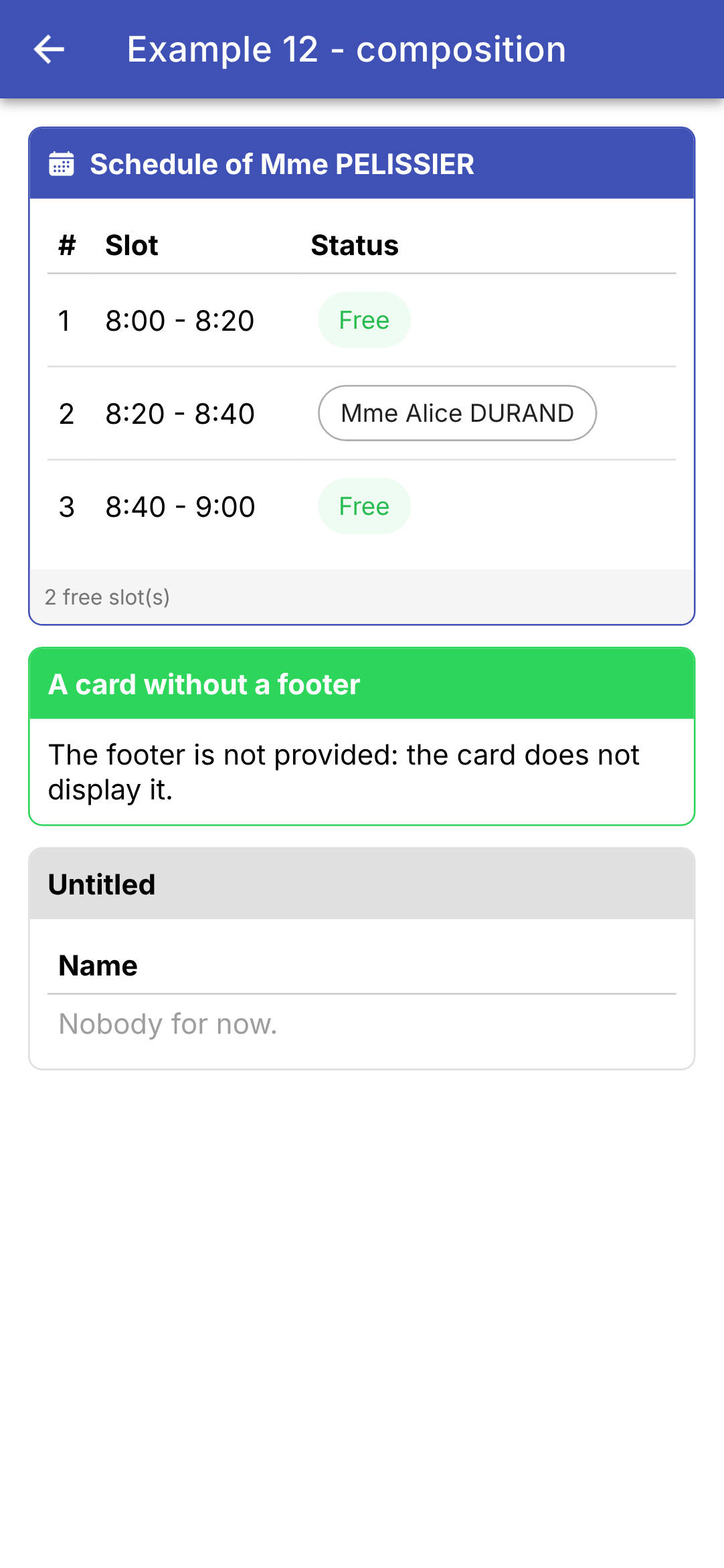
卡片定义框架(边框、页眉、页脚);父组件提供其中的内容。[Ionic] 自身的组件就是这样构建的:[ion-card] 接收其页眉和内容,而 [ion-item] 接收放在开头([slot="start"])或结尾([slot="end"])的元素。[Flutter] 通过 widget 的参数传递内容,而 [Angular] 把内容写在组件的标签之间;当内容依赖于子组件的数据时,[Flutter] 传递一个函数,而 [Angular] 传递一个模板([<ng-template>])。
4.4. 示例 13:组件的生命周期
4.4.1. 时钟
| // =========================================================================
// src/app/ex13-lifecycle/clock.ts - 一个会启动和停止的组件
// -------------------------------------------------------------------------
// Angular 组件的生命周期:
// 1. constructor() :对象被创建;它的输入还没有
// 值;
// 2. ngOnChanges(changes) :它的输入刚刚收到值
// (第一次),之后每当
// 父组件给它们新值时再次触发;
// 3. ngOnInit() :只执行一次,在第一次 ngOnChanges 之后。
// 组件即将出现:我们在这里启动
// 必须启动的东西;
// 4. afterNextRender(...) :在它第一次渲染之后(它的标签
// 已存在于页面中);
// 5. ngOnDestroy() :组件永远消失。我们在这里
// 停止已经启动的东西。
// 时钟在出现时启动一个定时器(setInterval)……并且
// 必须在它消失时务必停止它:否则定时器
// 会在一个已死的组件上白白地继续运行。
// =========================================================================
import { afterNextRender, Component, input, OnChanges, OnDestroy, OnInit, output, signal, SimpleChanges }
from '@angular/core';
// “12:05:09”:当前时间
export function currentTime(): string {
return new Date().toLocaleTimeString('en-GB');
}
@Component({
selector: 'app-clock',
templateUrl: './clock.html',
styles: `.time { font-size: 40px; font-family: 'Roboto Mono', monospace; }`,
})
export class Clock implements OnChanges, OnInit, OnDestroy {
// Ionic 颜色:'primary'、'danger'……
readonly color = input('primary');
// 时钟把它生命中的每个阶段通知父组件
readonly log = output<string>();
readonly time = signal(currentTime());
// 定时器的标识符,以便能够停止它
private timer?: ReturnType<typeof setInterval>;
constructor() {
// afterNextRender:一个只执行一次的函数,在下一次
// 渲染之后执行。它在构造函数中注册(需要“注入
// 上下文”,见示例 14)
afterNextRender(() => this.log.emit('Clock: afterNextRender - displayed'));
}
// changes:发生变化的输入,带有它们的旧值和新值
ngOnChanges(changes: SimpleChanges<Clock>): void {
const color = changes.color;
// firstChange:第一个值,在创建时收到;我们只
// 记录之后的变化
if (color && !color.firstChange) {
this.log.emit(`Clock: ngOnChanges - ${color.previousValue} -> ${color.currentValue}`);
}
}
ngOnInit(): void {
this.log.emit('Clock: ngOnInit - starting the timer');
// 每秒钟,时间都会变化:屏幕随信号而变化
this.timer = setInterval(() => this.time.set(currentTime()), 1000);
}
ngOnDestroy(): void {
clearInterval(this.timer); // 清理
this.log.emit('Clock: ngOnDestroy - timer stopped');
}
}
|
[Angular] 组件的生命周期:
方法 | 何时? |
constructor() | 对象刚刚创建;它的输入还没有值。在这里,我们调用 inject()、effect()、afterNextRender() 等。 |
ngOnChanges(changes) | 它的输入刚刚收到值(第一次),之后每当父组件为它们赋予新值时都会触发 |
ngOnInit() | 仅一次,紧接在第一次 ngOnChanges 之后:组件即将出现。在这里,我们启动一切需要启动的东西(定时器、订阅等) |
afterNextRender(...) | 在下一次渲染之后:组件的标签已经存在于页面上 |
ngOnDestroy() | 组件永久消失。在这里停止所有在此前启动的东西 |
- 第 26–28 行:当前时间,采用 [en-GB] 的 24 小时制格式(“12:05:09”);
- 第 35 行:[implements OnChanges, OnInit, OnDestroy]:[Angular] 的接口,它们要求类实现相应的方法(编译器会检查方法的名称和参数)。[Angular] 只要找到这些方法就会调用,无论是否声明了接口;
- 第 37 行:时钟的颜色:来自 [Ionic] 的颜色;
- 第 39 行:时钟通过输出(示例 11)把生命周期的每个阶段通知给它的父组件;
- 第 41–43 行:状态:显示的时间和定时器的标识符,以便能够停止它;
- 第 49 行:[afterNextRender] 注册一个函数,在下一次显示之后执行一次。它在构造函数中调用,因为它需要“注入上下文”(示例 14)。它不会在构造函数内部直接发出结果:因为此时父组件还没有订阅它;
- 第 53–60 行:[ngOnChanges] 接收发生变化的输入,每个输入都带有其旧值([previousValue])、新值([currentValue])以及 [firstChange],对于创建时收到的第一个值,它为 true。只记录后续的变化:父组件更改了颜色。这对应于 [didUpdateWidget] 在 [Flutter] 中的作用;
- 第 62–66 行:[ngOnInit]:启动一个周期性定时器([setInterval]);它的函数每秒被调用一次并更新时间。这对应于 [initState];
- 第 68–71 行:清理:停止定时器([clearInterval])。否则,它会在已销毁的组件上继续无谓地运行,并使其一直留在内存中(内存泄漏)。这对应于 [dispose]。
| <!-- ======================================================================
clock.html - the time, in large, in the requested colour
====================================================================== -->
<div class="time" [style.color]="'var(--ion-color-' + color() + ')'">{{ time() }}</div>
|
- 第 4 行:时间,以醒目的方式显示;它的颜色由与所接收名称对应的 [Ionic] CSS 变量 决定([var(--ion-color-danger)]……)。
有了信号,你往往可以不用 [ngOnChanges]:输入是一个信号,会被 [computed] 或 [effect] 自动跟踪(示例 11)。[ngOnChanges] 在像这里这样需要获取旧值时仍然有用。
4.4.2. 父组件
| // =========================================================================
// src/app/ex13-lifecycle/ex13.page.ts - 生命周期
// -------------------------------------------------------------------------
// - @if (withClock()) { <app-clock ... /> }:勾选/取消勾选复选框
// 会使组件出现/消失(ngOnInit,然后是 ngOnDestroy,
// 见 clock.ts);更改它的颜色会改变它的输入(ngOnChanges);
// - 一个在出现时就获得焦点的搜索字段
// (afterNextRender);
// - 浏览器选项卡的标题随输入而变化(一个 effect,即 effect());
// - Ionic 的页面事件(ionViewDidEnter、ionViewWillLeave……):
// 页面变得可见或不再可见,而不会被销毁;
// - 应用的生命周期:在手机上,它进入后台
// (打开另一个应用、屏幕熄灭),然后再回来。
// =========================================================================
import {
afterNextRender, Component, DestroyRef, effect, inject, Injector, signal, viewChild,
} from '@angular/core';
import { Title } from '@angular/platform-browser';
import {
IonBackButton, IonButton, IonButtons, IonCard, IonCardContent, IonCheckbox, IonContent, IonHeader, IonInput,
IonTitle, IonToolbar, ViewDidEnter, ViewWillLeave,
} from '@ionic/angular';
import { currentTime, Clock } from './clock';
@Component({
selector: 'app-ex13',
imports: [
IonHeader, IonToolbar, IonButtons, IonBackButton, IonTitle, IonContent, IonCard, IonCardContent, IonCheckbox,
IonButton, IonInput, Clock,
],
templateUrl: './ex13.page.html',
})
export class Ex13Page implements ViewDidEnter, ViewWillLeave {
readonly withClock = signal(true);
readonly red = signal(false);
readonly log = signal<string[]>([]);
readonly search = signal('');
readonly showSearch = signal(false);
// 搜索字段:一个信号,在字段不存在时为 undefined
private readonly field = viewChild(IonInput);
private readonly injector = inject(Injector);
constructor() {
// Angular 的 Title 服务:HTML 页面的标题(浏览器
// 标签页)。一个副作用(EFFECT):每当它读取的
// 信号(search)发生变化,该函数就会重新执行
const title = inject(Title);
const initialTitle = title.getTitle();
effect(() => title.setTitle(this.search() === '' ? 'Example 13' : `Search: ${this.search()}`));
// 应用程序进入后台(hidden)或返回前台(visible)
const onVisibility = () => this.trace(`Application: ${document.visibilityState}`);
document.addEventListener('visibilitychange', onVisibility);
// DestroyRef:编写 ngOnDestroy 的另一种方式,在这里我们启动
// 某些东西。清理代码就写在启动代码旁边
inject(DestroyRef).onDestroy(() => {
document.removeEventListener('visibilitychange', onVisibility);
title.setTitle(initialTitle);
});
}
trace(message: string): void {
this.log.update((j) => [...j, `${currentTime()} ${message}`]);
}
// Ionic 的页面事件:页面已进入屏幕……
ionViewDidEnter(): void {
this.trace('Page: ionViewDidEnter');
}
// ……或即将离开屏幕(另一个页面出现在它前面,或者我们返回)
ionViewWillLeave(): void {
this.trace('Page: ionViewWillLeave');
}
openSearch(): void {
this.showSearch.set(true);
// 字段要到下一次渲染之后才会存在:我们在那时让它获得
// 焦点(手机键盘随之打开)。在构造函数
// 之外,afterNextRender 需要组件的注入器。
// getInputElement():<ion-input> 所包含的 <input> 标签,在
// Ionic 构建它之后(一个 promise)
afterNextRender(async () => (await this.field()?.getInputElement())?.focus(), { injector: this.injector });
}
}
|
- 第 34 行:页面实现了 [Ionic] 的两个接口:[ViewDidEnter] 和 [ViewWillLeave] (见下文);
- 第 42 行:[viewChild(IonInput)]:模板的搜索字段,以信号的形式提供,在字段不存在时为 [undefined];
- 第 43 行:组件注入器(示例 14),[afterNextRender] 在第 85 行会需要它;
- 第 49–51 行:[Title] 服务来自 [Angular] ,用于修改 HTML 页面的标题(显示在浏览器标签页中的那个)。一个副作用(EFFECT)([effect]):每当它读取的某个信号发生变化,该函数就会重新执行;因此标题会随着文本的输入而更新。这对应于 [Title] widget 在 [Flutter] 中的作用;
- 第 54–55 行:应用程序自身的生命周期。在手机上,应用会进入后台(当打开另一个应用或屏幕关闭时),然后再返回:文档中的 [visibilitychange] 事件会发出这一信号(此时 [document.visibilityState] 等于 [hidden] 或 [visible])。你可以响应它来保存草稿或停止定时器。这对应于 [AppLifecycleListener] 在 [Flutter] 中的作用;[Capacitor] 应用也有 [@capacitor/app] 插件用于此目的;
- 第 58–61 行:[DestroyRef]:编写 [ngOnDestroy] 的另一种方式。[onDestroy(...)] 注册一个在组件被销毁时调用的函数;清理代码因此就写在它所清理的内容旁边:移除监听器,并恢复页面的标题;
- 第 69–76 行:[Ionic] 页面(PAGE)事件,在 [Flutter] 中没有对应物。从一个页面切换到另一个页面时,[Ionic] 会把前一个页面隐藏并保留在内存中而不销毁它(这样返回时无需重新创建):因此 [ngOnInit] 和 [ngOnDestroy] 并不能表明页面何时变为可见或不再可见。这些职责由 [ionViewWillEnter] 和 [ionViewDidEnter] (页面即将出现在屏幕上 / 已经出现在屏幕上)以及 [ionViewWillLeave] 和 [ionViewDidLeave] (页面即将离开屏幕 / 已经离开屏幕)承担。例如,返回页面时就在这里重新加载页面数据;
- 第 78–86 行:搜索字段要到下一次页面加载之后才会存在;此时使用 [afterNextRender] (对应于 [addPostFrameCallback])让它获得焦点。在构造函数之外,[afterNextRender] 要求向它提供组件的注入器。[getInputElement()] (在 promise 中)返回组件 [<input>] 中包含的标签 [ion-input],前提是 [Ionic] 已经创建了它;我们让它获得焦点,手机的键盘随即打开。
| <!-- ======================================================================
ex13.page.html - a clock that we make appear and disappear
====================================================================== -->
<ion-header>
<ion-toolbar color="primary">
<ion-buttons slot="start">
<ion-back-button defaultHref="/" />
</ion-buttons>
<ion-title>Example 13 - the lifecycle</ion-title>
</ion-toolbar>
</ion-header>
<ion-content class="ion-padding">
<ion-card>
<ion-card-content>
<ion-checkbox labelPlacement="end" [checked]="withClock()" (ionChange)="withClock.set($event.detail.checked)">
show the clock
</ion-checkbox>
<br />
<ion-checkbox labelPlacement="end" [checked]="red()" (ionChange)="red.set($event.detail.checked)">
in red
</ion-checkbox>
<!-- 只有勾选了复选框,组件才会存在 -->
@if (withClock()) {
<app-clock [color]="red() ? 'danger' : 'primary'" (log)="trace($event)" />
}
</ion-card-content>
</ion-card>
<ion-card>
<ion-card-content>
@if (!showSearch()) {
<ion-button fill="outline" (click)="openSearch()">Search...</ion-button>
} @else {
<ion-input
placeholder="the title follows the typing"
[value]="search()"
(ionInput)="search.set($event.detail.value ?? '')"
/>
}
</ion-card-content>
</ion-card>
<h6>Log</h6>
@for (line of log(); track $index) {
<div style="font-size: 12px">{{ $index + 1 }}. {{ line }}</div>
}
</ion-content>
|
- 第 17–23 行:来自 [Ionic] 的两个复选框([ion-checkbox]),标签位于复选框之后([labelPlacement="end"]);
- 第 25–27 行:勾选复选框会显示时钟([ngOnInit]);取消勾选则隐藏它([ngOnDestroy]):[@if] 确实会创建并销毁组件。更改它的颜色会更改它的输入([ngOnChanges]);
- 第 33–41 行:一个只有在点击“Search…”之后才会出现的字段;
- 第 46–48 行:日志。
我们更改颜色,移除并恢复时钟,打开搜索,并输入一个姓名:
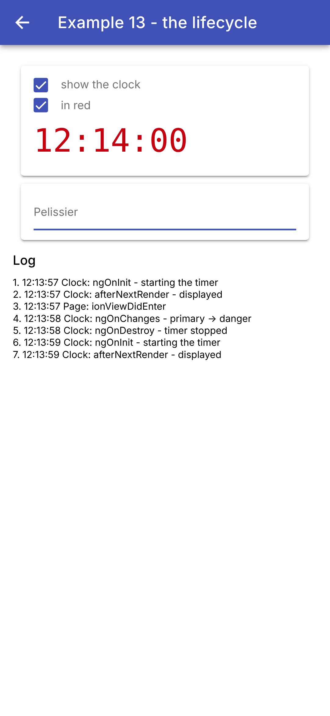
日志显示了时钟的活动:启动和初次显示、颜色变化、关闭和重新启动;而在这之间,还有页面出现在屏幕上([ionViewDidEnter])。字段自己获得了焦点:我们无需触碰它就在键盘上输入了姓名,并且浏览器标签页的标题随着输入而更新(“Search: Pelissier”,截图中看不到)。
对于 [Flutter] 而言,映射关系是直接的:[initState] 变为 [ngOnInit] (对于不依赖输入的元素,则是构造函数),[didUpdateWidget] 变为 [ngOnChanges] (对于某个输入,则是 [effect] ),[dispose] 变为 [ngOnDestroy] (或 [DestroyRef.onDestroy]),[addPostFrameCallback] 变为 [afterNextRender]。学过 [React] 课程的读者会认出 [effect] 和 [DestroyRef] 正是 [useEffect] 的两半:副作用及其清理函数。
4.5. 示例 14:依赖注入
如何在相距较远的组件之间共享数据和函数,而不必让它们逐级通过所有中间组件的输入传递?[Flutter] 通过继承数据([InheritedWidget])来解决,[React] 通过上下文来解决;[Angular] 使用的是服务和依赖注入。这正是 [Angular] 和 [Ionic] 自身所使用的机制:[Router]、[HttpClient]、[Title]、[AlertController]……都是通过 [inject(...)] 请求的服务。
原理:
- 服务是一个普通的类,用 [@Injectable] 标记;
- 提供者(PROVIDER)告诉 [Angular] 如何创建它的实例。它在应用程序的根部或由某个组件声明;
- 组件(或另一个服务)通过 [inject(Class)] 请求该对象:[Angular] 先在组件自身中查找提供者,然后在其父组件中,再在父组件的父组件中……一直到根,并返回最近的提供者所提供的对象。每个提供者只创建一次它的对象:请求它的各方共享同一个对象。
4.5.1. 整个应用程序共用一个数据实例
| // =========================================================================
// src/app/ex14-injection/providers/log.ts - 整个(WHOLE)应用程序共用的一份数据
// -------------------------------------------------------------------------
// 如何在相距较远的组件之间共享数据和函数,而不必让它们
// 逐级通过所有中间组件的输入传递?
// 借助服务(SERVICE)和 Angular 的依赖注入(DEPENDENCY INJECTION):
// 1. 服务是一个普通的类,用 @Injectable 标记;
// 2. 提供者(PROVIDER)告诉 Angular 如何构建它的对象;
// 3. 任何组件都通过 inject(Log) 请求它:Angular
// 会给它位于上方最近(NEAREST)的提供者的对象。
// providedIn: 'root':该提供者位于
// 应用程序的根部。只有一个(ONE)日志,由所有人共享(“单例”),
// 在第一次被请求时创建。
// 这是 Angular 和 Ionic 自身所使用的机制:Router、
// HttpClient、AlertController……都是我们注入的服务。
//
// 服务的数据是信号(SIGNALS):在模板中读取它们的组件
// 会在数据变化时更新。
// =========================================================================
import { Injectable, signal } from '@angular/core';
import { currentTime } from './clock';
@Injectable({ providedIn: 'root' })
export class Log {
// 私有且可修改;公开部分只有只读视图
private readonly _lines = signal<string[]>([]);
readonly lines = this._lines.asReadonly();
trace(message: string): void {
// 最新的一行在最前;最多六行
this._lines.update((l) => [`${currentTime()} ${message}`, ...l].slice(0, 6));
}
}
|
- 第 24 行:[providedIn: 'root']:日志的提供者位于应用程序的根部。只有一个日志,由所有人共享(“单例”),在第一次被请求时创建;
- 第 27–28 行:服务的数据是信号:在模板中读取它们的组件会在数据变化时更新(对应于 [ChangeNotifier] 和 [notifyListeners()] 在 [Flutter] 中的作用)。可编辑的信号是私有的;公开部分只能得到它的只读视图([asReadonly()]):只有服务才能通过自己的方法修改日志;
- 第 30–33 行:修改日志的唯一方式是在顶部添加新的一行,最多保留六行。
4.5.2. 由组件提供的数据
| // =========================================================================
// src/app/ex14-injection/providers/cart.ts - 由一个(ONE)组件提供的一份数据
// -------------------------------------------------------------------------
// 这个服务没有 providedIn:没有人提供它……除了在其 providers 中
// 声明它的组件:
// @Component({ ..., providers: [Cart] })
// 于是该组件得到了它自己(ITS)的购物车,它和它的所有
// 后代(其模板中的组件,以及这些组件模板中的组件……)都能看到它,
// 而且只有它们能看到。提供它的两个组件拥有两个相互独立的
// 购物车。购物车随其组件一起创建,也随其组件一起销毁
// (服务的 ngOnDestroy)。
// 服务本身可以注入其他服务:这里是日志。
// =========================================================================
import { computed, inject, Injectable, OnDestroy, signal } from '@angular/core';
import { Log } from './log';
export interface Item {
label: string;
price: number;
}
@Injectable()
export class Cart implements OnDestroy {
private readonly log = inject(Log);
private readonly _items = signal<Item[]>([]);
readonly items = this._items.asReadonly();
// 一个计算值:reduce 把列表“折叠”成单个值
readonly total = computed(() => this._items().reduce((sum, a) => sum + a.price, 0));
add(item: Item): void {
this._items.update((a) => [...a, item]);
this.log.trace(`cart: + ${item.label}`);
}
remove(index: number): void {
this.log.trace(`cart: - ${this._items()[index].label}`);
this._items.update((a) => a.filter((_, i) => i !== index));
}
// 由组件提供的服务随该组件一起销毁
ngOnDestroy(): void {
this.log.trace('cart: destroyed');
}
}
|
- 第 23 行:[@Injectable()],没有 [providedIn]:没有人提供购物车……除了在其 [providers] 中声明它的组件(见 [ex14.page.ts])。于是该组件得到了它自己的购物车,它和它的所有后代(其模板中的组件、这些组件模板中的组件……)都能看到这个购物车——而且只有它们能看到。提供它的两个组件拥有两个相互独立的购物车:这正是放在树中的 [InheritedWidget] 的行为方式;
- 第 25 行:服务本身可以注入其他服务:购物车会把每次添加和每次移除都记录到日志中;
- 第 29 行:总价,一个计算值。[reduce] 把列表“折叠”成单个值:价格之和;
- 第 31–39 行:对购物车的修改,每次都会生成一个新列表;
- 第 42–44 行:由组件提供的服务随组件一起创建,也随组件一起结束:[Angular] 此时会调用它的 [ngOnDestroy]。当你之后返回该页面时,会在日志中看到“cart: destroyed”这一行,而日志属于整个应用程序。
4.5.3. 已配置的提供者
| // =========================================================================
// src/app/ex14-injection/providers/clock.ts - 一个带参数(PARAMETERIZED)的提供者
// -------------------------------------------------------------------------
// 一个时钟,其刷新周期是提供者的
// 一个参数:
// @Component({ ..., providers: [provideClock(5000)] })
// 该参数本身是一个被注入的值,由一个令牌(TOKEN)
// (InjectionToken)指定:提供者 { provide: PERIOD, useValue: 5000 }
// 给它赋值。provideClock(period) 返回两个
// 提供者:周期的提供者和时钟的提供者。
// 两个组件各自提供一个时钟:后代会得到
// 位于它上方最近(NEAREST)的那个。
// 当其组件消失时,时钟停止(ngOnDestroy)。
// =========================================================================
import { inject, Injectable, InjectionToken, OnDestroy, Provider, Signal, signal } from '@angular/core';
// “12:05:09”:一个日期的时间
export function currentTime(d = new Date()): string {
return d.toLocaleTimeString('en-GB');
}
// 一个令牌:它指代并非类的值(这里是一个数字)。
// factory:默认值,在没有人提供时使用
export const CLOCK_PERIOD = new InjectionToken<number>('period of the clock (ms)', {
factory: () => 1000,
});
@Injectable()
export class Clock implements OnDestroy {
private readonly period = inject(CLOCK_PERIOD);
private readonly _now = signal(new Date());
readonly now = this._now.asReadonly();
private readonly timer = setInterval(() => this._now.set(new Date()), this.period);
ngOnDestroy(): void {
clearInterval(this.timer);
}
}
// 带参数的提供者:一个返回提供者的函数
export function provideClock(period = 1000): Provider[] {
return [{ provide: CLOCK_PERIOD, useValue: period }, Clock];
}
// 带默认值的读取:对于其上方没有人提供时钟的
// 组件,使用一个固定的日期。
// optional: true:inject 返回 null,而不是抛出错误
export function injectNow(): Signal<Date> {
return inject(Clock, { optional: true })?.now ?? signal(new Date(2026, 0, 1)).asReadonly();
}
|
- 第 25–27 行:令牌(TOKEN)([InjectionToken])指代并非类的可注入数据:这里是一个数字——时钟周期。[factory] 在没有其他人提供时给出它的默认值;
- 第 29–39 行:时钟,一个同样没有 [providedIn] 的服务。它注入自己的周期(第 31 行),并在创建后立即按该周期启动一个定时器(第 34 行);在其组件被销毁时(第 36–38 行)停止该定时器;
- 第 42–44 行:已配置的提供者:一个返回两个提供者的函数。[{ provide: CLOCK_PERIOD, useValue: period }] 把接收到的值赋给令牌;[Clock](单独写类名)是 [{ provide: Clock, useClass: Clock }] 的简写形式。组件会写 [providers: [provideClock(5000)]]。[Angular] 自身的提供者就是这样写的:在 [provideRouter(routes)]、[provideHttpClient()] 中,位于 [main.ts];
- 第 49–51 行:带默认值的读取:对于没有人为其提供时钟的组件,使用一个固定日期。[{ optional: true }]:[inject] 返回 [null] 而不是抛出错误;[?.] 和 [??] 随后取默认值。像 [injectXxx()] 这样的函数可以在任何允许使用 [inject] 的地方调用:在组件或服务的字段或构造函数中(“注入上下文”)。
4.5.4. 组件
| // =========================================================================
// src/app/ex14-injection/catalog.ts - 一个向购物车添加(ADDS)商品的后代
// =========================================================================
import { CurrencyPipe } from '@angular/common';
import { Component, inject } from '@angular/core';
import { IonButton, IonCard, IonIcon, IonItem, IonLabel, IonList } from '@ionic/angular';
import { addIcons } from 'ionicons';
import { cartOutline } from 'ionicons/icons';
import { Item, Cart } from './providers/cart';
const catalog: Item[] = [
{ label: 'Consultation', price: 30 },
{ label: 'Vaccine', price: 12.5 },
{ label: 'Certificate', price: 5 },
];
@Component({
selector: 'app-catalog',
imports: [IonCard, IonList, IonItem, IonLabel, IonButton, IonIcon, CurrencyPipe],
templateUrl: './catalog.html',
})
export class Catalog {
readonly catalog = catalog;
// 由 Ex14Page 提供的购物车(如果没有人提供,则会报错)
readonly cart = inject(Cart);
constructor() {
addIcons({ cartOutline });
}
}
|
- 第 26 行:目录组件请求购物车。[Angular] 从目录组件向上追溯到第一个提供它的组件:页面。如果没有任何组件提供它,[inject] 就会抛出错误(“No provider for Cart”):这是一个编程错误,并且提示得很清楚。
| <!-- ======================================================================
catalog.html - one item per row, and a button to add it
====================================================================== -->
<ion-card>
<ion-list lines="none">
@for (a of catalog; track a.label) {
<ion-item>
<!-- currency:以欧元表示的价格,英式风格(“€12.50”) -->
<ion-label>{{ a.label }} ({{ a.price | currency: 'EUR' }})</ion-label>
<ion-button slot="end" fill="clear" (click)="cart.add(a)" [attr.aria-label]="'add ' + a.label">
<ion-icon slot="icon-only" name="cart-outline" />
</ion-button>
</ion-item>
}
</ion-list>
</ion-card>
|
- 第 9 行:商品的描述和价格;[currency: 'EUR'] 以英式风格格式化价格(“€12.50”);
- 第 10–12 行:一个把商品加入购物车的图标按钮。模板直接调用服务的一个方法。[[attr.aria-label]] 为没有文字的按钮指定一个名称(供屏幕阅读器使用,也用于屏幕截图场景)。
| // =========================================================================
// src/app/ex14-injection/cart-summary.ts
// -------------------------------------------------------------------------
// 另一个后代:与 Catalog 相同(SAME)的购物车(页面的购物车),
// 但有它自己(OWN)的时钟,每 5 秒刷新一次:该组件
// 自己提供它(providers)。组件能看到它自己的
// 提供者:inject(Clock) 给它最近的一个,即它自己的。
// =========================================================================
import { CurrencyPipe, DatePipe } from '@angular/common';
import { Component, inject } from '@angular/core';
import { IonButton, IonCard, IonCardContent } from '@ionic/angular';
import { provideClock, Clock } from './providers/clock';
import { Cart } from './providers/cart';
@Component({
selector: 'app-cart-summary',
imports: [IonCard, IonCardContent, IonButton, CurrencyPipe, DatePipe],
templateUrl: './cart-summary.html',
// 一个 5 秒的时钟,供该组件及其后代使用
providers: [provideClock(5000)],
})
export class CartSummary {
readonly cart = inject(Cart); // 由页面在更高层提供
readonly clock = inject(Clock); // 最近的那个:5 秒的时钟
}
|
- 第 21 行:摘要组件为自己及其后代提供它自己的定时器,周期为 5 秒;
- 第 24–25 行:与目录组件相同的购物车(页面的购物车),但最近的定时器是它自己的。组件能看到它自己的提供者:不必像 [Flutter] 的 [CartSummary] 那样,把内容委托给放在提供者之下的一个小 widget。
| <!-- ======================================================================
cart-summary.html - the content of the cart, and its total
====================================================================== -->
<ion-card>
<ion-card-content>
<!-- date: 'HH:mm:ss':一个日期的时间 -->
<h2>Cart ({{ cart.items().length }} item(s)) - {{ clock.now() | date: 'HH:mm:ss' }}</h2>
@for (a of cart.items(); track $index) {
<div>
{{ a.label }}
<ion-button fill="clear" size="small" (click)="cart.remove($index)">remove</ion-button>
</div>
}
<strong>Total: {{ cart.total() | currency: 'EUR' }}</strong>
</ion-card-content>
</ion-card>
|
- 第 7 行:商品数量,以及来自 5 秒时钟的时间([date: 'HH:mm:ss']:针对特定日期的时间);
- 第 8–13 行:每行一件商品,以及一个移除它的按钮;
- 第 14 行:总价。
| // =========================================================================
// src/app/ex14-injection/ex14.page.ts - 三个层级的注入
// -------------------------------------------------------------------------
// - 日志:在根部提供(providedIn: 'root'),供整个
// 应用程序使用;
// - 购物车,由页面提供(providers):由 Catalog 和
// CartSummary 共享,它们看到的是同一个(SAME)购物车;
// - 时钟,由页面提供(默认周期,1 秒),同时也由
// CartSummary 提供(5 秒):各用各的。
// =========================================================================
import { DatePipe } from '@angular/common';
import { Component, inject } from '@angular/core';
import { IonBackButton, IonButtons, IonContent, IonHeader, IonText, IonTitle, IonToolbar } from '@ionic/angular';
import { Catalog } from './catalog';
import { provideClock, injectNow } from './providers/clock';
import { Log } from './providers/log';
import { Cart } from './providers/cart';
import { CartSummary } from './cart-summary';
@Component({
selector: 'app-ex14',
imports: [
IonHeader, IonToolbar, IonButtons, IonBackButton, IonTitle, IonContent, IonText, DatePipe,
Catalog, CartSummary,
],
templateUrl: './ex14.page.html',
// 页面为自己及其包含的所有内容提供一个时钟(1 秒)和一个购物车
providers: [provideClock(), Cart],
})
export class Ex14Page {
// 整个应用程序的日志
readonly log = inject(Log);
// 页面时钟的时间(最近的那个:页面自己的时钟)
readonly now = injectNow();
}
|
- 第 29 行:页面为自己及其包含的所有内容提供一个定时器(默认间隔:一秒)和一个购物车;
- 第 33 行:页面读取整个应用程序的日志;
- 第 35 行:页面时钟所显示的时间——最近的那个时钟,即页面自己提供的时钟。
| <!-- ======================================================================
ex14.page.html - the shop: the catalog, the cart, the log
====================================================================== -->
<ion-header>
<ion-toolbar color="primary">
<ion-buttons slot="start">
<ion-back-button defaultHref="/" />
</ion-buttons>
<ion-title>Example 14 - dependency injection</ion-title>
</ion-toolbar>
</ion-header>
<ion-content class="ion-padding">
<ion-text color="medium">Clock of the page: {{ now() | date: 'HH:mm:ss' }}</ion-text>
<!-- 没有输入:这些组件通过注入找到购物车 -->
<app-catalog />
<app-cart-summary />
<h6>Log (provided to the whole application)</h6>
@for (line of log.lines(); track $index) {
<div style="font-size: 12px">{{ line }}</div>
}
</ion-content>
|
- 第 17–18 行:目录组件和摘要组件不接收任何输入;它们通过注入获得购物车;
- 第 20–22 行:日志,每增加一行就会更新:这是一个信号。
我们添加三件商品,然后移除第一件:
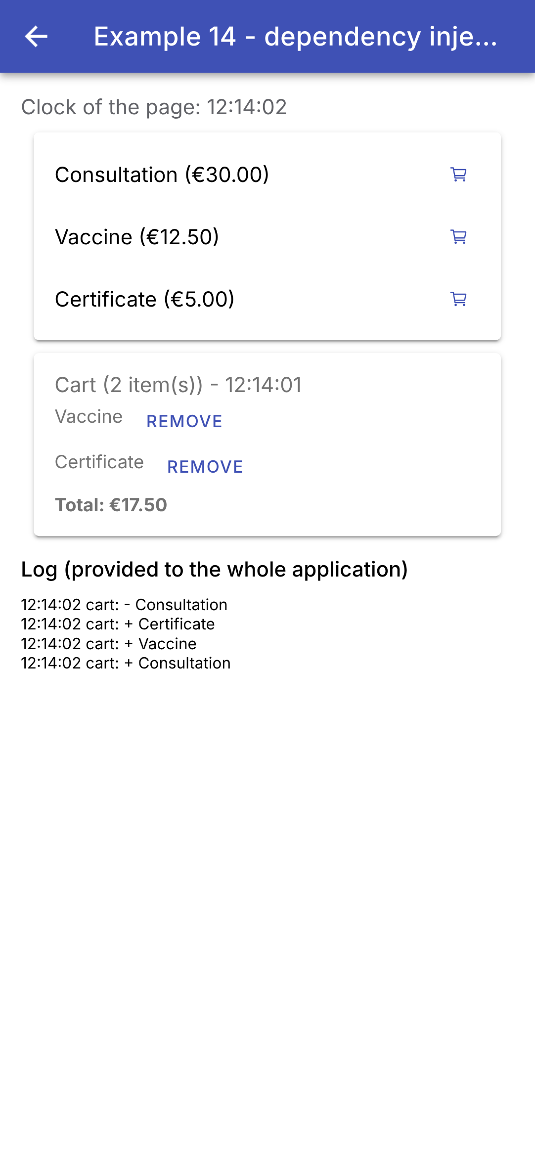
页面上的时钟每秒前进一次;购物车中的时钟每五秒前进一次。日志显示了添加和移除操作。示例 20 将把同样的机制用于整个应用程序的共享状态:一个服务及其信号。在 [Flutter] 需要 [InheritedWidget]、[ChangeNotifier]、以及 [of(context)] 方法(实际上还有 [provider] 包)的地方,[Angular] 默认就包含了全部内容:[@Injectable]、[providers]、[inject]以及信号。
4.6. 示例 15:复用行为
组件复用的是布局(模板)。那么如何复用行为及其状态(高亮被触碰的元素、长按后触发某个动作、启动时给予焦点)呢?[React] 有“自定义 Hook”;[Flutter] 有“包装器”widget 和 mixin;[Angular] 有属性指令,可以作为属性应用于任何标签,并且可以组合使用。
4.6.1. “高亮器”指令
| // =========================================================================
// src/app/ex15-behaviours/highlighter.ts - 放在指令(DIRECTIVE)中的行为
// -------------------------------------------------------------------------
// 组件复用的是显示(DISPLAY)(模板)。要复用
// 行为(BEHAVIOUR)(及其状态),Angular 有属性指令(DIRECTIVES):
// 一个没有模板的类,我们像属性一样把它设置在任何
// 标签上,它作用于该标签(即它的“宿主”):
// <ion-item highlighter="#d1e7dd">...</ion-item>
// 这个指令在其宿主被触碰(手指按在
// 屏幕上)时高亮它,并且在使用鼠标(Web、电脑)时,在它被悬停(HOVERED)时高亮。
// 每个标签都有自己的指令,因而有自己的状态:两行
// 互不干扰。
// =========================================================================
import { computed, Directive, input, signal } from '@angular/core';
@Directive({
selector: '[highlighter]',
// host:指令对其宿主所做的事情
host: {
// (event):它所监听的宿主事件。“指针”(pointer)
// 事件涵盖手指、鼠标和触控笔
'(pointerdown)': 'touched.set(true)',
'(pointerup)': 'touched.set(false)',
'(pointercancel)': 'touched.set(false)',
'(mouseenter)': 'hovered.set(true)',
'(mouseleave)': 'hovered.set(false)',
// [property]:它所设置的宿主属性。一个 CSS 过渡
// 为颜色变化添加动画(200 毫秒)
'[style.backgroundColor]': 'background()',
'[style.transition]': '"background-color 200ms"',
// ion-item 会绘制自己的背景(--background 变量):我们把
// 它设为透明,以便显示出指令的背景
'[style.--background]': '"transparent"',
},
})
export class Highlighter {
// 输入使用指令的名称:highlighter="#d1e7dd";不带
// 值(单独写属性)时,使用默认颜色
readonly color = input('#fff3cd', { alias: 'highlighter', transform: (c: string) => c || '#fff3cd' });
readonly touched = signal(false);
readonly hovered = signal(false);
readonly background = computed(() => (this.touched() || this.hovered() ? this.color() : 'transparent'));
}
|
- 第 17 行:[@Directive]:一个没有模板的类。它作用于携带它的标签,即它的宿主(HOST);
- 第 18 行:选择器:该指令应用于任何带有 [highlighter] 属性的标签;
- 第 20–35 行:[host]:指令在其宿主上所做的事情;
- 第 23–27 行:[(event)]:它所监听的宿主事件。“指针”事件包括手指、鼠标和触控笔:按下、抬起和取消(对应于 [Listener] 在 [Flutter] 中的作用);[mouseenter] 和 [mouseleave] 表示鼠标进入和离开,无论是在网页上还是在计算机上(对应于 [MouseRegion]);
- 第 30–31 行:[[property]]:它设置的宿主属性:背景颜色,以及一个在 200 毫秒内为其变化添加动画的 CSS 过渡(对应于 [AnimatedContainer]);
- 第 34 行:[ion-item] 在其组件内部根据它的 CSS 变量 [--background] 绘制自己的背景:把它设为透明,以显示指令的背景;
- 第 40 行:输入使用指令的名称(别名):[highlighter="#d1e7dd"] 既设置了指令,又指定了颜色。如果没有提供值(单独写属性,即空字符串),转换函数会使用默认颜色;
- 第 42–44 行:指令的状态——是否被触碰、是否被悬停——以及由此得出的颜色。每个标签都有自己的指令,因而有自己的状态;这两行互不冲突。
[Highlighter] 为任何标签添加其行为:[<ion-item highlighter>...</ion-item>],而无需把它包装在组件中。
4.6.2. 手势:长按
| // =========================================================================
// src/app/ex15-behaviours/long-press.ts - 一个手势:长按
// -------------------------------------------------------------------------
// <ion-item (longPress)="remove()" [longPressDuration]="1000">
// 只有在宿主被按住
// 整个持续时间的情况下,才会发出 longPress 输出:以防误触。
// 手势由 createGesture 识别,它是 Ionic 的手势
// 库:它整合手指和鼠标事件,
// 并通知手势的开始(onStart)和结束(onEnd)。
// 该指令公开了它的状态(pressing):使用它的组件
// 可以显示该状态(见 long-press-button.ts)。
// =========================================================================
import { DestroyRef, Directive, ElementRef, inject, input, numberAttribute, output, signal } from '@angular/core';
import { createGesture } from '@ionic/angular';
@Directive({
selector: '[longPress]',
// preventDefault:按下宿主不会使正在输入的字段
// 失去焦点(手机键盘保持打开)
host: { '(mousedown)': '$event.preventDefault()' },
})
export class LongPress {
// 按压的持续时间,以毫秒为单位
readonly duration = input(1000, { alias: 'longPressDuration', transform: numberAttribute });
// 输出使用指令的名称:(longPress)="..."
readonly longPress = output<void>();
// 按压是否正在进行?
readonly pressing = signal(false);
private timeout?: ReturnType<typeof setTimeout>;
constructor() {
// ElementRef:指令的宿主标签
const host: HTMLElement = inject(ElementRef).nativeElement;
const gesture = createGesture({
el: host,
gestureName: 'long-press',
// threshold: 0:手指一按下,手势就开始,无需
// 等待它移动
threshold: 0,
onStart: () => this.start(),
onEnd: () => this.stop(),
});
gesture.enable();
// 清理:宿主被移除时,不会再留下孤立的手势或定时器
inject(DestroyRef).onDestroy(() => {
gesture.destroy();
clearTimeout(this.timeout);
});
}
private start(): void {
this.pressing.set(true);
// 延迟结束:按压持续的时间已经足够长
this.timeout = setTimeout(() => {
this.pressing.set(false);
this.longPress.emit();
}, this.duration());
}
// 手指抬起(太早,或在动作之后)
private stop(): void {
clearTimeout(this.timeout);
this.pressing.set(false);
}
}
|
- 第 21 行:[$event.preventDefault()] 用于 [mousedown]:点按宿主不会使正在编辑的字段失去焦点(手机键盘保持打开),就像 [Flutter] 中的按钮一样;
- 第 25 行:按压的持续时间,以毫秒为单位:一个带默认值的输入;
- 第 27 行:输出使用指令的名称:父组件会写 [(longPress)="remove()"],这既设置了指令,又监听了它的输出;
- 第 29 行:指令报告其状态:使用它的组件可以显示该状态;
- 第 35 行:[ElementRef]:指令的宿主,而 [nativeElement] 是它在页面上的标签;
- 第 36–45 行:[createGesture],来自 [Ionic] 的手势库(用于拖动菜单和窗口的那个库)。它把手指事件和鼠标事件结合起来,并发出手势开始([onStart])和结束([onEnd])的信号。[threshold: 0]:手指一接触屏幕,手势就开始,无需等待它移动。创建的手势必须被激活([enable()]);
- 第 47–50 行:清理:宿主被移除时,不会再留下孤立的手势或定时器;
- 第 53–60 行:手指按下:按所需的持续时间设置一个定时器。如果它走到终点,就说明按压持续得足够久:指令输出其结果;
- 第 63–66 行:手指抬起:如果太早,就取消定时器,什么也不会发生。
4.6.3. 包含动画的组件
| // =========================================================================
// src/app/ex15-behaviours/long-press-button.ts - 一个长按按钮
// -------------------------------------------------------------------------
// <app-long-press-button [duration]="1000" (action)="remove()">Delete</app-long-press-button>
// 一个带有动画(ANIMATION)的组件:按压期间圆环逐渐
// 填满,如果手指抬起得太早,圆环就会清空。
// - 行为(手势)没有被重写:组件
// 把 LongPress 指令附加(ATTACHES)到自身(hostDirectives),就好像我们
// 写了 <app-long-press-button longPress>;与此同时它重命名了
// 指令的输入(duration)和输出(action);
// - 动画由 createAnimation 完成,它是 Ionic 的动画
// 库(Ionic 自身过渡所使用的那个)。
// =========================================================================
import { Component, effect, ElementRef, inject, viewChild } from '@angular/core';
import { Animation, createAnimation } from '@ionic/angular';
import { LongPress } from './long-press';
// 圆环的周长(半径为 10):描边的长度
const CIRCUMFERENCE = 2 * Math.PI * 10;
@Component({
selector: 'app-long-press-button',
templateUrl: './long-press-button.html',
// LongPress 指令,应用于组件的标签
hostDirectives: [{ directive: LongPress, inputs: ['longPressDuration: duration'], outputs: ['longPress: action'] }],
styles: `
:host { display: inline-flex; align-items: center; gap: 8px; color: var(--ion-color-danger);
font-size: 13px; cursor: pointer; user-select: none; touch-action: none; }
svg { width: 22px; height: 22px; transform: rotate(-90deg); }
circle { fill: none; stroke: var(--ion-color-danger); stroke-width: 3; }
`,
})
export class LongPressButton {
// 被附加的指令:组件读取它的状态
private readonly press = inject(LongPress);
private readonly circle = viewChild.required<ElementRef<SVGCircleElement>>('circle');
readonly circumference = CIRCUMFERENCE;
private animation?: Animation;
private startTime = 0;
constructor() {
// 一个副作用:它跟踪按压的开始和结束
effect(() => {
if (this.press.pressing()) {
this.fill();
} else {
this.empty();
}
});
}
// 圆环在 duration 毫秒内填满:描边的偏移量
// (stroke-dashoffset)从周长(什么也没画出)变为 0(全部画出)
private fill(): void {
this.startTime = Date.now();
this.animation?.destroy();
this.animation = createAnimation()
.addElement(this.circle().nativeElement)
.duration(this.press.duration())
.easing('linear')
.fill('forwards')
.fromTo('strokeDashoffset', `${CIRCUMFERENCE}`, '0');
this.animation.play();
}
// 手指抬起:圆环从当前位置开始以相同的速度清空
private empty(): void {
if (!this.animation) return;
const done = Math.min(1, (Date.now() - this.startTime) / this.press.duration());
this.animation.destroy();
this.animation = createAnimation()
.addElement(this.circle().nativeElement)
.duration(Math.max(1, done * this.press.duration()))
.easing('linear')
.fill('forwards')
.fromTo('strokeDashoffset', `${CIRCUMFERENCE * (1 - done)}`, `${CIRCUMFERENCE}`);
this.animation.play();
}
}
|
- 第 20 行:圆环(半径为 10 的圆)的周长,将用于绘制它;
- 第 26 行:[hostDirectives]:组合(COMPOSITION)指令。组件把 [LongPress] 指令附加到自身上,就好像每次使用它时我们都写了 [<app-long-press-button longPress>] 一样。它公开了该指令的输入和输出,并在此过程中重命名它们:[[duration]] 和 [(action)]。行为没有被重写,而是被复用:这对应于 [Dart] 的 mixin,它无需继承就能为类添加代码;
- 第 27–32 行:样式——文本和红色圆环;[touch-action: none] 阻止浏览器解释用户交互(滚动、缩放);圆环旋转了四分之一圈,以便从顶部开始填充;
- 第 36 行:组件注入关联的指令,以读取其状态;
- 第 37 行:[viewChild.required('circle')]:模板中引用 [#circle] 的标签;
- 第 45–51 行:一个跟踪按压开始和结束的副作用;
- 第 56–66 行:[createAnimation],[Ionic] 的动画库(包含它自己的各种过渡的那个库)。圆环是用虚线绘制的,虚线的第一段长度等于周长:在整个按压持续时间内([strokeDashoffset] 从周长移到 0,持续时间为 [duration]),以恒定速度([easing('linear')])移动这一段,圆就被逐渐画出。[fill('forwards')]:结束时,元素保持动画的最终状态。这对应于 [AnimationController] 在 [Flutter] 中的作用;
- 第 69–80 行:手指抬起:圆环从当前位置开始以相同速度清空([done]:已经过的那部分持续时间)。
| <!-- ======================================================================
long-press-button.html - a ring (SVG drawing), then the content of the button
====================================================================== -->
<svg viewBox="0 0 24 24" aria-hidden="true">
<!-- #circle: a reference, read by viewChild('circle'). At the start, the
stroke is entirely offset: nothing is drawn -->
<circle #circle cx="12" cy="12" r="10" [attr.stroke-dasharray]="circumference"
[attr.stroke-dashoffset]="circumference" />
</svg>
<ng-content />
|
- 第 4–9 行:一个 SVG 绘图:一个圆,在开始时被完全偏移(什么也没有画出)。[[attr.stroke-dasharray]]:绑定到标签的属性(ATTRIBUTE)(SVG 没有对应的 property);
- 第 10 行:按钮的内容,由父组件提供(示例 12)。
4.6.4. “启动时聚焦”指令
| // =========================================================================
// src/app/ex15-behaviours/autofocus.ts - 启动时聚焦
// -------------------------------------------------------------------------
// <ion-input focusOnStart placeholder="..." />
// 一个只应用于 <ion-input> 的指令(它的选择器):
// 因此它可以注入其宿主的 IonInput 组件,并使用
// 它的方法。在第一次渲染之后,字段获得焦点(手机
// 键盘打开)。
// (ion-input 的 autofocus 属性在
// 页面加载时也能达到同样的效果:这个指令展示的是该机制,可复用于其他用途。)
// =========================================================================
import { afterNextRender, Directive, inject } from '@angular/core';
import { IonInput } from '@ionic/angular';
@Directive({ selector: 'ion-input[focusOnStart]' })
export class FocusOnStart {
constructor() {
// 与该指令位于同一标签上的 IonInput 组件
const field = inject(IonInput);
// 第一次渲染之后:<input> 标签已存在,我们让它获得焦点
afterNextRender(async () => (await field.getInputElement()).focus());
}
}
|
- 第 16 行:选择器 [ion-input[focusOnStart]]:该指令只应用于带有该属性的 [ion-input] 。因此它可以……
- 第 20 行:……从其宿主注入 [IonInput] 组件并使用它的方法;
- 第 22 行:在初次显示之后,字段中的 [<input>] 标签获得焦点(示例 13)。
[Flutter] [FocusOnStart] mixin 为屏幕的 [FocusNode] 添加到 [State] 对象中;而指令则是添加到字段本身。([autofocus] 属性在页面加载时对 [ion-input] 也能达到同样的效果:这个指令是为了演示该机制,它可以复用于其他用途。)
4.6.5. 用法
| // =========================================================================
// src/app/ex15-behaviours/ex15.page.ts - 复用行为
// -------------------------------------------------------------------------
// 三种用于复用行为(BEHAVIOUR)(及其状态)的 Angular 和 Ionic 工具,
// 而不只是简单的显示:
// - 属性指令,设置在任何标签上(Highlighter、
// FocusOnStart);
// - 带有动画的组件(LongPressButton);
// - 指令组合(hostDirectives):LongPressButton
// 把 LongPress 指令附加到自身。
// =========================================================================
import { Component, signal } from '@angular/core';
import {
IonBackButton, IonButtons, IonContent, IonHeader, IonInput, IonItem, IonLabel, IonList, IonText, IonTitle,
IonToolbar,
} from '@ionic/angular';
import { FocusOnStart } from './autofocus';
import { LongPressButton } from './long-press-button';
import { Highlighter } from './highlighter';
@Component({
selector: 'app-ex15',
imports: [
IonHeader, IonToolbar, IonButtons, IonBackButton, IonTitle, IonContent, IonInput, IonText, IonList, IonItem,
IonLabel, FocusOnStart, Highlighter, LongPressButton,
],
templateUrl: './ex15.page.html',
})
export class Ex15Page {
readonly doctors = signal(['Mme Marie PELISSIER', 'Mr Paul TATOU', 'Melle Sophie DUPONT']);
readonly message = signal('');
remove(name: string): void {
this.doctors.update((l) => l.filter((m) => m !== name));
this.message.set(`${name} has been deleted.`);
}
}
|
- 第 26 行:两个指令和组件,照常声明;
- 第 34–37 行:移除医生。
| <!-- ======================================================================
ex15.page.html - directives and a component, set on the list
====================================================================== -->
<ion-header>
<ion-toolbar color="primary">
<ion-buttons slot="start">
<ion-back-button defaultHref="/" />
</ion-buttons>
<ion-title>Example 15 - reusing behaviours</ion-title>
</ion-toolbar>
</ion-header>
<ion-content class="ion-padding">
<!-- focusOnStart:该指令让字段获得焦点 -->
<ion-input focusOnStart placeholder="this field received the focus on its own" />
<p>
<ion-text color="medium">Touch the rows; hold a button down for one second to delete.</ion-text>
</p>
<ion-list>
@for (m of doctors(); track m; let even = $even) {
<!-- 每两行中有一行使用默认颜色;其余的使用绿色 -->
<ion-item [highlighter]="even ? '' : '#d1e7dd'">
<ion-label>{{ m }}</ion-label>
<!-- 只有在按压一秒之后,该操作才会发生 -->
<app-long-press-button slot="end" [duration]="1000" (action)="remove(m)">Delete</app-long-press-button>
</ion-item>
}
</ion-list>
@if (message()) {
<ion-text color="primary">{{ message() }}</ion-text>
}
</ion-content>
|
- 第 16 行:自动获得焦点的字段:只需设置该属性;
- 第 23 行:[let even = $even]:对于索引为偶数(0、2……)的元素为 true;
- 第 25 行:每一行在被点按时高亮:隔行使用默认颜色,其余行使用绿色;
- 第 28 行:它的“Delete”按钮只有在按住一秒之后才会生效。
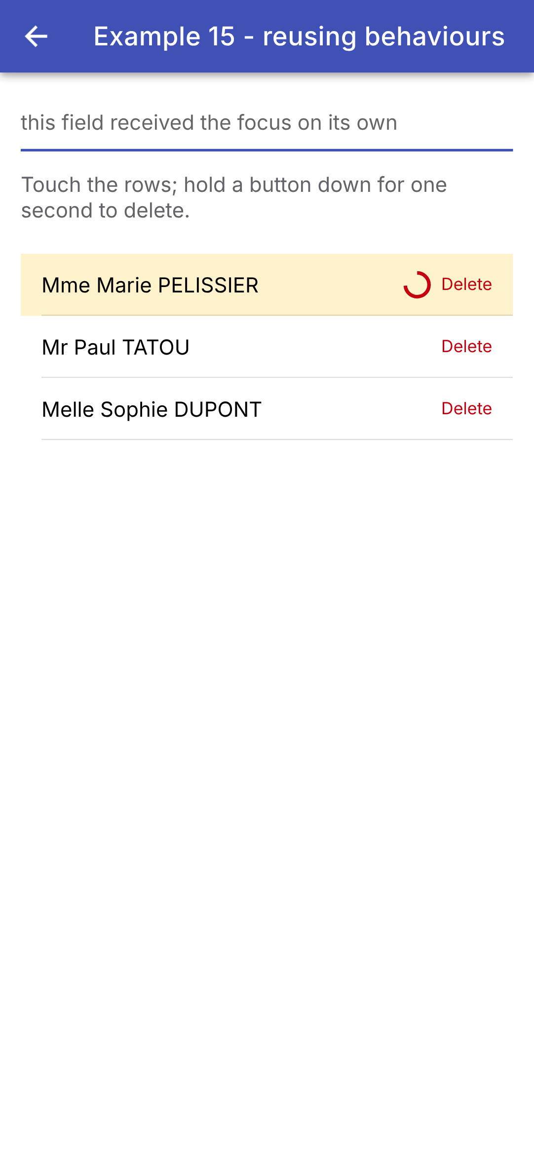
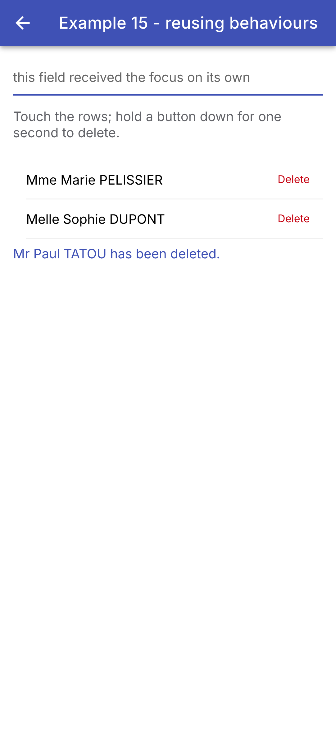
按住第一个按钮时(圆环逐渐填满,该行高亮,字段保持焦点);然后完整按下第二个按钮:
因此有三种工具:属性指令,为任何标签添加行为(相当于“包装器”widget 和 mixin 的更轻量版本);组件,用于行为伴随着可视元素(圆环)的情形;以及组合([hostDirectives]),它把两者结合起来。[Ionic] 提供底层构建块:手势([createGesture])和动画([createAnimation])。
4.7. 示例 16:可复用的确认窗口
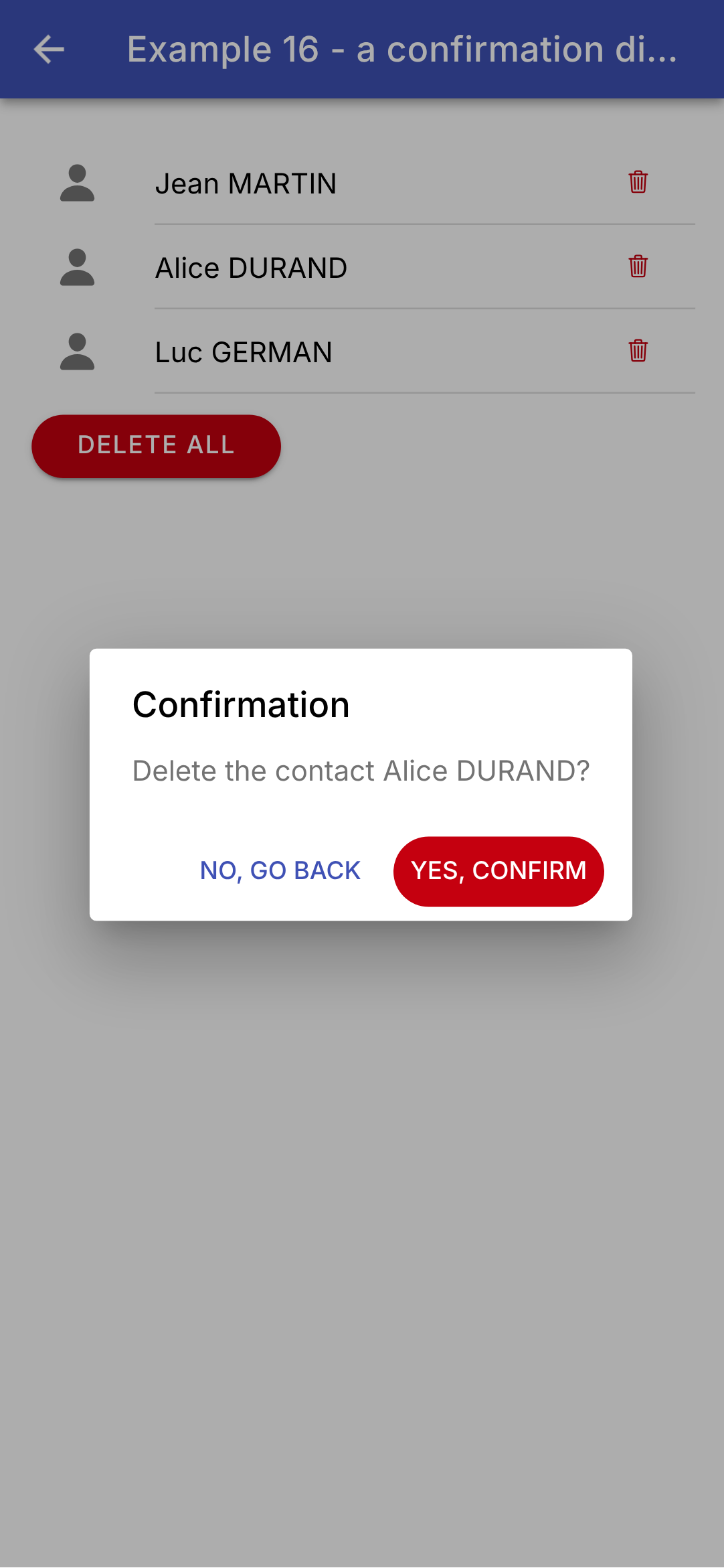
“确定吗?”:[Ionic] 提供了你所需要的一切。[AlertController] 服务会创建一个模态警告窗口([ion-alert]),显示在屏幕最上层;它的方法 [onDidDismiss()] 返回一个 promise([Promise]),该 promise 在窗口关闭时完成,结果为关闭窗口的那个按钮的角色。
4.7.1. 窗口
| // =========================================================================
// src/app/ex16-confirmation/confirmation.ts - “确定吗?”
// -------------------------------------------------------------------------
// Ionic 提供了所需的一切:AlertController 服务会构建
// 一个模态(MODAL)警告对话框(<ion-alert>),显示在屏幕上方;
// onDidDismiss() 返回一个 promise,在对话框关闭时完成,
// 结果为关闭它的那个按钮的角色。因此调用代码写起来
// 非常简单:
//
// private readonly confirm = injectConfirmation(); // 组件的一个字段
// if (await this.confirm('Delete this doctor?')) { ... }
//
// 不作回应就关闭对话框(点按外部、手机的返回键、
// Esc 键)时,对话框会以角色 'backdrop' 关闭:我们把它
// 视为“否”。
// injectConfirmation() 使用 inject():它在允许使用 inject() 的地方
// 调用(组件或服务的字段或构造函数)。
// =========================================================================
import { inject } from '@angular/core';
import { AlertController } from '@ionic/angular';
export function injectConfirmation(): (message: string) => Promise<boolean> {
const alerts = inject(AlertController);
// 返回的函数,可在任何时候使用
return async (message: string) => {
const alert = await alerts.create({
header: 'Confirmation',
message,
// 对话框的 CSS 类(见 ex16.page.ts 的样式)
cssClass: 'confirmation-alert',
buttons: [
// role: 'cancel':最不危险的选项,放在最前
{ text: 'No, go back', role: 'cancel' },
{ text: 'Yes, confirm', role: 'confirm', cssClass: 'confirm-button' },
],
});
await alert.present();
// 我们等待对话框关闭:role 是所选按钮的角色,
// 如果点按了外部,则为 'backdrop'
const { role } = await alert.onDidDismiss();
return role === 'confirm';
};
}
|
- 第 23 行:一个返回函数的函数。[injectConfirmation()] 使用 [inject]:它可以在任何允许使用 [inject] 的地方调用(组件或服务的字段或构造函数)。它返回的函数可以在任何时候使用:[await confirm('...')];
- 第 24 行:创建警告窗口的 [Ionic] 服务;
- 第 27–37 行:窗口:一个标题([header])、一条消息和两个按钮。[create] (在 promise 中)返回尚未显示的窗口对象。每个按钮都有一个角色([role]):[cancel] 对应“No, go back”——最安全的选项——而 [confirm] 对应“Yes, confirm”。[cssClass] 为窗口和确认按钮指定 CSS 类,以定义它们的样式;
- 第 38 行:显示窗口;
- 第 41–42 行:我们等待它关闭。[role] 是所选按钮的角色;不作回应就关闭窗口(点按窗口外部、按手机的返回键或按 Esc 键)时,窗口会以角色 [backdrop] 关闭,它被视为“否”。
这样,调用代码写起来就和使用浏览器的 [window.confirm] 一样简单:[if (await this.confirm('Delete this doctor?')) { ... }]。这与 [showDialog] 在 [Flutter] 中完全对应,后者返回一个 [Future];而 [React] 客户端则需要一个上下文、一个手工编写的 promise 和一个“portal”才能达到同样的效果。
4.7.2. 使用
| // =========================================================================
// src/app/ex16-confirmation/ex16.page.ts - 使用确认对话框
// -------------------------------------------------------------------------
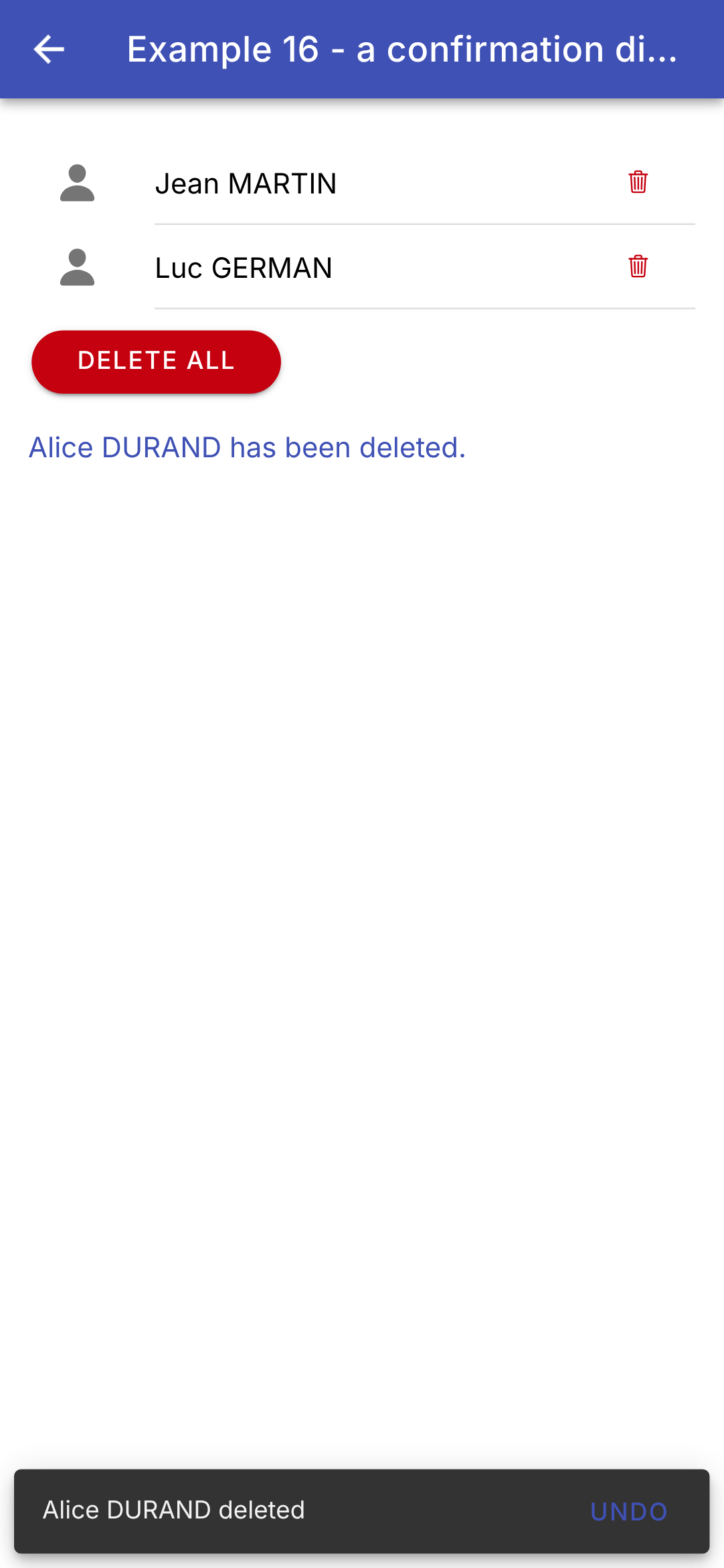
// 先删除,然后在屏幕底部显示一条短暂的消息(ion-toast),
// 带有一个“Undo”按钮:这是移动端上另一种非常常见的
// 保护用户免于误操作的方式。
// =========================================================================
import { Component, inject, signal, ViewEncapsulation } from '@angular/core';
import {
IonBackButton, IonButton, IonButtons, IonContent, IonHeader, IonIcon, IonItem, IonLabel, IonList, IonText,
IonTitle, IonToolbar, ToastController,
} from '@ionic/angular';
import { addIcons } from 'ionicons';
import { person, trashOutline } from 'ionicons/icons';
import { injectConfirmation } from './confirmation';
interface Contact {
id: number;
name: string;
}
@Component({
selector: 'app-ex16',
imports: [
IonHeader, IonToolbar, IonButtons, IonBackButton, IonTitle, IonContent, IonList, IonItem, IonLabel, IonIcon,
IonButton, IonText,
],
templateUrl: './ex16.page.html',
// 警告对话框不在页面的模板中:Ionic 把它添加到
// 文档的末尾。因此它的样式必须是全局的(GLOBAL):
// ViewEncapsulation.None 会禁用该组件的样式封装
encapsulation: ViewEncapsulation.None,
styles: `
.confirmation-alert { --max-width: 330px; }
.confirmation-alert .alert-button-group { flex-wrap: nowrap; }
.confirmation-alert .alert-button { white-space: nowrap; }
.confirmation-alert .confirm-button { background: var(--ion-color-danger); color: white; border-radius: 20px; }
`,
})
export class Ex16Page {
readonly contacts = signal<Contact[]>([
{ id: 1, name: 'Jean MARTIN' },
{ id: 2, name: 'Alice DURAND' },
{ id: 3, name: 'Luc GERMAN' },
]);
readonly message = signal('');
// 确认函数,以及短暂消息的服务
private readonly confirm = injectConfirmation();
private readonly toasts = inject(ToastController);
constructor() {
addIcons({ person, trashOutline });
}
// 一个 async 方法:它“等待”用户的回答
async remove(c: Contact): Promise<void> {
const yes = await this.confirm(`Delete the contact ${c.name}?`);
if (!yes) {
this.message.set('Deletion abandoned.');
return;
}
const position = this.contacts().indexOf(c);
this.contacts.update((l) => l.filter((x) => x !== c));
this.message.set(`${c.name} has been deleted.`);
// ToastController:屏幕底部的一条短暂消息,带有一个按钮
const toast = await this.toasts.create({
message: `${c.name} deleted`,
duration: 4000,
position: 'bottom',
buttons: [
{
text: 'Undo',
// 联系人回到它原来的位置
handler: () => {
this.contacts.update((l) => [...l.slice(0, position), c, ...l.slice(position)]);
this.message.set(`${c.name} is back.`);
},
},
],
});
await toast.present();
}
async removeAll(): Promise<void> {
if (await this.confirm(`Delete the ${this.contacts().length} contacts?`)) {
this.contacts.set([]);
this.message.set('All the contacts have been deleted.');
}
}
}
|
- 第 33–39 行:窗口的样式。它不在页面模板中:[Ionic] 会把它添加到文档末尾,位于其他所有内容之上。页面的作用域样式不会影响它:[ViewEncapsulation.None] 会禁用作用域,规则因而变成全局的。因此它们只针对类 [confirmation-alert],以免干扰其他任何内容。[--max-width] 是 [ion-alert] 的 CSS 变量:窗口稍微加宽一些,以便按钮能排在一行;确认按钮是红色的(在较大的项目中,这些规则会放在全局样式表 [styles.scss] 中);
- 第 50 行:确认函数,从组件的一个字段中获取(注入上下文);
- 第 51 行:来自 [Ionic] 的临时消息服务;
- 第 58–63 行:一个 [async] 方法:它“等待”用户的响应。与 [Flutter] 不同,在 [await] 之后无需检查屏幕是否仍然存在([mounted]):修改已销毁组件中的信号不会导致错误;
- 第 64–66 行:删除,同时保存该联系人的位置;
- 第 68–83 行:删除之后,屏幕底部会出现一条临时消息([ion-toast]),持续四秒,带有一个“Undo”按钮,可以把联系人恢复到原来的位置。这是移动设备上广泛使用的另一种保护用户免于误操作的方法:立即执行操作,但允许用户撤销。它对应于 [SnackBar] 在 [Flutter] 中的作用;
- 第 86–91 行:确认后删除全部。
| <!-- ======================================================================
ex16.page.html - a list of contacts, and confirmed deletions
====================================================================== -->
<ion-header>
<ion-toolbar color="primary">
<ion-buttons slot="start">
<ion-back-button defaultHref="/" />
</ion-buttons>
<ion-title>Example 16 - a confirmation dialog</ion-title>
</ion-toolbar>
</ion-header>
<ion-content class="ion-padding">
<ion-list>
@for (c of contacts(); track c.id) {
<ion-item>
<ion-icon slot="start" name="person" />
<ion-label>{{ c.name }}</ion-label>
<!-- aria-label:按钮的名称,供屏幕阅读器使用(它没有文字) -->
<ion-button slot="end" fill="clear" color="danger" [attr.aria-label]="'delete ' + c.name"
(click)="remove(c)">
<ion-icon slot="icon-only" name="trash-outline" />
</ion-button>
</ion-item>
} @empty {
<!-- @empty:列表为空时显示的内容 -->
<ion-item><ion-label color="medium">No contact.</ion-label></ion-item>
}
</ion-list>
<!-- [disabled]:列表为空时禁用该按钮 -->
<ion-button color="danger" shape="round" [disabled]="contacts().length === 0" (click)="removeAll()">
Delete all
</ion-button>
@if (message()) {
<p><ion-text color="primary">{{ message() }}</ion-text></p>
}
</ion-content>
|
- 第 21–24 行:一个红色的图标按钮,提示用户删除该联系人;
- 第 26–29 行:[@empty]:当列表为空时 [@for] 所显示的内容;
- 第 33 行:当列表为空时,[[disabled]] 会禁用该按钮;[shape="round"] 使它带有圆角。
确认窗口;然后删除完成,并出现它的临时消息:
警告窗口([AlertController])、弹出消息([ToastController])、模态窗口([ModalController])、操作菜单([ActionSheetController])以及加载指示器([LoadingController]):[Ionic] 为每种窗口类型都提供了一个可注入且返回 promise 的服务。这些“控制器”对应于 [showDialog]、[showModalBottomSheet] 和 [ScaffoldMessenger] 这几个来自 [Flutter] 的函数。